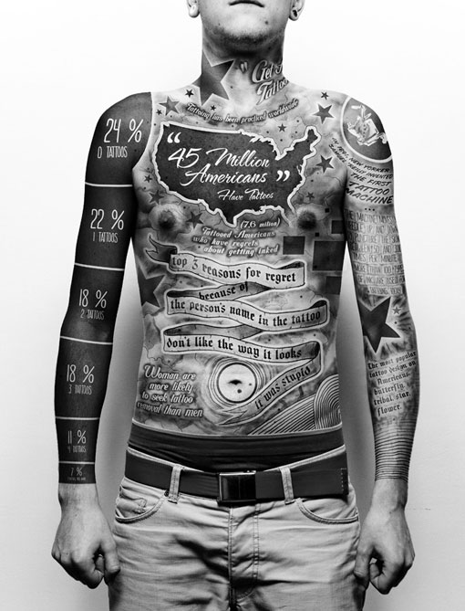
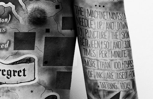
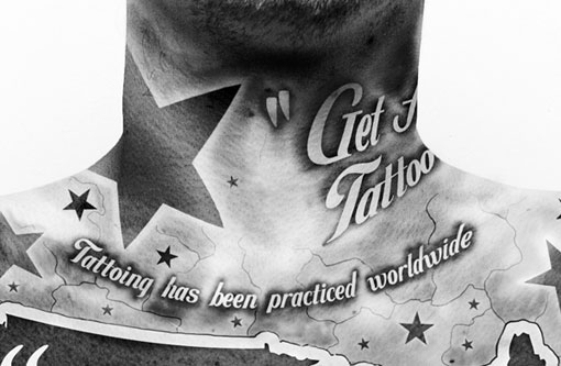
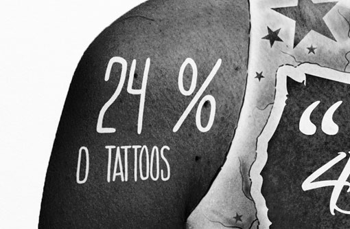
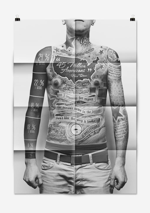
Lots of errors. “1 Tattoos, Tattoing, Woman are more likely…” Thank god it wasn’t a real tat. It does look pretty cool though.
Right. Personally I was really impressed with the formal qualities of the design, so I the typos didn’t immediately catch my attention. They could be the result of some sort of translation issue. Paul is a student in Poland.
I’m sorry, just too much of a Sagmeister rip-off to be impressed. You don’t always have to be original to be good- but as Picasso said “Good Artists Borrow, Great Artists Steal”.
I could agree this is certainly Sagmeister-inspired, but I think calling it a “rip-off” is a little harsh. Is anything design that’s ever written on the body now going to be deemed plagiarized? It’s an infographic about tattoos so it makes perfect sense that it’s handled in this way, and while the concept is the same the style, content and execution is completely different. Everyone has their own unique threshold of where they think something veers from inspiration into imitation, so I know the answer isn’t black and white. But for me, they are different enough that I wouldn’t classify it as a rip-off, and aside from the spelling errors, I think it’s pretty well done.
[…] very well-executed idea [the DesignWorkLife blog always has brilliant stuff on […]
[…] very well-executed idea [the DesignWorkLife blog is always […]
That’s true. Maybe my initial reaction was a bit harsh. It is well-done, it’s just hard for me not to think immediately of another designer- but that really shouldn’t discredit the craftsmanship of the work shown.
[…] is an awesome concept!! Great thought behind the idea. However, this design falls under the “confusing” category because of the TYPOS […]
Dude, did you see that guys nipples? They’re weird looking…
Good thing these aren’t real tattoos because tattooing is spelled wrong in multiple places :) Otherwise a very cool project!
Good point. Definitely missed those misspellings initially!
This reminds me of Stefan Sagmeister who carved typo in his skin:
http://www.designboom.com/eng/interview/sagmeister.html
Lots of errors. “1 Tattoos, Tattoing, Woman are more likely…” Thank god it wasn’t a real tat. It does look pretty cool though.
Right. Personally I was really impressed with the formal qualities of the design, so I the typos didn’t immediately catch my attention. They could be the result of some sort of translation issue. Paul is a student in Poland.
I’m sorry, just too much of a Sagmeister rip-off to be impressed. You don’t always have to be original to be good- but as Picasso said “Good Artists Borrow, Great Artists Steal”.
I could agree this is certainly Sagmeister-inspired, but I think calling it a “rip-off” is a little harsh. Is anything design that’s ever written on the body now going to be deemed plagiarized? It’s an infographic about tattoos so it makes perfect sense that it’s handled in this way, and while the concept is the same the style, content and execution is completely different. Everyone has their own unique threshold of where they think something veers from inspiration into imitation, so I know the answer isn’t black and white. But for me, they are different enough that I wouldn’t classify it as a rip-off, and aside from the spelling errors, I think it’s pretty well done.
[…] very well-executed idea [the DesignWorkLife blog always has brilliant stuff on […]
[…] very well-executed idea [the DesignWorkLife blog is always […]
That’s true. Maybe my initial reaction was a bit harsh. It is well-done, it’s just hard for me not to think immediately of another designer- but that really shouldn’t discredit the craftsmanship of the work shown.
[…] is an awesome concept!! Great thought behind the idea. However, this design falls under the “confusing” category because of the TYPOS […]