20 Comments

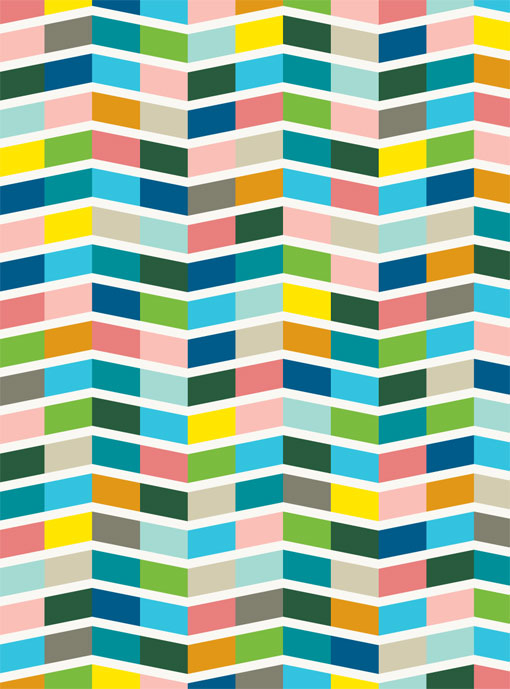
  1. I like the colour palette – folksy :-)
    I don’t understand the reason for choosing the incredibly corporate FF Din Rounded though.

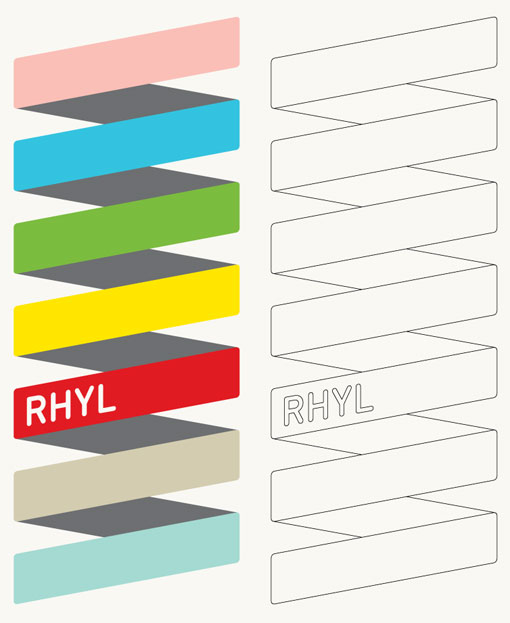
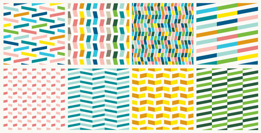
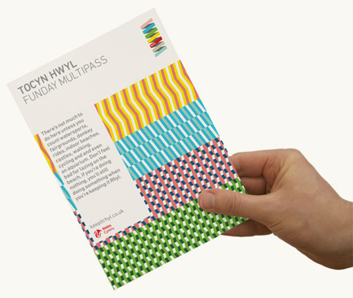
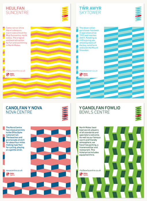
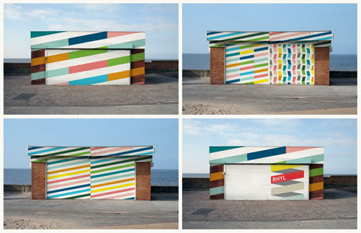
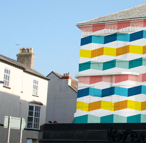
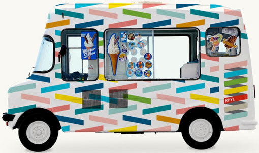
  2. […] The British seaside town of Rhyl would be silly not to adopt the visual identity created for it by Proud Creative–a holiday-bright rebranding based on a series of shapes and patterns meant to evoke the […]

  3. Rhyl isn’t an awful place, what a ludicrous statement. Parts of it aren’t good sure, but there’s beautiful parts too – tourists don’t get to see all of it and the media doesn’t note those.

    “Dressing up a whole town” – I imagine you wouldn’t find it so cool if it was yours (especially as you can’t please everyone all the time with 1 style/design). I know both the owners of those kiosks, I can’t wait to show them what’s been produced here!

    Yes, I live in Rhyl. And yes, I have a degree in design. The designs here are certainly pretty but best kept to stationery not whole towns (mine or otherwise).

Leave a Reply

Your email address will not be published. Required fields are marked *