For their New Year’s resolution, The New York Times is launching a beyond ambitious redesign of their future web experience and their first since 2006. Offering a new experience, the requisite press release promises a “cleaner, more engaging user experience” that will define the future of the paper’s digital edition. On Twitter, Rhodri Marsden cut through the spin and found the key to redesigning the Grey Lady was actually just about, “humans. As opposed to, say, the elk.”
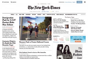
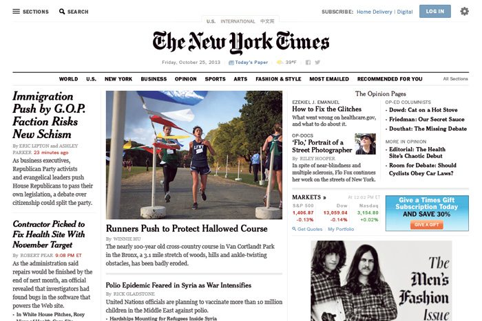
Already available since Jan. 2 for some users, the new design offers some timely examples of responsive web design, touch first philosophy, user centric thinking, and a whole lot of white space – bonus points for them having a trailer video and microsite of course. The NY Times digital strategy focused their responsive efforts just down to tablet devices and screen sizes since they have a completely separate mobile experience version. To fully appreciate this next generation of the paper, we highly recommend this animated GIF of The New York Times home page history as a good start. 2001 was adorable.
But how do you really redesign a site this large? How large? “Couldn’t even begin to tell you how many pages,” Ian Adelman, Director of Digital Design at The New York Times told us in an interview. “We tend not to think about it in terms of pages, more in terms of views. We see it in terms of how many types of views we need to serve up.”
As many stories and tweets about the redesign have noted, the paper believes this is the last redesign they’ll ever have to do. Adelman believes that, “It’s a beginning. We don’t see this as a redesign in the sense of it being an artifact. It is a new, more dynamic and flexible platform for expressing our journalism. We focused on trying to create a place where people would want to spend their time. We tried to pare it back to the essential elements, so that what is left is more powerful. It’s easier to add enhancements than it is to take things away. Among other things, we are exploring more ways that the experience can be passively personalized, in ways that feel helpful to our readers.”
The design’s influence from our touch interface world is clear from the first click, but it doesn’t forget where a large amount of work actually happens online. “Perhaps the simplest way to put it is that from the very beginning, we approached the UI design with the assumption that it would be used on touch-based devices,” said Adelman. “It sounds obvious, but in an environment where people are still doing most of their work – writing, designing and coding – on machines with a mouse, it’s important to take a very active position on that sort of intent.”
Get 300+ Fonts for FREE
Enter your email to download our 100% free "Font Lover's Bundle". For commercial & personal use. No royalties. No fees. No attribution. 100% free to use anywhere.
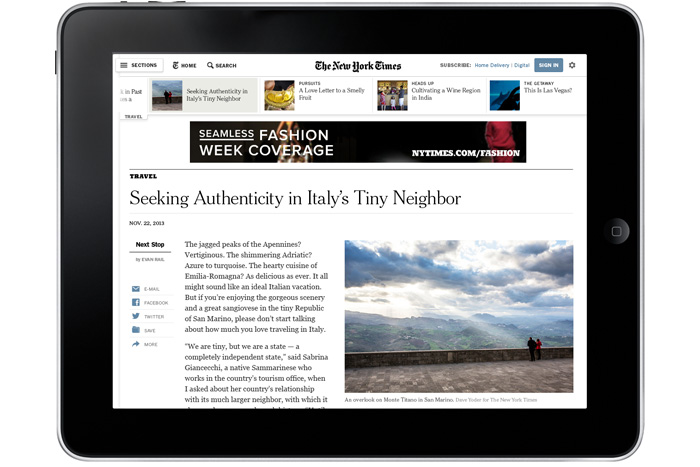
The biggest thing we can see beyond the much-needed design, is the single story scroll. No longer are articles set up in frustrating paginated views, but now on singular scrollable pages. “What’s generally best for the user is good for everyone else too,” said Adelman. “It’s certainly more pleasant. It keeps people engaged as there is no interrupted moment.”
The idea of the interrupted moment and how to solve for this is something that we’re going to see a lot more of going forward in web design. Of course the advertising impact of such a decision is unique to the user interface design of a newspaper website. “Everything about design is negotiation,” said Adelman. “When you take something where the essential product is journalism. Meantime you’re in the business of selling advertising, as well as the business of creating a compelling experience that people are willing to pay for. That’s a constant negotiation.”
Included in this new article design the comments now follow you down the page, and show up on the right hand side — this side-by-side feature for comments is a cool solution for desktopers and commenting addicts.
Another huge change was moving the long list of section navigation that previously appeared down the left side to a drop down navigation item at the top is a real game changer. The design also gives users some exciting new ways to explore content that subtlety lift from popular upstarts Zite or Flipboard is very, very, smart. Providing helpful right/left buttons on every article is a surfers dream, and the carousel of related stories at the top of articles is seemingly right out of Buzzfeed’s bag of design tricks.
What we found in talking with Adelman was how routed every decision was in content and journalism and how they are thinking about that going forward. “We made a lot of improvements in how we assemble the content so that it could express the journalism across platforms,” said Adelman. “We’re not building webpages. They exist now. And they will exist for some time. But what we’re really building is a journalism platform. The better we can articulate the shape of our material, the better we can display it across those platforms.”
