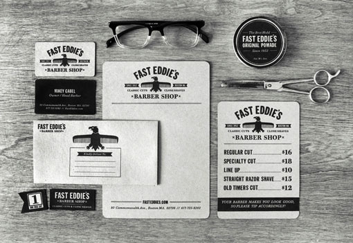
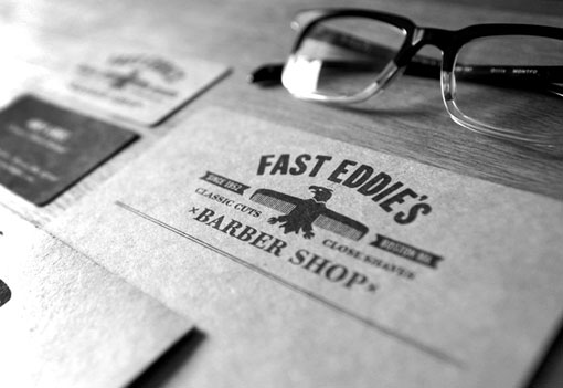
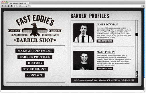
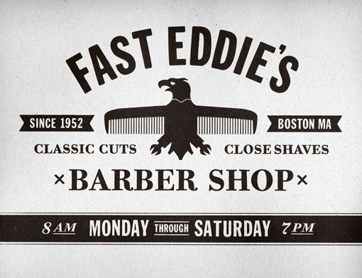
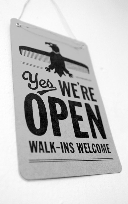
The aim of the identity for Fast Eddie’s Barber Shop, designed by Richard Arthur Stewart, was to evoke traditional Americana, a style that the Boston-based shop epitomizes.
Keeping Beantown looking good. Nice work.
Great work! Such a clever logo…I have designer envy.
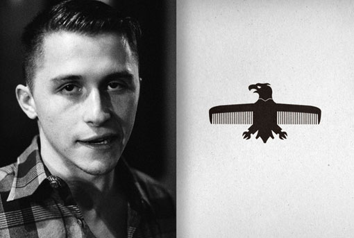
I love the image of the comb with the bird in the middle … very creative!
Ditto about the bird comb. Smart.
Thanks guys! Much appreciated!
Great photography and a great identity. Well put together. Love the black and white only approach to, not only, the work, but also the photography of the work.
Very, very nice. Consistant, creative and smart.
Um, well, the resemblence to the Reichsadler (http://en.wikipedia.org/wiki/Reichsadler) makes me feel uncomfortable…
Frau Haselmayer, you are a boring boring person. It’s clean and tight. I like.
wow this is fantastic. that third photo down showing the full collection.. too awesome.
LOVE THIS. Mostly because my father refers to my grandmother’s boyfriend only as “Fast Eddy”.
[…] from: design work life » Richard Arthur Stewart: Fast Eddie’s Barber Shop […]
Great idea basing a logo off the old Nazi Party eagle… oh hang on no it’s a terrible idea.
John,
Why don’t you leave us a URL so we can see the kind of work you do? If you’re going to bad mouth someone, you better back it up with some quality work. By the way, since when did the Nazis get exclusive rights to the eagle?
This seems to be getting a little out of hand. I love a good discussion, but let’s be nice people!
The eagle isn’t only a graphic used in the Nazi era, it is also a traditional American symbol. And being that this is a U.S. based business‚ that cited “Americana” as an influence, no less—I highly doubt the former was the designer’s inspiration.
Yikes.
[…] https://designworklife.com/2011/03/07/richard-arthur-stewart-fast-eddies-barber-shop/ var conveythis_src = "en";translationShare j = jQuery.noConflict(); var […]
[…] https://designworklife.com/2011/03/07/richard-arthur-stewart-fast-eddies-barber-shop/ ??: ?? ← Paic: Workout, Aerobics New Type Works 2 on the Behance Network → […]
Does loving this make me a Nazi? If so, slap a swastika on my arm and call it a day.
[…] ffffound via https://designworklife.com/2011/03/07/richard-arthur-stewart-fast-eddies-barber-shop/ Posted by: hade Parse error: syntax error, unexpected $end in […]
[…] Fine grain from design work life […]
[…] Fast Eddie’s Barber Shop identity by Richard Arthur Stewart via design work life […]
What stock was used for the stationary?
Hey Holly,
It’s called Brown Bag Paper Kraft…I think available in 70lb and 100lb.
http://www.amazon.com/Brown-Bag-Paper-KRAFT-70lb/dp/B001CZN45K/ref=sr_1_2?ie=UTF8&qid=1299701455&sr=8-2
[…] | Fast Eddie’s Barber Shop Nice retro branding for Fast Eddie’s Barber Shop. I love the eagle comb icon, and the choice of curving the text above. The whole setup is a little […]
[…] (via design work life ») […]
[…] Via Design Work Life Related posts:White Box by Makoto YabukiBeautiful motion graphics video by Makoto Yabuki of […]
Much appreciated!
[…] read it, for inspiration at the very least. And then I googled Richie and found that he has been blogged about quite often as of late. No surprise there, his work his great. So to pick a few things that perhaps […]
[…] vía Designworklife […]