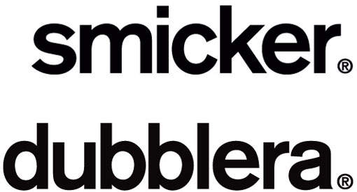
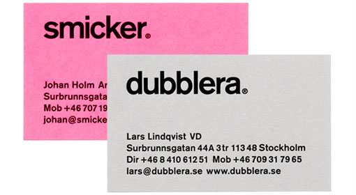
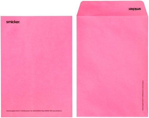
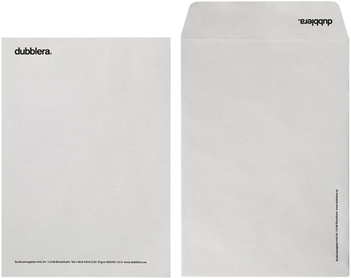
A recent look at BVD’s portfolio led me to a project I hadn’t seen before, the Smicker Dubblera identity. On its own the typographic system is super simple, but the pop of pink paper really makes it sing.


👋 Psst... Did you know you can get unlimited downloads of 59,000+ fonts and millions of other creative assets for just $16.95/mo? Learn more »
Get 300+ Fonts for FREE
Enter your email to download our 100% free "Font Lover's Bundle". For commercial & personal use. No royalties. No fees. No attribution. 100% free to use anywhere.
