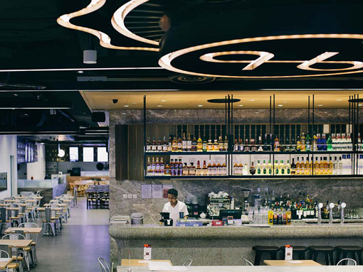
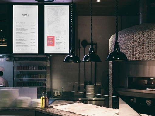
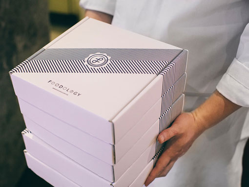
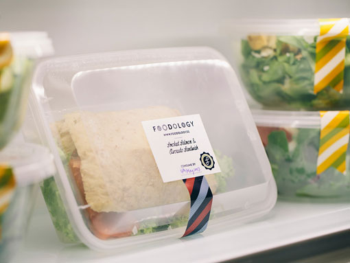
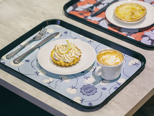
Somewhere Else just launched an extensive brand for Foodology, an 8000 square foot restaurant located in Singapore. The project encompassed development of everything from the identity to packaging, signage and interior graphics. You can get a look at a few more images right here.
A bit more background:
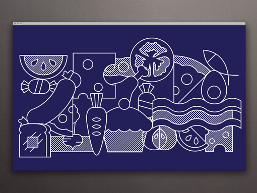
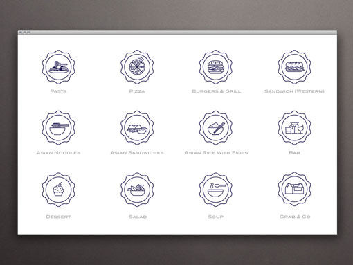
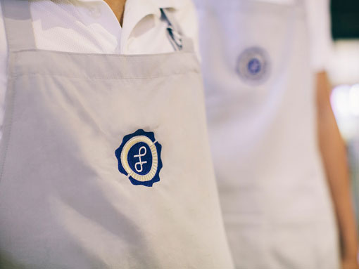
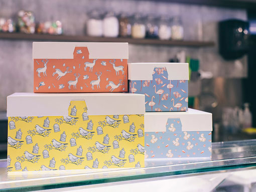
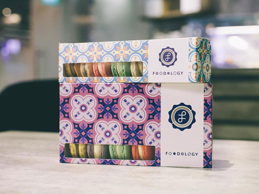
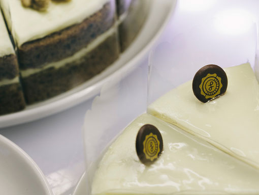
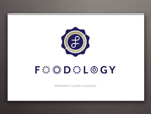
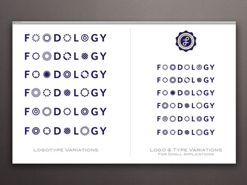
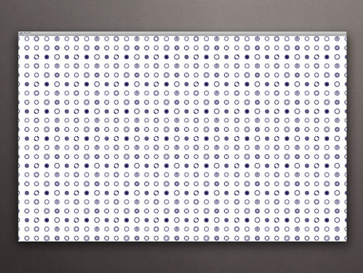
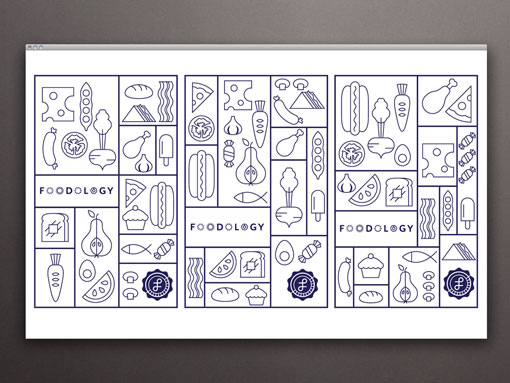
Based on the name, the identity treats Foodology as an institution for food and borrows different graphic elements from academia to create its own unique voice. The logo is designed like a seal with a “F” symbol and to express the fact that Foodology provides a wide selection of foods, the logotype comes in 6 different permutations with the “o”s replaced by different abstract symbols. To ensure that the identity system is flexible enough to accomomodate the different situations and broad spectrum of applications such a brand may encounter, an extensive set of illustrations and secondary graphics were also developed. These graphics allow the brand to be dynamic and show customers a multi-faceted, well rounded personality.

Get 300+ Fonts for FREE
Enter your email to download our 100% free "Font Lover's Bundle". For commercial & personal use. No royalties. No fees. No attribution. 100% free to use anywhere.