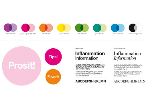
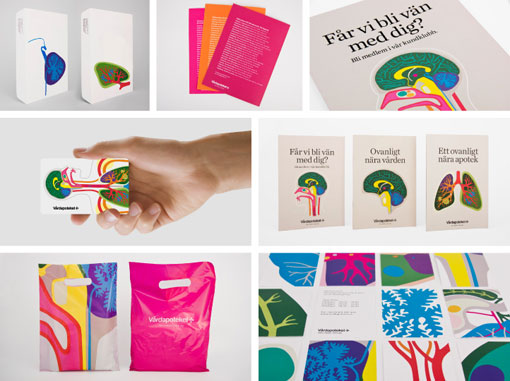
The vibrant identity was designed by Stockholm Design Lab for Vårdapoteket, a Swedish pharmacy chain. What a breath of fresh air it would be to shop in such colorful environment, especially compared to the typical Duane Reade I frequent here in NYC. Plus, the colorful organ pattern reminds me of Josef Frank’s work—which I love—a perfectly appropriate reference since he adopted Swedish citizenship later in life.


via Co. Design

Get 300+ Fonts for FREE
Enter your email to download our 100% free "Font Lover's Bundle". For commercial & personal use. No royalties. No fees. No attribution. 100% free to use anywhere.
