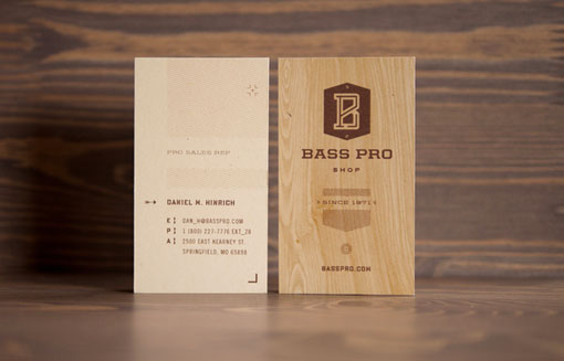
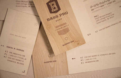
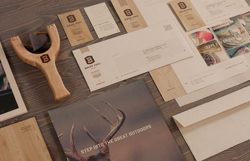
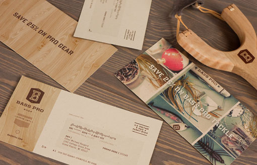
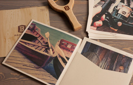
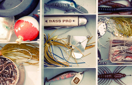
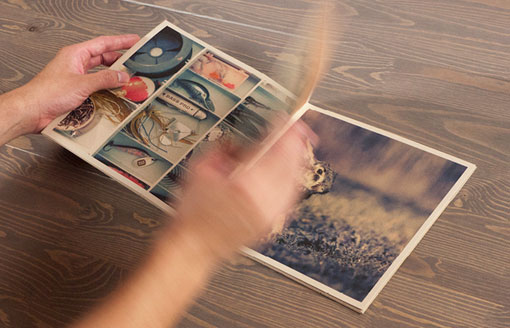
Check out this awesome student-designed identity for Bass Pro Shop by Fred Carriedo—a huge improvement in my opinion.
7 Comments
I love this! I’m afraid it’s not commercial enough or mainstream enough for the Bass Pro Shops’s target market (it’s pretty much %100 hipster) but the graphics are so beautiful and the overall look and feel works brilliantly! I think everyone agrees they need an overhaul of their identity, too.
Soooo clean! Love the faux bois. Definitely an improvement. I worked at Bass Pro as a college student and man, they could really use some help with their branding and design. It’s actually Bass Pro Shops, however, with an S on the end.
Yeah, overall it’s a nice look, but it looks more like L.L.Bean signature stuff, or something like that. I’m not crazy about the “B” logo either. It is, as conner said, a little to hipster/trendy, but nice execution at that.
I agree with all of the above. It’s a little too hipster and feels more in line with L.L. Bean (as Stephen said). The execution is beautiful though… just doesn’t feel like someone who just shot, killed and skinned a deer would shop here.
Beautiful work for sure but it really misses the target audience. I’ve been there numerous times cause the place is jokes and the customers are not high-end modern loving “folk”. They LOVE themselves a giant bass logo. The rebrand is gorgeous but what good is it if it misses it’s target demographic? It’s just design for design sake.
Great comments everyone. Admittedly, I have zero experience with Bass so I don’t have a great handle on who the typical customer is. I still get a very outdoorsy vibe from the identity and graphics, so it felt like a modern evolution for the company while still feeling warm and having a sense of history. I really don’t see it as being “hipster.” But I get that it’s very far off from the current design. One thing I do think is worth thinking about though, is just because a customer is used to more mainstream, less modern, and essentially less well-executed design, does that mean we should continue delivering to them based on that standard? Could it be that they are attracted to graphics in that vein because they haven’t been exposed to anything else when it comes to their favorite brands? I’m not saying this is the best solution for the customer, but I think the thought is worth considering.
[…] more here: Design work life Share this:TwitterFacebookLike this:LikeBe the first to like this post. Categories […]