In this article:
- Monochrome Design Begins With Contrast, Not Color
- Why Black-and-White Graphics Must Work Harder for Attention
- Hierarchy Without Color Requires Deliberate Structure
- Texture Helps Monochrome Designs Feel Alive
- Typography Carries the Emotional Tone
- I Study Real Brand Systems to Learn What Works
- 5 Rules I Follow for Monochrome Design
- Why I Still Love Designing in Black and White
Black-and-white design looks simple and elegant from a distance, but I’ve found it to be one of the most unforgiving systems to work with. Once color is out of the equation, you have no choice but to rely on the weight of type, the management of space between elements, the treatment of images, texture and scale, and the shape of negative space to create hierarchy.
Used correctly, the images can be more advanced, more distilled and more memorable than a busy full-color composition. Monochrome is when I get to see my designer judgment under the bright studio lights, and a splash of accent color isn’t enough to save a muddied composition. You have to make the form itself carry the message.
Monochrome Design Begins With Contrast, Not Color
One of the most common misconceptions about black-and-white design is that it automatically produces high contrast. Contrast can be ineffective in grayscale designs when the colors are too close.
Light gray text on a slightly darker gray background might look good in a design mock-up, but not read well in a finished piece. When I design without color, tonal value is the primary way I create a strong hierarchy.
Accessibility standards support this approach. The Web Content Accessibility Guidelines recommend a contrast ratio of at least 4.5:1 for normal text to be generally readable by people with limited contrast sensitivity. Monochrome graphics sacrifice the tonal hierarchy of color, while weak value contrast produces an unclear design.
The Nielsen Norman Group recommends the same from a usability perspective, stating that designers should never rely solely on color to convey meaning. Visual hierarchy must still function when it is unavailable. The same is true of intentional black and white design, where you do not have color as a communications tool, but the contrast, spacing and scale provide the same effect.
Why Black-and-White Graphics Must Work Harder for Attention
Color draws attention quickly. Research from the retail industry shows that marketing materials are read 42% more often in color than in monochrome. When I work in black and white, I’m giving up the natural advantage of colorful designs.

Get 300+ Fonts for FREE
Enter your email to download our 100% free "Font Lover's Bundle". For commercial & personal use. No royalties. No fees. No attribution. 100% free to use anywhere.
In its absence, I rely more on structure and form. Black-and-white design can still be successful, but it must rely on other design elements for impact. Without color, something else has to be stronger.
I pay attention to these elements:
- Dramatic scale contrast
- Strong typographic hierarchy
- Distinct silhouettes or imagery
- Clear negative space
- Textural depth
The best designs tap into visual memory. A Journal of Business Research study suggests logos are better remembered than brand names because of the “picture superiority effect.” The research is especially relevant in the world of black-and-white design, where shape and form can be the most visually arresting elements once color is gone.
Hierarchy Without Color Requires Deliberate Structure
Color hierarchy is often implicit, as a designer might stress a piece of information or separate elements with an accent color. In black and white, you have to be more strictly hierarchical in your structure.
The first tool I use is scale. Newspaper headlines need to feel a lot bigger than the text around them. In monochrome layouts, small size differences are usually eliminated.
Another tool is font weight. I often use a wider variety than regular and bold. Light, medium, semibold, condensed and bold styles can create a wider range of subtle tonal variation.
The third tool is negative space. I treat white space as a design element rather than a blank canvas. It provides information and helps direct the viewer’s eye.
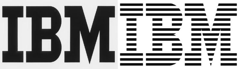
- Source: https://www.ibm.com/history/logo
One example of this is IBM’s note that Paul Rand’s redesign of the logo in 1972 added horizontal stripes, which give rhythm and differentiation from other logos. Even in pure black and white, the logo’s shape defines the branding.
Texture Helps Monochrome Designs Feel Alive
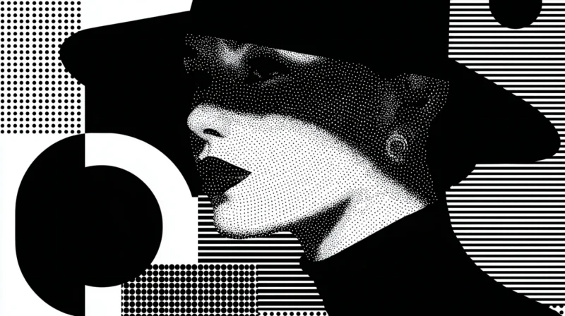
The biggest mistake I see regularly in black-and-white design is oversimplification. Some designers strip away all other elements of expression. The design looks clean, but is often flat.
That’s why I often add some texture to these black and white layouts, whether it’s a grain, halftone, patterned texture or high contrast photography. All add depth without sacrificing any hierarchy.
One reason texture works so well in monochrome is that it adds subtle gradations of tone without introducing new colors. When color is unavailable, texture becomes one of the few remaining tools for adding visual interest and dimensional depth. I’ve always found that a light grain, the contrast of a photograph and a paper texture all add depth and movement to a page.
Texture can also help delineate elements that would otherwise become two-dimensional and get lost. Instead of using color blocks or gradients, designers use tonal changes and textures to give visual guidance as to how to navigate the design. Examples of successful monochrome logos show how silhouette and tonal contrast can create stronger recognition than an embedded logo in complex color systems.

- Source: https://www.wwf.org.la/wwf_logo
Another graphic example in branding is the World Wildlife Fund’s choice of the panda symbol. It is a black and white symbol in bold print that would remain recognizable across cultures and languages. The logo proves that simplicity can actually increase visual impact.
Typography Carries the Emotional Tone
In situations where color is unavailable, typography becomes the primary source of emotion. A high contrast serif may be authoritative, a geometric sans serif may be progressive, and an open-spaced grotesque family may suggest institutional reliability and solidity.
It’s also often a key driver of rhythm. Changes to letter spacing, line height and alignment can hugely affect the character of a composition. I play with headline tracking, squeezing letters together for density and emphasis.
Occasionally, I pull the body copy wider. These are tiny details that help create a rhythm on the page, inviting the reader to move across the spread from the headline to the body copy.
Regarding how tonal contrast interacts with typography, I pay close attention to the monochrome layout. Typefaces with open shapes and similar weights seem to read the best in a dark-mode contrast environment. I’ve noticed that black text on a white background and white text on a black background may behave differently under different lighting and on different screens.
I Study Real Brand Systems to Learn What Works
When I want to see monochrome design at its best, I look at real brands rather than abstract design experiments. Luxury entities offer excellent examples.
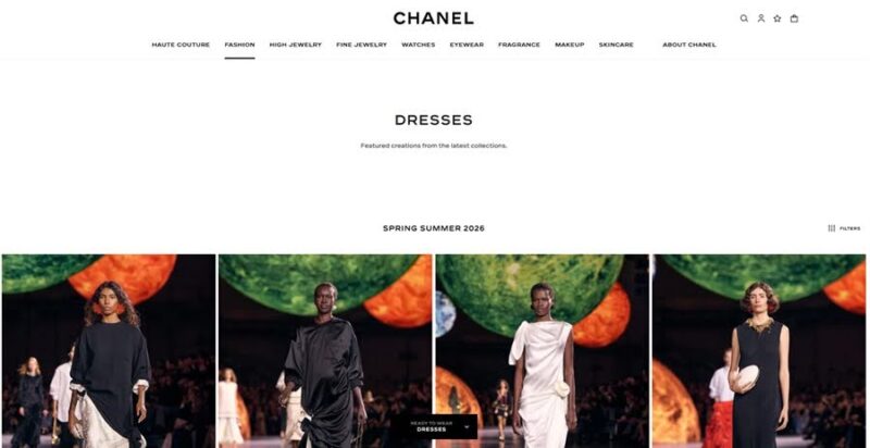
- Source: https://www.chanel.com
Chanel’s black and white digital presence shows how to represent elegance through moderation and consistency of expression. Technology brands offer an example through IBM’s identity system, which is based on repetition, geometry and spacing, and is still recognizable decades later. These two cases remind me that memorability is much less about color and much more about a strong structure and visual language.
5 Rules I Follow for Monochrome Design
Over the years, I have developed a handful of rules that help enormously in the black-and-white design process. They ensure that removing color will not destroy the design. I tend to follow them deliberately, and suddenly, the compositions feel clearer and stronger.
1. Exaggerate Hierarchy More Than Feels Necessary
The absence of color often makes the subtle hierarchy disappear, so I make the size differences between the headlines, subheads and body text more dramatic than I might have otherwise. This follows the principle of strong scale contrast, which creates a sense of hierarchy for viewers.
2. Design in Grayscale From the Start
I try not to design in color and then convert to black and white. I find when I start in black and white, I’m forced to work all of my hierarchy, contrast and balance without color. This usually leads to a stronger composition because the structure is built from the bottom up.
3. Remove Decorative Elements That Do Not Strengthen the Layout
When working in black-and-white graphic design, I prioritize legibility over decoration. I remove any lines, shadows or graphic elements that do not enhance legibility or hierarchy. A less cluttered design serves its purpose better.
4. Use Texture Strategically Rather Than Decoratively
Texture can help make monochrome graphics feel more dimensional, but only if there’s a good reason for it. I use grain, halftone patterns or photographic contrast so my graphics don’t feel cold. Where appropriate, texture can contribute to richness without disrupting hierarchy.
5. Test the Design in Multiple Viewing Environments
Black and white can look very different depending on your screen brightness, ambient light, print quality and more. I check monochrome layouts on a few different screens and sometimes even print a proof. By taking this next step, I can identify contrast issues or tonal imbalances I missed during the design review.
Why I Still Love Designing in Black and White
Black and white design is sometimes seen as a minimal and elegant alternative to design with color. I see it differently. I love how it gives everything a discipline — something that has to work harder once you take away color.
Typography must communicate tone, layout must guide the eye and contrast must maintain readability. When those elements come together, it can be incredibly powerful. A black-and-white graphic can be a considerate, elegant graphic that uses clarity, structure and confidence to get your message across more memorably than color.


