Even though Apple just sold another 43.7 million iPhones last quarter, countless products, screens and interfaces have apparently missed the memo on why design matters. Of course there are exceptions to every category and every rule, but it’s frustrating that in 2014, poor interface design continues to be ubiquitous in a variety of places where humans and machines play together. Here are five places where user interface designs go to die.
1. Entertainment
Traditional television hits you with two epic fails. First, manufacturers — along with their partners in crime, cable companies — are still churning out remote controls that feature what feels like 10,000 unnecessary buttons, creating a “featuritis” of buttons and things that users do not want or need. Next, they make you use a visual interface that acts like the past decade of design just hasn’t happened yet. Welcome to the time warp of industrial age thinking that ensures your channel surfing experience has more in common with PCs than it does your phone. Putting two and two together, you discover why everyone is desperate for Apple to jump into the television market and why Netflix is so popular.
2. Home Appliances

Home appliances and home automation systems attempt to ride the wave of the futuristic, but often miss the mark. Mostly, they feel like you’ve stepped back in time, nostalgically watching 1980s movies like War Games or 1990s classics like The Net. This all makes a lot of sense and certainly explains why you have no idea what all the buttons on your microwave are for.
“The lifespan of a refrigerator is measured in decades, not months,” writes Jessy Xia and Joe Pemberton from Punchcut, a human interface design company. “The more an appliance experience relies on third-party add on services, such as Netflix or Pandora, the more the appliance will need to be future-proofed to receive OS and app updates.”

Get 300+ Fonts for FREE
Enter your email to download our 100% free "Font Lover's Bundle". For commercial & personal use. No royalties. No fees. No attribution. 100% free to use anywhere.
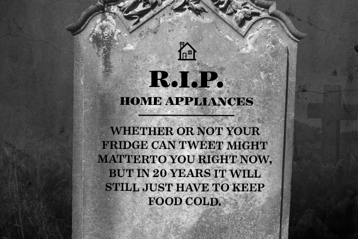
Your phone or tablet has about 36 months of potential life in it, and they are updating the OS constantly. Turns out, whether or not your fridge can tweet might matter to you right now, but in 20 years it will still just have to keep food cold. Ironically, the more unique and expensive your household running appliance gets, the worse the interface seems to be. The lesson: don’t be surprised if your hugely expensive audio system looks like Windows 95.
3. Exercise Equipment

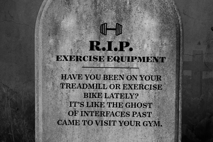
One of the worst offenders is the fitness category. Have you been on your treadmill or exercise bike lately? It’s like the ghost of interfaces past came to visit your gym. Get fit, be a better human being, and enjoy these old button and LED screen interfaces that look like the manufacturer is still copying original Star Trek.
Your average treadmill that can be picked up at Costco for under $2000 has more buttons than the Apollo rocket. Every one promises a number of apps, Google Maps, and a bunch of features that their data should tell them no one uses. You can’t text and drive, but you can certainly run and push useless buttons on a treadmill to your heart’s content.
4. Banking

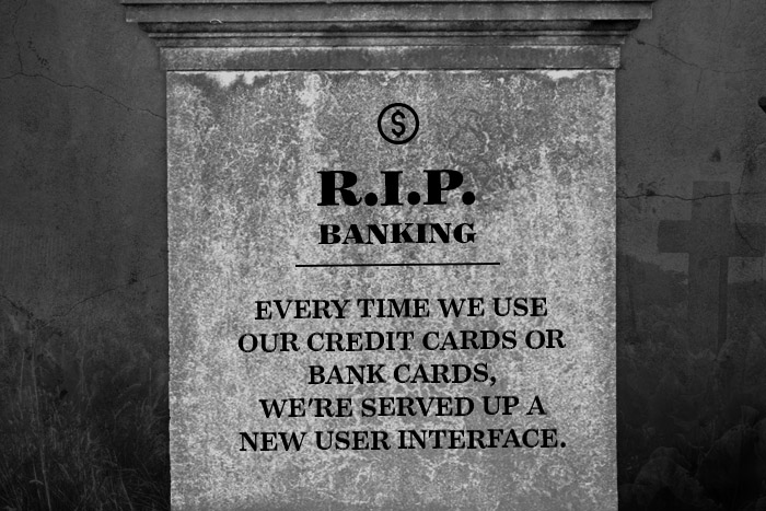
Every time we use our credit cards or bank cards, we’re served up a new user interface. It makes sense as there’s probably nothing more conservative than the “don’t fix what’s not broken” philosophy of banks. From banking websites to wireless credit terminals, users are often met with different, confusing, and inconsistent user experiences. In the age of self-checkout you’d think that things would be idiot-proof, but our failure to seamlessly checkout without help at the store 50% of the time still baffles the mind.
“Payment is another form of communication,” says Jack Dorsey, founder of Square, in Vanity Fair. “But it’s never been treated as such. It’s never been designed. It’s never felt magical. About 90 percent of Americans carry cards, but almost nobody can accept them. We want to balance that out and just make payments feel amazing.”
It’s not just Square, either; increasingly, companies like Starbucks are offering beautifully designed shortcuts to the traditional payment process with their own user-centric app payments.
5. Cars
Last but not least, cars may have the most room to grow. Like a scene out of Portlandia, it seems automakers are content to treat the dashboard interface like a bird for your vehicle and, as the story goes, simply put one on it. But if you’ve ever used a car dashboard system, you’ll soon realize these weren’t made for humans at all. Making car tech, it would seem, is hard.
“Think about the time, energy and number of iterations, software startups put into user interface design and navigation. For a car company, that is a major investment oblique to producing a product consisting of approximately 3,000 components,” writes auto journalist Neil Johnston in Medium. “One that needs to convey the brand experience in the way it drives, needs to sound right, not deafen people inside it, actually go around corners, can be seen out of, carry cargo, can be gotten in and out of easily, meet safety standards… you get the idea.”
Admittedly, Tesla has done something about this problem with their interface, but the reality is that automakers’ first job is to make a car, not a great UI. And again, it’s no wonder Apple is moving into this field with CarPlay. But what’s extraordinary is seeing how someone like Matthaeus Krenn can show the future of gesture-based interfaces in one short demo video.
What interface would you want to see redesigned?

