In this article:
- The First 50 Milliseconds: How Your Website Creates an Impression Before Anyone Reads a Word
- Narrative Architecture: Designing Websites That Guide, Not Just Display
- The Name Beneath the Design: Why Your Domain Is a Memory Device
- Type, Color, and the Emotional Memory of Visual Style
- Coherence Is the Secret: How Templates and Visual Voice Turn a Site Into a Brand
- To Sum it UP: Domain Names Are the Starting Point
Have you ever noticed that the websites you remember most rarely feel designed at all? They just work perfectly. What separates a forgettable site from one that lingers in your mind isn’t a massive budget or complex features. It comes down to a series of deliberate, psychological choices acting just below the surface.
You want to create an experience that feels natural and intuitive. Your very first decision, your web address, plants a memory before a visitor ever clicks the link. If you want to start strong, Wix generates domain name ideas to help you secure the perfect foundation for your site. When you understand how the human brain processes visual information, you can build a site that truly connects with your audience.
The First 50 Milliseconds: How Your Website Creates an Impression Before Anyone Reads a Word
Let’s talk about the speed of a first impression. In modern browsing, the human brain forms an aesthetic judgment in under 50 milliseconds. Visitors decide if they like your site before they read a single sentence. This instant reaction comes entirely from visual cues rather than actual content. You control these reactions through smart, deliberate design choices that guide the eye safely.
Ample whitespace gives the eyes room to rest, making your content feel approachable rather than overwhelming. Strong color contrast directs attention to what matters, pulling the viewer toward your main message. A balanced, symmetrical layout feels safe and professional to the human brain. Above-the-fold clarity ensures people immediately know they landed in the right place.
Great sites leave a lasting mark because of how they make the visitor feel on arrival, not just because of what they say. That feeling starts early, long before the pages are even published.
Narrative Architecture: Designing Websites That Guide, Not Just Display
The best websites function less like static brochures and more like guided journeys. You want to lead your visitors through a deliberate sequence of emotional states. This approach changes how people interact with your content. Instead of dumping every piece of information on a single page, try progressive disclosure. Show them exactly what they need at that specific moment, and let them scroll to uncover more.
This movement creates a dynamic experience rather than a flat, boring screen. The concept of “scrollytelling” turns the act of scrolling into a rewarding action. As the user moves down the page, new information gently fades in, creating a sense of momentum. Well-crafted interfaces that tell stories use data, imagery, and layout as active narrative tools.

Get 300+ Fonts for FREE
Enter your email to download our 100% free "Font Lover's Bundle". For commercial & personal use. No royalties. No fees. No attribution. 100% free to use anywhere.
When you treat your layout as a timeline, visitors stop skimming and start reading. They move through your content step by step. You can use large, striking images to set a mood, followed by concise text that answers their immediate questions. This architectural approach builds trust and keeps them engaged from top to bottom.
The Name Beneath the Design: Why Your Domain Is a Memory Device
A memorable website starts with a memorable address. The psychology of name recall applies just as much to URLs as it does to major brand names. You want an address that burrows into the mind effortlessly. First, think about phonetic fluency. Names that are easy to say out loud stick in the brain longer. If a visitor can easily pronounce your address, they can easily remember it tomorrow when talking to a friend.
Next, consider semantic fit. Names that clearly connect to your business purpose are processed faster by the brain. When your URL matches what you actually do, visitors feel confident they are in the right place. Finally, aim for distinctiveness. A name that breaks away from boring category norms grabs attention instantly.
You do not need to spend a fortune to secure a strong address, either. The options have expanded dramatically over the past few years. Accessible, cheap domains give you plenty of room to find something unique without breaking the bank. Your web address acts as a mental hook. Treat it as the very first design choice you make, because it sets the expectations for everything that follows.
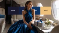
Type, Color, and the Emotional Memory of Visual Style
Typography and color carry immense psychological weight. These elements trigger associative memory in visitors, often without them realizing it. Let’s look at typography. Certain typefaces evoke very specific emotional registers. You might use serif fonts with nostalgia to project authority, tradition, and trustworthiness. On the other hand, geometric sans-serifs communicate a modern, clear, and efficient attitude. Script fonts bring warmth and a personal touch to your brand.
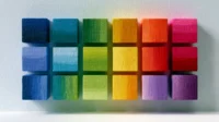
Colors work exactly the same way. The specific palette you choose creates a recognizable visual signature. Think about your favorite brands; you can likely picture their exact colors instantly. When you use those colors consistently across every page, that signature persists in the visitor’s memory long after they close the browser tab.
Warm colors like orange and yellow promote feelings of energy and optimism. Cooler tones like blue and green create a sense of calm and security. Think of color and type as the body language of your website. They silently tell your visitors exactly how to feel about your business before they even read your first headline.
Coherence Is the Secret: How Templates and Visual Voice Turn a Site Into a Brand
Visual consistency is the most underrated factor in creating a memorable site. When a design lacks coherence, the brain has to work harder to process the information. Mismatched fonts, inconsistent image styles, and clashing colors force the visitor to expend unnecessary cognitive effort. Sites that demand more mental energy are remembered less warmly, because they feel chaotic.
To avoid this, you need a unified visual approach. Take the time to pick templates that tell your story rather than just filling a random layout with text. A consistent visual voice signals professionalism and intent to a visitor’s subconscious. It shows you care about the details, which implies you will care about your customers, too.
This coherence builds immediate trust. Every button should have the same corner radius. Every photograph should share a similar lighting style or filter. When every element on your page feels like it belongs to the exact same family, your visitors can relax. They stop trying to figure out how to navigate your site and simply enjoy the content you created for them.
To Sum it UP: Domain Names Are the Starting Point
Memorable websites never happen by accident. They come from a clear understanding of human memory and perception. When you design with those psychological systems in mind, you create something lasting. From your initial web address to the final scroll position, every choice either reinforces or disrupts the impression a visitor carries with them.
Take a moment to review your own site against these psychological principles. Ensure your layout guides visitors naturally, your typography sets the right mood, and your visuals remain completely consistent across every page. Start the process where memory actually begins: with a name worth remembering and an experience that feels perfectly intuitive from the very first click. You have everything you need to build something unforgettable.