In this article:
- What Are Scratch Fonts and Why Are They So Popular?
- The Best Scratch Fonts to Try in 2026
- What Makes Scratch Fonts Feel So Authentic?
- Where to Use Scratch Fonts (And Where to Avoid Them)
- How to Choose the Right Scratch Font for Your Project
- Expert Tips for Working with Scratch Fonts
- The Psychology Behind Scratch Font Appeal
- Common Scratch Font Mistakes to Avoid
- Scratch Font Alternatives and Inspirations
- The Future of Scratch Fonts
- Frequently Asked Questions About Scratch Fonts
- Conclusion: Embracing Imperfection in Typography
Picture this: you’re scrolling through Instagram and suddenly stop at a post that feels like it was etched by hand, weathered by time, and touched by creative chaos. That irresistible textured look? That’s the magic of scratch fonts at work.
These beautifully distressed typefaces bring an authentic, handcrafted feel to designs that polished fonts simply can’t match. Whether you’re working on vintage-inspired branding, grunge aesthetics, or just want to add some rebellious character to your typography, scratch fonts are your secret weapon.
In this comprehensive guide, we’ll explore everything you need to know about scratch fonts – from what makes them tick to how to use them effectively in your designs. So grab your favorite design app, and let’s dive into the wonderfully imperfect world of scratched typography!
What Are Scratch Fonts and Why Are They So Popular?
Scratch fonts are typefaces that incorporate intentional distressing, weathering, and textural elements that mimic natural wear, scratches, and aging. Think of them as typography that’s been through life – fonts that tell a story through their imperfections.
These fonts capture the aesthetic of hand-carved signs, weathered billboards, vintage posters, and street art. They’re characterized by irregular edges, missing pieces, rough textures, and that coveted “lived-in” look that makes viewers want to reach out and touch the surface.
The popularity surge isn’t accidental. In our increasingly digital world, there’s a growing hunger for authenticity and human touch. Scratch fonts satisfy this craving by bringing organic, imperfect beauty to otherwise sterile digital designs. They’re the antithesis of perfect, sterile typography – and that’s exactly why they work so well.
The Best Scratch Fonts to Try in 2026
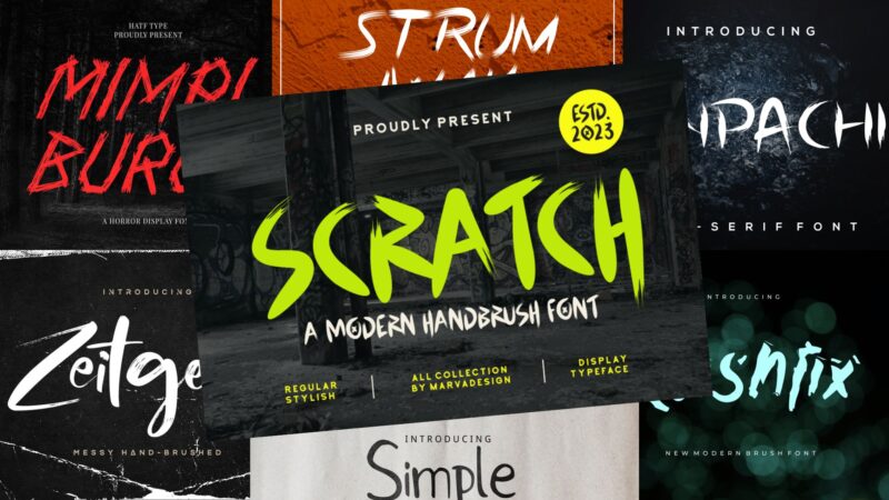
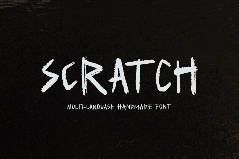
SCRATCH – A Modern Handbrush Font
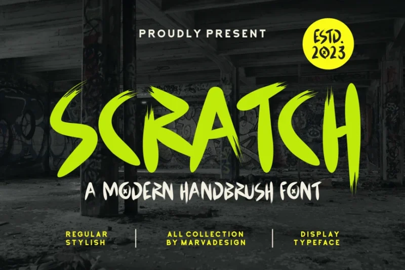
This modern handbrush font is perfect for designers seeking a fresh take on scratch fonts. With its brush and pencil-like qualities, SCRATCH offers a versatile option for projects requiring a handcrafted, authentic feel.

Get 300+ Fonts for FREE
Enter your email to download our 100% free "Font Lover's Bundle". For commercial & personal use. No royalties. No fees. No attribution. 100% free to use anywhere.
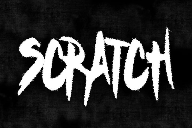
Scratch
Scratch is a multifaceted font that combines sans-serif, script, and handwritten styles with a touch of horror and creepiness. This versatile scratch font is ideal for designers looking to add an eerie edge to their typography projects.
Algeon – Display Font
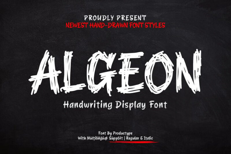
Algeon is a versatile display font that combines script, handwritten, and decorative styles with a scratchy aesthetic. This unique typeface is ideal for designers seeking to create eye-catching typography with a studio-crafted feel.
Mimpi Buruk
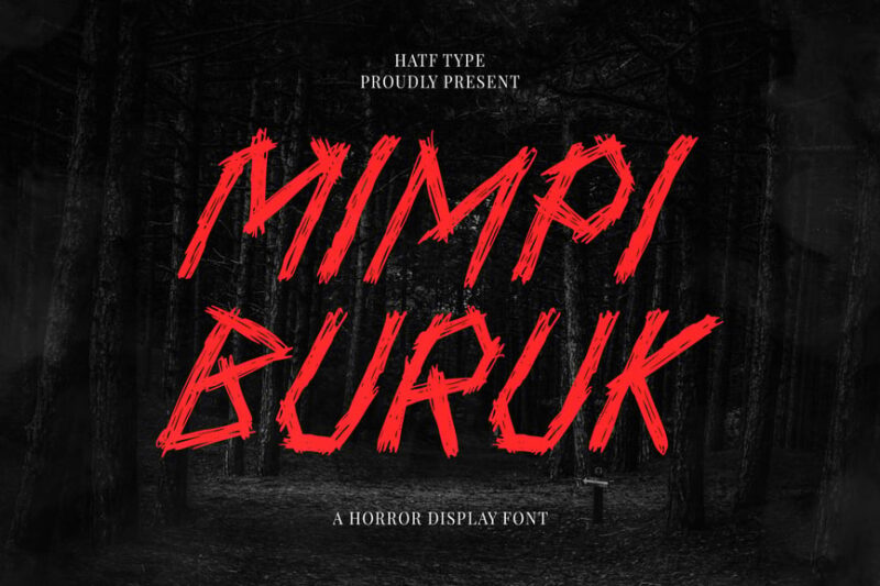
Mimpi Buruk is a decorative font with horror-inspired scratchy elements. This unique scratch-style typeface is perfect for designers looking to create eerie, unsettling typography for horror-themed projects or dark, edgy designs.
Scratch Font Duo
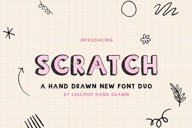
This dynamic scratch font duo offers both script and handwritten styles with a unique textured and 3D appearance. Perfect for designers seeking depth and character in their typography, this font pair brings scratch-style lettering to life.
Halloween – Zombie Scratch
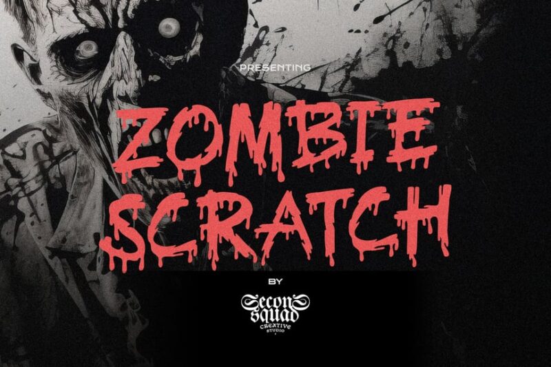
Halloween – Zombie Scratch is a dripping font that embodies the essence of horror and Halloween themes. This scratchy typeface is perfect for designers looking to create spooky, undead-inspired typography for seasonal projects.
Simple Scratch Font
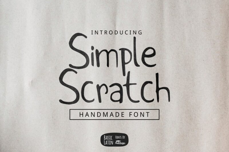
Simple Scratch Font combines sans-serif, script, and handwritten styles in a clean, minimalist package. This versatile scratch font is ideal for designers seeking a handmade look without excessive complexity in their typography projects.
Scratch Note
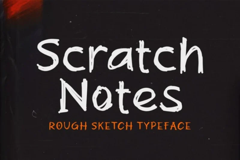
Scratch Note is a script and handwritten font that mimics hand-drawn, scribbled text. This scratch-style font is perfect for designers looking to add an authentic, spontaneous feel to their typography, ideal for personal or informal projects.
Rock Scratch – Brush Font
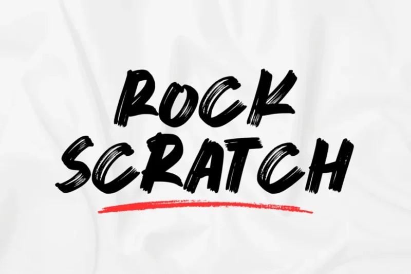
Rock Scratch is a bold brush font that combines script and handwritten styles with a scribble-like appearance. This edgy scratch font is perfect for designers working on music-related projects or seeking a raw, energetic typographic style.
SCRATCH METAL FONT
SCRATCH METAL FONT is a decorative typeface that combines distressed and death metal qualities. This unique scratch font is ideal for designers looking to create typography with an industrial, worn appearance for logos or headline text.
Scratched
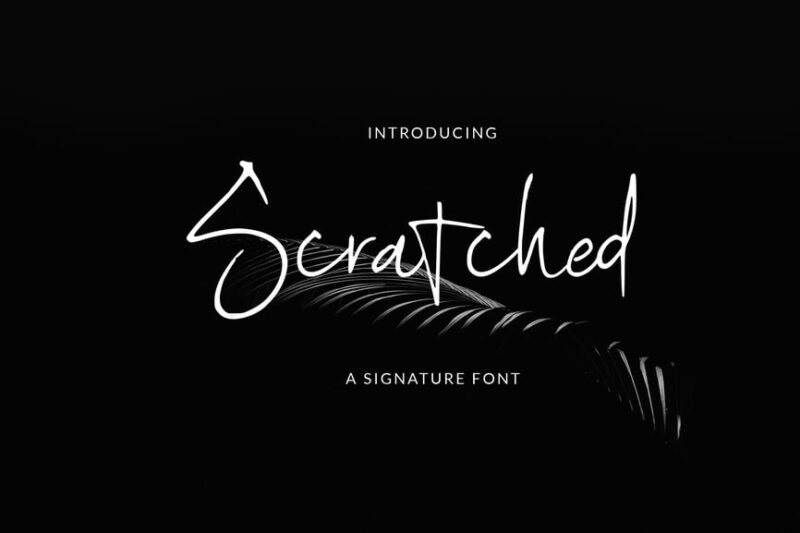
Scratched is a script and handwritten font that’s perfect for branding and brand identity projects. This versatile scratch-style font offers designers a way to create authentic, handcrafted typography that stands out in various applications.
Scratcher – Handwritten Type
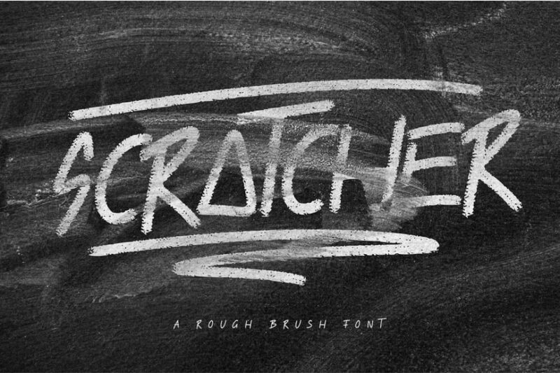
Scratcher is a handwritten typeface that mimics chalk on a chalkboard. This scratch-inspired font is perfect for designers seeking to create typography with a rustic, educational, or casual vibe in their projects.
Tooth and Nail
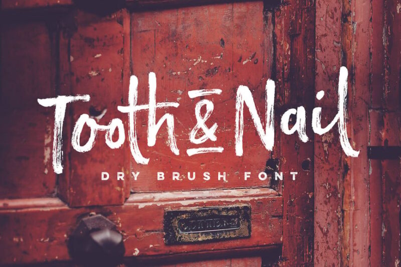
Tooth and Nail is a script and handwritten font with a medieval and rugged aesthetic. This scratch-like typeface is ideal for designers working on projects that require a raw, battle-worn typography style.
Black Scratch – Strong Bold Font
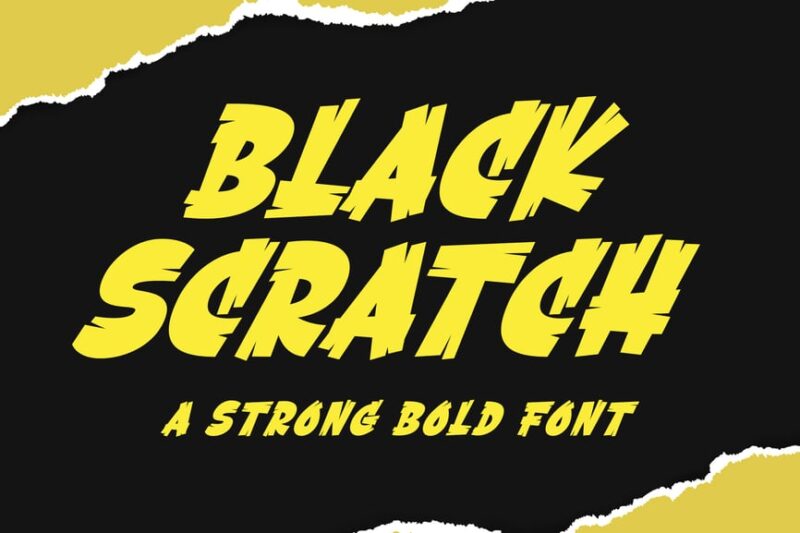
Black Scratch is a strong, bold decorative font featuring brush stroke-like elements. This powerful scratch font is perfect for designers looking to create impactful headlines or logos with a hand-crafted feel.
Blackton | scratch font
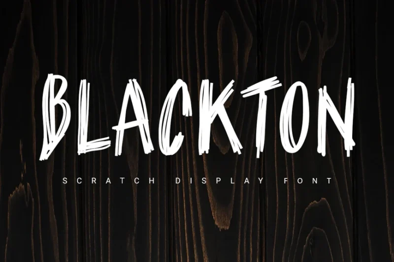
Blackton is a sans-serif scratch font that incorporates pencil stroke elements. This versatile typeface offers designers a way to add a scratchy, textured look to their typography while maintaining readability and modern appeal.
Chalk Scratch Font
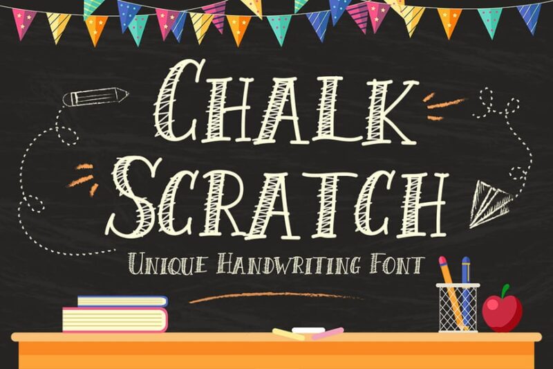
Chalk Scratch Font is a decorative serif typeface that mimics chalk on paper. This unique scratch font is perfect for designers looking to create typography with a schoolroom or nostalgic feel in their projects.
Zeitgeist
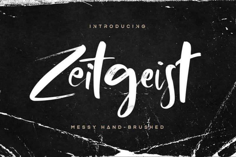
Zeitgeist is a script and handwritten font with a scratchy, calligraphic style. This elegant scratch-inspired typeface is ideal for designers working on projects that require a blend of sophistication and handcrafted authenticity.
Pax Suyud – Brush + Rough Font
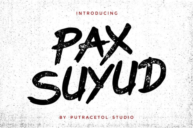
Pax Suyud is a distressed font that combines brush and marker-like qualities. This versatile scratch-style typeface offers designers a way to create typography with a raw, painterly feel for various creative projects.
Clawmark – Strong Brush Font
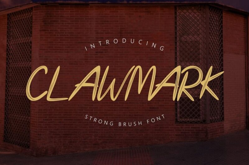
Clawmark is a strong, decorative brush font with script-like elements. This bold scratch-inspired typeface is perfect for designers looking to create impactful typography with a wild, aggressive edge for logos or headlines.
StrumIwak – Brush Font
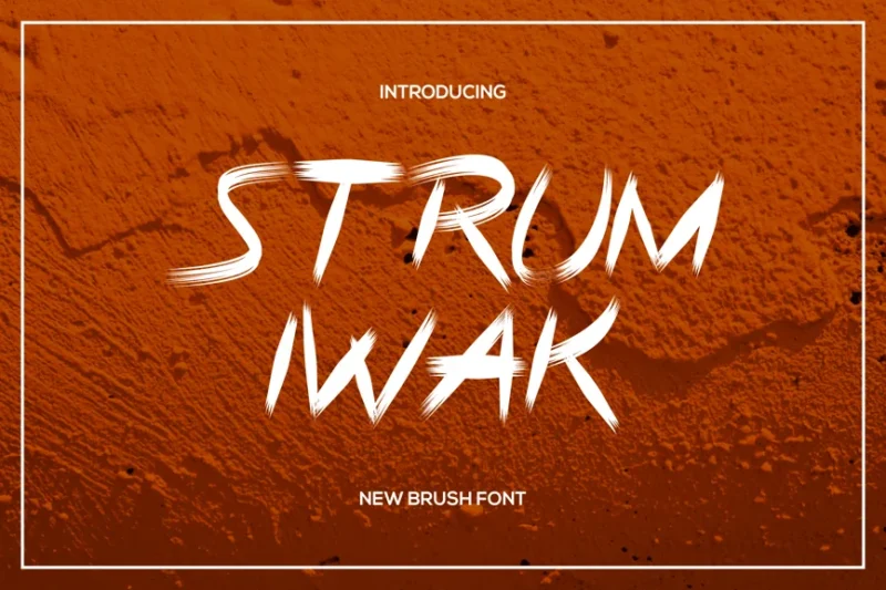
StrumIwak is a script and handwritten brush font that mimics sharpie-like strokes. This versatile scratch-style typeface offers designers a way to create typography with an authentic, hand-drawn feel for various creative applications.
Bad Habits – Rough Brush Font
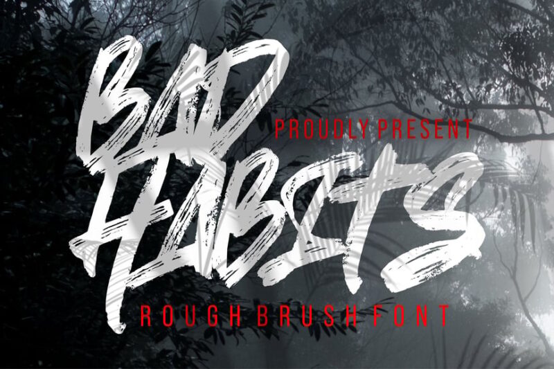
Bad Habits is a rough brush font with script and punk-like qualities. This edgy scratch-inspired typeface is perfect for designers looking to add a rebellious, grungy touch to their typography projects.
Rushfix – Font
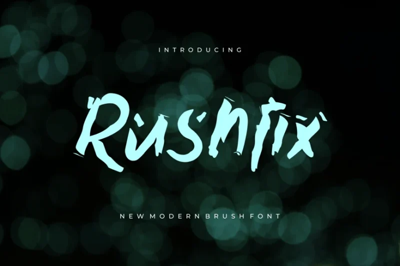
Rushfix is a script and handwritten font with a scratchy, brush stroke appearance. This dynamic scratch-style typeface offers designers a way to create typography that conveys energy and movement in their projects.
Street Howl – Graffiti Brush Font
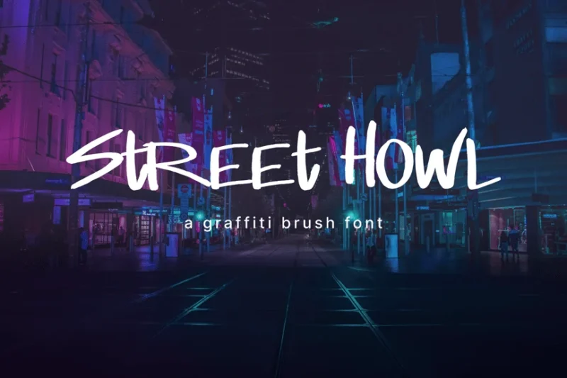
Street Howl is a graffiti-inspired brush font that combines script, handwritten, and decorative styles. This urban scratch-style typeface is perfect for designers looking to create typography with a street art aesthetic.
Nightmare Claw – Horror Grunge Display
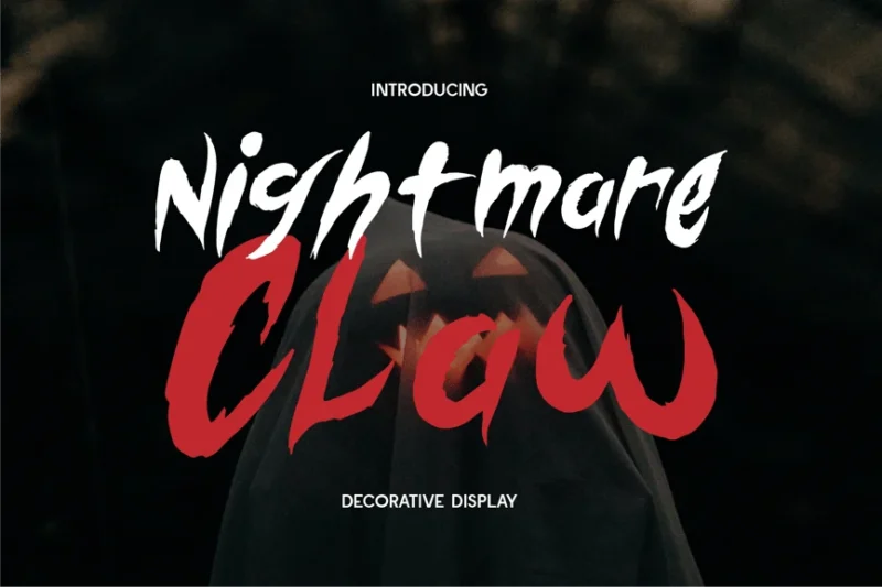
Nightmare Claw is a horror-themed grunge display font with decorative, script, and handwritten elements. This dark, scratchy typeface is ideal for designers working on projects that require a spooky, unsettling typographic style.
Scratchy Erratic Handwritten
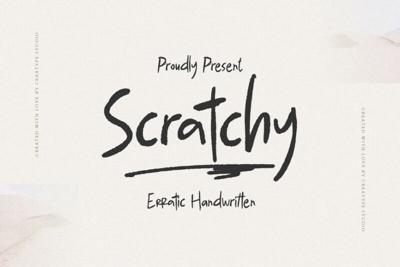
Scratchy Erratic Handwritten is a decorative font that combines sans-serif and display styles with a scratchy aesthetic. This versatile typeface offers designers a way to create typography with an authentic, hand-drawn feel for various projects.
Atalon Pro – A Scratch Handwritten Font
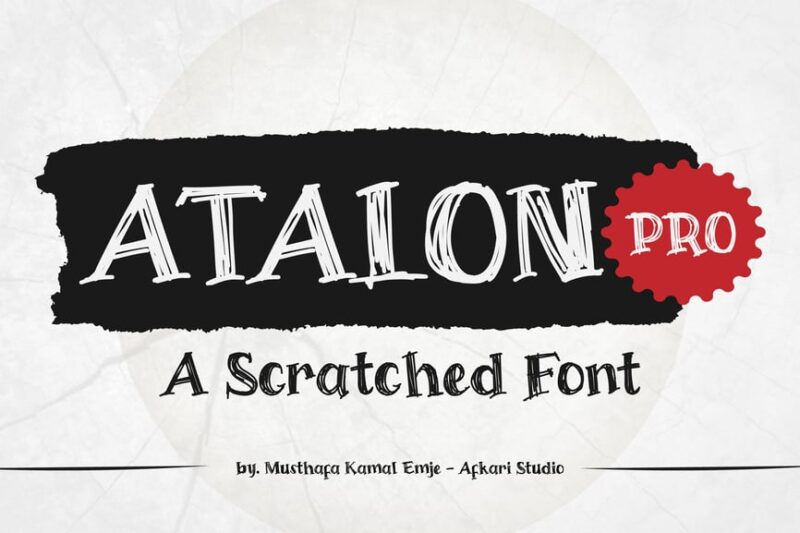
Atalon Pro is a scratch handwritten font that combines script, handwritten, and decorative styles. This versatile typeface mimics marker and chalkboard textures, perfect for designers seeking to create authentic, handcrafted typography.
Break Rules
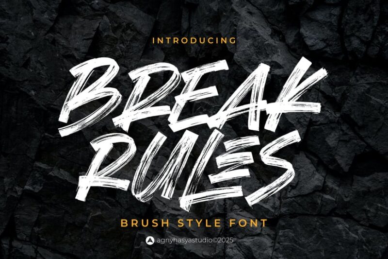
Break Rules is a script and handwritten font with a marker-like, rough appearance. This rebellious scratch-style typeface is ideal for designers looking to create typography that conveys a sense of defiance and raw energy.
Bangke – Textured Brush Font

Bangke is a decorative textured brush font that mimics paint strokes. This unique scratch-inspired typeface offers designers a way to create typography with a rich, tactile quality for various creative applications.
Whiplash
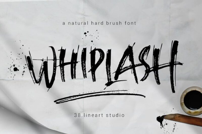
Whiplash is a script and handwritten font with a scratchy, hardcore aesthetic. This edgy scratch-style typeface is perfect for designers working on projects that require typography with an aggressive, high-energy feel.
Handodle – A Hand Scribble Display Font
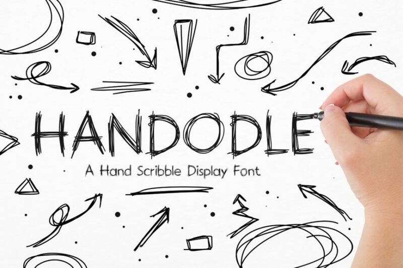
Handodle is a hand-drawn scribble display font with script and handwritten qualities. This playful scratch-inspired typeface is ideal for designers looking to create typography with a spontaneous, doodle-like appearance.
Encounter – Display Typeface + WebFonts
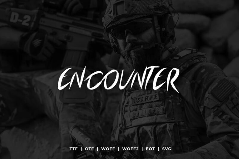
Encounter is a versatile display typeface that combines sans-serif, decorative, script, and handwritten styles. This Halloween-inspired scratch font offers designers a shocking, eye-catching option for creating impactful typography.
Kenpachi
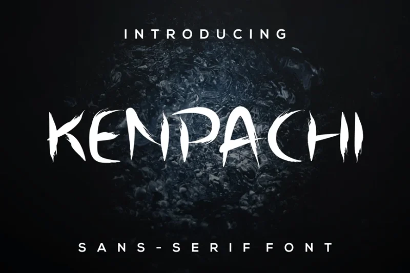
Kenpachi is a decorative font featuring scratch and brush stroke elements. This dynamic scratch-style typeface is perfect for designers seeking to create bold, energetic typography for various creative projects.
Punkbro
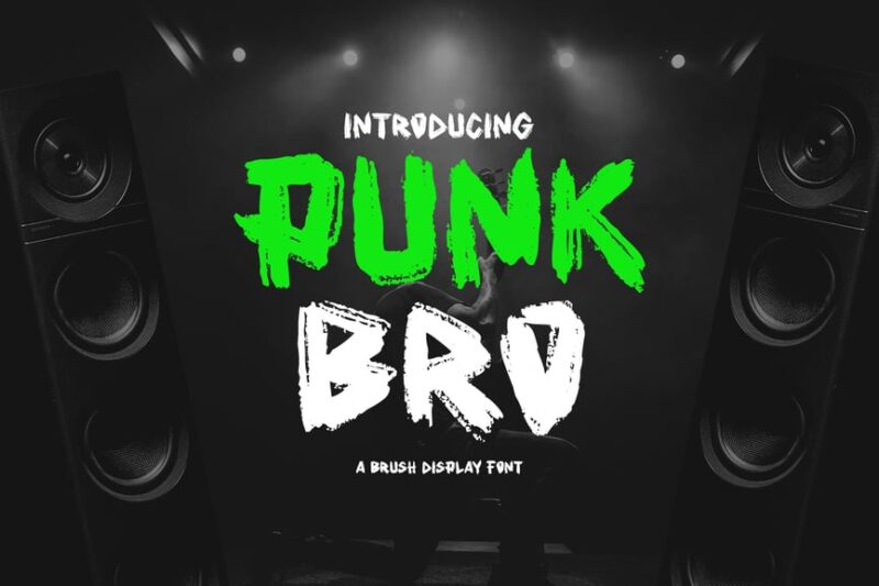
Punkbro is a decorative font that combines script and handwritten styles with a stencil-like, painted appearance. This rebellious scratch-inspired typeface offers designers a way to create typography with a raw, punk aesthetic.
Sketchy – Rough Sketch Font
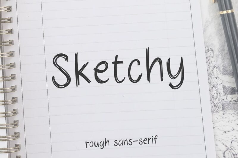
Sketchy is a sans-serif font with a rough, hand-drawn appearance. This versatile scratch-style typeface is perfect for designers looking to create typography that mimics quick sketches or rough drafts in their projects.
Gas’Rock! Font
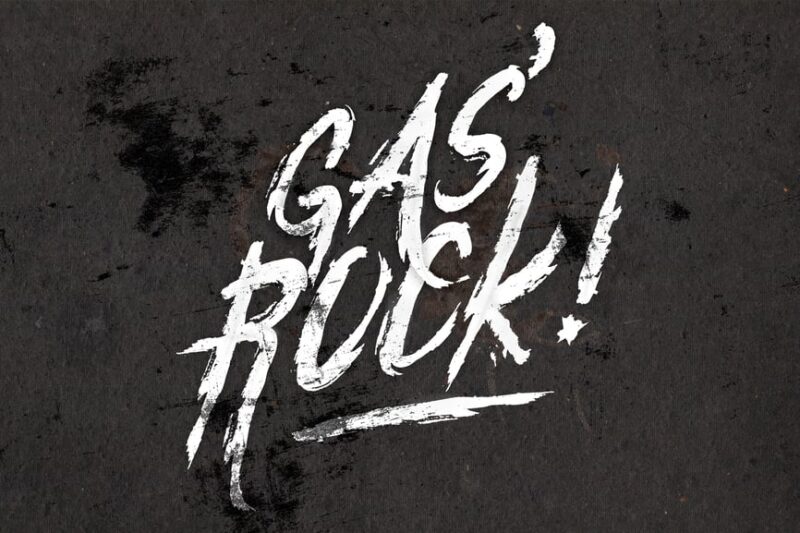
Gas’Rock! is a script and handwritten font with a grungy, paint-like texture. This energetic scratch-inspired typeface is ideal for designers working on projects that require typography with a raw, rock ‘n’ roll aesthetic.
Engraved on the Walls Svg Brush Font
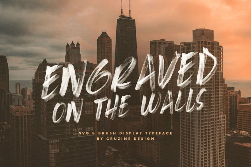
Engraved on the Walls is an SVG brush font that combines script, handwritten, and sans-serif styles. This unique scratch-inspired typeface offers designers a way to create typography with an engraved, marker-like appearance.
Ghoes Track Brush Fonts
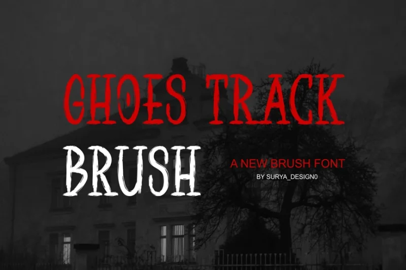
Ghoes Track Brush Fonts is a decorative typeface featuring brush and textured elements. This versatile scratch-style font collection is perfect for designers seeking to create typography with a rich, tactile quality in their projects.
What Makes Scratch Fonts Feel So Authentic?
The appeal of scratch fonts lies in their carefully crafted imperfections. Here’s what gives them that irresistible weathered charm:
Intentional Distressing
The best scratch fonts don’t just slap random scratches onto letterforms. They understand how materials naturally age and wear. Wood scratches differently than metal. Paint chips in predictable patterns. Stone weathers along grain lines. Quality scratch fonts study these natural processes and incorporate authentic-looking distress marks.
Varied Edge Quality
Unlike clean digital fonts with perfect curves, scratch fonts feature irregular, broken edges that feel hand-hewn. These imperfections catch the eye and create visual interest that smooth fonts simply can’t achieve.
Textural Depth
Many scratch fonts incorporate multiple layers of distressing – perhaps combining scratches, chips, fading, and rough edges all in one typeface. This layered approach creates the complex visual texture that makes designs feel tactile and dimensional.
Historical Inspiration
The most compelling scratch fonts draw inspiration from real-world sources – vintage signage, hand-carved typography, weathered advertisements, and aged printing techniques. This connection to authentic historical elements gives them genuine character rather than artificial grunge.
Where to Use Scratch Fonts (And Where to Avoid Them)
Scratch fonts are incredibly versatile, but like any strong design element, they work best in the right contexts.
Perfect Applications
Vintage and Retro Branding Scratch fonts are naturals for brands wanting to evoke nostalgia, craftsmanship, or historical authenticity. Breweries, distilleries, vintage clothing brands, and artisanal food companies often lean heavily on scratch typography to communicate their handcrafted values.
Music and Entertainment The music industry loves scratch fonts, particularly for rock, indie, folk, and alternative genres. They perfect capture the raw, unpolished energy these musical styles represent.
Restaurant and Bar Design Scratch fonts excel in hospitality design, especially for establishments wanting to feel established, authentic, or rustic. They work beautifully on menus, signage, and branding materials for gastropubs, barbecue joints, coffee roasters, and farm-to-table restaurants.
Apparel and Merchandise T-shirt designs, hoodies, hats, and other merchandise benefit from the rebellious, worn-in aesthetic that scratch fonts provide. They instantly make new products feel like treasured vintage finds.
Poster and Print Design Event posters, concert flyers, art prints, and editorial design often use scratch fonts to create visual hierarchy and add personality. They’re particularly effective for music events, art shows, and cultural programming.
Where to Use Caution
Corporate Communications While there are exceptions, most corporate environments require typography that feels polished and professional. Scratch fonts can undermine credibility in formal business contexts.
Fine Print and Body Text Scratch fonts work best at larger sizes where their textural details can be appreciated. For extended reading or small text applications, cleaner fonts ensure better readability.
Medical and Legal Applications Industries requiring absolute clarity and precision typically benefit from straightforward, highly legible typography rather than decorative scratch fonts.
How to Choose the Right Scratch Font for Your Project
Selecting the perfect scratch font requires considering several key factors:
Level of Distressing
Scratch fonts exist on a spectrum from subtly weathered to heavily distressed. Match the intensity to your design needs. Subtle scratches work for elegant vintage looks, while heavy distressing suits grunge and industrial aesthetics.
Historical Period
Different scratch fonts evoke different eras. Some feel Victorian, others channel 1950s Americana, and still others capture contemporary street art vibes. Choose fonts that align with your intended time period and cultural references.
Readability Requirements
Consider where and how your text will be read. Heavily scratched fonts might work perfectly for short headlines but become illegible in paragraph form. Always test readability at your intended size and viewing distance.
Brand Personality
The scratch font you choose should reinforce your brand’s personality. A craft brewery might choose rustic, woodcut-inspired scratches, while a vintage band might prefer paint-peeled distressing.
Medium and Scale
Consider how your font will be reproduced. Some scratch details that look amazing on screen might disappear when printed small, while others gain impact when scaled up for large format applications.
Expert Tips for Working with Scratch Fonts
Don’t Overdo the Distressing
The most effective scratch font designs often show restraint. Let the font’s built-in distressing do the work rather than adding additional effects that might make text unreadable.
Consider Layering
Many scratch fonts work beautifully when layered with cleaner supporting typography. Use scratch fonts for impact elements like headlines while pairing with readable fonts for body text.
Mind Your Spacing
Scratch fonts often benefit from slightly looser letter spacing than their clean counterparts. The irregular edges can make standard spacing feel cramped.
Test Across Applications
Always test your scratch fonts across all intended applications. What looks perfect on screen might not translate well to print, signage, or merchandise.
Color Considerations
Scratch fonts often shine when used with colors that enhance their weathered aesthetic – think muted tones, earth colors, or high-contrast combinations that emphasize the textural details.
The Psychology Behind Scratch Font Appeal
There’s real psychology behind why scratch fonts resonate so strongly with viewers. In an age of digital perfection, these imperfect typefaces trigger emotional responses that connect with our desire for authenticity, craftsmanship, and human touch.
Scratch fonts communicate several powerful messages:
Authenticity: The imperfections suggest something real and handmade rather than mass-produced History: The weathered appearance implies longevity and established credibility
Rebellion: The rough edges can suggest non-conformity and creative independence Craftsmanship: The hand-hewn quality implies care, skill, and artisanal values
Understanding these psychological triggers helps designers choose and apply scratch fonts more effectively.
Common Scratch Font Mistakes to Avoid
Using Scratch Fonts for Everything
Just because a scratch font looks cool doesn’t mean it should dominate your entire design. Use them strategically for maximum impact.
Ignoring Readability
Never sacrifice clarity for style. If viewers can’t read your message, even the coolest scratch font has failed its primary purpose.
Mismatching Historical Periods
Be consistent with your historical references. Mixing Victorian-era scratch fonts with modern tech branding creates confusing mixed messages.
Over-Processing
Resist the urge to add additional distressing effects to already-scratched fonts. This usually results in illegible, muddy typography.
Wrong Size Applications
Using heavily distressed scratch fonts too small makes them look like printing errors rather than intentional design choices.
Scratch Font Alternatives and Inspirations
If scratch fonts aren’t quite right for your project, consider these alternatives that capture similar authenticity:
Hand-Lettered Fonts: Custom typography with human imperfections Slab Serifs: Bold, robust fonts with vintage appeal
Distressed Sans Serifs: Clean fonts with subtle weathering Stencil Fonts: Industrial-inspired typography with built-in character Brush Script Fonts: Hand-painted aesthetic with organic irregularities
The Future of Scratch Fonts
Looking ahead, scratch fonts continue evolving with new technologies and design trends. We’re seeing more sophisticated distressing techniques, variable fonts that allow customizable scratch levels, and hybrid approaches that combine clean and distressed elements within single typefaces.
The trend toward authenticity shows no signs of slowing, which suggests scratch fonts will remain relevant tools for designers wanting to add human touch to digital experiences.
Frequently Asked Questions About Scratch Fonts
What’s the difference between scratch fonts and grunge fonts? While similar, scratch fonts specifically mimic physical scratching and weathering, while grunge fonts encompass broader distressing techniques including splatters, tears, and other damage types.
Can I use scratch fonts for logos? Absolutely! Many successful brands use scratch fonts in their logos, particularly in industries like food, beverage, music, and fashion where authenticity matters.
Do scratch fonts work in digital applications? Yes, but test carefully. Some scratch details that look great in print might not translate well to small screens or low-resolution applications.
How do I maintain readability with heavily distressed scratch fonts? Use them sparingly for headlines and impact text, ensure adequate size and contrast, and always test with real users when possible.
Conclusion: Embracing Imperfection in Typography
Scratch fonts remind us that sometimes the most compelling designs come from embracing imperfection rather than pursuing digital perfection. They bring soul, history, and human touch to projects that might otherwise feel sterile or forgettable.
Whether you’re designing for a craft brewery, vintage band, artisanal food brand, or any project that benefits from authentic character, scratch fonts offer a powerful way to connect with audiences on an emotional level.
The key is using them thoughtfully – understanding their psychological impact, respecting their historical inspirations, and always prioritizing your message alongside their aesthetic appeal.
So next time you’re stuck with typography that feels too clean or corporate, consider adding some scratches to the mix. Sometimes a little intentional imperfection is exactly what your design needs to come alive.
Remember, in the world of scratch fonts, flaws aren’t bugs – they’re features. And in 2026, that beautifully broken aesthetic continues to scratch an itch that perfectly polished typography simply can’t reach.