In this article:
- The Best School Fonts That Earn an A+ in 2026
- What Makes a Font "School-Ready"?
- Where School Fonts Shine Brightest
- Choosing the Perfect School Font for Your Needs
- The Science Behind School Font Selection
- Common School Font Mistakes to Avoid
- The Future of School Fonts
- Making the Switch: Implementing New School Fonts
- School Font FAQs: Your Questions Answered
- Conclusion: Typography That Teaches
It’s almost “Back to School” season and there’s something magical about the way the right typography can transform a boring worksheet into an exciting learning adventure, or turn a simple classroom poster into an inspiring educational masterpiece.
School fonts aren’t just about looking “educational” – they’re about creating an environment where learning thrives. From the playful scripts that make kindergarteners excited about reading to the clean, professional fonts that help high schoolers focus on complex concepts, typography plays a crucial role in educational success.
In this comprehensive guide, we’ll explore the fascinating world of school fonts and discover how the right typeface choices can enhance learning, improve readability, and create that perfect educational atmosphere. So grab your favorite red pen, and let’s dive into this typographic lesson!
The Best School Fonts That Earn an A+ in 2026
Not all fonts are created equal when it comes to educational materials. I’ve compiled a list of the top-performing school fonts that teachers, administrators, and educational designers swear by. Here are the fonts making the honor roll:
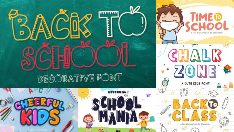
Back To School
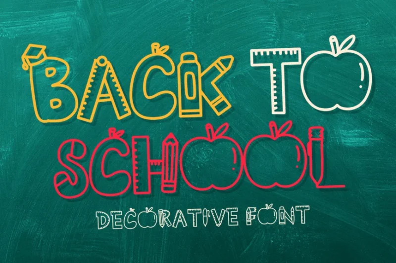
Back To School is a decorative font perfect for school-themed designs. Its playful and nostalgic style evokes memories of chalkboards and notebook doodles, making it ideal for educational materials or back-to-school promotions.
The Best Pencil
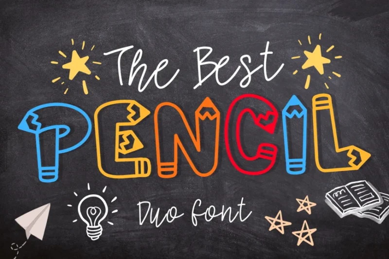
The Best Pencil is a script and handwritten decorative pencil font that mimics natural handwriting. Its authentic, personal style is ideal for creating designs that feel handcrafted, making it perfect for educational materials or projects that require a human touch.
Chalkzone
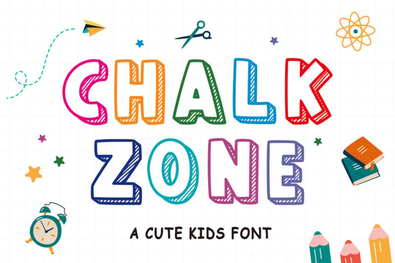
Chalkzone is a back-to-school font that combines decorative and serif styles to mimic chalk writing. Its authentic, slightly rough texture evokes classroom nostalgia, making it perfect for creating designs with a traditional school atmosphere.

Get 300+ Fonts for FREE
Enter your email to download our 100% free "Font Lover's Bundle". For commercial & personal use. No royalties. No fees. No attribution. 100% free to use anywhere.
Back to Class
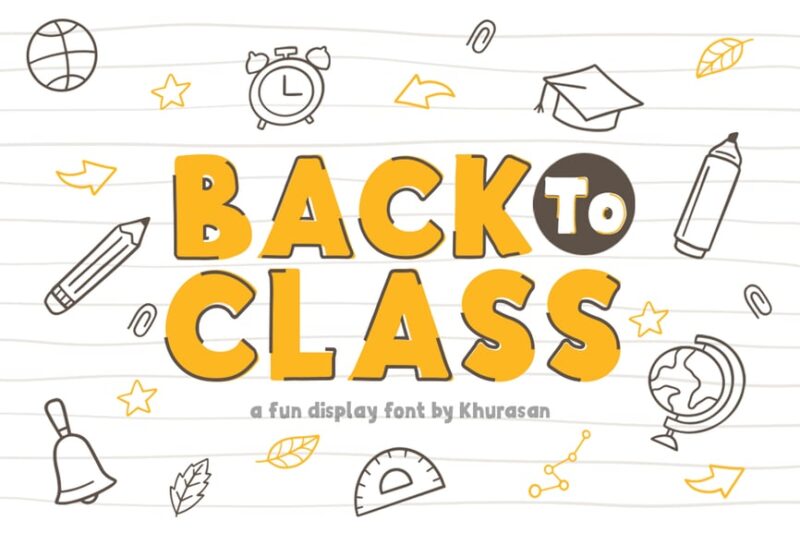
Back to Class is a decorative sans-serif font that captures the excitement of returning to school. Its bold, energetic style is perfect for creating eye-catching back-to-school promotions, educational materials, or school event announcements.
School Rules Font
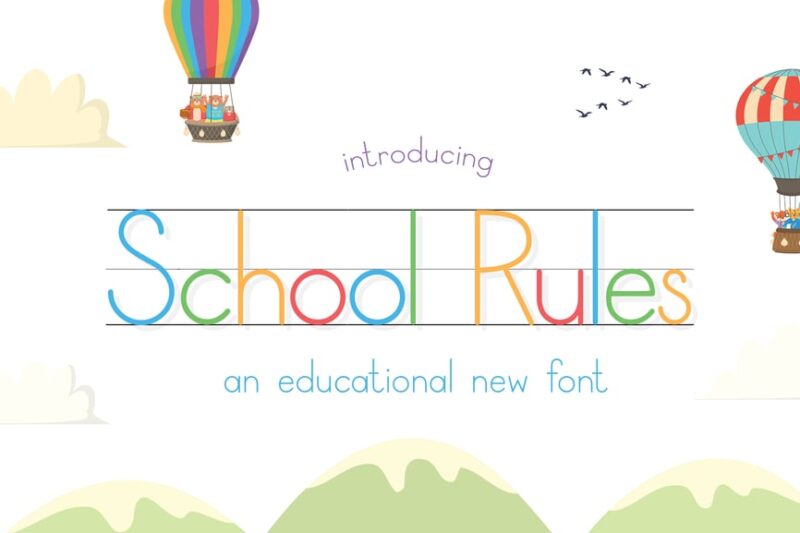
School Rules Font is a sans-serif, decorative typeface that captures the essence of school life. Its bold and structured design is reminiscent of classroom posters and school signage, making it perfect for educational projects and academic-themed designs.
School Mania
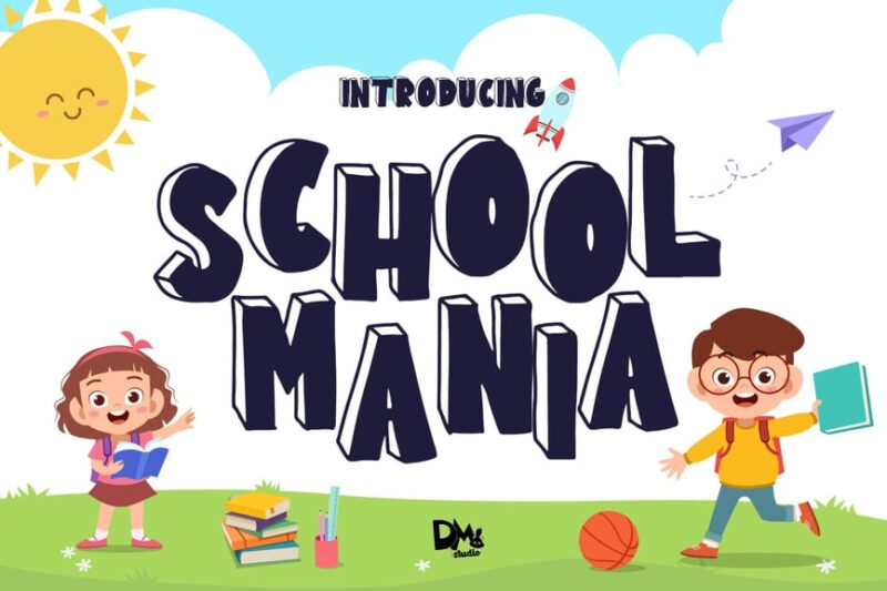
School Mania is a crafty shadow font with a sans-serif style. Its chunky, playful characters give a fun and energetic feel to designs, making it ideal for children’s educational materials or back-to-school campaigns.
Too Cool for School Font Trio
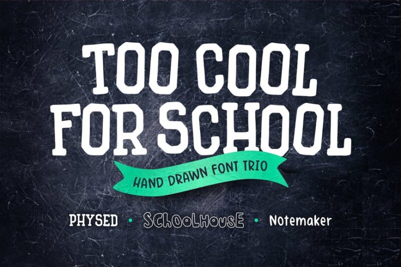
This font trio combines creative block, outline, and handwritten styles with a collegiate flair. It offers versatility for designers, allowing them to create dynamic layouts that capture the spirit of school life while maintaining a cool, modern edge.
School Meeting
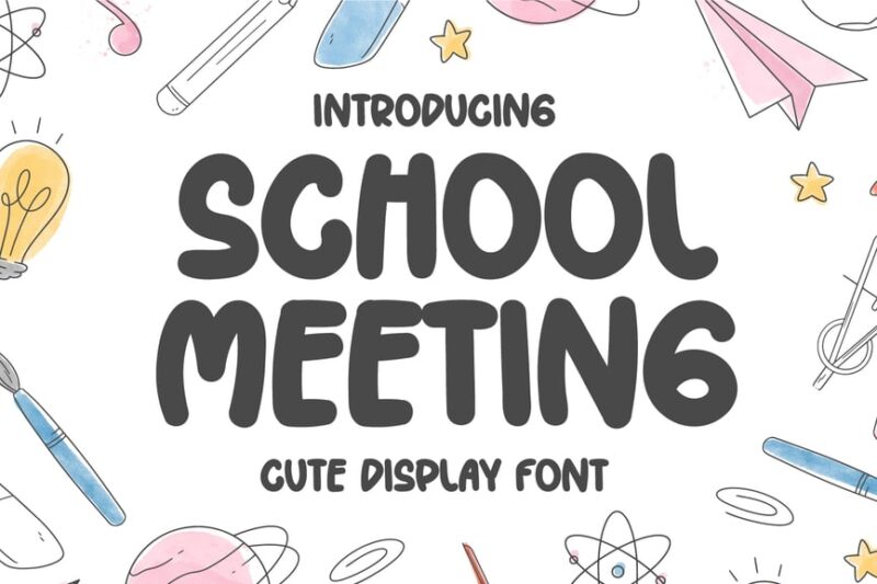
School Meeting is a cute handwritten display font that exudes happiness and warmth. Its friendly, approachable style makes it perfect for creating inviting designs for school events, children’s books, or any project requiring a cheerful touch.
Scholarly Font
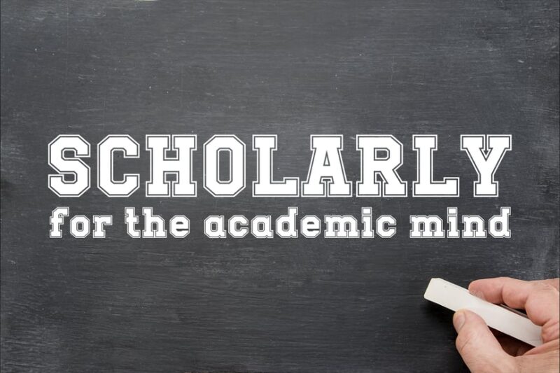
Scholarly Font is a varsity typeface that embodies academic elegance. Its refined design evokes a sense of tradition and knowledge, making it ideal for university branding, academic publications, or any project requiring a sophisticated, scholarly touch.
Schoolyst
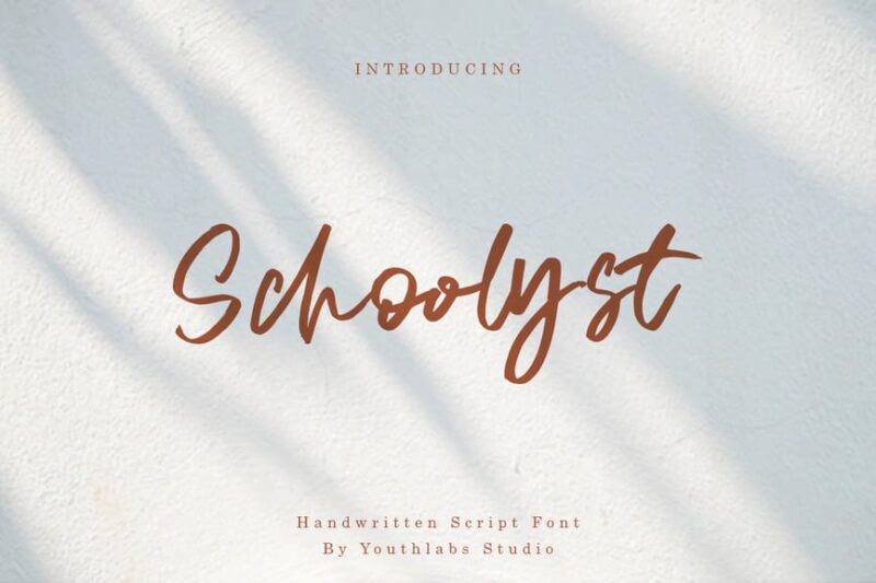
Schoolyst is a handwritten brush font that captures the spontaneity of classroom notes. Its natural, flowing style adds a personal touch to designs, making it perfect for creating relatable content for students or informal educational materials.
School Gloshar Font
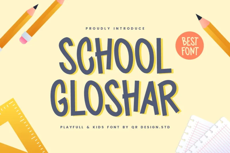
School Gloshar Font is a script and handwritten typeface that brings a touch of personality to school-related designs. Its fluid, expressive style is perfect for creating eye-catching headlines or adding a friendly feel to educational content.
Cheerful Kids Display Font
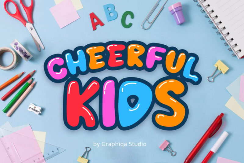
Cheerful Kids Display Font is a sans-serif, decorative typeface designed to appeal to children. Its playful, bubbly characters and joyful appearance make it ideal for creating engaging designs for kids’ products, educational materials, or child-focused branding.
Univarsity
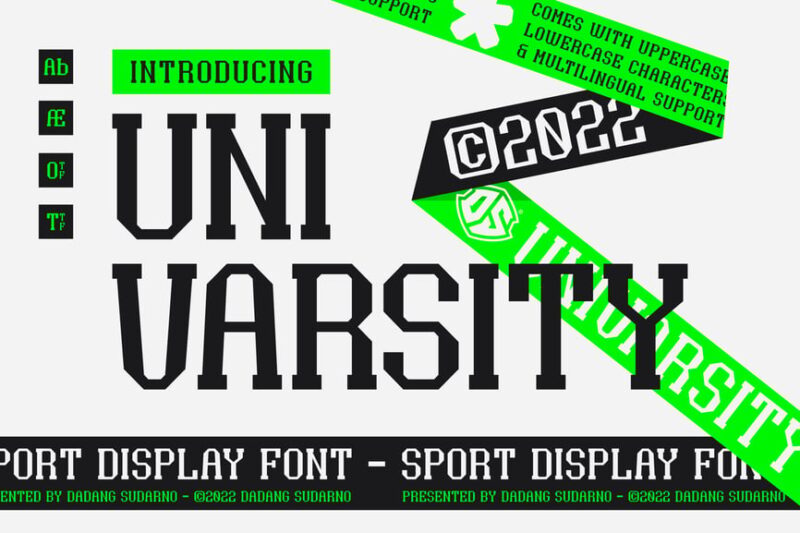
Univarsity is a sport display font with a serif style, perfect for collegiate and athletic designs. Its bold, structured appearance evokes the spirit of athletics and sports, making it ideal for school team merchandise, sports event promotions, or university branding.
School Stryke
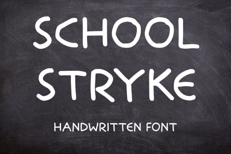
School Stryke is a handwritten font combining script and sans-serif styles. Its dynamic, energetic appearance captures the vitality of student life, making it perfect for youth-oriented designs or informal educational materials.
School Room
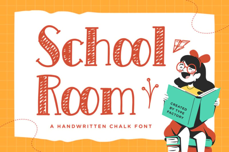
School Room is a handwritten chalk font that recreates the authentic look of classroom chalkboards. Its nostalgic, slightly rough texture adds character to designs, making it perfect for creating a traditional school atmosphere in digital projects.
Sticky Bold
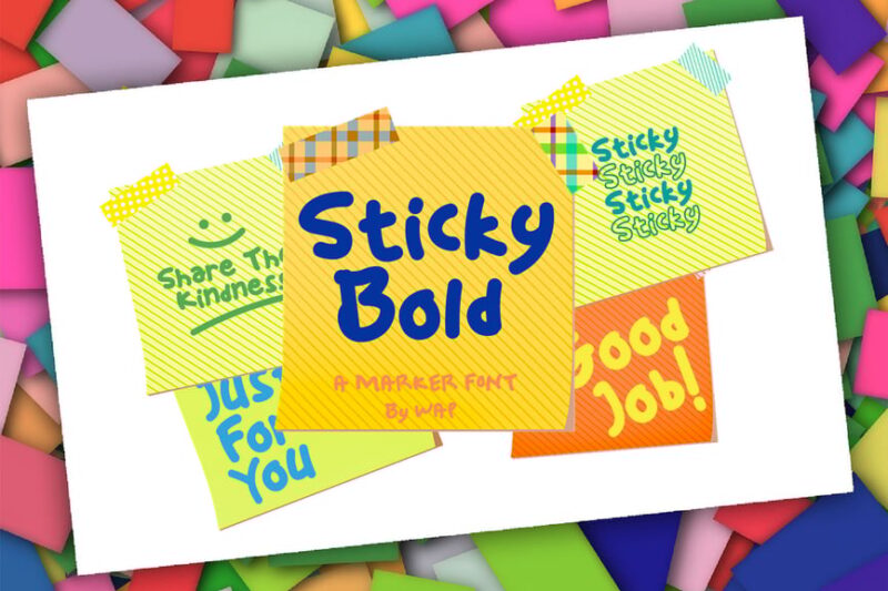
Sticky Bold is a decorative, script and handwritten font that brings a fun, casual vibe to designs. Its bold, slightly messy style is reminiscent of handwritten notes, making it great for creating youthful, energetic layouts for school or college-themed projects.
Time To School
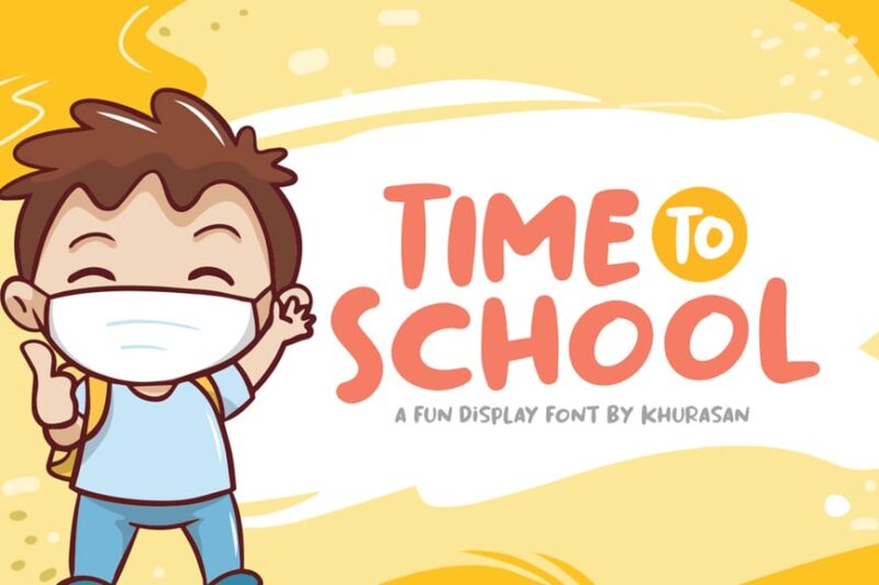
Time To School is a decorative sans-serif font with a clean, minimal style. Its modern, streamlined design makes it versatile for various educational projects, from school logos to digital learning platforms, offering a contemporary take on academic-themed typography.
Freshman College
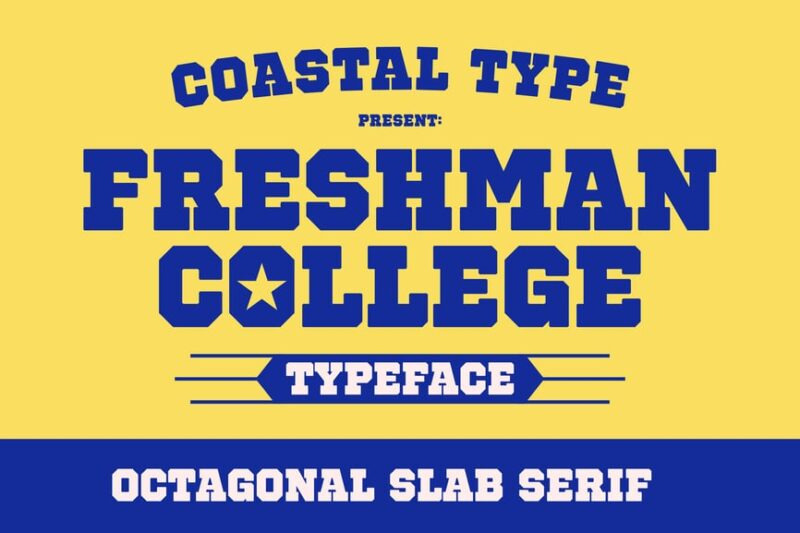
Freshman College is a serif font that combines collegiate and baseball aesthetics. Its classic, slightly sporty appearance makes it perfect for creating designs that evoke school spirit, particularly for college sports teams or alumni events.
Chalk Study Education
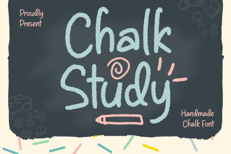
Chalk Study Education is a script and handwritten font that replicates chalk writing on a blackboard. Its authentic, slightly rough texture adds a nostalgic classroom feel to designs, making it ideal for educational materials or school-themed projects.
Balone Kids
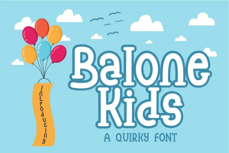
Balone Kids is a decorative font that captures the spirit of outdoor adventures and children’s stories. Its playful, whimsical design makes it perfect for creating engaging layouts for children’s books, educational materials, or kid-friendly branding.
School Story Font
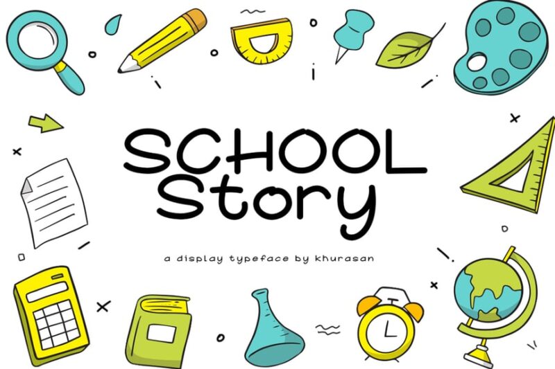
School Story Font is a sans-serif, decorative typeface that brings a narrative quality to school-themed designs. Its friendly, approachable style makes it ideal for creating engaging educational content or storytelling materials for students of all ages.
WARNAI
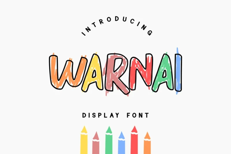
WARNAI is a decorative font that combines kid-friendly aesthetics with a sporty edge. Its playful yet dynamic design makes it versatile for children’s projects, sports-themed designs, or any layout requiring a fun, energetic typographic element.
Scrooge
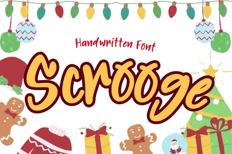
Scrooge is a script and handwritten font that offers a personal, handcrafted feel. Its natural flow and slight irregularities add character to designs, making it ideal for creating authentic-looking handwritten notes or adding a personal touch to layouts.
School Browad
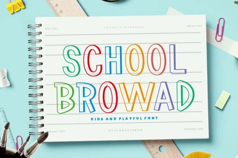
School Browad is a playful sans-serif font designed for educational contexts. Its friendly, approachable style makes it perfect for creating engaging materials for students, from elementary school resources to college-level designs.
Puzzle
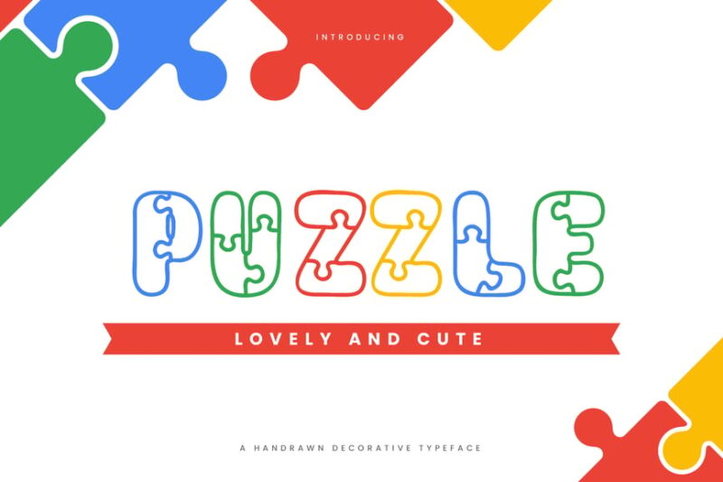
Puzzle is a fun children’s typeface combining decorative and sans-serif styles. Its playful, interlocking design mimics puzzle pieces, making it ideal for creating engaging layouts for kids’ educational materials, games, or child-focused branding.
Schoolae
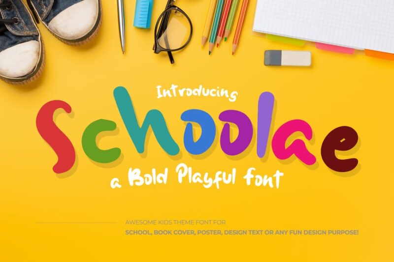
Schoolae is a bold, playful font that blends sans-serif and script styles. Its energetic, versatile design makes it suitable for various educational contexts, from summer camp materials to classroom resources, adding a fun touch to any school-related project.
Kids Magic
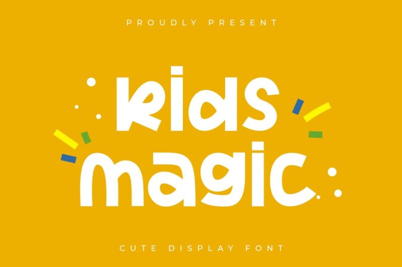
Kids Magic is a handwritten display font designed to captivate children’s imagination. Its whimsical, magical style makes it perfect for creating enchanting designs for kids’ books, educational materials, or any project aimed at sparking young minds’ creativity.
Chalk Times
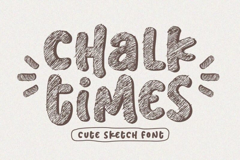
Chalk Times is a versatile sketch font that includes sans-serif, serif, script, handwritten, and symbolic styles. Its authentic chalk texture and varied character set make it ideal for creating diverse, engaging designs with a classroom aesthetic.
Kids Gen Marker
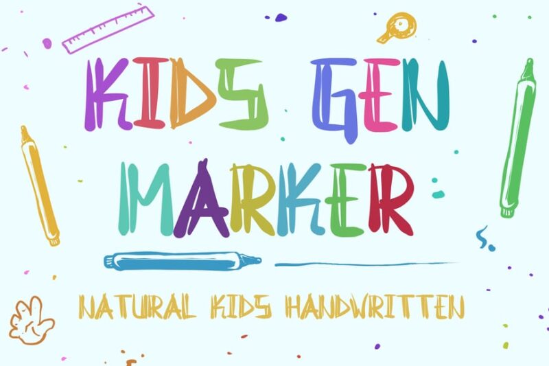
Kids Gen Marker is a natural kids’ handwritten font that mimics marker writing. Its authentic, slightly messy style captures the essence of children’s handwriting, making it perfect for creating relatable designs for kids’ products or educational materials.
Createland
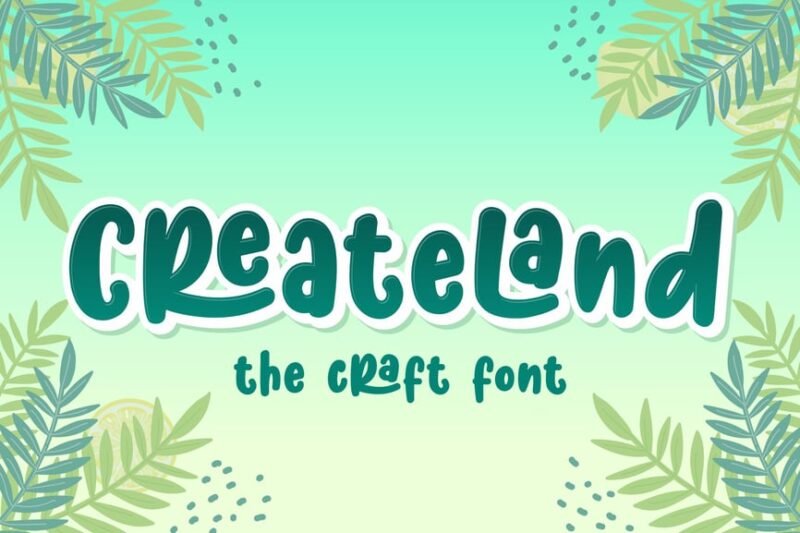
Createland is a decorative font with a focus on food-related designs. Its playful, appetizing style makes it suitable for creating engaging layouts for children’s cooking classes, school cafeteria menus, or food-themed educational materials.
Smile Kids
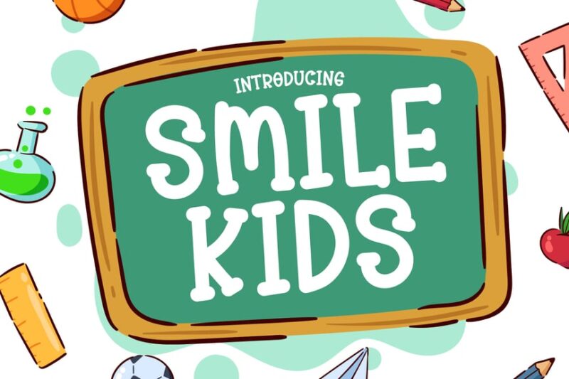
Smile Kids is a decorative display font designed to bring joy to children’s designs. Its cheerful, rounded characters and playful style make it perfect for creating friendly, inviting layouts for kids’ products, educational materials, or child-focused branding.
School Times
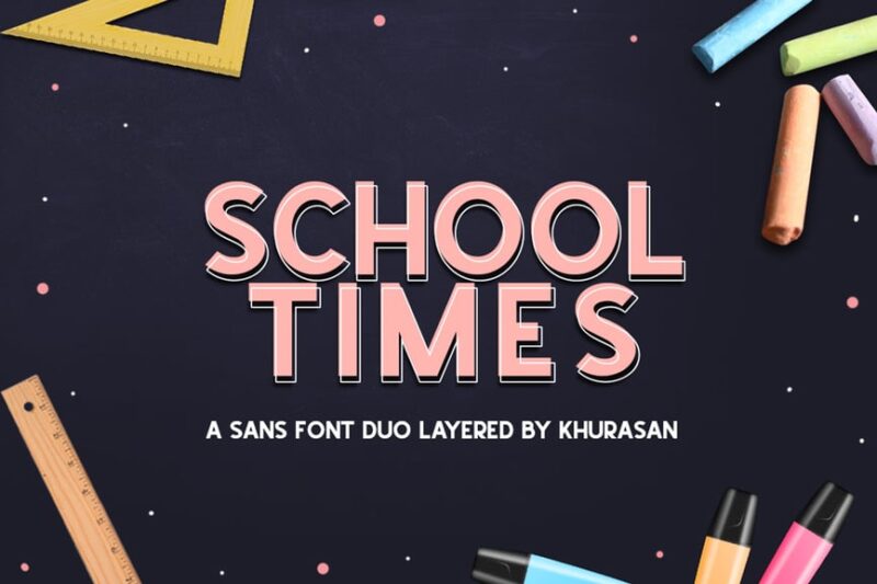
School Times is a bold sans-serif font with a touch of serif styling. Its strong, confident appearance makes it ideal for creating impactful headlines or titles in school publications, educational materials, or academic-themed designs.
Kind Garten
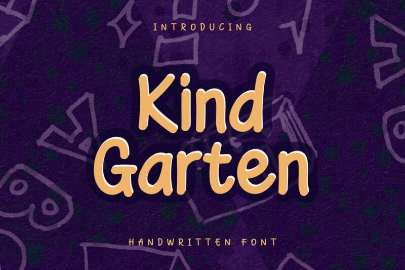
Kind Garten is a script and handwritten font with a cute, child-friendly style. Its playful, nurturing appearance makes it perfect for creating designs for kindergartens, early childhood education materials, or any project aimed at young children.
Babybo
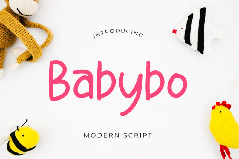
Babybo is a cute display font with a script and handwritten style. Its soft, rounded characters and gentle appearance make it ideal for creating designs for baby products, children’s books, or early childhood educational materials.
Kinder
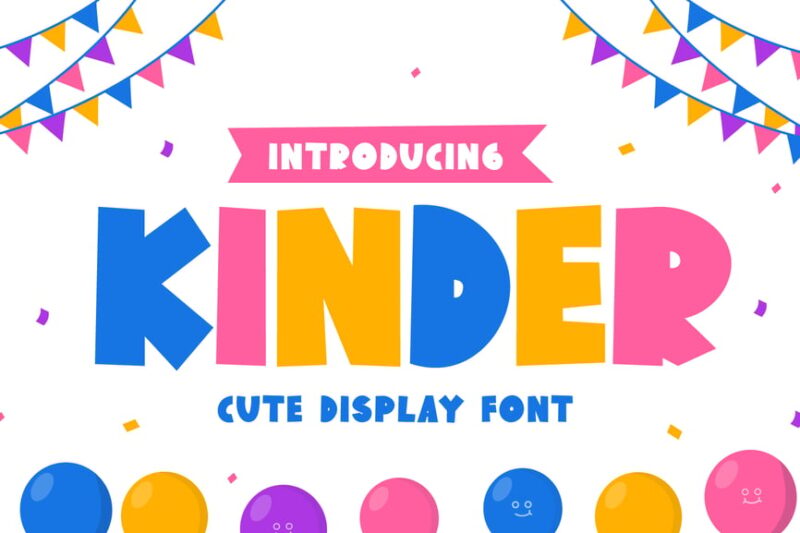
Kinder is a bold display font with a decorative style. Its energetic, playful appearance makes it perfect for creating eye-catching designs for school events, children’s products, or educational materials aimed at younger students.
Note Today
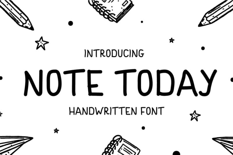
Note Today is a handwritten display font combining script and decorative styles. Its natural, flowing appearance mimics cute handwriting, making it ideal for creating personal-looking notes, informal educational materials, or designs that require a friendly touch.
Childlike Font Duo
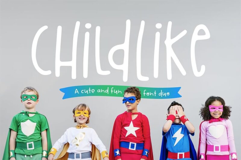
Childlike Font Duo is a script and handwritten typeface that captures the essence of children’s writing. Its authentic, slightly uneven style is perfect for creating designs that feel genuinely kid-made, ideal for children’s books or educational materials.
Sketchy Pencil Font
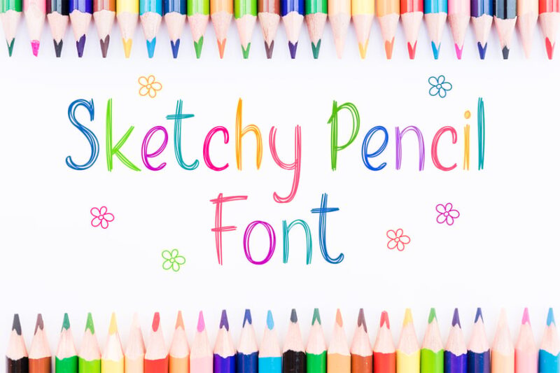
Sketchy Pencil Font is a script and handwritten typeface that mimics pencil writing. Its natural, slightly rough texture adds an authentic hand-drawn feel to designs, making it perfect for creating sketchy layouts or adding a personal touch to school-themed projects.
What Makes a Font “School-Ready”?
Ever wonder why certain fonts just feel more educational than others? It’s not magic – it’s science! The best school fonts share several key characteristics that make them perfect for learning environments:
Exceptional Readability
First and foremost, school fonts need to be crystal clear. When you’re dealing with developing readers or students with learning differences, every letter needs to be easily distinguishable. That means clear differentiation between similar letters like ‘b’ and ‘d’, or ‘p’ and ‘q’.
The best educational fonts also feature generous letter spacing and comfortable line height. Think of it as giving each letter room to breathe – just like students need space to learn and grow.
Age-Appropriate Character
Different age groups respond to different typographic personalities. Elementary fonts can be playful and welcoming, with gentle curves and friendly letterforms. As students progress, fonts can become more sophisticated while maintaining their educational clarity.
Middle school fonts need to strike that tricky balance between “not too childish” and “not too grown-up.” High school fonts, on the other hand, can embrace more mature, professional styles that prepare students for the working world.
Dyslexia-Friendly Features
Modern school fonts increasingly consider students with dyslexia and other reading challenges. The best educational typefaces feature unique letter shapes that prevent common reading errors, weighted bottoms on letters to reduce flipping, and careful attention to letter spacing.
These thoughtful design choices don’t just help students with learning differences – they make reading easier for everyone.
Where School Fonts Shine Brightest
School fonts aren’t just for textbooks anymore. Their versatility makes them perfect for a wide range of educational applications:
Classroom Materials
From worksheets to wall displays, school fonts create consistency and professionalism in learning materials. They help establish visual hierarchy, making it easier for students to navigate through information and focus on what’s important.
Educational Technology
With the rise of digital learning, school fonts have found new life on screens. The best educational fonts translate beautifully from print to pixels, maintaining their readability across tablets, computers, and interactive whiteboards.
School Branding
Progressive schools are using carefully chosen fonts to create cohesive brand identities that reflect their educational philosophy. A playful elementary school might choose bubbly, friendly fonts, while a prestigious prep school might opt for classic, traditional typefaces.
Assessment Materials
Clear, neutral fonts are crucial for tests and assessments. The typography shouldn’t distract from the content or accidentally influence student performance. The best assessment fonts fade into the background, letting the questions take center stage.
Parent Communication
School fonts help create professional, trustworthy communication with families. Whether it’s newsletters, report cards, or important announcements, the right typography conveys competence and care.
Choosing the Perfect School Font for Your Needs
Selecting the ideal school font isn’t just about what looks good – it’s about what works best for your specific educational context. Here’s how to make the right choice:
Consider Your Audience
Kindergarteners need different typography than college freshmen. Younger students benefit from larger, friendlier fonts with plenty of character. Older students can handle more sophisticated typefaces that mirror what they’ll encounter in the professional world.
Think About Medium
Will your font primarily live on paper or screens? Some fonts that look great in print can become muddy on low-resolution displays. Others shine digitally but lose their impact when printed.
Evaluate Reading Levels
Consider the reading abilities of your audience. Struggling readers need maximum clarity and generous spacing. Advanced readers can handle more compact, efficient typography.
Match Your Institution’s Personality
Your font choice should reflect your school’s character. A creative arts school might embrace more expressive typography, while a traditional academic institution might prefer classic, time-tested fonts.
The Science Behind School Font Selection
Educational typography isn’t just about aesthetics – there’s real research behind what makes fonts effective for learning:
Reading Speed and Comprehension
Studies have shown that certain font characteristics can significantly impact reading speed and comprehension. Fonts with clear letter differentiation and optimal spacing help students process text more efficiently.
Attention and Focus
The right typography can actually help students maintain focus and reduce cognitive load. When students don’t have to work hard to decode letters, they can dedicate more mental energy to understanding content.
Memory and Retention
Believe it or not, font choice can influence how well students remember information. Some research suggests that slightly challenging fonts can actually improve retention by requiring more cognitive engagement.
Common School Font Mistakes to Avoid
Even well-intentioned educators sometimes make typography choices that hinder rather than help learning. Here are the most common pitfalls to avoid:
The Decorative Font Trap
Just because a font looks “fun” doesn’t mean it’s good for education. Overly decorative fonts can distract from content and make reading unnecessarily difficult.
Size Matters
Too small, and students strain to read. Too large, and you waste valuable space while making text feel condescending. Finding the sweet spot is crucial.
Color Complications
While colorful text can be engaging, it can also be problematic for students with visual processing issues or color blindness. Always ensure sufficient contrast and consider providing black-and-white alternatives.
Mixing Too Many Fonts
Typography chaos confuses students and creates visual noise. Stick to 2-3 fonts maximum, and use them consistently throughout your materials.
The Future of School Fonts
As education continues to evolve, so does educational typography. Here’s what’s on the horizon:
Adaptive Typography
Emerging technologies are making it possible to customize font size, spacing, and even letterforms for individual students’ needs. Imagine textbooks that automatically adjust their typography based on each student’s reading level and visual processing abilities.
Inclusive Design
There’s a growing movement toward fonts that work for everyone, including students with dyslexia, visual impairments, and other learning differences. These universally designed fonts don’t just help some students – they make reading better for all students.
Digital-First Design
As digital learning becomes more prevalent, fonts are being designed specifically for screen reading. These digital-native typefaces consider factors like pixel density, screen glare, and reading distance.
Making the Switch: Implementing New School Fonts
Ready to upgrade your educational typography? Here’s how to make the transition smooth and successful:
Start Small
Don’t overhaul everything at once. Begin with new materials and gradually update existing resources. This prevents overwhelm and allows you to test what works best.
Get Buy-In
Involve teachers, administrators, and even students in the font selection process. When everyone understands the reasoning behind typography choices, they’re more likely to embrace the changes.
Train Your Team
Make sure everyone knows how to properly use your chosen fonts. Provide guidelines for sizing, spacing, and application to maintain consistency.
Monitor Results
Pay attention to how the new fonts affect student engagement and performance. Be prepared to make adjustments based on real-world feedback.
School Font FAQs: Your Questions Answered
Let’s tackle some of the most common questions about educational typography:
What’s the best font size for elementary students? Generally, 12-14 point fonts work well for elementary materials, but this can vary based on the specific font and medium. Always test with your actual audience.
Are serif or sans serif fonts better for schools? Both can work well, depending on the application. Sans serif fonts often work better for digital materials and young readers, while serif fonts can enhance reading flow in longer texts.
How do I know if a font is dyslexia-friendly? Look for fonts with unique letter shapes, weighted bottoms, generous spacing, and clear differentiation between similar letters. Many fonts now specifically advertise their dyslexia-friendly features.
Can font choice really impact learning outcomes? Yes! Research shows that appropriate typography can improve reading speed, comprehension, and retention. It’s a simple change that can have significant educational benefits.
Conclusion: Typography That Teaches
School fonts might seem like a small detail in the grand scheme of education, but they’re actually fundamental building blocks of effective learning materials. From improving readability for struggling students to creating professional, cohesive school brands, the right typography choices can transform educational experiences.
The best school fonts don’t call attention to themselves – they fade into the background while making content more accessible, engaging, and effective. They’re like the best teachers: supportive, clear, and always working to help students succeed.
As we move forward in 2026 and beyond, educational typography will continue to evolve. New technologies will bring personalized fonts, improved accessibility, and better integration between print and digital materials. But the core principle will remain the same: the right font can make learning easier, more enjoyable, and more effective for every student.
So the next time you’re creating educational materials, remember that your font choice is more than aesthetic – it’s pedagogical. Choose wisely, test thoroughly, and watch as the right typography helps your students reach new heights of learning success.
After all, in the world of education, every detail matters. And when it comes to school fonts, making the grade has never been more important.