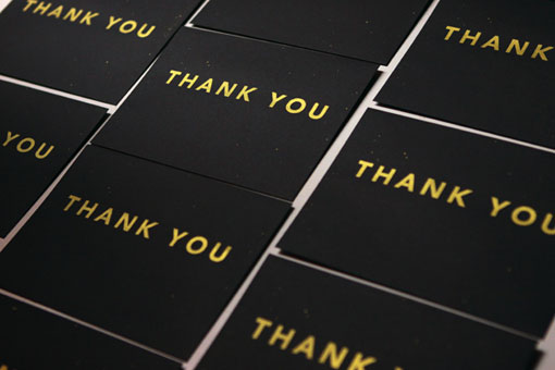
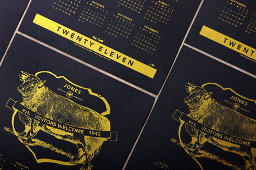
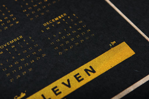
We’re almost a quarter of the way through the year (how did that happen so fast??), so I know that New Year’s promotions are a bit out of date. But while browsing through Tim Jones’s portfolio, I couldn’t help but stop and look at these striking gold and black designs. The New Year’s cards and calendars were both screen printed on heavy French paper with metallic ink.
Courtney
<p>Courtney is the founder of Design Work Life and <a href="http://seamlesscreative.com" target="_blank" rel="noopener">Seamless Creative</a>, a small design studio she runs with her husband Brian. She now splits her time between developing brand identities for small businesses and soaking up (and passing along) as much inspiration as she possibly can.
5 Steps to Land Your First Freelance Graphic Design Gig
Dreaming of ditching the daily grind and turning your design passion into a profitable career? Freelancing can provide substantial opportunities...
How to Design a Table of Contents Like a Pro
Ah, the table of contents. How can something that feels so boring on the surface also feel so intimidating as...
12 Perfect Fonts for Quotes in September 2024
Selecting the best font for quotes can elevate them from forgettable to impactful. A thoughtful font choice helps convey the...