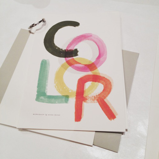
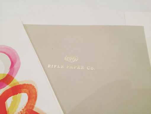
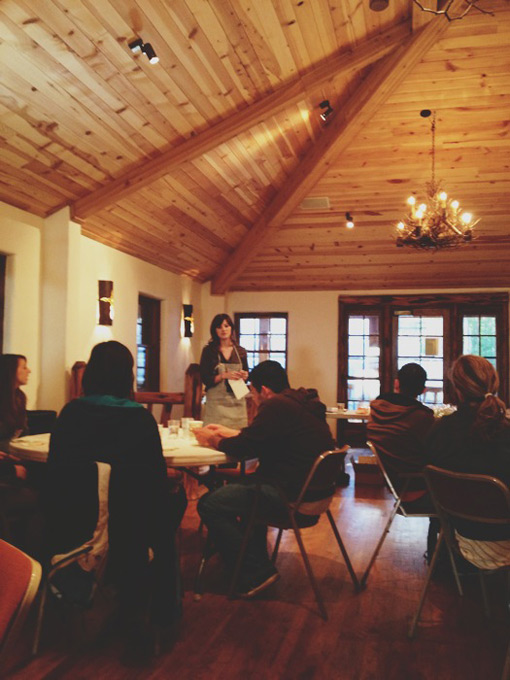
This morning I spent the first session of the day with Anna Bond of Rifle Paper Co. in a workshop entitled, “What’s Your (Color) Story?” As both a fan of Rifle Paper and someone who loves color, I was especially excited for this one.
The goal of the class was to create your own personal color story through techniques Anna uses in her own work. Rifle’s palettes are part of the reason I’m consistently drawn to the products, so I was definitely interested to hear more about how she got there. What was surprising to hear was that Anna only ever works from a palette of 24 colors. From the outside it’s easy to pick up on the fact that all of her designs relate to each other colorwise, but I never would have guessed that so few colors were used. And while the idea of narrowing down an infinite amount of colors to a smaller palette is a bit daunting, I can imagine it must make the design process so much simpler when creating new work.
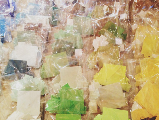
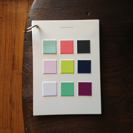
When we entered the workshop we each sat in front of a place setting holding a mini-binder that acted as a workshop guide. A table in the front of the classroom (which was beautiful by the way) held small bags of color chips in any color you could think of.

Get 300+ Fonts for FREE
Enter your email to download our 100% free "Font Lover's Bundle". For commercial & personal use. No royalties. No fees. No attribution. 100% free to use anywhere.
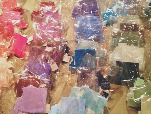
Our first objective was to pick 16 colors from the 100 on the table to use as our personal palettes, while trying to maintain a balanced mix of lights, darks, vibrant and muted tones. Challenging but fun. I tend to veer heavily towards brights, so I had to work a bit to make sure there was some variety in there. You can see what I ended up with below.
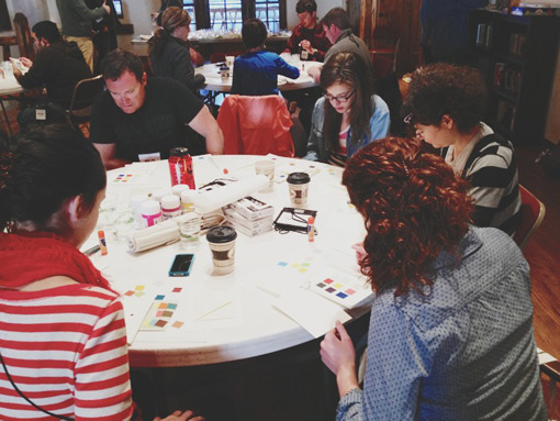
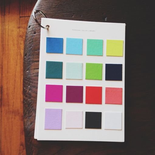
Once everyone had their palettes set up, our next step was to create three palettes of 3 colors out of the 16. The bigger challenge was that each of the three palettes had to incorporate several different traits. Each had to have a light, medium and dark color; a vibrant, medium and muted color, and at least one warm and one cool color. It was tough to come up with palettes that fit into all of those guidelines and still looked like something you would use, but in the end the results were really interesting. I ended up with three palettes I never would have put together to begin with, but that I really love—a pleasant surprise. That seemed to be the consensus with everyone else at my table as well.
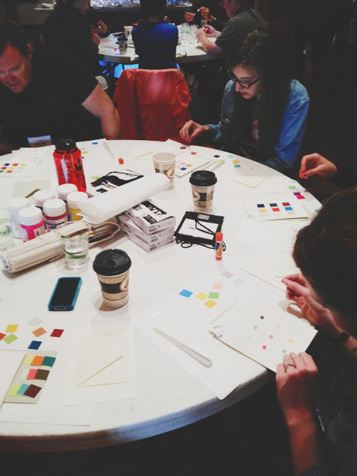
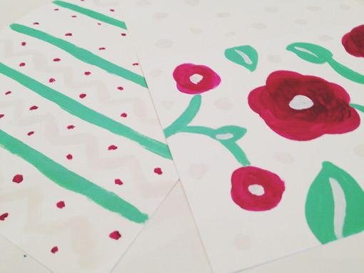
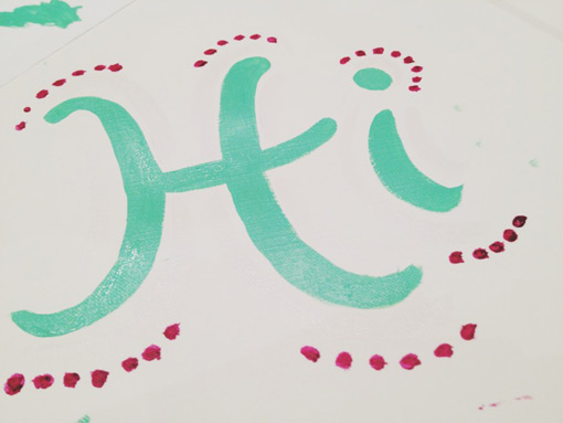
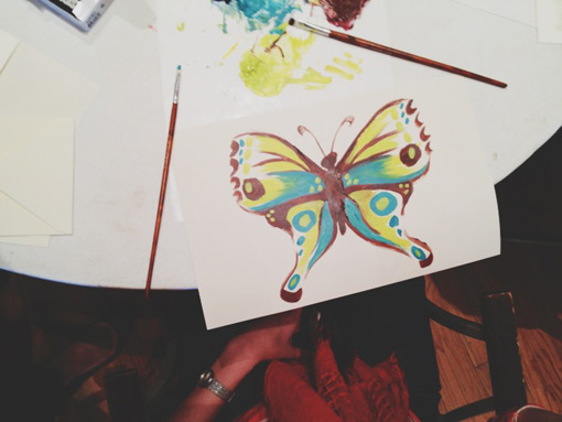
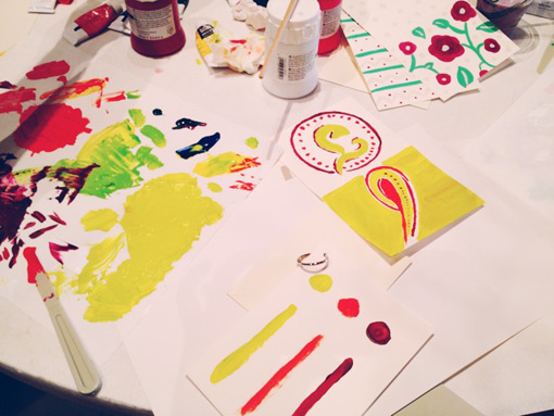
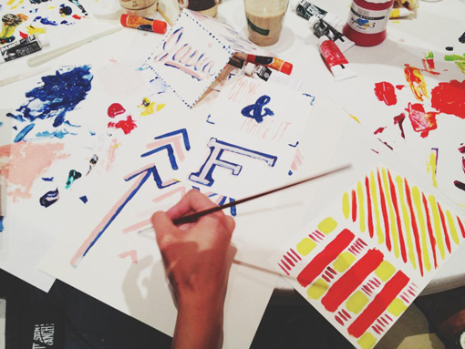
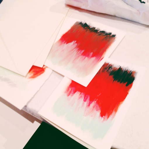
Once we had our palettes, we chose one of the three as a favorite, and mixed paint colors together to match. It’s been years since I painted anything, so this part was really fun to do. Once our colors were mixed, we were given paper and folded greeting cards to play around with and paint whatever we wanted.
Overall I got a ton out of this workshop. On top of it being super fun to do, I will definitely take some of the things we learned home with me and incorporate it into my work.
I’ll leave you with some of the awesome things everyone was painting around me…
P.S. Ranchers, if you see yourself (or your work) in any of these pictures and want me to add your name (with a link if you have one!) in a caption, let me know.
—-
For more information, check out the Design Ranch site.
