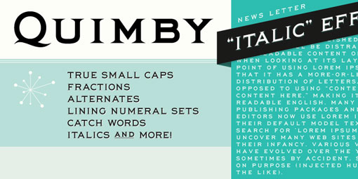
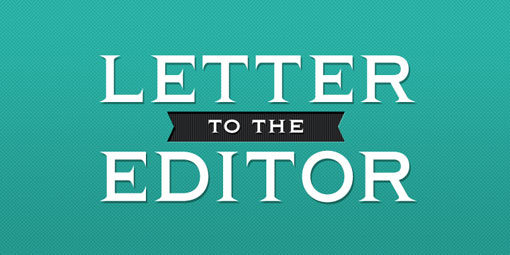
The ubiquity and misuse of Copperplate—on everything from bank logos to lost and found flyers—drives me insane (who’s with me?). So I love Quimby as a more elegant, pared down alternative.
Thank you for your shared Copperplate discontent – drives me nuts!
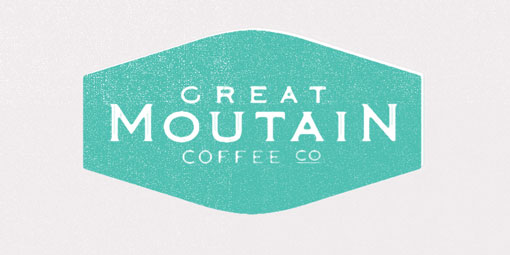
Copperplate, papyrus and zapfino are all frequent offenders. I really like Quimby, especially in the slightly distressed Great Mountain Coffee logo.
I think the Great Mountain Coffee logo is distressed because “Mountain” is missing an N.
i am with you 100%
Dang, somebody beat me to the punch. First thing I noticed was the missing ‘n’ in Mountain. That said, I agree, much nicer than Copperplate.