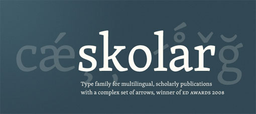
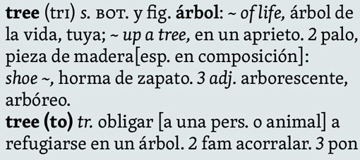
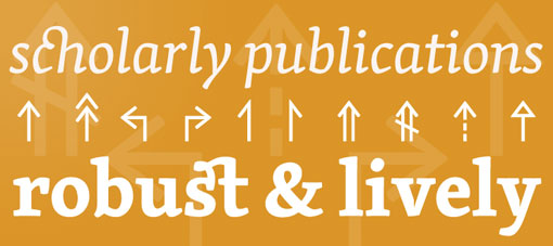
If nothing else, Type Together’s Skolar is a workhorse. A text serif originally designed to shine in multilingual publications, the Skolar family includes three weights and a complex system of arrows. It’s friendly openness reminds me a bit of Caecelia, one of my go-to slab serifs.