
In this article:
- What Is a Variable Font? (Quick Answer)
- How We Chose These Variable Fonts
- Variable Fonts That Can Run an Entire Brand
- Using Variable Fonts in a Responsive Brand
- Variable Font FAQ
There’s a font folder somewhere on an old hard drive that explains exactly why variable fonts exist. Ten files, maybe twelve: Thin, Light, Regular, Medium, SemiBold, Bold, ExtraBold, Black, and the italic sibling of each one. A whole family of type, sliced into rigid, separately licensed increments. Need a weight that lands right between Medium and SemiBold? Too bad. You round up, round down, or buy another file.
Variable fonts quietly made that entire folder optional. One file now holds the full range of a typeface, and a browser or design app can dial in on any point along the way instead of picking from a fixed menu. For a brand that has to look right on a smartwatch, a billboard, and everything in between, that kind of flexibility isn’t a bonus feature anymore. It’s the whole point.
What Is a Variable Font? (Quick Answer)
A variable font is a single font file that contains a continuous range of styles instead of a separate static file for every weight, width, or slant. Rather than choosing between fixed files, you set numeric values along axes like weight and width, and the letterforms adjust smoothly between the limits the type designer built in. That’s the entire shift: one file replaces what used to take eight or ten separate downloads, each with its own request and its own line in a font license.
For web performance, that means fewer files loading and less weight added to a page. For design, it means finer control, since you can dial in exactly the weight a headline needs instead of rounding to the nearest static option. Keep this in mind as you scroll, because it’s the idea every pick on this list is built around.
How We Chose These Variable Fonts
We judged every font on the same four things. A useful axis range matters more than a token weight slider that barely moves the needle between two nearly identical styles. Quality across the whole range matters just as much as quality at the named weights, because a font that looks sharp at Regular and falls apart at Black doesn’t belong on a “best of” list. Character that holds a brand together from thin to black is non-negotiable, since a typeface that reads like two unrelated fonts at its extremes defeats the purpose of going variable for branding in the first place. And clean performance on the web matters, because a bloated variable font file can quietly erase the performance benefit it’s supposed to deliver.
Since axis range is really the differentiating spec for this topic, it’s worth seeing the picks side by side before diving into the full write-ups below.
Variable Fonts That Can Run an Entire Brand
These are the workhorses: variable font examples with enough weight and width range to carry a logo, a nav bar, and a paragraph of body copy without ever swapping families.

Get 300+ Fonts for FREE
Enter your email to download our 100% free "Font Lover's Bundle". For commercial & personal use. No royalties. No fees. No attribution. 100% free to use anywhere.
Variable Geometric Sans Serif Font – Worgant
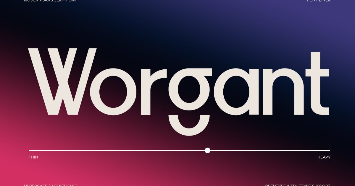
Worgant is a sharp, contemporary sans serif built on geometric principles, offering precision and clarity across headlines, branding, and digital interfaces. Its clean letterforms balance mathematical structure with subtle warmth, making it equally suited for tech startups and editorial design. As one of the newer variable fonts on the market, it provides seamless weight adjustments for flexible typography. The family includes multiple styles alongside the variable format, with multilingual character support and full punctuation sets. Files are provided in modern font formats for both web and print applications.
Variable Modern Sans Font – Bacley
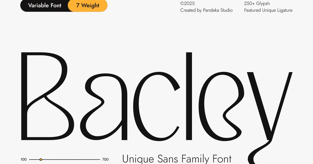
Bacley is a contemporary sans-serif typeface that embraces minimalist design principles with clean, geometric letterforms. Its variable fonts technology allows for flexible weight adjustments, making it adaptable across diverse design contexts from editorial layouts to corporate branding. The font features a modern aesthetic with balanced proportions and open apertures that ensure excellent readability at any size. Ideal for websites, presentations, and marketing materials where clarity and sophistication matter, Bacley includes uppercase and lowercase characters, numerals, and punctuation. Files are provided in standard font formats for seamless integration into professional design workflows.
Jollin Family – Variable Font
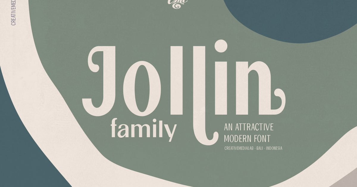
Jollin Family brings a contemporary aesthetic to sans-serif design with clean lines and versatile styling options. As one of the more adaptable variable fonts, it offers smooth transitions between weights, making it ideal for brand identities, editorial layouts, and digital interfaces where typographic flexibility matters. The family supports multilingual projects and includes a full complement of uppercase and lowercase characters, numbers, and punctuation. Its modern yet approachable personality works well across both headline and body text applications, delivering clarity without sacrificing visual interest.
Mike Variable Font
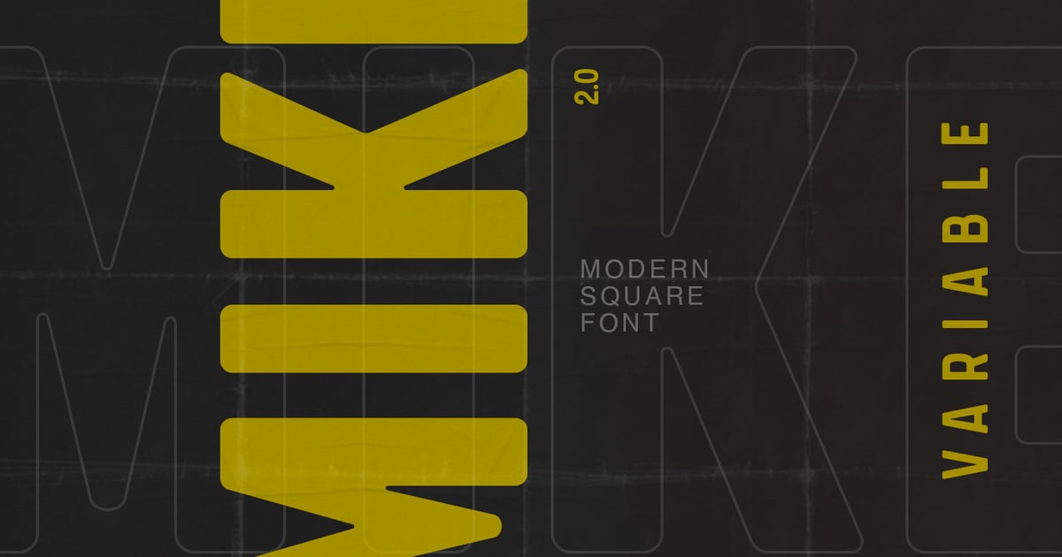
Mike Variable Font brings a contemporary sans-serif aesthetic with crisp, clean lines that adapt seamlessly across weights. Its streamlined letterforms work beautifully for modern branding, editorial headlines, and digital interfaces where clarity matters. As one of the newer variable fonts on the market, it offers fluid weight adjustments that give designers precise typographic control. The character set covers essential glyphs for everyday projects, while its straightforward geometry ensures readability at any size. Perfect for corporate identities, app design, and minimalist layouts that need a polished, professional presence.
Fortune Variable Font
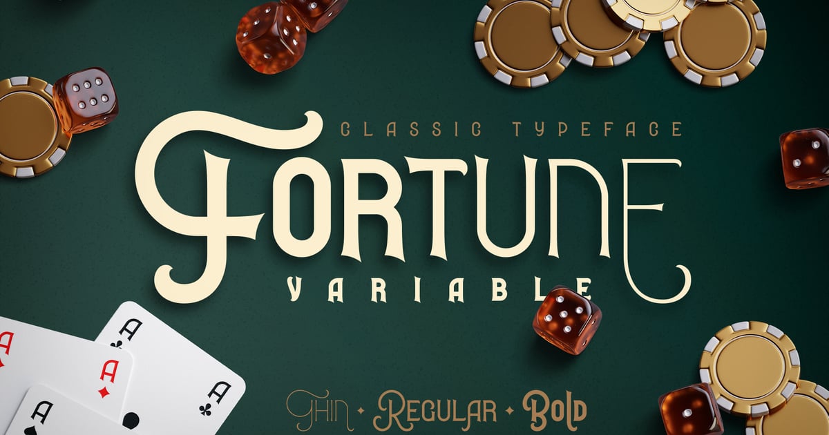
Fortune Variable Font brings nostalgic charm with its vintage-inspired letterforms that evoke classic casino signage and mid-century gambling aesthetics. The design balances retro appeal with contemporary versatility, making it ideal for entertainment branding, poster designs, and projects requiring bold personality. As variable fonts go, this one offers flexibility in weight and style adjustments. It works particularly well for headlines, logos, and promotional materials where a touch of old-school Vegas glamour enhances the message. The typeface includes essential glyphs and punctuation for professional typesetting.
Chiefland Variable
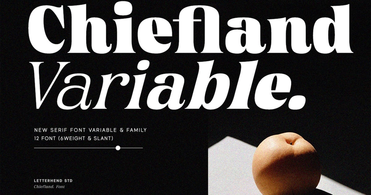
Chiefland Variable is a refined serif typeface that brings sophistication and versatility to editorial and branding projects. Its adjustable design makes it ideal for headlines, magazine layouts, and elegant identity work where precise typographic control matters. The character set supports multiple languages alongside a full range of uppercase and lowercase letters, numerals, and punctuation marks. As one of the newer variable fonts available, it offers designers flexibility to fine-tune weight and style seamlessly within a single file. Both TTF and OTF formats are included for broad compatibility across design applications.
Urema Variable
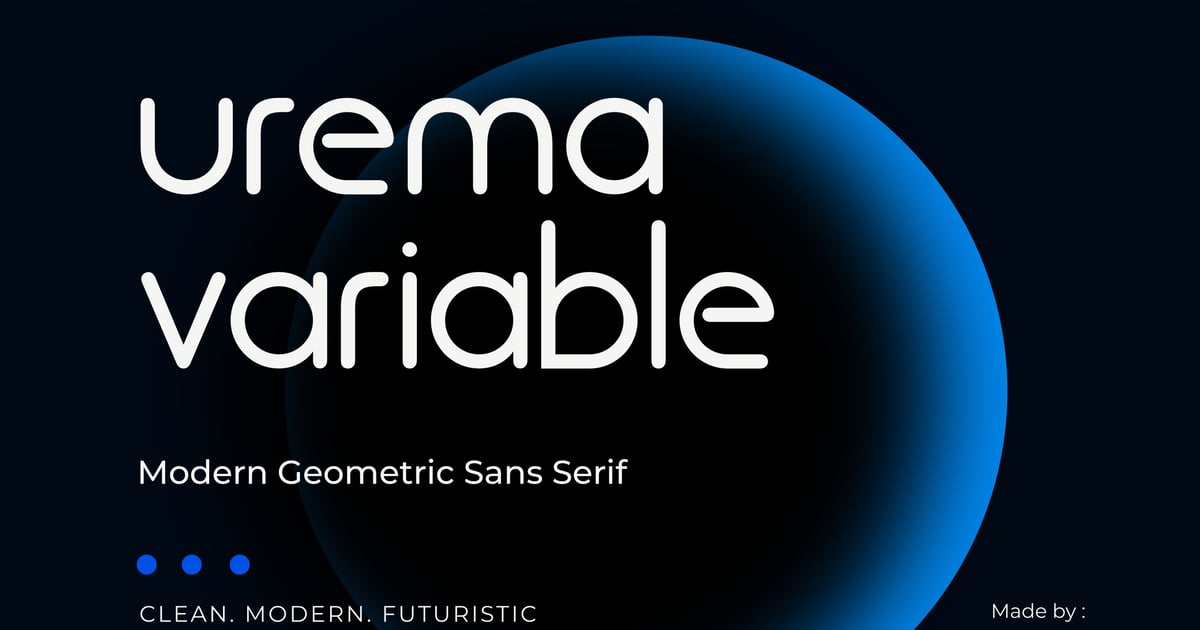
Urema Variable is a geometric sans-serif typeface built on clean, systematic principles. Its structured forms and consistent proportions make it well-suited for corporate identities, editorial headlines, and digital interfaces where clarity matters. As one of the variable fonts gaining traction in contemporary design, it offers adjustable weight axes for precise typographic control. The family supports multiple languages and includes uppercase and lowercase alphabets, numbers, and essential punctuation. Files are provided in modern font formats compatible with professional design software.
Atelier – Modern Serif Variable Font Family
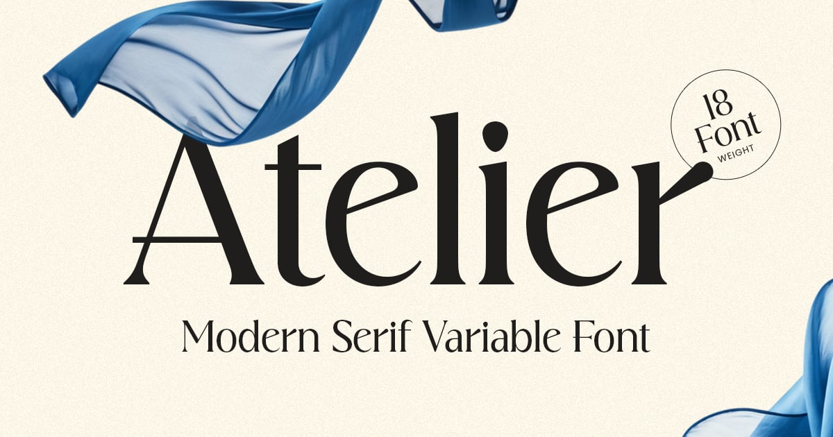
Atelier is a contemporary serif typeface that balances classical elegance with modern refinement. Its clean letterforms and sophisticated proportions make it well-suited for editorial design, luxury branding, and upscale packaging projects. As variable fonts, the family offers flexible weight adjustments for precise typographic control. The design features refined serifs and graceful curves that bring polish to both headlines and body text. It supports multilingual characters and includes a complete set of uppercase and lowercase letters, numerals, and punctuation marks for comprehensive typographic versatility.
Chic and Stylish Variable Serif Font
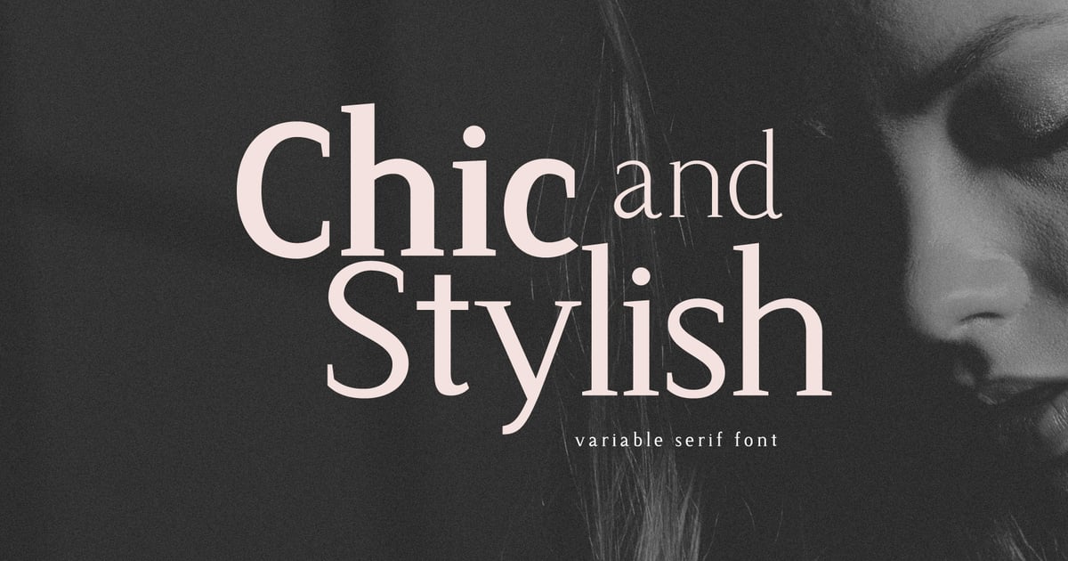
This refined serif design brings sophistication to editorial layouts, fashion branding, and luxury packaging. With its elegant proportions and contemporary details, it strikes a balance between classical typography and modern aesthetics. As variable fonts go, it offers flexible styling options that adapt seamlessly across different design contexts. The typeface works particularly well for magazine headers, upscale identity systems, and premium digital content where a polished, distinctive appearance matters. Its clean letterforms maintain readability while adding a touch of refinement to any project requiring elevated visual appeal.
Gemrock Font Family
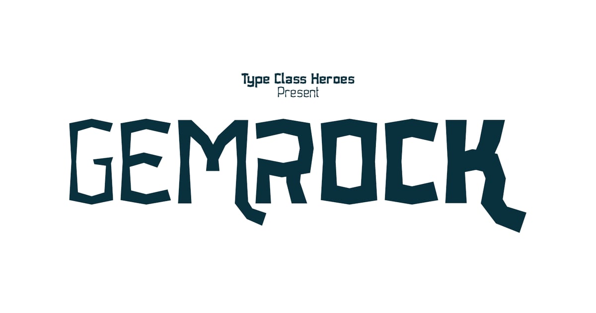
Gemrock Font Family combines bold geometric forms with a distinctive decorative edge, making it ideal for headlines, branding projects, and eye-catching promotional materials. The family includes both standard weights and variable fonts for enhanced flexibility, plus an integrated monogram feature that adds a custom touch to logos and personalization work. With full multilingual character support and a complete set of uppercase letters, numerals, and punctuation, Gemrock delivers strong visual impact across print and digital applications. Files are provided in modern font formats for broad compatibility.
Ace Sans Variable Font
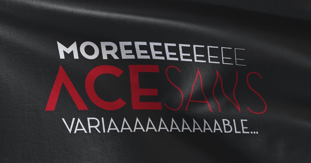
Ace Sans Variable Font delivers crisp, contemporary letterforms with a clean geometric foundation. Its modern sans-serif structure makes it ideal for branding projects, editorial headlines, and user interface design where clarity and professionalism matter. Among the growing selection of variable fonts available today, this one stands out for its versatility and technical sophistication. The family includes multilingual character support to accommodate international projects, ensuring broad typographic coverage. With its balanced proportions and refined details, Ace Sans works equally well at display sizes and in longer text settings.
Cobya – Modern Variable Font
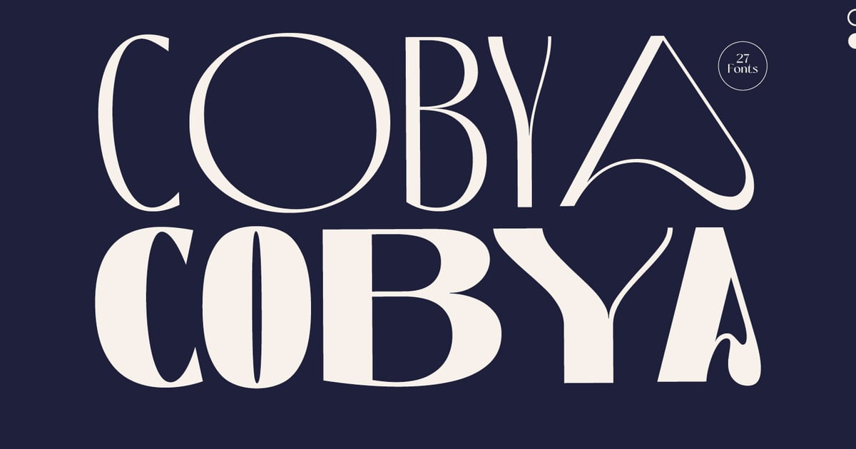
Cobya is a contemporary sans-serif typeface that brings clean, minimalist sophistication to modern design projects. Its streamlined letterforms and geometric foundation make it ideal for editorial layouts, tech branding, and digital interfaces where clarity matters. As variable fonts go, it offers flexibility in weight adjustments, allowing designers to fine-tune typography across different contexts with a single file. The character set supports multilingual applications, providing versatility for international projects. Perfect for corporate identities, web design, and publication work that demands both style and readability.
Beckman Variable Font
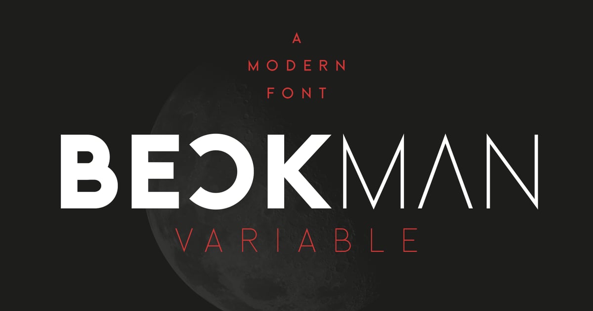
Beckman Variable Font brings bold geometric forms to contemporary design projects. Its clean construction and poster-inspired alternate style give designers flexibility for headlines, branding, and display work where impact matters. The typeface works especially well for editorial layouts and advertising that demand strong visual presence. As one of the variable fonts offering weight adjustments on the fly, Beckman streamlines workflows while maintaining consistent design language. The family supports multiple languages and includes both TTF and OTF file formats for broad compatibility across design applications.
Caromy – Variable Retro Font
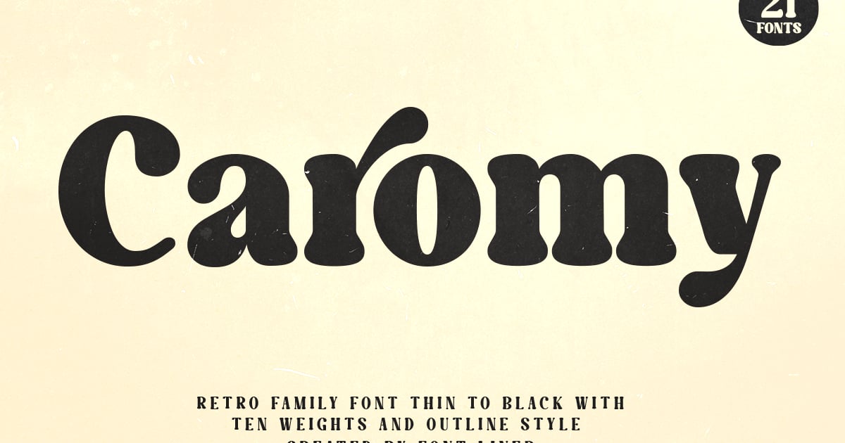
Caromy channels mid-century typography with bold, nostalgic letterforms that evoke vintage signage and classic packaging design. Its thick strokes and rounded terminals create an instantly recognizable retro aesthetic perfect for branding, posters, and headlines that demand attention. As variable fonts, it offers flexible weight adjustments to fine-tune your designs. The family supports multiple languages and includes uppercase and lowercase characters, numbers, and essential punctuation. Ideal for projects seeking an authentic throwback vibe with modern technical capabilities.
Gravity Shift – Variable Font Family
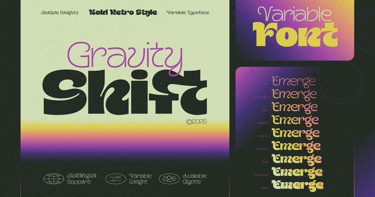
Gravity Shift channels the bold spirit of 1970s science fiction and retrofuturism through angular letterforms and dynamic proportions. This variable fonts package lets designers fine-tune weight and width to achieve the perfect retro-tech aesthetic for album covers, gaming interfaces, and futuristic branding projects. The sans-serif design balances vintage appeal with contemporary versatility, making it ideal for headlines that demand attention. Whether you’re crafting a space-age poster or a nostalgic tech brand identity, these adjustable axes provide creative flexibility across modern digital platforms.
Quited Happines – Elegant Variable Serif Font
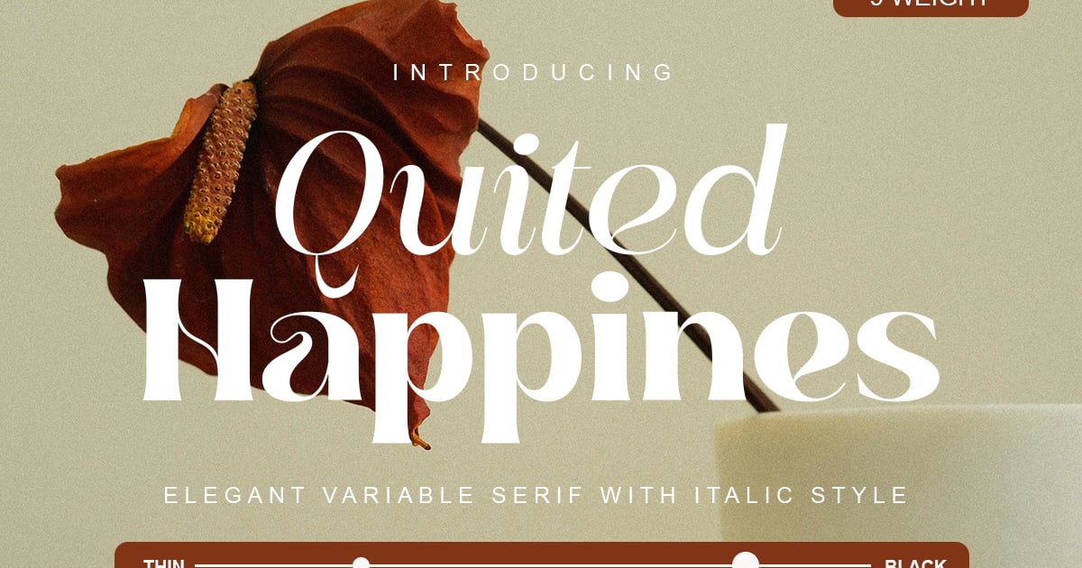
Quited Happines brings refined sophistication to editorial and branding projects with its elegant serif structure. The design balances classic proportions with contemporary refinement, making it suitable for luxury packaging, magazine headlines, and upscale identity work. As one of the newer variable fonts on the market, it offers flexible weight adjustments for precise typographic control. The family includes multilingual support alongside standard uppercase, lowercase, numerals, and punctuation. Its graceful letterforms convey understated elegance while maintaining excellent readability across different applications and sizes.
Agharti Family
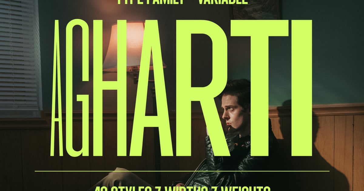
Agharti Family is a versatile sans-serif typeface that combines contemporary geometric forms with exceptional flexibility. The family features both condensed styles and variable fonts, offering designers precise control over weight and width for dynamic layouts. Its clean, modern letterforms work beautifully across branding projects, editorial headlines, and digital interfaces where clarity matters. The typeface maintains excellent legibility at any size while delivering a distinctive, professional character. With comprehensive language support and multiple file formats included, Agharti Family adapts seamlessly to diverse design applications from print to screen.
The Qualified Family (54 Fonts)
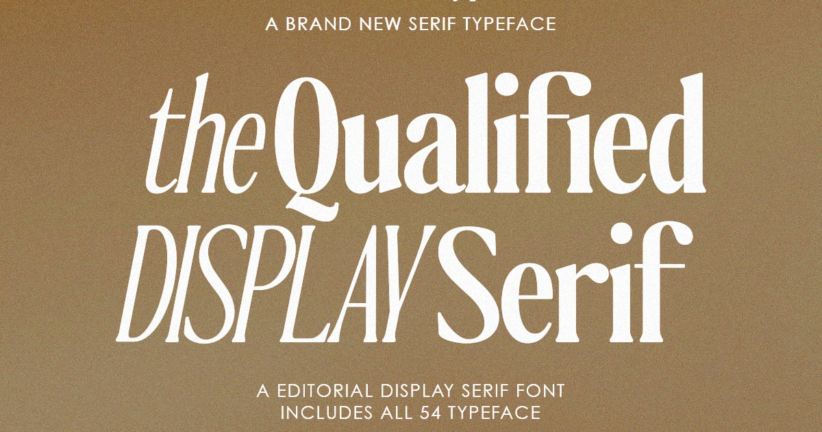
The Qualified Family is an expansive serif collection spanning 54 fonts, offering exceptional range for editorial and branding projects. With multiple weights and styles, it delivers the refined elegance of traditional serif typography while maintaining contemporary clarity. The family excels in magazine layouts, corporate identities, and sophisticated web design where hierarchy and readability matter. As one of the more comprehensive variable fonts available, it provides precise typographic control across all weights. The collection supports multilingual characters and includes complete uppercase, lowercase, numerals, and punctuation sets, delivered in standard desktop formats for professional workflows.
Gizale
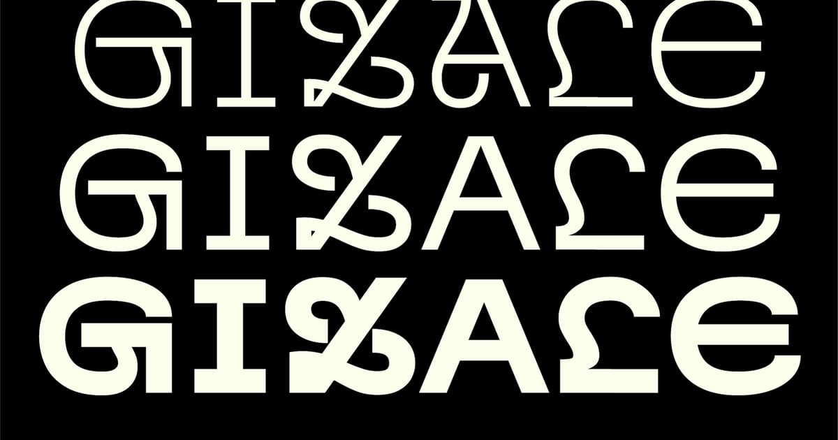
Gizale offers a contemporary sans-serif design system that balances clean geometry with approachable warmth. Its letterforms feature subtle refinements that give text a polished, professional appearance while maintaining excellent readability across sizes. As one of the variable fonts gaining attention, it provides flexibility for designers working on branding projects, editorial layouts, and digital interfaces. The family supports multilingual typography and includes a comprehensive range of weights, making it suitable for both display headlines and body copy. Files are delivered in modern font formats ready for immediate use.
Figerona
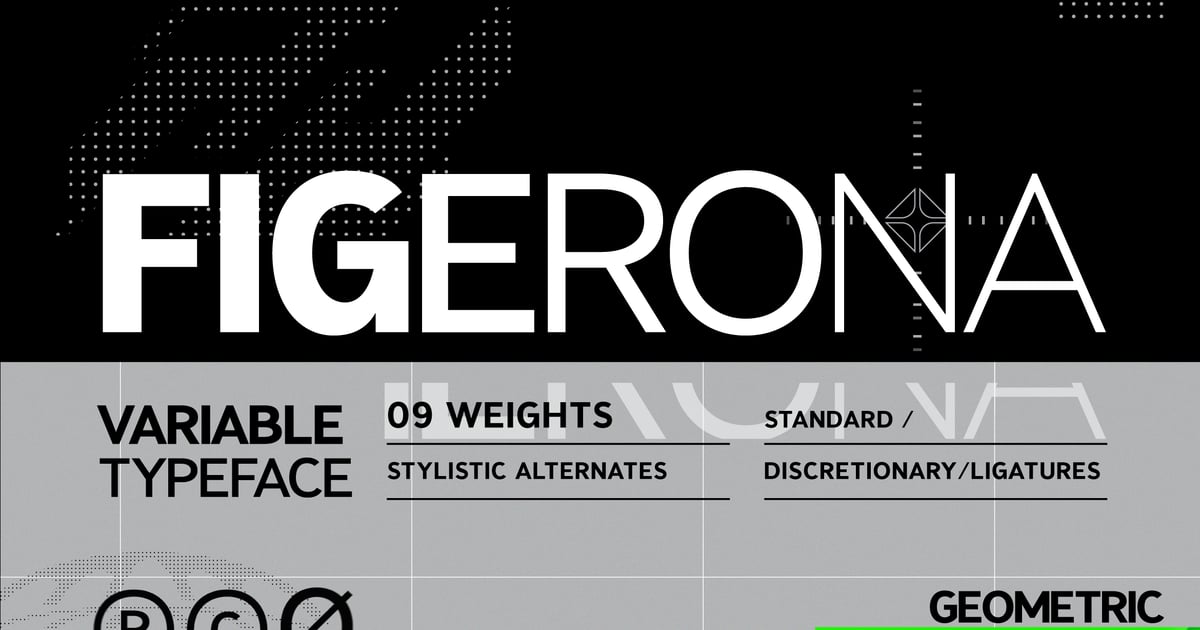
Figerona is a contemporary sans-serif typeface that balances clean geometric forms with subtle warmth. Its modern structure makes it well-suited for branding projects, editorial headlines, and digital interfaces where clarity matters. The design works particularly well for tech startups, creative portfolios, and minimalist web layouts seeking a professional yet approachable voice. As one of the growing collection of variable fonts available today, it offers design flexibility for various applications. The family includes multilingual support along with essential punctuation and numerals, delivered in standard font formats ready for both print and screen use.
Baste Font
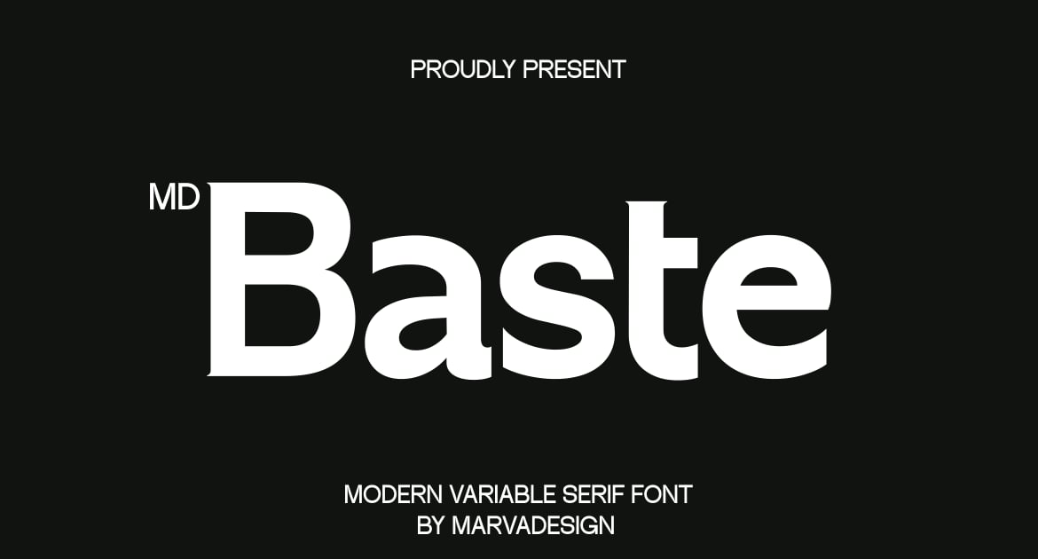
Baste Font delivers a refined serif typeface with classic proportions and contemporary detailing. Its letterforms balance traditional elegance with current design sensibilities, making it suitable for editorial layouts, sophisticated branding, and luxury packaging. The family offers a range of weights that work seamlessly across print and digital applications. As variable fonts continue to reshape typographic workflows, Baste provides designers with dependable versatility. The collection includes uppercase and lowercase characters, numerals, and punctuation, with files available in multiple formats for broad compatibility across design software.
Gizale
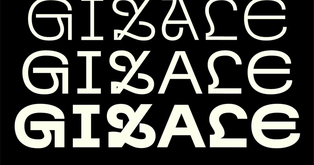
Gizale is a contemporary sans-serif typeface that balances clean geometric forms with approachable warmth. Its crisp letterforms and consistent stroke weight make it well-suited for editorial layouts, brand identities, and digital interfaces where clarity matters. As variable fonts go, Gizale offers flexibility for designers seeking precise typographic control across different weights. The family supports multiple languages and includes a complete set of uppercase and lowercase characters, numbers, and essential punctuation. Files are provided in standard font formats, ready for both print and screen applications.
Mostest Mono tech Logo font
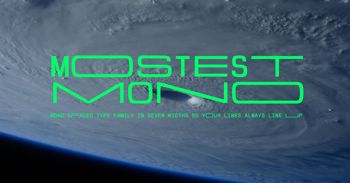
Mostest Mono tech Logo font delivers a technical, monospaced aesthetic perfect for contemporary branding and digital interfaces. Its geometric construction and uniform character widths create a systematic, code-inspired appearance that works exceptionally well for tech startups, app designs, and modern corporate identities. The typeface includes both monospaced and proportional family variations, offering flexibility for different design contexts. As one of the emerging variable fonts in the display category, it combines precision engineering with strong visual impact, making it ideal for logos that demand a sleek, forward-thinking presence.
Nguque – Unique Font
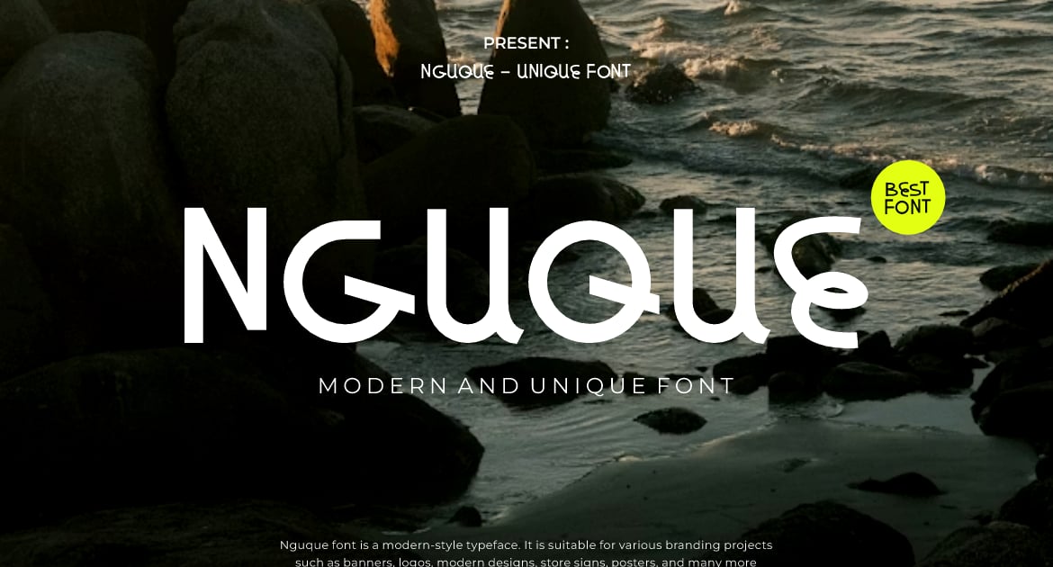
Nguque is a distinctive sans-serif typeface that balances clean geometric forms with unexpected character details. Its letterforms combine minimal structure with subtle personality quirks that set it apart from conventional sans designs. The font works particularly well for contemporary branding, editorial headlines, and logo applications where you need clarity with a memorable twist. As one of the variable fonts offering flexible styling options, Nguque includes both uppercase and lowercase characters, numerals, and essential punctuation marks. Files are provided in standard font formats for seamless integration across digital and print projects.
En Passant
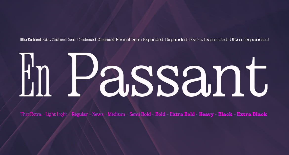
En Passant bridges classic serif tradition with contemporary design sensibilities, creating a typeface that feels both timeless and current. Its refined letterforms work beautifully for editorial layouts, sophisticated branding, and upscale packaging where elegance matters. The font brings versatility to projects requiring a polished, professional appearance without feeling stuffy or outdated. As variable fonts continue to gain traction in modern workflows, En Passant offers designers a dependable option for projects demanding typographic refinement and visual distinction across print and digital applications.
Romantic Editorial
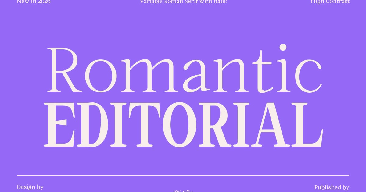
Romantic Editorial is a refined serif typeface that balances classic elegance with contemporary sophistication. Its graceful letterforms feature delicate contrasts and flowing curves, making it ideal for magazine spreads, book covers, wedding stationery, and luxury branding projects. The family offers versatile styling options through variable fonts technology, allowing designers to fine-tune weight and width for precise typographic control. With comprehensive multilingual support and a full complement of uppercase, lowercase, numerals, and punctuation, it delivers both beauty and functionality for editorial and display work.
Using Variable Fonts in a Responsive Brand
Once you’ve picked a variable font, the real work is putting it to use. Instead of loading multiple font files for different weights, let one file’s weight and width axes do that job. You’ll cut requests and keep type consistent across the whole system, which is the “one file, every weight” promise of variable fonts for web performance actually paying off.
Tie those axes to your breakpoints so type doesn’t just shrink on smaller screens, it adapts. A slightly tighter width axis on mobile can preserve line lengths that a static font would force into an awkward wrap, which is a big part of what makes fonts that adapt across screen sizes feel deliberate instead of accidental. If you’re experimenting with kinetic and animated type, keep axis animation subtle and purposeful. A headline that breathes gently on scroll reads as intentional; one that wobbles through its entire range reads like a tech demo. And before you commit a full brand system to a specific axis, check browser and app support for that exact axis. Weight is safe almost everywhere at this point, but some of the rarer axes still have gaps. For more on where type and interaction are headed next, this rundown of web design trends is worth a look.
Variable Font FAQ
What is a variable font?
A variable font is a single font file that stores a continuous range of styles, such as weight, width, slant, and sometimes optical size, instead of shipping a separate static file for each one. Designers and browsers can select any point along those ranges, so one file can cover everything from a thin caption to a heavy display headline.
Are variable fonts better for website performance?
Usually, yes. Loading one variable font file typically weighs less than loading several static weights separately, and it means fewer HTTP requests overall. The exact savings depend on how many styles you’d otherwise load and how many axes the variable file contains, but for most responsive sites, it’s a net win for page speed.
What are variable font axes?
Axes are the dimensions a variable font can adjust along. The most common are weight, running from thin to black, and width, running from condensed to expanded, with slant, italic, and optical size showing up in more advanced fonts. Each axis has a defined range, and you can set any value within it instead of choosing from fixed presets.
Can I use variable fonts for print and branding, not just web?
Yes. Most design software now supports variable fonts, letting you pick a precise point on an axis for a logo, a poster, or a full identity system, not just a webpage. The web performance benefit doesn’t apply to print, but the design flexibility and consistency across a brand absolutely do.
2026 is shaping up to be the year variable fonts stop being treated as just a developer’s performance trick and start getting judged as the branding decision they actually are. Pick one with real range, make sure it holds its shape from thin to black, and let it flex across every screen your brand shows up on.