In this article:
- My Favorite 90s Fonts to Use in 2023
- What makes a 90s font authentic?
- How to Pick the Best 90s Fonts
- Where to Use 90s Fonts
- Which 90s fonts will you pick?
I was a young kid in the 90s—and I remember it fondly. Watching The Lion King on repeat, jamming out to Hansen’s “Mmm Bop,” and downing Dunkaroos at lunchtime.
The 90s also brought a creative explosion of typefaces and fonts with high energy and style. Plus, as personal computers and the internet began to pick up steam (remember that AOL online modem sound?) more digitized fonts became extremely common.
If you’re hoping to recapture the 90s in your design, then you’re in the right place. 90s fonts are fun, energetic, and speak to a unique era when we got away with saying “Booyah” and listening to Will Smith “get jiggy with it.”
In this list, I’ll share 90s fonts that I think recapture the fun and nostalgia of the 90s. Here we go:
My Favorite 90s Fonts to Use in 2023
Nineties Vibes
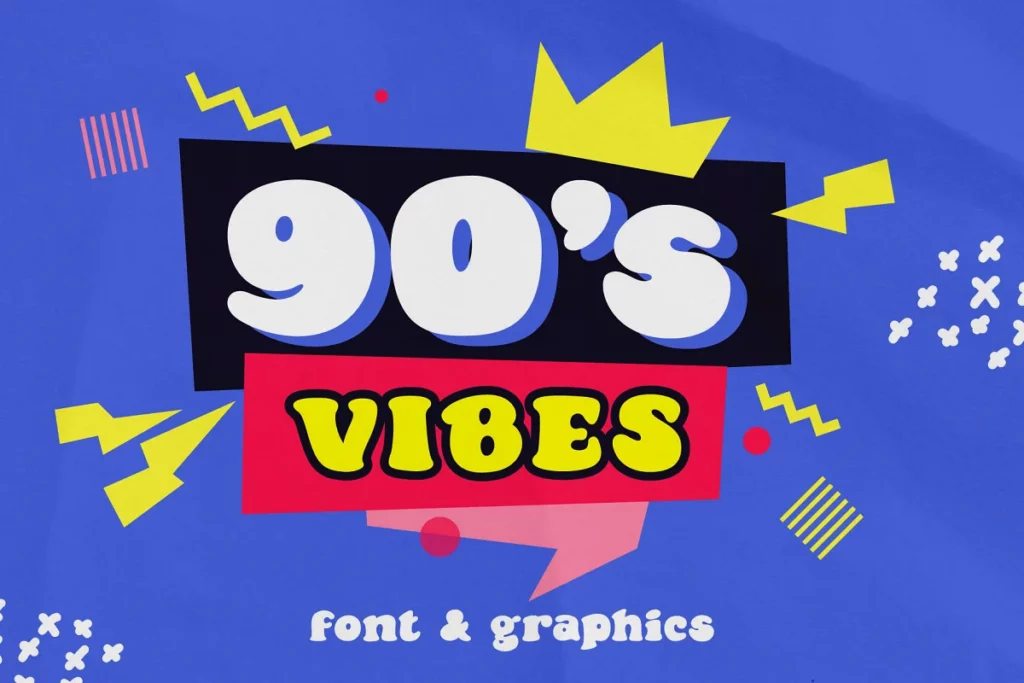
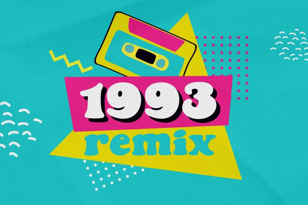
Inspired by the graphics and fashion of the 1990s, this lively font captures the quintessential spirit of the decade with its bubbly, rounded letterforms and vibrant personality. It’s the perfect choice when I want to infuse a design with playful nostalgia. Can’t you just hear the Saved By the Bell theme song playing when you look at it!?
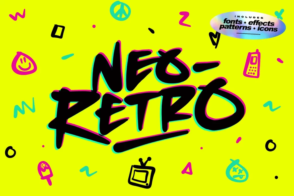
Neo-Retro Font

Get 300+ Fonts for FREE
Enter your email to download our 100% free "Font Lover's Bundle". For commercial & personal use. No royalties. No fees. No attribution. 100% free to use anywhere.
With its bold, high-energy letterforms, this font encapsulates the exuberant retro futurism of 90s aesthetics. I love using it to create vibrant, youthful designs that celebrate the decade’s boundary-pushing creative spirit.
DigiBop Y2K
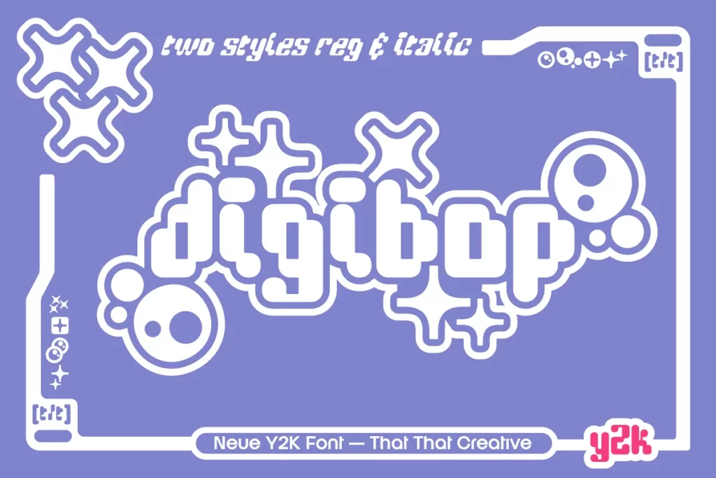
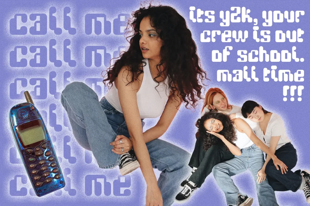
A modern interpretation of the digital 90s era, this attention-grabbing font conjures up memories of flashy tech gadgets and dial-up modems. It’s my top pick for evoking Y2K nostalgia in branding, websites, and more.
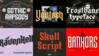
Oh Snap! (from the The Ultimate 90s Font Pack)
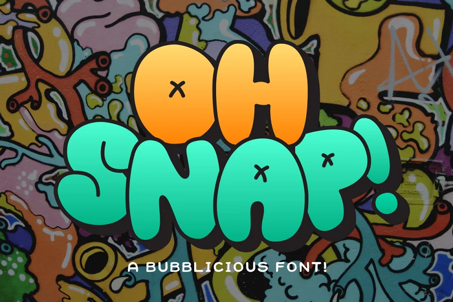
This mega bundle brings together four playful, casual fonts that ooze quintessential 90s style. For anyone looking to infuse projects with the fun spirit of the decade, this value-packed collection is a must-have. My favorite 90s font from the bundle? Definitely Oh, Snap (seen above).
Bubbles in 90s
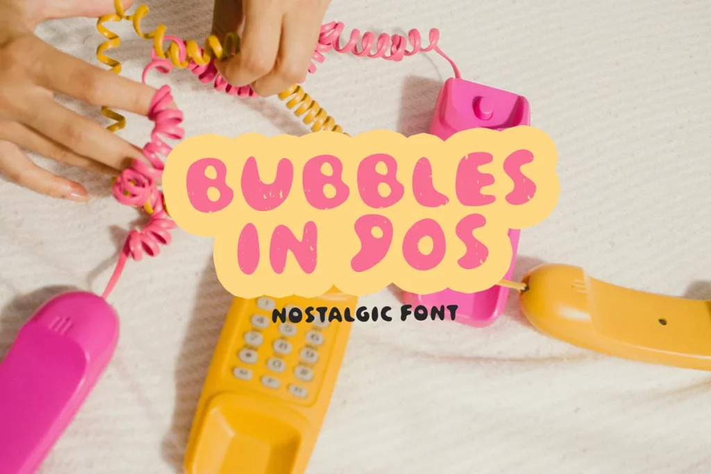
The soft, bubbly letterforms of this font immediately transport me back to the bright colors and carefree vibes of the 1990s. It’s my go-to for adding a nostalgic, old-school accent to designs.
Balgin Font Family
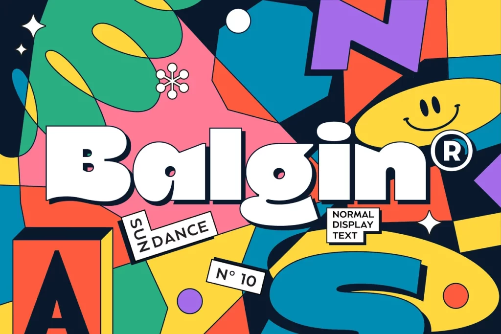
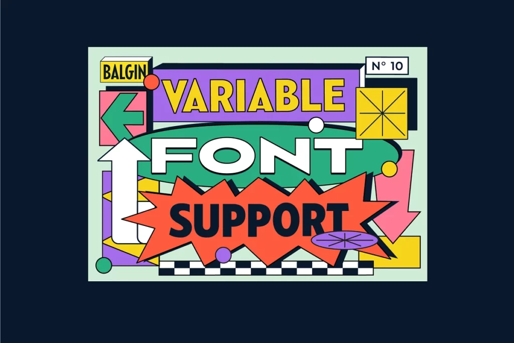
With its mix of geometric shapes and dynamic, flowing lines, Balgin masterfully blends retro and futuristic elements for a quintessential 90s look. Available in a range of weights and widths, it offers tremendous versatility.
Break Snooze
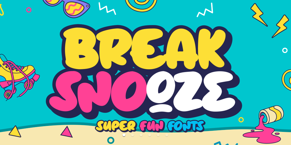
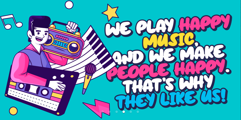
The sketchy, grungy texture of Break Snooze’s letterforms make it the perfect font for capturing that rebellious 90s attitude. I love using it to add an edgy, underground vibe to designs.
Template Gothic
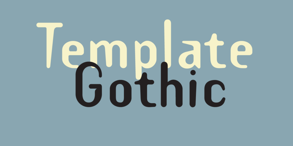
A landmark 90s font known for its imperfect, distorted aesthetic, Template Gothic authentically reflects the decade’s spirit of imperfection and experimentation in digital design. An iconic font choice.
Wasted Youth
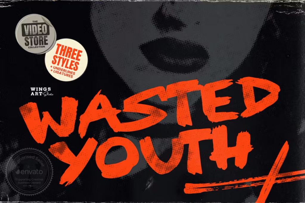
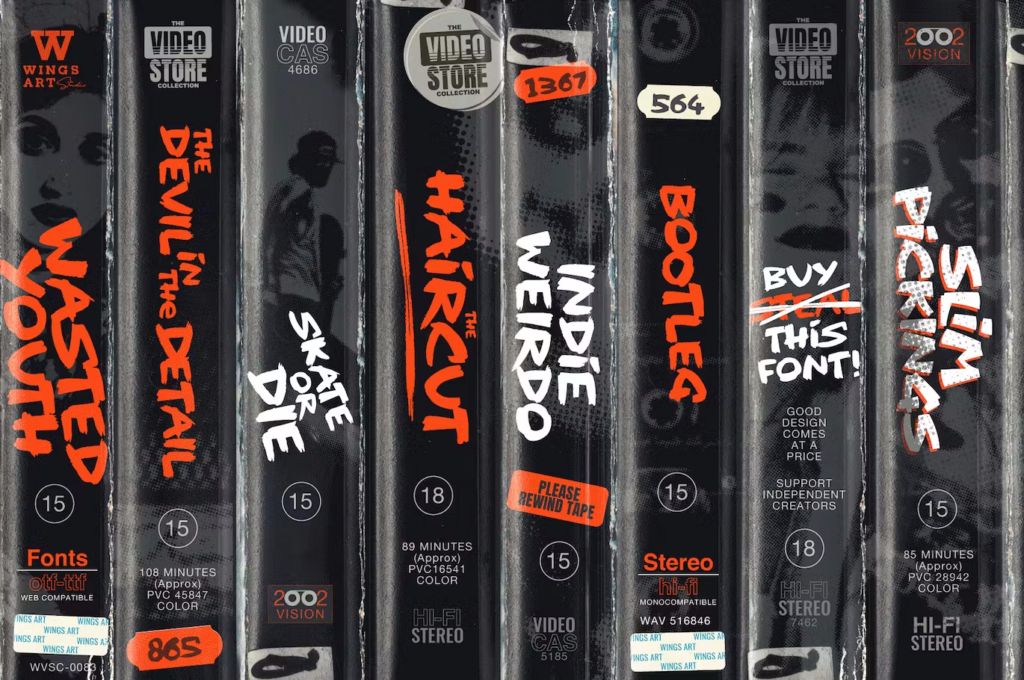
Wasted Youth is a remarkably versatile font available in three distinct styles – clean-edged, brush, and marker. Drawing inspiration from 90s grunge and punk rock aesthetics, it authentically captures that raw, handcrafted vibe. With unique ligatures, underlines, alternates and more, this font can transform titles and headlines into designs that look straight out of a 90s music video or skate zine. It’s my top pick for adding edgy, underground flair with authentic DIY charm.
What makes a 90s font authentic?
If you’re going for a totally authentic 90s vibe, then the last thing you want to do is pull a font that looks nothing like what we experienced during that memorable decade.
Here’s what to look for in 90s fonts if you want to come off completely real to the time period in your design:
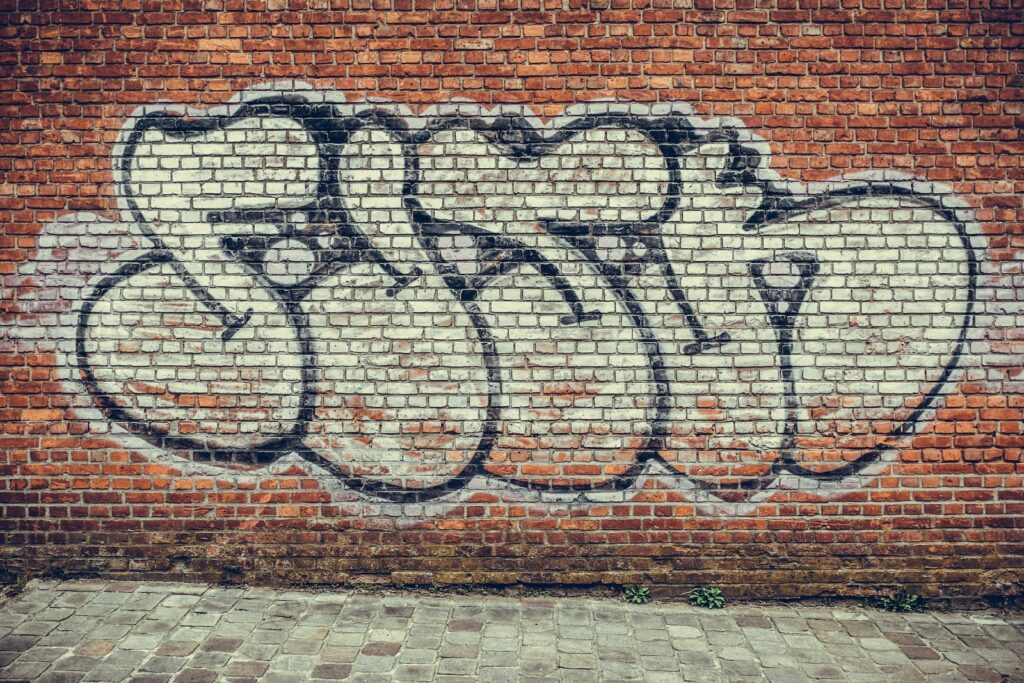
Grunge Textures
Grunge was BIG in the 90s (and it’s making a real comeback too). If you want to be use a genuine 90s font, try out something a bit grungy.
Grunge fonts have highly distressed, rough textures that mimic the look of hand-drawn pen or marker strokes. They’re messy, with letters that appear almost accidentally scratched together sometimes.
This creates an edgy, raw, underground feel that broke free from the ultra-sleek, crisp minimalism of the 80s and is perfect for a 90s font.
Rounded Shapes
Many 90s fonts moved away from the rigid, geometric letterforms of previous decades and embraced much softer, rounded edges and shapes.
This gave them a more friendly, approachable, and organic look and feel. The roundness conveyed warmth and invited people in compared to the cold detachment of overly sharp geometric designs.
Bold Impact
Display and text fonts of the 90s got dramatically heavier and impactful compared to previous decades.
Really thick weights, condensed widths, and unusual shapes grabbed attention in new artistic ways. These bolder fonts felt more like art, posters, and signage than just vehicles for delivering plain text content.
Vibrant Color
90s fonts embraced vibrant, neon colors after the relatively boring and sterile styles from the 80s. 90s fonts integrated lively color accents and effects which aligned typography with the louder, eclectic cultural expressions and art/music scenes of the decade. The 90s were a wild time—trust me!
Digital Innovation
But not everything in the 90s was edgy, grungy, or wild. The 90s also ushered in the internet for most of us (“You’ve Got Mail”).
New digital technologies enabled a rush of font experimenting in the 1990s. Desktop publishing programs like Word Perfect or Microsoft Word allowed much wider access to new fonts. This kickstarted an explosion of innovative new typefaces as well as revivals of retro fonts from other decades. Designers had an unprecedented palette to push boundaries and we loved it.
I still remember designing signs for my snow cone business and I think I used a different font for each flavor because….why not?
How to Pick the Best 90s Fonts
With so many options to choose from, how do you make sure you get an authentic 90s font and still fulfill the requirements of your project? Here are a few tips:
Don’t Forget Your Project Goals
Align your 90s font choice with the specific style and emotions you want to convey. For example:
- Try a lively, bubbly font like Lucky Land for a 90s-themed party flyer to capture the decade’s playful spirit.
- Choose an edgy, grungy font like Freebooter FY for a website on 90s fashion trends to mirror our “rebellious” attitudes.
- Use a sleek, futuristic font like Code Pro for the logo of a tech company founded in the 90s to reflect “innovation.”
Don’t just arbitrarily choose a certain 90s font because it looks cool. Instead, make sure your creative goals align with the font’s inherent vibe and personality. Make each choice intentional and your 90s throwback will be more authentic.
Consider Your Audience
Not everyone was around in the 90s. So when picking a 90s font, it’s important that you consider exactly who will be viewing your project. Will your target audience have nostalgia for 90s fonts, or could those styles seem dated and irrelevant? Carefully balance past retro charm with a modern understanding of design and your audience.
For those of us who lived through the 90s, authentic 90s fonts might bring back fond memories. But for younger demographics, those same fonts could feel tired, boring, odd, or disconnected from their experience.
Use Wild Fonts Lightly (Looking at you, Curlz)
Some 90s fonts are just plain crazy. Too much. They should never come back, IMHO. But if you insist on using them again, these particular 90s fonts work best in small doses. Avoid large blocks of text in weights and styles that seem overstimulating or too crazy.
Instead, use these eye-catching 90s fonts just for headlines or title cards and then use a classic like Arial or Helvetica to prevent visual clutter. Trust me, no one wants to read more than a few words at a time in Curlz (if you know, you know).
Pair with Modern Fonts
Blending classic 90s fonts with clean, contemporary styles creates an appealing contrast. The 90s font provides nostalgic flavor while the modern font keeps it feeling current.
For example, coupling a geometric art deco font with a minimalist sans serif is a great way to marry each style. Or teaming a grunge font with a sharp, streamlined display font can really emphasize that contrast.
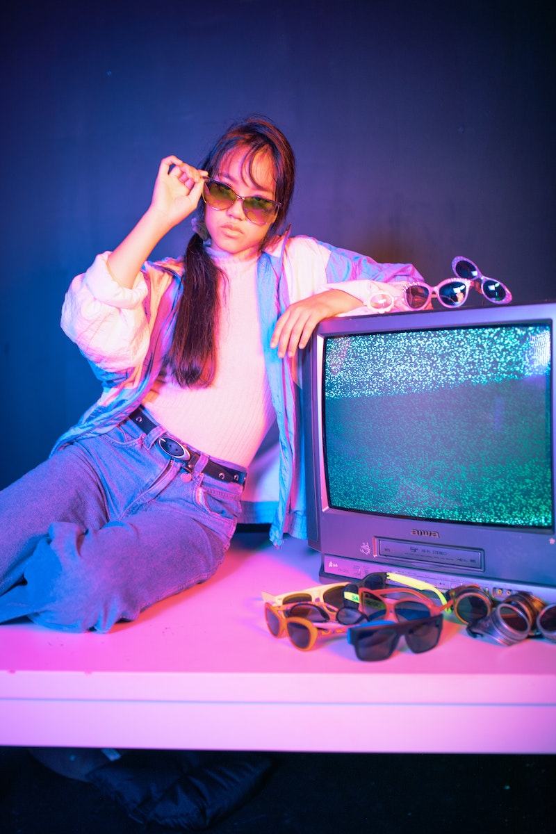
Where to Use 90s Fonts
90s fonts can be a fantastic way to inject your project with a dose of nostalgia, fun, and personality. Whether you’re aiming to evoke memories of the grunge era, the rise of the internet, or the bold, colorful designs that defined the decade, there are plenty of places where 90s fonts can make a big impact. Here are some ideas:
- Event Branding
Give your event materials a 90s vibe by using bold, eye-catching fonts on posters, flyers, banners, and websites. Perfect for 90s-themed parties, concerts, and conventions. - Apparel Graphics
Elevate your t-shirt designs, hoodies, and accessories by incorporating fonts that scream 90s streetwear. These fonts bring out the bold and rebellious spirit of the decade.
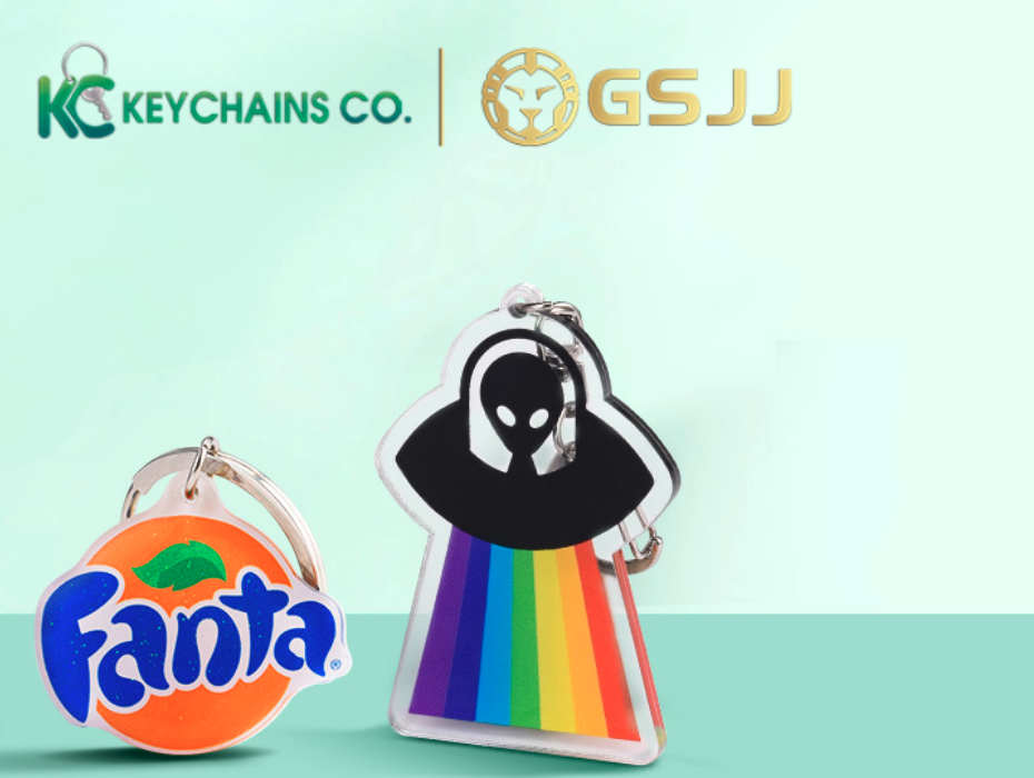
- Keychains
Capture the essence of the 90s in small, fun accessories like Custom Acrylic Keychains. Use playful, retro fonts to create memorable keepsakes that people will love to carry around. - Music Promotion
For bands or events with a 90s influence, using authentic fonts from the decade on album covers, posters, and merch is a surefire way to resonate with fans of the era. - Retro Product Packaging
Whether it’s for snacks, toys, or beauty products, 90s fonts can make your packaging pop with nostalgia, appealing to both those who remember the decade and those discovering its charm for the first time. - Movie & Show Aesthetics
Infuse your film or television project with 90s flair by using fonts that reflect the era in titles, credits, posters, or social media promotions.
By using 90s fonts in these areas, you can create a powerful connection to the past while also offering a fresh take on a beloved aesthetic.
Which 90s fonts will you pick?
The 1990s gave us a bounty of unique, boundary-pushing, and sometimes outrageous fonts.
By thoughtfully incorporating them into modern designs, you can recapture the creative spirit of this unforgettable decade. Now go out there and bring back one of the greatest decades of the last century with designs that leave us saying “Booyah!”