

In this article:
- Understanding the Foundations of Color Theory
- Creating Emotion With Color Harmonies
- Understanding Psychology and Cultural Meaning
- Color Theory in the Real World
- Choosing the Right Color System
- Designing With Accessibility in Mind
- Building Better Color Palettes
- Using Color With Intention
Most graphic designers learn the basics of color early on, but understanding why certain combinations work is what turns color into a strategic design tool. Whether you are creating a brand identity, a website or marketing materials, the choices you make influence how people interpret and interact with your work.
I have found that a solid grasp of color theory makes my creative decisions feel more intentional, rather than purely instinctual. To use color strategically, it helps to understand the core principles that shape every effective palette.
Understanding the Foundations of Color Theory
Before you start combining colors, it helps to understand the elements that influence how these colors behave. While the traditional color wheel remains a useful reference, it is only one part of the equation. Designers also need to consider how color properties and temperature affect readability, visual hierarchy and the overall mood of a design.
The color wheel organizes hues into primary, secondary and tertiary colors, making it easier to identify relationships between them. These relationships form the basis for color harmonies such as complementary, analogous and triadic patterns, which you will use later when building cohesive designs.
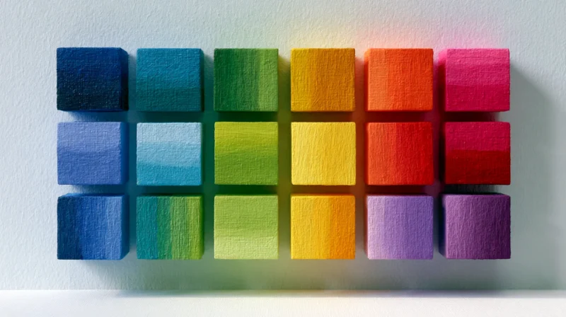
Beyond hue, every color has three defining characteristics — hue, saturation and value (HSV). Hue identifies the color itself, saturation controls its intensity, and value determines how light or dark it appears. Making small adjustments to saturation or value can completely change the visual impact of a design without requiring an entirely new palette.
Color temperature adds another layer of meaning. Warm colors, such as reds, oranges and yellows, often create a sense of energy or urgency, while cool colors like blues and greens tend to feel calmer and more stable. Neutral colors, including black, white, gray and beige, provide balance and give brighter colors room to stand out.
Understanding how these foundational elements work together makes it much easier to choose colors with purpose rather than relying on instinct alone.

Get 300+ Fonts for FREE
Enter your email to download our 100% free "Font Lover's Bundle". For commercial & personal use. No royalties. No fees. No attribution. 100% free to use anywhere.
Creating Emotion With Color Harmonies
Once you understand the basics of color theory, the next step is learning how colors work together. Different color harmonies create different emotional responses, making them one of the most effective tools for shaping how people experience a design. Rather than choosing colors that look good together, think about the feeling you want your audience to have before selecting a palette.
Monochromatic Is Clean and Sophisticated

Monochromatic palettes use different tints, shades and tones of a single hue. They create a refined, cohesive look that is often associated with luxury brands, minimalist websites and editorial layouts. Because there are fewer competing colors, typography and imagery tend to take center stage.
Analogous Is Calm and Cohesive
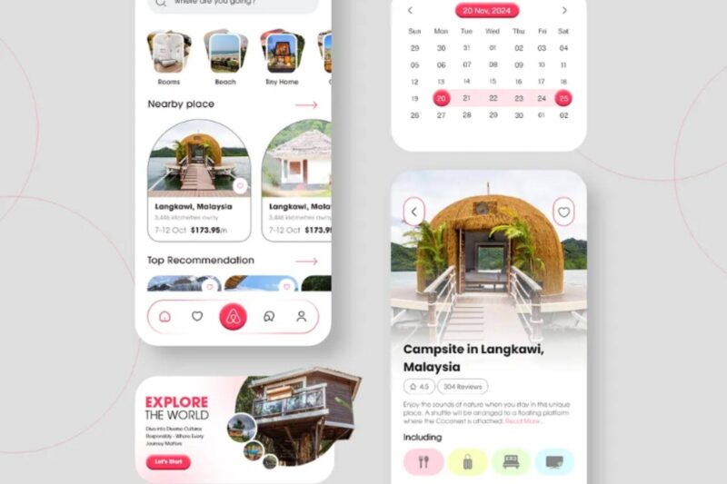
Analogous color schemes combine neighboring colors on the color wheel, creating smooth transitions and a natural sense of harmony. They are a good choice for wellness brands, travel companies and designs meant to feel approachable or relaxing. The limited contrast keeps the overall composition unified without becoming monotonous.
Complementary Is Bold and Attention-Grabbing
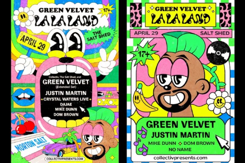
Complementary colors sit opposite one another on the color wheel, producing the highest level of visual contrast. Used thoughtfully, they can draw attention to calls to action, promotional graphics or key interface elements. Because the contrast is so strong, it is usually best to let one color dominate while the other serves as an accent.
Triadic and Tetradic Are Dynamic and Playful

Triadic palettes use three evenly spaced colors, while tetradic palettes combine four colors arranged into two complementary pairs. Both create energetic compositions that work well for illustrations, children’s brands, entertainment and playful marketing campaigns. The challenge is maintaining hierarchy, so one color should usually lead while the others provide support.
Understanding Psychology and Cultural Meaning
Color does more than make a design visually appealing — it shapes how people feel before they have read a single word. While color psychology is not an exact science, certain associations consistently influence how audiences interpret brands, interfaces and marketing materials. In fact, research shows that color can enhance memory retention, underscoring why thoughtful color choices matter beyond aesthetics.
Warm colors, including red, orange and yellow, naturally attract attention and communicate energy, excitement and optimism. Depending on how they are used, they can also signal urgency, caution or aggression, making them effective for promotions and high-impact branding.
Cool colors such as blue, green and purple often evoke trust, stability, creativity or growth. That is why you frequently see blue used by financial institutions and technology companies, while green appears in wellness and sustainability-focused brands. Purple tends to balance sophistication with imagination, making it popular among luxury and creative businesses.
Neutral colors, including black, white, gray and brown, provide visual balance while carrying their own emotional weight. Black often conveys elegance and authority, white suggests clarity and brown feels grounded and dependable.
One thing I have learned is that color meanings are not universal. White often represents purity and weddings in many Western cultures, but it symbolizes mourning in parts of East Asia. Red may communicate luck and celebration in China while signaling danger or urgency elsewhere. If you are designing for an international audience, considering cultural context is just as important as understanding color theory itself.
Color Theory in the Real World
Understanding color theory is one thing, but seeing it applied by recognizable brands makes its impact much easier to understand. Considering that 90% of companies rely on graphic design, thoughtful color choices can influence everything from brand recognition to customer perception. Looking at real-world examples shows how successful brands use color to reinforce their identity and communicate specific emotions.
Spotify Uses Green to Signal Energy and Discovery

Spotify’s signature green was not chosen simply because it stood out — it was intended to reflect the company’s identity from the very beginning. Lauren Solomon, Spotify’s senior director of global brand, explained the team selected a vivid green because the hue felt alive and had an energy that competitors’ colors lacked. It matched the company’s innovative, disruptive spirit.
That decision helped Spotify distinguish itself in a technology world that was heavily dominated by blues and neutral colors, reinforcing the brand’s image as fresh, creative and constantly moving forward.
Cadbury Uses Purple to Communicate Premium Quality
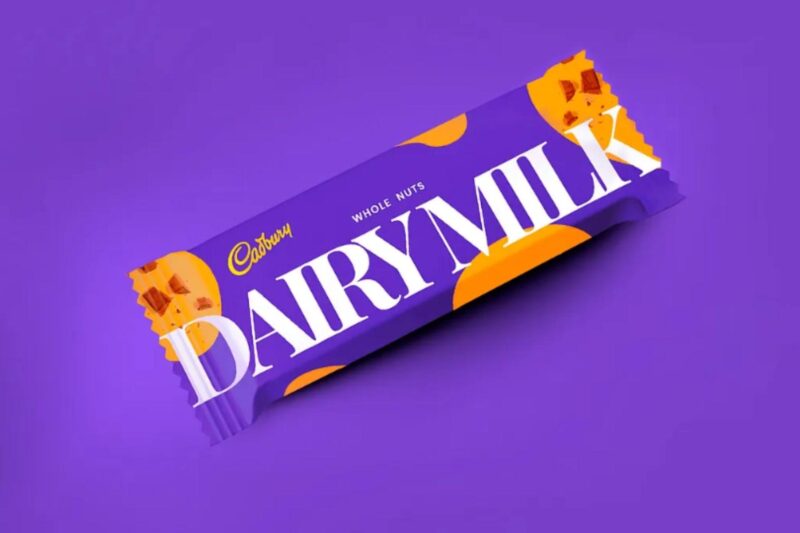
Cadbury has used its distinctive purple branding for decades, helping the company build a strong association with quality and indulgence. It even tried to copyright Pantone 2685C in 1995. Historically, purple has been linked to luxury and prestige, making it a natural fit for a premium chocolate brand. Because the color has become so closely tied to Cadbury’s identity, consumers often recognize the brand before reading the name on the packaging.
Choosing the Right Color System
Creating an effective color palette is only part of the design process. You also need to ensure those colors remain consistent wherever they are used, from digital interfaces to printed marketing materials. Understanding how different color systems work helps you avoid unexpected shifts and maintain a cohesive brand identity.
For digital projects, Red, Green and Blue (RGB) is the standard color model. Because screens create color by combining light, RGB produces a broad range of vibrant colors that work well for websites, mobile apps, social media graphics and other digital content.
Printed materials use Cyan, Magenta, Yellow and Black (CMYK), a subtractive color model that creates color by layering ink. Since CMYK cannot reproduce every color available in RGB, designs often require adjustments before going to print. Digital printing systems communicate the exact percentages of cyan, magenta, yellow and black needed to reproduce a specific color, allowing designers to fine-tune those values for a closer match between digital files and the finished printed piece.
For brands that depend on a consistent visual identity, the Pantone Matching System provides an additional level of precision. A Pantone library includes more than 15,000 standardized colors, giving designers and printers a shared reference for reproducing the same shade across different materials and print runs.
Pantone colors ensure your branding looks consistent whether it is viewed on a business card or a large-format display. Understanding when to use RGB, CMYK and Pantone gives you greater control over the final product.
Designing With Accessibility in Mind
Good color choices may make a design more attractive, but they also make it more usable. Accessibility should be considered from the beginning of the design process since an estimated 1.3 billion people live with a significant disability. Designing with accessibility in mind helps ensure your work can be understood by the widest possible audience, including people with low vision or color vision deficiencies.
One of the most important accessibility guidelines is maintaining sufficient color contrast between text and its background. The Web Content Accessibility Guidelines (WCAG) establish minimum contrast ratios that improve readability, particularly for users with low vision. Most design applications also offer built-in accessibility features or plug-ins that make it easier to evaluate contrast before publishing.
Accessibility also means avoiding color as the only way to communicate information. An error message, for example, should not rely solely on red text to indicate a problem. Pairing color with icons, labels or patterns makes information easier for everyone to understand, resulting in more inclusive and effective designs.
Building Better Color Palettes
Once you grasp the fundamentals of color theory, the next challenge is applying them intentionally. I have found that the strongest color palettes usually start with a clear objective rather than a favorite color. I focus on hierarchy and inspiration to ensure I have a clear understanding of the message I want my design to communicate.
One technique I rely on is the 60-30-10 rule. I use the primary color about 60% of the design, a secondary color for 30% and an accent color for the remaining 10%. This creates visual balance while giving key elements enough contrast to stand out.
Inspiration can come from almost anywhere. Photography, films, nature, architecture and fine art contain well-balanced color relationships that you can study and adapt. Rather than copying a palette, look at how colors interact and why they create a particular mood or atmosphere.
Avoid feeling pressured to chase every color trend. Trends can provide fresh inspiration, but timeless brands typically evolve their palettes gradually instead of completely reinventing them. If you are updating an existing identity, focus on incorporating modern accents while preserving the core colors that make the brand recognizable.
Using Color With Intention
Color theory is about understanding how different choices influence perception, emotion and communication. Whether you are building a brand identity, designing a website or preparing files for print, applying these principles intentionally can help you create work that is visually compelling and more effective.
I have learned that the more I observe how color is used in the world around me, the more instinctive these decisions become. Keep experimenting, studying successful design and refining your approach, and color will become one of the most valuable tools in your design process.