
In this article:
- How We Chose These Fonts
- Signs Your Brand Typeface Needs Replacing
- My Top Picks for a Corporate Rebrand in 2026
- Rolling Out a New Brand Typeface
- FAQ
- Final Thoughts
A corporate rebrand rarely starts with a mood board. It starts with someone pulling up the current logo next to a competitor’s and asking, quietly, why theirs looks like 2026 and ours looks like a filing cabinet. If you’re hunting for fonts for rebranding a company that has simply outgrown its old identity, the search usually narrows fast. Each earns its spot for a different reason — distinctiveness, restraint, or sheer range — and together they set the tone for everything else on this list.
How We Chose These Fonts
Corporate identity typefaces get judged by a different rubric than the fonts you’d pick for a poster or a pitch deck, and rebrand typography in particular has to survive scrutiny most design decisions never face.
- It’s distinctive enough to own — nobody mistakes it for the template default.
- It’s restrained enough to last a decade, not just a trend cycle.
- The family is deep enough to cover every touchpoint, from signage to UI.
- The licensing scales with a growing company instead of capping out at ten seats.
Signs Your Brand Typeface Needs Replacing
If you’re already searching for fonts for a modern corporate brand, one of four things probably brought you here. The current typeface has quietly become the default everyone reaches for because nobody remembers why it was chosen in the first place. It’s missing the weights or language support the company has grown into since launch. It renders poorly on the digital products now carrying the brand — apps and dashboards that didn’t exist when the original type was picked. Or it simply belongs to a previous era of the company, the one before the acquisition, the pivot, or the IPO. That last one is really the line between a brand refresh vs full rebrand: a refresh nudges what’s already there, a rebrand replaces the type entirely, the way Coca-Cola’s heritage-led rebrand did.
My Top Picks for a Corporate Rebrand in 2026
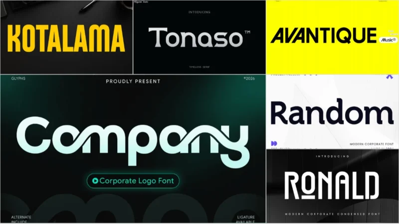
Company – Corporate Logo Font
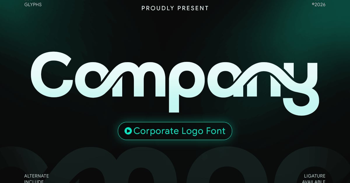
Company is a clean, professional sans-serif typeface built for business identity work. Its geometric letterforms and balanced proportions convey reliability and modern professionalism, making it ideal for enterprise communications, presentation decks, and brand guidelines. As a font for corporate rebrand projects, it delivers the clarity and authority that institutional clients expect. The family supports multilingual typesetting and includes uppercase and lowercase alphabets, numerals, and essential punctuation marks. Files are provided in both TTF and OTF formats for seamless integration across design applications.
Gate – Corporate logo Font
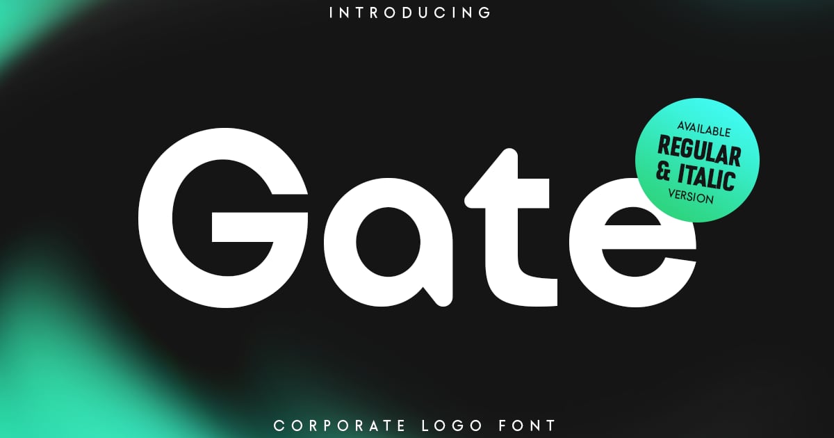
Gate is a clean, professional typeface designed to project authority and modern sophistication. Its geometric letterforms and balanced proportions make it ideal for corporate identities, tech startups, and institutional branding. As a font for corporate rebrand projects, it brings clarity and confidence to logotypes and visual systems. The design emphasizes legibility at various scales while maintaining a distinctive character that helps brands stand out. Perfect for companies seeking a contemporary yet timeless aesthetic, Gate delivers the polish and professionalism that enterprise applications demand.
Ewangi – Corporate Font
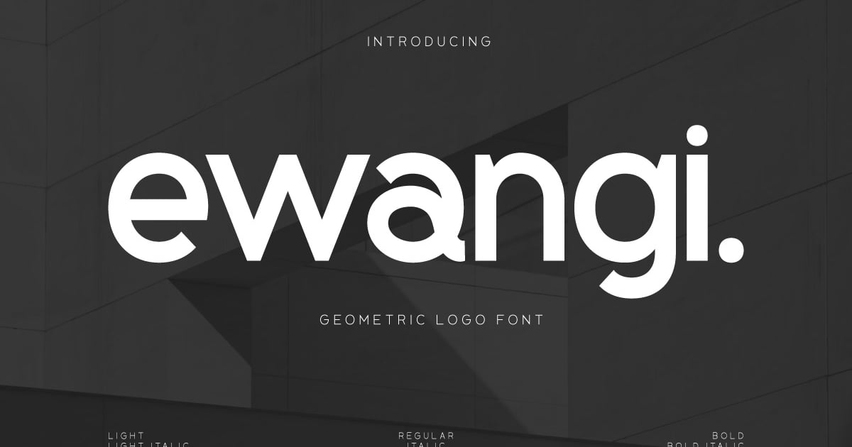
Ewangi is a clean, professional sans-serif designed for business communication and visual identity work. Its geometric letterforms strike a balance between approachable and authoritative, making it well-suited for presentations, brand guidelines, and digital interfaces. As a font for corporate rebrand projects, it delivers the clarity and polish that modern organizations require. The typeface includes both headline and minimalist weights, offering flexibility for hierarchical typography. Ewangi supports multilingual character sets and comes with standard punctuation and numerals, providing a complete toolset for professional design applications.
Modern Corporate Font – Kotalama
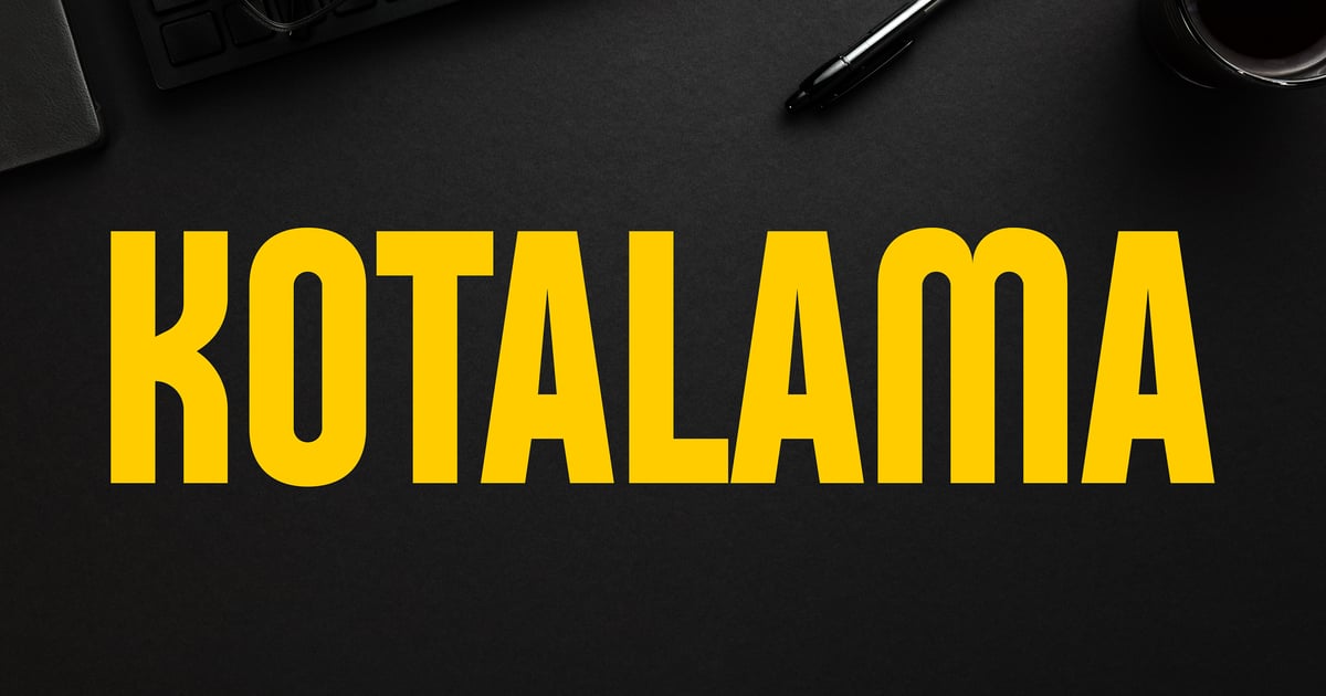
Kotalama brings clean geometry and professional polish to contemporary visual identities. This sans-serif typeface balances technical precision with approachable warmth, making it equally effective for presentation decks, brand guidelines, and marketing collateral. As a font for corporate rebrand initiatives, it offers the clarity needed for digital interfaces while maintaining sophistication in print applications. The family supports multilingual projects with extended Latin characters, and includes uppercase and lowercase letters, numerals, and punctuation. Files are provided in OTF and TTF formats for seamless integration across design workflows.
Get 300+ Fonts for FREE
Enter your email to download our 100% free "Font Lover's Bundle". For commercial & personal use. No royalties. No fees. No attribution. 100% free to use anywhere.
George – Modern Corporate Logo Font
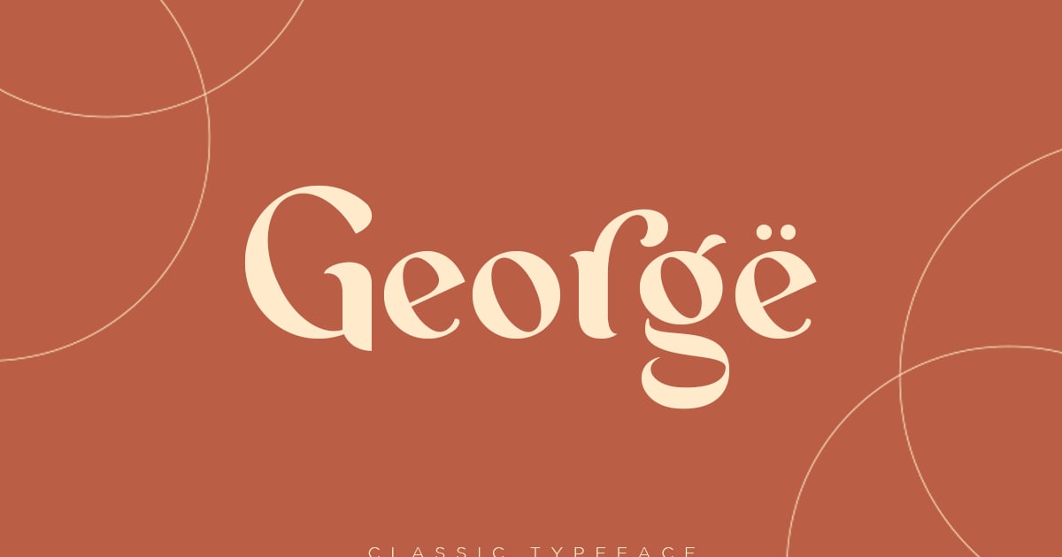
George is a refined serif typeface that balances classical elegance with contemporary minimalism, making it an excellent font for corporate rebrand projects and professional logo design. Its structured letterforms convey authority and sophistication while maintaining approachability through subtle modern touches. The design works particularly well for financial institutions, law firms, and premium lifestyle brands seeking to communicate trustworthiness and refinement. George includes uppercase and lowercase characters, numerals, punctuation, and multilingual support. Files are provided in both OTF and TTF formats for seamless integration across print and digital applications.
Espena – Corporate Logo Font
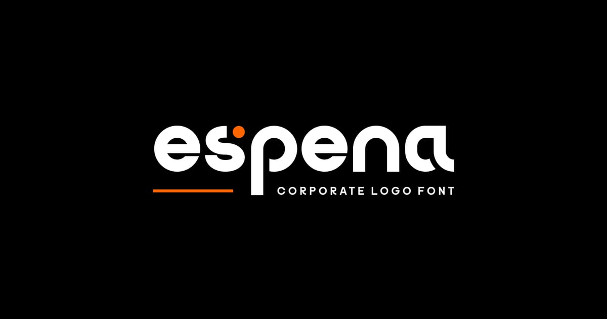
Espena is a refined sans-serif typeface designed to convey professionalism and contemporary sophistication. Its clean geometric forms and carefully balanced proportions make it particularly effective for logo design, brand identities, and corporate communications. The family pairs a standard corporate weight with a luxury variant, offering designers flexibility for hierarchical typography. As a font for corporate rebrand projects, Espena delivers the polish and versatility needed for modern business applications. The package supports multilingual characters and includes both TTF and OTF formats for seamless integration across digital and print workflows.
Tonaso – Serif Font Corporate
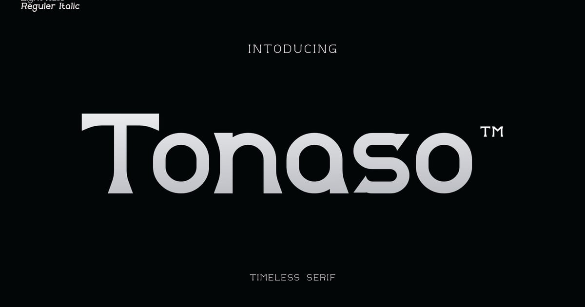
Tonaso is a refined serif typeface designed to bring sophistication and authority to professional communications. Its balanced letterforms strike a commanding presence while maintaining excellent readability across print and digital applications. This font for corporate rebrand works beautifully in annual reports, executive presentations, editorial layouts, and premium packaging where credibility matters. The design pairs traditional serif elegance with contemporary proportions, making it equally suited for body text and display headlines. Tonaso includes a comprehensive character set with multilingual support, numerals, and punctuation. Files are provided in standard font formats for broad compatibility.
Novax – Modern Corporate Logo Font
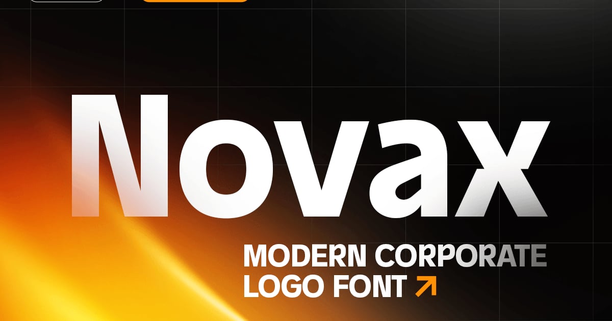
Novax is a clean, contemporary sans-serif typeface engineered for professional identity work. Its geometric letterforms balance precision with approachability, making it ideal for tech startups, financial services, and consulting firms seeking a polished visual voice. As a font for corporate rebrand projects, it delivers the authority and clarity essential for logos and headline applications. The family includes uppercase and lowercase characters, numerals, punctuation, and multilingual support. Files are provided in OTF and TTF formats for seamless integration across print and digital platforms.
Bargain – Logo Branding Corporate Font
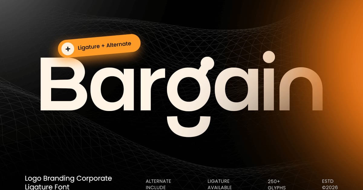
Bargain is a clean, professional sans-serif typeface built for business identity work and mark-making. Its straightforward letterforms balance contemporary geometric precision with approachable warmth, making it equally suited for wordmarks, presentation decks, and brand guidelines. As a font for corporate rebrand projects, it delivers clarity without feeling sterile. The family supports multilingual character sets and includes uppercase and lowercase letters, numbers, and essential punctuation. Files are provided in both OTF and TTF formats for broad compatibility across design applications.
Boncei – Geometric Corporate Font
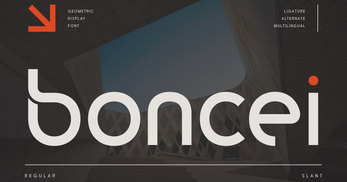
Boncei is a clean geometric sans-serif built for professional environments where clarity and precision matter. Its structured letterforms balance technical accuracy with approachable warmth, making it suitable for presentations, brand identities, and digital interfaces. As a font for corporate rebrand projects, it brings contemporary sophistication without sacrificing readability. The design works equally well in headlines and body text, offering versatility across marketing materials and internal communications. Boncei includes standard uppercase and lowercase characters, numerals, and punctuation, with files provided in multiple formats for broad compatibility.
Manyto – Display Professional Corporate Font
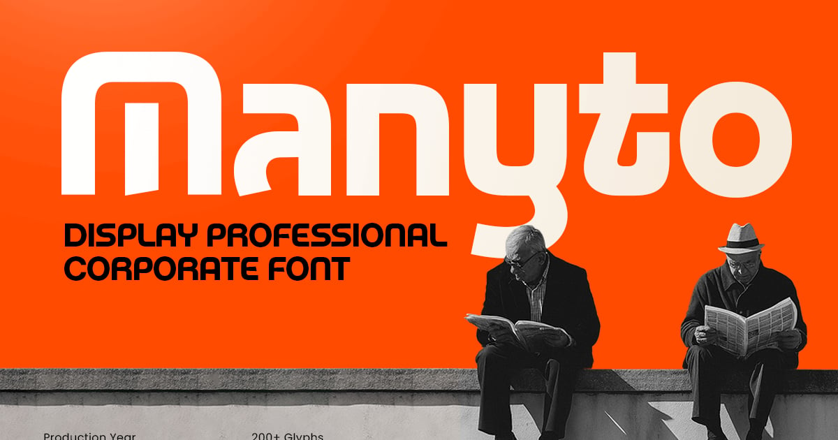
Manyto is a clean, contemporary display typeface built for professional environments where clarity and confidence matter. Its sans-serif structure delivers strong presence in headlines, presentations, and business communications while maintaining excellent readability. As a font for corporate rebrand projects, it brings polish and authority to identity systems without feeling stiff or outdated. The design balances geometric precision with subtle warmth, making it equally suited for tech startups and established enterprises. Manyto includes a full character set with multilingual capabilities, providing flexibility across various markets and applications. Files are provided in TTF and OTF formats.
Random – Modern Corporate Font
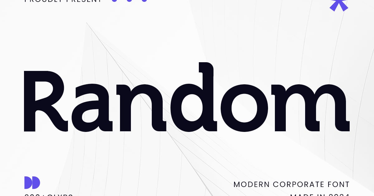
Random is a contemporary sans-serif typeface that balances clean geometric forms with approachable corporate sensibility. Its straightforward letterforms deliver clarity across business communications while maintaining visual interest through carefully considered proportions. This font for corporate rebrand excels in presentations, annual reports, website headers, and professional documentation where legibility meets modern sophistication. The family supports multilingual typography with uppercase and lowercase characters, numbers, and essential punctuation. Available in standard font formats, Random provides design teams with a reliable workhorse for identity systems that demand both professionalism and contemporary appeal.
Mogan – Modern Branding Corporate Font
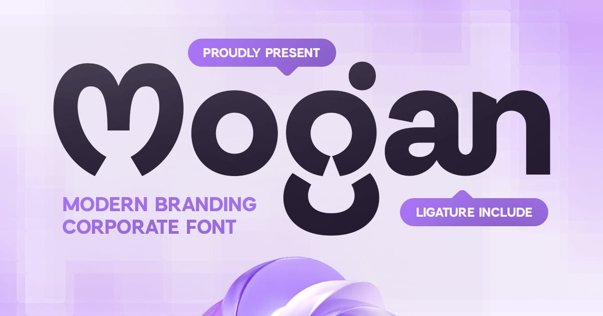
Mogan delivers sharp, contemporary letterforms designed for professional identity systems and business communications. Its clean geometric structure and carefully balanced proportions make it ideal for headlines, presentations, and marketing materials where clarity matters most. As a font for corporate rebrand, it brings sophistication without sacrificing readability across print and digital applications. The typeface includes uppercase and lowercase characters, numerals, punctuation, and multilingual support to serve international brands. Available in standard desktop formats, Mogan offers design teams a reliable foundation for building cohesive visual identities.
Ogelo – Corporate Logo Geometric Font
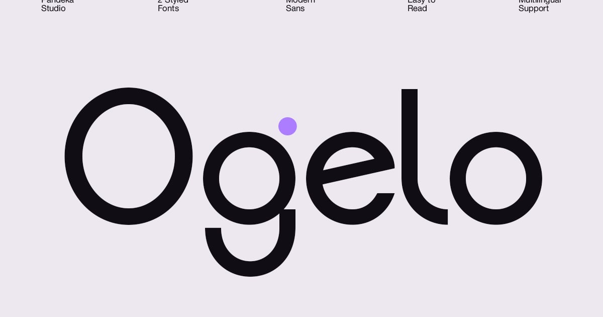
Ogelo is a geometric sans-serif typeface built with precision and clarity in mind. Its clean, structured letterforms draw from classic modernist principles while maintaining approachability for contemporary applications. The design works particularly well for technology brands, financial institutions, and professional services seeking a polished visual identity. As a font for corporate rebrand projects, it delivers the balance of authority and accessibility that modern businesses require. Ogelo includes uppercase and lowercase characters, numerals, punctuation, and multilingual support, with files provided in both TTF and OTF formats for flexible implementation across print and digital platforms.
Ronald – Modern Corporate Condensed Font
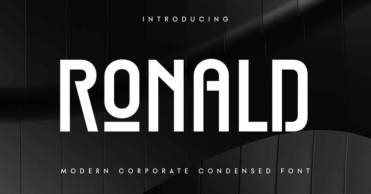
Ronald is a sleek condensed sans-serif typeface built for efficient, professional communication. Its narrow proportions maximize space without sacrificing legibility, making it ideal for headlines, presentations, and annual reports. The design balances contemporary geometric forms with approachable warmth, positioning it as a strong font for corporate rebrand projects seeking modern sophistication. Ronald includes uppercase and lowercase characters, numerals, punctuation, and multilingual support. Files are provided in both TTF and OTF formats for broad compatibility across print and digital applications.
Racky – Geometirc Corporate Logo Font
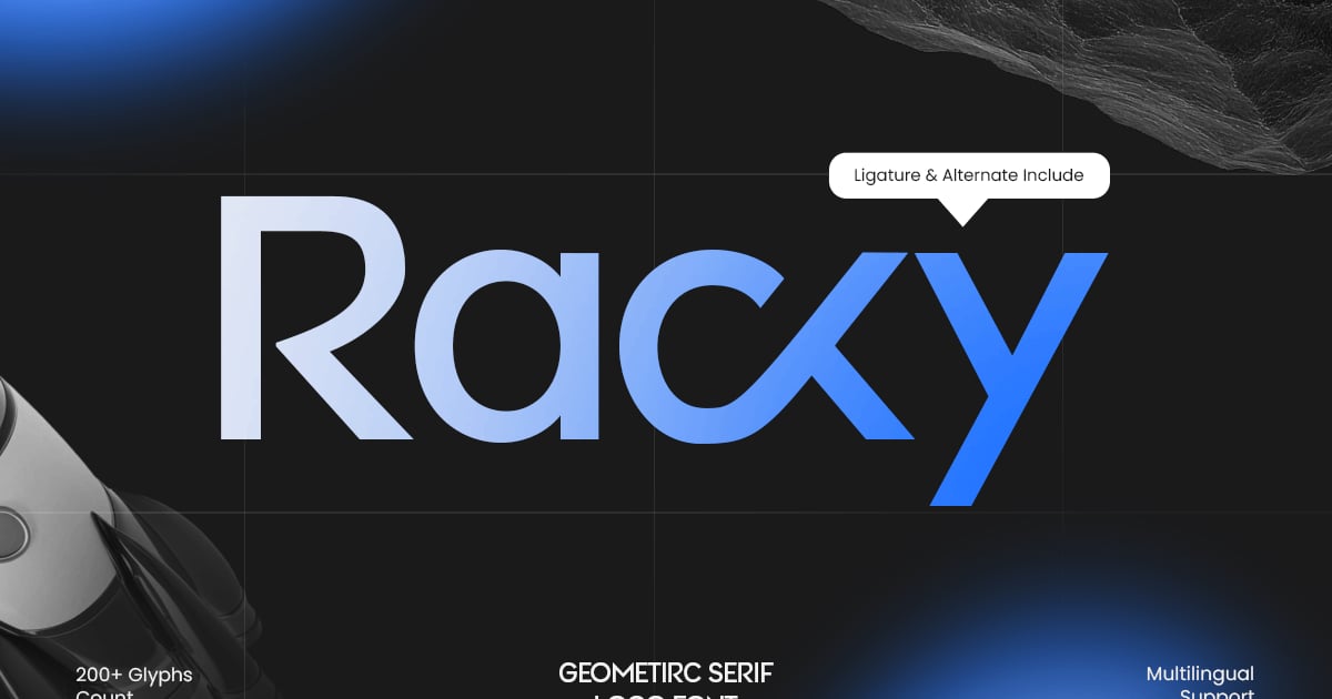
Racky is a clean geometric sans-serif built for precision and professional impact. Its structured letterforms and balanced proportions make it ideal for corporate identities, tech startups, and modern logo design. As a font for corporate rebrand, it delivers the clarity and sophistication that businesses need when establishing a contemporary visual presence. The typeface works particularly well in headlines, presentations, and digital interfaces where legibility matters. Racky includes multilingual support along with numerals and punctuation, arriving in both TTF and OTF formats for flexible implementation across print and screen applications.
Corporate Bensoon Sans Serif Font
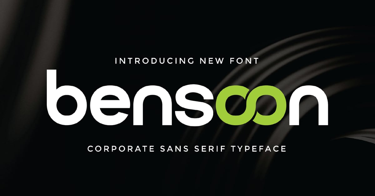
Corporate Bensoon Sans Serif Font delivers a professional aesthetic with clean, structured letterforms designed for business applications. Its straightforward geometry and balanced proportions make it ideal for presentations, annual reports, and company materials where clarity matters most. As a font for corporate rebrand, it brings modern sophistication without sacrificing readability across both print and digital platforms. The family works particularly well for tech startups, financial services, and consulting firms seeking a polished yet approachable visual identity. Standard files include multilingual character support along with complete numerals and punctuation.
Roghin – Unique Branding Corporate Font
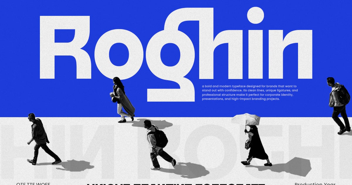
Roghin brings a distinctive sans-serif design to professional identity work, combining clean geometric forms with subtle contemporary details. Its versatile letterforms work equally well for company presentations, website headers, and brand guidelines. As a font for corporate rebrand projects, it delivers the polish and clarity essential for modern business communication while maintaining enough personality to help companies stand out. The family supports multiple languages and includes uppercase and lowercase characters, numbers, and standard punctuation. Files are provided in both OTF and TTF formats for broad compatibility.
Qadone – Corporate Sans Font
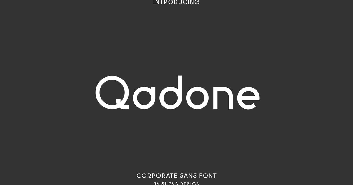
Qadone is a clean, professional sans-serif typeface designed for business communications and brand identities. Its balanced letterforms and contemporary proportions make it suitable for presentations, marketing materials, and digital interfaces where clarity matters. As a font for corporate rebrand projects, it offers the kind of neutral sophistication that works across industries. The family includes both regular and heading weights, giving designers flexibility to establish visual hierarchy. With multilingual character support and standard punctuation, Qadone handles diverse content needs while maintaining a consistently polished appearance throughout.
Caviler – Geometric Corporate Sans Serif Font
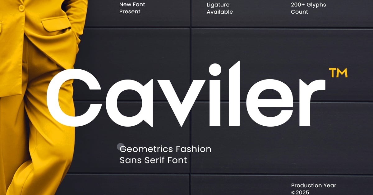
Caviler is a clean, geometric sans serif typeface built for professional environments where clarity and modern sophistication matter. Its precisely drawn letterforms balance mathematical precision with approachable warmth, making it ideal for presentations, reports, digital interfaces, and brand identities. As a font for corporate rebrand projects, it brings fresh energy without sacrificing readability or professionalism. The family supports multiple languages and includes uppercase and lowercase characters, numerals, and essential punctuation. Files are provided in both TTF and OTF formats for broad compatibility across design applications.
Queny – Unique Logo Corporate Famly Font
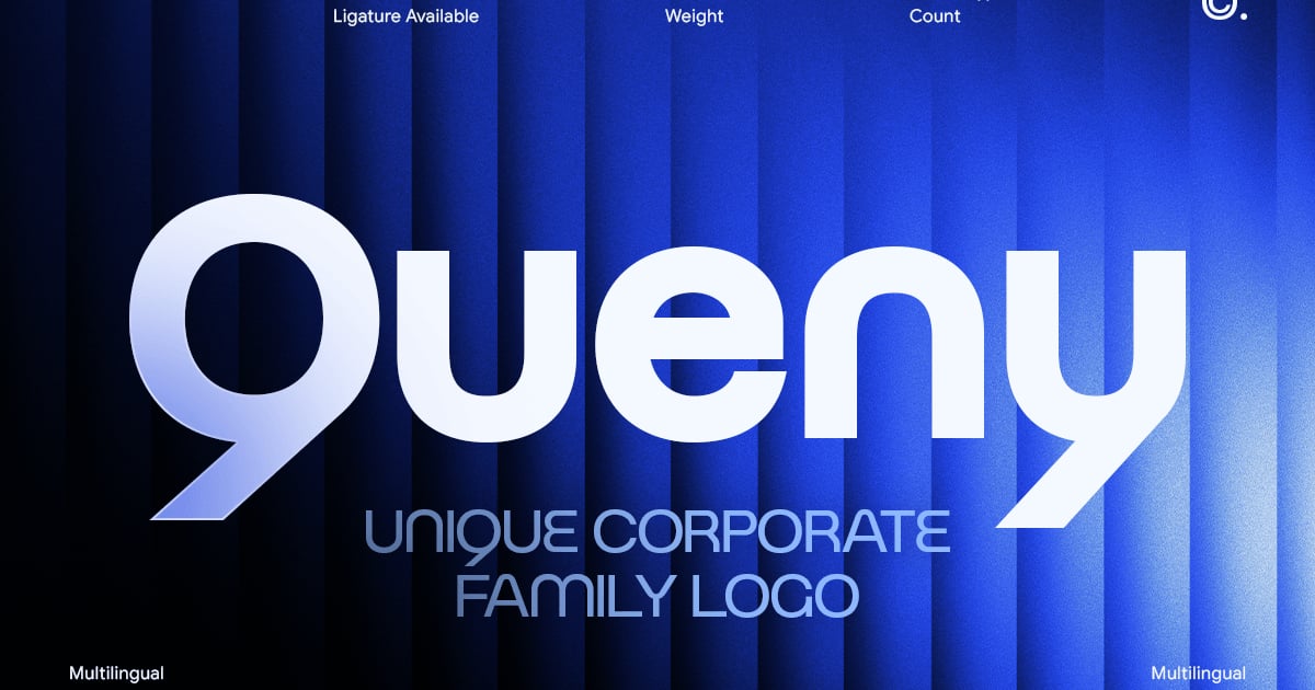
Queny is a distinctive sans-serif typeface designed to bring clarity and character to professional identity work. Its clean geometric structure pairs well with contemporary logo designs and business communications that demand both personality and legibility. As a font for corporate rebrand projects, Queny delivers the modern sophistication that companies need when refreshing their visual presence. The family provides versatile weight options suitable for everything from bold headlines to refined body text. With multilingual character support and professional OpenType features, it adapts seamlessly across international markets and diverse branding applications.
Modern Corporate Font – Neova
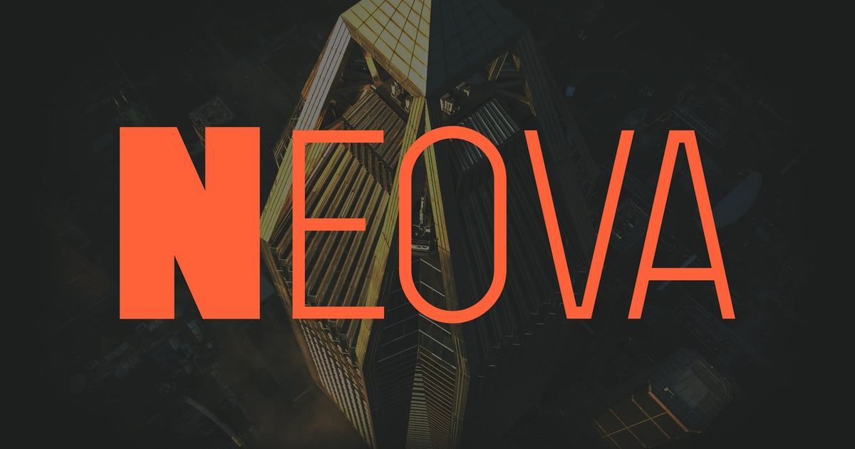
Neova brings sharp geometric precision to contemporary branding with its clean, futuristic aesthetic. This sans-serif typeface balances technical sophistication with approachable legibility, making it ideal for tech startups, financial services, and modern editorial design. As a font for corporate rebrand, it delivers the forward-thinking confidence that companies need when repositioning themselves in competitive markets. The character set supports multiple languages alongside standard uppercase, lowercase, numerals, and punctuation. Files are provided in both TTF and OTF formats for seamless integration across digital and print applications.
Gerline – Contemporary Sans
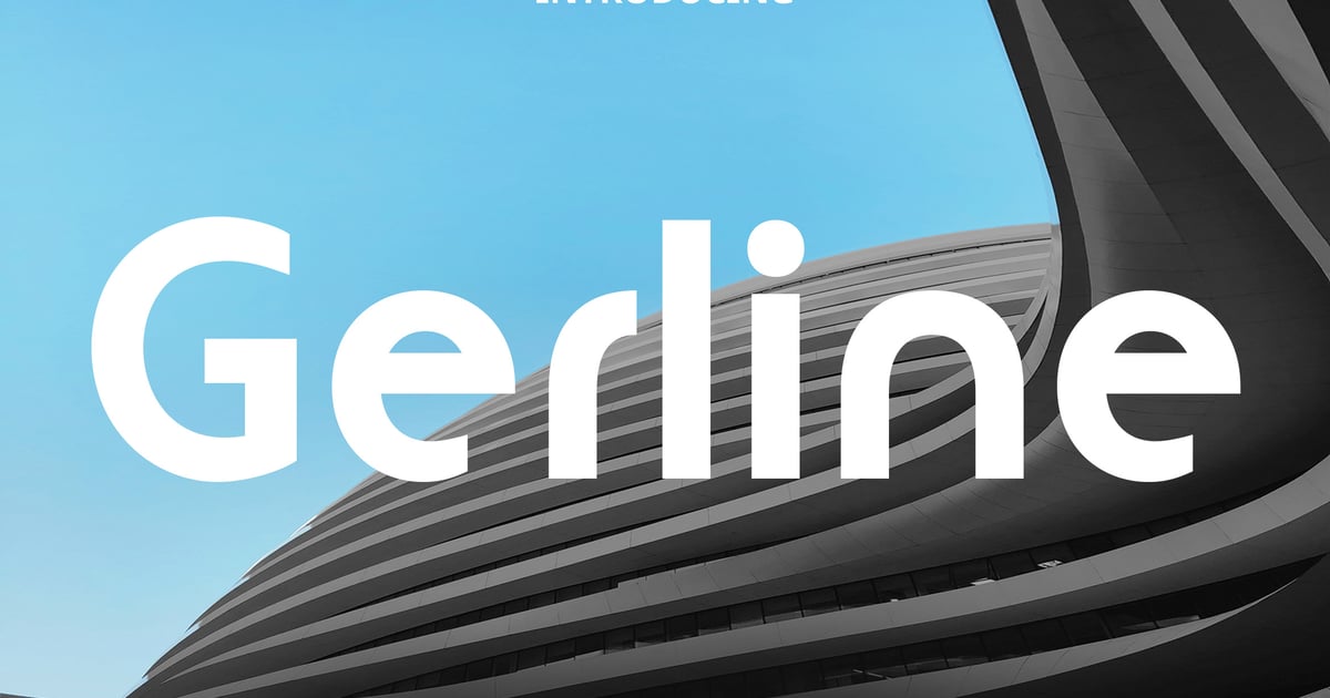
Gerline is a refined sans-serif typeface that balances clean geometry with subtle contemporary warmth. Its crisp letterforms and generous spacing make it ideal for editorial layouts, branding systems, and digital interfaces where clarity matters. As a font for corporate rebrand projects, it brings fresh sophistication without sacrificing readability. The family supports multilingual character sets and includes uppercase, lowercase, numerals, and punctuation. Available in standard desktop formats, Gerline works equally well in headlines and body text, offering designers a versatile tool for modern visual communication.
Inspires – Elegant Corporate Display Font
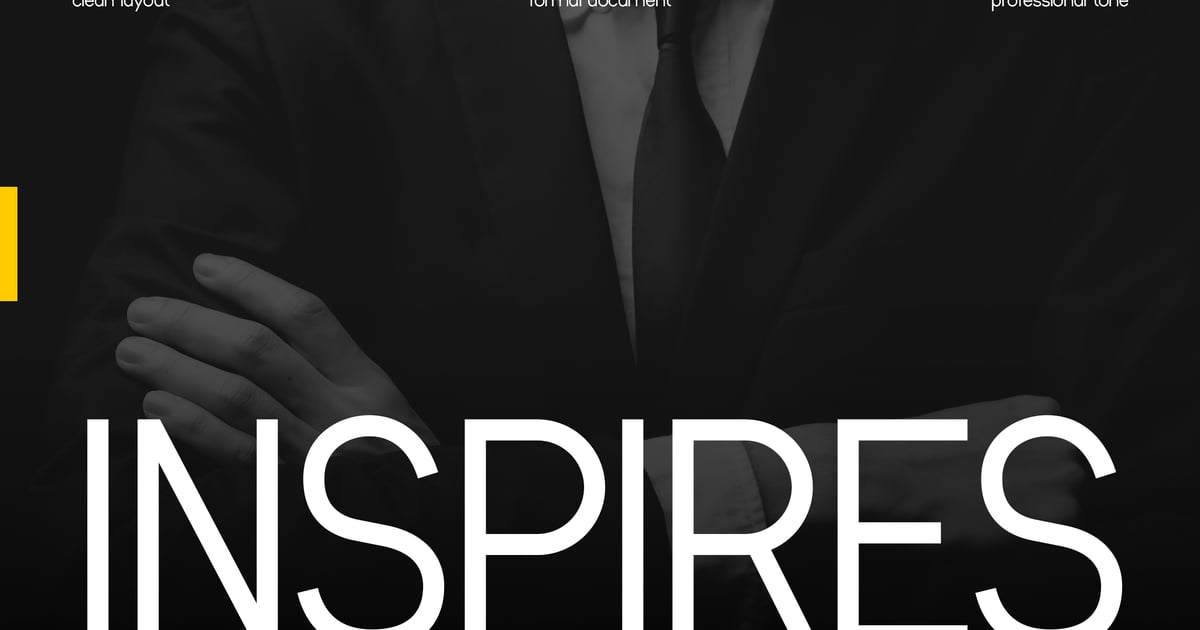
Inspires is a refined sans-serif typeface that brings sophistication to professional design work. Its clean geometry and balanced letterforms create a polished, contemporary aesthetic ideal for business presentations, brand identities, and editorial layouts. As a font for corporate rebrand, it strikes an excellent balance between approachability and authority. The family supports multilingual typography and includes uppercase and lowercase characters, numbers, and essential punctuation marks. Perfect for headlines, logotypes, and marketing materials that demand clarity with style. Available in standard desktop font formats for seamless integration into any design workflow.
Strenx – Modern Futuristic Font for Branding
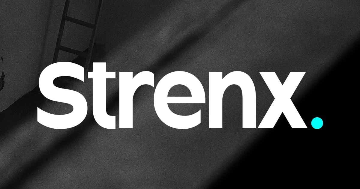
Strenx is a bold, geometric typeface built for forward-thinking brands that want to make a strong visual statement. Its sharp angles and clean lines create a confident, tech-inspired aesthetic that works exceptionally well for startups, digital platforms, and product packaging. As a font for corporate rebrand projects, it brings a sleek, contemporary edge to identity systems. The family includes uppercase and lowercase letterforms, numerals, and punctuation. Multiple weights provide flexibility across headlines and supporting text, while the modern construction ensures excellent legibility at any size. Files are delivered in both OTF and TTF formats.
Harping – Contemporary Font
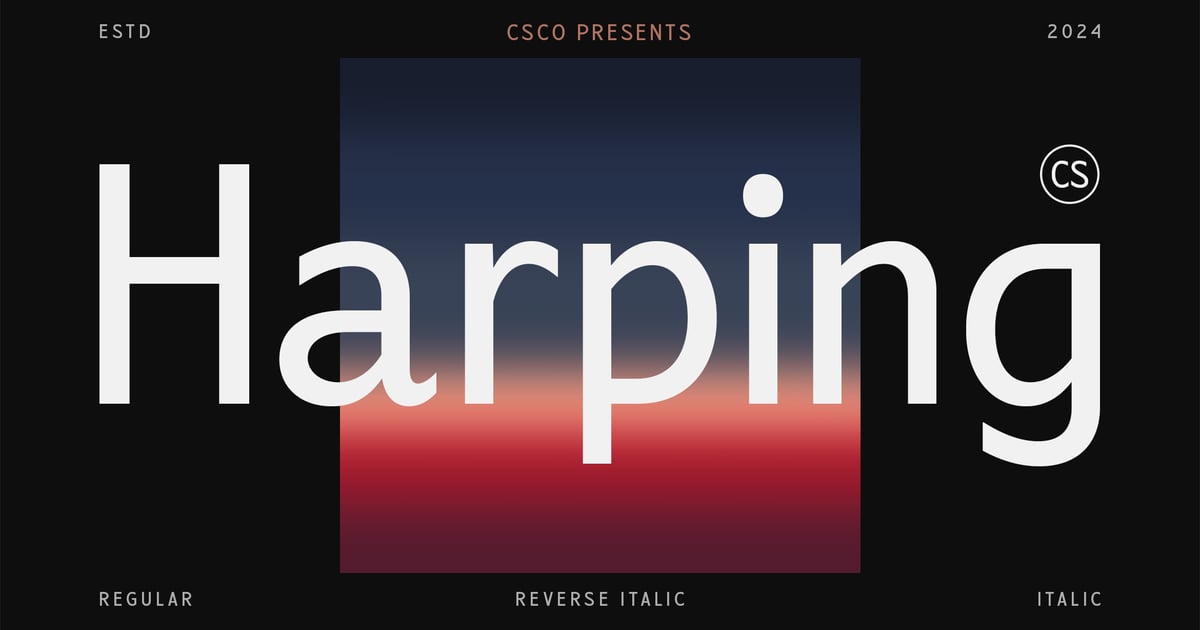
Harping is a sleek sans-serif typeface that balances clean geometry with contemporary refinement. Its straightforward letterforms convey professionalism without rigidity, making it equally suitable for editorial layouts, digital interfaces, and business presentations. As a font for corporate rebrand projects, it brings clarity and modern sophistication to identity systems. The design works particularly well in headlines and body copy where legibility matters most. Harping supports standard character sets including uppercase and lowercase letters, numerals, and essential punctuation, delivered in accessible font formats for immediate implementation across print and screen applications.
Ranky Corporate Sans Serif Font Typeface
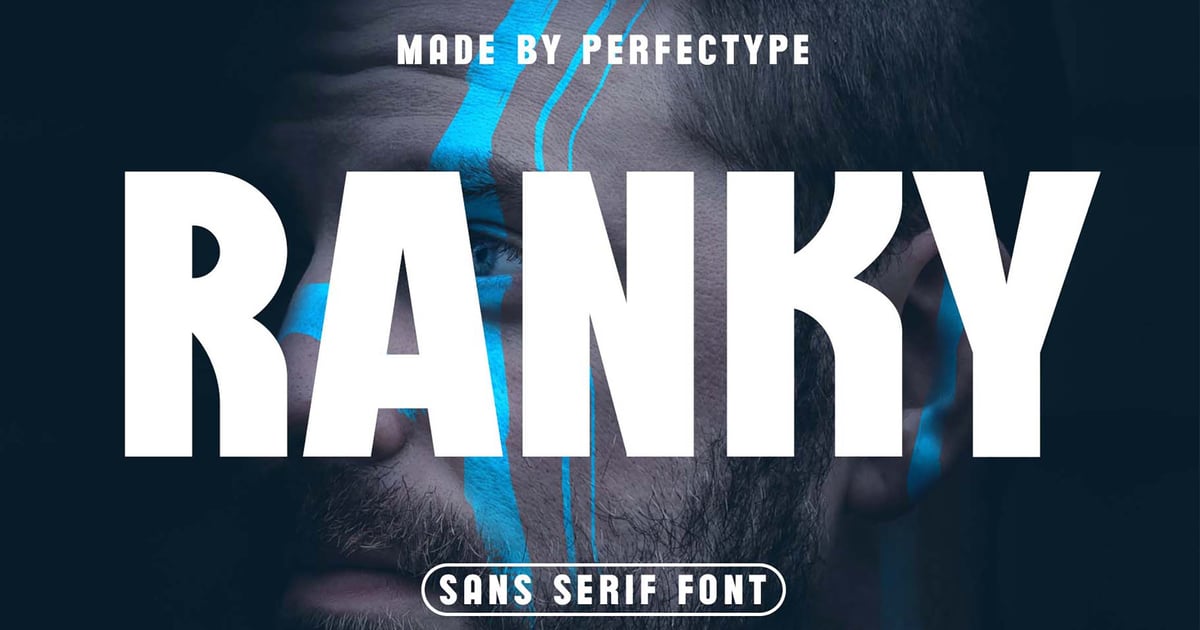
Ranky Corporate Sans Serif delivers a clean, professional aesthetic with roots in classic Swiss typography. Its balanced letterforms and generous x-height ensure excellent readability across both digital interfaces and print materials. The typeface works particularly well for business presentations, annual reports, and website headers where clarity matters most. As a font for corporate rebrand projects, it brings contemporary sophistication without sacrificing timeless appeal. The family includes multiple weights and styles, providing designers with the flexibility needed for comprehensive brand systems and editorial layouts.
Avant ique – Corporate Logo Geometric Grotesk Font
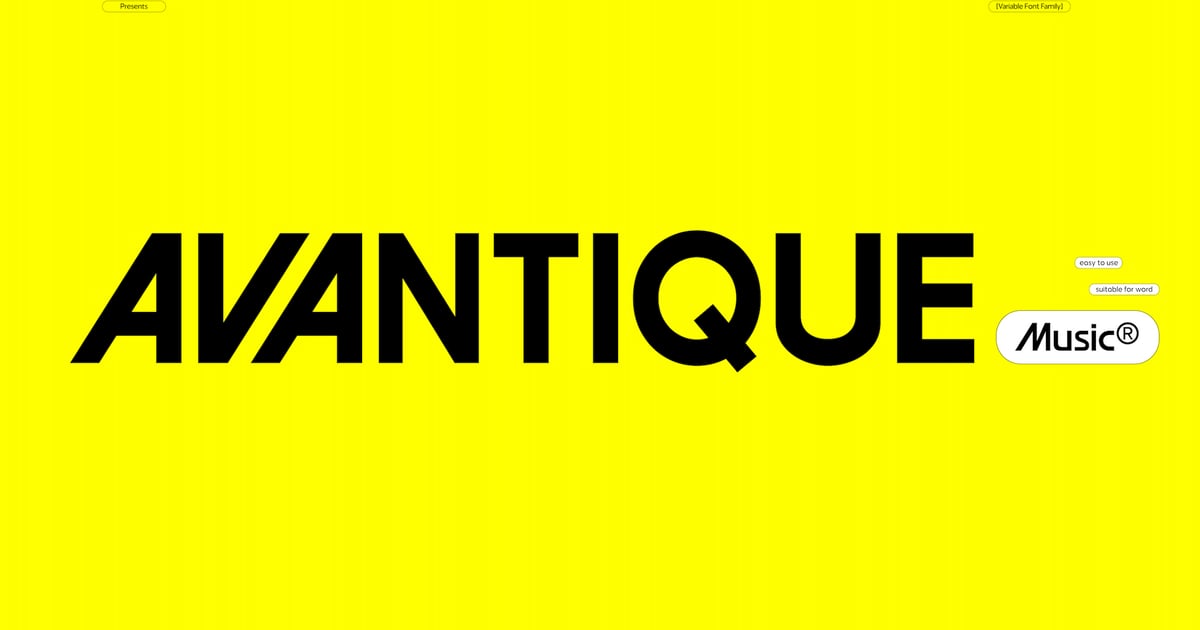
Avant ique is a geometric grotesk typeface built on precise angles and clean lines, delivering the structured clarity essential for professional identity work. Its contemporary sans-serif forms balance technical precision with approachable warmth, making it particularly effective for logo design and brand systems. As a font for corporate rebrand projects, it brings both authority and modern simplicity to the table. The design works across multiple languages and includes uppercase, lowercase, numerals, and punctuation. Files are provided in TTF and OTF formats for broad compatibility across design applications.
Rolling Out a New Brand Typeface
Updating brand fonts is the easy part on paper and the hard part in practice. Before anything ships, audit every place type currently shows up — website, app, signage, email footers, the deck templates nobody remembers making — so the new font gets tested where it will actually live, not just on a mood board. Run the new and old typefaces side by side on real materials before committing; a font that looks sharp in a logo lockup can fall apart in a paragraph of body copy. Build a transition plan, because templates, documents, and signage almost never switch overnight, and a half-updated brand looks worse than an outdated one. And before any of this gets announced internally or externally, confirm the licensing covers the full team and every use case — web embedding, app packaging, print — not just the handful of seats someone bought to mock up the pitch.
FAQ
What fonts do companies use when rebranding?
Most companies rebranding today reach for a distinctive sans serif as the primary typeface, paired with a serif or characterful secondary font for contrast. The exact choice depends on the industry — tech and consumer brands lean modern and geometric, while finance, law, and legacy institutions often keep a serif in the mix to signal trust.
How do I choose a typeface for a corporate identity?
Choosing a brand typeface starts with an honest audit of where your brand actually shows up — web, product UI, signage, print — then narrowing to families with enough weights and language support to cover all of it. From there, test finalists in real layouts, not just logo mockups, before deciding.
Should a rebrand change the brand font?
Not always. If the existing typeface still tests well and simply needs a refresh — new weights, better licensing, tighter application rules — a full replacement may be overkill. But if the font itself reads dated, generic, or limited, changing it is usually one of the highest-impact decisions in the whole rebrand.
How many fonts should a corporate brand use?
Most corporate identities work best with two typefaces: one primary font for headlines and branding moments, and one highly legible secondary font for body copy, UI, and documents. A third, more decorative option is sometimes added for specific use cases, but three is typically the ceiling before consistency starts to slip.
Final Thoughts
A typeface is one of the few brand decisions that shows up everywhere, all the time, whether anyone’s paying attention or not — the invoice, the loading screen, the sign above the door. Get it right during a rebrand and it becomes invisible in the best way: nobody notices the font, they just notice the company looks like it knows what it’s doing. Get it wrong and you’ll be having this same conversation again in eighteen months. Wherever your rebrand lands, pick something with enough range to grow past this year’s plans.
Have a favorite typeface from a recent corporate rebrand that deserves a mention? Drop it in the comments — I’m always adding to this list.