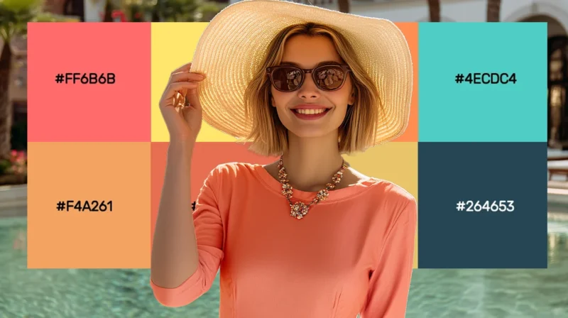
Coral’s magic lies in its perfect balance—vibrant yet sophisticated, warm yet refined. This versatile hue elevates everything from brand identities to...
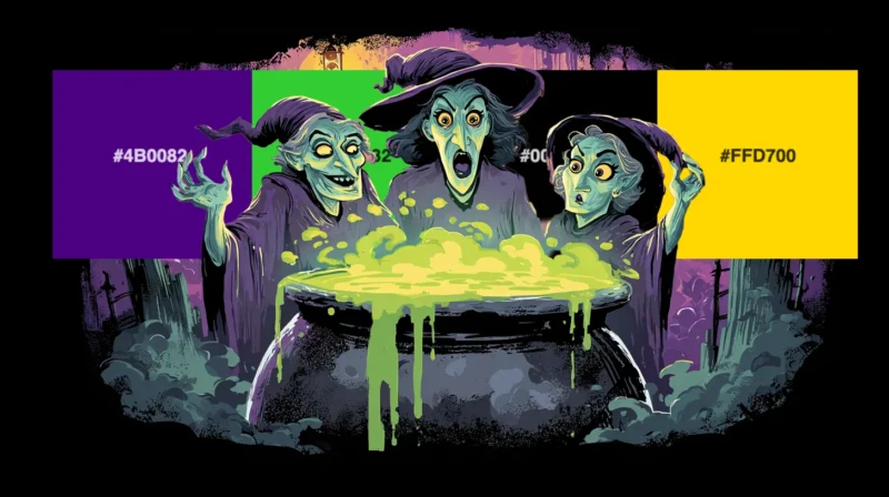
As a designer who absolutely lives for the spooky season, I can’t help but get excited when October rolls around and Halloween colors start making the...
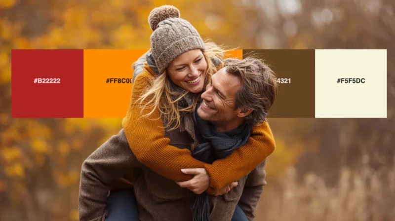
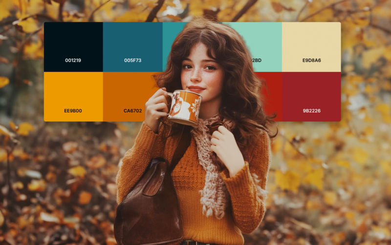
As the leaves begin to turn and the air grows crisp, I find myself completely captivated by the rich, warm hues that autumn brings. There’s something ...
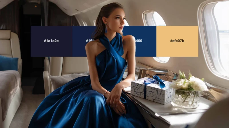
As a designer who’s worked with premium brands for over a decade, I can tell you that nothing elevates a design quite like the right luxury color pale...
There’s something absolutely magnetic about the electric energy of 1980s color schemes. The decade was unapologetically bold, mixing neon brights with...
Color has a powerful impact on the human mind. From setting moods to influencing decision-making, the psychology of color plays a significant role in ...
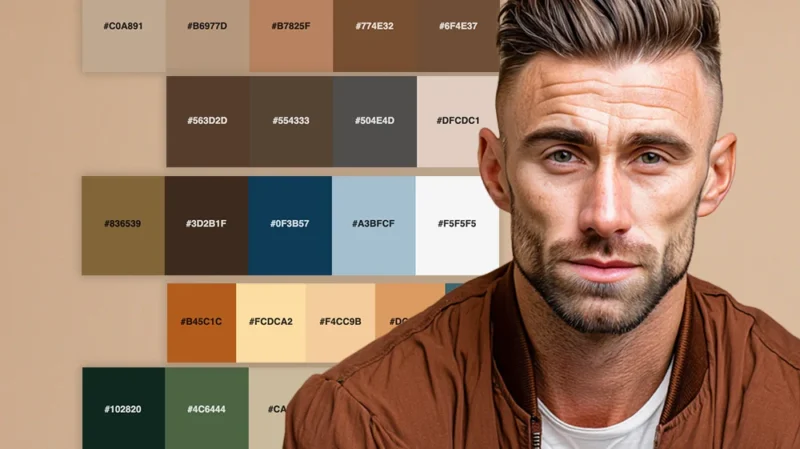
Brown might not be the flashiest color in the spectrum, but as a designer who’s worked with countless color combinations over the years, I can tell yo...
Chasing the perfect balance between impact and subtlety is not always easy. I’ve developed a deep appreciation for muted color palettes. There’s an un...
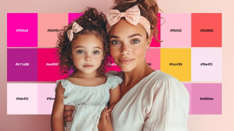
I can confidently say that pink is having its moment—and it’s not going anywhere. Far from being just a “girly” color, pink has evolved into one of th...
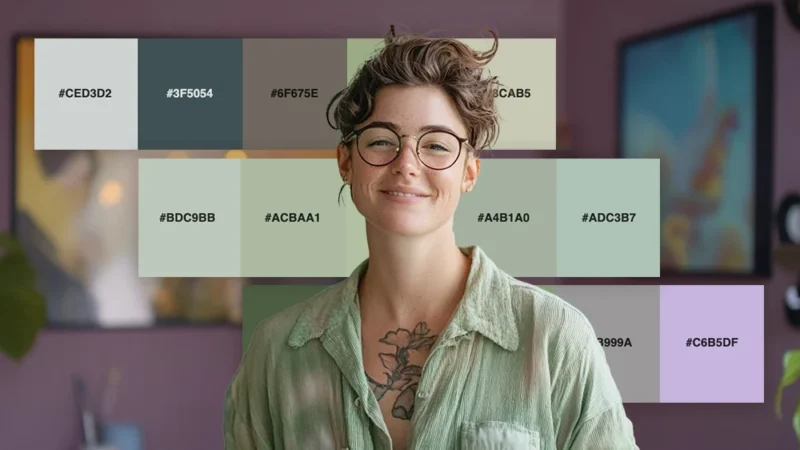
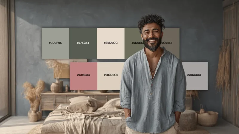
There’s something undeniably calming about sage green that makes it one of my absolute favorite colors to work with as a designer. This muted, earthy ...
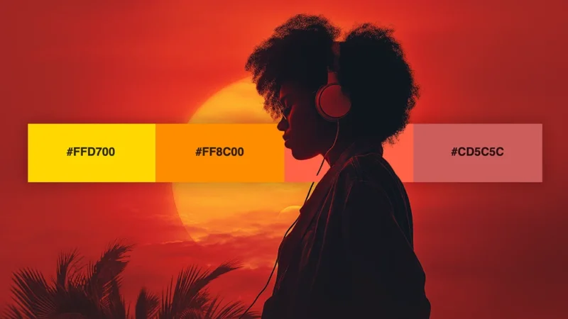
There’s something absolutely magical about watching the sun dip below the horizon, painting the sky in breathtaking hues that seem almost too beautifu...
There’s nothing quite like the embracing quality of warm colors to make a design feel inviting and alive. As someone who’s spent years working with co...
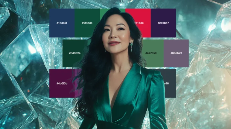
As a designer who’s always searching for color combinations that exude sophistication and richness, I find myself constantly returning to jewel tones....
There’s something undeniably captivating about the color schemes of the Roaring Twenties. As a designer with a passion for historical aesthetics, I’ve...
When I look for inspiration that balances nostalgia with timeless appeal, I always find myself drawn to the refined elegance of 1950s color schemes. T...
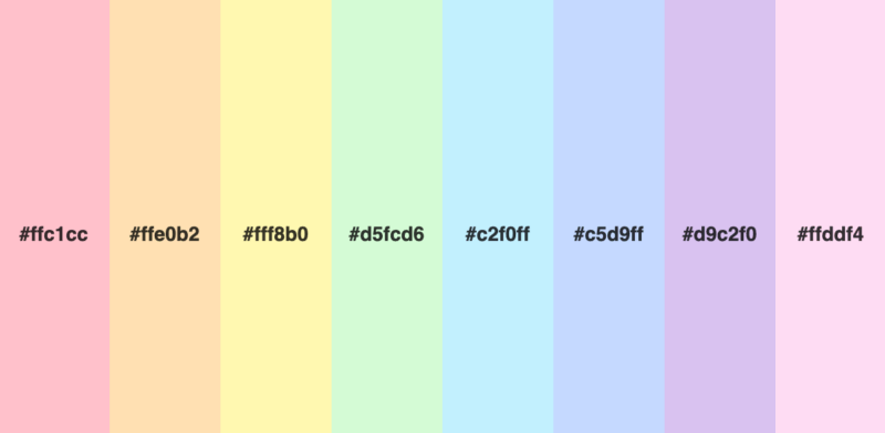
Few palettes are as universally appealing as the pastel rainbow. There’s something magical about these soft, muted versions of vibrant colors that ins...
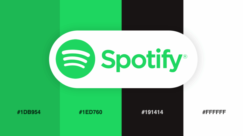
Color choice can make or break a brand’s visual impact. Few companies illustrate this principle better than Spotify, the streaming giant that has revo...
Blue is more than just a color—it’s an experience. When we encounter blue, we’re drawn to its tranquil beauty, finding ourselves unable to look away f...

Red is one of the most powerful colors in logo design. It’s bold, passionate, and impossible to ignore. I’ve spent years analyzing how brands use this...
Your brain processes color before words, making it incredibly powerful visual stimuli. If you use it strategically, you can subconsciously influence v...

In the world of User Experience (UX), every detail counts. Color is one of the most powerful tools designers can leverage. Color serves a variety of i...
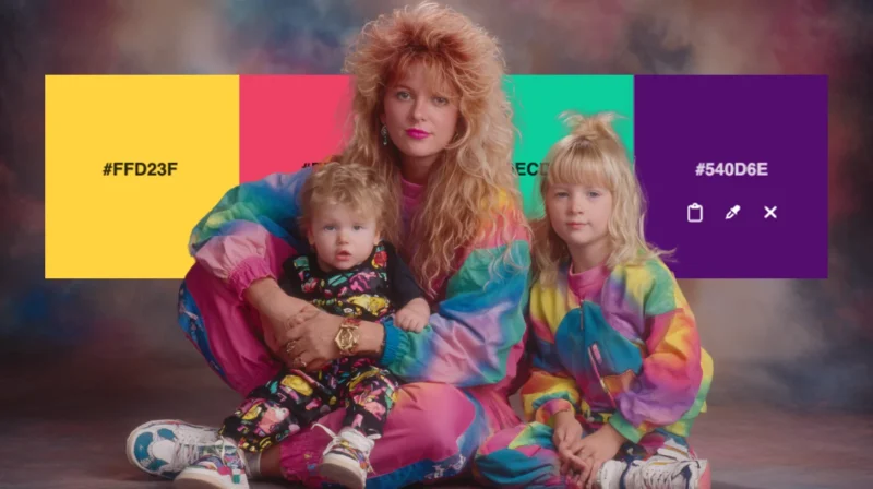
As a 90s kid turned designer, I have a special fondness for the color palettes that defined my childhood. From the vibrant hues of Nickelodeon to the ...
In the world of marketing, colors are more than just a visual element—they’re a powerful tool that can shape consumer behavior. Did you know that cert...
As a designer, I’m constantly drawn to the bold, expressive colors of the 1970s. There’s something about those vibrant hues and earthy tones that just...
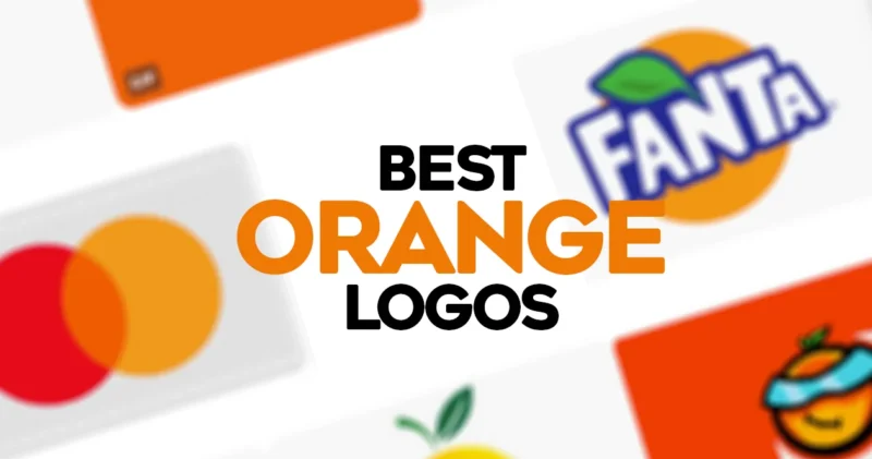
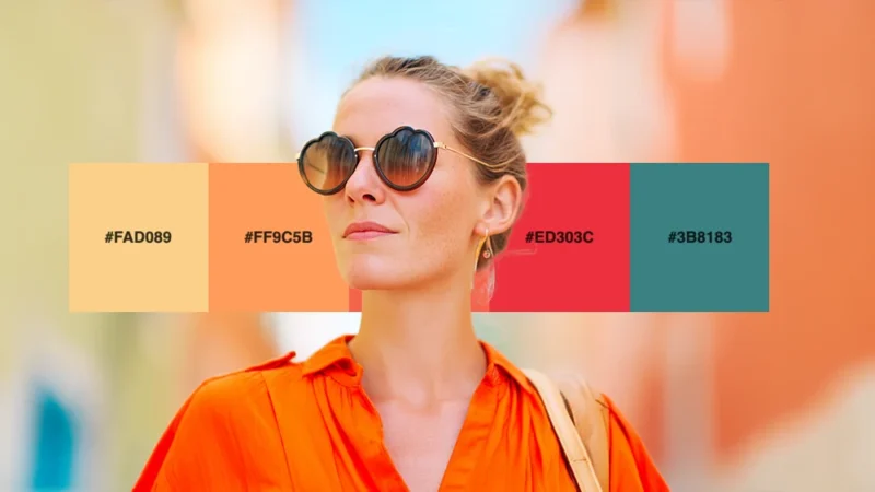
I absolutely love the color orange. It’s bold, energetic, and impossible to ignore – which makes it the perfect color for eye-catching logos. In this ...
...
...
...
...
...
Love the palette of this vintage piece. Unfortunately I don’t have any source information— if you happen to know any, please pass the info along. Edit...
I haven’t done a Color Happy post in quite awhile, but when I spotted this Springy, colorful Fossil Brand Poster I was compelled to. You can check out...
This vibrant vintage specimen was found by Jericl Cat. It originated from Canoga Park Bowl in Canoga, California. via Expresh Letters...
Sometimes I (unfortunately) temporarily forget about the amazingness that is Sheaff Ephemera. But every time it pops back onto my radar, I’m promptly ...
I love this vintage specimen found by Mikey Ashworth, which is menu card for The Beaufort Restaurant at Great Eastern Hotel in Liverpool London from 1...
For the month of August, a series of guests will be filling in on DWL with daily posts. Today’s posts come to you from designer and illustrator Alyssa...
Green Spot 1 is an original screen print by Castle. Unfortunately this piece is sold, but you can browse their available prints right here....
According to the folks over at Retrographica, this colorful advertisement was designed by Georges Lafaye and featured in the July 1961 issue of French...
A bright summery specimen from Art of the Luggage Label....
I’m loving the pale, soothing palette found in this image by L’hort de la Lolo....
Loving the beautiful shades of peachy pink in this image by Cassia Beck....
I know literally nothing about Pokemon (and I may be completely wrong), but apparently this illustration depicts a creature called Charmeleon. Even th...
Such an eye-catching palette in this poster by Astronaut Design....
This illustration is an excerpt from Noisy Book, a vintage children’s story by Margaret Wise Brown & Leonard Weisgard, which was discovered and catalo...
This muted vintage specimen was discovered by Tom Schifanella from Art of the Luggage Label, one of my favorite Flickr users....
Another awesome vintage album cover from Project Thirty-Three....
This minty vintage specimen was discovered and photographed by Bravo Six Niner Delta in March 2011. The stamps are from the late 1960s and were found ...
“Poppy stalking” by heavenly~flower....
A beautiful piece by Andrew Bannecker....
Yet another lovely pattern from the always awesome Helen Dardik. Follow her blog for more....
Loulou and Tummie always produce colorful, vibrant pieces, so they’re a great resource for color palette inspiration. Today this this city art print c...
Images like this one by twodolla remind me why the Neon Boneyard is on my future “must visit” list....
A beautiful DIY nest and eggs, created and photographed by Maria Kallin....
I’m loving this image from illustrator Paul Thurlby developed a series of alphabet illustrations, which was created to promote the series. You can bu...
Here is yet another lovely vintage matchbook label, this time found in the stream of Shailesh Chavda. Check out more from his collection right here....
This vibrant, colorful architecture was captured by Matthias Heiderich....
Jacqui Lee created this lovely illustration for the Postcards to Alphaville project....
The muted, natural palette found in this lovely photo by Lisa Rupp is pretty much the exact opposite of the palettes I’m usually drawn to. But every o...
Loving this palette of primary colors plus neutrals found on these Czech matchbox labels from Kindra Murphy’s Flickr stream....
I can’t get enough of the color palette from this album cover found via Project Thirty-Three....