Matt Luckhurst: Advertising Women of New York Identity
I’m loving this dynamic identity that Matt Luckhurst created for the Advertising Women of New York organization.
I’m loving this dynamic identity that Matt Luckhurst created for the Advertising Women of New York organization.
Even though I’ve never had a chance to visit, I’ve always loved the identity for Flora Grubb Gardens. So I was pleasantly surprised to stumble upon it on the new website of the original designer, Volume.
London-based studio The Plant recently developed this spirited design work for Union Jacks, Jamie Oliver’s newest restaurant chain. They took an interesting approach to the identity and collateral development: Our concept for the branding of the new chain is equally as challenging.…
Love this minimal, geometric identity designed by Studio Brave for interior designer Christopher Elliott.
Two Arms recently created these beautiful typographic business cards for Expert Americana Tattooing, a Brooklyn-based tattoo artist.
Orlando, Florida based design studio Push recently completed a rebrand for Old Chicago, a national restaurant chain with a pizza, pasta and beer menu. Push’s heavily research-based approach resulted in a new brand language, hierarchy and positioning, which then encompassed…
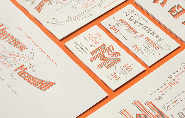
Couldn’t resist also posting this beautiful stationery system that Kevin Cantrell designed for the Law Office of Matthew Messina. I’m loving the intricate details and vintage-inspired typography.
Love this playful identity for Blue Marble Ice Cream by Gabriele Wilson Design.
A fun, vintage-inspired identity by Florida-based studio Hatchet Design for Cask & Larder, a local restaurant. via Art of the Menu
I’m loving the friendly, laid-back identity that New Zealand-based Hardhat Design developed for Coffee Supreme, a local chain. via Best Awards
I can’t get enough of the gold foil inline type on these pieces for Mabe by Australian studio Band.
Sometimes all you need is a black and white geometric pattern. Or twenty. See the rest of Maddison Graphic’s new stationery right here. via Present and Correct Pinterest
This vintage letterhead is amazingly over-the-top. What makes it even more incredible is that it was created for Chung Ling Soo, who was an American magician (Chung Ling Soo was a stage name) who is unfortunately best known for his…
If you’re any sort of Brad Goreski fan (as am I) you must agree how incredibly perfect these sophisticated yet playful calling cards are for him. Well played, Sarah Drake Design. Well played. via OK Paper
While I don’t have a specific fear of snakes, I can’t say I particularly like them either. Still I couldn’t resist posting this excellent identity by J Fletcher for Fenwick Pythons, a business that “promotes the hobby and captive breeding…
A beautifully sophisticated identity by Hovard Design for Creel and Gow, an Upper East Side boutique. I can’t get enough of their signature persimmon color.
I love this clever identity by Ascender for Megan Sheerin, a corporate communications consultant.
I love the bold, minimal design for Furlined, an L.A.-based film production company, by Blok Design: Working with the company’s founder and senior executive team, we defined the brand as a starting point for thought, for ideas, and for questioning. The…