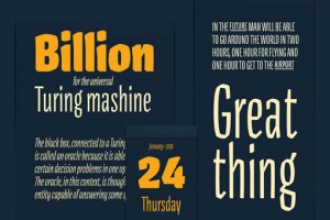
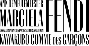
I’m currently loving Gigalypse, a new chunky square sans serif from Dunwich Type Founders....
I’ve had my eye on Steinweiss Script for awhile, a typeface that was originally developed as cover lettering for a Taschen edition on the work of Alex...
Frost* Design recently put their stamp on the new library at Stanmore Public School, located in Sydney, Australia, through the use of bright, colorful...
Luella is a whimsical, vintage-inspired, hand-drawn font by Cultivated Mind. Pick it up at You Work for Them....
Type Together makes so many great workhorse typefaces, both serif and sans serif, that can work for an incredibly wide range of applications. I would ...
For the month of August, a series of guests will be filling in on DWL with daily posts. Today’s posts come to you from Brad Surcey of Zeus Jones. For ...
For the month of August, a series of guests will be filling in on DWL with daily posts. Today’s posts come to you from Jason Johnson who fights the go...
For the month of August, a series of guests will be filling in on DWL with daily posts. Today’s posts come to you from Jason Johnson who fights the go...
For the month of August, a series of guests will be filling in on DWL with daily posts. Today’s posts come to you from Jason Johnson who fights the go...
For the month of August, a series of guests will be filling in on DWL with daily posts. Today’s posts come to you from Diane Faye Zerr of Faye & Co. ...
For the month of August, a series of guest posters will be filling in on DWL with daily posts. Today’s posts come to you from Dylan Haigh, of Haigh & ...
iamalwayshungry (IAHH) is a New Orleans-based studio founded by Nessim Higson in 2005. I first discovered (and became a fan of) the studio’s work way ...

I’m really impressed with the work of the 2012 graduates of the Type and Media program at The Royal Academy of Art in The Netherlands. Here are a few ...
I’m super inspired by Andrei Robu‘s lettering and typography work, examples of which you can see below. For more from Andrei, be sure to check out his...

You may not know the name Jesse Ragan, but you certainly know his typefaces. Since his graduation from RISD in 2001 he’s contributed to many HF&J favo...
As a self-initiated project, London-based studio Two Times Elliott developed a series of printed type specimens. This one in particular, features one ...
I’m loving Long Story Short, a project by Archie McLeish which typographically renders common digital speak acronyms in a decidedly non-digital style....
Here is some gorgeous dimensional tpographic work by Jordan Metcalf for Nike Create the Future: At the end of 2011 I was asked to pitch on the identi...
Steven Bonner (whose blog features some great typographic and designy finds) has some really impressive typography and lettering in his portfolio. Bel...
Laudon is the Swedish type design studio of Carolina Laudon, focused on typography, type design and type education. Here’s a small sampling of the typ...
These illustrative numbers by Iglika Kodjakova are super fun. via Typography Served...
Below you will see a selection of Tom Davie‘s stellar typographic posters from 2011. Yesterday Tom actually kicked off a giveaway via his Facebook pag...
1985 is a new typographic experiment by Jan Avendano. Prints are available right here—would make a great gift for someone born that year. ...
This gorgeous packaging was conceptualized, designed and illustrated by Simon Frous for Jamaica Blue Premium Coffee. Based on the island’s close proxi...
These beautiful lettering snippets were created by Saranna Drury. More here. via Typeverything...
I’m loving the playful, geometric forms found in this (clearly labor intensive) typographic project by Geetika Alok for Wolff Olins. Check out the vid...
I have been a fan of the Lost Type Co-op since it opened its doors. So I’m pleased to announce that as of this morning they have launched a brand new ...
Citizens for Optimism is a collaboration among 17 up and coming designers who strive to use their unique styles to inspire happiness through design. O...
I can’t get enough of Martin O’Neill’s mixed media, and largely typographic, collage and art work. Check out a whole lot more here, and pick up prints...
Awhile back I briefly mentioned the Area Code Project, Mike McQuade’s ongoing project whose mission is to catalog all of the area codes in the United ...
For a solo show in Johannesburg, South Africa, Jordan Metcalf created Pictures | Words, a “range of type and image based pieces in various mediums inc...
Alfonso is a typeface that was developed by Mark McCormick during his time in the type@cooper program. It’s not yet available for purchase, but as soo...
This colorful, typographic branding for Core of Discovery is right up my alley. Designed by Travis Brown while at TOKY, the program was intended to in...
Check out this awesome typographic mural that Bryan Patrick Todd designed to adorn a building in the Highlands, a popular neighborhood in Louisville, ...
This vintage record jacket was found at the always-awesome Project Thirty Three....
I recently caught a glimpse of DSType’s Braga, via Typophile and since then I have been anxiously awaiting its release. Well, now the wait is over—thi...
For Dominique Falla’s contribution to this year’s Positive Posters competition, she designed We are all a Part of the Same Thing, an amazing, typograp...
Zoo is a show curated by the husband and wife team of Jacqui Oakley and Jamie Lawson, which featured “a collection of smaller paintings and artifacts ...
This flexible, three-dimensional typeface was created by Studio8 for Wired. Fingers crossed that some day down the line they offer it up for public co...
Sean Freeman—who is represented by Levine/Leavitt—is producing some truly inspiring work. This piece for The Decemberists grabbed me immediately, and ...
Grizzly Bear is another fun display typeface from Match & Kerosene. The family includes twelve titling fonts in styles that range from inline to shado...
Brera and Solferino are are two new type families designed exclusively for the Italian newspaper, Corriere della Sera. They were designed by Leftloft ...
I’m loving Paris-based Dépli‘s beautiful work for the Musée de la danse, which includes a custom typeface, signage and collateral....
Textaxis has created a ton of amazing proprietary typefaces for their clients. Unfortunately none are currently available for sale, but they have plan...
This post has been removed at the request of the author....
ok Mitch studio specializes in custom and hand-painted murals and signage. Their work is great across the board, but I’m particularly loving with the ...
Not sure why it took me so long to discover Six Word Story Every Day, “a daily storytelling exploration through language and typography”, but it’s bee...
“Nikaia is a squarish sans serif with an additional script weight.” Designed by Miller Type Foundry, the family features five weights and italics in a...
Awhile back I posted about the EF Destinations Live the Language video series, which featured the typographic stylings of Albin Holmqvist. Since then,...
I’m really admiring the beautiful typography in this identity for Arte y Mecenago by Mucho, which from what I gather, is a Spanish arts organization. ...
Keith Scharwath created these hand-painted signs of his favorite “disposable communications” for a recent show at Parlor Gallery in Asbury Park, NJ. Y...
Agile, a quirky sans serif designed by Edgar Walthert, is now available at Village. I’m thinking this one will definitely be part of my next big type ...
I’ve been catching snippets of The Lost Type Co-Op on Dribbble the last couple of months so I am thrilled to see the site finally launch today. Here’s...
A little while back we spent a rainy Saturday at the Museum of Natural History here in New York. I had never been so I was excited to explore the cave...
FF Spinoza is an “elegant workhorse” that was designed by Max Phillips over a period of 11 years. Images via Behance...
I’m really excited about Project Neon, Kirsten Hively‘s attempt to document and map all of New York’s best neon signs. Each week she’ll visit a new lo...
Robert Montgomery creates large-scale, typographic works of art, in a “poetic and melancholic post-Situationist tradition.” View more of his work righ...
Kinney is a 6 weight, 12 font family by Terminal Design, whose aim is to be a great “neutral serif.” If you ask me, I’d say it definitely fits the bil...
I recently came across the work of Bianca Chang in this month’s O Magazine. (By the way, I have to say I’m consistently impressed by the caliber and d...
Periódico, which means newspaper in Spanish, is a serif typeface from Emtype. Originally commissioned by the Spanish daily newspaper ‘ABC’, and inspir...