

In this article:
- Decision-Focused Design Makes Uncertainty Feel Manageable
- Visual Consistency Creates an Immediate Sense of Credibility
- Visible Proof Reduces Doubt Behind the First Impression
- Familiar Design Patterns Make New Brands Feel Safer
- Transparent Information Architecture Signals Competence
- Verifiable Details Turn Technical Authority Into Trust
- Final Thoughts
Trust often starts before a customer reads a headline, explores a product, or speaks to a sales team. A brand’s visual identity shapes that first judgment within seconds, giving designers a direct role in how audiences perceive credibility, quality, and professionalism. Typography, layout, and consistency all contribute to that response.
As designers, we obsess over these details. We kern letters and tweak shapes because we know design speaks before words do.
We also know there’s a deeper layer we rarely discuss in the studio – the psychology behind why certain layouts feel safe, why specific elements trigger loyalty, and why clear messaging builds instant authority.
This article unpacks the science of trust in brand design. The principles ahead give you a practical framework you can use on your next project.
Decision-Focused Design Makes Uncertainty Feel Manageable
When brand design reflects the way customers actually make choices, trust begins to accumulate.
Categorization, guided discovery, relevant imagery, and descriptive storytelling reduce cognitive load and help customers feel more confident navigating unfamiliar options. When someone faces a complex decision, they look for structure. They want signposts, not walls of information.
Design that anticipates those moments and leads visitors through them with clarity earns trust because it respects the visitor’s mental state.

Get 300+ Fonts for FREE
Enter your email to download our 100% free "Font Lover's Bundle". For commercial & personal use. No royalties. No fees. No attribution. 100% free to use anywhere.
To implement this:
- Map the decision points your customers face.
- Break complex offers into clear categories with descriptive, human labels rather than jargon.
- Use imagery that shows outcomes, not just products.
- Write short, scenario-based copy that helps visitors picture themselves using what you offer.
- Build guided flows (quizzes, filters, or step-by-step selectors) that narrow options based on stated preferences.
- Test these flows with real users and watch where they drop off or hesitate.
- Simplify those moments. Every unnecessary question you eliminate reduces friction and uncertainty.
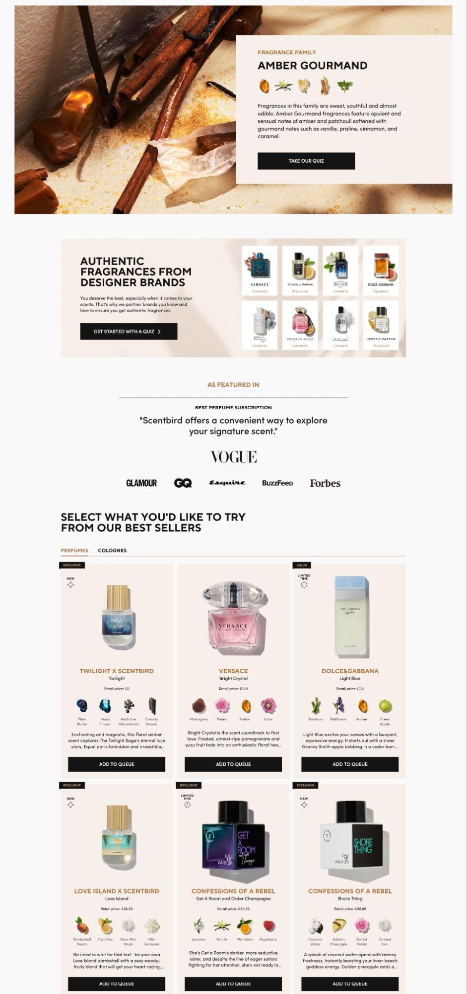
A brand that illustrates this approach well is Scentbird, a fragrance subscription service. Their website combines designer-brand imagery with fragrance-family storytelling to make subjective scent discovery feel curated and approachable.
Visitors can discover their scent family rather than confronting an alphabetical list of hundreds of perfumes. Rich visuals pair with narrative descriptions like “warm and inviting” or “fresh and energizing,” turning an overwhelming category into a personal journey.
For designers, artists, and typographers offering services, the same framework applies:
- A portfolio site can guide visitors by project type, industry, or creative challenge solved rather than dumping every piece into a single grid.
- A typography foundry can help buyers discover fonts by voice, application, or mood rather than scrolling through endless specimens.
- A design agency can structure case studies around the business problem first, then reveal the creative solution.
When you design for how people decide, uncertainty shrinks and trust grows.

Source: scentbird.com
Visual Consistency Creates an Immediate Sense of Credibility
A visitor doesn’t need to study a brand guide to notice when a brand has one. Visual consistency creates a sense of order almost instantly.
Typography, color, imagery, spacing, buttons, and layouts should feel like parts of the same system. When they do, people can process the experience with less effort and form a clearer opinion of the business.
Recent Storyblok research found that 73% of shoppers are less likely to buy from brands that feel inconsistent across touchpoints.
For designers, the practical lesson is simple:
- Define the rules before adding the personality.
- Choose a core type system, a controlled color palette, repeatable spacing principles, and a clear image direction.
- Build reusable components so those decisions hold up across web pages, social posts, packaging, and campaigns.
- A useful test is to place your homepage beside three recent campaigns and blur the copy. If the brand still looks unmistakably the same, your visual system is doing its job.
- Then review the brand as a customer would. Look for shifts in type, scale, color, tone, or interaction that feel accidental.
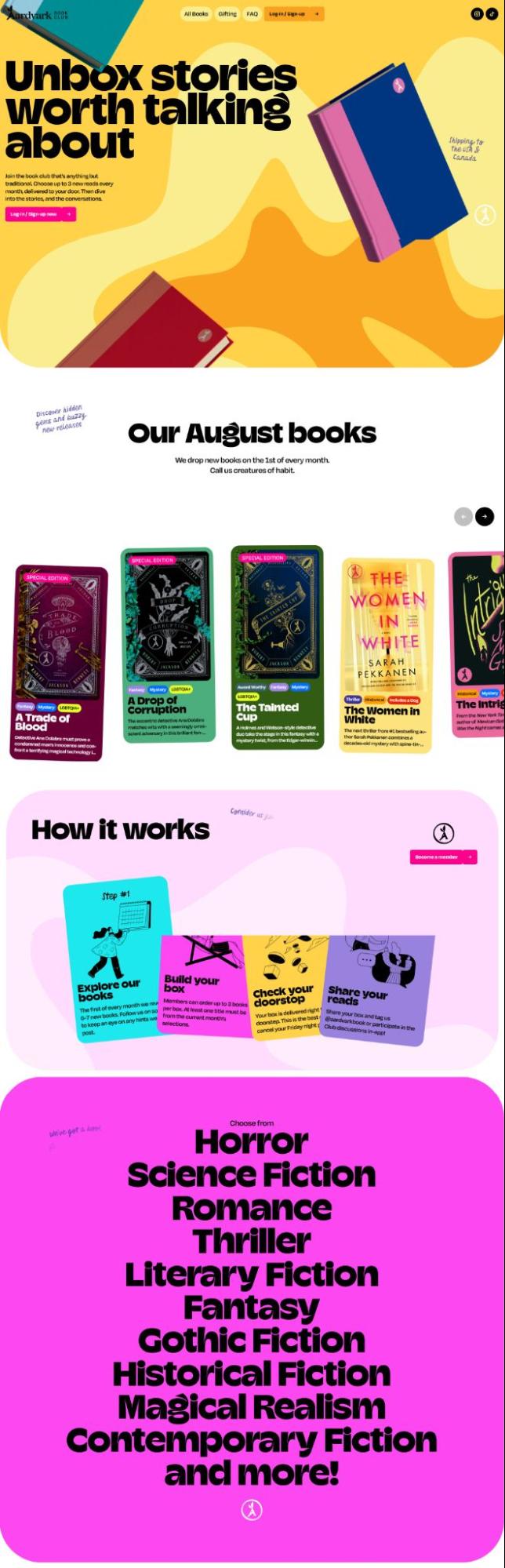
An example here is Aardvark Book Club, a monthly subscription service that targets readers who want curated hardcover fiction across genres. They show how consistency can carry a distinctive personality.
Their website uses pastel colors, playful graphic details, quirky typography, animated elements, parallax, popups, and fluid transitions. The typefaces can change between sections, yet the choices still belong to the same expressive visual language. Swirls, rich colors, 3D touches, and unexpected movements reinforce that identity throughout the experience.
Those effects could feel distracting for a financial firm or law practice. For Aardvark, they communicate the brand’s playful, curious attitude with remarkable clarity. Consistency gives the eccentricity structure, which helps the experience feel deliberate by design.

Source: aardvarkbookclub.com
Visible Proof Reduces Doubt Behind the First Impression
A polished visual identity earns attention, but proof gives that attention a reason to turn into trust. When visitors see recognizable associations, concrete product details, client logos, reviews, certifications, or process information, they have evidence to test the claims a brand makes.
For instance, research proves that authentic video testimonials can increase conversions by up to 68% when placed near decision points.
The design challenge is making trust signals easy to notice at the moments when uncertainty appears.
To apply this principle:
- List the claims your brand needs customers to believe.
- Then pair each claim with visible evidence.
- Show client names beside relevant work, explain your process near the service it supports, and place testimonials close to forms, pricing, or key CTAs.
- Keep proof specific and easy to scan.
- Use headings, logos, numbers, captions, and short quotes to create a clear hierarchy.
- Avoid pushing every credibility signal into one crowded section.
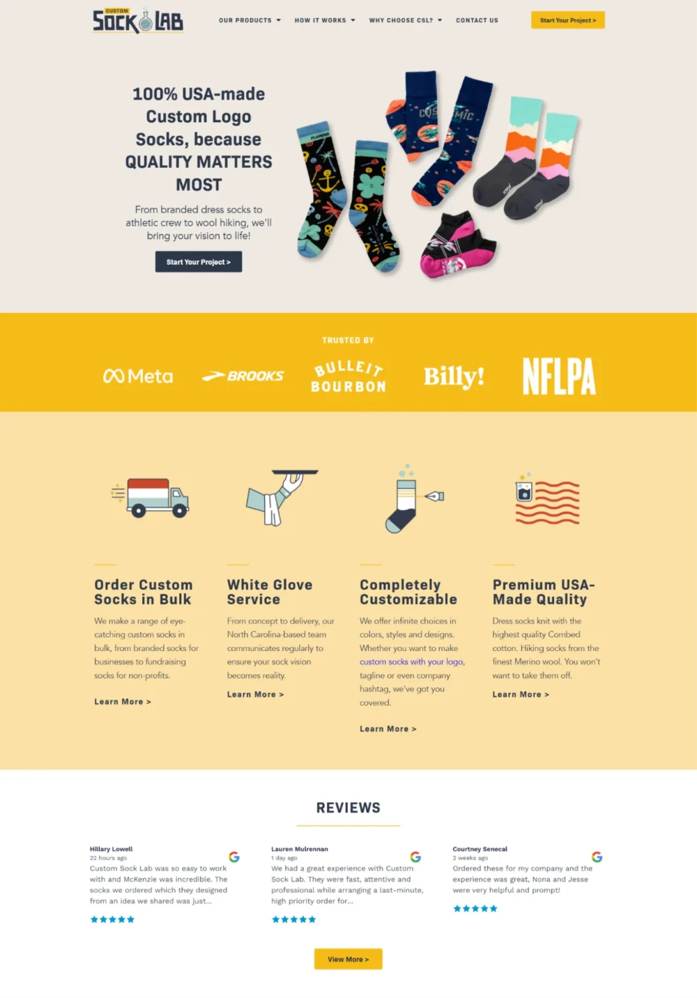
Custom Sock Lab puts this approach to work. The company makes custom socks for businesses, teams, events, and personal projects, with a strong focus on USA-made production.
Its homepage makes that promise highly visible, supporting it with information about its manufacturing process and visual references to American production. Client logos reinforce familiarity, while customer testimonials provide direct evidence from buyers.
These proof points appear throughout the page, so reassurance stays close to the claims and decisions they support. That sequence keeps credibility visible during browsing instead of asking visitors to hunt for reassurance elsewhere.
Design, art, and typography studios can use the same structure. A studio can place a client logo beside a relevant project, show a testimonial near its inquiry form, or explain its production workflow beside the service description.
So, make your strongest claims, then put credible evidence where customers naturally question them.
Source: customsocklab.com
Familiar Design Patterns Make New Brands Feel Safer
Trust grows faster when people know how to use an interface. Recognizable navigation, familiar buttons, clear CTAs, and predictable page structures reduce the mental effort needed to understand what happens next. Visitors can focus on the message instead of decoding the interface.
Familiar visual cues also create a sense of control, which matters when someone encounters a younger or less established brand for the first time.
To implement this:
- Keep the interaction model familiar while giving the brand its own visual character.
- Use standard navigation patterns, place key actions where users expect them, and label CTAs according to their purpose.
- Keep menus, forms, cards, and content sections consistent across pages.
- Test the interface with someone who hasn’t seen the site before and watch where they hesitate. Those moments usually point to unnecessary complexity.
- Save experimentation for elements that don’t interfere with basic orientation, such as illustration style, motion, typography, or decorative details.
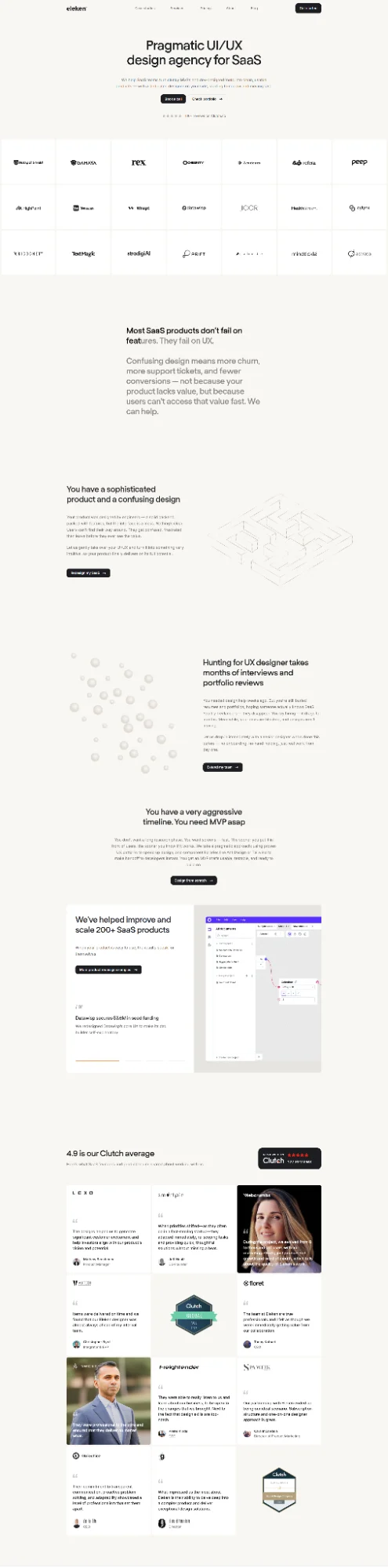
Eleken is a strong example of this aspect. The agency specializes in UI/UX design for SaaS companies, so its website reflects the same priorities its clients expect from digital products – clarity, usability, and easy scanning.
Its design uses generous whitespace, bold typography, simple color accents, and an orderly content structure. Subtle scrolling effects and restrained animations add character without disrupting familiar browsing patterns.
Wide margins and comfortable line spacing keep longer passages readable, while focused text wrapping helps the layout adapt to smaller screens. Navigation remains straightforward, and each section follows a clear visual hierarchy that tells visitors where to look and what to do next.
That balance gives Eleken a distinctive presence without turning the interface into a puzzle. The site feels polished because the branding adds personality around established interaction patterns, rather than forcing users to relearn how a website works.

Source: eleken.co
Transparent Information Architecture Signals Competence
Visitors judge credibility not only by visual aesthetics but also by how easily they can find and understand important information. This matters particularly for expensive, technical, or high-consideration purchases, where uncertainty can make customers cautious from the outset.
Clear navigation, buying guidance, specifications, comparisons, and logical information hierarchy communicate competence and openness. When someone arrives ready to spend significant money or commit serious time, they bring questions.
A brand that answers those questions before they are asked signals that it knows its business and respects the visitor’s intelligence.
To implement this:
- List the top ten questions your customers ask before buying.
- Structure your navigation and page hierarchy so those answers sit within two clicks of the homepage.
- Use plain language in headings and subheadings so visitors can scan for relevance.
- Build comparison tables, specification sheets, or FAQ sections that anticipate objections.
- Add progress indicators or guided paths for multi-step decisions.
- Test with users who match your target audience and watch where they hunt for information. Those hunt moments reveal gaps in your architecture. Fill them.
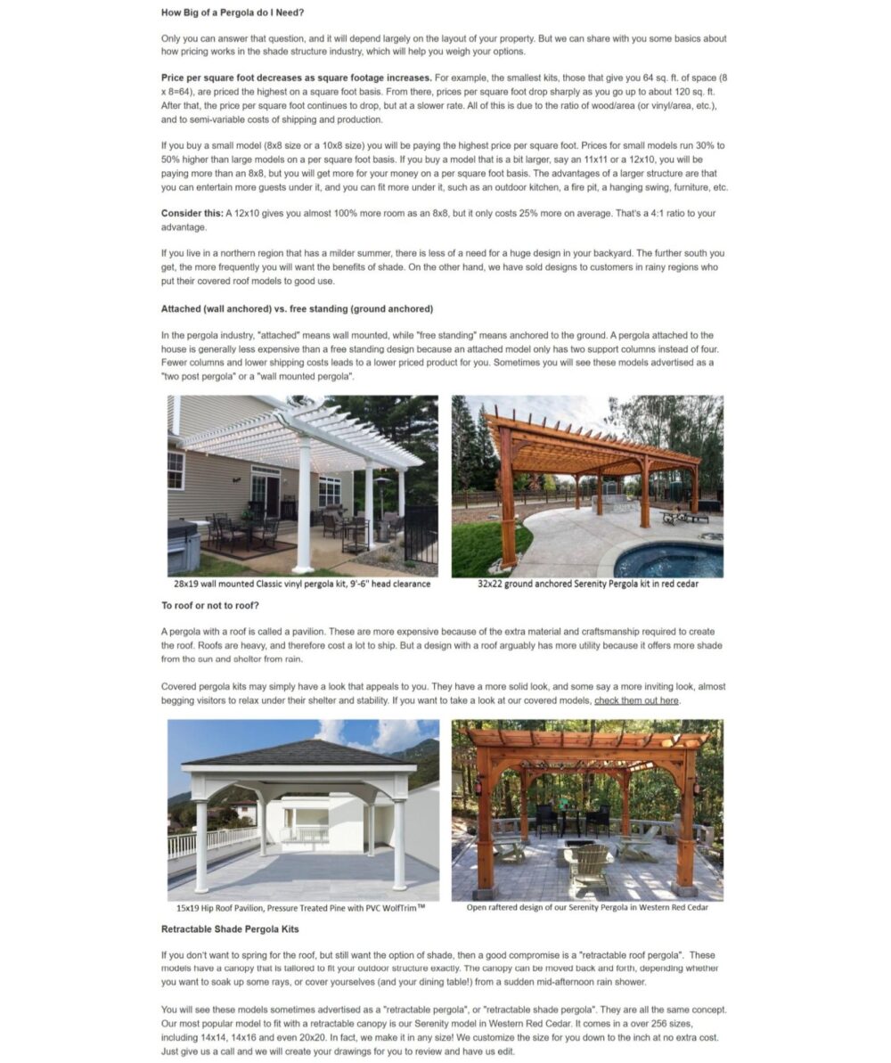
Pergola Kits USA, a company selling pergolas and patio kits, demonstrates this with precision. Throughout their website, they use technical buying guidance to make complex, high-cost purchases feel more transparent.
Carefully edited, highly descriptive text walks buyers through material choices, sizing considerations, and assembly expectations. Representative images complement the descriptions so visitors can visualize the outcome alongside the details.
Designers, artists, and typographers can apply the same approach:
- A design agency can publish clear process pages that explain timelines, deliverables, and revision rounds before a prospect ever emails.
- A typographer can offer detailed licensing guidance, character set specifications, and supported languages upfront.
- An illustrator can outline usage rights, turnaround times, and file formats in plain sight.
When information is easy to find and easy to trust, competence speaks for itself.

Source: pergolakitsusa.com
Verifiable Details Turn Technical Authority Into Trust
Brands operating in scientific, technical, health-oriented, or otherwise expertise-driven categories can use design to communicate authority without relying on vague claims.
There’s a psychological difference between simply appearing authoritative and supporting that appearance with specific standards, testing information, methodologies, or other verifiable details. Aligning visual identity with accessible evidence helps customers reconcile an immediate impression of expertise with reasons to trust it.
Authority without proof is posture. Authority with proof is confidence that transfers to the visitor.
To implement this:
- Identify the claims your industry expects you to back up.
- Replace sweeping statements with precise ones.
- Show testing protocols, cite standards, name methodologies, and link to source material where appropriate.
- Design these details into the visual flow rather than burying them in footnotes.
- Use clean tables, labeled diagrams, or expandable sections that let curious visitors dig deeper without overwhelming casual browsers.
- Maintain a clean, focused aesthetic that keeps the evidence easy to evaluate.
- Avoid decorative fluff that competes with the evidence.
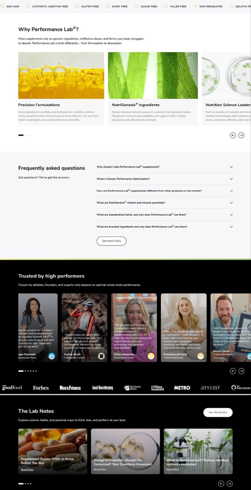
A brand that executes this with discipline is Performance Lab, a nutritional supplements brand. Their website design features strategically placed science-led visual positioning with ingredient standards, third-party testing, and formulation transparency.
Visitors encounter specific dosages, bioavailability explanations, and certification badges woven into the product experience rather than hidden in a separate tab. The design feels clinical yet accessible, matching the brand’s promise of clean, research-backed nutrition.
The same principle holds for design professionals:
- A design agency can publish case studies that detail the research methods, user testing protocols, and measurable outcomes behind each project.
- An illustrator can document their creative process with sketches, reference materials, and revision rationale.
- A typographer can share the technical specifications, hinting strategies, and rendering tests that validate their fonts across platforms.
When expertise is visible and verifiable, trust follows naturally.

Source: performancelab.com
Final Thoughts
The thing about trust is that you can’t fake it with a trendy gradient or a well-placed serif. It builds up from a hundred small decisions, and it collapses when one of them feels off.
If you take one idea from this article, let it be this. The examples we looked at prove there’s no single formula. What connects them is care. Every element earns its place. Nothing is there by accident.
So here’s your homework. Pick one project you’re working on right now. Ask yourself where a visitor might feel uncertain, confused, or skeptical. Then fix that spot with design, not with more words.
Do that enough times, and trust stops being something you hope for. It becomes something you build.