This week is Valentine’s Day. What better way to indulge in this manufactured holiday than to share our love of all things digital and talk about a few of 2014’s hottest apps? From re-imagining the news feed, to the quantified life, or the redesign of the infernal calendar, these apps are leading the way in terms of minimal user interface and maximizing human gestures. If this is where UI design is going, 2014 is going to be very fun for designers.
Paper
Last week Facebook introduced their latest app, Paper. Leaving aside the fact that there is already an amazing app called Paper, Facebook is using this app to reinvent their news feed in a beautiful new interface. The app takes the content from your feed then enables you to customize the content to your personal interests.
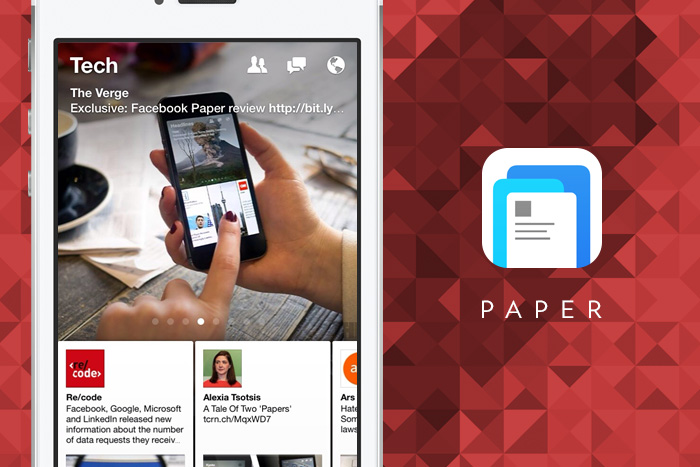
The app basically takes the status update to a new logical conclusion—everything is a story. Now, assuming we all live in that world, will users be able generate content that doesn’t look ridiculous in this format? Like kryptonite to mediocre, when everything is a story, and everyone is now a publisher, some of your friends are going to get unfollowed, rather quickly. As Matt Buchanan of The New Yorker put it, “Paper is, in other words, a slower, more deliberate way to browse Facebook. It might seem, in some ways, that the stream has been simply turned on its side. But the atomic unit of the card forces you to reckon with each piece of content for at least a moment before you flick past it, preventing it all from bleeding together into a single mind-numbing ribbon.”
Not only is this better than any other app Facebook has introduced—well aside from Instagram—it also borrows its design heavily from other digital-first publications and news reader apps, namely Flipboard. It’s so good that you wonder how it came from Facebook at all—until you learn that Loren Brichter, the creator of the elegantly addictive Letterpress, was onboard to help. From a design perspective, it’s the lack of design that is most incredible—the app uses more gestures and less buttons to encourage interactivity without getting in the way of the story itself.
Reporter
Meanwhile, former Facebook alum and Timeline designer, Nicholas Felton released Reporter, a new app designed to measure your life. Felton, of course, is the designer who since 2005 has been measuring his life, and then documenting it in stunning infographics and annual reports. Documents so stunning that he regularly spends up to 80 hours a year collecting data, and also sells printed copies. Last years edition of 2500 copies is sold out.

Get 300+ Fonts for FREE
Enter your email to download our 100% free "Font Lover's Bundle". For commercial & personal use. No royalties. No fees. No attribution. 100% free to use anywhere.
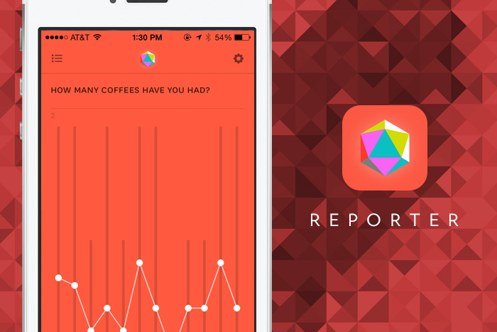
The website suggests the app is designed “for understanding the things you care about.” The Life Tracking app, based on a custom version Felton used for himself, simply pings the user a couple of times a day and quizzes them, to create a set of data and ridiculously stunning visualizations, charts and graphs. In an effort to keep the data mining and interaction to a minimum there isn’t any endless scrolling or constant engagement—a simple user interface, in customizable color scheme. ”We want you to record as quickly as possible—in 10 seconds or less—what’s important to you,” Felton told Fast Co. Design, “then get back to walking, talking, hanging out, and living your life.”
Peek
And finally, there is Peek. Now if you browse the iTunes store you notice that three types of apps appear more often than many others: to do lists, weather apps, and calendar apps. Peek is in the later category; something that interfaces into your existing calendars and just makes it look so much more beautiful. The usefulness married with strong design is hardly a surprise given that it comes from the mind of Amid Moradganjeh, formerly of IDEO.
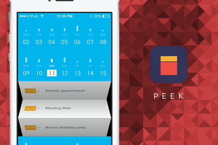
For those individuals that dread even looking at their calendars, the animations and simple colorful design just makes you feel better about it. Like Paper, gestures are just as important as buttons—all holding true to their “The Calendar Humanized” driving force.
“Our design approach is very simple, we wanted Peek to be an experience that is more aligned with what we need and want on the go instead of our needs and wants being dictated by technology,” the Peek Calendar’s press kit promises. “The design is guided by four core values. These values are derived from the demands and aspirations of the user and are used to define the Peek calendar experience.”
