
Comedian Louis C.K. had a very funny bit a few years ago about just how ridiculous it is when your mobile website or app isn’t working instantly. “Give it a second,” he said, “It’s going to space. Can you give it a second to get back from space?”
Two years later, and your mobile web designs are still up against that same radically impatient reaction. To think that your website or app could illicit a total irrational backlash like this is kind of amazing.
Back in 2012, Fast Company featured an article that had the temerity to ask if we could finally declare 2012 as the “long-anticipated Year of Mobile.” Mobile traffic was already 11% of all web traffic. Mashable reminds us that one year later, mobile was still only 17.4% of total traffic. Sure, this still means a staggering 1.2 billion users, billions of app downloads, and more eyeballs than radio or print, but what are we really doing with it?
That’s why we usually dumb things down for our users on mobile. We take out features, we limit interactivity, we lose animations, and we generally focus on ensuring our sites and apps load fast. Call it the Louis C.K Effect – a premeditated war and the dumbing down of small screen creativity.
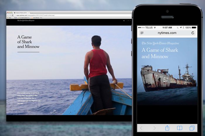
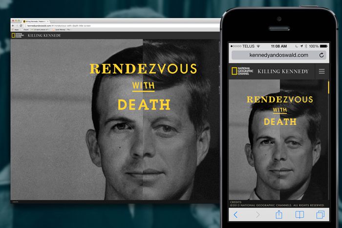
Take for instance all of the New York Times splashy digital reporting on projects like Snow Fall or A Game of Shark and Minnow. We love these experiences, however for the small screen they have less impressive user experiences. Gone are the sounds, the video, and any idea of cool map zooms. It makes sense, but the experience just isn’t the same. It lacks the punch compared to The Silent History – a novel built for the mobile age, which doesn’t sacrifice size for experience. Or National Geographic’s responsive website for the film Killing Kennedy, which doesn’t dumb down the experience at all. They optimized it for sure, but the mobile is, arguably, a faster and more superior storytelling experience than its slower, big-screened brother from a different mother.
Does this mean we should build mobile first? Maybe. It’s certainly a buzz worthy notion tailor-made for the serious PowerPoint strategists and conference keynotes. It’s true, 25% of the mobile traffic you get will be people who don’t use or probably ever look at desktops. As creatives, math isn’t really our “thing”, but we love that Joshua Johnson at Design Shack rightly points out that means, “75% of them aren’t.” Meaning, like it or not desktops and laptops still matter, for now. Of course, some things should be mobile first. Think restaurant websites or transportation websites like city busses. We would settle for mobile second, or even third for those who insist on auto-playing house music and coding in flash.

Get 300+ Fonts for FREE
Enter your email to download our 100% free "Font Lover's Bundle". For commercial & personal use. No royalties. No fees. No attribution. 100% free to use anywhere.
What’s interesting in mobile design is the trickery we don’t ever see. On Instagram for example, the photos you’ve liked are still being liked for real as the system pings the server in the background, on a bit of delay. They literally are going to space. The key here is to make it feel like things are happening immediately, even if the reality is that it takes some time to do so in real life. It’s thinking like this that makes users happy, and keeps them playing and interacting with your website or app.
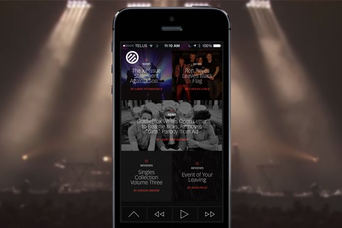
One of the bigger challenges for mobile designers is around how you can stay creative when you have to ensure every interaction is accessible by just one thumb. Technically, it’s less about our thumbs and more about the tap and swipes we perform with them. One example from the CEO of Hotel Tonight is that on his app it’s three taps and a swipe to book a room vs. 52 taps for Priceline. That’s a huge difference. Again, on the new Pitchfork Weekly – an app so beautiful it makes you forget it’s even on your phone – you can consume all content with one thumb and there is no sacrificing of imagery, type, or subtle animations. It also has a sick mobile menu without the requisite hamburger icon.
And when all else fails, just make everything blue. This is the color equivalent of ‘putting a bird on it’. According to one study of 8 million images, the Instagram photos that had blue as the dominant color generated 24% more likes than red ones.
