Just as it was with print, editorial design on the web is always an exciting playground for designers. And today pretty much everyone is in the editorial and publishing business. As Gary Vaynerchuck puts it, almost daily across his social channels, “Everybody in the world is a media company. Whether you’re an entrepreneur or a business, everybody’s in the media business. They should be doing content marketing.”
And in terms of inspiration, there are a lot of sites turning editorial content into beautiful, must-read experiences online. And just as many brands offering up companion storytelling content with their online shops.
Victory Journal
We love this site. Victory Journal is an unapologetic look at the sporting world, offering stories about 80’s wrestling icons and the offbeat tales of Marseille’s jousting sailors. The magazine is the calling card of agency Doubleday & Cartwright, and while print based, features a beautiful responsive site mixing media—especially photography and illustrations—that balance perfectly with just the right amount of written content (read: just enough to keep you wanting more).
Seersucker
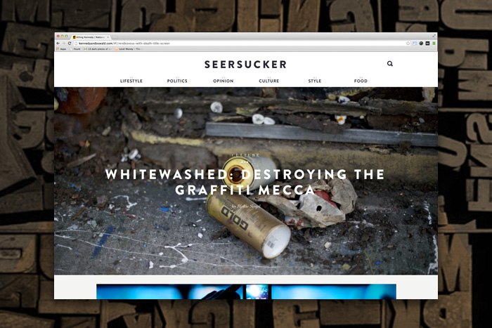
Another upstart digital-first publication is Seersucker, and it responsively designs its way to making content relevant for the millennial generation. Think The New Yorker in a world where Instagram rules the attention span, so the articles are shorter, the images larger, and experience effortless. The website is the product of Flavor, a Portland Oregon digital studio. The design direction detailed on their Behance profile describes Seersucker like this:
From the beginning we decided that we wanted the content to be king. This meant simplifying the experience and minimizing the UI wherever possible. Our article templates embrace photography as much as the written word to tell the story. We’ve also leaned heavily on web fonts and retina ready graphics to make sure the site looks beautiful on high resolution screens.
👋 Psst... Did you know you can get unlimited downloads of 59,000+ fonts and millions of other creative assets for just $16.95/mo? Learn more »Get 300+ Fonts for FREE
Enter your email to download our 100% free "Font Lover's Bundle". For commercial & personal use. No royalties. No fees. No attribution. 100% free to use anywhere.

Vanity Fair France
Another editorial site we drool over is Code and Theory’s site for Vanity Fair France. They specialize in creating editorial experiences for Vogue, The Verge, The Daily Beast, NBC Olympics, and DuJour—all of which could have made the article, but this one is like pop-culture candy. The French edition of the famed publication is an exciting and photographically driven editorial experience borrowing heavily from a classic sense of print design without being burdened by it.
USA Today
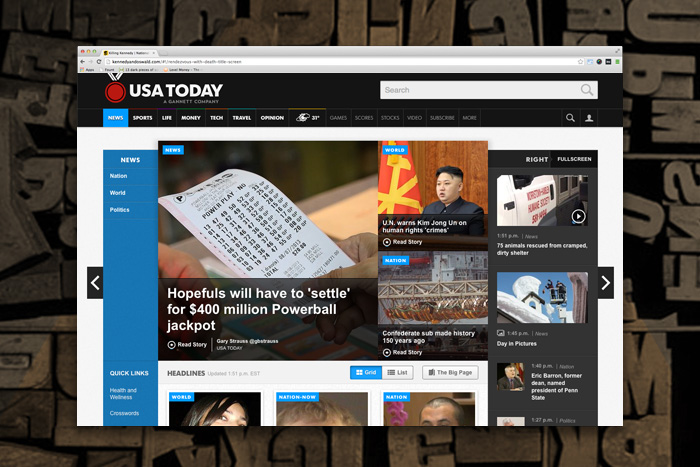
Fantasy Interactive updated the iconic pop-newspaper in late 2012. And it still holds up well. The app-driven design completely remade the USA Today experience for today. “Most designers actually design newspapers for the web to look like a newspaper, to use a paper texture, to use that kind of typography,” Anton Repponen, FI’s global creative director told Poynter.org after the launch. “And we really wanted to stay away from that. We wanted to make this project interactive. It’s a USA Today Web-based app. It’s news, but it’s not a newspaper.” This un-print approach is exactly what the aging pop-publication needed.
Quartz
From the makers of The Atlantic, Quartz is a true digital-only business magazine that looks like it has been designed without any knowledge of a desktop computer at all. In fact, it’s all mobile and tablet all the time, and takes a serious no-frills approach to speak to their presumably fast-paced readers. As the website promises,
As we build Quartz, we are focused on the touchscreen and mobile devices that increasingly dominate our lives. Our design began with the iPad foremost in mind, and we modified it from there to suit smartphones and, finally, personal computers. Your experience with Quartz should befit the hardware you visit us with and shift as seamlessly as you do from phone to tablet to laptop and back again. Call us a website or, if you like, a web app: Quartz combines the benefits of the free and open Web with the elegance of an application.
It’s like an old timey news feed that allows you to read as much or as little as you want, with effective but limited photography to break up the content.
Inspiration from Publishing
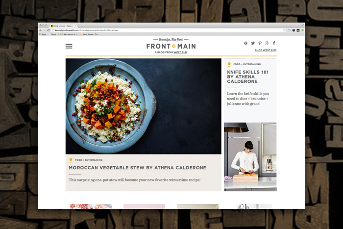
Given the need for content, and stories to drive traffic and interest, it’s no surprise that upstart brands like West Elm, Huckberry, Frank & Oak, and Pressed Juicery’s Chalkboard magazine all spend effort on maintaining high quality content on their websites. Each of these sites have created well designed, artfully edited, and interesting content streams for their users offering recipes, decorating tips, travel ideas, and interviews. Even the whimsical general store, Old Faithful Shop, that occupies our building’s ground floor spends as much time creating content as they do curating eccentric goods within the store.
This is the world of content marketing and it’s clear that designers can’t just design a great website or an online store anymore. They must also design platforms that include publishing capabilities too.
