For the month of August, a series of guest posters will be filling in on DWL with daily posts. Today’s posts come to you from illustrator Lydia Nichols For more from Lydia, be sure to follow her on Twitter and Dribble. Enjoy!
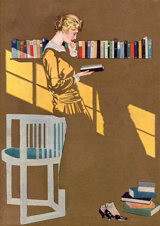
The first time I saw the work of Coles Phillips as an illustration undergraduate, everything I thought about illustration changed. Being in a very traditional painting-oriented program, I was used to feasting of beautiful works on art that were technically stunning, but sometimes lacked that little something to put it over the edge. Born in 1880, Phillips’ work felt fresh and contemporary in spite of being created nearly a hundred years prior. Best know for his “fadeaway girl,” Phillips’ mastery of negative space, use of pattern, and sophisticated color palette still stand the test of time.
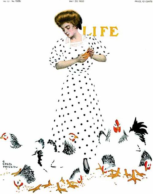
His cleverness resulted in more than just beautiful imagery—it allowed magazines like Life to save money. At a time when full color was becoming all the rage—and quite the expensive—Phillips was creating equally alluring images using fairly limited palettes. I love when parameters can bring about such amazing solutions!
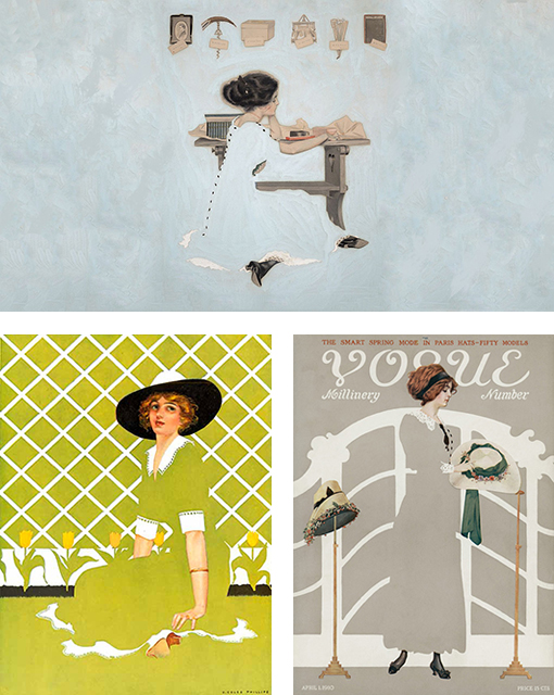
I’ve always liked that aspect of image making—it can be a visual challenge, a puzzle of shape, color, and space. Many have since followed in Phillips’ footsteps and I thought it would be fun to take a look at how these same principals are in use today.

Get 300+ Fonts for FREE
Enter your email to download our 100% free "Font Lover's Bundle". For commercial & personal use. No royalties. No fees. No attribution. 100% free to use anywhere.
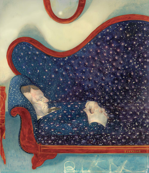
Another personal long-time favorite, Sterling Hundley paints and composes his pieces in unexpected ways. There’s always another layer to his work or an unusual, forced perspective. It always takes a moment to realize what you’re seeing isn’t exactly what you thought it was.

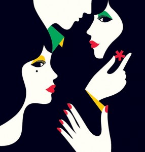
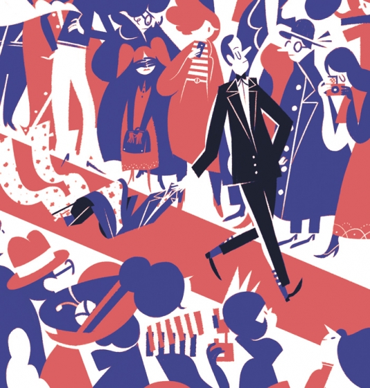
French “designer led” illustrator Malika Favre has a far more graphic approach. The way her shapes fit together is simply masterful!
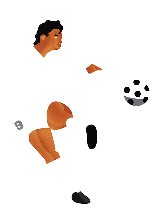
Like Favre, James Boast has bold, shape-driven style accentuated by subtle textures. This piece in particular exemplifies how little information actually needs to be shown in order to communicate an idea. It reads almost instantaneously even though we don’t actually see much of the soccer player’s body.
What I love about this piece is how nearly unexpected the “fadeaway” aspect is—Roman Muradov balances his shapes and colors in just such a way, you almost don’t even notice his excellent use of negative space.
