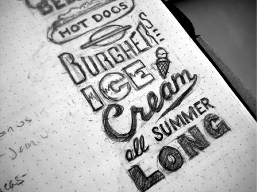
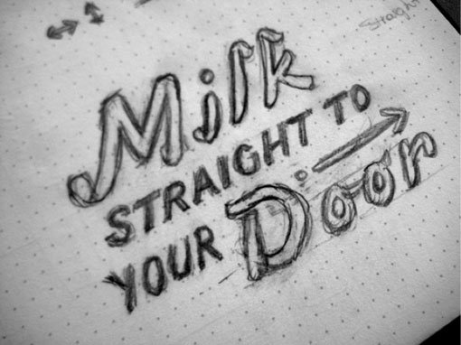
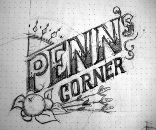
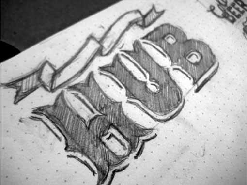
I know we most often show the finished product around here, but I am equally—if not more so—inspired by the process. Take these type sketches by Matt Braun of Brain vs. Braun, for example. I love that you can very clearly see all of the eraser marks and imperfections, and places where he changed course, which is in large part what makes them so great. But at the same time, it’s also pretty easy to imagine exactly how the sketches could come to life.
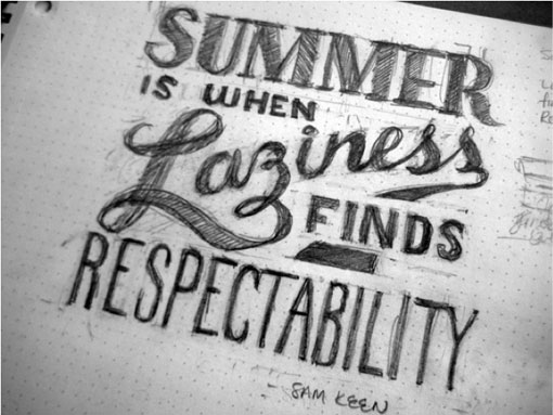
via Dribbble

Get 300+ Fonts for FREE
Enter your email to download our 100% free "Font Lover's Bundle". For commercial & personal use. No royalties. No fees. No attribution. 100% free to use anywhere.
