7 Comments

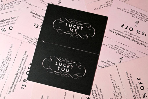
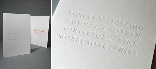
  1. Aside from this being a direct ripoff of the Cruet & Whisk logo, the colors are nice. But that has to be some of the worst kerning I have ever seen. If you are going to ripoff another design, at least execute it correctly. You could drive a car between the R and C.

  2. Hi Eric, Your opinion may be valid. But if you’re going to make plagiarism accusations it would be helpful to have submitted a real email address so that we could discuss them. I don’t support plagiarism on this site, and any time someone has brought something respectfully to my attention, I’ve handled the situation as best I could.

  3. In response to Eric’s comment – you can only plagiarise something if you’ve actually seen the thing that you are supposed to have copied before. As the designer I can confidently say that having read your comment, today was the first time I’ve seen the Cruet & Whisk logo.

  4. I love this! I googled Cruet & Whisk out of curiosity… (Eric’s post)This is much more original then the “Cruet & Whisk” logo IMO.

Leave a Reply

Your email address will not be published. Required fields are marked *