Every two years or so, fFurious, a boutique creative agency in Singapore, completely redesigns their business cards. The result is a series of six entirely unique cards that span the course of almost thirteen years.
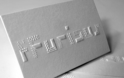
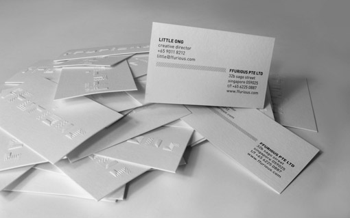
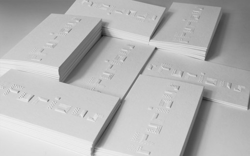
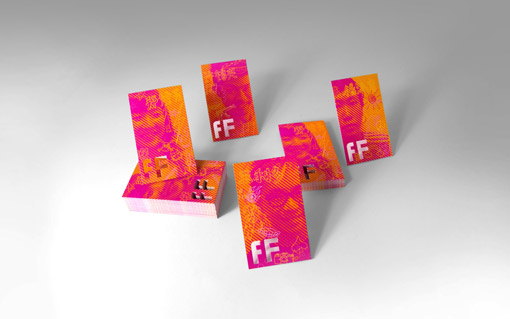
2013
Our new business cards adopt a minimalist design approach that features one-colour printing and intricate embossing work. Taking inspiration from our multi-disciplinary output, geometric patterns were used to suggest the various disciplines that coalesce into the dynamic form of the agency. The geometric patterns make up the embossed mark that creates an intriguing, sensory experience which delivers an immediate and lasting impact. The debossed back of the card is further sandwiched with another card to conceal the debossing.
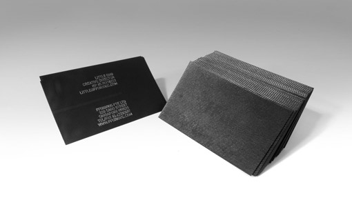
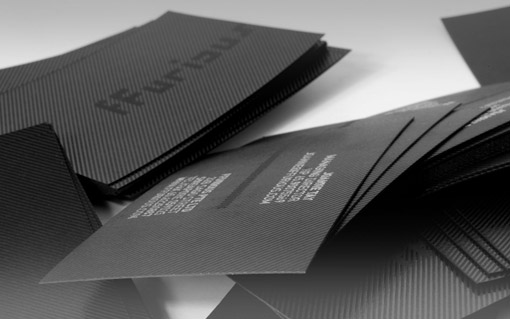
2010
After 10 years as an agency, we felt that we should appear more grown-up so we adopted our favourite non-colour, black. As testament to our curious, experimental nature, we created a card without using ink. A matt black card stock was selected to have black lines to be hot-stamped on it to create a raised texture that would be offer a sense of surprise when it’s received, while silver was used to hot-stamp our details on it.
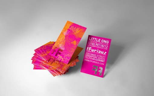
2005
This cards were influenced by a deluge of property and insurance agents cards that we couldn’t seem to avoid. Those cards always had the agent’s photo on them, so we thought it would be interesting to put our own photos but in a graphic style.
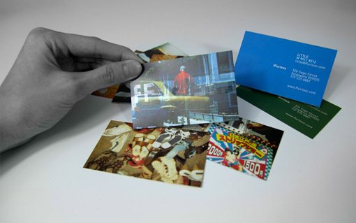
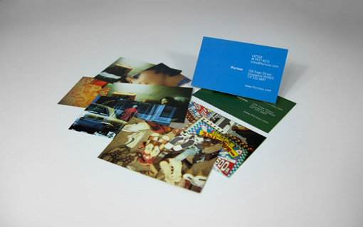
2003
As we were early adopters of Lomography in Singapore, we were subsequently appointed as the Lomography Embassy of Singapore. During this 3 year stint, we organised twelve exhibitions, collaborations, competitions and special projects that revolved around this fun and radical form of photography. We also ran a small store in our space that sold the cameras and hung out with fellow enthusiasts. It was only apt that we had namecards that featured our favourite personal lomographs.

Get 300+ Fonts for FREE
Enter your email to download our 100% free "Font Lover's Bundle". For commercial & personal use. No royalties. No fees. No attribution. 100% free to use anywhere.
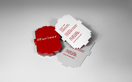
2001
We moved into our first office in a shophouse in Chinatown; before that we were working from our homes. This namecard reflected the Chinese-ness of Chinatown with it’s red colour and the shape was influenced by old shop signages that were in our neighbourhood. The shape was given a pixellated look in reference to the pixels in our logo.
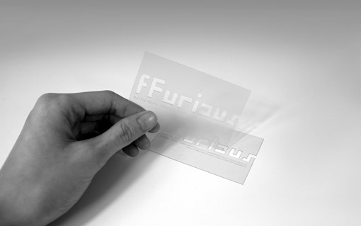
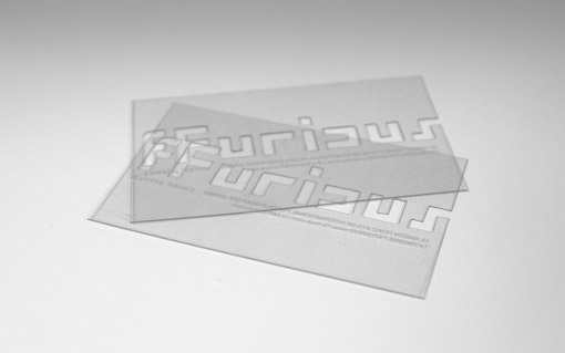
2000
When we started the agency, we wanted to create a bang and let people know we were different, so we explored using acrylic for our namecards which created a lot of attention at that time. We were also looking at ourselves being new to the creative scene and thought the clarity of the cards represented our purity.