In the couple of weeks since its launch, Squarespace Note has received quite a bit of positive buzz in the design and tech communities. If you haven’t caught on, Squarespace Note is a clean, minimalist note taking app that gives you the ability to push notes on the go to email, Evernote, Dropbox, Facebook, Twitter, and Squarespace.
Today we have the opportunity to hear from the designer of the app, Grant Gold, about the thinking and process behind its development. Below you’ll see commentary directly from Grant, interspersed with screenshots and design details from the app itself.
Take it away, Grant!
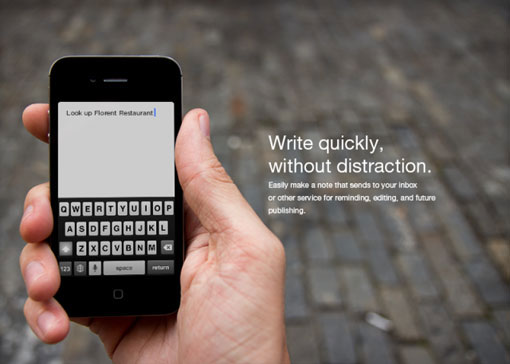
Most To Do or note taking apps require you to change your behavior, changing behaviors like this require a lot of practice and persistence. Squarespace Note follows a behavior you already do, but also removes a step. We all check our email… a lot of us send emails to ourselves, but have to go through opening an email, filling in our email address, writing it out, hitting send. Squarespace Note takes no more than writing out the thought. It’s a very small removal of a step, but it’s just enough to make you jot down that stupid idea that, with a bit of later noodling, turns into something great.
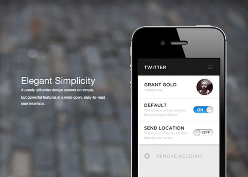
I don’t like to make up new interactions, I like to design in the mindset that even if one don’t know any standard interactions one will likely try a certain “thing.” In the note app, “swipe up to send” is an example of that. Consider where all apps put their “send” button, it’s either on the top or bottom (under the keyboard). If you type something and don’t know what to do next because there are absolutely no controls on the screen, you’re likely to scroll up or down, and in doing so revealing the interaction. In other words I didn’t have to make anyone learn anything, they taught themselves.

Get 300+ Fonts for FREE
Enter your email to download our 100% free "Font Lover's Bundle". For commercial & personal use. No royalties. No fees. No attribution. 100% free to use anywhere.
People often claim that interactions like this are not “intuitive”. Although, swipe to delete, pull down to refresh, and long-press weren’t intuitive until a lot of apps began to use them… then it made perfect sense. At one time opening a magazine and scanning the copy and images in the right order and knowing innately where to find something was also not very intuitive. Behaviors like these are what I and most designers mold with. When they are always consistent, interactions can be beautifully simple.
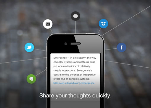
This is one in a suite of apps i designed for Squarespace, from original concepts and mocks to icon and interaction design, copywriting, animation, and beta testing. The concept behind the apps is one of complete and absolute simplicity. Building the apps that would more beautifully match Apple’s stripped down, industrial design.
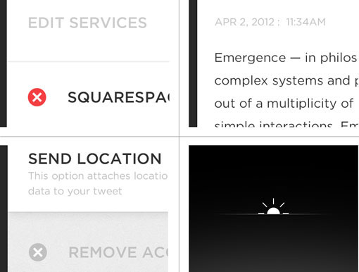
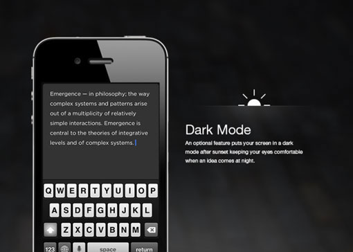
Another thing no one seems to be talking about on design blogs is a feature I built in after using the app in a movie theater. It was glaringly bright in such a dark room, but I needed to write down this thought. I spent a lot of time doubling all the assets of the app to make a dark version. After sunset the app will go into dark mode, also shaking the app at anytime switches it from light to dark and vice-versa.
Thanks so much for your insight Grant!
