For the month of August, a series of guest posters will be filling in on DWL with daily posts. Today’s posts come to you from Maddy Hague of Somewhere Splendid. For more from Maddy, be sure to check out her etsy shop and follow her on Twitter. Enjoy!
Hello, everyone! It’s Maddy from Somewhere Splendid again, and today I’m going to bring you some of my favorite invitation design inspiration of the moment. Courtney and I first met when I was writing the Inspired Bride wedding blog (which I sold earlier this year before I had a baby girl), and she shared her gorgeous invitations with me. Today, I’m highlighting a few other fantastic designs that I hope you’ll love as much as I do.
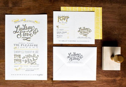
As I mentioned in my first post for DesignWorkLife earlier this month, I can’t get enough of the hand lettering trend in invitation design. It breathes new life into the classic calligraphed or script face invitation by giving it a quirky makeover. This invitation, designed by Molly Jacques, is no exception.
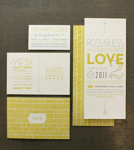
Speaking of quirky lettering: Ross & Jess’s invitations use digital illustration and hand lettered look typefaces to give it a more hand made feel that is perfect when set with more traditional sans serif type. The perfectly imperfect patterning and drawings also add to the look for an incredibly gorgeous suite.

Get 300+ Fonts for FREE
Enter your email to download our 100% free "Font Lover's Bundle". For commercial & personal use. No royalties. No fees. No attribution. 100% free to use anywhere.
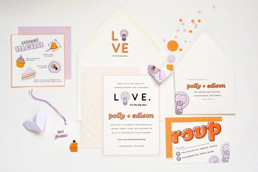
I’ve loved Megan’s work at MaeMae Paperie for a long time, and this suite has been one of my perennial favorites. I love the daring use of color (because let’s be honest, not many people would pair lilac and orange), the adorable illustrations and the off register color fills that work together to create one of the most fun suites I’ve seen to date.
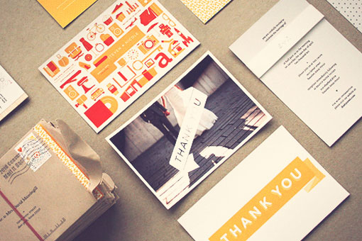
If left to my own devices without direction, this is the area of the design world I live in: modern, silhouette style illustrations a la Katie Kirk. It’s no surprise then that I love Nicole and Steven’s invitations by Design Curiosities, which blends that style with photography seamlessly.
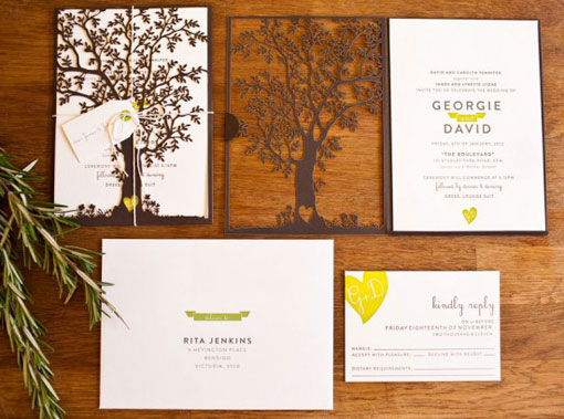
While I’m usually not a big fan of die or laser cuts on invitations, I think this suite from Saint Gertrude Design and Letterpress is simply stunning. The intricate tree design is offset by simple type and a little splash of color that keeps the design from going overboard.
I’m pretty sure everyone in the design community is aware of Erin Jang’s work at this point, but this is still one of my favorite invitation suites of all time. Whereas a lot of invitation suites are letterpressed simply because everyone loves letterpress these days, Erin makes the most of the transparency of the lettepress inks by working the layering into the design in her pattern and illustration work.
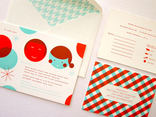
PHOTO CREDITS (from top to bottom):
01: Molly Jacques
02: Designed by Ross and Jess Bruggink via Studio on Fire
03: Maemae Paperie
04: Design Curiosities via OSBP
05: Saint Gertrude Design and Letterpress via OSBP
06: Erin Jang
