I’m loving this new project by The Original Champions of Design for MC Kitchen, a modern Italian restaurant in the Miami Design District.
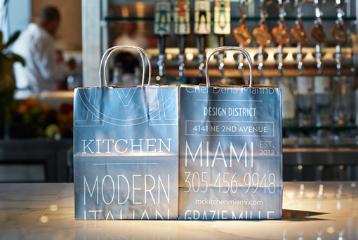
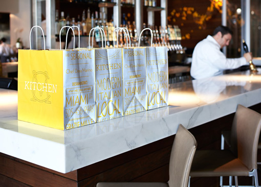
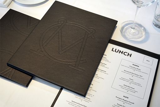
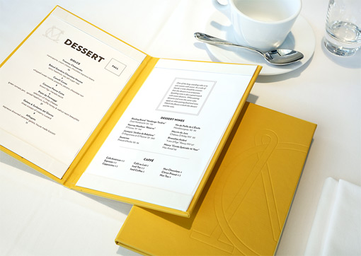
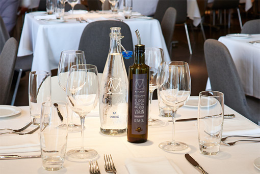
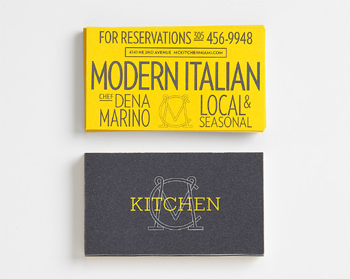
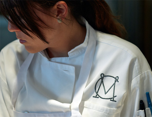
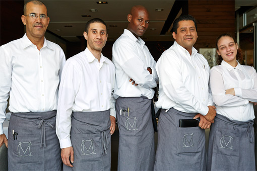
MC Kitchen opened in the Miami Design District in November 2012. Chef Dena Marino serves up modern Italian organic food. It is rich, fresh and delicious. MC Kitchen is driven by contrast: Miami/Italian, refined/rustic, modern/kitchen. The identity system had to walk that same line.
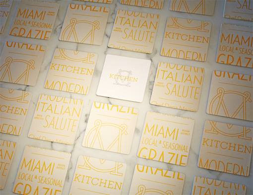
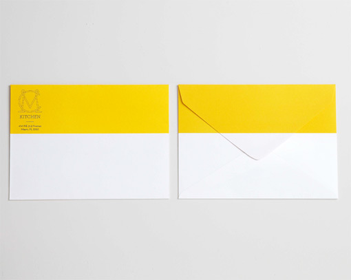
The sharp Verlag contrasts the colloquial Rockwell and traditional monogram. The color palette is white and warm gray with yellow. And that’s it. The tool kit is simple and straightforward. The graphic language is entirely typographic. And the color balance walks the Miami/Italian line.

Get 300+ Fonts for FREE
Enter your email to download our 100% free "Font Lover's Bundle". For commercial & personal use. No royalties. No fees. No attribution. 100% free to use anywhere.
There is lots more to see in the original case study, so be sure to check it out.
via Brand New
