Helia, a semi-squared sans serif typeface by Nootype, includes eight weights—from hairline to black—plus italics, and a whole host of OpenType feature...
The Becker Gothics is a new display font family from Dunwich Type Founders: The Becker Gothics pay homage to the nineteenth century American lettering...
Felice is a new serif typeface from Nootype, featuring 10 styles, from light to black, plus italics and a slew of OpenType features. Check it out and ...
I’ve been meaning to feature Brix Slab, an extended family of 24 fonts, for quite awhile. Designed by Hannes von Döhren & Livius Dietzel in 2011, the ...
Center is a new typeface by Signal, with geometry based on a rounded rectangle. The typefaces includes 6 weights plus italics and a variety of OpenTyp...
Respublika FY is a new sans serif family by Fontyou that includes five weights plus italics. Check it out at MyFonts....
Equip is a new geometric sans serif from the folks at Hoftype. The typeface features 8 weights, 16 styles and a plethora of OpenType features....
The condensed, elongated Directors Gothic, a revival from the 1938 original, is a new favorite. Here’s a bit about its history: Handcrafted by Letteri...
Asterism is a gorgeous new calligraphic font from Great Lakes Lettering. Pick it up at MyFonts....
The latest release from MVB Fonts is MVB Solitaire Pro, a sleek sans serif that was designed and built to primarily serve content, as opposed to drawi...
Breakers Slab is a companion to the sans serif typeface Breakers, designed by Kostic Type Foundry. It features six weights, each including small caps,...
Selektor Slab is a new extension to the Selektor font family. Published by You Work for Them, the typeface was inspired by and designed with “the char...
Pétala Pro is a new superfamily released by Typefolio that includes 18 weights plus italics. Pick it up at MyFonts....
Metro Nova is a new release from Linotype which is an update of the 1929 modern classic by W.A. Dwiggins. The newly updated family includes seven weig...
Riona Sans is a sans serif family of 16 fonts in 8 weights, including true italics. Pick it up at MyFonts for 80% off for a limited time....
Lust Script is a new extension of the Lust family by Positype, which includes both regular and display formats. Pick it up at MyFonts....
For the month of August, a series of guest posters will be filling in on DWL with daily posts. Today’s posts come to you from Gerren Lamson of Creativ...
Encorpada Classic is a beautiful serif that was designed with “functional considerations” in mind. Released by dooType last month, this family of 14 f...
Summit is a new display face designed by Luke Lisi, which includes a layering system of 10 styles in five weights. Check out how some of the layering ...
The most recent release from Hamilton Wood Type Foundry is HWT Slab, a set of two display fonts. Pick up a copy on MyFonts....
Sini is described as “a warm and delicious hand-lettered” typeface, which includes two styles, bold and ornaments. Pick up a copy for yourself at MyFo...
Gentona is a new release from Rene Bieder… Designed for a wide range of applications, Gentona was intended to support the goals of contemporary design...
JAF Facit was designed in 2005, but is a new find for me. It was designed by Tim Ahrens through Just Another Foundry, which he started in 2004, and fe...
The latest release from Hold Fast Foundry is Prohibition, a sans serif display face that includes sylistic alternates, discretionary ligatures, and mu...
Doctrine Stencil is a “utilitarian display typeface with a muscular character” from Jonathan Barnbrook’s Virus foundry. The typeface features five dif...
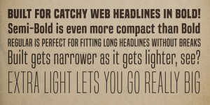
Built is a new release from Ray Larabie’s foundry, Typodermic, that is intended to be used for the purpose of making solid, compact headlines onscreen...
Aisha, designed by Titus Nemeth, is a soft, friendly script that supports both Latin and Arabic characters. Pick up a copy for yourself at MyFonts. Wa...
Rolling Pen is a new script from Suditupos. Similar to their 2009 release Business Penmanship, Rolling Pen was inspired by vintage hand-writing and ca...
Designed by Ján Filípek, Preto is an extensive type family that includes a collection of over 16 fonts that include sans, serif, italics and a wide va...
Last week House Industries introduced Paperback, a set of 15 serif fonts including both text and display cuts, plus a series of ornaments. This new re...
Bicyclette is a new sans serif typeface by Nikola Kostic, whose name was chosen because it is “all about balance and elegance.” The family includes si...
Tenso is the latest from Jos Buivenga’s foundry exljbris. This friendly sans serif includes five weights, from light to black, plus italics. Pick up a...
Nyte is a 2012 release from DSType. This serif family was originally designed for New York Times Magazine, and features all sorts of swashes and alter...
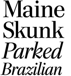
Richler is a beautiful new serif family from Shinntype. Described as “an open, evenly spaced book face designed for quality headlines and enhanced rea...
I have a bit of a weakness for slab serifs, so Lost Type Co-op’s latest release, Klinic Slab, is right up my alley. Designed by Joe Prince, the typefa...
Adriane Swash, a companion to Adriane Text, includes uppercase, lowercase and small caps, as well as a wide range of OpenType features, including alte...
Diversa is an interesting new display face from DSType: Diversa is a single typeface with 9 fonts within, containing 2760 glyphs, divide in 9 stylisti...
Gin is a new release from Hold Fast Foundry, a vintage-inspired display face that includes stylistic alternates, discretionary ligatures, and multiple...
Esmeralda is a new display serif from Sudtipos, which was heavily influenced by classic capitals carved in stone, and includes a huge amount of ligatu...
HWT Unit Gothic is the latest release from the Hamilton Wood Type Foundry, a digitization of the Unit Gothic series, which was released by Hamilton Ma...
Live is a new release by Lián Types The lively brush script features three fonts, Pro, Standard and Live More which includes a set of pre-designed cat...
Historism Border 2D is an ornamental font family consisting of various friezes and patterns grouped into four fonts. All of the ornaments were based o...
Tomato is a new discovery for me, but it was actually produced in 2005 by Canada Type. This curvy display face is actually an expanded digitization of...
Kana Sans was released earlier this year by GT & CANARY, a New York City studio founded by Takaaki Goto, a type designer from Japan. Kana Sans feature...
Verb and Verb Condensed are two sans serif families from Yellow Design Studio. Verb Condensed is just a slightly more condensed version of the origina...
Poster is a new release from Type-Ø-Tones designed by Íñigo Jerez. Want more type? Check out my Type Wishlist, current Favorites and Calligraphic scri...
Program is a new sans serif from Emigre. Designed by Zuzana Licko, Program is a “type designer’s typeface”: …It’s about the craft of typeface design a...
I’ve been loving everything Great Lakes Lettering has produced since they launched at the end of last year; and Icing, their newest font, is no except...
Quant is a beautiful new serif from Hoftype. The family includes eight styles, support for over 40 languages and more, proving it to be “well-equipped...
Grey Sans is “a contemporary sans with an angular design” by Canada-based foundry Greyscale Type. Want more type? Check out my Type Wishlist and curre...
HWT Catchwords was released earlier this month by Hamilton Wood Type Foundry. HWT Catchwords features over 80 words based directly on designs offered ...
Arek is a serif typeface from Rosetta, designed for both Latin and Armenian languages. Originally designed for textbooks, the family features beautifu...
Guanabara Sans is a new release from Plau, a foundry based in Rio de Janeiro. The inspiration for the typeface came from their home city, “with its ne...
I’m really loving Quadon, a modern slab serif by René Bieder. The typeface features line weights, from Think to Black, with matching italics, plus a w...
Today I’m loving the chunky, playful letterforms of Azo Sans Uber, the heavy headline version of Azo Sans. Want more type? Check out my Type Wishlist ...
Alegreya ht Pro, designed by Juan Pablo del Peral, is a beuatiful serif typeface originally intended for literature. Want more type? Check out my Type...
Saint Agnes, a “handwritten font with a Roman feel,” is a new release from Great Lakes Lettering. Want more type? Check out my Type Wishlist and curre...
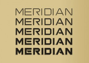
This style of open, linear display type is nothing new, but I’m always drawn to the modern, graphic presence it adds to a design. This week I happened...
Since I just mentioned Mark Simonson’s new site launch, I thought it only fitting to feature one of his new-to-me fonts. Refrigerator Deluxe is “a con...
Ronnia is one of Type Together‘s sans serifs that I’ve had my eye on for awhile. Its original intention was for use in newspaper and magazine applicat...