FOUND: 1. Ace Hotel Mural by Dana Tamachi, 2. Alphabet Paperweights, 3. Chalk, 4. Chalk-it-to-me Piggy Bank, 5. Chalkboard Spice Jar, 6. Mini Chalk Bo...
Mallory Smith is a current Communications Design student at the University of Louisville. This project, Southern Sayins, is a set of 10 greeting cards...
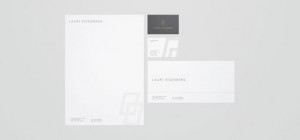
Jake Dugard is a designer currently working towards his Masters in Fine Arts at Louisiana Tech University. This identity project was created for ficti...
Sara Saedi is a Los Angeles-based illustrator with a rather extensive digital illustration portfolio. In particular I’m loving the illustrations from ...
Man vs. Ink is a Portland-based shop featuring a variety of screen printed goods, from textiles to prints. Check out the full stock right here....
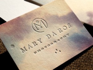
Check out this new beautiful identity and stationery system designed for Mary Da Ros Photography by that always inspirational Eric Kass. The letterpre...
As a former dancer, I was immediately drawn to the dynamic design program created by Think Studio for the Extraordinary Moves Dance Festival. ...
Josh Rhode of Kult House just recently relaunched his portfolio site, with a striking new design. There’s all sorts of great work to be seen, much in ...
Herb Lester released a new map of Austin, Texas illustrated by Curtis Jinkins. Okay Type created a beautiful site for the release of their new typefac...
Martin Oberhäuser designed the site below as part of a pitch for an undisclosed client. The design includes visual and structural concepts for a trave...
Loving this palette of primary colors plus neutrals found on these Czech matchbox labels from Kindra Murphy’s Flickr stream....
I’m always drawn to great design for a great cause, and Hybrid Design‘s Impact Campaign. The campaign, which is concerned with the sobering statistic ...
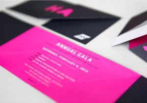
Feast your eyes on this vibrant collateral designed by TOKY for the 2012 Contemporary Art Museum St. Louis Gala. Beyond the playful interactivity of t...
Christine Wisnieski recently designed this dinosaur-themed invitation suite for a pair of young brothers, Brody and Charlie. Great illustrations and c...
Rooney is a friendly, rounded slab serif that is right up my alley. Featuring six weights, from light to black, and italics, this one is definitely at...
It’s short notice, but if you happen to be in the Chicago area, a great creative event is happening this Friday. Diaspora: The Art of Blackness, an ev...
Perhaps it is my strong ties to my Boston roots, but I’m really loving the patch designs Ben Whitla recently developed for Boylston Trading Co. Boylst...
FOUND: 1. Jetlag Travel Alarm Clock, 2. Catbird Travel Candle, 3. Travel Leather Sticker, 4. J. Crew Globe Trotter Suitcase, 5. Clarks Botanicals Trav...
I’m loving the clean, colorful design that Face came up with for Pocketmag, a Mexican magazine. Check out a few more details right here. ...
Crank Bunny is shop featuring handmade 3D pop up cards, paper puppets, personalized custom greeting cards, hand cut-out paper toys and other nostalgic...
The embossed effect found on these business cards designed by Tim Boelaars is actually a property of the paper used, GF Smith Colorplan. Colorplan has...
Here’s a great identity and site design by Los Angeles-based Ludlow Kinsley (who is also responsible for Milton Glaser’s beautiful new site). Fix Food...

Issue 2 of Computer Arts Collection is now out! Check out this more in-depth preview of the first two issues for a closer look. Roald Dahl Stamps! In ...
Here’s another great student identity project by Denmark-based Jonathan Faust. The design was developed for a fictive company with the intention of he...
This minimal, classy identity was designed by student Rod Castro for an up-and-coming architecture firm....
I can’t get enough of the color palette from this album cover found via Project Thirty-Three....
This beautiful 2012 planner was designed for Allegheny Financial by Bunch. The impressive design features all sorts of fun production details, includi...
This project by Katey Mangel, is one of the reasons why I love student projects so much—school gives you the freedom to create completely fictional co...
Uma is a new, two-weight, rounded typeface from Sudtipos. Check out the features and pick it up right here at MyFonts....
I couldn’t resist featuring another project from the creative minds at Design Ranch this week—they have such an incredible portfolio. Here’s a little ...

Ben Geier is a Chicago-based designer and photographer with a decidedly impressive portfolio. What caught my eye in particular was the work he did for...
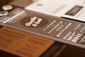
Bay area designer Remilla Ty designed this suite of paper goods for her own wedding this past November. The pieces feature all sorts of handmade detai...
FOUND: 1. Vintage White House Postcard, 2. Vintage George Washington Postcard, 3. Vintage Mount Rushmore Commemorative Plate, 4. Vintage Political Cam...
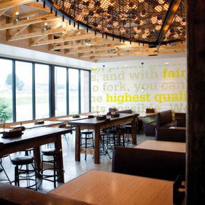
By way of Laura Berglund’s portfolio I found this super fun restaurant branding project by Design Ranch, where she is currently employed. Here’s the d...
Studio Lin recently designed this beautiful poster to commemorate the 2012 Core77 Design Awards, which is currently accepting entries through March 13...
Feast your eyes on the incredible photography of Erin Drewitz. What you see below is a selection from her Places series, but she also shoots portraits...
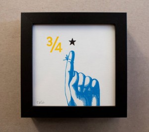
I’ve mentioned Constellation & Co.’s work in the past, but I only recently discovered their etsy shop. It’s filled with all sorts of letterpress paper...
How cool are these tattoo infographics?!? A very impressive student project by Paul Marcinkowski. via Quipsologies ...
Recently, Almanac was commissioned by the St. Louis Art Museum to assist them in creating an online resource centered around Claude Monet’s Water Lili...
I’m incredibly intrigued by this branding project from new-to-me studio Red Design… Red Design were invited by Aspex Gallery in Portsmouth, UK along w...

Kate Spade has brought back their e-valentines for 2012. I can’t tell you how much I love Love Ever After, a Kickstarter project by Lauren Fleishman. ...
Check out these excellent, alphabet flashcard business cards by Michael Braley for Colin Corcoran, a copywriter....
Tind’s latest experimental poster (remember these?) is a typographic beauty screen printed in phosphorescent and fluorescent inks. Take a look at a fe...
Daniel Zender has put together quite the extensive portfolio of design and illustration work. In particular, I’m really loving his Hitchcock film post...
I’m loving this cool, crisp color palette found in a book design from Mucho’s portfolio featured on September Industry....
In my opinion, this stark, minimalist design—by Ehrenstråhle & Wågnert—is perfectly apropos for a high-end clothing line named Modesty. I’m also lovin...
I can’t get enough of these vintage animal illustrations by Swedish illustrator Staffan Wirén. Each alphabet illustration was found in the children’s ...
Narziss Text is the serif companion to the very popular Narziss display face by Hubert Jocham Type....
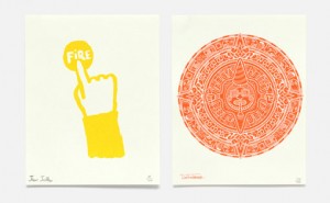
This Year… is an annual piece by NB Studio sent to clients and friends as an alternative to the typical holiday card. Each year they focus on a partic...
On Passports: A Study is a visual summary that accompanied Marwan Kaabour’s thesis project PASS/PORT, which critically investigates the different part...
An icon is such a small piece of artwork that it presents quite the communication challenge. So I’m impressed with this extensive set that Radio devel...
FOUND: 1. Sugar Paper Gold Hearts Card, 2. Love You Daily, 3. I Like You and Naps card, 4. Loved ring, 5. Tattly Love Tattoo, 6. Custom Love Wall Art,...
Proof Wine Collective is producing some really interesting wines with some impressive label artwork. You can see a whole lot more right here....
Mark Gowing Design has created some excellent poster designs for Hopscotch films....
Melbourne, Australia-based Studio Brave recently developed the identity and collateral for Egg Unlimited, an old-fashioned bakery that bakes all of th...
I’ve seen these geometric, color blocked notebooks and planners all over the place recently, so I’m glad I finally stumbled upon the shop. Julia Kostr...
In celebration of the project’s publishing in the CA Typography Annual, Braden Wise has posted a whole new series of his Good Day CA postcard designs....
This perfectly charming stop motion animation was created by Alfalfa Studios for Kate Spade in celebration of the color chocolate brown, as part of th...
Check out Lulu Dee’s new Valentines—four, two-color designs in her signature playful style. They’re available for purchase as a complete set or indivi...
Here is yet another amazing project from The Hungry Workshop, a promotional piece for The Rabbit Hole Ideation Cafe, “a place to meet, work, share and...
