Check out this small sampling of vintage style posters by Paul Rogers. Much more to be seen right here. ...
I always love House Industries type catalogs. This one is even more of a beauty in person. ...
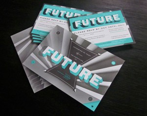
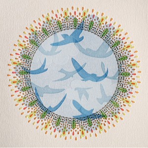
This incredible invitation package was designed by Will Miller, and Ohn Ho for Firebelly Design’s annual Grant for Good project....
I think the common perception is that, for the most part, wedding photography tends towards the cheesy and less towards the artistic. But Fer Juaristi...
Spade is a new chunky display face by Canada Type, which features one font with sharp edges and one with round....
Edrea Lita designed this graphic identity for Spread the Word, an organization that acts as a resource for designers who need logos from non-profit an...
Check out the gorgeous illustration work of Jessica Singh. ...
These unique, 3D posters were designed by Amy Rodchester for the Newcastle Festival of Dance. ...
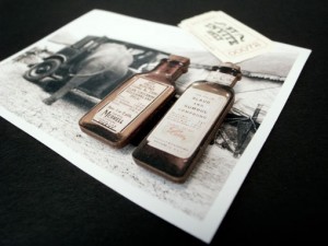
FOUND: 1. Modern Library Storage Bin, 2. Bibliotheque Wooden Sign, 3. Vintage Wooden Card Catalog, 4. Edgar Allen Poe Library Candle, 5. Library Card ...
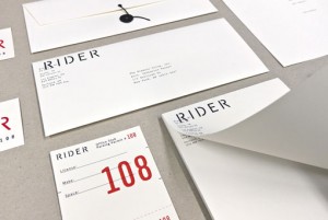
I’m loving Josh Finklea‘s identity for Rider, a boutique hotel chain that caters to touring musicians....
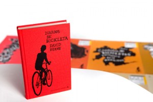
This beautiful publication was created by Swiss designer Felix Reichle, who happens to be—employers—looking for an internship in NYC. In his own words...
I’m absolutely loving the bold colors and intricate line work found in Nate Luetkehans’s illustrations. For more, you can follow Nate on Flickr or Dri...
Big Love Letterpress Valentine Card by Anemonene Letterpress Letterpress Card by Find Day Press You Make Me Smile Letterpress Card by Wiley Valentine ...
These beautiful maps were drawn in colored pencil by John Phalane, a cartographic artist who focuses on the areas of South Africa where he’s lived and...
I am a huge fan of Radiolab—if you don’t know the podcast, I highly recommend checking it out—so this brand and site redesign by recent Art Center gra...
I know we’ve barely made it through winter on the East Coast, but I am already craving warm, sunny weather and coastal road trips. Since I have no cho...
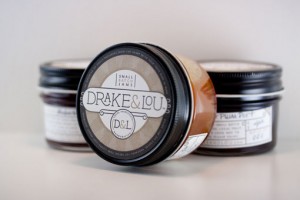
Take a look at yet another gorgeous project by Miller Creative: packaging for Drake & Lou, a small-batch jam maker, which features labels letterpresse...
We were happy to join in last week’s protest against SOPA and PIPA, and it looks like the internet’s joint efforts paid off. The bill has now been ind...
I became an instant fan of Lila Symons’s hand-lettering and calligraphy work the second I laid eyes on it. Take a look at a plethora of other work sam...
I’m loving the beautiful drawings and paintings of Sana Park. ...
Though I can’t speak a word of Norwegian, or translate their web page, I love the aesthetic details of this project for Grilleriet by Uniform....
Jiin Kim, another recent grad of Art Center College of Design, has an excellent portfolio. I was most impressed by these graphic, hand-sewn posters de...
This lovely packaging was designed by Paige Foley for Abbey Brown, Chicago-based soap artisan and gift shop....
Love this colorful image from CSA Flat File....
I’m not one for violence, so when Safwat Saleem emailed me about his latest project, a poster series based on “ass kicking and mayhem”, I almost wrote...
Below you will see a selection of Tom Davie‘s stellar typographic posters from 2011. Yesterday Tom actually kicked off a giveaway via his Facebook pag...
I spotted this poster series in the recent Communication Arts Typography Annual (lots of great work in there, by the way). Designed by Juan Marin, the...
Just a quick thank-you for those of you that filled out the DWL content survey last week. Your responses were extremely interesting and helpful, and w...
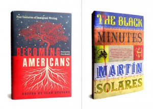
I’ve long been familiar with the work of Roberto de Vicq de Cumptich through projects such as Bembo’s Zoo and Type Calendar (I also just discovered Ho...
Project49 is a self-initiated poster series by Jeremy Payne based on the San Francisco 49 mile scenic drive, which he walked and photographed in its e...
Even though it’s only January, I would venture a guess that Marian will be at the very top of my Favorite fonts of 2011 list a year from now. Designed...
Hello Readers! I wanted to give you a head’s up that DWL will be joining internet giants like Wikipedia, Reddit and BoingBoing, as well as many other ...
If you’re looking for a non-traditional Valentine’s Day card this holiday, look no further than The Hungry Workshop‘s two new designs. Love Struck fea...
1985 is a new typographic experiment by Jan Avendano. Prints are available right here—would make a great gift for someone born that year. ...
Tracy Hung is a recent graduate of Art Center College of Design. Linger is a 5-week long summer outdoor film festival in Pasadena, California, for whi...
Tim Boelaars just launched a pretty extensive set of icons that encompasses quite a wide range of topics. Check out the rest right here. ...
Illustrated Etymology is an intriguing project by Adam Garcia. Illustrated Etymology is just that – a collection of visual correlatives to English wor...
Kring Emporium’s full name is “Kring Emporium of Tiny Literature and Cards”. And they sell just that: miniature storybooks, cards and other paper good...
Many Hands is a new shop that allows you to purchase variety of artwork directly from a carefully curated group of artists. A few of my favorites are ...
Lee Anthony Zelenak created these print pieces for Art of Ornament No. 2, an annual charity event hosted by AIGA Cleveland. The event enlists members ...
Jason Perez conceptualized these unique wine displays for Treasury Wine Estates, using only sustainable or upcycled materials provided by the winery....
This gorgeous packaging was conceptualized, designed and illustrated by Simon Frous for Jamaica Blue Premium Coffee. Based on the island’s close proxi...
Good morning readers! Just a quick reminder about the DWL Content Survey, which is open through tomorrow: if you’re still interested in giving us some...
Feast your eyes on the stunning work of Japanese illustrator Yukari Terakado....
Bravo Company designed the identity and collateral for By Invite Only, a handcrafted jewelry brand, with a rustic, vintage circus theme. via BP&O...
This lettering specimen, created by Typebrain, was inspired by the envelope for Spanish cigarette rolling papers from 1899....
Icinori is the publishing project of Mayumi Otero and Raphael Urwiller. Together they produce limited edition artist book that are hand printed and bo...
These abstract, organic illustrations were created by Ana Raimundo, a Portugal-based artist who, among other things, is inspired by people’s portrait...
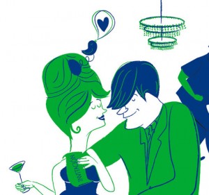
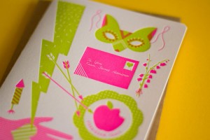
Loving the playful work of Spanish illustrator Marisa Morea—especially this series of images that adorn a party invitation....
I’m loving the sleek curves and high contrast thicks and thins of Vanitas, a new typeface by California-based foundry Reserves. Pick up a copy right h...
Brian Michael Gossett (who just launched a new portfolio site) created these imaginary worlds for People for Bikes, an organization committed to makin...
Berlin-based studio Apfel Zet designed this poster series for Stuttgarter Filmwinter, a short and experimental film festival....
For his thesis project, Robert Finkel chose to produce an exhibition based on the history of the arrow, entitled Up, Down, Left, Right. Here’s a brief...
These beautiful lettering snippets were created by Saranna Drury. More here. via Typeverything...
FOUND: 1. Garnet Karung Credit Card Case, 2. Continuum Necklace, 3. Sur La Table Red Baroque Charger, 4. Nike Blazer Hi Suede VNTG Deep Garnet, 5. Red...
Hey Readers! As we get ready to launch the redesign in the next couple of months, I have my mind on content. We have some ideas in the works for chang...
SVA just launched a new poster campaign featuring a design by George Tscherny, who actually taught their first graphic design course in the 1950s and ...
I’m loving the graphic illustrations and limited color palettes of the packaging designed for Intuition Ale by DeRouen & Co. Definitely the kind of be...
Check out the incredible drawings of Jorinde Voigt. Wow. via But Does it Float...
I discovered Fabio Ongarato Design late in 2010, and have loved every project they’ve done since then. So it’s no surprise that I was impressed with t...