Designers & looks like it could be a great resource for designers to connect with both printers and developers. I love these great illustrations about...
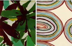
I’m in love with these hand-painted watercolor patterns by Luli Sánchez. So much more to see right here. via Oh Joy!...
Laudon is the Swedish type design studio of Carolina Laudon, focused on typography, type design and type education. Here’s a small sampling of the typ...
Borja Bonaque just released this print series of urban landscapes housed within basic geometric shapes. Get a closer look here and pick up a set for y...
I’m usually one for bright, vibrant color palettes, but the muted tones of these letterpress tags by Joseph Parra caught my eye this week....
We’ve got a brand new Facebook page! To go along with our current rebranding efforts, we’ve consolidated our updates to one page where we’ll post news...
The Seamless shop has been in the works for quite awhile, and we’re now finally ready to release our first product! We recently designed these celebra...
These illustrative numbers by Iglika Kodjakova are super fun. via Typography Served...
CODO Design recently developed the branding for Bird on a Wire, a small boutique in Franklin, Indiana that sells repurposed, recycled and refurbished ...
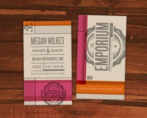
I’m a big fan of Foundry Collective’s work, so it’s no surprise that I love their branding for Emporium Pies. The color palette might be my favorite d...
Kurry is a fun, curvy new display face from Cadson Demak. ...
BOND recently completed the branding and interior design for Aschan Deli. I’m loving the pops of red against the neutral color palette and materials....
Check out this gorgeous promotion that Matter sent to their clients this year: two custom designed notebooks housed in a zipper-perforated mailer. Bea...
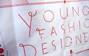
Great work by Matt Delbridge: pieces designed for Noble Discord, a proposed fashion show highlighting the collections of young Bay Area fashion design...
FOUND: 1. Need Supply Navy Watch (sold out), 2. Farm Ruck Sack, 3. Richer Poorer Socks, 4. Cracked Chroma iPad Case, 5. Ugmonk Percent Shirt, 6. Fleec...
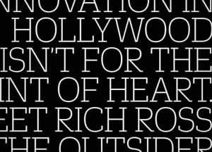
This past Fall, Fast Company—a magazine I subscribe to and highly recommend—launched a redesign featuring three custom typeface families by Commercial...
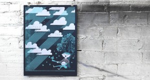
Lincoln, Nebraska based design and print studio Doe Eyed just launched a brand new site with loads of new work. Below you can see a small selection of...
I am really drawn to the offbeat brand designed by P.A.R. for Barcelona-based Strata Bakery. I know this look is something we’ve seen a lot of before,...
According to recent grad Colin Pinegar, F. Troupe is “a drunkship of cobblers from London who make shoes that are ‘quintessentially British.'” Check o...
I was happy to discover that Texas-based designer has an Etsy shop, where several screen printed posters are available for sale. Check out the rest ri...
I’m really inspired by the beautiful marbling in these posters found via Creative Review: Music worked with screen printers ASForPrint and marbling ar...
I’ve long been a fan of Thymes products—especially their packaging—so I was excited to learn about the products designed for a new line, Thymes Mandar...
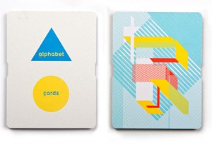
Australian agency Naughtyfish created this printed promotional piece for Keaykolour, a paper range manufactured by ArjoWiggins. Their unique spin on t...
The vibrant identity was designed by Stockholm Design Lab for Vårdapoteket, a Swedish pharmacy chain. What a breath of fresh air it would be to shop i...

Never thought these words would come out of my mouth, but I’m really liking JC Penney’s new brand. Seems like most of the Brand New commenters enthusi...
Computer Arts Collection is a new annual series of six in-depth guides from the makers of Computer Arts. I’ve seen one of these babies in person and i...
Check out this small sampling of vintage style posters by Paul Rogers. Much more to be seen right here. ...
I always love House Industries type catalogs. This one is even more of a beauty in person. ...
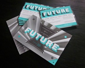
This incredible invitation package was designed by Will Miller, and Ohn Ho for Firebelly Design’s annual Grant for Good project....
I think the common perception is that, for the most part, wedding photography tends towards the cheesy and less towards the artistic. But Fer Juaristi...
Spade is a new chunky display face by Canada Type, which features one font with sharp edges and one with round....
Edrea Lita designed this graphic identity for Spread the Word, an organization that acts as a resource for designers who need logos from non-profit an...
Check out the gorgeous illustration work of Jessica Singh. ...
These unique, 3D posters were designed by Amy Rodchester for the Newcastle Festival of Dance. ...
FOUND: 1. Modern Library Storage Bin, 2. Bibliotheque Wooden Sign, 3. Vintage Wooden Card Catalog, 4. Edgar Allen Poe Library Candle, 5. Library Card ...
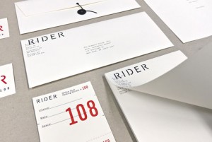
I’m loving Josh Finklea‘s identity for Rider, a boutique hotel chain that caters to touring musicians....
This beautiful publication was created by Swiss designer Felix Reichle, who happens to be—employers—looking for an internship in NYC. In his own words...
I’m absolutely loving the bold colors and intricate line work found in Nate Luetkehans’s illustrations. For more, you can follow Nate on Flickr or Dri...
Big Love Letterpress Valentine Card by Anemonene Letterpress Letterpress Card by Find Day Press You Make Me Smile Letterpress Card by Wiley Valentine ...
These beautiful maps were drawn in colored pencil by John Phalane, a cartographic artist who focuses on the areas of South Africa where he’s lived and...
I am a huge fan of Radiolab—if you don’t know the podcast, I highly recommend checking it out—so this brand and site redesign by recent Art Center gra...
I know we’ve barely made it through winter on the East Coast, but I am already craving warm, sunny weather and coastal road trips. Since I have no cho...
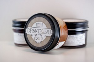
Take a look at yet another gorgeous project by Miller Creative: packaging for Drake & Lou, a small-batch jam maker, which features labels letterpresse...

We were happy to join in last week’s protest against SOPA and PIPA, and it looks like the internet’s joint efforts paid off. The bill has now been ind...
I became an instant fan of Lila Symons’s hand-lettering and calligraphy work the second I laid eyes on it. Take a look at a plethora of other work sam...
I’m loving the beautiful drawings and paintings of Sana Park. ...
Though I can’t speak a word of Norwegian, or translate their web page, I love the aesthetic details of this project for Grilleriet by Uniform....
Jiin Kim, another recent grad of Art Center College of Design, has an excellent portfolio. I was most impressed by these graphic, hand-sewn posters de...
This lovely packaging was designed by Paige Foley for Abbey Brown, Chicago-based soap artisan and gift shop....
Love this colorful image from CSA Flat File....
I’m not one for violence, so when Safwat Saleem emailed me about his latest project, a poster series based on “ass kicking and mayhem”, I almost wrote...
Below you will see a selection of Tom Davie‘s stellar typographic posters from 2011. Yesterday Tom actually kicked off a giveaway via his Facebook pag...
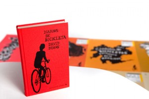
I spotted this poster series in the recent Communication Arts Typography Annual (lots of great work in there, by the way). Designed by Juan Marin, the...
Just a quick thank-you for those of you that filled out the DWL content survey last week. Your responses were extremely interesting and helpful, and w...
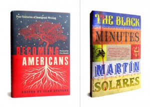
I’ve long been familiar with the work of Roberto de Vicq de Cumptich through projects such as Bembo’s Zoo and Type Calendar (I also just discovered Ho...
Project49 is a self-initiated poster series by Jeremy Payne based on the San Francisco 49 mile scenic drive, which he walked and photographed in its e...
Even though it’s only January, I would venture a guess that Marian will be at the very top of my Favorite fonts of 2011 list a year from now. Designed...

Hello Readers! I wanted to give you a head’s up that DWL will be joining internet giants like Wikipedia, Reddit and BoingBoing, as well as many other ...
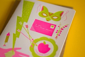
If you’re looking for a non-traditional Valentine’s Day card this holiday, look no further than The Hungry Workshop‘s two new designs. Love Struck fea...
1985 is a new typographic experiment by Jan Avendano. Prints are available right here—would make a great gift for someone born that year. ...
