We exist in an age of design and business that institutionalizes short attention spans. Main project. Side hustle. Really need to update my site. Clie...
I’m loving this recent project by Matt Chase that explores the concept, What Species Did You Evolve From? The design is great, but the content is even...
Kelli Anderson recently completed a complex series of infographics that explore the topic of “Buying a Gun in America,” for the Mayors Against Illegal...
Nicholas Felton has once again created a stunning annual report for 2012. This year’s version features 16 pages with sewn stitched binding, printed wi...
Sydney, Australia-based designer Olivia King has a profound love for ink. So much so that she developed this multi-page, hand-drawn infographic as an ...
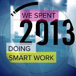
This year the creative team at TOKY took a different approach to their year-end assessment. Faced with the dilemma of a year flying by with no time to...
The Parks of the World is a series of striking infographics designed by Mikell Fine Iles. The series was developed to compare various characteristics ...
Trent Edwards is a recent grad of the excellent MFA program at Tyler School of Art. Of all his projects I’m especially loving his cartographic approac...
I’m a big fan of Nicholas Felton’s information design work—I’ve posted about him several times in the past, and own all of his printed personal Annual...
How cool are these tattoo infographics?!? A very impressive student project by Paul Marcinkowski. via Quipsologies ...
Like so many others, I’ve been admiring the infographic snippets Kelli Anderson has been posting on Dribbble over the last few months. So I was super ...
I don’t think I’ve seen one 826 project that I didn’t love, and this piece by Spencer Charles is no exception. Designed for 826 Seattle’s Greenwood Sp...
I’ve posted about Kelli Anderson several times in the past, so it’s no secret that I’m a big fan of her smart, thoughtful and visually arresting work....
A year ago yesterday, the massive Gulf oil spill began. In recent months though, chatter about the disastrous event has all but disappeared. The impen...
The Conquest, by Delane Meadows, is an infographic that visualizes the travels of the characters in Harry Potter and the Deathly Hallows. Click on the...
Andrew Janik‘s illustrations and infographics are smart, cheerful, and just all-around fun to look at....
Intelligence in Lifestyle Magazine is a supplement to the Italian newspaper, Il Sole 24 Ore. One of the art directors One of the publication’s art dir...
Loving this self-promotional infographic piece by Kenny Barela. via HOW magazine...
Take a look at 317 by Carolina Andreoli. According to Carolina: “317 is an exploration of how emotionally close versus how geographically close the pe...
Paper Cut, a studio of two French graphic designers living in Brooklyn, recently took a road trip to move from LA to NYC. Being the visual people that...
I’m really loving the incredibly sophisticated color palette of this oversized Map of the Future infographic. If you’re interested in the background o...
Infographic designer extraordinaire, Nicholas Felton, has just released his 2009 annual report. Each year I continue to be inspired by the new ways he...
A new little project by Frank Chimero....
Loving these nonsense infographics by designer Chad Hagen. via Pitch Design Union...
Alex Cornell has a great style, and a portfolio packed with fun projects, including the Mega City Impact Web, below. Lots more to see right here....
I’m loving the work Alice Cho has done for SEED magazine....
The husband-and-wife team behind Me and Mr. Jones created these awesome infographics as part of the 2009 RJ Calendar. Check out the rest of their port...
Nicholas Feltron has released his 2008 annual report. Take some time to look through all the infographic goodness, and pick up the print version right...
You can find GOOD sheet No. 11, Our Present Economy, right here. This edition is a collaboration with design studio, Kiss Me I’m Polish. Love this one...
The tenth GOOD sheet—National Service—covers the topic of Volunteerism in the U.S. and can be found right here....
You can find last week’s GOOD sheet, The First 100 Days, right here....
Unfortunately I don’t speak German, so I can’t really give you any information as to what any of these infographics actually mean. But they’re still b...
You can find GOOD sheet No. 8, America. Love It or Fix It ‘08, right here....
Better late than never—you can find the seventh GOOD sheet, “Does Your Vote Matter?”, right here. As always, click on the photo for the full size imag...
You can find the third GOOD sheet, It’s the Economy, Stupid!, right here....
I forgot to mention this last week. The latest GOOD sheet to be released, Reform School, is all about education. You can find it right here. I also re...
The fourth GOOD sheet, Getting Gas, is now posted right here. I can’t say I’m as crazy about this design as the others, but it’s still definitely inte...
Earl Boykins creates infographics based on the music he listens to—a pretty awesome combination of disciplines if you ask me....
You can find the third GOOD sheet, Coming to America (on immigration, if you hadn’t guessed), right here....
Steve Stankiewicz Nigel Peake Zsuzsanna Ilijin (Much more map goodness to be found in each of their portfolios.)...
I recently came across the work of Brian Oakes in an article on Design Observer where they were discussing the Lehman Brothers situation. What brought...
I’ve been a subscriber of GOOD Magazine since it started. In case you’re not aware, it’s a publication “for people who give a damn” whose subscription...
This site is great for anyone wanting to keep up with all of the election news. Perspctv takes traditional news feeds as well as blog posts and tweets...
Image from Mr. Wright This site compiles all of the graphics and imagery created in support of Barack Obama, which is pretty awesome to see all in one...