Anagrama gives a fun and refreshing new look to a toilet tissue brand: Smartas....
According to MyFonts: Marat Sans is a clean and lively sans serif typeface designed by Ludwig Übele. It is characterized by excellent legibility and s...
States of Matter has a tradition of sending out creative holiday promotions to their clients. Below you can get some insight into their thinking strai...
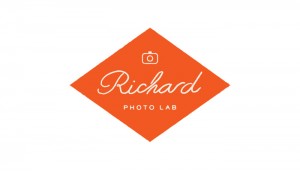
Matchstic’s new identity for Richard Photo Lab just plain makes me happy. From the color palette to the vintagey graphic details to the friendly and w...
This morning, designer and illustrator Brad Woodard has officially launched his new studio, Brave the Woods. He’s got lots of new work to share, inclu...
I’m excited to announce that our 2013 coasters are now up in the shop! This year, the set of four coasters will not only give you a place to rest your...
I’m loving the crisp, clean modern details (and the color palette, of course—can’t resist mint!) of the identity and collateral designed for Norton by...
Beautiful identity work by Savvy Studio for Iannilli, a traditional Italian restaurant....
Love these playful food pyramid illustrations that Mikey Burton created for a recent issue of Real Simple....
One of my resolutions this year is to get my hands dirty with craft projects more often. On that note, here’s a few courses that sound pretty interest...
Barcelona-based Solo is making some seriously sophisticated work. Love the packaging and collateral they developed for Viña Verino, a wine made by Gar...
I’m loving the combination of gold foil and (what looks like) vibrant colored pencil sketches on this series of notecards by Kamal. Check them out in ...
Memo NY developed this identity and collateral for San Marco, Mario Battali’s Italian trattoria and wine bar at the Venetian Hotel in Las Vegas via Ar...
Designer Bryan Kepleskey has had the fun privilege of working with the Austin, Texas barbershop chain, Birds, to create interior artwork for each of t...
Vulpa is a quirky little serif typeface by Schizotype Fonts....
I’m loving the layered, collage-like illustration of Zurich, Switzerland-based Mariana Rodrigues....
Some awesome work by Allan Peters and his team at the Target inHouse design studio for their 50th Anniversary Party. Get a closer look right here. Cre...
Sure, some aspects of this work by STUDIO ARHOJ tends toward the visually chaotic, but I love it. Check out more details from their work for Helt, a D...
Take a look at this student packaging project by Pratt student Michelle Wang: packaging design for We the People, White House Brew. The design is real...
I recently came across the portfolio of LAND, a studio formed by Caleb Owen Everitt and Ryan Rhodes, and became an instant fan. Each piece has a weath...
I’ve already acquired way too many calendars for 2013, but this perpetual calendar designed for Fab by Studio Lin is really tempting. If you’re intere...
I’ve got my eye on Australis Pro from Latinotype....
Designer Joanna Waterfall developed this identity for Block Shop Textiles, a line of beautiful silk and cotton scarves that are hand-block-printed in ...
Bella Figura recently launched their 2013 invitation collection, which features a huge amount of beautiful designs by various designers. A few of my f...
DWL fave Lab Partners just added a really fun new series of prints to their shop, featuring a colorful, graphic peacock illustration. Each print is si...
This impressive student project was developed by Fred Carriedo for the Transform conference, an event that tackles evolution and the future of communi...

I’ve had a DSLR camera for a couple of years now, but I’ve never devoted quite enough time to learning the ins and outs of photography that I would li...
Designer Amber Asay developed the identity and collateral for The Voyager Shop, a San Francisco lifestyle boutique, while a student at Brigham Young U...
I spotted this project over on Allan’s blog yesterday and immediately knew I had to share here as well. I’m a huge fan of Eight Hour Day’s work, and t...
Roman Extended Lightface is a new release from the Hamilton Wood Type Foundry. This new digitization features a full Western and Eastern European char...
While working at Sagmeister & Walsh, Spanish designer Xavi Garcia had the privilege of doing some work for Story, a unique, immersive store experience...
Feast your eyes on the vibrant illustration work of Hazuki Miyahara—I especially love the layered blocks of color found in each piece. ...
I’m loving this pair of sophisticated identities that David J Weissberg developed for Jane Mayle....
Yesterday Monotype’s new font rental service, SkyFonts, officially came out of beta and released publicly. The service gives users access to over 8000...
The folks at 3 Advertising created this impressive identity and business card for photographer Michael Barley. Beyond all of the intricate production ...
This week Daniel Howells relaunched siteInspire, which if you’re not familiar, is a showcase of great design for the web. Overall the new design isn’t...
Earlier this week Jessica Hische launched her latest font, Minot, a beautiful ornamental display face. Minot includes three styles—Outline, Fill and B...
Barcelona-based studio Lo Siento developed this fun and playful identity and collateral for the Tenerife Design Festival, a design festival held in th...
The layered type trend has certainly taken off in the last year or so. (See Detroit, Valuco, Frontage.) Now Latinotype has contributed their version t...
Bleed—who recently launched a beautifully redesigned website—developed this sophisticated identity and collateral for Aker Brygge, a popular area in O...
This year the creative team at TOKY took a different approach to their year-end assessment. Faced with the dilemma of a year flying by with no time to...
Invisible Creature designed this beautiful set of architectural nesting blocks for Toth Construction as a holiday gift for their clients. The blocks a...
Before I took a look back, I thought I might have a hard time finding ten really great typefaces from 2012 to feature. But once I actually explored th...
I don’t know about you, but for me the new year means taking a fresh look at my business, assessing what’s working and what needs to change, and deter...
Designer Darrin Higgins developed the brand and web experience for new site Sprout Up, which aims to provide children with environmental education: En...
I’ve got one more 2013 calendar to share with you this week (and likely for the year). Designed by Megan Sullivan of Carnevale, this desk calendar fea...
You may remember the stationery designed for the Cattle Baron’s Ball by Cory Say that was posted back in August. Well today he’s been kind enough to s...
This morning I’m loving Quarzo, an elegant, traditional script by Corradine Fonts....
This year, North Carolina-based ad agency Mottis developed a really fun interactive story for their holiday promotion. The story revolves around Jelly...
For their second volume, CA Collection has undergone a complete design overhaul. The first edition was stellar, in both design and content, but the ne...
If you’re in the market for a large wall calendar, designer Edwin Carter has two awesome options for you. First up is Radial, a calendar based on and ...
On the opposite end of the design spectrum is this charming letterpress calendar by Mink Letterpress. Each month features a pastel illustration of a d...
I promise I won’t overload you with too many more 2013 calendars this year, but I do have a few lined up that I think are worth sharing. It’s certainl...
While I was away last week, FUNNEL updated their portfolio with a couple of new projects, including this gorgeous identity and collateral for Tailored...
Illustration by Ma + Chr via L’affiche Moderne Happy New Year readers! We’ve got lots of things in store for the coming year that we’re excited to sha...
We’re taking off this week to spend time with friends and family for Christmas. We’ll be back and raring to go first thing in January. Best wishes for...
Carat is a “contemporary interpretation of a classic serif” by German foundry Hoftype....
Finnish illustrator/designer/artist Hanna Konola is currently in the process of adding to her Christmas calendar, a daily illustration project. Despit...
Each year Monnet Design redirects the money typically spent on holiday gifts to charities: Here’s what they did in 2011: As we’ve done since our found...
Cosmos MMXII is a 2013 calendar that consists of 12 original illustrations inspired by the universe and beyond. Beautiful! It’s available as a high-re...