For the past couple of years Atelier Martino&Jaña has done an excellent job creating the look and materials for the Guimarães Jazz festival, an annual...
Check out this super creative card by the folks over at Division Of/. Each year they aim to make a useful holiday gift, so this year they created a ge...
The Fruitful Field, by Maddison Graphic, is an identity and book for the Methodist Church introducing their project of the same name. I’m particularly...
This beautiful Holiday “gift pack”, which includes 3 cards, gift tags, postcards and an ornament, was conceptualized, illustrated designed and printed...
As a team, Karen To and Piper Weaver developed the announcement and program for the CalArts 2011 Graduation. Based on theme of metamorphosis, the desi...
This stunningly beautiful invitation was designed by TOKY for the St. Louis Library Foundation’s annual gala. Here’s a little insight into the process...
I’m always a fan of Erin Jang’s work, so it’s no surprise that I’m loving the new calendars designed for 2012. I have her 2011 Icon Calendar hanging u...
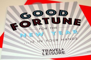
This playful fortune teller holiday card was created for Travel + Leisure magazine by art Director Jill Sabato and her talented in-house design team. ...
I’m consistently impressed with the work coming out of Atlanta-based Matchstic, so my eyes widened when I spotted the recent rebrand of their own stud...
I have been a fan of the Lost Type Co-op since it opened its doors. So I’m pleased to announce that as of this morning they have launched a brand new ...
I’m really excited about Gifted, a side project from the folks at Atelier 1A and FormFiftyFive. Gifted will be a mix of a “shop, blog and community fu...
I have a huge sweet tooth, so well-done branding for any dessert-related product is hard for me to resist. Case in point: Swoon, a custom sugar cookie...
Cast Iron Design Company, a relatively new two-man shop, has just launched their complete website. There’s lots of great work to be seen, but I was es...
Exciting news—two huge talents, Eric Strohl and Christine Celic Strohl have officially joined forces as STROHL, a San Francisco-based design firm spec...
Apologies if you saw this post disappear earlier today, an unfinished version of this post went up unintentionally. Like Figtree says in their descrip...
I loved Brad Woodard’s illustration style at first sight—especially this poster design he created for Big Fish, a submission to the current Silver Scr...
I’m loving this new screen print by Loulou & Tummie, Moonwalking the Dog—great color palette. Pick up a print for yourself in their shop....
Moxy Creative House presents Touristique, a series of five illustrated posters based on major cities. They’re available for purchase right here. New Y...
If you’re still on the hunt for this year’s holiday cards, this set by Sane and Able, The Londoner Christmas Games, is definitely a fun and one-of-a-k...
Take a look at this beautiful senior project by Tony Lee Jr., a recent graduate of Carnegie Mellon. He developed visual identities for three Puccini o...
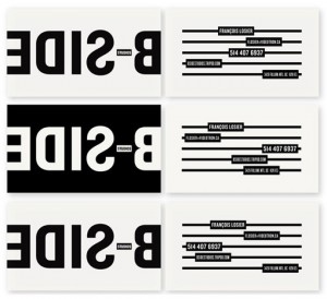
I’m loving the crisp black and white branding and materials for B Side Studios by Sébastien Bisson. via The Dsgn Blog...
Citizens for Optimism is a collaboration among 17 up and coming designers who strive to use their unique styles to inspire happiness through design. O...
Michael Croxton recently did a bit of work for Viacom and Viacom International that caught my eye. This first set of images represent a campaign creat...
Hopscotch Design is the new studio of paper artist Chloe Fleury, who I featured back in February. She’s been quite busy since then, as you can see by ...
DWL fave Vesa Sammalisto just launched an online shop! The shop currently stocks his personal Alphabet project, a series of limited edition mini print...
As a kid, my brothers and I used to get one of those vintage style chocolate advent calendars every year, which was pretty much my favorite thing abou...
Mama’s Sauce is generously offering you almost 200 300 dpi bitmaps of created from scanning their collection of vintage letterpress plates. Score! Jol...
I can’t get enough of Martin O’Neill’s mixed media, and largely typographic, collage and art work. Check out a whole lot more here, and pick up prints...
Lovely branding and design for Fitting Wines by Marian Williams Design....
Typographic maps are nothing new, but these by Fontmap are the best I’ve seen. The letters that denote each area also make up an accurate geographic r...
Emily Macrae’s Nine Lives is a self-initiated project that examines how older generations are affected by the huge changes in the way we communicate. ...
I just recently stumbled upon this project of Linzie Hunter‘s from last Christmas, where she hand lettered 100 different holiday cards for clients. He...
Check out this gorgeous branding created by Miller Creative for Olli Salumeria, a virginia-based shop that makes dry-cured salumi. I especially love t...
The creative letterpress projects that are coming out of The Hungry Workshop are so incredibly inspiring—this little piece of paper goodness was desig...
Earlier this month Foundry Collective launched a beautiful new site featuring lots of new work. They excel at layering typographic and illustrative de...
Love this simple, yet bold packaging and identity work for Quills Coffee by Pedale Design....
Awhile back I briefly mentioned the Area Code Project, Mike McQuade’s ongoing project whose mission is to catalog all of the area codes in the United ...
I came across this graphic packaging the other day, and they immediately grabbed my attention. According to the source, BP&O, John & John is “is a ran...
Minneapolis has such an amazing design scene, including an especially high concentration of talented female designers. So it was great to see the deve...
Last week Curtis Jinkins launched a brand new site for his shop, Neighborhood Studio, featuring loads of new work. All of it is fantastic, but this pa...
TunnelBravo recently completed the identity and collateral design for North, a brand new Italian restaurant in Phoenix. I’m especially loving the hand...
Like so many others, I’ve been admiring the infographic snippets Kelli Anderson has been posting on Dribbble over the last few months. So I was super ...
Mai K. Nguyen is a current design student at Cal Poly San Luis Obispo with a whole lot of talent. I’m incredibly impressed with this identity and pack...
I’ve been a big fan of Nate Williams’s illustration, design and lettering work for quite awhile, so it’s no surprise that I instantly loved one of his...
Check out this gorgeous announcement that Greg Christman designed to celebrate the birth of his son Oliver (love that name!). The lyric he chose to us...
Thanks again to all who participated! I’m psyched to have a huge list of new recipes to try; check the comments on the original post to see for yourse...
Have you heard of Fake Anything? I hadn’t before I received Misty Manley‘s submission. But I’m certainly glad I did, especially since the blog feature...
A beautiful identity for Park House by London-based NB Studio. More here....
When we were planning our wedding last year, a wedding video seemed like one of the items we could live without, so we opted not to hire a videographe...
For The New York Times Magazine’s Education Issue, Dan Cassaro was commissioned to create a a series of stickers to accompany each article. It looks l...
DDB New York’s campaign for ADC’s Annual Awards Call for Entries is just plain awesome—I think we all can relate. I especially love the tagline: Keep ...
I’m always on the lookout for scripts that emulate handwriting a bit more than traditional ones do, so I was excited to discover Carolyna, which defin...
I’m incredibly inspired by the work of Eric Frommelt, whose abstract compositions are informed by “technology, maps, data visualizations, information ...
I’ve said before that I don’t feature web design enough around here, so I’m excited to share this sleek design for Mr. Bob Films by René Bieder and Ya...
Philadelphia’s Tyler School of Art seems to be producing one talented designer after another—we’ve posted about a few of their students from the progr...
LOVE this student project by Miriam Altamira—packaging for a series of Cocktail Sodas...
I’m a bit late to the game on this one, but I am so excited about this new poster series by Lab Partners that I had to share. This screen printed, fiv...
Along with a newly designed website, San Francisco-based stationery design shop Hello! Lucky recently launched a series of fantastic custom holiday ca...
I’m completely smitten with this new project by Stitch Design Co. Rewined is a line of allnatural soy candles that are housed in recycled wine bottles...
This giveaway is now closed; the winner will be announced on Monday morning. Thanks to all who participated! For the third week in a row, I have anoth...