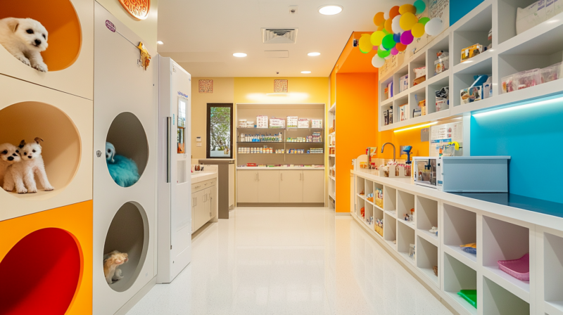
In veterinary care, customer trust is essential. After all, not only are more and more people owning pets, but many also care deeply about their furry...
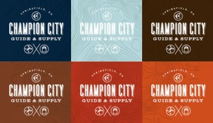
I recently came across the work of Guts & Glory, the Oakland, California-based studio founded by Faun Chapin and Meg Paradise, and I am loving what th...
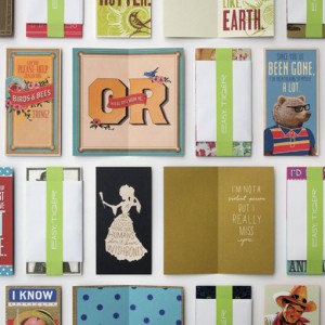
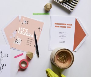
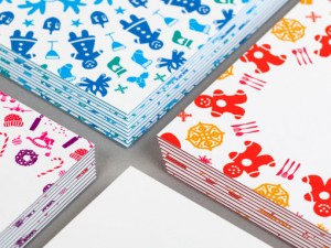
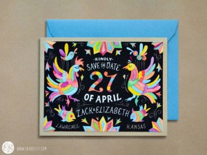
Easy Tiger is a new Kansas City based stationery business that strives to make “cards for awesome people.” And they are certainly distributed in an aw...
I have proclaimed my love for Behancein all its formson this blog many times, but one of their services I use the most is Creative’s Outfitter, a shop...
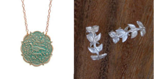
Stationery from Chewing the Cud Let’s Ketchup Card, $4.25 right here. Jewelry from We Dream in Colour Ines Necklace, $42 and Athena Silver Ring, $72...

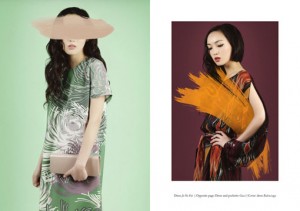
Everyone seems to be talking about the new Kate Spade collection right now. And as much as I love the clothes and accessories, I’m more impressed by t...
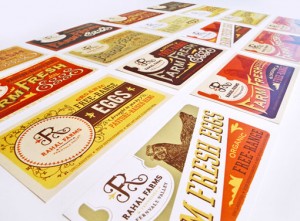
Nashville-based Anderson Design Group recently completed this branding project for Rahal Farms, a holistic and sustainable farm, also in Tennessee.The...

Brooklyn-based studio Franklyn?recently completed a rebrand for Betaworks,?who builds and invests in companies and products in the digital realm. Part...
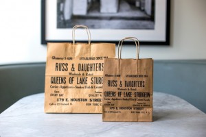
I am incredibly impressed with the extensive?project that Kelli Anderson recently completed for New York institution, Russ and Daughters. Working alon...

I just recently stumbled upon Roger Dario‘s portfolio?which he just redesigned this past winter?and found a selection of really impressive identity pr...
I’m loving the whimsical and?colorful illustration style of Boyoun Kim, who I stumbled upon on Etsy. Her shop features?the?selection of prints you see...
Paperless Post’s latest collaboration is with none other than major fashion brand?J. Crew, who created a collection of 42 greetings and invitations th...
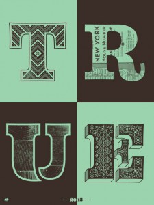
Kevin Cantrell just completed the next poster in his 7 Days series, Terra, and it is—as expected—just plain gorgeous. This time around he has printed ...
This week’s Wise Words come from English philosopher, statesman, scientist, jurist, orator, essayist, and author, Francis Bacon. via The Quotery...
Meagan Tidwell has a beautiful portfolio filled with work that is sophisticated, elegant and often soft, light, airy. Below are a few projects that pa...
Laski Slab is a new release from Amsterdam-based foundry Re-Type. Conceived for editorial purposes, the typeface includes a total of 20 fonts, includi...
Neenah Paper recently worked with Design Army to reinvent their line of Environment papers, including the development of a new color palette and textu...
Triboro recently relaunched their website with a ton of beautiful, new work. One project that particularly caught my eye is their identity and collate...
Not your typical DWL post, but I cannot get enough of these gorgeous, patterned hardwood floor tiles by Mirth Studio....
This year, for their annual Arbor Day initiative, KNOCK Inc put together a Buzzfeed-style quiz that tells users what CelebriTree they are. Results are...
It’s been a little while since I checked in with what Fuzzco was up to, and since I always love their work, I figured now is the time. Here are a few ...
Looking for some new color inspiration? Check out The Day’s Color, a daily color digest. If you’re looking for icons to use in your next design projec...
Illustrators Alyssa Nassner and Allison Beck just recently launched Hooray Today, a new line of colorful greeting cards and paper goods. They have lot...
I’m really enjoying these two student packaging projects by Rosie Gopaul, a designer based out of Vancouver, BC. Hushh Stewards Soapery Messy Masters ...
This week’s Wise Words from James Victore remind us that a change of attitude can go a long way. Check out the companion Burning Questions video for m...
Urban Grotesk is Suitcase Type Foundry‘s most recent release. A traditional grotesk sans serif, this typeface includes six weights with matching itali...
New from BLOW is their work for Project Charisma, a teaser promotion for Polytrade Paper. To promote their range of eight papers, BLOW developed eight...
This week’s recommended resource is a book I just finished reading and found incredibly insightful, The Design Method by Eric Karjaluoto. You may be f...
Last week I had the incredible opportunity to travel to Atlanta and work with Marriott Hotels as they celebrate the launch of Meetings Imagined, an am...
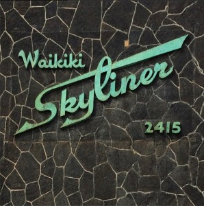
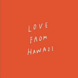
Since Hawaii is my absolute favorite place on earth, I am loving this Instagram photo series of vintage signs found there. Most of the images have bee...
Discover.typography is a really cool tool developed by H&Co that provides users with the ability “to experience type, an environment that makes it eas...
Ghost Signs is a New Jersey-based shop featuring photographs of ghost signs, brick ads, painted advertisements, faded signage, and old hand painted wa...
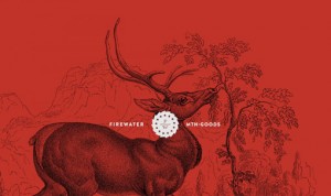
I am by no means a whiskey fan, but I definitely love the bold identity and packaging that Werklig developed for Kyrö Distillery Company, a rye whiske...
This week’s Wise Words come from Joshua Grott, Creative Director at Epipheo, a video production company “dedicated to translating ideas into true stor...
Adorn is Laura Worthington‘s latest font family. Aimed at the handmade wedding invitation crowd, the family includes seven display fonts, four script ...
I’m loving some of Hammerpress’s most recently launched paper goods, from their series of astrological notecards, to their small chipboard prints, to ...
This series of beautiful colored pencil illustrations was created by Morgan Davidson, a soon-to-be graduate of Ringling College of Art and Design. Eac...
Before there was Pantone, there was A. Boogert, who wrote a book in Dutch about mixing watercolors in 1692. The resulting book, which ended up spannin...
I’m loving these colorful, abstract paintings created by Belinda Marshall, a Melbourne, Australia-based artist and surface designer. Her Etsy shop off...
This week’s Wise Words come from psychologist Barry Schwartz’s 2009 TED Talk, Our Loss of Wisdom. via The Quotery...
Modum is a new contemporary serif typeface from The Northern Block. Featuring eight weights with matching italics, over 800 characters, seven variatio...
Kevin Cantrell has recently lent his beautiful, highly detailed, maximalist style to the identity, collateral and packaging for Commonwealth Coffee. T...
Oslo-based studio Bielke+Yang developed this dynamic, experimental identity for the new incarnation of the traditional Norwegian Agriculture Museum. B...
...
This week’s wise words come from Sharon Ann Lee’s Creative Mornings talk about what she calls “DYO (Design Your Own) Success.” ...
Chicago-based designer Will Miller worked with AURA Natural pet to develop their identity, packaging and stationery. One detail that especially stands...
Geometria is a new geometric sans serif typeface from Moscow-based type foundry Brownfox. The typeface offers 16 fonts, encompassing eight weights wit...
I’m in love with this minimal identity and gorgeous business cards and tags designed by The Hungry Workshop for Inkster Maken, designer of equally min...
The newest addition to MOO’s incredible line of paper products is letterhead. The letterhead is available in both their classic (80lb) and Luxe (90lb)...
I’m loving Maud Vantours‘s colorful 3D paper sculptures which I discovered via Collosal. It was really interesting to see how Anna Bond of Rifle Paper...
With all of the holidays and graduations coming up, you, like me, probably have quite a few gifts on your list. One great option which would work for ...
Moglea recently got their new collection uploaded to their Etsy shop and it is all kinds of awesome. Featuring playful hand lettering, candy colored w...
Every May I am faced with a gift-giving challenge, as Mother’s Day and my Mom’s birthday happen to fall less than a week apart. Do I combine gifts? Ge...
This week’s wise words come from author Og Mandino who I discovered via the Sycamore Street Press Instagram feed....
Moniker is a new San Francisco-based studio led by Brent Couchman. I’ve always been a fan of Brent’s work—see here, here and here—so I’m not surprised...
Grilli Type just recently released their latest typeface, GT Sectra, an angular serif. Originally designed for the long-form journalism magazine “Repo...
If you want a jolt of creative inspiration, try looking to PIE Books, a Japanese book publisher who aims to produce “sweet and fresh books that keep y...
This morning I’m excited to introduce you to The Meaning of Maggie, Megan Jean’s Sovern‘s debut novel about eleven-year-old Maggie Mayfield, a “girl j...
Check out the charming illustration work of My Dear Fellow Co., a husband-and-wife paper goods studio based in Dallas, Texas. Their shop features a se...
French artist Miguel Chevalier made the floors of the Sacré Coeur church in Casablanca, Morocco his canvas with his new project Magic Carpets 2014. Th...
I’m not sure how it took me so long to come across Naomi Wilkinson‘s beautiful work. A UK-based illustrator, Naomi’s Etsy shop features a tightly cura...
This week’s wise words come from novelist, philosopher, playwright, and screenwriter Ayn Rand, via The Quotery....
If you’re looking for a playful typeface for a new project, these few examples from Type-Ø-Tones may be worth a look. The Barcelona-based digital foun...
One of Almanac’s most recent projects is the branding and website development for photography Jay Fram. We began our discovery phase by working with J...
It’s that time of year again—enter to win Hatch’s Annual Easter Egg decorating Contest. If you want a daily dose of found typography, follow New York ...
...
Wise words for both work and life via The Quotery....
Rein Grotesk, a new release by The Northern Block, is “a low contrast typeface with a strong, neutral personality.” The sans serif typeface includes s...
I follow quite a few blogs, and beyond those featuring visual inspiration, I love reading articles that make me think and help me to improve how I run...
I really enjoyed this week’s interview with Austin Kleon on The Great Discontent. This video showing how lettering is painted on city streets is prett...
Etsy shop BelloPop makes colorful, geometric prints and decorative matchboxes. See all that they have to offer right here....
Miles Design worked with the team at William Roam on an extensive project which encompassed their identity and stationery, website, the naming and pac...
This week’s Wise Words come from Mark Z. Danielewski’s House of Leaves via Jen Myers. ...
Love this illustration series by Mike Ellis. Entitled Room For Rent, the illustrations were created as part of an experiential installation show where...
Surveyor is a brand new release from H&Co.; a serif family that was inspired by the lettering found on engraved maps. Check out all of the—plentiful—i...
I’m loving this vibrant and dynamic identity redesign for the Freies Theater Hannover by Hardy Seiler and Created by Monkeys. via Form Fifty Five...
Shawna X created this impressive series of typographic illustrations, It’s Warm Inside, as a response to her long, cold winter in Chicago. The pieces ...
Exciting work by Winkreative for The Government of Thailand. As Thailand prepared to host the World Economic Forum, Winkreative was selected by the Of...
Future Artifacts, a digital art project by Dxmiq, is just about the opposite of the type of work I do, which is probably why I’m so drawn to it. While...
New York-based photographer Daniel Zvereff recently photographed a series of Arctic scenes using some of the last remaining stock of expired Kodak Aer...
...
Janine Rewell managed art direction, illustration and body paint design for a SS2014 Minna Parikka promotional campaign. Creative Credits: Photography...
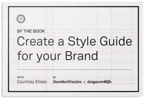
This afternoon I’m doing a series of posts featuring the winners of the first challenge in my Skillshare class, By the Book: Create a Style Guide for ...
This afternoon I’m doing a series of posts featuring the winners of the first challenge in my Skillshare class, By the Book: Create a Style Guide for ...
This afternoon I’m doing a series of posts featuring the winners of the first challenge in my Skillshare class, By the Book: Create a Style Guide for ...
Wise Words by Ann Landers via After the Jump...
I’m loving the identity and collateral designed by Jenney Stevens for Far North Spirits. The white glass bottle for their gin is especially gorgeous. ...
It’s fascinating to get a look behind the scenes of Wes Anderson’s latest film, The Grand Budapest Hotel, through the work of the designer, Annie Atki...
FF Dora is a serif family of five weights including display styles. OpenType features like ligatures, small caps, fractions, and super- and subscript ...
Check out the new stationery package that Stitch Design Co. designed to go with their recently updated website. Gorgeous, as always....
I’ve already raved about Skillshare’s educational platform multiple times, so I will keep this short and sweet. In addition to their offering of hundr...
For the past three years, Nicole McQuade—designer and photographer—and Judi Cutrone—writer—have been collaborating on Some Kitchen Stories, a blog tha...
I’m loving this beautiful stationery developed by MaeMae Paperie for Munster Rose, a floral design company based out of Minneapolis....
The VSCO Artist Initiative is a “$100,000 USD scholarship fund providing artists the resources to pursue their creative vision.” More info here. I cam...
I know it was only a week ago that I featured a desk design being funded on Kickstarter, but I’ve got another one for you today: The UpStanding Desk b...
Plus63 Design Co., a Phillipines-based studio, recently developed the brand identity and collateral for Your Local, a restaurant serving Asian comfort...
This week’s Wise Words on community come from Jenna Meister of Airbnb. via Behance Instagram...
Bryan Patrick Todd recently opened his first solo show, “Banner Year,” which includes eight handcrafted banners featuring eight quotes serving as “par...
Result is a grotesque sans serif designed by Cloud9 Type Dept, an independant type foundry based out of Helsinki, Finland. Result features three weigh...
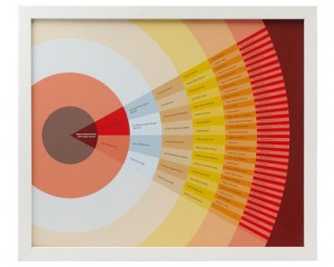
I’ve always been a fan of Nicholas Felton‘s personal annual reports—so much so that I own every single one, in all of their data-heavy, infographic, p...
Regular readers may remember the introduction of the Slate Mobile Air Desk seen here a few months ago. At that time my enthusiasm for this new product...
This week’s Wise Words come from Antoine de Saint-Exupery via this great collection of leadership quotes, by way of Swissmiss....
At the moment, I happen to be anxiously anticipating Wes Anderson‘s new film, The Grand Budapest Hotel (now in select theaters.) So when I spotted Nat...
Lovely clean, modern, sophisticated work for BNT Studio, “a distribution studio devoted to design and innovation,” by Emmanuel Cohen....
Malina is a new display face by Katatrad, a Thailand-based foundry. Defined by graceful, elegant letterforms, the typeface includes four fonts—two wei...
Congrats, Allison—you’ve won a free pass to the upcoming RE:DESIGN UXD Conference! Please shoot me an email so that I can pass your contact info onto ...
As a personal project, designers Naomie Ross and Daniel Renda set out to rebrand Pastosa Ravioli Co., an NYC shop whose pasta they both grew up eating...
When Adobe came to them to create an interpretive graphic of their logo, Sagmeister & Walsh came up with the brilliant idea of turning the process int...
This Perth, Australia-based Etsy Shop, Vintage Posters Art, is offering some awesome vintage poster reproductions. Their stock mostly covers travel—th...
I’m loving this vibrant work by 1983 Present for The Happy 8, a chain of hotels in Malaysia. The Happy 8 is a high-quality chain hotels brand of Malay...
It’s that time of year again! The 2014 RE:Design UXD Conference is coming up at the end of April in Brooklyn, and I’m happy to offer one lucky winner ...
Wise Words about the good things that can come from sharing your work from Tim O’Reilly via Austin Kleon...
It’s been far too long since I’ve posted a project from the ladies at Stitch Design Co., so this morning I’m excited to share their latest packaging p...
Over the years, Typejockeys has come up with various ideas for fonts that don’t necessarily warrant a huge, in-depth typeface buildout. So to give the...
Today, Scotty Reifsnyder and Chronicle Books release Cheers!, a set of 12 notecards and envelopes “perfect for toasting any occasion.” The set include...
Between the kaleidoscopic use of color and deconstructed, abstract forms, I can’t stop staring at Rollercoaster, a new illustration series by Atelier ...
While browsing Klim Type Foundry’s blog recently, I discovered D.T. Practice’s work for UK’s The Roxy. Featured because of its heavy use of a modified...
I’m excited to share more new beautiful work from Studio MPLS, this time a new brand identity, stationery and packaging project for Alli Marie, a new ...
Did anyone not fall in love with Mayhem this week? If you’re not familiar, Mayhem is an adorable, ultra creative four-year-old who makes dresses out o...
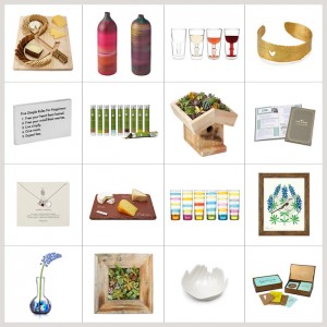
Luvocracy Love is a monthly column that features a handful of the products I’ve spotted over the past four weeks. Shop the links: 1. Colour + Pattern ...
One of the many reasons I fell in love with Hawaii when I first visited a few years ago, was the Aloha spirit that is in the air. Beyond a greeting, a...
Wise words from David Ogilvy, the “Father of Advertising.” For more wisdom, also check out his 10 Tips on Writing on Brain Pickings...
Revisal is a new typeface from Switzerland-based foundry Type Dynamic. This “humanist sans family” includes seven weights plus italics, from hairline ...
Personally, I’m not a huge fan of coconut water as a beverage. But despite that face, I am loving the fresh, sunny packaging that Marx Design recently...
As an avid user (and teacher) of Skillshare’s online classes, I thought it would be great to use this column to highlight a few of their offerings eac...
I am loving the work that Minneapolis’s Little has developed for Fair State Brewing Cooperative, Minnesota’s first cooperative brewery. As a co-op, th...
Matt Stevens‘s Junk Drawer series is an ongoing set of illustrations that depict “fascinating characters from pop culture by showing the random and fo...
I’m loving these cool “Seeing New York” Cinemagraphs by Ann Street Studio found via Diego Guevara’s blog. The folks at Global Inheritance are looking ...
Sarah Abbott’s Etsy Shop features a collection of prints and paper goods designed by the Sheffield, UK based artist, who clearly has a strong affinity...
I was happy to recently discover the work of Los Angeles-based Chris Turnham, who has worked as an artist in both feature and television animation and...
This week’s wise words come from Justin McMurray’s Medium article, The time is now to share your work with the world. Found via Austin Kleon‘s blog Th...
You may remember seeing Jessica Hische‘s epic wedding website awhile back, a richly detailed parallax design featuring the work of many of her and now...
Nomada, a new release from Tipografies, is a compact set of sans serif fonts in four upright weights, from light to black. Pick up a copy for yourself...
Victionary is an excellent resource for books that contain lots of design eye candy, both in the content as well as the books’ own designs. They have ...
I’m not sure how I have not come across Jen Mussari‘s lettering portfolio before now, but it is filled with all kinds of awesomeness. You can check ou...
We love Jono Garrett’s work so much that it’s getting a double post! And since it is Valentine’s Day, what better project to share than the gorgeous m...
I’m absolutely loving this sophisticated and whimsical brand identity and collateral system developed by Jono Garrett for Frida von Fuchs, a Berlin-ba...
I’m a huge fan of Stephen Powers’s (most recently featured here) large-scale, typographic, and poignant environmental works of art. So I was really ex...
In case you haven’t heard, The Great Discontent (on of my favorite blogs) has their sites set on creating a biannual print magazine! They currently ha...
...
Fairgoods, a shop that puts “the maker at the forefront,” recently introduced a couple of new products that caught my eye: Code Mode Light First, the ...
I’m happy to have recently discovered this new project by Scott Patt, an artist whose inspirations—”the folk art of his youth and post pop consumerism...
This week’s wise words come from French aristocrat, writer, poet, and pioneering aviator, Antoine de Saint-Exupéry....
Well, Groundhog Day has passed, and unfortunately most of us didn’t get the result we wanted (6 more weeks of winter—no fun), but that doesn’t mean we...
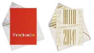
With Valentine’s Day swiftly approaching this week, I know many of you will be on the lookout for fun, interesting and creative greetings to send to f...
Louize is a new serif typeface by Nonpareille, the foundry of France-based, Swiss-born Matthieu Cortat. The typeface is a contemporary revival of Au...
Awesome work by Kjell Ekhorn and Jon Forss, of Non-Format, for nyMusikk, the leading promoter of contemporary music in Norway. nyMusikk, the leading p...
This afternoon I’m loving Coen Cast, a fun little side project from designer Richard Perez. He’s started a Tumblr to collect his illustrations of char...
I’m personally not a huge fan of “selfies” (both taking them myself and the word in general), but if I was surrounded by these amazing backdrops I mig...
Pennsylvania-based studio Projekt recently created a beautiful new identity and packaging system for Choiselle, a new line of all natural skincare pro...
Etsy shop Little Low Studio features the “illustrative, expressive, and charming style” of owner and designer Caitlin McClain. The shop offers a huge ...
Wise words from Steve Jobs’s 2005 commencement address at Stanford University. Watch a video of the entire speech on TED....
It’s impossible not to smile when viewing Jasper Gold‘s playful Faces in Places series, a fun set of illustrations depicting a handful of adorably ant...
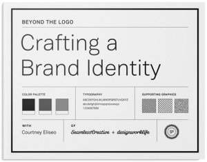
This afternoon I’m doing a series of posts featuring the winners of the first challenge in my Skillshare class, Beyond the Logo: Crafting a Brand Iden...
This afternoon I’m doing a series of posts featuring the winners of the first challenge in my Skillshare class, Beyond the Logo: Crafting a Brand Iden...
This afternoon I’m doing a series of posts featuring the winners of the first challenge in my Skillshare class, Beyond the Logo: Crafting a Brand Iden...
This afternoon I’m doing a series of posts featuring the winners of the first challenge in my Skillshare class, Beyond the Logo: Crafting a Brand Iden...
Industry Inc is a new typeface from Hold Fast Foundry, based on the previously released Industry family. This sans serif display face includes a colle...
Ludlow Kingsley had quite a few custom-designed chocolate bars left over from a recent holiday promotion. So, after weighing all their options, they d...
In 2012, Australia-based Studio Round was tasked with developing a brand new identity for the Jewish International Film Festival. Their goal was to re...
I’m absolutely loving the first series of limited edition prints from Print Club Boston, an initiative by artist Elizabeth Corkery. Each series will b...
I recently discovered the work of Vitae Design, the studio of Toronto-based independent graphic designer Cameron McKague. His work is equal parts mini...
Awesome work by Vancouver-based Post Projects for Brassneck Brewery, a retail brewery in the area. The design team developed their brand identity by c...
I love it when I see new updates pop into my reader from Studio MPLS. They’ve posted several new pieces of work in the last couple of weeks, including...
I’m loving Mike Dornseif‘s recent contribution to The Desktop Wallpaper Project on The Fox is Black. Yay Squarespace Logo. Enough said. Charms, Quiver...
I pretty much always buy wine based on its label (with the hope that it tastes good too), so I am all over this new packaging design for South Austral...
Luvocracy Love is a monthly column that features a handful of the products I’ve spotted over the past four weeks. Shop the links: 1. Aloha Maui Island...
This packaging series, a collaboration between Steven Noble and Taxi Studio, was created for Kate Hudnott, a UK-based drinks pioneer. The Taxi Design ...
ilovedust designed this series of 8 illustrated beer coasters as part of their most recent promotional pack. They will soon be available for purchase ...
...
Here is yet another gorgeous packaging project by Isabela Rodrigues (previously published here, here and here.) This time the creative work was develo...
Brandon Printed is a new variation on the much loved Brandon Grotesque by HVD Fonts. This new release has a distressed, printed look and includes four...
Bogotá, Colombia-based design studio Indice recently completed the identity and collateral for Ocio, a creative, informal restaurant and bar. The ency...
Design Square is a new, curated directory of the graphic design industry, aiming to make connections between design and business. The site is free to ...
I’m loving the colorful, whimsical characters that Rachael Saunders has created in the world of Otto’s Circus....
If you missed Ugmonk’s studio tour on their blog last week, it is definitely worth a look. For a small space, it is packed with design inspiration fro...
Savvy Studio recently worked on the design for Puebla 109, a new gastropub in Mexico City. The identity consists of a series of icons inspired by Mexi...
Kickstarter is an amazing place for watching (and helping) innovative ideas develop into real world products. Once a month we will feature one project...
This year, Hello! Lucky has designed a large collection of illustrated, letterpressed cards for Valentine’s Day. Each one features a light-hearted, qu...
It’s a rare occurrence when an annual report crosses my inbox these days, so I was pleasantly surprised to find Nicole and Mike McQuade‘s recently com...
Wise words from “Ask for Help,” Simon Sinek‘s best advice, given at Creative Morning’s 5th Birthday Bash. By the way, if you’re looking for more inspi...
For this year’s Valentine designs, The Hungry Workshop worked with two designers on unique letterpressed love notes. The first card was designed by Ge...
I’m loving the identity and custom packaging design that Funnel developed for Lyon Distilling Co. Based out of Saint Michaels, Maryland, the distiller...
Grota Rounded is a new unicase release from Latinotype. The typeface includes six weights, from thin to black, plus matching italics. Currently marked...
Excellent work by Anagrama for the lifestyle magazine Gist: Gist is a lifestyle magazine that reports on many different subjects, from fashion to gadg...
If you’re anything like me, your inbox is almost always overflowing. It’s a constant battle; and while “inbox zero” is not something I even try to ach...
Tim Lahan developed this fun set of illustrations for Kenzo. Each one represents a common English idiom having to do with eyes. I never would have gu...
Orlando-based studio Push recently took their design for restaurants one step further, by choosing to conceptualize, own and operate one for themselve...
I’ve seen Wedge & Lever, a relatively new (established in 2012) design studio out of San Diego, all over the place lately, and rightfully so. Their po...
Blok Design developed this promotional piece for The Advertising and Design Club of Canada with the goal of driving membership to the organization. Th...
Last weekend I went to see Her and it was magical. I absolutely loved it. Between its wide release last Friday and the Golden Globes, tons of articles...
...
While browsing around Behance recently I stumbled upon the awesome portfolio of Clara Mulligan, who happens to be a Design Director at Creature. And a...
Tony Lee Jr., a designer at MoMA Design Studio (and previously featured for his student work), recently sent over his updated portfolio. I was immedia...
This week Milton Glaser reminds us of the importance of concept over ornamentation. via Quotes on Design...
One of Apartment One‘s most recent projects is their work for Beespace, “a new concept nonprofit incubator, helping to identify and launch the next ge...
If, like me, you’ve been admiring Erik Marinovich‘s envelope handiwork via Friends of Type, you are in luck. Now, through his new project Do Not Open,...
Roihu is a new sans serif typeface by Mika Melvas that includes eight upright and eight italic weights. The set also includes a huge selection of swas...
This afternoon I am loving the stripped down, graphic brand identity and collateral that DIA developed for Porter & Plot: Porter & Plot is an artisana...
Timothy Goodman recently completed an impressive, permanent 60-foot wall installation for Airbnb, the culmination of almost three months of preliminar...
The What I Be project is a beautiful initiative by Steve Rosenfield Photography that aims to “tell your story the way you want it to be told.” The clo...
This week I am in love with the nostalgic and whimsical paintings of Janet Hill. Her Etsy shop offers a huge catalog of prints and originals—often upd...
Jonathan Quintin, of Studio JQ, is currently working on a self-initiated project that immediately caught my eye: a weather dashboard that will display...
UK-based illustrator Eleanor Taylor uses various methods to create her textural, narrative and somewhat somber mixed media illustrations. The layering...
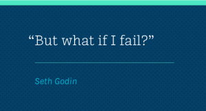
I love this recent short post from Seth Godin. It’s the perfect thought for the beginning of the year when we’re all contemplating new risks to take, ...
The latest project from BLOW’s creative team is the identity and collateral for Shanghai PoPo 336 a modern restaurant located in Shanghai: Inspired by...
I know the holidays are over, but I had to share one last holiday project until next season—Dan Cassaro‘s work for Old Navy’s latest holiday campaign....
Designer Shauna Luedtke, who is currently the Art Director at Fairgoods, designed these beautiful save the dates for her own wedding, which is coming ...
Stay Gold is one of Decade Type Foundry‘s newest releases. A vintage-inspired display script, the typeface includes a series of swashes, stylistic alt...
1001 pt is a new print shop that features a selection of A2 typographic screen prints, each one showcasing a letterform set in precisely 1001 points....
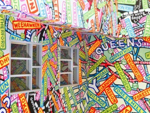
Though I don’t live there any longer, being a Queens resident for almost ten years means it will always hold a special place in my memory, which is wh...
The last couple of months have seen quite a few new site launches, including one for talented illustrator and designer Danielle Kroll. Designed by Jes...
Kelli Anderson’s standing desk Ikea hack (above) is absolutely incredible. Check out all of the behind the scenes construction details on her blog. Ni...
Heydays recently did a massive portfolio update (with a beautiful new site, by the way), and their work for Bolivar was one of the projects that caugh...
Etsy shop of illustrator Sue Jean Ko offers a selection of colorful greeting cards for all occasions. Each card design features a retro composition of...
It’s rare to see music packaging these days, so I was pleasantly surprised to stumble upon Anti Grandpeople‘s recent work for Rumble in Rhodes. The pa...
Some short and sweet words of wisdom from Jamie Tworkowski, as part of CreativeMorning’s recent series on Bravery. Check out the entire talk here....
I’ve always been a fan of Matt Stevens’s side projects (and envious of his productivity levels!), so it’s no surprise that I’m loving his latest perso...
From landscapes, to portraits, to wedding photography, Jessica Tremp always capture spontaneous moments that evoke pure and genuine emotion. And the d...
It’s that time of year again! I don’t know about you but I love end-of-the-year “Best of” lists. So below I present to you a selection of my twelve fa...
Moodley Brand Identity created this elegant brand identity for Studio Arrc, a design blog by Sophie Carr, an aspiring interior designer. The design te...
Glenn Wolk recently published a project that showcases all of the work he’s done with Arrow Shirts / Cluett and Peabody—a huge selection of gorgeous v...
If you enjoyed my previous podcast-themed post, you will definitely love Podcast Thing. Created by Max Temkin and Veronica Corzo-Duchardt, the site wa...
GIF(T)S FOR FUN is a collaborative series of holiday-themed animated gifs featuring illustration by Tyler Dale and animation by Nune Leites....
I’m loving States of Matter‘s holiday card design for 2013, a lucky wooden rabbit. My favorite detail is how the shape of the accompanying message mim...
I’ve been loving VSCO Cam’s 2013 round-ups. Check them out here: People, Environments, Black and White, Animals, Microcosms, The World. Two resources ...
This gorgeous event invitation was designed by Paperlux for DIE GOLDENE KAMERA. Technically this just a sneak peek before the event has taken place, s...
Luvocracy Love is a monthly column that features a handful of the products I’ve spotted over the past four weeks. Shop the links: 1. Geometric Print L...
I’m late to the game on this one, but last month Jeff Rogers launched a beautiful new site. In addition to huge, crisp images of his work, he’s also i...
A lovely holiday series by Tom Froese for River Rock Casino....
Some wise words from Jessi Arrington from the advice she gave at CreativeMorning’s fifth birthday party. Watch the video here. via Creative Mornings B...
W+K Studio always does a fun calendar every year. This year’s is a limited edition run of 100 and each month features a unique two-color, Risograph-pr...
Planet Propaganda chose to celebrate the holiday season by creating 12 Days of 6 Words for the Holidays. As fans of the Six-Word Memoirs® project, the...
Equip Slab, by Hoftype, is the newest edition to the Equip family. The slab serif typeface includes eight weights plus italics, for a total of 16 styl...
Mike Smith’s quirky advent calendar-themed design for the Vague family is by far my favorite Christmas card I’ve seen this year. Check out Mike’s blog...
For this year’s holiday card, Westwerk Design went the non-traditional route and created Yeti Spotter, an interactive contest. The team sent out paper...
This colorful holiday card was created for LA-based printer BurdgeCooper by CT-based designer Fred Schaub. The set of engraved and stamped cards were ...
Perhaps more Halloween appropriate than Christmas, but still worth sharing, Itzmin is a project that tasked 40 Mexican designers and artists to create...
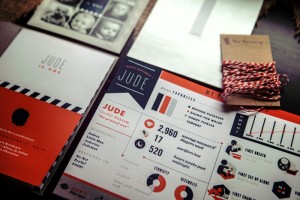
Misty Manley created these super fun infographic-style invitations for her son Jude’s first birthday, which is coming up in January. More than just yo...
Unless you’ve been living under a rock, you’ve probably heard about Beyoncé’s recent surprise album release. I haven’t actually not listened at all, b...
Designer Vincent Le Moign of Webalys recently introduced Streamline, a set of over 1600 icons for designers and developers. Yes, you read that right, ...
As someone who takes mobile photos quite a bit, I understand that lighting is a constant challenge. Enter Foldio, a compact, portable, foldable photo ...
I’m loving all of the new cotton products that House Industries recently released, including men’s and women’s t-shirts, tote bags and tea towels. Che...
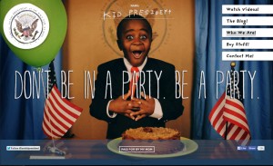
If you’re not familiar with Kid President, you’re in for a treat. The inspirational video series was created by Brad Montague, whose mission is to hel...
Studio on Fire‘s letterpress desktop calendar is always my favorite calendar to purchase. Each year they work with a group of designers and illustrato...
I’m loving Blok Design‘s new work for Topix, a special effects and animation studio operating out of Toronto: A pioneer in special effects and animati...
Clear Sans is a “rational geometric sans serif” from Positype, that has been reworked since its original introduction in 2008. The newly expanded fami...
If you’re still on the lookout for a fun holiday card to send this year (fashionably late) I have a few suggestions for you. Alex Perez designed a fun...
Designer and illustrator Tim Denee has generously designed a 2014 calendar that you can all print and use for free. He’s designed two options with a s...
The Great Discontent is one of my all-time favorite blogs. Each week they feature in-depth interviews with people from creative fields who are doing r...
When Michael J. Hildebrand was planning his most recent website update, he knew he wanted to add a fun ending into the mix. So he shifted his focus to...
Mattson Creative recently had the opportunity to work with Audi on a 28-page book that celebrates the carmaker’s history. Check out the gorgeous illus...
This one’s for the eggnog enthusiasts: Eggnog—A Project. I spotted Paul McCartney’s newest album NEW in Starbucks the other day. I’m loving the cover ...
There’s some beautiful work coming out of Studio Hausherr, a Berlin-based studio specializing in corporate, editorial and web design. I’ve selected a ...
...
Just yesterday Tad Carpenter launched a beautiful new site featuring tons of awesome new projects. Below is a brief selection of my favorites, but be ...
Sing Statistics recently released You Are The Friction, a new anthology of collaborative short fiction and illustration. The collection includes twelv...
via Ben Pieratt...
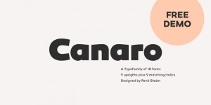
Canaro was released last month by Rene Bieder: Conceived as an exploration of geometrical typedesigns of the early 20th century, Canaro developed into...
You may recognize this For Like Ever print (top image) that was popularized several years ago through Domino Magazine—I actually have it hanging in my...
One of the things I love about working on my own is having the freedom to listen whatever I want during the day. And while I do listen to music (via S...
Lundgren+Lindqvist recently updated their portfolio with a handful of new projects. Their work for Kodamera, “a digital agency specialising in designi...
For this year’s All-Set Card Set (see past versions here and here), Colle + Mcvoy decided to take a slightly different approach.They stuck with the si...
I hope you all are enjoying the new browsing experience on DWL! (If you happen to notice any problems, please let us know.) As I mentioned in our laun...
If you’re still on the lookout for this year’s holiday card, Brad Woodard‘s newest design may fit the bill. The NOEL holiday cards were beautifully le...
Attention grammar enthusiasts: the latest exhibit Super Precious Art Gallery is the Punctuation Show, which features 17 pieces by 11 artists, all insp...
Sanna Annukka has released some beautiful new prints since the last time I checked in with her shop. They’re all limited edition, so get them while yo...
Unfortunately I am extremely late to the game in announcing this, but Fonts.com is holding it’s first ever Fontactular, with awesome deals on type eve...
Strohl designed some lovely new tins for Leckerlee this year....

If you’re a laptop user, this new Kickstarter project is for you. Slate is a lightweight, heat-absorbent laptop surface that provides both mobility a...
Exciting news! This week Showtime has made Ty Mattson‘s awesome jazz record-inspired Homeland tribute posters available for purchase. You can pick ind...
Garth Purkett is our new DWL intern! He is going to help me out with all kinds of things behind the scenes, but he will also be lending his voice to t...
This morning I’m incredibly excited to introduce our next contributor to all of you. Please welcome Melanie Richards, an awesome designer who works at...
For quite awhile, one of the ways I’ve been wanting to improve DWL’s content is to provide more information and inspiration focused on the digital spa...
Surprise! The new DWL is here! Over the last few years we’ve had a few (too many for my liking!) stops and starts so I’ve been a bit tight-lipped abou...
I’m please to announce the winner of the Uncommon Goods $50 gift certificate! Expect an email from Uncommon Goods soon. Thanks to everyone else for pa...
If you haven’t yet decided on this year’s holiday or new year’s card for your family, I highly recommend Paperless Post. They offer a huge selection o...
Moodley Brand Identity developed the brand identity and extensive packaging system for Servus am Marktplatz, an online marketplace selling handmade go...

Finland-based studio Werklig designed this clean, graphic identity for Pikseli (which means “pixel” in Finnish), an office building in Vallila, a cent...
This morning I’m pleased to introduce you to Stout, the brand new San Francisco-based studio of Ryan Meis (who you may know from Lab Partners) and Bri...
If you’re still looking for gift ideas—I know a lot of you will be kicking holiday shopping into high gear this week—I wanted to point you in the dire...
I’m loving this black and white, typographic gift wrap by German designer Angelo Stitz....
Directa Serif is a new release from Outras Fontes that is designed to save space while maximizing readability. It includes seven weights plus italics,...
John Clifford, of Think Studio, just released his very first book, Graphic Icons: Visionaries Who Shaped Modern Graphic Design, and it is a book every...
Uncommon Goods is one of my absolute favorite online retailers. They offer a wide selection of unique products that you can’t find anywhere else. And ...
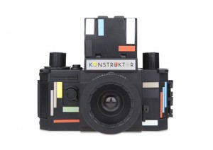
I’m please to announce the winner of the Lomography Konstruktor DIY camera: Expect an email from Lomography soon. Thanks to everyone else for particip...
One of the latest additions to Moo.com’s Luxe Project is this set of Holiday Kaleidoscope postcards designed by Armin Vit and Bryony Gomez-Palacio of ...
MIJLO, a new company that provides simple solutions for small spaces recently launched their first product, A Better Backpack, via Kickstarter. The ba...
I’m please to announce the winner of the Lomography Konstruktor DIY camera: Expect an email from Lomography soon. Thanks to everyone else for particip...
Tim Gough just released this amazing print of his Sgt. Pepper illustrations. Printed in a limited run of 100, the design features 8-color printing wit...
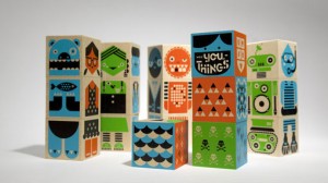
Without further ado, the winner of the Wee-You-Things block set is: Expect an email from Wee Society soon. Thanks to everyone else for participating!...
John J. Custer recently worked with developer Chris P. Wolf to put together a new site that showcases a complete archive of his work. There’s some rea...
Jen Serafini—who I had the pleasure of working with as an intern awhile back—recently worked with DC-based chef Alli Sosna on her brand identity and w...
Nate Koehler recently launched a brand new site, which features tons of design and illustration work in his bold and colorful style. Check out the wor...
Hey Readers! Just a quick reminder that we have two giveaways going on right now which will close out tonight, so get in your entries quickly! Enter t...
For her graduate thesis at Tyler School of Art, Hannah Johnson created Quarter Life Review, a series of book covers inspired by her childhood drawings...
Daniel Ting Chong was one of 9 Cape Town artists selected to participate in Red Bull’s South Africa-based Canvas Cooler project, where they commission...
Ben Whitla recently developed the identity for Mapkin, an app that combines turn-by-turn GPS with human storytelling, by allowing the user to “create ...
Frances MacLoed has created a daily gratitude project to celebrate all the things she is thankful for, entitled Thirty Days of Thankfulness. The posts...
Pacific Northwest is a whimsical handwritten font by Vancouver-based foundry Cultivated Mind. Pick up a copy at MyFonts....
Update: Two more prints were posted after this post were published. They are now included at the bottom of this post. Check them out! This week Help I...
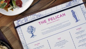
Foreign Policy Design Group recently updated their portfolio with lots of new projects, including this branding project for The Pelican, a seafood res...
Update: This giveaway is now closed. Thanks for participating! Readers, I have another awesome giveaway for you! The folks at Wee Society have offered...
Update: This giveaway is now closed. Thanks for participating! To celebrate the launch of this year’s Gift Guide, I have an awesome giveaway for you f...
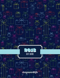
Woohoo! The 2013 Holiday Gift Guide is here! You can flip through clicking on the image above or following this link. A special thanks to this year’s ...
Jessica Bruggink recently launched a new site, and I was particularly drawn to all of her pattern design work. Check out the rest of her portfolio rig...
I’m loving this fun print that Jolby & Friends recently released. It features the words, “Ride the Weird,” which, among many other things, encourages ...
To commemorate the 150 year anniversary of the Gettysburg Address, Craig Welsh (of Go Welsh) developed a Kickstarter project to help spread Lincoln’s ...
Displace Cut is a display face by Dzianis Serabrakou. It’s a special, stencil-style edition of the original Displace. Pick up a copy at MyFonts....
Turnover, a new Kickstarter project by Katie MacLachlan, Sisi Recht and Robyn Faith Donnelly, is a product most art and design enthusiasts will love. ...
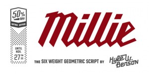
Millie is a cool, new, angular script by Kyle Wayne Benson. Pick up a copy (at 50% off for a limited time!) at MyFonts....
Beautiful work by Reynolds and Reyner for Coffee House London, a new coffee brand based in Ukraine....
For Fieldwork’s one year anniversary, they developed a limited edition printed piece with the theme of “A Guide to Making Things.” The piece features ...
Great new work by Bravo Company for Sopra, a Singapore-based Italian restaurant that is inspired by “the glamorous days of post-war Italy.”...
I’m loving all of the identity work coming out of new-to-me, Athens, Georgia-based studio Rook. Check out a few of my favorite projects are below: Fir...
As part of their self-publishing collection, EPHEMERA & MISCELLANEA, Studio Fludd developed Gelatology, a booklet (available here) that explores relat...
Australia-based studio The Company You Keep developed this clean and bold typographic campaign to facilitate an ongoing dialogue between the Builders ...
Just a quick reminder that my new Skillshare class, By The Book: Create a Style Guide for Your Brand, opens up this Thursday. Once again you have life...
The Paperlux team created this series of fun, colorful—and incredibly useful for book lovers!—bookmarks for Arjowiggins. Check out more details right ...
South Africa-based illustrator Johhny Kotze created this series of playful characters for the Wimpy restaurant’s (a UK hamburger chain) kids menu. The...
An Invitation Across the Nation is a collection of twenty posters featuring and celebrating musical artists from the 1960s, especially those who helpe...
Illustrators Carlos Lerma and Azucena Morales recently collaborated on this colorful and fun illustration as part of a submission for Picnic Magazine ...
Urge Text is a recent release from Schizotype that includes six weights in regular and condensed widths, plus matching italics. Check it out a pick up...
Typefight, “an arena for alphabetic altercations,” recently relaunched and it is looking awesome. Each day the Typefight folks pit two designers in a ...
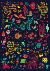
I’m loving the vibrant design and illustrations that Bosque created for the Oaxaca moleskine for Monoblock....
The folks at Karsh Hagan designed this unique wine bottle for the annual Governor’s Tourism Conference in Colorado. Each bottle was laser etched and d...
Talented designer Taylor Goad recently launched a brand new site, featuring all sorts of new projects. A few favorite images are below, but you can ch...
Beautiful, sophisticated work by Ghost for Ladies & Gentlemen, a full service millinery boutique offering high-end, handmade and custom hats from acro...
Every so often a Kickstarter project comes through my inbox that I get really excited about, and Oakland Illustrated is definitely one of them. Curate...
Post Grotesk is a new release via Village’s Incubator program, and the first typeface designed by Josh Finklea. The typeface features four feature-ric...
New York-based studio DIA developed this bold identity and series of collateral pieces for Speak Up Africa, a non-profit organization dedicated to “ca...
Telegramme recently updated their portfolio with a ton of new projects that span various design disciplines. One that particularly caught my eye is th...
If you’ve been a reader for a little while, you may remember Michael George Haddad‘s self-initiated project, Mid-Century Canada. Well he’s back at it ...
Restaurant identity design is one of my favorite things to feature, so when Jeshurun Webb sent over her work for Area Four I jumped at the chance to p...
These beautiful water color fashion illustrations were created by Berto Martinez for Tantalum Magazine....
I’m loving Anna Dunn‘s graphic patterns and illustrations....
I’m loving this sophisticated, feminine identity and collateral that Andrew Colin Beck developed for Aurora Florence, a singer, songwriter, violinist,...
Geli is a friendly, hand-lettered typeface by Volcano, including over 130 OpenType features. Check it out at MyFonts....
Awesome design and illustration work by Uraguay-based designer Martín Azambuja....
Think Work Observe recently designed this series of illustrated prints—Snake, Mask and Surprise—for Editions of 100, an online shop that sells limited...
Loving the style and color palette of this illustration series by Marco Goran Romano for GQ Germany....
As a student project, designers Tiffany R. Hsu, Eric Cancino and Nathan Shigeta developed this identity and extensive collateral system for the clothi...
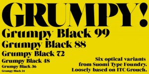
Grumpy (which was used in the charity:ball invitations I posted last week) is a display face with six optical variants. Pick it up at MyFonts....
Earlier this month Always With Honor launched a brand new site. I’m particularly loving their work for Boke Bowl, a Portland-style ramen shop. Creativ...
Chelsea Brink recently collaborated with Zeus Jones to create these fun e-card illustrations for Cheerios for the purpose of encouraging families to s...
I’m loving these pixelated collages by Ed Spence: Using a knife and a ruler I dissect the information within the image. The hand-generated pixels are...
Odesta is another recent release from Village that flew to to the top of my wishlist. Designed by Ondrej Jób of Urtd, the typeface features seven weig...
Patrick Fry developed the identity and website design for Good Design, a blog by Joseph Maduma that focuses on “design and creativity that is created ...
Quick reminder: If you’ve been meaning to submit a gift idea for this year’s Gift Guide, you have until this Friday, November 1st to do so. Simply sho...
Loving the illustration work of John-Patrick Thomas, who is currently a Jr. Designer at Penguin Books....
This space designed by Clare Cousins Architects looks like such an inspiring, energizing place to live and work....
Beautiful work by Noise 13 for Reorient, a brand that creates herbal tonics and broths: Based in San Francisco, Reorient creates artisanal herbal toni...
Mrs Summer is a “a hand drawn narrow typeface with a Western touch.” This display face comes with two weights—regular and bold—all caps letterforms an...
Lovely work by Joseph Veazey for the Azede Jean-Pierre S/S 2011 Lookbook....
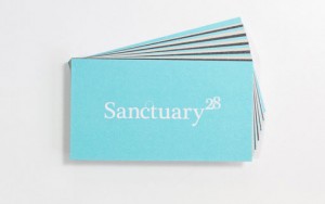
While at TUSK Agency, Andrew Suggit was tasked with the rebranding of Sanctuary 28, a builder of homes strongly influenced by coastal living. Creative...
An impressive collection of lettering samples by Caetano Calomino. Much more to see in his portfolio and on his Facebook page....
Mama’s Sauce recently produced this fun limited edition print by Seth Lucas of ElloThere. The 5-color screen print features all of the U.S. national p...
If you’re taking any Skillshare classes, you may have noticed that they recently introduced a new feature: Challenges. This feature allows teachers to...
LCT Palissade is a formal, all caps display font by LCT. Check it out at MyFonts....
Kyle Miller recently developed the identity and collateral for Dyer & Jenkins, an American-made men’s clothing line. Lifestyle images shot by Evan Lan...
Last week Dan Blackman launched a brand new site featuring lots of great new work. In particular, these two restaurant/bar projects caught my eye: Dus...
I’m late to the game in discovering the Midnight Moment project, an initiative by the Times Square Advertising Coalition (TSAC) and Times Square Arts ...
Mike Smith recently did a beautiful job of designing the invitation package and collateral for charity:water‘s annual charity:ball. Be sure to check o...
I’m extending the ad submission deadline for this year’s Gift Guide until the end of the day tomorrow, October 22nd, so I thought I would share the sp...
A nice selection of work by Milwaukee-based Varado & Co....
Superior Title is a new release by one of my favorite type designers, Jeremy Mickel. The family is available in “five feature-rich weights” at Village...
I’m loving these pieces of unconventional lettering and typography by UK-based designer Ethan Park....
Awesome work by Kerry F. Williams, a Los Angeles-based designer that has worked at some really great agencies....
Quiroga is a space-saving serif typeface that was designed for continuous text and optimized for smaller sizes. Pick up a copy for yourself—currently ...
I’m loving these watercolor portraits of various characters from movies and TV (some of my favorites!) by Oh Gosh, Cindy!. Check out the rest of what’...
Craig & Karl recently collaborated with MCM on Eyes on the Horizon, a playful collection of luxury handbags and accessories. via LL Reps News...
Moodley Brand Identity developed this work for J. Hornig, a new coffee brand. More to see right here....
Artist and designer Rob Lowe, also known as Supermundane, recently launched a brand new site. via Form Fifty Five...
States of Matter recently helped designer sunglasses brand Rivet & Sway conceptualize and create a really fun pop-up shop concept: Rivet and Sway want...

Paula Scher’s team at Pentagram recently completed a brand refresh of their iconic identity for Jazz at Lincoln Center. The update encompassed changes...
Helia, a semi-squared sans serif typeface by Nootype, includes eight weights—from hairline to black—plus italics, and a whole host of OpenType feature...
I’m loving this series of t-shirts and posters that Office created for Evernote Market as part of their recent launch. Evernote Market is a new shop t...
Kelli Anderson‘s latest creation is an incredible paper piece commissioned by Adobe for distribution at the annual AIGA national conference. They left...
Beer Press is a new Kickstarter project by Jordan Mummert. The project includes a set of six beer-themed letterpress coasters as well as a handcrafted...
The Wire Poster Project is a new side project by Oliver Munday. He’s designed one typographic poster for every episode of cult favorite HBO series, Th...
I am still a faithful print magazine reader, and New York Magazine has been one of my favorites ever since I moved to NYC almost 10 years ago. One fea...
Brooke and Matt Lunneberg of Half His Half Hers recently designed this lovely little birth announcement package to celebrate the birth of their daught...
Loving this collection of wine labels that Cat Coquillette designed for a good friend’s Golden Birthday....
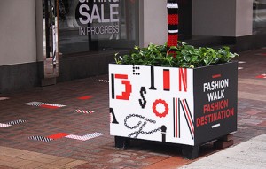
I’m loving the pattern-heavy collateral and environmental graphics that Blow developed for the Fashion Walk Fashion Destination campaign, which was la...
Earlier this week Lotta Nieminen released her first children’s book, Walk this World, a hardcover book that enables children to the explore cultural s...
The Becker Gothics is a new display font family from Dunwich Type Founders: The Becker Gothics pay homage to the nineteenth century American lettering...
I’m loving the dark, mysterious and dramatic work of Paul X. Johnson....
Lovely block printed textiles from Etsy shop Hokoda....
Portland, Oregon studio Band recently launched a new project for Forest for the Trees, a Pacific Northwest-based public mural project which aims to en...
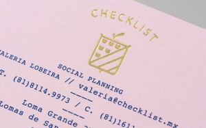
Another great identity project by Anagrama, this time for Checklist, a company that specializes in custom event planning....
Lobulo Design created a series of sculptural experiments that turn a flat letterform into a three-dimensional object using paper. Get a closer look ri...
A short but sweet message about creativity from Conversations with Maya Angelou. ...
Felice is a new serif typeface from Nootype, featuring 10 styles, from light to black, plus italics and a slew of OpenType features. Check it out and ...
The Essentials is a new side project by Marisa Seguin, which was inspired by a friend’s trip to the grocery store where she came home with an amusing ...
Each year the Picasso Museum promotes and organizes Big Draw in Barcelona, a celebration of the act of drawing and an event that aims to bring the com...
I’m loving the fun aerogram wedding invitation package designed and printed by The Hungry Workshop for Sonia and Glenn’s nuptials last year....
Beautiful illustration series by new-to-me Alice Wellinger, called The Limits of Love. via Illustration Age...
Designer and illustrator Danielle Evans is running a fun little side type called Food Type, where she creates lovely hand-lettering specimens out of v...
Awesome patterns by Llew Mejia....
I’m really loving the rich, textural design and illustration work of New Zealand-based Brett King. via Designspiration...
One of my favorite studios, Perky Bros, just published a new project to their portfolio, the identity and collateral for No. Six Depot, a small-batch ...
Herencia Mexicana is a collaborative project intended to commemorate the 200th anniversary of Mexico’s independence. The illustrations below are the c...
I’ve been meaning to feature Brix Slab, an extended family of 24 fonts, for quite awhile. Designed by Hannes von Döhren & Livius Dietzel in 2011, the ...
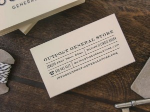
Great new work for Outpost General Store, a “modern take on an old fashioned general store,” by Knoed, who also happened to have just launched a brand...
I’m exited to announce that I’ll be teaching another Skillshare class next month! I really enjoyed the experience and hope to continue to offer more c...
Eat Real Essentials is an interactive eBook designed for use the iPad. Beautifully designed, the book features all kinds of great information about he...
I’m loving the colorful abstract illustrations of Gabe Gonzales. via Ape on the Moon...
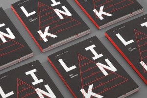
Nice work for Link Magazine Issue 14 by David Di Gennaro, Pietro Buffa, Niccolò Mazzoni and Luca Zamoc....
It’s that time of year again! The DWL Gift Guide development is underway on our end, and we need your help to make this year’s guide even better than ...
The new Party Collection series of prints by Judy Kaufman is certainly aptly named. The series of four prints features a collection of weird, colorful...
Center is a new typeface by Signal, with geometry based on a rounded rectangle. The typefaces includes 6 weights plus italics and a variety of OpenTyp...
The Object Enthusiast is the one-woman shop of Emily Reinhardt, which aims to “create heirlooms for the modern traditionalist.” The shop features beau...
I’m loving this new series by Andrew Kolb, Mused on Tattoos, which he created for Hero Complex Gallery’s Young Guns of Print show that opened last wee...
Nice typographic layouts by Alexey Persh. Get a closer look at VAQUM right here....
I realize the focus of this project is fashion. But more than the clothing and accessories, I’m particularly drawn to the colorful, pattern-heavy sets...
I’m loving the colorful, illustrated wedding suite that Elizabeth Baddeley designed for her own wedding this past Spring. via Paper Crush Pinterest...
Cue recently developed some beautiful packaging for two Thymes product lines, Clary Sage Tea and Thymes Classics....
I’m loving the lively and colorful illustration work of Los Angeles-based illustrator Ellen Surrey. via Gems...
I’m loving this new pair of prints by Tanamachi Studio. The two 20″ square designs were beautifully printed on 2ply wood veneer, in oak and walnut, by...
Respublika FY is a new sans serif family by Fontyou that includes five weights plus italics. Check it out at MyFonts....
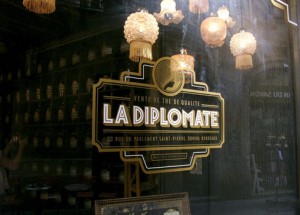
Lovely new work by Vietnam-based studio Rice Creative for La Diplomate, a tea shop in Bordeaux, France....
I’m loving Life’s A Party, a project by Danielle Kroll in which she designed and illustrated a pocket planner and book of labels “inspired by fashion,...
OVER is an editorial project that features the photography and illustration of Sara Pellegrino. I’m loving the interactivity between the painterly bru...
I’m really excited about Mohawk Paper’s recent initiative that asks the question, “What will you make today?” This new promotion includes three public...
I keep a running list of books I want to read. It’s a gigantic list that grows faster than I can possibly keep up with, unfortunately, and includes ev...
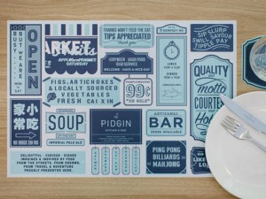
Some great new work by Singapore-based studio Somewhere Else for Pidgin, a restuarant that offers “delightful, curious dishes imagined and inspired by...
Photography enthusiasts will love these products by Dodge & Burn, a company “created out of a passion for analogue photography and classic cameras.”...
Equip is a new geometric sans serif from the folks at Hoftype. The typeface features 8 weights, 16 styles and a plethora of OpenType features....
Who hasn’t been glued to their TV watching the final episodes of Breaking Bad?? I don’t know about you, but I’ve found the last couple of episodes hav...
F is for Fonts is a collection of hand-painted typefaces that have been digitized into downloadable, vector alphabets. I’ve included a few styles belo...
I recently rediscovered the beautiful work of Kari Herer—previously featured here—and fell in love with this series of prints. Each one combines the g...
I can’t wait to get my hands on Pattern Box, a collection of 100 postcard designs by ten contemporary pattern designers. Below you can see a few of my...
I was struck by these words by Seth Godin last week, as this is something I need to remind myself of when I get caught up in the sometimes frustrating...
Beautiful floral typography by Nina Hunter....
The condensed, elongated Directors Gothic, a revival from the 1938 original, is a new favorite. Here’s a bit about its history: Handcrafted by Letteri...
I’m loving the whimsical, vintage-inspired work of illustrator Lesley Barnes....
This intricately illustrated map of Spain was designed by studio Relajaelcoco in order to represent the most important goods that Spain produces. Get ...
I’m loving these playful, colorful animated GIFs by Skip Dolphin Hursh. Many more to see right here....
In honor of International Talk Like a Pirate Day—yup, it’s a real thing—I’m happy to share a fun side project by James Abercrombie, a designer and ill...
You’ll both receive an email with the details shortly. Everyone else, thanks so much for participating!...
Poppin, one of my favorite brands, has released some great new products in recent months. In case you’re not familiar, Poppin, whose motto is “Work ha...
Asterism is a gorgeous new calligraphic font from Great Lakes Lettering. Pick it up at MyFonts....
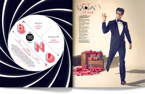
While at Design Army, Matt Chase conceptualized, designed and art directed this awesome shoot for Washingtonian Magazine. Be sure to check out The Tie...
Haikuglyphics is a collaborative side project between designer Anne Ulku and haiku-writer Michael Derus. The project began in January of this year and...
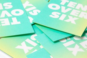
As part of their expansion to a second location, RoAndCo developed a fresh new brand for TenOverSix, a high-concept boutique originally based in Los A...
I’m loving the vibrant floral prints and pet portraits by Studio Legohead. via Oh Joy!...
I recently checked in on Fuzzco’s newer projects and spotted this identity and collateral work for Snyder Event Rentals. I love the resulting brand ma...
Hey Readers! Just a quick note to say THANKS for all of the incredible applications you submitted for the new DWL positions. It’s going to take me awh...
The latest release from MVB Fonts is MVB Solitaire Pro, a sleek sans serif that was designed and built to primarily serve content, as opposed to drawi...
I’m really excited about this new line of products that came out of a collaboration between House Industries and Chronicle Books. You can now pre-orde...
Israel-based studio The Art of Branding took it upon themselves to create Good Morning Sunshine, a project inspired by Simon Sinek’s mission: The desi...
For their September campaign, Charity: Water commissioned several designers to create a poster design inspired by India. 100% of the profits from the ...
As part of her new role at Tinybop, a company that builds educational apps for kids, Tuesday Bassen designed this series of fun and colorful wallpaper...
I’m mesmerized by Island Continent’s Studies in Broadcast Colour print series (part two here): ‘Studies in Broadcast Colour’ by The Island Continent i...
This morning I’m really into the oddball style of Swedish illustrator Martin Nicolausson. It’s actually not a look I am typically drawn to, but I am e...
Breakers Slab is a companion to the sans serif typeface Breakers, designed by Kostic Type Foundry. It features six weights, each including small caps,...
I’m loving this series of colorful, hand lettered murals created by Paula Scher’s team at Pentagram for the Queens Metropolitan Campus. Lots more deta...
Just interrupting regular posting to quickly remind you that I’m closing out applications for the DWL internship and DWL contributor positions tomorro...
This fresh, airy, nautical-inspired identity by Studio Crême caught my eye recently. Check out more of their work for Trevose Harbour House right here...
New Zealand-based Strategy Design & Advertising created this quirky, bold identity and collateral for Boosted, an initiative established by The Arts F...
Selektor Slab is a new extension to the Selektor font family. Published by You Work for Them, the typeface was inspired by and designed with “the char...
Check out this great resource for vintage NYC transit maps. I pulled out a few favorites, but there are quite a few more, so take a look around. via Q...
I’m loving the wedding materials—invitations, save the dates and engagement party invitations—designed by Jaime Van Wart for her sister Krista and her...
This giveaway is now closed. Winners will be announced on Thursday, September 19th. That’s right I said, giveaways, as in two! This year, I’m excited ...
Under the creative direction of Will Miller, Firebelly Design recently led the charge on a rebrand for Chicago-based Art + Science salons. The new ide...
Portugal based Royal Studio was tasked with the challenge of creating a collection of posters to promote a series of concerts showcasing indie music o...
The playful Seashore tote is just one of the many fun handmade products sold by Fairgoods. To make it extra designy, this roomy and sturdy tote featur...
This minimal yet welcoming identity was developed for Tangent Café, a local café and bar that serves craft beer and hosts live music by Fivethousand F...
Pétala Pro is a new superfamily released by Typefolio that includes 18 weights plus italics. Pick it up at MyFonts....
As always, I’m loving some of the new card designs that Hammerpress has released this season. Check out the rest of what’s new right here....
I haven’t checked in with Jason Munn—or poster design in general for that matter—in quite awhile, so I was excited to come across this great new serie...
The super talented team at 160over90 recently had 6 weeks to conceptualize, design and produce a new viewbook for the University of the Arts in Philad...
Metro Nova is a new release from Linotype which is an update of the 1929 modern classic by W.A. Dwiggins. The newly updated family includes seven weig...
When browsing through Frances Close‘s portfolio for the first time recently, her work for the Grand Rapids Urban Forest Renewal Project immediately ca...

I instantly fell in love with these paintings by Michael Ward the second I saw them. Each one depicts an ordinary, everyday scene based on a photograp...
This colorful photo series gives us one last glimpse of summer before Fall weather starts to set in this month, at least here on the East Coast anyway...
I’m loving the playful illustration style of Michéle Brummer Everett....
One of my favorites, Stitch Design Co., just published a new identity project that they developed for Garnish & Gather an Atlanta-based company that e...
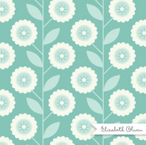
Feast your eyes on a few new patterns from the lovely Elizabeth Olwen. There’s much more to see right here....
Big news around here! After 5+ years of running DWL on my own—with the overwhelming support of Brian of course—I’m ready to bring on a few people to h...
Almanac recently developed this interactive online annual report for the St. Louis County Library. The design centers around the use of full-bleed ima...
This fun packaging project was designed by Lacy Kuhn for Beehive Honey Squares, while a student at Western Washington University. For more from Lacy, ...
Over the past year, Mette Hornung Rankin, of Bureau of Betterment, created this beautiful illustration series featuring various quill pens alongside o...
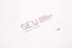
Mirim Seo created this beautiful project while a student at Tyler School of Art. S.E.W., which stands for Saving Endangered Wildlife, is a game that t...
Ugmonk, one of my favorite brands, just recently launched a new limited edition anniversary set to celebrate their 5th anniversary. The package, which...
I’m loving Jeremy Loyd‘s new side project, Branding Bad, in which he creates a logo for each of the eight final episodes of Breaking Bad (which I’d ar...
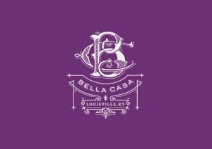
Jack Muldowney—previously featured here—recently published some beautiful new projects: Bella Casa Interiors The Hop Review Dance/USA...
Riona Sans is a sans serif family of 16 fonts in 8 weights, including true italics. Pick it up at MyFonts for 80% off for a limited time....
Lust Script is a new extension of the Lust family by Positype, which includes both regular and display formats. Pick it up at MyFonts....
If you have been considering signing up for my Skillshare class, Beyond the Logo: Crafting a Brand Identity, now is the time to do it! The class opens...
Encorpada Classic is a beautiful serif that was designed with “functional considerations” in mind. Released by dooType last month, this family of 14 f...
We’ve featured several projects from Mattson Creative over the years. (Remember these LOST posters? Still my fave.) We love their work and their creat...
Once again, for the month of August I will be taking a step back from DWL to focus on some in-house projects that need more devoted attention, and to ...
I was recently (and happily!) introduced to Fairgoods, which is an online store that sells a curated selection of items that are a combination of exis...
Summit is a new display face designed by Luke Lisi, which includes a layering system of 10 styles in five weights. Check out how some of the layering ...
I’m loving this beautiful series by Cosmosnail that depicts solitude in various environments. Get a closer look at the Alone series on Behance. via Il...
Brazilian studio Isabela Rodrigues developed this suite of stationery, print materials and packaging for Spicemode Foods, a line of international spec...
This lovely brand identity was designed for Fueguia 1833, a perfume brand, by Buenos Aires-based designer Ale Román. I can’t get enough of that red gl...
San Francisco’s Noise13 recently revamped the identity and collatearal for Saison, a two-Michelin-star restaurant helmed by chef Joshua Skenes. When C...
Bunch’s signage design for Zetland House is a great example of a clear, navigable and visually pleasing wayfinding system. via MyFonts tumblr...
The most recent release from Hamilton Wood Type Foundry is HWT Slab, a set of two display fonts. Pick up a copy on MyFonts....
I’m loving the playful prints in the Etsy shop PetitReve, which features the work of Sarah and Colin Walsh....
These colorful, textural materials were created by Coöp for Number Station, a Melbourne-based band....
Here is a lovely identity project by Atomicdust for Niche, chef Gerard Craft’s flagship restaurant in St. Louis. Check out this post on their blog for...
Sini is described as “a warm and delicious hand-lettered” typeface, which includes two styles, bold and ornaments. Pick up a copy for yourself at MyFo...
Fun, minimal packaging and design for Hugo’s Hot Sauce by Jag Nagra (who also has a new website!)...
Frost* Design‘s environment team recently completed this incredible interiors project for Commonwealth Bank’s call center, located in Melbourne, Austr...
I’m loving the design that Lotta Nieminen came up with for Beautified, an app that helps find and book last-minute beauty appointments from a curated ...
I was recently introduced to the work of Berlin-based Alex Robbins, and I quickly became a fan. I am especially loving his typographic illustrations, ...
Andy Hayes recently launched a brand new site for Hucklebuck Design Studio, featuring loads of new work. A few of my favorites are below, but you can ...
I’m loving these two new projects from Hum Creative. First, the identity and collateral for Brian Paquette Interiors, a Seattle-based full-service ful...
Nudge recently updated their portfolio with several new projects, and these two in particular caught my eye. First up is the identity and packaging de...
FoundryCo just recently added a bunch of new work to their portfolio. A few glimpses at the awesomeness are below, but be sure to check out the rest o...
Gentona is a new release from Rene Bieder… Designed for a wide range of applications, Gentona was intended to support the goals of contemporary design...
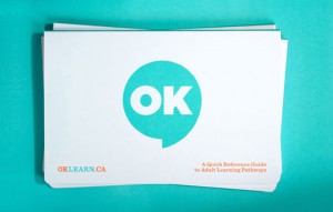
Matter recently developed this bright and eye-catching identity for OKLearn.ca, a free resource which helps adult students and service providers find ...
JAF Facit was designed in 2005, but is a new find for me. It was designed by Tim Ahrens through Just Another Foundry, which he started in 2004, and fe...
Check out these amazing new book covers that Dana Tanamachi created for Puffin Books, the children’s division of Penguin Books. Each one was designed ...
I’m loving this series of constellation prints that Andrew Kolb created for a current Space-themed show at Gallery 1988 in Los Angeles. If you’re in t...
As promised, here is a selection of One Plus One‘s recent design for weddings. You can check out the rest of their wedding portfolio right here....
I’ve been meaning to do a post that covers some of One Plus One‘s recent work for quite some time now—it’s long overdue. So at this point it may not t...
The latest release from Hold Fast Foundry is Prohibition, a sans serif display face that includes sylistic alternates, discretionary ligatures, and mu...
This morning MOO is launching The Luxe Family, a suite of high quality printed products geared especially towards those running small businesses. Two ...
I am super excited to announce that next month I will be teaching a class on Skillshare! In case you’re unfamiliar with the site, they offer both in-p...
I recently stumbled upon this beautiful wedding invitation created by Cempaka Surakusumah, a designer from Jakarta, Indonesia. I’m loving the mix of ...
Here is yet another example of great work from Sydney-based Naughtyfish. This brand identity was developed for (Insiders), Sydney Opera House’s member...
This gorgeous invitation suite was designed by the lovely Erin Jang for a couple who planned an intimate Paris wedding. This is also yet another examp...
Check out this awesome print that Spencer Charles recently designed, featuring 268 instances of the word “the.” Printed by the fine folks at Mama’s Sa...
Doctrine Stencil is a “utilitarian display typeface with a muscular character” from Jonathan Barnbrook’s Virus foundry. The typeface features five dif...
I’m loving this recent project by Matt Chase that explores the concept, What Species Did You Evolve From? The design is great, but the content is even...
Another great packaging design by Make & Matter for Bernie’s Burger Bus Ketchup (check out their Epic packaging here), which you can get a closer look...
Stellavie’s latest print is a colorful, playful illustration featuring a heartwarming, glow-in-the-dark message. You can pick one up in their shop rig...
Check out the lovely work of NY-based designer Kristen Haff. More to see right here....
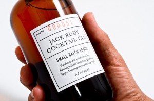
My friends over at Mama’s Sauce recently introduced me to the gorgeous portfolio of Studio Birdsall. Feast your eyes on a selection of clean, sophist...
Montreal-based studio Caserne recently developed this offbeat identity for P.A. & Gargantua, a local foodtruck offering up delicious variations on gri...
Designer Andrew Althouse designed this lovely glow-in-the-dark world map for Real Mart, the shop that features the side projects of the designers at D...
I’m loving these bright and fresh illustrated patterns by Amy van Luijk....
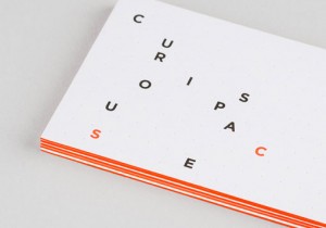
Mash Creative worked with MayNinth to develop this adaptive identity for Curious Space, a design studio that creates “unique and inspiring spaces for ...
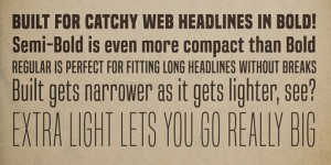
Built is a new release from Ray Larabie’s foundry, Typodermic, that is intended to be used for the purpose of making solid, compact headlines onscreen...
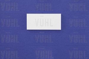
Blok Design just recently revealed their new brand identity for Vuhl, a new Mexican supercar....
I know they are a London-based studio, but it still seems visually appropriate to share the red, white and blue work of Crispin Finn today. These piec...
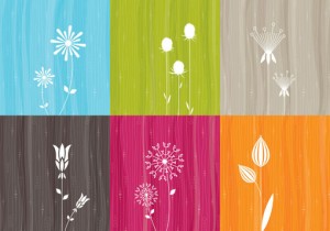
Earlier this week Studio MPLS launched a slick new site to showcase their beautiful work, new and old. A few standouts are below, but be sure to visit...
This morning I’m super into the illustration work of Monica Ramos, especially her ongoing Comfort Food series. Prints of some of the pieces you see be...
Aisha, designed by Titus Nemeth, is a soft, friendly script that supports both Latin and Arabic characters. Pick up a copy for yourself at MyFonts. Wa...
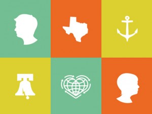
I’m loving the colorful, playful wedding invitation and materials that Patrick Macomber designed for his 2011 wedding....
I’m loving all the new paper goods that Moglea introduced at this year’s stationery show. Check out the lookbook in its entirety right here....
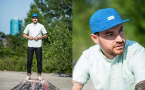
As of today, designer Sean Sutherland has launched his latest business venture, a small men’s headwear brand called MBS MFG. CO. Collection One includ...
In other apparel news, check out this new venture from Isle of Printing. They’ve designed a series of customizable men’s and women’s t-shirts that all...
Karl Hebert, of Gold Lunchbox, just recently updated his portfolio with a ton of excellent new work. A few favorites are below…...
Cotton Bureau is a new venture from the creative minds behind United Pixelworkers that gives designers like you the opportunity to have shirts printed...
Christopher Eckel recently left a postition at VSA Partners to take advantage of freelance opportunities, and as a result just launched a new site to ...
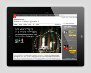
Feast your eyes on the innovative, magical work that Tolleson developed for Adobe to promote the release of Lightroom 5. On location deep within a coa...
Rolling Pen is a new script from Suditupos. Similar to their 2009 release Business Penmanship, Rolling Pen was inspired by vintage hand-writing and ca...
Sarah Surette is a recent Tyler School of Art grad with quite the portfolio. Here are a few examples of the pieces that caught my eye:...
Designed by Ján Filípek, Preto is an extensive type family that includes a collection of over 16 fonts that include sans, serif, italics and a wide va...
Beautiful hand-lettering and illustration by Orlando, Florida-based Shauna Lynn Panczyszyn:...
Matter created this awesome identity and 12 page, side-stitched business card for The Farm, a design consultancy. Get a closer look right here....
To promote herself to prospective employers and clients, recent grad Amber Asay (previously featured here) created Design Variety, a beautifully desi...
I’m loving these graffitied business cards that Barcelona-based studio Cocolia designed for themselves. Get a closer look right here. via Type That I ...
Portland-based studio Factory North created this warm and friendly identity for Angela & Evan Photography, a Seattle wedding photography duo. I’m espe...
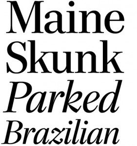
Last week House Industries introduced Paperback, a set of 15 serif fonts including both text and display cuts, plus a series of ornaments. This new re...
Illustrator Jonny Wan worked with agency Northstar to develop The A-Z of Q, a series of spot illustrations and front cover feature for Audi Magazine‘s...
Brooklyn-based T. Koppel Design recently launched a brand new website and shop. The shop features a pretty large selection of posters that span topics...
Check out this incredible mural—don’t miss the video documentation!—that Yiu Studio created for their new office. The design fuses their love of Kung ...
Planting Poetry is a series of colorful, typographic sculptures that were created by Burgess Studio for the Ministry of Stories, a charity that aims t...
I’m loving the playful approach that Gra Monteleone took in creating this series of illustrations to accompany a calories calculator for the British H...
Bicyclette is a new sans serif typeface by Nikola Kostic, whose name was chosen because it is “all about balance and elegance.” The family includes si...
Do yourself a favor this morning and take a few minutes to watch Eoin Duffy’s new animated short film, On Departure. Visually minimal yet emotionally ...
As part of SVA’s Masters of Branding program, the students are each currently participating in a self-initiated project that spans the course of 100 d...
Tenso is the latest from Jos Buivenga’s foundry exljbris. This friendly sans serif includes five weights, from light to black, plus italics. Pick up a...
Today’s newest Beauty of Letterpress launch is “Rebuild Moore,” a print commissioned by Neenah Paper to raise funds for Architecture for Humanity in s...
In addition to being three of my favorite things, Food Chocolate Design is an exhibition and accompanying publication featuring the work of various fo...
I’ve featured the work of Pratt student Michelle Wang a couple of times before, so it’s no surprise that I’m equally impressed with one of her latest ...
I couldn’t resist posting another of Blow’s recent projects this morning—this time a series of thank-you cards also printed on Astrobrights, whose geo...
Feast your eyes on this gorgeous packaging that Blow created for Polytrade paper to explore the possibilities of the Astrobrights paper series. The fo...
I just discovered Jonathan Adler’s Paperless Post collaboration, which features the bright colors, playful illustrations and graphic patterns I’ve com...
Nyte is a 2012 release from DSType. This serif family was originally designed for New York Times Magazine, and features all sorts of swashes and alter...
Yesterday Lumadessa introduced two new vibrant hummingbird prints, as well as a re-issue of the original Ruby-throated Hummingbird The three prints a...
I’m loving this project by new-to-me Portland, Oregon-based studio Band. Their design for Lowbrau Beirhalle, a beer hall and sausage joint in Sacramen...
BVK Milwaukee recently collaborated with Timothy Goodman on the CITGO Fueling Good Road Trip, which aims to promote CITGO through the good things they...
Check out this fun promotion that animator Rogier Wieland developed for Starbucks to illustrate the reversed story of how their coffee goes from bean ...
DWL favorite Perky Bros recently launched a site update featuring lots of new work. I’m especially loving the brand and collateral that they developed...
I can’t get enough of the gorgeous, fruit-inspired textile designs of recent grad Hannah Rampley. There’s lots more to see in her portfolio, so be sur...
New, beautiful work from End of Work for Bib & Tucker, new restaurant in Western Australia: Bib & Tucker is a restaurant and bar on Leighton Beach in...
Richler is a beautiful new serif family from Shinntype. Described as “an open, evenly spaced book face designed for quality headlines and enhanced rea...
Timothy Goodman recently completed a really fun project for The New Yorker‘s Fiction Issue, entitled “Crimes and Misdemeanours.” He created six Noir f...
Check out the beautiful illustration, lettering and pattern design work of Michael Mullan....
http://www.behance.net/gallery/Icon-Ink/8488019 For those of you who prefer to something more interesting to your default computer icons, designer Nin...
As part of his Horn Please exhibition, Shantanu Suman created a series of beautiful music boxes to demonstrate the various horns found in Indian truck...
Check out Ludlow Kingsley‘s 2013 design for the Santa Monica Festival, an annual cultural event. I’m loving the color palette, in particular....
For her thesis project at the University of San Francisco, Mia Johnson created Adventure Supply Kit, which was “designed to aid, inspire, and entertai...
I have a bit of a weakness for slab serifs, so Lost Type Co-op’s latest release, Klinic Slab, is right up my alley. Designed by Joe Prince, the typefa...

Jim Leszczynski sent over this great little animation that I’m happy to share with you this morning. The animation was developed for Merit, an online ...
A great series of illustrations by Poland-based designer and illustrator Adam Quest. Check out the rest of his Behance portfolio for more. via Illustr...
The Freaks Alphabet, by My Name is Wendy, is a series of letterforms created from a catalog of vector shapes and design sketches. Get a closer look ri...
The Blksmith Design Co. is the Southern California-based design studio of David M. Smith. He has some excellent work in his portfolio (which you shoul...
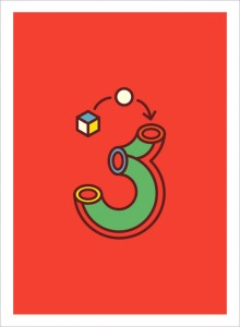
I’m loving this playful series of numbers that Tatalab created for Yorokobu Magazine. via Present & Correct...
Adriane Swash, a companion to Adriane Text, includes uppercase, lowercase and small caps, as well as a wide range of OpenType features, including alte...
UK-based studio Passport recently developed the identity and collateral for Word., a copywriting company. Word approached us wanting a complete brand ...
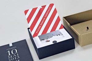
Paperlux created this incredible Save the Date for the christening of MS Europa 2, a new luxury liner for Hapag-Lloyd Cruises. Check out the video bel...
Laura Berglund recently launched a brand new portfolio site, with lots of new work. One of the projects that caught my eye in particular, is this grap...
I’m not sure when they launched, but I just discovered that Sideshow Press has an entirely new (to me, anyway) website, blog and shop. The shop is fil...

I’m loving this series of black and white stationery items by Sarah Thorne, which includes seasonal notebooks, cards, envelopes and wrap for UK-based ...
Heartwork is an annual project designed to raise money for art supplies within the art room at Target House, which is a “home-away-from-home for the f...
Diversa is an interesting new display face from DSType: Diversa is a single typeface with 9 fonts within, containing 2760 glyphs, divide in 9 stylisti...
I’m loving this poster that Justin Pervorse designed for a recent talk by Aaron Draplin. The concept, graphic and content are perfectly appropriate fo...
Studio Muti recently designed and illustrated a cover for British Airways’ inflight magazine, Highlife SA. The design was inspired by things to see in...
Rick Murphy, of Hardly Code, just released his first print inspired by the city of Seattle. The four-color screen print, signed and numbered by the ar...
Gin is a new release from Hold Fast Foundry, a vintage-inspired display face that includes stylistic alternates, discretionary ligatures, and multiple...
Who’s excited for Arrested Development‘s return this weekend?!? Well, in addition to me, the folks over at Fiction certainly are—so much so that they ...
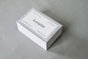
David Arias recently completed this dreamy, whimsical brand for Leuie, a company that “captures and celebrates the wonderful joy of childhood” through...
For the first product in a forthcoming line of “designer type” products, Sydney, Australia-based studio End of Work has produced a series of iPad mini...
Andrew Lyons created these gorgeous illustrations for the packaging for Strong, a new line of nutrient supplements. The textures and subtle color grad...
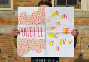
Chicago-based designer Buddy Boor recently sent over this excellent project with a great look and a great message, the “Design Is” newsprint, an educa...
I’m loving these gorgeously hand-painted saws that were created by Vault49, a NYC-based “artistic collaboration, a playground, and a creative incubato...
I’m in love with this series of package designs that Make & Matter developed for Epic, a line of 100% grass fed animal protein bars....
Anagrama recently completed this playful, feminine identity, collateral and packaging for Cocolobo, a high-end women’s fashion boutique. Cocolobo is a...
I’m loving the adorable, colorful animal illustrations found at Minimals. The site offers the illustrations on various printed pieces, from greeting c...
Esmeralda is a new display serif from Sudtipos, which was heavily influenced by classic capitals carved in stone, and includes a huge amount of ligatu...
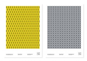
I’m loving the new identity for Sam + Cam, a two-person design studio based in Paris. via Branding Served...
Harry Diaz recently created this fun package as a self-promotional piece for current and prospective clients. The package includes four small Risograp...
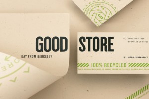
Editor’s Note: As learned through the comments, this project was actually the result of a group effort. The other designers who worked on The Good Sto...
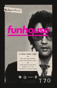
Michael George Haddad created this awesome series of posters for Funhouse, a DJ night at a venue called Mugshots, which is located in the historic Ott...
My friends at Mama’s Sauce recently pointed me in the direction of Ryan Hamrick, a Pittsburgh-based designer. And as expected, his portfolio did not d...
This morning I’d love to point you in the direction of a great design event happening in NYC in just a few weeks. After the Jump: Designing Better Exp...
HWT Unit Gothic is the latest release from the Hamilton Wood Type Foundry, a digitization of the Unit Gothic series, which was released by Hamilton Ma...
Raymond Biesinger recently launched several great new prints, including a series that depicts How Illustrations Are Made, his illustrated take on the ...
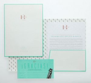
Hotel Boca Chica, a hotel in Acapulco, Mexico, was once the place to be in the 1950s and 60s, but in recent years had lost its glamorous appeal. To tu...
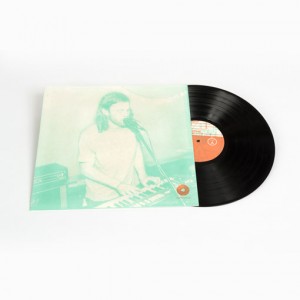
For his senior thesis project at the Tyler School of Art, designer Russell Edling created Homespun Records, a “small time record label that puts an em...
Ryan Frease has been making some excellent work since the last time I checked in with him (way too long ago!) In addition to the two pieces that he cr...
Live is a new release by Lián Types The lively brush script features three fonts, Pro, Standard and Live More which includes a set of pre-designed cat...
Designer Richard Baird—who also runs the excellent blog BP&O—recently completed this beautiful identity for Solis, the fashion label of Tel Aviv-based...
No-Studio is a showcase of the personal work of Vancouver-based designer and illustrator Miles Chic, who loves “big colour, Japanese & French culture,...
Montreal-based studio Booth recently developed this lovely identity for The Secret Garden, a traditional Cape Cod bed and breakfast. Take a look throu...
Historism Border 2D is an ornamental font family consisting of various friezes and patterns grouped into four fonts. All of the ornaments were based o...
Somewhere Else just launched an extensive brand for Foodology, an 8000 square foot restaurant located in Singapore. The project encompassed developmen...
Encounter is Eoin Duffy‘s short animated film which explores the territorial responses of varying North Atlantic species. The message, which he states...
Last week Help Ink launched t-shirts, a welcome addition to their shop. This week’s design, “Never Give Up,” comes to you from designer extraordinaire...
The DM Collection is a line of prints and cards featuring the work of artist Daniel Mackie, who is inspired by the styles of traditional Japanese prin...
Kevin Cantrell recently released the second of seven posters in his “7 Days” series, Águas. This new poster features the same style of gorgeous letter...
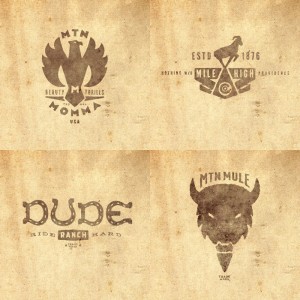
Jeremy Pruitt, aka Thinkmule, recently contributed a deck design to AIGA Colorado’s Bordo Bello, a skateboard art show that’s been on view annually si...
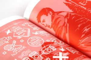
The creative minds behind Kern and Burn, 100 Days of Entrepeneurship have just launched the site for their first book, Kern and Burn: Conversations Wi...
Draw Your Own Alphabets: Thirty Fonts to Scribble, Sketch, and Make Your Own is a new book by Tony Seddon that teaches you how to create your own cust...
I’m loving Cat Neligan‘s illustrative interpretation of Edward Lear’s The Owl and the Pussycat....
Neck of the Woods is hand-lettering project by Chloe Allen, a current student at the University of Leeds. Each entry illustrates a local idiom, from p...
Take a look at Chicago-based designer Lashun Tine‘s work for the 2013 Diaspora “The Art of Blackness” exhibition. (See the 2012 edition right here.) A...
I’m loving this series of bright, summery patterns by illustrator Amy Walters....
Tomato is a new discovery for me, but it was actually produced in 2005 by Canada Type. This curvy display face is actually an expanded digitization of...
Poppin is definitely a favorite brand of mine, so I was excited to see the work Kathryn Brylinsky (who currently works in house fo them) has developed...
For Michael de Pippo’s recent nuptials, he designed a super fun suite of materials around the theme of Love at First Flight. The theme, which was insp...
Check out We Heart Trees, KNOCK’s 2013 campaign in celebration of Arbor Day, a site that asks users to design their own virtual trees while also pledg...
In case you missed the launch of Instagram’s new logo last week, see below for Mackey Saturday‘s new and improved version. I also happened to stumble ...
The Mood Series, by Riccardo Casinelli, combines cheerful colors with not-so-cheerful messages in this dimensional typography. Love the contrast....
I can’t get enough of the graphic illustration work of Guatemalan artist Muxxi. The colors! These particular pieces are a new series of symmetrical ex...
Weekly Crop is a new year-long illustration project started by Jim Mezei. Each week four designers and illustrators will interpret the same topic, res...
Hofstede Design recently launched a new website featuring quite a few new projects. In particular, their modern and playful—love the cat chasing the b...
For her graduate thesis, Sabrina Smelko wrote and illustrated VOA, a science fiction novel focused on the concepts of death, power and justice. If you...
I’m incredibly impressed by this Shakespeare poster series designed by Michelle Wang, a current graphic design student at Pratt. In her words: A commo...
Earlier this year Andy Luce overhauled his portfolio, featuring lots of new work. Below you can see a few projects I’m especially loving, but be sure ...
Animography is a side project by Netherlands-based designer Jeroen Krielaars. The site is essentially a type foundry that produces and distributes exc...
I don’t post a lot of animation work around here, but every so often one really catches my eye. And Adam Wells‘s beautiful black and white piece, The ...
Awhile back I briefly featured the work of Matthew Korbel Bowers in Color Happy 152. And after stumbling upon his work again this week, I realized his...
Belgium-based designer Christophe Remy has done some beautiful work for Delbôve, a high-end cosmetics line. Be sure to check out Christophe’s site to ...
I’m loving the playful retro style of Eric Comstock‘s illustrations....
Kana Sans was released earlier this year by GT & CANARY, a New York City studio founded by Takaaki Goto, a type designer from Japan. Kana Sans feature...
Radio recently worked with London-based agency Cubo to create all new maps for Sea World in Orlando. Get a closer look right here....
One Heart Boston is an initiative by Boston-based Hairpin Communications to benefit victims of the Boston Marathon attack. In the aftermath of the att...
Verb and Verb Condensed are two sans serif families from Yellow Design Studio. Verb Condensed is just a slightly more condensed version of the origina...
Push recently completed the identity and extensive collateral for Italio, a fast casual Italian restaurant chain. Challenge. Italio came to Push with ...
I’m loving this new project by The Original Champions of Design for MC Kitchen, a modern Italian restaurant in the Miami Design District. MC Kitchen o...
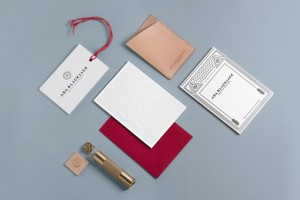
Beautiful work for bag and leather goods brand Ada Blackjack by Verena Michelitsch and Tobias van Schneider. Check out the products online right here....
Trigger Communications just launched this year’s annual report for Calgary Zoo. But it isn’t your typical printed piece; the report unfolds through a ...
I’m loving this work for QT Port Douglas by Fabio Ongarato Design: Each QT Resort and Hotel has it own unique character and individual personality bot...
In a post over the weekend, I requested that if anyone had pictures of the finished pieces from the Learn + Let Go workshop to send them my way. Well,...
A recent browse through Hammerpress‘s custom portfolio turned up this beautiful work for the W. 18th St. Fashion Show, a collaboration with Peregrine ...
Poster is a new release from Type-Ø-Tones designed by Íñigo Jerez. Want more type? Check out my Type Wishlist, current Favorites and Calligraphic scri...
Damn You Art School, who provides answers for “everything they never taught you in art school,” looks like an awesome resource for students, recent gr...
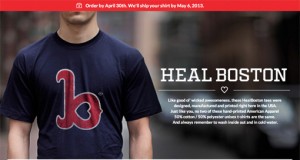
Designer Richie Stewart just launched Heal Boston, a great project to benefit victims of the Boston Marathon attack. Buy a shirt and all proceeds will...
Today I’m taking off after two days jam-packed with creativity. While I’m anxious to get back to NYC, I am incredibly grateful for this experience. As...
This afternoon the last group of workshops were held in one three-hour block. So rather than take one full class, I decided to jump around to as many ...
Yes, armadillo races. Maybe it’s naive of me, but I had no idea this was a thing. (FYI, it’s definitely a thing.) But hey, it was a new and different ...
This morning I spent the first session of the day with Anna Bond of Rifle Paper Co. in a workshop entitled, “What’s Your (Color) Story?” As both a fan...
After I had a chance to familiarize myself with the ranch this morning, I was able to attend two sessions in the afternoon: Jay B. Sauceda‘s “Thinkin’...
Well, after a series of many travel hiccups, I finally arrived in Hunt, Texas at Camp Waldemar at 2AM earlier today. It was quite the adventure. But a...
To celebrate Design Ranch‘s 10th anniversary this weekend, Brian and I made up some little goodies for all of the Ranchers. Based on the idea, “Wear y...
I am currently en route to Texas for Design Ranch! That means that over the next four days, posting will be entirely Design Ranch focused, and regular...
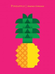
Designer Chris Dina has created a vibrant new print series that celebrates “wondrous varieties of fruit” through colorful, graphic illustrations. All ...
Beautiful work for Højmark Cycles by Denmark-based studio Ineo Designlab. I’m especially loving the architectural typographic mark they developed....
Program is a new sans serif from Emigre. Designed by Zuzana Licko, Program is a “type designer’s typeface”: …It’s about the craft of typeface design a...
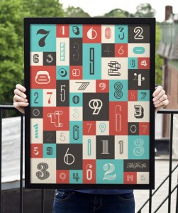
This morning 55 Hi’s is releasing two new posters, Numbers and Numbers 2. They follow the same format as the previous Letters series (which I have bee...
Love the palette of this vintage piece. Unfortunately I don’t have any source information— if you happen to know any, please pass the info along. Edit...
I love this image so much. via Quipsologies I feel the need to take a quick time out from design posts to express how heartbroken I am over the tragic...
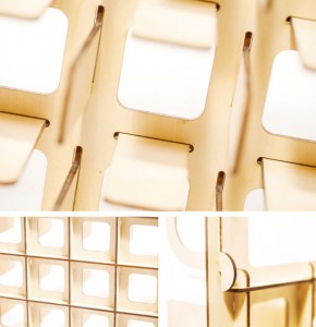
Mosto is a line of minimal, modular, flat pack organizational accessories developed by a student design team from Ohio State University. Their first t...
Loving this typography by Wun Ping Christopher Wong: Merge is a san-serif type face designed with the combination of vector, pencil sketch, fine lines...
Noa Bembibre just released a few new Cats Let Nothing Darken Their Roar products! Archival prints: Love Card: Custom Invitations, Cards or Prints:...
Good Measure is this year’s Tyler School of Art Graphic and Interactive Design MFA Thesis Exhibition. The students are celebrating and showcasing two ...
I’m loving the identity and packaging that Paul Belford developed for Waddeson Wine: Waddesdon Manor is the historical country seat of the Rothschild ...
I’ve been loving everything Great Lakes Lettering has produced since they launched at the end of last year; and Icing, their newest font, is no except...
For her Typo San Francisco talk, Kelli Anderson created these incredible paper type experiments. Each one features intricate letters—mostly white on w...
We’ve teamed up with CourseHorse to bring you a selection of current NYC classes that will be of particular interest to you. Here’s what we recommend ...
As promised, I present to you the amazing remaining Design Ranch session leaders. Much more to come next week from Texas! Jay B. Sauceda Jay B. Sauced...
Earlier this week, the folks at Creative Market launched a pretty impressive new digital product, the Creative Market Photoshop extension. The extensi...
Quant is a beautiful new serif from Hoftype. The family includes eight styles, support for over 40 languages and more, proving it to be “well-equipped...
Design studio mgmt., recently had the opportunity to develop a fun new identity for Elbow Room, a mini-chain of restaurants that serve many variations...
So many amazing artists, designers and creative people will be leading the workshops at Design Ranch next week. In anticipation of my arrival in Texas...
I’m loving the fun, playful approach that Gummy Industries, a new branding, marketing, and social media agency based in Italy, took in creating their ...
The McKinsey Global Institute just released a fascinating new iPad app, Urban World. Urban World provides users with a visually engaging way to explor...
Berlin-based studio Dittmar developed this colorful identity for The Project Factory, a digital production company: The new brand is inspired by a rub...
Last week Neenah Paper launched The Beauty of Letterpress, an incredible online resource featuring educational tools, a printer directory, and the bes...
I’m loving this geometric typographic exploration by Patrick Seymour....
Face updated their portfolio with a few new projects this week. Their work for Highpark, a new residential building in Monterrey, Mexico, particularly...
I’m loving this colorful project designed by Dublin-based studio Aad for the DCU Student Union: DCU Students’ Union approached us with a couple of tri...
Charleston-based studio Nudge recently completed this lovely branding for Brown’s Court Bakery, a new area bakery with historical roots. Get a closer ...
Grey Sans is “a contemporary sans with an angular design” by Canada-based foundry Greyscale Type. Want more type? Check out my Type Wishlist and curre...
Yesterday I got to open the windows in the office for the first time this year, and it was glorious. So in the spirit of welcoming warmer temperatures...
Ico created this beautiful body for work for The Mellier, an upscale London residence. The Mellier is a penthouse in the heart of London’s Mayfair, de...
55His latest creation is Pick Your Poison, a set of six screen printed coasters. Each coaster is double-sided, featuring a popular drink mix on one si...
Tag Collective recently completed an extensive identity project for Salad Pangea, a “fast-casual restaurant that offers a modern, multi-cultural exper...
Awesome geometric identity work for Spa Q by Australian studio Maud: QT Hotels approached us to design a brand for their first of several spas around...
Dutch artist and illustrator Merijn Hos recently had an exhibition at Beginnings NYC, featuring a selection of his colorful wood sculptures. A bit of ...
Glenn Wolk designed this incredible series of patches for fashion brand Tommy Hilfiger. Much more to see right here....
We’ve teamed up with CourseHorse to bring you a selection of NYC classes that will be of particular interest to you. Here’s what we recommend checking...
As evidenced below, Chloe Scheffe, a current student at RISD, is doing some seriously awesome work. You can explore more of her portfolio right here....
HWT Catchwords was released earlier this month by Hamilton Wood Type Foundry. HWT Catchwords features over 80 words based directly on designs offered ...
Anthem Worldwide recently designed this set of vibrant letterpress coasters as a promotional piece for 2013: Design Life is a set of 8 letterpress coa...
Cue recently partnered with Hen’s Teeth to create a bold new identity for Earthjustice, the nation’s leading environmental law organization. Check out...
In just a few short weeks I’ll be heading down to Texas for the first time ever! I’m taking the trip to attend and live-blog AIGA Austin’s Design Ranc...
Jason Grube and Corianton Hale recently collaborated on the identity and packaging for Intrigue Chocolate Co., an artisanal chocolate maker who specia...
I’m loving Leta Sobierajski‘s bold, graphic personal identity system—especially the black and white pattern found on the back of the letterhead....
Beautiful invitations by Carina Skrobecki and Lizzy Showman for Blakely and Matthew, a couple getting married at the Arctic Club in Seattle....
Arek is a serif typeface from Rosetta, designed for both Latin and Armenian languages. Originally designed for textbooks, the family features beautifu...
Love this work for show brand Loeffler Randall by RoAndCo....
Love this new project from A Friend of Mine. The Town Mouse is a new bar/restaurant in Melbourne, and the AFOM team was responsible for everything fro...
Yesterday we talked visual inspiration apps. Today we’re going in a totally different direction: shopping. Luvocracy is a relatively new social shoppi...
I’m loving this project by Heroes Design, the Poland-based design studio of Piotr Buczkowski for Chabur, a lingerie shop....
FontShop’s Using Type series is a great resource for beginners and seasoned designers alike. In case you’re not familiar, Using Type is an ongoing ser...
As a personal project, UK-based designer Luke Skinner created Luxury Rap, “a hand-lettered A-Z of fashion references in Hip-Hop.” More to see right h...
Steven Bonner created this series of graphic illustrations for Computer Arts Collection Volume 2, the Typography edition. The illustrations accompanie...
Kelli Anderson recently completed a complex series of infographics that explore the topic of “Buying a Gun in America,” for the Mayors Against Illegal...
We’ve teamed up with CourseHorse to bring you a selection of NYC classes that will be of particular interest to you. Here’s what we recommend checking...
Have you heard of Iceber.gs? It’s a new(ish) visual organization app, in the same vein as Pinterest or Dropmark, but targeted specifically towards cre...
Brad Woodard, of Brave the Woods, had the opportunity to design the Brand Identity and collateral for this year’s Camp NaNoWriMo, which offers online ...
Check out this incredible poster by José Mendes at MAGA, designed to celebrate 20 years of M2. via Chronique...
I’m loving all the neon artwork and gift items in Upper Tiny, a new-to-me Etsy shop featuring the work of Jenn Smith. Gotta love their tagline too: “I...
I haven’t done a Color Happy post in quite awhile, but when I spotted this Springy, colorful Fossil Brand Poster I was compelled to. You can check out...
Bureau of Betterment recently completed this series of posters and icons for XPlane, aiming to illustrate the company’s vision. XPlane, an organizatio...
Aside from the fact that this photo shoot features two of my most favorite things, ice cream and flowers, it has me seriously craving Spring in a bad ...
Love this identity and stationery for The Clocksmiths, a small Italian design studio....
Somehow I only just discovered David Drummond‘s incredible collection of book cover designs this week. More here. via MyFonts Facebook...
Guanabara Sans is a new release from Plau, a foundry based in Rio de Janeiro. The inspiration for the typeface came from their home city, “with its ne...
I’m loving these abstract watercolor and acrylic paintings by Erik Barthels on Buy Some Damn Art. They also have a great short Q&A with the artist rig...
http://jack-hudson.com/...
It’s been quite a while since I posted about the work of South Africa-based designer Adam Hill. So I was happy to recently come across his newly desig...
I just came across some of the covers from the latest in Penguin’s Great Ideas Series, Volume IV (check out Volume III here). They’re not yet up on Da...
Designer Christine Wisnieski recently completed the materials for Oliver Printing’s 32nd Annual Clambake. I never thought I would catch myself saying ...
I’m really loving Quadon, a modern slab serif by René Bieder. The typeface features line weights, from Think to Black, with matching italics, plus a w...
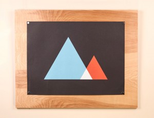
Ugmonk recently launched a new product, called OpenFrame, via Kickstarter. OpenFrame is “a simple, flexible solution to display art, posters, photos, ...
Hatch recently launched their 6th Annual Egg Coloring Contest! Submit yours here....
We’ve teamed up with CourseHorse to bring you a selection of NYC classes that will be of particular interest to you. Here’s what we recommend checking...
Luke Finch just launched a brand new portfolio, under the name WeLoveNoise. There’s lots of great work to check out, but I’m particularly loving the s...
All The Buildings in New York, James Gulliver Hancock‘s personal illustration project (originally posted here) is now a book! It wil be released on Ap...
42Pressed recently designed and printed this beautiful custom birth announcement for twins Ayat and Azaan. Love the color palette—especially the tiffa...
Today I’m loving the chunky, playful letterforms of Azo Sans Uber, the heavy headline version of Azo Sans. Want more type? Check out my Type Wishlist ...
Shane Cranford and Ross Clodfelter, of Device Creative Collaborative, recently revealed a new suite of gorgeous, letterpress stationery. I’m especiall...
Nicholas Felton has once again created a stunning annual report for 2012. This year’s version features 16 pages with sewn stitched binding, printed wi...
New York-based designer Davy Rudolph has produced some beautiful print and interactive work as the Creative Lead at Squarespace. via Site Inspire...
Singapore-based studio Pupilpeople has released a colorful series of typographic 2013 prints, using hand-mixed block printing ink pressed with teak wo...
Designer Senongo Akpem put together a series of incredible photo essays that depict life in Africa and the U.S. in the 1960s and 70s, entitled Lost Ni...
Ariel Wilson recently completed an ongoing project at Oak Grove Center, a therapeutic treatment facility for at-risk kids. Over the past few months Ar...
Bravo Company recently completed the identity and collateral for Mexout, a “fresh-mex eatery in Singapore.” Get a closer look right here....
I’m loving this colorful print series, The Birthstones, by Elisa Werbler. http://elisawerbler.bigcartel.com/category/the-birthstones ...
We’ve teamed up with CourseHorse to bring you a selection of NYC classes that will be of particular interest to you. Here’s what we recommend checking...
I’m loving the pattern-heavy identity and collateral that Raw Color developed for the TextielMuseum in the Netherlands via Present & Correct...
Alegreya ht Pro, designed by Juan Pablo del Peral, is a beuatiful serif typeface originally intended for literature. Want more type? Check out my Type...
Designer Alex Pierce has taken on the ambitious challenge of developing Black In History, a site that curates the names of influential Black Americans...
Saint Agnes, a “handwritten font with a Roman feel,” is a new release from Great Lakes Lettering. Want more type? Check out my Type Wishlist and curre...
Adam&Co. recently had the awesome opportunity to develop the PF Flyers FW13 Catalog. According to Adam, the concept for the catalog was “based on the ...
lg2boutique recently created this new campaign for Vintage, a brand new show from the mind of musician Gregory Charles. The show will include a musica...
Lots of great stuff to see in the portfolio of Alex Register, a senior graphic design major at Iowa State University....
This year, Owen Davey will release his third picture book, entitled Laika. According to Owen, “Laika is based on a true story of a stray, living on th...
Since many fron the design community are currently living it up in Austin at South by Southwest (jealous!), I thought it apropos to post this personal...
One a recent browse through Etsy, I recently came across these awesome graphic Furoshiki cloths by The Link Collective, two friends who live on opposi...
I could have sworn I posted about Happy Menocal over here before, but a little research led me to realize I had only shared her beautiful work on Head...
Marx Design created this “strange by lovely” promotional gift to introduce StrangeLove, a new energy drink, to the Australian market. Some background:...
This style of open, linear display type is nothing new, but I’m always drawn to the modern, graphic presence it adds to a design. This week I happened...
I’ve been admiring the poster work of Status Serigraph for quite awhile, so I thought it was high time they got their own post. Full disclosure: some ...
Sagmeister & Walsh are the latest in the line of excellent designers to collaborate with Moo on a line of cards for their Luxe collection. In typical ...
We’ve teamed up with CourseHorse to bring you a selection of NYC classes that will be of particular interest to you. Here’s what we recommend checking...
Here is yet another incredible identity and web design project by Eight Hour Day. This time they’ve lent their skills to a project for Olive Juice Stu...
This week Colle + McVoy is rolling out a new campaign for Caribou Coffee, based around the theme: “Life is more than coffee. That’s why there’s coffee...
Poppin, one of my favorite brands, recently added a series of art prints to their inventory. My personal favorites are the three abstract pieces you s...
You may remember Michael George Haddad’s excellent personal project, Mid-Century Canada, which I featured earlier last month. Well, due to the overwhe...
Erin Jang, of The Indigo Bunting, always creates the best party themes. Her latest creation is a little dumpling themed baby shower for a good friend ...
Sal Curioso is an interesting restaurant concept, which was visually brought to life by Substance, a studio with locations in both Paris and Hong Kong...
Dan Cassaro launched a brand new site this week, with lots of new work to see. Love the black and white stripes!...
Erik Marinovich recently created this gorgeous lettering and set of numerals for Cincinnati Magazine‘s annual ‘Where to Eat’ issue....
I’m not a big fragrance person, but that’s due, at least in part, to the problem Commodity is now trying to solve. Once their Kickstarter project is f...
Since I just mentioned Mark Simonson’s new site launch, I thought it only fitting to feature one of his new-to-me fonts. Refrigerator Deluxe is “a con...
Yesterday Paravel launched a brand new site for type designer Mark Simonson, that puts his many typefaces front and center. It features a fully respon...
This morning I’m excited to share the wedding materials of designer couple Nicole Zeigler and Mike McQuade. Nicole and Mike collaborated on the design...
I’ve admired this project by KentLyons for quite awhile, so I’m not sure why it’s taken me so long to get it up on the site! Tricolette is a Wool shop...
I’m so glad I stumbled upon the Etsy shop of Osborn Woods. I hadn’t heard of them before, but I’ve learned that David Osborn and Charles Woods were an...
Fabien Barral, of Mr. Cup, is gearing up to move from Bali back to France, and as a result, he’s cut prices on all of his beautiful wood products for ...
I’m loving these posters that Lab Partners created for Goodby, Silverstein and Partners as part of their pitch for Jet Blue....
Ben Geier recently began a personal project that entails redesigning the logos of his favorite record labels in a retro style, which is also heavily i...
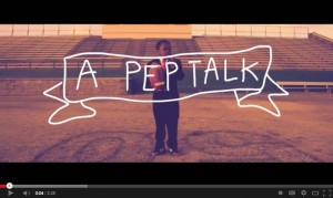
This video is just all kinds of awesome. The perfect pick-me-up for a Monday morning. Check out the rest of the series by SoulPancake right here. via ...
Hyperkit, the studio of husband-and-wife team Tim Balaam and Kate Sclater, just launched a beautiful new site. via Form Fifty Five ...
Better Half Wine is a fictional wine brand targeted towards young males with a casual approach to wine drinking, conceptualized by Daniel Green. The c...
Paris-based designer Leslie David created this series of graphic, mesmerizing broadcast animations for the French TV show, “La Mode, La Mode, La Mode....
Aprile Elcich created these gorgeous collage save the date postcards for Brittany and Jeff, using their engagement photos layered underneath bits of v...
I recently discovered the work of Alexander Purdy on Steady Print Shop‘s blog. I’m especially loving this series of promotional cards that the print s...
Ronnia is one of Type Together‘s sans serifs that I’ve had my eye on for awhile. Its original intention was for use in newspaper and magazine applicat...
I just came across this really fun personal illustration project by Michele Rosenthal, Criterion Affection. Through the project, Michele is visually d...
The identity and packaging you see below was designed by Salih Kucukaga for Static, Espresso Republic’s new coffee line. Awhile back, we shared the bu...
Kate Thomas of Little Things Studio has recently started making these gorgeous, hand-painted, one-of-a-kind silk scarves. They’ve been selling out qui...
I’m a big fan of the work that comes out of Gabriele Wilson Design, especially because she’s developed brands for quite a few recognizable NYC establi...
I recently came across this project that SouthSouthWest developed for Secret Agent, a Melbourne-based property buyer advocates service. I’m particular...
There’s lots of great things going on in the portfolio of Brussels-based studio Stoëmp, but I’m especially loving their album packaging designs. Much ...
While browsing the portfolios of Casey Martin and Kyle Poff last week for the post on Beurre & Sel, I came upon this lovely project. Designed with the...
Bryan Keplesky recently added the rebrand for ColdTowne Theater, a premier comedy, sketch and improv theater in Austin, Texas, to his portfolio. I’m l...
National Currency is a new font from Decade Typefoundry, which was inspired by lettering found on 19th century stock certificates. In addition to the ...
I’m loving the work that Kyle Anthony Miller has been doing for Grouper, a social club that sets up drinks between two groups of friends. via Dribbb...
For their new business cards, Chicago agency Bright Bright Great added a vibrant pop of color to a minimal design using an air brushing technique. Che...
Ashley, you’ll receive an email with the details shortly. Everyone else, thanks so much for participating!...
The folks at Typejockeys recently had the pleasure of designing the album packaging for Freude, the second album from Tombeck. Their work included des...
I’ve recently discovered the gorgeous work of Russell Cobb, a UK-based illustrator. I’m especially fascinated with his massive series of paintings on ...
Tyler and Jessie of One Plus One were kind enough to send over one of their Recipe For Success themed New Year’s promos a little while back. I posted ...
I’ve been following Skillshare since the beginning, but for whatever reason I never actually signed up for a class until recently. Once I got one unde...
Quan is a new release from new-to-me foundry, Typesketchbook, which is based in Thailand. The family features bold and rounded styles—plus obliques fo...
lg2boutique recently completed this gorgeous work for La Vittoria, a charitable event held in Montreal: Montreal’s luxurious Ritz Carleton Hotel playe...
Monument Partners, the studio of Casey Martin and Kyle Poff, recently completed this extensive project for Beurre & Sel, a line of delicious-looking c...
When I spotted Aaron Eiland’s new business cards on Dribbble, I knew I had to share. For this year’s Flatstock in Austin—one of these days I’ll get th...
Brooklyn and Brooklyn Stencil are two new releases from Village. The pair was originally developed by Chester Jenkins as part of the massive Atlantic ...
Allan Peters recently had the pleasure of designing a typeface for ESPN’s Music Issue, which is currently on newsstands. The resulting typeface, which...
Designer Meng Yang just launched a new Kickstarter project that I think you all will love. Inspired by a road trip with his girlfriend, Meng was decid...
One of my favorites, Eight Hour Day, recently completed the Identity and various collateral you see below for The ADMCi, the American Design and Maste...
Designer Meenal Patel is doing some excellent work at KNOCK. In particular, I’m loving the play title illustrations she’s developed for various season...
Every two years or so, fFurious, a boutique creative agency in Singapore, completely redesigns their business cards. The result is a series of six en...
Berlin-based designer Georgia Hill created these gorgeous hand-lettered plates as a unique “Reserved” sign for the tables at The Michelberger Restaura...
This giveaway in now closed. Today I’m happy to once again offer one lucky reader a free pass to the next RE:DESIGN conference, RE:DESIGN UXD, which i...
After this post, we’ll be taking off for Presidents Day. We’ll be back tomorrow with regular posting, but in the meantime enjoy these illustrations of...
As a textbook introvert, I was very much drawn to Zara Picken‘s recent illustration series, which was inspired by Susan Cain’s TED Talk, The Power of ...
As a New Year’s promotion, Because Studio developed Reminders, a “desktop planner that helps you navigate your way through the year, one pin at a time...
Letters from Sweden recently introduced Kumla, a display face inspired by lettering on the facade of Kumla Skofabrik, a shoe factory in Sweden. This t...
I’m loving LA-based illustrator Jon Lau‘s painterly style, especially when he applies it to animals and wildlife. There’s much more to see on his blog...
It’s too bad I didn’t get this in yesterday’s love-themed posts, because it would have been perfect; but nevertheless I’m excited to share this recent...
I’m loving this neutral, slightly rustic invitation suite that designer Aaron Bloom developed for Alli & Whitney’s wedding day. Much more to see right...
This post doesn’t exactly fit into my Valentine’s Day theme, but bear with me… If you follow me on Instagram you may have noticed last night that I at...
For designer Kelley Galbreath’s wedding, she went the non-traditional route and designed an oversized newsprint guide to their big day, including a to...
Each year Little & Company designs a Valentine’s gift for their clients and collaborators. This year they partnered with Lucky’s Hot Sauce to develop ...
I don’t often do themed posting days on DWL, but today I’ve decided to feature a handful of love-inspired projects in honor of today’s holiday. (Maybe...
I’m loving this graphic gift wrap collection from Esme Winter, a new-to-me, UK-based paper goods brand. I especially love that the unique geometric p...
Designer Fanny Nordmark has completed some really beautiful interactive work under the direction of Mario Hugo at Hugo & Marie. I’m especially loving ...
Spanish design firm Atipo developed the materials you see below for Minke, a “a graphic services provider that brings together production and research...
I can’t get enough of these gorgeous pattern designs by Hélène Georget—check out a whole lot more right here....
Each week in 2013, Jen Montgomery will create a unique illustration (some of which are available as prints on Society6). Here’s some of what she’s com...
I’ve just discovered Misc. Goods Co., a new shop from Tyler Deeb of Pedale Design. You may remember his playing cards Kickstarter project from a littl...
One of Harvest Creative‘s recent projects was developed for Jessica Puckett of Perenelle Beauty, a line of natural, pearl-based beauty products. The t...
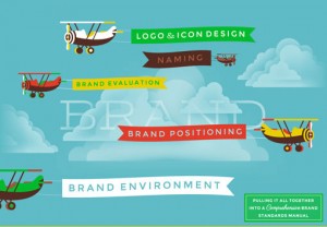
Harvest Creative recently launched a super fun new website. I’m going to hand over the reins to talented designer Michael J. Hildebrand to give you so...
Chris Rushing has one of those rare portfolios that includes excellent work across disciplines, from illustration to digital design. In particular, hi...
Brandon Grotesque is one of my favorite san serif typefaces, so I’m pretty excited about Brandon Text, the latest release from HVD Fonts. Brandon Text...
Embark, a recruiting and staffing company, recently commissioned NYC studio Squat Design to develop this fun little animated video, for the purpose of...
Nowadays maintaining or growing a business requires a robust online presence. That landscape is changing constantly, so takin a focused class on a rel...
Without further ado… The winner of the GT Pressura Monospaced package is: And the winner of the GT Pressura Proportional package is: Congrats to you...
I’m loving the fun, uplifting messages on these banners created by Jimmy Marble. Each one features hand cut unbleached canvas layered on top of colore...
Ollie is a new casual script by Schizotype, with a huge variety of special features. It was designed to make the most of OpenType technology, and incl...
I’m loving the fancy business cards, which feature gold foil, gold edge painting and embossing, that designer Belinda Love Lee designed for Christina ...
Yesterday Hoefler & Frere-Jones added another awesome family to their library: Landmark. The architectural typeface was originally commissioned by Mic...
Mirth & Co. is a two-person, bookbinder and designer team out of Austin, Texas. Their “purpose is to provide products to help people engage with the f...
Not only did Ryan Feerer develop the identity, collateral and interiors (which he collaborated on with Dana Tanamachi and Jeff Rogers) for this awesom...
I’m not sure how it took me so long to discover the work of Amy Borrell, but I fell in love with her gorgeous illustrations at first sight. There’s mu...
Have you seen Princeton Architectural Press’s new gift line? They’ve released a series of paper goods, including notecards and journals, many of which...
In my experience, I’ve found that designers are generally a very compassionate group of people. Over the years working on DWL I’ve loved seeing and sh...
California-based studio TRÜF recently took on the challenge of rebranding themselves, ending up with a bold Swiss-inspired look: After years of design...
One of my favorite letterpress stationers, Moglea, just launched their Etsy shop with a slew of beautiful letterpress goodies. Check out all they have...
San Francisco-based studio I Shot Him recently got in touch to let us know they’d launched a brand new portfolio site. Their work consists mainly of c...
Print enthusiasts, you’re going to love this self-promotional project by Tommy Perez. Tommy, who is a designer and frequent paper crafter, worked alon...
Boston-based studio Commoner recently launched a brand new site! They have tons of great work to share, but I had to feature their complete work for F...
Lolita is one of Latinotype’s latest releases, which they call a “sans family with a touch of mojo.” The typeface features ten weights, and includes a...
I’m loving the quirky characters that Italian illustrator Roberto Blefari has developed in his work....
This giveaway is now closed. Readers, I have an awesome giveaway for you today! Independent Swiss type foundry Grilli Type has offered up a fantastic ...
Seattle-based agency Creature recently developed some really fun work for the Northwest Film Forum Children’s Film Festival. You can check out more of...
I’ve always enjoyed the designs Martino&Jaña have created for the Guimarães Jazz festival. (If you’ve missed their past work on DWL you can check them...
I can’t get enough of Sarah Andreacchio’s colorful patterns and illustrations. Be sure to check out her shop as well. via Ape on the Moon...
If it’s been awhile since you searched for a new job, or you’re getting ready to apply to new college programs, you may want to brush up on your inter...
To promote their stores’ ‘Shirt Bars,” the creative team at Ben Sherman came up with a creative solution: a paper origami folded shirt collar. Underne...
Hello!Lucky, one of my favorite stationers, has introduced several new products for 2013. Personally, I’m most excited by their new monthly card subsc...
While at Chicago Portfolio School (where she graduated from this past fall), designer Liz Cook took on a rebrand of Pandora Internet Radio: Refining t...
I’m loving the bold and energetic illustration work of Tyler Gross....
Sydney, Australia-based designer Olivia King has a profound love for ink. So much so that she developed this multi-page, hand-drawn infographic as an ...
Mid-Century Canada is the personal project of designer Michael Haddad. He chose to design a logo for every province in Canada in a graphic vintage-ins...
The collaborative coaster set I posted about recently, Love Letters by Mama’s Sauce, is now printed and available for purchase. In case you missed it ...
Bellissima Pro is the latest fancy script release from Sudtipos....
Earlier this week Delicious Design League launched a brand new site. Below are a few of my favorites from their new shop additions....
Karsh Hagan recently designed this gorgeous invitation and event package for Portico, a collection of luxury resorts around the in various locations a...
I’m loving this foil stamped Valentines that Sugar Paper designed for goop. Available for purchase here. via Black Eiffel Pinterest ...
A little over a year ago Sasha Barr started a small skateboard company with a few friends called Amigos. Below you can see a selection of all the awes...
lg2 recently developed this classic, and somewhat nautical, design program for Maison Orphée’s new line of sea salts: As an importer and producer of e...
To promote the line of Astrobrights papers, Design studio BLOW developed these bright and colorful paper products. Using a flower theme, (which origi...
Realistic-looking hand lettering typefaces are hard to come by, so I was plesantly surprised to stumble upon Insolente, a family of two fonts—the prim...
For their 2013 promotional package, Matter created a custom box containing 13 foil stamped cards and coordinating envelopes. Get a closer look right h...
If you’re in the market for some fun Valentines to give to loved ones this year, look no further than The Hungry Workshop. They’ve expanded their coll...
Bravo Company recently completed an extensive identity program for The Sicilian, an Italian restaurant in New South Wales, Australia: The Sicilian is ...
Whether it comes from a place of fear or self-doubt, or simply not knowing how to craft an engaging presentation, public speaking is a definitely a co...
Designer Hans Thiessen recently worked with Canadian studio Wax to design the Victoria Symphony’s 2012/2013 Brochure. I’m especially loving the graphi...
Daily Dishonesty is Lauren Hom’s daily design project where she hand-letters all of the little lies she tells herself throughout the day. The letterin...
I’m loving this new project from Adam Garcia, of The Pressure: the Good Stuff Holiday Pack: In collaboration with Portland-based printer Premier Press...
This new project by Vgrafiks is so much fun. Designed for Wink, a laser and wax studio, Vgrafiks chose to go in the opposite direction of the typical,...
I’m absolutely loving the fun wordplay designer Gabby Lord used on her self-promotional business cards....
Prisma Pro is an energetic display face by RMU Typedesign. This version is actually a revival and expansion of Prisma, a typeface that was designed by...
Love this new project that Jay Fletcher recently posted to his site. He partnered with agency Obviouslee Marketing and writer Jenny Badman to create t...
Based on the branding by Special Group, this New Zealand restaurant, shop and inn looks like a fun place to be. The Oyster Inn project is actually sti...
Mary Kate McDevitt recently updated her site with some new work. Check it out here....
I knew I had to share Turnstyle’s gorgeous stationery with you as soon as I laid eyes on it....
Anagrama gives a fun and refreshing new look to a toilet tissue brand: Smartas....
According to MyFonts: Marat Sans is a clean and lively sans serif typeface designed by Ludwig Übele. It is characterized by excellent legibility and s...
States of Matter has a tradition of sending out creative holiday promotions to their clients. Below you can get some insight into their thinking strai...
Matchstic’s new identity for Richard Photo Lab just plain makes me happy. From the color palette to the vintagey graphic details to the friendly and w...
This morning, designer and illustrator Brad Woodard has officially launched his new studio, Brave the Woods. He’s got lots of new work to share, inclu...
I’m excited to announce that our 2013 coasters are now up in the shop! This year, the set of four coasters will not only give you a place to rest your...
I’m loving the crisp, clean modern details (and the color palette, of course—can’t resist mint!) of the identity and collateral designed for Norton by...
Beautiful identity work by Savvy Studio for Iannilli, a traditional Italian restaurant....
Love these playful food pyramid illustrations that Mikey Burton created for a recent issue of Real Simple....
One of my resolutions this year is to get my hands dirty with craft projects more often. On that note, here’s a few courses that sound pretty interest...
Barcelona-based Solo is making some seriously sophisticated work. Love the packaging and collateral they developed for Viña Verino, a wine made by Gar...
I’m loving the combination of gold foil and (what looks like) vibrant colored pencil sketches on this series of notecards by Kamal. Check them out in ...
Memo NY developed this identity and collateral for San Marco, Mario Battali’s Italian trattoria and wine bar at the Venetian Hotel in Las Vegas via Ar...
Designer Bryan Kepleskey has had the fun privilege of working with the Austin, Texas barbershop chain, Birds, to create interior artwork for each of t...
Vulpa is a quirky little serif typeface by Schizotype Fonts....
I’m loving the layered, collage-like illustration of Zurich, Switzerland-based Mariana Rodrigues....
Some awesome work by Allan Peters and his team at the Target inHouse design studio for their 50th Anniversary Party. Get a closer look right here. Cre...
Sure, some aspects of this work by STUDIO ARHOJ tends toward the visually chaotic, but I love it. Check out more details from their work for Helt, a D...
Take a look at this student packaging project by Pratt student Michelle Wang: packaging design for We the People, White House Brew. The design is real...
I recently came across the portfolio of LAND, a studio formed by Caleb Owen Everitt and Ryan Rhodes, and became an instant fan. Each piece has a weath...
I’ve already acquired way too many calendars for 2013, but this perpetual calendar designed for Fab by Studio Lin is really tempting. If you’re intere...
I’ve got my eye on Australis Pro from Latinotype....
Designer Joanna Waterfall developed this identity for Block Shop Textiles, a line of beautiful silk and cotton scarves that are hand-block-printed in ...
Bella Figura recently launched their 2013 invitation collection, which features a huge amount of beautiful designs by various designers. A few of my f...
DWL fave Lab Partners just added a really fun new series of prints to their shop, featuring a colorful, graphic peacock illustration. Each print is si...
This impressive student project was developed by Fred Carriedo for the Transform conference, an event that tackles evolution and the future of communi...

I’ve had a DSLR camera for a couple of years now, but I’ve never devoted quite enough time to learning the ins and outs of photography that I would li...
Designer Amber Asay developed the identity and collateral for The Voyager Shop, a San Francisco lifestyle boutique, while a student at Brigham Young U...
I spotted this project over on Allan’s blog yesterday and immediately knew I had to share here as well. I’m a huge fan of Eight Hour Day’s work, and t...
Roman Extended Lightface is a new release from the Hamilton Wood Type Foundry. This new digitization features a full Western and Eastern European char...
While working at Sagmeister & Walsh, Spanish designer Xavi Garcia had the privilege of doing some work for Story, a unique, immersive store experience...
Feast your eyes on the vibrant illustration work of Hazuki Miyahara—I especially love the layered blocks of color found in each piece. ...
I’m loving this pair of sophisticated identities that David J Weissberg developed for Jane Mayle....
Yesterday Monotype’s new font rental service, SkyFonts, officially came out of beta and released publicly. The service gives users access to over 8000...
The folks at 3 Advertising created this impressive identity and business card for photographer Michael Barley. Beyond all of the intricate production ...
This week Daniel Howells relaunched siteInspire, which if you’re not familiar, is a showcase of great design for the web. Overall the new design isn’t...
Earlier this week Jessica Hische launched her latest font, Minot, a beautiful ornamental display face. Minot includes three styles—Outline, Fill and B...
Barcelona-based studio Lo Siento developed this fun and playful identity and collateral for the Tenerife Design Festival, a design festival held in th...
The layered type trend has certainly taken off in the last year or so. (See Detroit, Valuco, Frontage.) Now Latinotype has contributed their version t...
Bleed—who recently launched a beautifully redesigned website—developed this sophisticated identity and collateral for Aker Brygge, a popular area in O...
This year the creative team at TOKY took a different approach to their year-end assessment. Faced with the dilemma of a year flying by with no time to...
Invisible Creature designed this beautiful set of architectural nesting blocks for Toth Construction as a holiday gift for their clients. The blocks a...
Before I took a look back, I thought I might have a hard time finding ten really great typefaces from 2012 to feature. But once I actually explored th...
I don’t know about you, but for me the new year means taking a fresh look at my business, assessing what’s working and what needs to change, and deter...
Designer Darrin Higgins developed the brand and web experience for new site Sprout Up, which aims to provide children with environmental education: En...
I’ve got one more 2013 calendar to share with you this week (and likely for the year). Designed by Megan Sullivan of Carnevale, this desk calendar fea...
You may remember the stationery designed for the Cattle Baron’s Ball by Cory Say that was posted back in August. Well today he’s been kind enough to s...
This morning I’m loving Quarzo, an elegant, traditional script by Corradine Fonts....
This year, North Carolina-based ad agency Mottis developed a really fun interactive story for their holiday promotion. The story revolves around Jelly...
For their second volume, CA Collection has undergone a complete design overhaul. The first edition was stellar, in both design and content, but the ne...
If you’re in the market for a large wall calendar, designer Edwin Carter has two awesome options for you. First up is Radial, a calendar based on and ...
On the opposite end of the design spectrum is this charming letterpress calendar by Mink Letterpress. Each month features a pastel illustration of a d...
I promise I won’t overload you with too many more 2013 calendars this year, but I do have a few lined up that I think are worth sharing. It’s certainl...
While I was away last week, FUNNEL updated their portfolio with a couple of new projects, including this gorgeous identity and collateral for Tailored...
Illustration by Ma + Chr via L’affiche Moderne Happy New Year readers! We’ve got lots of things in store for the coming year that we’re excited to sha...
We’re taking off this week to spend time with friends and family for Christmas. We’ll be back and raring to go first thing in January. Best wishes for...
Carat is a “contemporary interpretation of a classic serif” by German foundry Hoftype....
Finnish illustrator/designer/artist Hanna Konola is currently in the process of adding to her Christmas calendar, a daily illustration project. Despit...
Each year Monnet Design redirects the money typically spent on holiday gifts to charities: Here’s what they did in 2011: As we’ve done since our found...
Cosmos MMXII is a 2013 calendar that consists of 12 original illustrations inspired by the universe and beyond. Beautiful! It’s available as a high-re...
In support of the Hamilton Wood Type & Print Museum—if you don’t know about their current struggles, read more here—Mama’s Sauce has teamed up with se...
Unio is a friendly slab serif with rounded edges by Wilton Foundry....
The illustration team Peskimo created this fun series of prints inspired by the seemingly endless varieties of tea. Special Brews has launched with an...
Seattle-based studio Baji recently completed the re-brand and site development for Elements of Education, a Washington-based non-profit that aims to s...
I’ve already bought far too many 2013 calendars—not sure where I’m hanging them all!— but I have to say I’m loving this vibrant Risograph Calendar by ...
Bureau of Betterment created this playful Holiday Chutes and Ladders Game Board for Xplane, a company that specializes in Business Design Thinking....
Bond developed this fun interactive Christmas card game for the University of The Arts Helsinki. Take a minute to play with the greeting for yourself ...
If you’re not already watching Homeland, you should be. Plain and simple, it’s just great TV. What’s also great—better than great, really—is this new ...
Anagrama just completed this gorgeous Brand Identity and collateral for Bonnard, a Mexican french-inspired tea and confectionery shop. I am loving the...
It hasn’t been that cold on the East Coast yet this winter, but I’m still craving a tropical vacation right about now. So Nate Williams’s recent Mar d...
I just discovered the work of Sydney, Australia-based two-person team WBYK. I’m loving their illustration style, especially when it comes to the huge ...
Chris Streger has just launched the 2013 edition of the To Resolve Project, where designers submit their resolutions for the new year in the form of p...
I’m loving the colorful holiday decorations that Jenny Bowers developed for Bloomingdales this season. via Peepshow Collective...
Two Times Elliott developed this clean, modern identity for Daniel Hopwood, a London-based interior design practice....
The Little Friends of Printmaking are greeting 2013 with “all the hostility it deserves” by way of their Unlucky silk screened calendar. Printed on gr...
If you’re interested in getting into illustration or brushing up on your basic drawing and painting skills these classes are for you: Drawing Workshop...
...
This gorgeous wine label was designed and illustrated by Pearly Yon for the Ashbourne Sauvignon Blanc. Here’s a bit about her process: I was briefed t...
Earlier this week illustrator Molly Jacques announced Great Lakes Lettering, a new collaboration between herself and font designer Dathan Boardman. Th...
The Winter Cabin Collection is a new collaboration between Mary Kate McDevitt, Man vs Ink and Wanderlust Vintage & Handmade. The line began as a lette...
For Icon Magazine’s re-design section, Bond bravely took on Santa Claus. Faced with the challenge of a dwindling number of believers, they gave Santa ...
I’m a little late to the game on this one, but Dan Blackman launched a beautiful new (and responsive!) portfolio site yesterday. All of the work is gr...
Shelton Slab is a distressed letterpress style font featuring letterforms that appear to be from many different alphabets. Pick up this new release by...
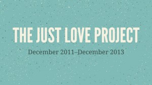
Just a quick reminder that if you haven’t entered The Just Love Project giveaway yet, you have until tomorrow to do so. Just leave a comment on THIS P...
I’ve always loved emerald green, but being that it’s been declared Pantone’s 2013 color of the year, lately it’s been more prominently on my mind. So ...
Seattle-based Hum Creative recently threw this super fun launch party to celebrate their brand new website. Love those hum dog posters and tattoos. Al...
I’ve been enjoying following Dominic Flask and Rory Harms’s illustration project, 12 Days of Christmas. They have been publishing their own designy ta...
Anagrama recently completed this elegant Brand Identity and Collateral for Doce Cielos, makers of traditional honey-based products....
I’m loving the whimsical stationery items that Stitch Design Co. created for Hob Nob, an event curator based in Charleston, South Carolina....
Here is another awesome Foundry Collective project. This clean, modern and elegant identity and collateral was developed for Fireside, design + build ...
The Mule is another Foundry Collective project that I’ve seen snippets of in the past, but never the complete brand fleshed out to print pieces and si...
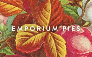
Earlier I happened to stumble upon Foundry Collective’s site after not visiting for awhile, and I noticed several project updates that are very much w...
Olio is a bold, geometric display face by Max Little. Available in Bold and Inline, you can currently pick up the set for 50% off at MyFonts....
This identity and collateral designed for KOMBOH, a “fun loving bureaucracy run by two people,” is SO much fun. Check out KOMBOH’s work right here....
This giveaway is now closed. Thanks to all who participated! Back in March I first posted about The Just Love Project, a philanthropic, collaborative ...
Check out Noise 13′s new line of holiday cards. You can choose to buy one of three series of three, each with its own theme, or the entire set of nine...
This week’s classes are for those of you that may want to dive in further to Photoshop and all of its capabilities. I personally use Photoshop every d...
If you’re looking for a non-traditional card option this holiday, you may want to check out Petra Börner’s graphic, black and white Cosmos series....
Thanks to commenter Tracy (on this post), I’ve learned the other artists who participated in the Gap Cares gift card designs. In addition to Andrew Ba...
Congrats Brian! Expect an email from me later today. Thanks to all who participated!...
These interesting, painterly illustrations and patterns by Santtu Mustonen caught my eye today. More here. via Hugo & Marie Behance...
Manual recently released Edition 2 of Loose Leaf, their hybrid publication and print series that is published twice a year. Edition 2 focuses on the t...
FUNNEL updated their portfolio with a few new projects this week, including the gorgeous identity and packaging that they developed for Waxing Kara ho...
The 2013 Studio on Fire desk calendar is now available! This year’s design is based on the theme “Lucky Number 13” and includes collaborations with Sa...
It’s been awhile since I posted a small sampling of Aaron Bouvier’s work back in 2010. Since then he’s updated his portfolio with a slew of new projec...
Trigger Communications has sent out a unique and engaging holiday promotion this year: We know December can get overwhelming, so this year we’ve sent ...
Check out this super fun new project by Australian studio Naughtyfish. They designed this spine ‘Totem’ to identify issues of desktop magazine, a lead...
Eames: Beautiful Details, a new book from Ammo Books, is definitely on my wishlist....
This giveaway is now closed. Back in March I posted about Hannes Beer’s All Day Everyday Project, a self-initiated daily illustration and design proje...
There’s a good change you’re not familiar with the rapper Riff Raff. I’m wouldn’t call myself a fan of his music, but I will say he is definitely ente...
I recently discovered the work of artist Ryan Schneider through 20×200, and immediately fell in love with his colorful and pattern/texture-filled comp...
Ramsey is a new display sans from the folks at Associated Typographics, aptly described as having a “strong structure and a warm personality.” Look cl...
Colle + McVoy‘s 2012 All-set Card Set is now available! (Check out last year’s set here.) This year, proceeds from the cards will go to Feeding Americ...
Have you seen Gap’s new gift cards for the holiday season? This year when you purchase a gift card, 2% of the proceeds go to the non-profits CARE or C...
Australian studio There developed this colorful rebrand for Marble, a business whose focus is on technical recruitment for the mining and construction...
Stitch Design Co. recently completed the design of some print collateral to accompany their earlier packaging work for Rewined Candles (posted here). ...
Designer Riley Cran, who is also a founder of the Lost Type Co-op, just launched a brand new portfolio featuring some great projects. A few favorites ...
Designer Darrin Crescenzi developed this luxe set of materials for a Nike-hosted event during the Olympics. He created the visual identity and print c...
Suitcase Type Foundry recently released two new typefaces to complement the popular serif Tabac: Tabac Slab and Tabac Mono. The entire Tabac family is...
While pursuing her Masters Degree in Packaging at Pratt Institute, Yu Ping Chuang developed these beautiful materials for Tivoli, a line of bath produ...
I’ve always said that if I ever win the lottery I would become a professional student. I’ve always wanted to go back to school, and I would be enrolle...
If you follow Kelli Anderson on Dribbble, as I do, you may have also been anxiously anticipating the launch of her latest project, a pair of newspaper...
I’m loving the clean, simple design and bright pops of color in the stationery system that Daniel Renda designed for himself....
San Francisco studio Noise13 recently completed an in-depth branding and design project for Living Greens, an organic juice company. Here’s a bit of b...
Have you guys heard about the Etsy Holiday Shop? It’s up and running now through December 8th in Soho, and they have all sorts of fun things going on....
Lost Type Co-op’s latest release is a “reverse contrast cowboy font” by Dan Gneiding, aptly named Dude. The font includes twelve awesome styles, each ...
Brooklyn studio Red Antler recently designed this bright and friendly identity for GRK, a new casual Greek restaurant in NYC. They were responsible fo...
Holiday pop culture fans will love Monkey Ink Design‘s gift wrap inspired by Home Alone and Christmas Vacation. I don’t know about you but, both movie...
I’m loving The Hungry Workshop’s selection of holiday cards, which can be purchased as a set or individually. Check them out in their shop!...
This intricately illustrated poster was created by Hungary-based designer Boglárka Nádi for the Urban Folklor poster competition. More details right h...
I’m currently loving Feather Script, an elegant vintage design from Lettering Inc. Pick it up at My Fonts....
Designer Jake Dugard (previously posted here) developed the identity and collateral for the Ruston Farmer’s Market. I especially love the bags!...
The folks over at Proof Wine Collective (previously posted here) have embarked on a brand new endeavor: Turncoat, a new combination wine bar, restaura...
UK-based studio The One Off recently worked with Italian paper manufacturer Fedrigoni on this colorful promotional piece for their Woodstock range. Th...
“No other city in the world stages dusk to dawn like New York City. In this book one can experience New York on foot, the ultimate reward for the noct...
Nobrow just released three fun new limited edition prints by Patrick Hruby. Pick them up for yourself right here: Bear, Penguin, Seal....
Harriet is an elegant serif typeface developed by Okay Type. It features two styles, display and text; six weights, from thin to black, and a wide arr...
Australian studio End of Work, who just launched their brand new site today, sent over this gorgeous packaging project they recently completed. When X...
I recently discovered that the New Jersey shop Norman’s Printery also operates an Etsy store: The Trading Post. Head on over to check out their curren...
w-o-r-d-u-p.biz is a fun new project by Nicole Lavelle. In just three easy steps, you can purchase a bespoke piece of text art. Simply choose your siz...
In case you’re planning on doing any shopping today and looking for ideas, I just wanted to stop in and suggest that this year’s Gift Guide might be a...
We’re taking off today and tomorrow to celebrate Thanksgiving with friends and family. We’ll be back bright and early on Monday with regular posts. En...
I just got my hands on a copy of Brooklyn Makers, a new publication from Princeton Architectural Press. The book features the photography of Jennifer ...
Just in time for the holidays, Jason Dean of The Best Part has released a new Christmas edition of his glow-in-the-dark Day and Night print. Pick one ...
For 2013, W+K Studio has designed a letterpress coaster calendar in a graphic mint, black and white palette. You can pick one up right here, and check...
Calling all designers and typography afficionados: The incredible Hamilton Wood Type & Printing Museum in Wisconsin, needs your help. The owners of th...
Trithart is a playful, hand-drawn, Open Type font by illustrator Emma Trithart. You can pick it up right here at You Work for Them. ...
Speaking of vintage-inspired design and illustration, I am also loving Cardon Webb’s colorful design for a series of texts by Ralph Ellison. For each ...
I’m loving the vintage-inspired illustration work of Sanna Mander. via Laura Belle Wright Pinterest...
Worthe Numberals is a set of fun set of decorative numerals from House Industries. The set of two fonts includes both the standard and drop shadow ver...
Print Aid NYC is an artistic initiative in support of Hurricane Sandy relief. Various NYC-based artists were asked to create a poster design based on ...
Woohoo! The 2012 Holiday Gift Guide is here! You can flip through clicking on the image above or following this link. A special thanks to this year’s ...
Oklahoma City studio Ghost recently completed this beautifully quiet and minimal identity for Marfa Contemporary, a Marfa, Texas-based extension of Ok...
I’m loving this dynamic identity that Matt Luckhurst created for the Advertising Women of New York organization....
Yesterday HF&J launched the new and improved Tungsten family, which now boasts 32 styles. Improvements include four new lighter weights, the addition ...
Even though I’ve never had a chance to visit, I’ve always loved the identity for Flora Grubb Gardens. So I was pleasantly surprised to stumble upon it...
In the couple of weeks since its launch, Squarespace Note has received quite a bit of positive buzz in the design and tech communities. If you haven’t...
London-based studio The Plant recently developed this spirited design work for Union Jacks, Jamie Oliver’s newest restaurant chain. They took an inter...
Exciting news! The latest in the line of amazing designers to collaborate with Paperless Post is none other than DWL favorite Erin Jang. Today marks t...
Blok Design developed the interactive “Not Myself Today” Campaign for Partners in Mental Health, with the goal of improving mental health in Canada. H...
Today marks the launch of Fabien Barral’s new venture, Mr. Cup. This brings together all of his previous sites—FabienBarral.com, Harmonie Interieure, ...
Lupa Sans is a fun new typeface designed by Melle Diete. Lupa includes a range of weights, from Extra Light to Black, and an incredible extended chara...
Netherlands-based Leffe Goldstein developed the pop-up store design and details for Maximus Brouwerj, a brewer, to showcase new bottle designs during ...
I’m loving the bright, playful designs created for Cocoville Chocolates by Isabella Rodrigues....
I’m loving this self-initiated packaging project from Orion Janeczek. His inspiration for Sauvie’s Hard Cherry, an organic soda, was Sauvie Island, a ...
I’m loving the all of layered, narrative details and selective use of color shown in the illustration work of South Africa-based Johnny Kotze....
Stellavie is the Germany-based design practice of Steffen Heidemann and Viktoria Klein. Their shop features some seriously stunning limited edition pr...
This fun letterpress calendar is the result of a collaboration between Paperreka stationery and 11 of her designer friends aiming to “defend the honor...
San Francisco-based studio Noise 13 recently completed the design for Heath Newton Family law firm’s annual Halloween mailer. This year they designed ...
New Zealand-based studio Designworks recently completed the branding and graphics for Black Dog Brew Co.’s retail space. More to see right here....
I’m loving Signalist, a lively brush script by Mike Melvas....
If you frequent Dribbble at all you may have come across quite a few pieces of art created for the #GoVote campaign, an artistic initiative that aimed...
Charleston, South Carolina-based studio Nudge just recently relaunched their portfolio with lots of new work, including this great identity for Stars ...

Modular is a six layer stacking display typeface by Letterwerk that allows for unlimited possibilities. Two versions, a slab serif and a sans serif, a...
We Don’t Work – We Play was an exhibition held in Germany that featured various typographic interpretations of the phrase. Check out more examples fro...
I love this series of illustrations by Sol Linero for Descorches Magazine....
Photographer JC Lemon took this series of haunting photographs while riding around lower Manhattan—which is still without power—on his bike the other ...
In addition to Blue Marble—which had raised about $4k as of yesterday—20×200 is also giving you the opportunity to contribute to Hurricane Sandy relie...
I’m taking a little break from regular posting today to focus on the millions of people in our part of the country who have been impacted by Hurricane...
According to London-based illustrator Philip Dennis, his inspirations include: “80s films and cartoons, natural forms and patterns, playing around wit...
TOKY designed these incredible pop-up invitations for the St. Louis Public Library’s end-of-year Gala. The design and construction was inspired by the...
I’m not much of a Halloween person (I know, I know), but I couldn’t resist posting Siobhán Gallagher’s latest illustration project: Twelve Days of Hal...
Herb Lester‘s map selection represents an amazing group of designers and illustrators, including many that are DWL favorites. So needless to say, I’m ...
Love this minimal, geometric identity designed by Studio Brave for interior designer Christopher Elliott....
The companion Salvo Sans and Salvo Serif was originally designed by Cyrus Highsmith for use in various AARP publications. Both typefaces are available...
Portland-based designer Orion Janeczek developed these awesome suite of promotional materials—check out that gorgeous engraving work—for Supreme Table...
For her current self-initiated project, illustrator Summer Pierre is illustrating and hand lettering a new story every day for 100 days. She’s current...
I don’t think these are new, but I love these limited edition screen prints by Sanna Annukka....
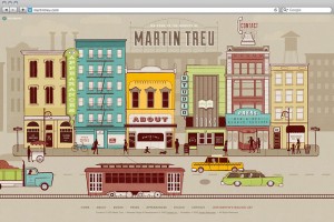
Take a look at this newly launched site for Martin Treu, “an urbanist, author, designer and architect,” which is the result of a collaboration between...
San Francisco-based studio HoffmannChrisman has developed some incredibly elegant websites for various wineries and wine purveyors. Case in point: Han...
I’m loving the whimsical vintage feeling illustrations of Jonathan Burton. This series was designed for a poster campaign to promote the 2012 Cultural...
I’m loving the colorful digital illustrations of UK-based Scott Balmer....
Aria is a graceful, elegant display serif by Fountain Type, that was released back in 2011. Get a closer look on MyFonts....
Two Arms recently created these beautiful typographic business cards for Expert Americana Tattooing, a Brooklyn-based tattoo artist....
After designing print materials for Bookjigs bookmarks, Modern8 pitched the brand on a redesign of the product itself. The result was a series of 30 b...
I’m loving the elegant idetity that Leo Burnett Dept. of Design developed for the Star Reacher Award, a prize given to individuals for their commitmen...
Need a pick-me-up? Well I just might have the answer for you: Emergency Compliments, an altruistic online project from Megs Senk, a designer at W+K 12...
Orlando, Florida based design studio Push recently completed a rebrand for Old Chicago, a national restaurant chain with a pizza, pasta and beer menu....
Just in time for the holidays, Tad Carpenter has written and illustrated a new book. Sad Santa is a story about Santa’s annual holiday blues—such a fu...
Designer Craig Ward (who I’ve previously posted about here and here) has written a new book entitled, Popular Lies About Graphic Design. Craig describ...
For a recent grad, Catherine Dimalla has quite the portfolio. I’m especially loving the work she’s done for Jeopardy Magazine, which is an annual, und...
Good news: We’ve extended our initial sponsorship deadline through the end of this week! We have several sizes and rates available. So if you run a bu...
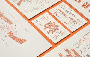
Couldn’t resist also posting this beautiful stationery system that Kevin Cantrell designed for the Law Office of Matthew Messina. I’m loving the intri...
Take a look at this absolutely stunning poster by Kevin Cantrell, the first addition to his brand new online shop. Luminares is available for purchase...
Swagg is a friendly sans serif—love the lowercase “g”—that was released by Miller Type Foundry back in 2011. You can pick up all five weights individu...
Check out this awesome mural that Invisible Creature recently designed for Vulcan Real Estate. They worked with artist Don Rockwell and Foley Sign Com...
For her thesis project, German designer Alexandra Turban developed the concept and design for The Inside, a fast food restaurant specializing in dumpl...
Attention creative thinkers/dreams/doers: Wieden + Kennedy 12 is on the hunt for this year’s participants! Wieden + Kennedy 12 is an elite creative so...
I am not a whiskey drinker by any means, but I love the packaging explorations that FUNNEL has developed for Early Times Hot Cinnamon Whiskey....
In case you’re unfamiliar, Help Ink is an altruistic, collaborative site that offers prints and other goods by various artists to benefit charitable o...
Love this playful identity for Blue Marble Ice Cream by Gabriele Wilson Design....
Originally released in the late 1960s, Filmotype Manchester has recently been reissued with new refinements and expansions. Along with Miner and Marle...
I love these playful maps—the Maui one first caught my eye, of course—by New York City-based illustrator Aaron Meshon....
As of today, the popular Keep Calm Gallery has become The Calm Gallery. They’ve launched a brand new site featuring lots of new prints, including thos...
As both a devoted New York Magazine reader and avid consumer of pop culture, I am in love with this new project by Matt Stevens. For Vulture.com, NY M...
Take a look at Timothy Goodman’s latest amazing project. While at the MAGIC trade show this past August, he created a mural for FlexFit Headwear featu...
A fun, vintage-inspired identity by Florida-based studio Hatchet Design for Cask & Larder, a local restaurant. via Art of the Menu...
These pages from Sophie Roach’s sketchbook are spectacular. See more here....
You may remember that I already posted about Alda in 2010, back when it was still a work-in-progress. Well, I just happened to stumble upon it again r...
I’m loving the friendly, laid-back identity that New Zealand-based Hardhat Design developed for Coffee Supreme, a local chain. via Best Awards...
Komboh’s National Hero Registration Forms made me smile this morning. You can download one for yourself right here....
The first series of the excellent Computer Arts Collection (previously mentioned here and here) is now complete. Each issue focuses on one broad topic...
As usual, the approaching holiday season has completely snuck up on me. Aside from needing to personally get a move on with my shopping, it also means...
I can’t get enough of the gold foil inline type on these pieces for Mabe by Australian studio Band....
Construct London designed this bold yet playful identity for Koffman’s, a London restaurant created by chef Pierre Koffmann. I love the contrast of th...
Ashley, you’ll receive an email with the details shortly. Everyone else, thanks so much for participating!...
Will Bryant’s work always puts a smile on my face. So I was excited to see he’s just launched a new site with a ton of new projects. Below you can see...
HWT American Chromatic is the first release from the Hamilton Wood Type Foundry, a new collaboration between P22 and the Hamilton Wood Type & Printing...
Sometimes all you need is a black and white geometric pattern. Or twenty. See the rest of Maddison Graphic’s new stationery right here. via Present an...
I’m loving this new poster that Grady McFerrin designed for Calexico’s current tour. Beautiful palette....
This vintage letterhead is amazingly over-the-top. What makes it even more incredible is that it was created for Chung Ling Soo, who was an American m...
Illustrator Ann Shen has created this awesome series of illustrated postcards featuring bad girls throughout history, like Marie Antoinette and Bettie...
Beautiful pattern designs by Berlin-based Estrella de Anis…...
Susa, by Hubert Jocham Type, is currently one of my favorite casual scripts. Pick it up at MyFonts....
I’m so glad illustrator Gabrielle Barouch sent over her work this week. I love the imaginative subject matter and soft, delicate textures, especially ...
Update: This giveaway is now closed. I’m so happy to be able to offer another free pass to one of the incredible RE:DESIGN conferences, RE:DESIGN/Crea...
I was recently introduced to London-based design studio Wurtemberg, and discovered that their polished, sophisticated work is right up my alley. I’m e...
Over the past few months, Tyler Deeb of Pedale Design has been working on the design for a custom deck of playing cards. He’s set up the project on Ki...
Etsy shop Sass & Peril offers a wide array of screen printed textiles and paper goods featuring all sorts of adorable, graphic animal illustrations. C...
I am in love with the pattern designs of Toronto-based surface designer Elizabeth Olwen. Much more to see right here....
I love these gorgeous new city maps by illustrator Owen Gatley. NYC is my favorite, naturally, but all three are available for purchase as A3 prints a...
Lexia is another Dalton Maag typeface originally created in 2007. The friendly slab serif features six weights plus italics. Pick it up right here....
Radio just updated their portfolio with several new projects, including these editorial illustrations for Wired UK....
Check out this gorgeous birth announcement that Meg Gleason, of Moglea, recently designed for little one Wolf Finley. I especially love the color pale...
I’m loving the colorful, illustrative look and feel of the wedding materials designed by Letitia Buchan for her own wedding. via Brooklyn Bride...
Anagrama recently completed the identity, collateral and interiors for Montero, a restaurant in Saltillo Coahuila, which is a city very close to the M...
Melbourne-based Studio Hi Ho was asked with developing a campaign to promote Backyard Apartments, an off-the-beaten-track housing development in the c...
Toko was commissioned by the Sydney-based Arts & About Festival to create a vibrant urban installation. Here’s a bit of insight into the thinking behi...
Public Bikes has launched a new traveling exhibition featuring posters interpreting the concept of “public.” The exhibition, which will soon be headin...
Cake for Charlie is a new line of modern paper goods by designer Sarah Hodges. Her initial offering includes ten fun wrapping paper designs, but plans...
Colabs is a new creative community currently being developed by Brooklyn-based designers Noah Akinson and Jennica Johnstone. Once launched, the site w...
Designer Ben Noe recently completed the design of a series of seven embroidered patches for Next Level Expeditions, which illustrate the tallest summi...
Check out this new project from the folks at Design Ranch: God Hates Goods is a line of clothing and ephemera intended solely to raise eyebrows and st...
Check out these new posters from justAjar, all printed on a Vandercook letterpress from carved wood blocks and hand-set type. I’m especially loving th...
This gorgeous floral alphabet was hand-crafted and photographed by Anne Lee, a junior Graphic Design major a MICA....
Apartment One has teamed up with Rock the Vote to develop and launch this year’s epic youth voter campaign, “We Will.” Here’s a bit about their thinki...
I’m loving the playful softness of Foco, a typeface published by Dalton Maag from 2007....
You may remember the posters Mattson Creative developed for CBS to commemorate some of their classic television shows. Well, get a load of how amazin...
Playtype just launced their new series of I Love Typography posters. They will soon be available in the online shop....
Beautiful Bitmaps is a recent project from Uppercase Magazine: For issue 15, we invited 26 typographers, designers and illustrators to make beautiful ...
More awesome in the Telegramme shop…...
These Tooth Fairy Receipts by Nocciola Design are simply adorable. If you’re the DIY type, there’s a printable version too....
I am fascinated by James Griffioen’s Feral Houses, both the phenomenon itself and the way James has captured them on film. A few prints from the serie...
If you’re any sort of Brad Goreski fan (as am I) you must agree how incredibly perfect these sophisticated yet playful calling cards are for him. Well...
“The South Illustrated” 2013 calendar was designed by Stitch Design Co. and letterpress printed by Sideshow Press, exclusively for Garden & Gun. Each ...
While I don’t have a specific fear of snakes, I can’t say I particularly like them either. Still I couldn’t resist posting this excellent identity by ...
Designer/illustrator Emily Isles created this series of posters, Italian Inventions as a self-initiated project. The idea for the series came about as...
Just noticed an older draft of this went up incorrectly—sorry about that! DWL favorite Lumadessa has recently launched a series of Canine Editions, wh...
I’m a big fan of the work Imaginaria Creative is doing. This particular piece is a self-promotional one, centered around the theme of “We, You & Us.” ...
I’m currently loving Gigalypse, a new chunky square sans serif from Dunwich Type Founders....
These sophisticated print pieces by & SMITH for Porto Montenegro are giving me major vacation cravings....
Tom Froese, along with Chad Holden and Rigel St. Pierre on development, recently launched a brand new site for Everlovin’ Press, the letterpress shop ...
I’ve had my eye on Steinweiss Script for awhile, a typeface that was originally developed as cover lettering for a Taschen edition on the work of Alex...
Zara Picken recently launched a brand new site design featuring a clean, simple layout and lots of new work. A few favorites are below, but be sure to...
This week Gordon’s gin just launched a fun collaboration with Conran, a series of ten limited edition bottle designs: Seeming an obvious marriage, the...
Frost* Design recently put their stamp on the new library at Stanmore Public School, located in Sydney, Australia, through the use of bright, colorful...
It clear from past posts that I have a bit of a fascination with Iceland. So it should be no surprise that I’m loving the cool, quiet beauty of Tom Ko...
Luella is a whimsical, vintage-inspired, hand-drawn font by Cultivated Mind. Pick it up at You Work for Them....
Malika Favre just released a new series of mini screenprints featuring seven black, white and red illustrations centered around the theme of Hide and ...
I’m loving these graphic food-themed posters from Bklyn Larder. I don’t have any information about the designer/illustrator, so if you have any info p...
These gorgeous hang tags were designed and printed by Rocio Cogno during a letterpress class at Cooper Union....
A beautifully sophisticated identity by Hovard Design for Creel and Gow, an Upper East Side boutique. I can’t get enough of their signature persimmon ...
Jessica Hische and Paul Buckley have collaborated on an exciting new project, a series of cover designs for classic literature featuring Jessica’s Dro...
Check out this identity developed by SB Studio for The Brink, which is a dry bar in the UK. I absolutely love the punchy graphics and the degree of in...
Gorgeous work by Alan Coulson. via Ignant...
I love this clever identity by Ascender for Megan Sheerin, a corporate communications consultant. ...
This gorgeous typography was created by Ginger Monkey for Hook & Irons Co., a clothing label created by two firefighters. Pick up merch for yourself r...
I’m loving this new packaging project by Bureau of Betterment… The 54-40 packaging project was a collaboration between two sole proprietors: Mette Hor...
I’m loving the packaging solutions Christine Wisnieski came up with for Tavern Vinegar Co., a line of housemade artisanal vinegars by Chef Jonathon Sa...
I love the bold, minimal design for Furlined, an L.A.-based film production company, by Blok Design: Working with the company’s founder and senior exe...
Type Together makes so many great workhorse typefaces, both serif and sans serif, that can work for an incredibly wide range of applications. I would ...
Glenn Wolk developed these t-shirt designs for Ruffian’s (a label created by his brother Brian Wolk) Spring 2013 collection. Check out more right here...
I love the contrast between the natural textures and fluorescent strings in the hangtags that Studio Thomson created for Savile Row tailor Richard Jam...
I was disappointed that I couldn’t attend Kelli Anderson’s Creative Mornings talk back in July, so I’m thrilled that the video of her talk is now avai...
Creative parents will love Wee Society, a new kids brand from some of the folks at Office, “a team of moms and dads who believe in bright little minds...
Last week I attended the Brand New Conference here in NYC. I’ve been meaning to write a recap post, but my schedule will probably prevent me from gett...
DKNG launched five new posters today, and they are all beauties. Click on each image for the link, or check them out in the shop....
Even if you’re not a Game of Thrones fan—though if you’re not, you should be—you have got to appreciate this gorgeous typographic heraldry project by ...
These abstract photographs by Akihiko Miyoshi caught my eye....
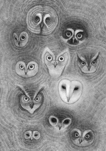
Beautiful drawings by Orka Collective....
What can I say, Stitch just creates the best complex invitations. They often include elements of surprise, interesting objects, and unique details and...
Pauline Automatique created these beautiful (and playful) letterpress announcements to celebrate the birth of her daughter Jeanne....
Adrian Forrow created this colorful silkscreen poster as part of The Bastonnade Project....
All of the seasonal Charlie Brown movies are engrained into my memory from childhood. I still love them twenty or so years after my first viewing. So ...
The Best Part just launched a new print that’s perfect for the nature/camping enthusiast in your life....
EnsaimadArt is a project launched by the Majorca, Spain-based publishing house Infolio to celebrate the 50th anniversary of Amadip.esment, a non-profi...
Herman Miller just launched an exciting new series called Why Design: At Herman Miller design is the language we use to ask questions and seek answers...
UK-based studio Believe in recently completed an identity and stationery project for Christophe Szpajdel, aka Lord of the Logos: The work follows the ...
I’m loving Tuesday Bassen’s adorable new ceramic collection. Pick these pieces up in her Etsy shop....
Feast your eyes on this impressive wine packaging from Stranger & Stranger. Stranger & Stranger have teamed up with winemaker Truett Hurst and retaile...
I love these bright graphic textiles and paper goods from Wendy Polish....
First, thanks everyone for participating in the survey regarding our advertising, especially those of you who took the time to elaborate on your answe...
Rebecca Chew is currently the art director for Esquire (Malaysia) and Esquire (Singapore). Below are a few examples of the work she’s done for the con...
Loving the illustration style of Valencia, Spain-based illustrator Laura Castelló....
Yours, Roxanne is the illustration practice of Roxanne Daner, who is part of the Ludlow Kingsley team. I’m especially loving this series of critters s...
Beautiful work for Las Buenas Maneras by Perth, Australia-based Wallnut Studio....
Owl Scouts is a truly epic photo series by Todd Baxter. As Photo Awards explains: The photo series follows the misadventures of a young boy and girl w...
I’m loving these crazy patterns developed by Micah Lidberg for Lacoste L!ve....
LOVE the identity for SXSW 2013 designed by Foxtrot Bravo Alpha. via Oscar Morris...
Salih Kucukaga recently completed two fun packaging projects for Dripp, a coffee bar: Hot Coffee Cups Boxed Water...
Terroir Magazine is a bi-annual publication that focuses on Singaporean perspectives on travel. Each copy is inkjet printed, and painstakingly coptic-...
I love this minimalist modern approach to the Charleston Ballet Theatre’s posters for the 2012–2013 season. By Gil Shuler Graphic Design....
Check out these awesome glow-in-the-dark business cards that The Hungry Workshop printed for Luke Lucas. Pretty freaking cool....
Check out the latest in beautiful stationery developed by Stitch Design Co., this time for Lichty Guitars....
I’m loving the combination of natural realism and abstract geometry in the paintings of Frank Gonzales. via Booooooom...
Earlier this year I shared Monnet Design’s work for SummerWorks, an annual theater festival in Toronto. Below you can see the new look for 2012....
These incredible Flower Constructions were created by Anne ten Donkelaar: Fantasy Herbaria, filled with pressed paper, with dried plants and leaves, w...
Paris-based studio Müesli developed this identity for Le Baigneur identity, a line of face and body care products for men....
Have you seen Ugmonk’s amazing 4th Anniversary set? It is an incredible package of limited edition goods including a t-shirt, a letterpress block made...
Image: Script and Seal for Friends of Type As you all know, I took a step back from DWL this last month. Luckily I had some amazing people available t...
This vibrant vintage specimen was found by Jericl Cat. It originated from Canoga Park Bowl in Canoga, California. via Expresh Letters...
Nat Grotesk, a family of 14 styles and 4 weights by Paratype, has a sort of vintage feel that I’ve been drawn to lately. Pick it up at You Work For Th...
FOUND: 1. Greenmarker, 2. Soft-Focus Dessert Plate, 3. Hickoree’s Utility Tote, 4. Lush Grass Shower Gel, 5. Modernica Grasshopper Chair, 6. These Are...
This week I’m loving the colorful, abstract, acrylic paintings and collages of Emmy Rickard Fine Art....
There was a great two-part interview with Jessica Hische and Russ Maschmeyer on The Great Discontent last week: Part 1, Part 2. Game of Thrones enthus...
Sometimes I (unfortunately) temporarily forget about the amazingness that is Sheaff Ephemera. But every time it pops back onto my radar, I’m promptly ...
Proxima Nova Soft is a rounded version of Mark Simonson’s popular Proxima Nova. Fun fact: this Soft cut was originally designed for use as a web headl...
FOUND: 1. Home Cinema Popcorn Pack, 2. TCM Classic Movie Trivia, 3. Dear Movie Watcher Letterpress Card, 4. Retro Carnival Popcorn Bags, 5. Chevron Kn...
Etsy shop New Documents is a treasure trove of mid-20th century design specimens. Check out the entire stock right here....
Help Ink launched a beautiful new poster by Jacqui Oakley: To Love. Read more about the process right here. Last week Skillshare launched hybrid class...
I love this vintage specimen found by Mikey Ashworth, which is menu card for The Beaufort Restaurant at Great Eastern Hotel in Liverpool London from 1...
Sixta is a new sans serif typeface from Hoftype, which comes in six weights. Get a closer look at MyFonts....
FOUND: 1. Ridley’s Retro Harmonica, 2. Moleskine Large Music Notebook, 3. Vilac Piano, 4. Record Coasters, 5. Crosley Radio Portable USB Turntable, 6....
For the month of August, a series of guests will be filling in on DWL with daily posts. Today’s posts come to you from Brent Anderson of Kansas City s...
For the month of August, a series of guests will be filling in on DWL with daily posts. Today’s posts come to you from Brent Anderson of Kansas City s...
These striking lampshades are wrapped with giclee reproductions of the artwork of Rowan Chase, making colorful abstract patterns out of his lanscapes ...
Fuzzco just launched a project I’m really excited about: Goes to Work, “a suite of internal management tools that allow companies in the creative spac...
Henriette is a new, historically-influenced serif typeface by Typejockeys. Here’s a bit of info about its origin: In the 1920s the Viennese government...
FOUND: 1. Cushion Cut Peridot Ring, 2. Green Moss Candle, 3. Chanel Nail Polish, 4. Mid Century Sofa, 5. Peridot Crystal, 6. Panasonic Monitor Headpho...
This week I’m loving the hand-printed textiles offered by Sara Lee Parker. There’s plenty of fabric, napkins, aprons and more to see in her shop....
For the month of August, a series of guest posters will be filling in on DWL with daily posts. Today’s posts come to you from Erin Jang of The Indigo ...
Good morning readers! I’m just checking in quickly to let you know that things will be slightly different around here for the next four weeks. I am ta...
This weekend I finally made it to the Cooper Hewitt’s exhibition on Governor’s Island, Graphic Design—Now In Production. I was already familiar with m...
One of BoyBurnsBarn’s latest projects is the identity and collateral for The Spence, Richard Blais’s new Atlanta restaurant. Now if you’re a fan of To...
Daniel Ting Chong was recently commissioned to illustrate a South African cityscape by ABSA Bank. The intricate illustration will be used at ABSA bran...
States of Matter recently designed this lovely packaging program for Rivet & Sway, an online shopping boutique selling women’s prescription glasses. U...
Green Spot 1 is an original screen print by Castle. Unfortunately this piece is sold, but you can browse their available prints right here....
I love the illustration style that Masha Shachaf has developed—the combination of textures, layered imagery and off-kilter proportions she often uses ...
iamalwayshungry (IAHH) is a New Orleans-based studio founded by Nessim Higson in 2005. I first discovered (and became a fan of) the studio’s work way ...
I’ve been anxiously awaiting the release of Valuco since Aesthetic Apparatus announced its development with a Kickstarter project earlier this year. T...
Graduation guide for design students is a palm-sized book that was written and illustrated by Moniek Paus of Netherlands-based Studio Pomp. The book i...
Last year I published the annual report for Global Footprint Network by Bob Dinetz Design; and today I’m pleased to feature the 2011 edition: Under pr...
FOUND: 1. Winter Horses by Kevin Russ, 2. Tropical Floral by Amy Sia, 3. 311 Washington DC by The Best Part, 4. The Whale Watchers by Josh Cochran, 5....
Casey Martin recently developed this vibrant and colorful identity and collateral for Farmhouse, a new innovation company from the creative minds at L...
I’m blown away by the illustration work of Felicita Sala, a self-taught artist based in Rome. I especially love the approach she takes to drawing peop...
German branding agency Zeichen & Wunder recently gave themselves a makeover. The entire program revolves around the slogan that you’ll see on many of ...
I just came across Lucy Snowe’s photography and fell in love with her sense of color and geometry. I’m partial to her Mid-Century collection, which fe...
Drawing on the rich details of Maggie and Christopher’s wedding venue, as well as their love of books, Sideshow Press developed this beautiful suite o...
Urban Myths is an on-going series of illustrations by Mother Volcano. The initial set of images depicts three of their favorite myths, for which you c...
Designer and illustrator Brad Woodard recently worked with Herb Lester to develop this incredible map of Los Angeles. How to Find Old LA, “a guide to ...
Keegan Wenkman just added an awesome new poster to her shop—an orange and black linocut for Florance and the Machine and The Walkmen’s recent Portland...
I’m loving the minimal, typographic covers that Astrid Stavro Studio designed for this Sol de Ícaro Essay Collection....
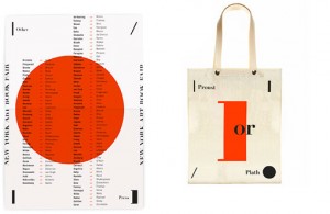
Here’s an interesting identity project by Brooklyn-based designer Amrita Marino: Other Press is an independent publisher of print-on-demand books and ...
According to the folks over at Retrographica, this colorful advertisement was designed by Georges Lafaye and featured in the July 1961 issue of French...
Melbourne-based studio Projects of Imagination developed the identity and collateral for Chin Chin, a “a restaurant serving no-frills, quality Asian c...
Glenlake is a new addition to Filmotype’s extensive library of vintage fonts. This one in particular was originally designed and released in 1955, and...
Designer Cory Say designed this beautiful set of stationery for the 2012 Cattle Baron’s Ball around the theme “Give Cancer the Boot.” All of the type ...
Glenn Wolk’s design work is awesomely vintage, featuring lettering and illustrations that have a gorgeous handmade quality and sense of history. I’m a...
FOUND: 1. Delfonics® for Top Hat Medium Vinyl Briefcase, 2. Slim Calculator, 3. Kamoi Kakoshi™ for Top Hat Tape, 4. Present & Correct Colour Block Pen...
I love Silent Partner‘s modern take on a nautical theme for the design of Phillpa and Trevor’s wedding stationery....
Luke Brown developed this graphic black and white identity for Reuben Hills, a Sydney-based cafe. Check out more of his work right here....
Hero Design Studio is a Buffalo, NY-based husband and wife design and printing team. Their shop features all sorts of gig posters, art prints, t-shirt...
Stebbings Partners recently completed the branding and collateral for BUCU, a burger and cupcake restaurant....
Building off Raw Color’s identity for Keukenconfessies—featured earlier this month—is the new look for Franke Elshout, a food stylist. Since she is a ...
Check out this new identity and packaging project by Anagrama for Bermellón, a Mexican hot candy confectionary shop....
Mike, you’ll receive an email with the details shortly. Everyone else, thanks so much for participating!...
Matt Stevens has a brand new site! I have my eye on these security pattern paper bags from Present & Correct. Your Logo is Not Hardcore. Side note: I...
The identity for Vivint, a home technology brand, was developed by Austin Taylor along with their in-house team. Take a look in Austin’s portfolio to ...
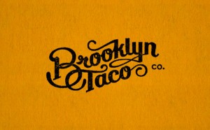
I love the work coming out of Tag Collective, especially this identity for Brooklyn Taco, a local food purveyor based in the Essex St. Market....
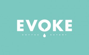
One of my favorite studios to watch, Foundry Co, has just launched a new brand and site for their company. The new look is smart, streamlined and poli...
A bright summery specimen from Art of the Luggage Label....
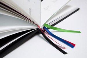
Mark Gowing Design was tasked with the challenge of developing an identity for the five divisions of the University of NSW Press Ltd., a non-profit pu...
de Vicq Design recently completed this beautiful identity and the accompanying collateral for Caffe Storico, a Venetian restaurant at the NY Historica...
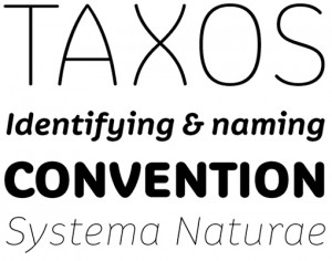
Village is one of my favorite type shops. I’d love to own their entire library, but right now I especially have my eye on some of their 2012 releases,...
I love these typographic prints from The Playtype concept store in Copenhagen. Unfortunately they’re not available online, so you’ll have to visit the...
I’m loving the work that Six has developed for Kirschner, a Brazilian cycling apparel brand. ...
FOUND: 1. German Anchor Knife, 2. A.P.C. Canvas Anchor Tote, 3. Gold Tiny Anchor Necklace, 4. Anchors Away Throw Pillow, 5. Flat Top Anchor Sunglasses...
This beautiful identity was developed by Netherlands-based studio KVHW for Level, a multifunctional building. See more here and here....
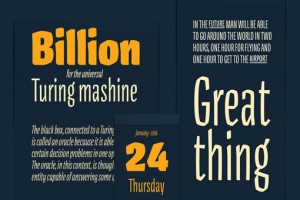
I’m really impressed with the work of the 2012 graduates of the Type and Media program at The Royal Academy of Art in The Netherlands. Here are a few ...
The Mason Dixon shop features all sorts of great vintage items plus reclaimed wood furnishings. Much more to see right here....
Update: This giveaway is now closed. Today I’m happy to offer one lucky reader a free pass to the next RE:DESIGN conference, RE:DESIGN Inspire, which ...
Rolls n’ Bowls was a made-to-order Japanese kitchen based out of Gainesville, Florida in need of a new identity—they tasked 160over90 with the challen...
Miller Creative recently developed a new set of business cards to accompany their new identity and website. They took a uniue approach to the printing...
A new, designy Tumblr is born: Gotham Logos. Gum Cards is “an ever-expanding set of limited edition, screen-printed trading cards focused on artists a...
ShopVon is an online shop and gallery featuring the artwork of London-based artist Von, whose work is described as “both detailed and abstract, being ...
Atelier Martino&Jaña recently completed a new print project, design for the magazine PLI Arte & Design: This magazine is the result of an exploratory ...
I’m super inspired by Andrei Robu‘s lettering and typography work, examples of which you can see below. For more from Andrei, be sure to check out his...
I’m loving the pale, soothing palette found in this image by L’hort de la Lolo....
Studio Lin recently completed a beautiful identity and e-commerce website for Brooklyn-based industrial designer Jason Miller: The website features a ...
Andy Tran is a West Coast designer who mainly focuses on print-based work. When browsing his portfolio, I was particularly intrigued in his poster des...
Frost Design was recently tasked with developing a new industry magazine for Eye, an international out-of-home media company. The print publication fe...
Memoire is a gorgeous linear, hairline contemporary sans by Reserves. Pick it up at MyFonts....
High Times: A History of Navigation is a new NoBrow publication designed by the Berlin-based illustration duo Golden Cosmos: This beautiful Leporello ...
Feast your eyes on the lovely cut paper illustrations by Petra Börner. There’s so much more to see in her portfolio (including prints!) so be sure to ...
I am loving this new Save the Date designed by Lisa Hedge. The combination of minimal typography and clipped floral images is so fresh, fun and unexpe...
FOUND: 1. Limoges Legle Rose Petal Teacup & Saucer, 2. O-Check Polka Dot Notebook, 3. Roman Chair, Venetta Rosewood, 4. G. Lalo Mode de Paris Statione...
Author/Designer/Filmmaker/Artist/Firestarter James Victore has recently launched a brand new project, Take This Job and Love It: “A one day live event...
Austria-based studio Bureau Rabensteiner recently developed this incredibly impressive identity and collateral system for N. Daniels Wien, a photo pro...
Trash Things is a UK-based shop offering brightly colored, upcycled vintage decorative accessories....
Atipus developed this identity and packaging for the band (BUMT)....
One of Miller Creative‘s recent projects involved developing the packaging for a line of gourmet ginger snap cookies—yum!—Bunches & Bunches Snaps. In ...
I’m loving the gorgeous identity and collateral that Lotta Nieminen developed for Maeven, a Brooklyn-based online clothing boutique. The color palette...
Uppercase Magazine just launched a major site redesign—congrats!—and to commemorate the occasion they’ve teamed up with The People’s Pennant to create...
The Silver Star is a unique story about a iconic railway car’s journey from the American midwest to the remote Pilbara region of West Australia. Glasf...
Lovely illustration work by UK-based illustrator Ruby Taylor....
Loving the beautiful shades of peachy pink in this image by Cassia Beck....
This colorful and playful identity was designed by Netherlands-based studio Raw Color for Keukenconfessies, a food design studio: For their identity w...
Check out this great identity designed by Liquorice Studio for Pickle Pictures. I am absolutely loving the various tone-on-tone green details....
This beautiful invitation package was designed by Los Angeles-based designer Arian Franz: Inspired by traveling, vintage etchings, and a historic Los ...
Latinotype has recently added Italic styles to their original Andes family. Check it out on MyFonts—it’s on super sale for a limited time. ...
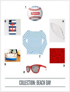
We’re taking off today to celebrate Independence Day. Back at it tomorrow. FOUND: 1.Supreme New York Baseball, 2. Sierra Platter, 3. Simon C Page Prin...
Enormous Champion recently collaborated with A. Heirloom, makers of state-shaped cutting boards, on their new logo and packaging. The primary design p...
Chris Silas Neal is another artist I’m ashamed to have never featured here before. On my umpteenth visit to his portfolio, his book cover illustration...
Meera Lee’s etsy shop stocks prints, textiles and other objects featuring her beautiful illustrations....
Brainstorm just launched a series of six new prints! I have to say The Planets is my personal favorite, but I love the florals too. Check them out in ...
I recently got my hands on Issues 3 and 4—Illustration and Branding, respectively—of Computer Arts Collection, and they do not disappoint. Below you c...
Behance put together this quick post about what makes a project feature-worthy, and the guidelines really apply to DWL as well, so I thought I’d share...
South Africa based Studio Botes recently completed this sophisticated identity and collateral design for Cavalli Wine and Stud Farm, which is also loc...
I’m intrigued and inspired by the illustration work of Andrew Groves. His use of graphic blocks of color, angular shapes and offbeat color palettes co...
Ian Gabb recently launched a brand new website showcasing his letterpress design work, all personal projects completed while acting as the letterpress...
I know literally nothing about Pokemon (and I may be completely wrong), but apparently this illustration depicts a creature called Charmeleon. Even th...
Atipo recently completed the branding and collateral for Mi&Mall, brings together small- to medium-sized fashion labels into one online shopping desti...
I became an instant fan of Elroy Ink’s bright and colorful abstract prints as soon as I laid eyes on them. Check out the entire selection and pick up ...
Grant Gold is an interactive designer who will soon be taking his talents to Rdio as a product designer. I don’t have any experience with Rdio myself;...
Ninfa Serif, designed by Brazilian foundry dootype, was built from the “genetic inheritance” of their earlier semi-serif design, Ninfa....
French designer Jean-Charles Desevre specializes in creating beautifully complex logos, emblems and labels. Check out more of his work right here....
It’s a bit of a travesty that I’ve never featured the work of Designer/Artist/Writer/Thinker/Teacher Nicole Lavelle in this space—not really sure how ...
Kevin Russ’s photographs make me want to dive into them—either that or embark on an epic road trip pronto. Get a look at more of the gorgeous scenes o...
Check out the gorgeous stationery package that Stitch Design Co. developed for calligrapher Elizabeth Porcher Jones. As always, their attention to det...
FOUND: 1.Zara Sunglasses, 2. Color Burst Beach Towel, 3. Cabana Beach Folding Chair, 4. Cape Cod Beach Tote, 5. Vivesana Solar Sunscreen, 6. Chroma-Ki...
As a student project, Januar Rianto, designed and produced an artist’s book for Robert Montgomery (whose work I’ve featured previously), entitled Fire...
Offscreen Magazine, a publication about the “human side of websites and apps” just launched Issue 2: In our second issue we speak with the legendary I...
The Parks of the World is a series of striking infographics designed by Mikell Fine Iles. The series was developed to compare various characteristics ...
I have to say a Double Bravo feature is long overdue. The Brooklyn-based studio is run by Barbara Buenz who describes its products as “Bespoke Station...
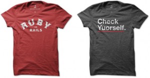
Designer Dan Horan is cooking up some fun screenprinted t-shirts for design nerds over at The Unrefinery. Check out all of the available designs right...
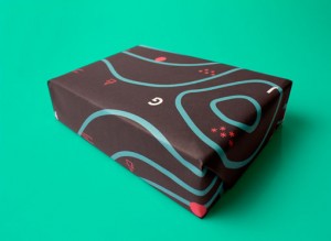
As his final project at the Iceland Academy of the Arts, Þorleifur Gíslason developed Børk, a creative studio focusing on surface pattern design. As p...
You may not know the name Jesse Ragan, but you certainly know his typefaces. Since his graduation from RISD in 2001 he’s contributed to many HF&J favo...
“Symbolsets are semantic symbol fonts. They work in modern browsers and anywhere OpenType features are supported.” These look great—pre-order right he...
Bibliothèque Design developed this subbrand for the D&AD to “unify the education strands of the organization.” The project incorporated separate campa...
Landland is a small Minneapolis-based design studio that makes some amazing screenprinted posters—they have a style you don’t often see in this are of...
Such an eye-catching palette in this poster by Astronaut Design....
This new series of Ipad cases from Anthropologie is like nothing I’ve seen. Each one features a one-of-a-kind masterpiece by Leslie Oschmann for Swarm...
Seattle-based States of Matter developed these vibrant print materials for the 2010 Gala for the International Community Health Services (ICHS), the l...
On the heels of Idlewild’s release comes Halogen, another extended typeface but with more quirky details. Designed by Positype, Halogen features seven...
Michael Hildebrand is doing some awesome work for Memphis studio Harvest Creative. In particular I’m loving this wedding announcement and invitation h...
Brandon Wilson, of Contrabrand, worked with Studio Skate Supply to create Hardware, a series of products inspired by memories of his grandfather and t...
FOUND: 1.Embletree Pattern, 2. Painted Floors, 3. Dana McClure, 4. Sasha Prood, 5. Moniquilla, 6. Little Green Notebook, 7. Cliff Hengst....
Feast your eyes on the latest product from Lomography: the Fisheye Baby 110. It fits in the palm of your hand but produces the same quality photos as ...
Base Art Co. has cranked out a few new posters for The Head & The Heart, Noel Gallagher’s High Flying Birds and Young The Giant. Yes, the Young the Gi...
Alex Perez recently updated his site with lots of great new work, including the pieces below. Head on over there and check it out....
I randomly stumbled upon the work of Studio Tipi, an illustration duo from Alberta Canada and was excited to find they operate an etsy shop. The shop ...
Last week Evan Huwa, along with partners Mike Mueller and AK Hottman, launched a brand new studio and site: Jakshop. I’ve included highlights from a f...
Check out this new packaging project by lg2boutique for Fruits & Passion. The colorful, minimalist graphics just pop right off the package—love it. Re...
Brad Hodgskiss, of Mingo Lamberti, was recently commissioned by Raw furniture to create original illustrations for their Ikonik furniture range. He wa...
I’m guest judging (along with some other lovely ladies) the Joy to the World Holiday Card Challenge at Minted. Check out all of the submissions and v...
As I mentioned earlier in the week, I am very much interested in designers’ personal projects. So naturally, my interest was piqued by From Cover to C...
I recently discovered the work of Kacie Mills, a current MICA student, through Eric Mortenson, whose new portfolio site I posted about last week. She ...
This illustration is an excerpt from Noisy Book, a vintage children’s story by Margaret Wise Brown & Leonard Weisgard, which was discovered and catalo...
These 1950s-inspired advertisement illustrations were created by Adam Hancher for Link Magazine, to accompany an article about the theories of Marshal...
This beautiful identity and supporting collateral pieces were designed by Arlo Vance and Kevin Cantrell for the AIGA 100 show in 2010....
A little while back I mentioned that Adelle Sans, the sans serif companion typeface to TypeTogether’s popular Adelle, was being designed. Well lucky f...
This beautiful identity system was designed for Hawthorne & Wren, a company that provides “gifts with meaning,” by Salt Lake City-based designer Kevin...
Outpost is the Los Angeles-based studio of Atley G. Kasky and Keith Scharwath. Out of all their projects, I’m particularly loving this work for Lybba,...
This project was created for Seattle-based hip hop artist Sol by Nicole Yeo and Jonny Sikov, two students from the University of Washington. The desig...
FOUND: 1.Turkish Beach Towel, 2. Churned Stemles Wine Glass, 3. Bobbi Brown Beach Body Oil, 4. Saturdays Atlantic Beach Soap, 5. North Fork Living, 6....
It’s no secret that I’m a big fan of Tom Davie—I previously posted about his work here, here and here—so I was excited to learn about his new shop and...
I love exploring the personal projects of artists and designers. It provides so much insight into the topics/styles/themes they’re interested in outsi...
Hong Kong-based studio BLOW recently completed the identity for ‘wich, a new sandwich shop in their city. I love all of the playful details—they provi...
I’m a big fan of Albie Design’s city prints, which feature cities throughout the United States and Europe. A few of my favorites are below, but you ca...
Alex Liebold created this super sweet announcement to celebrate the birth of his daughter, Elise. The announcements were printed by Rise and Shine Pap...
Italian studio Happycentro was recently asked to design and produce an invitation for the opening of a Louis Vuitton store in Osaka, Japan. The result...
HF&J released their latest typeface, Idlewild, an extended sans serif in five weights. I picked it up right away, and it’s definitely filling a void i...
Check out Studio Beige‘s extensive branding project for Goliath Sportswear, which encompasses everything from identity to print to web to signage. Bel...
This muted vintage specimen was discovered by Tom Schifanella from Art of the Luggage Label, one of my favorite Flickr users....
Pietari Posti created this series of illustrations for Shop Magazine under the art direction of Studio8 (which has sadly closed its doors.) Each one a...
Here is yet another excellent project from the folks at Fuzzco, the identity and collateral design for Ruell and Ray Denim. I absolutely love the hand...
Pixelbox is a small creative studio based in Spain, who works on design, illustration and photography projects. These graphic and textural portraits e...
I’m loving the quirky personality of Winco, a new typeface from Re-Type. At first glance it may look like your typical sans serif, but upon closer exa...
As a self-initiated project, London-based studio Two Times Elliott developed a series of printed type specimens. This one in particular, features one ...
This series of summery illustrations were created by Malika Favre for the iPad Summer 2012 issue of Gucci Style. I love that each one feels very graph...
Apartment One recently completed a site redesign for author Gretchen Rubin’s The Happiness Project. I’m an avid reader of Gretchen’s blog, but I don’t...
FOUND: 1.Vintage Albany City Map Print, 2. Rustic Barn Oil Painting, 3. Saratoga Water Bottle Glasses, 4. Organic Almond White Chocolate Candy, 5. New...
Minneapolis-based Colle + McVoy was recently tasked with the challenge of breathing new life into Farm Credit service of Mid-America’s existing brand....
Eric R. Mortenson, who among other things is the co-founder of The People’s Pennant (one of my new favorite sites), has just launched a brand new port...
Take a look at the excellent rebrand that Creature recently completed for District Threads, a fashion basics line owned by SanMar: “Creature rebrands ...
In honor of Venus’s trip past the sun today (!), I’m excited to share Elise Mahan’s gorgeous celestial paintings....
I don’t have any tattoos myself—mostly because I can’t decide what to get—but I’ve wanted one for as long as I can remember. Maybe that will change so...
MWM Graphics recently had the opportunity to collaborate with Attik and CocaCola on an extensive campaign for the London 2012 Olympics. They were resp...
Trent Edwards is a recent grad of the excellent MFA program at Tyler School of Art. Of all his projects I’m especially loving his cartographic approac...
I’d have to agree with the folks at Studio on Fire that Douglas Behl’s wedding invitations “ooze summer.” The split fountain printing—which means two ...
In case you were living under a rock last week and missed the news of Stefan Sagmeister and Jessica Walsh joining forces as Sagmeister & Walsh, here i...
Molly Weber created these beautiful laser cut pieces as a student at Academy of Art University. The pieces were designed to promote Bridesmade, a fict...
Illustrator Ben Weeks created this poster as a self-promotional piece. It folds out to reveal all sorts of things that he loves, plus bespoke letterin...
Another awesome vintage album cover from Project Thirty-Three....
Great packaging by Hip Street for Mugly, a local coffee purveyor....
This summer, designer and letterer Becca Clason has embarked on an extended road trip—jealous!—with her husband, a documentary filmmaker. They’ll be d...
Bulo, which means “hoax” in Catalan, is a new sans serif family by Barcelona-based foundry Tipografies. The typeface was specifically designed to save...
Designer Andy Baron created this vibrant suite of wedding materials, including a 20-page booklet invitation, letterpressed marmalade tags, a website a...
A great identity by Tim Kamerer for Yoga Bhoga, a yoga studio in Portland, Oregon....
FOUND: 1.Rag & Bone Duffel Bag, 2. Chanel Blue Rebel Polish, 3. Don’t Let Yesterday Risograph Print, 4. Large Cream Dipped Planter, 5. Blueberry Cupca...
The graduating students of the University of Washington in Seattle, WA have put together an excellent online showcase of their work: UW Design 2012. C...
Check out these beautiful business cards that Print and Grain created for Making lemonade, a business making handmade baby clothing, quilts and pillow...
Initially, I was familiar with Maddy Lucas through the stationery shop she runs with her husband, Ello There. What I didn’t know is that she is also a...
I’m really loving the mix of vintage goods at Pine and Main....
We’re taking off after the Quick Links today to enjoy Memorial Day. We’ll be back with regular posts tomorrow. Enjoy! Registration for the next Brand ...
I’m loving these printed event materials that Jamie Mitchell designed for Emma’s Children’s Hospital. Creative Credits: Studio: …,staat Photography: M...
I’m loving the combination of bold typography and graphic illustrations in this recent print series by artist Lara Cameron. The Proteaflora series is ...
This minty vintage specimen was discovered and photographed by Bravo Six Niner Delta in March 2011. The stamps are from the late 1960s and were found ...
I recently discovered London-based illustrator Emily Robertson and instantly fell in love with the soft edges, hand-lettering and color washes used in...
Dear Me is an all-day basserie and deli in Cape Town, South Africa whose Brand Identity was created by Daniel Ting Chong. The collateral creates such ...
Latinotype seems to be cranking out fonts at extremely high speeds these days. Magallanes is one of their latest, a “neo humanist sans serif” family t...
Unfortunately I can’t read a word of this site (and Google translate is failing me at the moment), but I couldn’t resist posting this gorgeous black a...
Check out this awesome student-designed identity for Bass Pro Shop by Fred Carriedo—a huge improvement in my opinion....
FOUND: 1.Super Sunglasses, 2. Pocket Bocce, 3. J. Crew Boardwalk Tote, 4. Mrs. Lilien’s Cocktail Swatchbook, 5. Fish-Shaped Serveware, 6. Picnic Blank...
In my opinion, sister companies Sideshow Press and Stitch Design Co. can do no wrong. Their wedding invitation designs are simply stunning, and this n...
Sandstrom Partners has done some truly beautiful work for St. Germain liqueur. More to see right here....
I’m a long-time fan of Anne Benjamin’s wedding invitations—which she designs under the moniker of Mok Duk—so it’s no surprised that her prints and pos...
This sophisticated suite of printed materials was designed by Australian design studio End of Work. There’s an incredible attention to detail and prod...
Illustrator and textile designer Emily Isabella specializes in “design for the young at heart”, which is immediately apparent when browsing through he...
I was lucky enough to attend the first ever 99% Conference back in 2009. It was awesome—I left feeling energized and inspired. But ever since then, fo...
Last week, Lost Type Co-op celebrated both their first birthday and the release of a new font, Edmond Sans. Fast Company just launched the 2012 instal...
I recently stumbled upon the beautiful hand-lettering and calligraphy work of Molly Jacques, and became an instant fan. She works in a wide variety of...
This graphic Japan Day artwork was submitted by Christopher Dina to commemorate the 100th anniversary of Japan’s donation of cherry trees to the Unite...
“Poppy stalking” by heavenly~flower....
Een though science was always my least favorite subject in school, I can never resist a well-designed piece with a scientific theme. Here is an awesom...
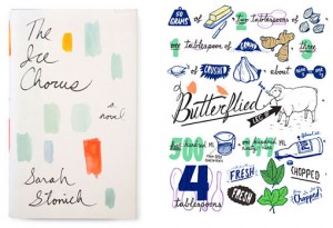
Feast your eyes on the gorgeous hand-lettering and illustration work of New York-based Joel Holland. Many of these pieces appear on books that I would...
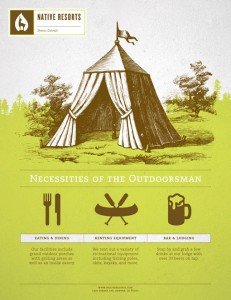
The Native Resorts hotel identity is a recent project by Brian Rau, who will be graduating from Northern Illinois University this spring. Take a look ...
Meet Jocham, the first typeface created by Hubert Jocham that also bears his name. The bold script was developed from the lettering used to create his...
This year Andrew Holder created an updated identity for Outside Lands, a music festival held in San Francisco’s Golden Gate Park. (Sidenote: the lineu...
I’ve been anticipating the launch of Brent Couchman‘s new site ever since I saw some snippets on Dribbble awhile back. Well last week, the site went l...
I am in love with Allison Kerek’s illustration style. Her portfolio is overflowing with great work. But as a lifelong fan of illustrated books, I was ...
FOUND: 1.Eva Solo Flower Vase, 2. Prescott Dishtowel, 3. Castile Rose Bathmat, 4. Silhouetted Zinnia Knob, 5. Rifle Paper Co Botanical Journal, 6. Dra...
Barcelona-based Dorian recently published a few new wine packaging projects—take a look....
This year Kate Thomas will be making her debut at Surtex (Booth 670, if you’re able to attend), an international fair for the sale and license of desi...
Austin Petito, of Tight Slice Graphics Co. developed this insanely gorgeous wedding package for his own recent wedding. The suite of materials feature...
This awesome packaging series, Folksaga, was designed by by Caleb Heisey, who is currently pursuing an MFA at Tyler School of Art. Here’s a bit of bac...
I’m loving the whimsical paper goods that Jessica Yeo creates as Nocciola Design. Take a look at the rest of the stationery items she has to offer rig...
Great work by Massachusetts-based Stebbings Partners for LeanWorks, a new area restaurant featuring healthy fast food: LeanWorks is serving up a whole...
Awesome work by Aldis Ozolins for Blue Note Legend: Design for a proposed specialty sub label for Blue note records called “Blue Note Legend.” The bra...
Check out The Hungry Workshop’s Trophy Lives letterpress prints—they’re awesome. Knoed put together some great advice for young designers. In case you...
A playful illustration in a monochromatic palette by Liam Barrett....
Check out the lively identity and collateral designed for Dan Arisa, a musician and percussionist, by Barcelona-based designer Alex Dalmau....
Mother New York designed this suite of luxe printed materials for the opening of Maison Gerard‘s new gallery showroom on East 10th Street. Gorgeous....
I’ve had my eye on Vibro ever since it was released on MyFonts back in March. It’s certainly not the most versatile font in the world, but for the rig...
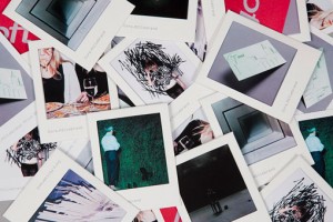
As a promotion for artist Cora Hillebrand, Lundgren + Lindqvist developed these printed pieces that combine the functionality of a business card and m...
Really impressed with Chul Lee’s work, especially the identity and collateral developed for the fictional event, Omnibus Film Festival....
FOUND: 1. Lollia Candle in Sunspots On A Photograph No. 2, 2. Hable Construction Picnic Tote, 3. Virginia Johnson Shawl, 4. Kate Spade Hand in Hand Ba...
Valerie Jar recently developed this series awesome of stamp icons for the National Parks by National Geographic app, an interactive guide to the U.S.’...
Mike Perry is a soon-to-be-graduate of Tyler School of Art with a great portfolio. In particular, I’m most impressed with his packaging projects, so I...
I’m loving the work of Print & Grain, a letterpress studio based in Portland Oregon and operated by designers Violet Tchalakov and Mike James. They’re...
Tom Jaeger recently completed a brand new identity for his design practice. Here’s a bit of info that describes his thinking: Design with the ability ...
How fun are Lomography’s new La Sardinia stripey beach editions?? Check out all of the available options right here....
I’ve only seen a couple of episodes of Louie, but I’m hoping to catch up with it over the summer while all my usual shows are on hiatus. And the lette...
During a three-week Creative Problem Solving Course in the Digital Media Management master program of Hyper Island Manchester, students developed Queu...
What a great year-end project by Ludlow Kingsley, the 2011 LK Year End Report: Every early December, it starts up again. “Should we send out a holiday...
I’m loving the graphic and colorful illustration work of London-based illustrator Thereza Rowe....
A beautiful piece by Andrew Bannecker....
These beautiful CD packages were designed and illustrated by Macarena López. You can check out more of her work right here. ...
I’m loving the illustration work of Sami Viljanto, who operates under the moniker of Grand Deluxe. I especially love the colorful, jiggly Jello-like l...
Feast your eyes on the gorgeous identity and collateral that was developed for fashion label Honor by RoAndCo—featuring a perfectly balanced combinati...
Sofia Pro is a 16-font sans serif type family that was originally designed in 2008 by Oliver Gourvat. This year it’s been redesigned to support a wide...
I’ve mentioned this year’s SVA MFA program a couple of times recently, as the work the graduates are doing is really impressive across the board. In p...
Heather Hardison recently opened a show at San Francisco’s Curiosity Shoppe featuring food-related bits of hand-lettering and illustration. The show’s...
Mette Rankin, of Bureau of Betterment, recently completed some identity and illustration work for Well Vegan, a website that caters to hungry vegans w...
FOUND: 1. Early Birds Letter Set, 2. Illustrated Bird Garland Kit, 3. The Animal Print Shop Owl Print, 4. Western American Bird Calls, 5. Sanna Annukk...
Sydney-based studio End of Work recently completed the identity and interiors for Meet the Greek, an Australian restaurant chain. A few details: The i...
I’ve used Paperless Post a couple of times when I’ve needed an evite and didn’t have the time to design and code it myself. It’s a great option—their ...
Concrete business cards by Murmure. Wow....
For this recent project, Daniel Ting Chong collaborated with a soap maker in Johannesburg, South Africa to develop a range of soaps. Each one has a un...
This week’s find: beautiful photographs by Janis Nicolay of Pinecone Camp....
88 Brand Partners is a brand new full service agency based in Chicago. Be sure to check out their site to learn more about who they are and how they w...
A great project for a great cause by Bravo Company: The Chain Reaction Project (TCRP) is a non-profit organization that was born in 2009 to help chang...
Trigger recently took a unique approach to designing and producing the Calgary Zoo’s 2011 Annual Report. Be sure to check out the video below for more...
The site for the SVA MFA Design program is up and running, with links to each designer and their thesis projects. Check it out here. Speaking of SVA, ...
Woody Harrington is currently a Senior at Tyler School of Art, with an excellent portfolio. In particular, his identity project for Novel Tea Cafe, a ...
Identity and collateral for Ink, a team of copywriters, by Mytton Williams....
Yet another lovely pattern from the always awesome Helen Dardik. Follow her blog for more....
Personal identity and stationery for O&Co Branding....
Great redesign by Hovard Design for the Founders Card packaging....
Beautiful illustration work by Janice Wu: “My work explores how meaning, value, and associations are placed upon things in the material realm. I am in...
I’ve recently discovered Dunwich Type Founders, a New York-based foundry with a handful of solid typefaces available for licensing. Armitage, in parti...
Take a look at the lovely illustration work of Victoria Fernandez. More here....
We were lucky enough to attend a wedding held at Atlanta’s Parish Food & Goods last fall, so I was excited to discover that Boy Burns Barn was behind ...
Sean Sutherland designed this series of inspirational posters for use in his fiance’s office as a guidance counselor at a middle school....
FOUND: 1. Karen Walker Eyewear, 2. O Happy Day Print, 3. Thinksport Safe Suncreen, 4. Huffy Women’s Ocean Deluxe Bike, 5. Nixon Headphones, 6. Coach H...
A beautiful identity by Atipus for Rítmia, a music therapist and social educator....
Great packaging for Chocolate Factory by ruiz+company....
Check out: The HUB Concierge an identity project by Toronto-based Michael Mavian....
The Aldas Project is a philanthropic daily art project by Kristy Modarelli. Here are the details: I am a mixed media artist, generally working in scul...
I’m loving Long Story Short, a project by Archie McLeish which typographically renders common digital speak acronyms in a decidedly non-digital style....
Today I’m pleased to share the invitations Loren Klein designed for his wedding last summer. Below is a bit of background from Loren about the design,...
Los Angeles-based design firm TRÜF (pronounced trooph) recently completed a re-brand and website overhaul for Indiegogo, a funding platform that’s bee...
Sadly, the design world lost Hillman Curtis last week, an incredibly influential creative thinker who touched the lives of many. (If you haven’t watch...
This flexible and playful identity for Westbrook Brewing Co., was created by Fuzzco and inspired by both the visual cues found in wrought-iron work an...
Who knew Yelp was cranking out such fun design work behind the scenes? Thanks to designer Jessica Taich for sending these along for me to share....
I love the business card and resume that Kelli Marie created for herself while she was a student. Check out the rest of her work right here....
Loulou and Tummie always produce colorful, vibrant pieces, so they’re a great resource for color palette inspiration. Today this this city art print c...
I first came across the work of Brandt Brinkerhoff via the collaborative storybook poster project I posted about recently. So it was great to discover...
Love these pieces: Hallo liebe Unbekannte by Anne Vagt....
South African designer Dustin Holmes has a great selection of gig posters in his portfolio. Check out the rest right here....
Foro is an elegant slab serif by Hoftype featuring 8 weights and italics. Pick it up at Myfonts. ...
Tom & James Draw is the beautiful collaborative art project between James Gulliver Hancock and his brother Tom, who was born with Down’s Syndrome. The...
Ping Zhu recently created this gorgeous piece for Nobrow based on a performance of Tchaikovsky’s Swan Lake. The unique format features the theater, au...
In case you’re unfamiliar with Help Ink (I’ve only briefly mentioned them on DWL before), it is a collaborative site featuring unique artwork created ...
FOUND: 1. Hex Weight, 2. Drona Hexagonal Winerack, 3. Hex Desk Lamp, 4. Hexagon Navy Circle Stud Earring, 5. Noen Hexagon Ring, 6. Concrete Hexagon Co...
I couldn’t resist posting another project from & Smith’s enviable portfolio. This whimsical branding for SugarSin sweet shop isn’t technically new, bu...
Check out this adorable modern birth announcement for twins by Salt Lake City-based printer and designer, Print in Cursive. I love the gray and neon c...
I’m in love with these matchbox landscapes created by Krista Charles, who has been collecting vintage matchbooks ever since inheriting a stash from he...
And Smith recently updated their portfolio with some new work, and their colorful work for Lux Island Resorts immediately caught my eye. Check out som...
Adam&Co was recently commissioned to develop the visual identity for Nike’s Lebron 9 campaign, based on the concept “Shoe Science.” The result is a se...
Coming up this week is a great event for the SVA MFA Design Department: the 2012 Thesis Forum, “Designer As _____.” Here are the details: The MFA Desi...
I’m so excited to share this Kickstarter project with you this morning. Veteran designer Barbara DeWilde, perhaps best know for her book jacket design...
Check us out on page 50 of the latest issue of Uppercase Magazine, where we interviewed the incredibly talented Kelli Anderson. If you missed Paula Sc...
Sylvain Toulouse developed this sophisticated, feminine identity for Jacqueline Fleury a seamstress specializing in custom drapery. via Looks Like Goo...
Great work by Lausanne, Switzerland-based studio Moser Design for Philipe Guignard, a hospitality brand....
Images like this one by twodolla remind me why the Neon Boneyard is on my future “must visit” list....
Lately I’ve noticed that Madewell is offering up a pretty large selection of designy office supplies, from notebooks to paper clips to tacks. You can ...
Seth Lunsford, a senior at Iowa State University, has quite an impressive student portfolio. Out of all his projects, 1,000 Paces caught my eye as a p...
Argumentum is a new sans serif family from Kostic, a Serbia-based foundry. It features six weights plus italics, an extended set of monetary symbols a...
I’m incredibly inspired by the whimsical Papier Mâché creations of Amsterdam-based artist Elsa Dray-Farges....
Sarah Taylor is a student enrolled in Capilano University’s IDEA Program. Spion, a fictive spy-themed store, is a project involving multiple component...
FOUND: 1. Samal Designs 6DPI Glasses, 2. Pixel Punch Wrapping Paper, 3. Guillaume Delvigne 72DPI Light, 4. CB2 Pixel Rug, 5. Icon Watch, 6. Tattly Pix...
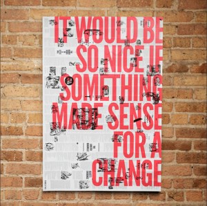
Brandt Brinkerhoff & Katherine Walker collaborated on this poster series based on the original text and etchings from classic children’s stories. Pick...
I’m loving the playful illustrations of UK-based illustrator Charlotte Trounce....
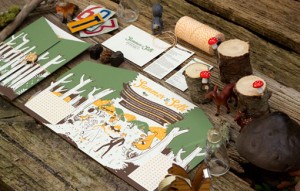
Check out this playfully illustrated wedding invitation by Casebolt Design for Summer and Seth’s wedding in the North Carolina mountains. Printed by m...
Small Talk Studio is the etsy shop of illustrator Alyssa Nassner, whose work I’ve long admired and featured on DWL several times. She has quite a few ...
Fivethousand Fingers is a small creative studio founded by Lexane Rousseau & Eli Horn. They have a really interesting portfolio, but this project for ...
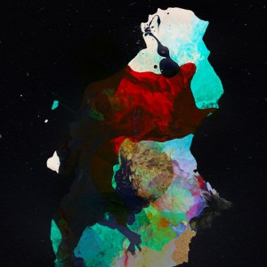
Check out these beautiful abstract pieces by Peter Skwiot Smith, which he describes as such: These images reveal layers comprised of audible and invis...
Bless just recently shared with me this recent letterpressed wedding invitation suite they designed for a client. It’s such a perfectly springy color ...
Abstract City, a compilation of 16 of Christoph Neimann’s popular New York Times visual essays, is now available for sale. Fast Company is launching a...
Check out this vibrant and festive birth announcement that Invisible Creature created for Don Clark’s daughter, Flora—beautiful work, beautiful name....
Stockholm-based studio 25ah worked with Koncept Stockholm to develop the branding and design for You Stockholm, a hairdressing salon conceived by famo...
A beautiful DIY nest and eggs, created and photographed by Maria Kallin....
As part of a recent site update, Foreign Policy Design Group added Darryl Jingwen Wee‘s business cards to their portfolio, whose unique look and produ...
I’m loving this simple and nostalgic identity for Van Horn, a Cobble Hill eatery offering up Southern fare (check out their menu here.) The identity a...
I don’t have a pet, but admittedly I’m one of those people that oohs and aahs over cute puppy photos. So naturally, these dog portraits by Marko Savic...
Fancy Antique Display features the perfect mix of solids and stripes. Designed by Morten Iveland, the font was inspired by French decorative alphabets...
Foreign Policy Design Group recently gave their brand and stationery a facelift. The resulting business cards feature a triplex design covered in copp...
For the design of their recent self-promotional materials, Hub Collective chose to develop a mix and match postcard series. The cards were printed on ...
Portland-based HUB Collective recently developed a set of promotional materials that includes new business cards and a postcard series. Lucky for you,...
Nick, you’ll receive an email with the details shortly. Everyone else, thanks so much for participating!...
FOUND: 1. Gutermann Pastel Colored Seashell Sequins, 2. Bubbled Cone Pendant, 3. Classic Backpack, 4. Letterpress Merci Cards, 5. Essie A Crewed Inter...
Allan Peters designed this poster as part of Artcrank 2012, a Minneapolis-based event that features hand-made, bike-inspired posters created by 40 Twi...
Ben Whitla recently launched a newly designed—and entirely responsive—site. When looking around, I was most excited to get a new, closer look at the i...
I’ve long been a fan of Methane Studios’s gig posters, so I was excited to recently come across their etsy shop. The sop doesn’t offer everything that...
Kelli Anderson’s latest project is this stunning press invitation and program for a recent Brooklyn Philharmonic concert. The invitation package inclu...
The Hungry Workshop’s latest letterpress creation is the aerogram, a self-sealing letter and envelope in one. Their modern take on this vintage statio...
House Industries added nine new limited edition prints to their shop. Print featured this series of fun watercolor portraits of well-known designers b...
As many of you are aware, we had some unexpected (and unfortunate) issues with our host over the last few days, resulting in extensive downtime for DW...
London-based designer Carlie Templeman developed this self-initiated project for fictive clothing label, Victoria & Albert. The men’s and women’s labe...
Love this identity project by Because Studio for A Good Week, a celebration of all the good that happens in the world....
I’m loving this image from illustrator Paul Thurlby developed a series of alphabet illustrations, which was created to promote the series. You can bu...
Here’s some great identity work for Palomino Restaurant by Superbig Creative, a Seattle-based studio. I’m loving all of the attention to typographic d...
Awesome work by SoCal-based illustrator Mark Allen Miller. via Featured/by...
King Wood is a new release from Canada Type which they classify as a “gothic wood type with a Tuscan flair.” Pick it up at MyFonts....
These super fun wedding invitations were designed by Apartment One for their Creative Director Spencer Bagley. A bit of background: Spencer and his wi...
Each year New York-based studio RoAndCo designs a special holiday gift for clients, friends and collaborators. For 2011, the team worked with the them...
Here is yet another impressive (and super fun) brand identity project from the creative minds at Tractorbeam, this time for Texas restaurant Sissy’s S...
FOUND: 1. Jungle versus Forest Magnet Animal Set, 2. Aquamarine Sea Glass Photograph, 3. Heath Single Stem Vase, 4. Aqua Fade Bowl Set, 5. Aqua Blue C...
UK-based Mind Design developed the identity and collateral for The Collection, a restaurant, cultural event and retail space. According to the agency:...
I previously posted about Malin Rosenqvist’s work almost a year ago. Since then she’s added tons of great work to her portfolio, all with the same vib...
Check out these great coaster wedding invitations and saved the dates designed by Ross Clodfelter for Brittany Brown & William Goncharow. Some backgro...
Monkey-Rope Press is a Chicago-based letterpress shop that specializes in prints featuring hand-set antique wood type and hand-carved linocut illustra...
Designer Look Woodhouse has some great identity work in his portfolio—especially this project for Galante, which he designed while at Ragged Edge Desi...
Check out 1 Trick Pony’s recent holiday promotion: “Alcoholidays” is One Trick Pony’s annual self-promotion that celebrates awesome clients and hard w...
Update: This giveaway is now closed. Thanks for your participation! Good news readers! For the second year in a row I’m excited to offer one lucky rea...
Thanks for your participation everyone! Winners, you’ll get an email shortly....
Pinterest has updated their Terms of Service, Acceptable Use Policy, and Privacy Policy. Their recent blog post outlines the basics. In honor of last ...
Work in Progress developed this fresh, identity—loving the blind embossed details—for Tjuvholmen Sjømagasi, a seafood restaurant in Oslo, Norway. Ther...
I recently stumbled upon the work of Son&Sons, a New York-based studio. They have a great portfolio, but I was particularly drawn to their work for Ga...
Here is yet another lovely vintage matchbook label, this time found in the stream of Shailesh Chavda. Check out more from his collection right here....
I’m loving Cast Iron’s identity for Jack Sinclair, a letterpress studio. They declare it a “designer’s dream project”, and I definitely agree. To lear...
The Capitol is a luxury apartment building located in Melbourne, Australia. Fabio Ongarato Design developed the identity and various collateral for th...
Check out this new print campaign by DDB New York for Hertz. The highly stylized campaign centers on the them of “Traveling at the Speed of Hertz” to ...
User is a new monospaced (which means there’s no kerning) type family from DSType. The family includes 30 styles with five weights ranging from hairli...
Eric Hanson is an award-winning, Minneapolis-based illustrator with an incredible client list. He works in a sketchy pencil style, developed while wor...
Magpie Studio created this sophisticated identity for Jackson Gilmour, a family-run catering company. I especially love the tone-on-tone metallic deta...
This beautiful board game, Serengeti, was designed by recent Tyler School of Art grad, Nina Reck. In this educational board game, players migrate acro...
FOUND: 1. XOXO Stacking Ring in Sterling Silver, 2. Aimee Wilder Wallpaper, 3. Dwell Studio Circle Artwork, 4. Serena & Lily Parker X-Bench, 5. Perfec...
Alejandro Largo, is a Brooklyn-based designer who also spends his days designing for Apartment One, a studio I featured yesterday. This freelance proj...
Here is some gorgeous dimensional tpographic work by Jordan Metcalf for Nike Create the Future: At the end of 2011 I was asked to pitch on the identi...
This week I stumbled upon the etsy shop for the Western New York Book Arts Collaborative, and I’m so glad I did. Located in Buffalo, the non-profit or...
I became an instant fan of Poppin the second I laid eyes on their website; and it was only solidified once I received some of their fantastic products...
The Just Love Project is a new collaborative initiative based on the resolution of “Just Love.” Each month one poster will be released by a designer f...
If you’re in the San Francisco area on March 29th (I wish I was!) don’t miss this great event: Fifty Books/Fifty Covers, a juried selection of the bes...
Update: This giveaway is now closed. Thanks for your participation! Readers, you’re in for a treat today—I have a new giveaway to share with prizes fo...
I’m still not 100% sure if I will adopt the Curator’s Code process for attribution. I’m all for citing sources, but I have some of the same questions ...
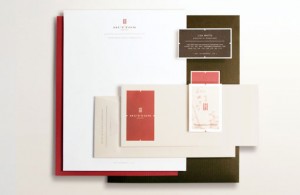
What a beautiful identity Tractorbeam has created for Hutton Hotel, a Nashville boutique hotel that caters specifically to musicians and Vanderbilt Un...
Australian studio Parallax developed a wide range of work for Henry’s Drive Vignerons, including everything from brand strategy to web design. The res...
This vibrant, colorful architecture was captured by Matthias Heiderich....
As promised, here is an exclusive look at the branded trade show booth created for Resin Denim by Kevin Landwehr of NOTHING:SOMETHING. This gives you ...
I’ve long been a fan of the work of New York Studio, NOTHING:SOMETHING. In particular, I love that their work for each client has its own distinct voi...
I’m giving you a double dose of type love today, with this new display font designed by Frances MacLeod. Abraham Lincoln was born out of a need for a ...
This week has been a restaurant and packaging heavy one (I love weeks like this), so why not continue the trend? This super chic identity for Café Luc...
Storefront is the latest—fantastic—release from Sudtipos. Inspired by American sign painting, the script features all sorts of alternatives and swashe...
Great work for Saloon, a Boston-area restaurant, designed by Oat Creative. via Sceneologist...
That’s Impressive is a print piece designed by Kerr Vernon in collaboration with Glasgow Press. The colorful piece is comprised of five letterpressed...
This project has already made its way around the interwebs but I couldn’t resist another post. I love seeing how well the identity translates from sma...
FOUND: 1. You Are My Sunshine Print, 2. Kate Spade Sailor Stripe Scarf, 3. Yellow Matchbox Light, 4. Poppin Yellow Tape Dispenser, 5. Neon Yellow Geo ...
I’m a sucker for restaurant design, and Vigor’s blog has turned out to be a great resource for finding fantastically designed brands and spaces. Case ...
This post has been removed at the request of the featured designer....
I love everything about Caste’s design for Citizen, a menswear boutique in Victoria, BC—from the carefully crafted flourishes to the quirky postcard c...
I’m loving the small selection of prints in Brittany Burton‘s shop, which, according to the illustrator, is dominated by “patches of floral fluff and ...
Unleashed! is a recent identity project of Singapore-based studio Acre: Taking our design direction from M.O.D’s sophomore performance of going beyond...
For their most recent issue, GOOD Magazine commissioned Dan Cassaro to create this series of six full page illustrations inspired by WPA poster art. L...
This beautiful, limited edition book is the result of a collaboration between Jon Contino and German studio, Sven Hoffmann. Developed for La Marzocco,...
Last week Jon Contino relaunched his site with a new design and lots of new work. While there is plenty of inspiring work to see, this project, illust...
The Curator’s Code, “a standard for honoring attribution of discovery across the web”, is a new project from Maria Popova, Kelli Anderson and Tina Rot...
Studio Constantine recently revamped their printed materials. Here’s a bit about how they arrived at this solution: We wanted our own printed material...
I can’t get enough of Rikka Sormunen’s illustration work—she has such a lovely way with color, texture and composition. You can see more of her work r...
Feast your eyes on James Reeve’s striking Lightscapes series. via The New Minimum...
Jacqui Lee created this lovely illustration for the Postcards to Alphaville project....
I’m a big fan of Mucca Design and the work they produce, but I am especially loving the work I spotted recently for Teplitzky’s, a diner-inspired rest...
I’m incredibly impressed with the results of Hannes Beer‘s All Day Everyday Project. A few favorites are below, but you can check out the entire serie...
It would be putting it lightly to suggest that I have a strong aversion to bugs of any kind. So it’s a testament to Vladimir Stankovic’s illustration ...
To my delight, layered type systems seems to be popping up everywhere lately. Frontage, the newest version I’ve spotted, features five separate layers...
I started out my design career with a heavy focus on print design, so I love when a well-designed annual report pops in my inbox—they’re few and far b...
Marc Shur maintains Sign Language, an impressive set of vintage signage photographs (as well as their locations) on Flickr—definitely a great inspirat...
Studio Makgill recently completed the rebranding for Good Energy, the UK’s only dedicated 100% renewable energy supplier. I love that it manages to ha...
FOUND: 1. Balsam Fir Incense, 2. YeeHaw SPRING TREES Letterpress Mini Prints with Envelopes, 3. Kate Spade Gum Drop Studs, 4. Walker Derby 100, 5. Man...
The Hungry Workshop recently printed the coasters and business cards for Super Whatnot, a new Brisbane-based bar. Designed by Adam Gower, the printed ...
I recently spotted Poly’s packaging design for Stark Skincare on Dribbble, and knew I had to share it with you. Here’s a bit of background straight fr...
Istanbul-based designer Salih Kucukaga just sent over the hot-off-the-presses, letterpressed business cards he designed for Espresso Republic (If you’...
Steven Bonner (whose blog features some great typographic and designy finds) has some really impressive typography and lettering in his portfolio. Bel...
I’ve never really needed glasses (so far anyway), but I’ve always wished I did. I just like the look. So the amazing selection of vintage (mostly wome...
Over the past few years, Toronto-based studio Monnet Design has completed the branding and collateral for SummerWorks Theatre Festival. Each year they...
This past year Pentagram put a really fun and unique spin on their Holiday card with the development of Today I’m Feeling Turquoise, an interactive bo...
I’m a big fan of Nicholas Felton’s information design work—I’ve posted about him several times in the past, and own all of his printed personal Annual...
Industry Standard is a new print shop that specializes in custom printing by artists for artists based in Portsmouth, New Hampshire. The new venture i...
This has been a week of stellar student work, and Jon Wong is no exception. He has a particular talent for book and publication design, as evidenced e...
The muted, natural palette found in this lovely photo by Lisa Rupp is pretty much the exact opposite of the palettes I’m usually drawn to. But every o...
Check out the lovely illustration work of Natalie Andrewson, a third year student at Ringling College of Art and Design...
I’m loving these fake movie title screens designed by Lorenzo Cappelli, where modern comedies are transformed into vintage classics....
Saissant is a hand-drawn script by Magpie Paper Works. It’s probably not the most legible typeface in the world but it would be beautiful for envelope...
Anagrama was responsible for the branding and collateral development for Sofia, a building designed by architect Cesar Pelli for One Development Group...
A little while back I featured a project by London-based designer and illustrator Liam Stevens for Anya Hindmarch. A second look at his portfolio reve...
FOUND: 1. Ace Hotel Mural by Dana Tamachi, 2. Alphabet Paperweights, 3. Chalk, 4. Chalk-it-to-me Piggy Bank, 5. Chalkboard Spice Jar, 6. Mini Chalk Bo...
Mallory Smith is a current Communications Design student at the University of Louisville. This project, Southern Sayins, is a set of 10 greeting cards...
Jake Dugard is a designer currently working towards his Masters in Fine Arts at Louisiana Tech University. This identity project was created for ficti...
Sara Saedi is a Los Angeles-based illustrator with a rather extensive digital illustration portfolio. In particular I’m loving the illustrations from ...
Man vs. Ink is a Portland-based shop featuring a variety of screen printed goods, from textiles to prints. Check out the full stock right here....
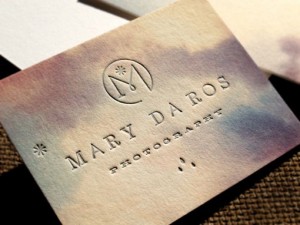
Check out this new beautiful identity and stationery system designed for Mary Da Ros Photography by that always inspirational Eric Kass. The letterpre...
As a former dancer, I was immediately drawn to the dynamic design program created by Think Studio for the Extraordinary Moves Dance Festival. ...
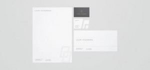
Josh Rhode of Kult House just recently relaunched his portfolio site, with a striking new design. There’s all sorts of great work to be seen, much in ...
Herb Lester released a new map of Austin, Texas illustrated by Curtis Jinkins. Okay Type created a beautiful site for the release of their new typefac...
Martin Oberhäuser designed the site below as part of a pitch for an undisclosed client. The design includes visual and structural concepts for a trave...
Loving this palette of primary colors plus neutrals found on these Czech matchbox labels from Kindra Murphy’s Flickr stream....
I’m always drawn to great design for a great cause, and Hybrid Design‘s Impact Campaign. The campaign, which is concerned with the sobering statistic ...
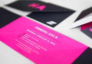
Feast your eyes on this vibrant collateral designed by TOKY for the 2012 Contemporary Art Museum St. Louis Gala. Beyond the playful interactivity of t...
Christine Wisnieski recently designed this dinosaur-themed invitation suite for a pair of young brothers, Brody and Charlie. Great illustrations and c...
Rooney is a friendly, rounded slab serif that is right up my alley. Featuring six weights, from light to black, and italics, this one is definitely at...
It’s short notice, but if you happen to be in the Chicago area, a great creative event is happening this Friday. Diaspora: The Art of Blackness, an ev...
Perhaps it is my strong ties to my Boston roots, but I’m really loving the patch designs Ben Whitla recently developed for Boylston Trading Co. Boylst...
FOUND: 1. Jetlag Travel Alarm Clock, 2. Catbird Travel Candle, 3. Travel Leather Sticker, 4. J. Crew Globe Trotter Suitcase, 5. Clarks Botanicals Trav...
I’m loving the clean, colorful design that Face came up with for Pocketmag, a Mexican magazine. Check out a few more details right here. ...
Crank Bunny is shop featuring handmade 3D pop up cards, paper puppets, personalized custom greeting cards, hand cut-out paper toys and other nostalgic...
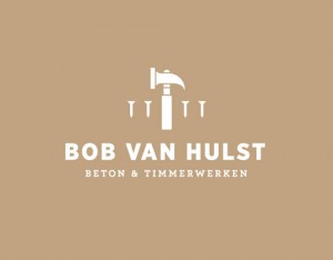
The embossed effect found on these business cards designed by Tim Boelaars is actually a property of the paper used, GF Smith Colorplan. Colorplan has...
Here’s a great identity and site design by Los Angeles-based Ludlow Kinsley (who is also responsible for Milton Glaser’s beautiful new site). Fix Food...
Issue 2 of Computer Arts Collection is now out! Check out this more in-depth preview of the first two issues for a closer look. Roald Dahl Stamps! In ...
Here’s another great student identity project by Denmark-based Jonathan Faust. The design was developed for a fictive company with the intention of he...
This minimal, classy identity was designed by student Rod Castro for an up-and-coming architecture firm....
I can’t get enough of the color palette from this album cover found via Project Thirty-Three....
This beautiful 2012 planner was designed for Allegheny Financial by Bunch. The impressive design features all sorts of fun production details, includi...
This project by Katey Mangel, is one of the reasons why I love student projects so much—school gives you the freedom to create completely fictional co...
Uma is a new, two-weight, rounded typeface from Sudtipos. Check out the features and pick it up right here at MyFonts....
I couldn’t resist featuring another project from the creative minds at Design Ranch this week—they have such an incredible portfolio. Here’s a little ...
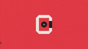
Ben Geier is a Chicago-based designer and photographer with a decidedly impressive portfolio. What caught my eye in particular was the work he did for...
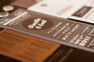
Bay area designer Remilla Ty designed this suite of paper goods for her own wedding this past November. The pieces feature all sorts of handmade detai...
FOUND: 1. Vintage White House Postcard, 2. Vintage George Washington Postcard, 3. Vintage Mount Rushmore Commemorative Plate, 4. Vintage Political Cam...
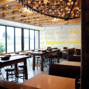
By way of Laura Berglund’s portfolio I found this super fun restaurant branding project by Design Ranch, where she is currently employed. Here’s the d...
Studio Lin recently designed this beautiful poster to commemorate the 2012 Core77 Design Awards, which is currently accepting entries through March 13...
Feast your eyes on the incredible photography of Erin Drewitz. What you see below is a selection from her Places series, but she also shoots portraits...
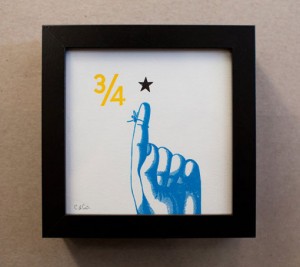
I’ve mentioned Constellation & Co.’s work in the past, but I only recently discovered their etsy shop. It’s filled with all sorts of letterpress paper...
How cool are these tattoo infographics?!? A very impressive student project by Paul Marcinkowski. via Quipsologies ...
Recently, Almanac was commissioned by the St. Louis Art Museum to assist them in creating an online resource centered around Claude Monet’s Water Lili...
I’m incredibly intrigued by this branding project from new-to-me studio Red Design… Red Design were invited by Aspex Gallery in Portsmouth, UK along w...
Kate Spade has brought back their e-valentines for 2012. I can’t tell you how much I love Love Ever After, a Kickstarter project by Lauren Fleishman. ...
Check out these excellent, alphabet flashcard business cards by Michael Braley for Colin Corcoran, a copywriter....
Tind’s latest experimental poster (remember these?) is a typographic beauty screen printed in phosphorescent and fluorescent inks. Take a look at a fe...
Daniel Zender has put together quite the extensive portfolio of design and illustration work. In particular, I’m really loving his Hitchcock film post...
I’m loving this cool, crisp color palette found in a book design from Mucho’s portfolio featured on September Industry....
In my opinion, this stark, minimalist design—by Ehrenstråhle & Wågnert—is perfectly apropos for a high-end clothing line named Modesty. I’m also lovin...
I can’t get enough of these vintage animal illustrations by Swedish illustrator Staffan Wirén. Each alphabet illustration was found in the children’s ...
Narziss Text is the serif companion to the very popular Narziss display face by Hubert Jocham Type....
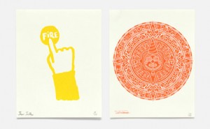
This Year… is an annual piece by NB Studio sent to clients and friends as an alternative to the typical holiday card. Each year they focus on a partic...
On Passports: A Study is a visual summary that accompanied Marwan Kaabour’s thesis project PASS/PORT, which critically investigates the different part...
An icon is such a small piece of artwork that it presents quite the communication challenge. So I’m impressed with this extensive set that Radio devel...
FOUND: 1. Sugar Paper Gold Hearts Card, 2. Love You Daily, 3. I Like You and Naps card, 4. Loved ring, 5. Tattly Love Tattoo, 6. Custom Love Wall Art,...
Proof Wine Collective is producing some really interesting wines with some impressive label artwork. You can see a whole lot more right here....
Mark Gowing Design has created some excellent poster designs for Hopscotch films....
Melbourne, Australia-based Studio Brave recently developed the identity and collateral for Egg Unlimited, an old-fashioned bakery that bakes all of th...
I’ve seen these geometric, color blocked notebooks and planners all over the place recently, so I’m glad I finally stumbled upon the shop. Julia Kostr...
In celebration of the project’s publishing in the CA Typography Annual, Braden Wise has posted a whole new series of his Good Day CA postcard designs....
This perfectly charming stop motion animation was created by Alfalfa Studios for Kate Spade in celebration of the color chocolate brown, as part of th...
Check out Lulu Dee’s new Valentines—four, two-color designs in her signature playful style. They’re available for purchase as a complete set or indivi...
Here is yet another amazing project from The Hungry Workshop, a promotional piece for The Rabbit Hole Ideation Cafe, “a place to meet, work, share and...
Designers & looks like it could be a great resource for designers to connect with both printers and developers. I love these great illustrations about...
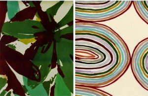
I’m in love with these hand-painted watercolor patterns by Luli Sánchez. So much more to see right here. via Oh Joy!...
Laudon is the Swedish type design studio of Carolina Laudon, focused on typography, type design and type education. Here’s a small sampling of the typ...
Borja Bonaque just released this print series of urban landscapes housed within basic geometric shapes. Get a closer look here and pick up a set for y...
I’m usually one for bright, vibrant color palettes, but the muted tones of these letterpress tags by Joseph Parra caught my eye this week....
We’ve got a brand new Facebook page! To go along with our current rebranding efforts, we’ve consolidated our updates to one page where we’ll post news...
The Seamless shop has been in the works for quite awhile, and we’re now finally ready to release our first product! We recently designed these celebra...
These illustrative numbers by Iglika Kodjakova are super fun. via Typography Served...
CODO Design recently developed the branding for Bird on a Wire, a small boutique in Franklin, Indiana that sells repurposed, recycled and refurbished ...
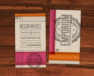
I’m a big fan of Foundry Collective’s work, so it’s no surprise that I love their branding for Emporium Pies. The color palette might be my favorite d...
Kurry is a fun, curvy new display face from Cadson Demak. ...
BOND recently completed the branding and interior design for Aschan Deli. I’m loving the pops of red against the neutral color palette and materials....
Check out this gorgeous promotion that Matter sent to their clients this year: two custom designed notebooks housed in a zipper-perforated mailer. Bea...
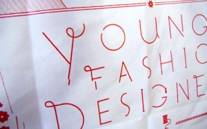
Great work by Matt Delbridge: pieces designed for Noble Discord, a proposed fashion show highlighting the collections of young Bay Area fashion design...
FOUND: 1. Need Supply Navy Watch (sold out), 2. Farm Ruck Sack, 3. Richer Poorer Socks, 4. Cracked Chroma iPad Case, 5. Ugmonk Percent Shirt, 6. Fleec...
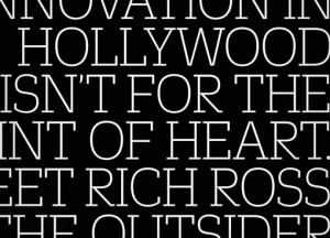
This past Fall, Fast Company—a magazine I subscribe to and highly recommend—launched a redesign featuring three custom typeface families by Commercial...
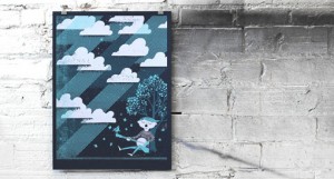
Lincoln, Nebraska based design and print studio Doe Eyed just launched a brand new site with loads of new work. Below you can see a small selection of...
I am really drawn to the offbeat brand designed by P.A.R. for Barcelona-based Strata Bakery. I know this look is something we’ve seen a lot of before,...
According to recent grad Colin Pinegar, F. Troupe is “a drunkship of cobblers from London who make shoes that are ‘quintessentially British.'” Check o...
I was happy to discover that Texas-based designer has an Etsy shop, where several screen printed posters are available for sale. Check out the rest ri...
I’m really inspired by the beautiful marbling in these posters found via Creative Review: Music worked with screen printers ASForPrint and marbling ar...
I’ve long been a fan of Thymes products—especially their packaging—so I was excited to learn about the products designed for a new line, Thymes Mandar...
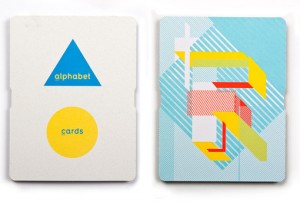
Australian agency Naughtyfish created this printed promotional piece for Keaykolour, a paper range manufactured by ArjoWiggins. Their unique spin on t...
The vibrant identity was designed by Stockholm Design Lab for Vårdapoteket, a Swedish pharmacy chain. What a breath of fresh air it would be to shop i...
Never thought these words would come out of my mouth, but I’m really liking JC Penney’s new brand. Seems like most of the Brand New commenters enthusi...
Computer Arts Collection is a new annual series of six in-depth guides from the makers of Computer Arts. I’ve seen one of these babies in person and i...
Check out this small sampling of vintage style posters by Paul Rogers. Much more to be seen right here. ...
I always love House Industries type catalogs. This one is even more of a beauty in person. ...
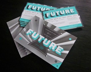
This incredible invitation package was designed by Will Miller, and Ohn Ho for Firebelly Design’s annual Grant for Good project....
I think the common perception is that, for the most part, wedding photography tends towards the cheesy and less towards the artistic. But Fer Juaristi...
Spade is a new chunky display face by Canada Type, which features one font with sharp edges and one with round....
Edrea Lita designed this graphic identity for Spread the Word, an organization that acts as a resource for designers who need logos from non-profit an...
Check out the gorgeous illustration work of Jessica Singh. ...
These unique, 3D posters were designed by Amy Rodchester for the Newcastle Festival of Dance. ...
FOUND: 1. Modern Library Storage Bin, 2. Bibliotheque Wooden Sign, 3. Vintage Wooden Card Catalog, 4. Edgar Allen Poe Library Candle, 5. Library Card ...
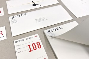
I’m loving Josh Finklea‘s identity for Rider, a boutique hotel chain that caters to touring musicians....
This beautiful publication was created by Swiss designer Felix Reichle, who happens to be—employers—looking for an internship in NYC. In his own words...
I’m absolutely loving the bold colors and intricate line work found in Nate Luetkehans’s illustrations. For more, you can follow Nate on Flickr or Dri...
Big Love Letterpress Valentine Card by Anemonene Letterpress Letterpress Card by Find Day Press You Make Me Smile Letterpress Card by Wiley Valentine ...
These beautiful maps were drawn in colored pencil by John Phalane, a cartographic artist who focuses on the areas of South Africa where he’s lived and...
I am a huge fan of Radiolab—if you don’t know the podcast, I highly recommend checking it out—so this brand and site redesign by recent Art Center gra...
I know we’ve barely made it through winter on the East Coast, but I am already craving warm, sunny weather and coastal road trips. Since I have no cho...
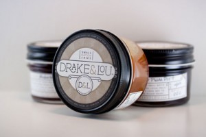
Take a look at yet another gorgeous project by Miller Creative: packaging for Drake & Lou, a small-batch jam maker, which features labels letterpresse...
We were happy to join in last week’s protest against SOPA and PIPA, and it looks like the internet’s joint efforts paid off. The bill has now been ind...
I became an instant fan of Lila Symons’s hand-lettering and calligraphy work the second I laid eyes on it. Take a look at a plethora of other work sam...
I’m loving the beautiful drawings and paintings of Sana Park. ...
Though I can’t speak a word of Norwegian, or translate their web page, I love the aesthetic details of this project for Grilleriet by Uniform....
Jiin Kim, another recent grad of Art Center College of Design, has an excellent portfolio. I was most impressed by these graphic, hand-sewn posters de...
This lovely packaging was designed by Paige Foley for Abbey Brown, Chicago-based soap artisan and gift shop....
Love this colorful image from CSA Flat File....
I’m not one for violence, so when Safwat Saleem emailed me about his latest project, a poster series based on “ass kicking and mayhem”, I almost wrote...
Below you will see a selection of Tom Davie‘s stellar typographic posters from 2011. Yesterday Tom actually kicked off a giveaway via his Facebook pag...
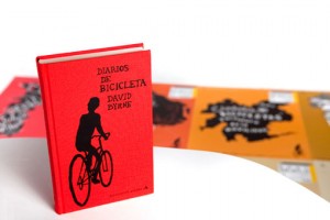
I spotted this poster series in the recent Communication Arts Typography Annual (lots of great work in there, by the way). Designed by Juan Marin, the...
Just a quick thank-you for those of you that filled out the DWL content survey last week. Your responses were extremely interesting and helpful, and w...
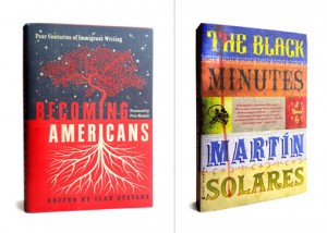
I’ve long been familiar with the work of Roberto de Vicq de Cumptich through projects such as Bembo’s Zoo and Type Calendar (I also just discovered Ho...
Project49 is a self-initiated poster series by Jeremy Payne based on the San Francisco 49 mile scenic drive, which he walked and photographed in its e...
Even though it’s only January, I would venture a guess that Marian will be at the very top of my Favorite fonts of 2011 list a year from now. Designed...
Hello Readers! I wanted to give you a head’s up that DWL will be joining internet giants like Wikipedia, Reddit and BoingBoing, as well as many other ...
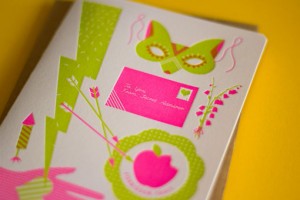
If you’re looking for a non-traditional Valentine’s Day card this holiday, look no further than The Hungry Workshop‘s two new designs. Love Struck fea...
1985 is a new typographic experiment by Jan Avendano. Prints are available right here—would make a great gift for someone born that year. ...
Tracy Hung is a recent graduate of Art Center College of Design. Linger is a 5-week long summer outdoor film festival in Pasadena, California, for whi...
Tim Boelaars just launched a pretty extensive set of icons that encompasses quite a wide range of topics. Check out the rest right here. ...
Illustrated Etymology is an intriguing project by Adam Garcia. Illustrated Etymology is just that – a collection of visual correlatives to English wor...
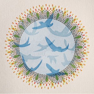
Kring Emporium’s full name is “Kring Emporium of Tiny Literature and Cards”. And they sell just that: miniature storybooks, cards and other paper good...
Many Hands is a new shop that allows you to purchase variety of artwork directly from a carefully curated group of artists. A few of my favorites are ...
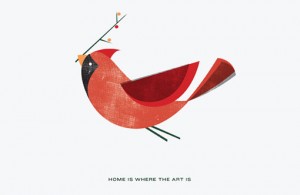
Lee Anthony Zelenak created these print pieces for Art of Ornament No. 2, an annual charity event hosted by AIGA Cleveland. The event enlists members ...
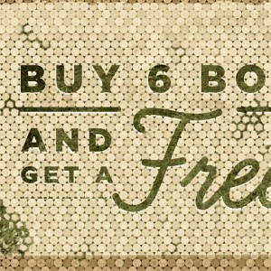
Jason Perez conceptualized these unique wine displays for Treasury Wine Estates, using only sustainable or upcycled materials provided by the winery....
This gorgeous packaging was conceptualized, designed and illustrated by Simon Frous for Jamaica Blue Premium Coffee. Based on the island’s close proxi...
Good morning readers! Just a quick reminder about the DWL Content Survey, which is open through tomorrow: if you’re still interested in giving us some...
Feast your eyes on the stunning work of Japanese illustrator Yukari Terakado....
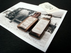
Bravo Company designed the identity and collateral for By Invite Only, a handcrafted jewelry brand, with a rustic, vintage circus theme. via BP&O...
This lettering specimen, created by Typebrain, was inspired by the envelope for Spanish cigarette rolling papers from 1899....
Icinori is the publishing project of Mayumi Otero and Raphael Urwiller. Together they produce limited edition artist book that are hand printed and bo...
These abstract, organic illustrations were created by Ana Raimundo, a Portugal-based artist who, among other things, is inspired by people’s portrait...
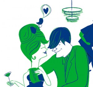
Loving the playful work of Spanish illustrator Marisa Morea—especially this series of images that adorn a party invitation....
I’m loving the sleek curves and high contrast thicks and thins of Vanitas, a new typeface by California-based foundry Reserves. Pick up a copy right h...
Brian Michael Gossett (who just launched a new portfolio site) created these imaginary worlds for People for Bikes, an organization committed to makin...
Berlin-based studio Apfel Zet designed this poster series for Stuttgarter Filmwinter, a short and experimental film festival....
For his thesis project, Robert Finkel chose to produce an exhibition based on the history of the arrow, entitled Up, Down, Left, Right. Here’s a brief...
These beautiful lettering snippets were created by Saranna Drury. More here. via Typeverything...
FOUND: 1. Garnet Karung Credit Card Case, 2. Continuum Necklace, 3. Sur La Table Red Baroque Charger, 4. Nike Blazer Hi Suede VNTG Deep Garnet, 5. Red...
Hey Readers! As we get ready to launch the redesign in the next couple of months, I have my mind on content. We have some ideas in the works for chang...
SVA just launched a new poster campaign featuring a design by George Tscherny, who actually taught their first graphic design course in the 1950s and ...
I’m loving the graphic illustrations and limited color palettes of the packaging designed for Intuition Ale by DeRouen & Co. Definitely the kind of be...
Check out the incredible drawings of Jorinde Voigt. Wow. via But Does it Float...
I discovered Fabio Ongarato Design late in 2010, and have loved every project they’ve done since then. So it’s no surprise that I was impressed with t...
I am in love with the electric color palettes and geometric forms that adorn all of SketchInc‘s goods. The shop features everything from prints and sh...
I’m loving the playful, geometric forms found in this (clearly labor intensive) typographic project by Geetika Alok for Wolff Olins. Check out the vid...
This Vintage Handkerchief calendar by Mink Letterpress instantly caught my eye. You can read more about the design and production process on their blo...
Recent grad Meghan Besinger created this campaign during her last year at the University of North Texas. In her own words, Move to Amend is “a non-pr...
A couple of more “best of” posts to round out the year: The Best Movie posters of 2011, Johnson Banks Review of the Year. Jessica Hische’s Should I Wo...
I am utterly captivated by the paintings of Canadian artist Kris Knight. Here’s an excerpt from his artist’s statement, which I think captures the ess...
The Sultan is a brand new boutique hotel in Singapore. It’s elegant branding was conceptualized and developed by Manic....
The subject of this week’s Color Happy is one of the book covers Owen Davey created for Orange: The Feed. I’m a big fan of both the color palette and ...
As a self-initiated project, Stewart Scott-Curran designed a series of posters inspired by Pink Floyd’s Dark Side of the Moon. Each poster represents ...
When Julie of Duet Letterpress realized her husband’s 30th birthday would fall at an inopportune time for a gathering, she came up with an ingenious s...
This week I thought I’d share my favorite typefaces of 2011, in no particular order. Just click on each image to pick up a copy for yourself....
I’ve recently become a fan of Jackie Besteman’s illustration work—especially her portraits and pattern design. There is quite a bit more to see in her...
I’ve mentioned before that Iceland is on my dream trip list. But since I unfortunately won’t be getting there any time soon, I’ll have to settle for l...
I was recently introduced to Jennifer Maravillas’s work via Fab.com, a newish flash sale site that offers tons of discounted designy products daily—it...
FOUND: 1. Saint George and the Dragon Laser cut Shadow Puppets, 2. J.Crew Vintage Matchstick Cords, 3. ban.do Sequin Scarf, 4. Mylar Confetti, 5. Chiy...
I’m loving these lush illustration pieces by Angela Rizza, an FIT graduate. Her goal is for the viewer to get a sense of nostalgia from her current wo...
Inflated/Deflated is a collaborative project by three Chicago-based creatives: Jillian Barthold, Lauren Connolly, and Kady Dennell, with photography b...
Feast your eyes on yet another gorgeous specimen of hand-embroidered typography by MaricorMaricar, featuring a quote from one of my favorite movies of...
The Lost & Found Department Etsy shop features a selection of awesome graphic prints—both letterpressed and screen printed—by Portland-based designer ...
I’m a firm believer that the best and most successful self-initialed projects grow out of a personal or shared passion. This is precisely the case wit...
For the past couple of years Atelier Martino&Jaña has done an excellent job creating the look and materials for the Guimarães Jazz festival, an annual...
Christina Hart is a recent grad of the Tyler School of Art graphic design program, who is now pursuing a career in illustration. I love her graphic, i...
Happy New Year Readers!!! I hope you had some time to relax and recharge over the holidays. We have lots of exciting things in store for 2012 and we c...
We’re signing off to celebrate Christmas and New Year’s with friends, family and a whole lot of relaxation. Happy Holidays and thanks for an amazing 2...
Take a look at Brandt Imhoff’s latest project, Twelve Fluid Ounces. The ongoing series of drawings is inspired by vintage beer cans. Love it....
Check out this super creative card by the folks over at Division Of/. Each year they aim to make a useful holiday gift, so this year they created a ge...
The Fruitful Field, by Maddison Graphic, is an identity and book for the Methodist Church introducing their project of the same name. I’m particularly...
It’s been awhile since I featured anything wedding-related, so I’ve been on the lookout. And as a huge fan of all things Hammerpress produces, this pr...
I’m very much in the mood for a holiday palette this week, and this vintage gem, from the stream of Alan Mays, sure is a beauty....
This beautiful Holiday “gift pack”, which includes 3 cards, gift tags, postcards and an ornament, was conceptualized, illustrated designed and printed...
As a team, Karen To and Piper Weaver developed the announcement and program for the CalArts 2011 Graduation. Based on theme of metamorphosis, the desi...
Check out the work of Paris-based illustrator an designer, Antoine Corbineau. His pieces feature an organized chaos of type, textures and illustration...
Air, by Positype, is definitely at the top of my wishlist. This workhorse super family features nine weights, regular, condensed and compressed styles...
These sophisticated stationery items by Loligo are perfect for someone who is looking for a somewhat traditional holiday card in a non-traditional col...
This stunningly beautiful invitation was designed by TOKY for the St. Louis Library Foundation’s annual gala. Here’s a little insight into the process...
FOUND: 1. Gingerbread Cookies, 2. Peppermint Crunch-Milk Chocolate Chip Cookies, 3. Eggnog Cheesecake Bars, 4. Peppermint Patty Brownie Bites, 5. Whit...
I’m always a fan of Erin Jang’s work, so it’s no surprise that I’m loving the new calendars designed for 2012. I have her 2011 Icon Calendar hanging u...
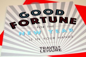
This playful fortune teller holiday card was created for Travel + Leisure magazine by art Director Jill Sabato and her talented in-house design team. ...
I’m consistently impressed with the work coming out of Atlanta-based Matchstic, so my eyes widened when I spotted the recent rebrand of their own stud...
I have been a fan of the Lost Type Co-op since it opened its doors. So I’m pleased to announce that as of this morning they have launched a brand new ...
This morning I’m loving the illustrative, hand-lettered designs of Quill and Fox, whose whimsical style adorns various paper goods in their shop. A sh...
I’m really excited about Gifted, a side project from the folks at Atelier 1A and FormFiftyFive. Gifted will be a mix of a “shop, blog and community fu...
I have a huge sweet tooth, so well-done branding for any dessert-related product is hard for me to resist. Case in point: Swoon, a custom sugar cookie...
Cast Iron Design Company, a relatively new two-man shop, has just launched their complete website. There’s lots of great work to be seen, but I was es...
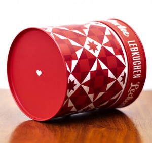
Exciting news—two huge talents, Eric Strohl and Christine Celic Strohl have officially joined forces as STROHL, a San Francisco-based design firm spec...
This beautiful alphabet by Luci Everett was made out of the scraps from another project. I just rediscovered From Here to There: A Curious Collection ...
I’m loving the unusual characters in these colorful, woodcut-inspired illustrations by Berlin-based Jakob Hinrichs....
In addition to the illustrative details, I’m loving the color palette of this map created by Always With Honor for the MTV European Music Awards in Be...
Apologies if you saw this post disappear earlier today, an unfinished version of this post went up unintentionally. Like Figtree says in their descrip...
Abril is one of Type Together’s newest releases, a serif designed with intensive editorial use in mind. You can pick up the complete family of Abril D...
I’m loving the childlike, geometric illustration of the French artist Pepillo. Her work can be purchased in print form at L’Affiche Moderne, or in dig...
Check out the beautiful and intricate window painting by Barcelona-based Kikayis. ...
FOUND: 1. Edie Velvet Chaise, 2. Burgundy Plum Rectangular Post Earrings, 3. Fresh Sugar Plum Tinted Lip Treatment, 4. Garrett Leight Sunglasses, 5. L...
I loved Brad Woodard’s illustration style at first sight—especially this poster design he created for Big Fish, a submission to the current Silver Scr...
I’m loving this new screen print by Loulou & Tummie, Moonwalking the Dog—great color palette. Pick up a print for yourself in their shop....
Moxy Creative House presents Touristique, a series of five illustrated posters based on major cities. They’re available for purchase right here. New Y...
Back in May I posted about Project Neon, which at the time, was an active Kickstarter campaign. Well I’m excited to share that the accompanying Etsy s...
If you’re still on the hunt for this year’s holiday cards, this set by Sane and Able, The Londoner Christmas Games, is definitely a fun and one-of-a-k...
Take a look at this beautiful senior project by Tony Lee Jr., a recent graduate of Carnegie Mellon. He developed visual identities for three Puccini o...
Pantone reveals the color of the year: Tangerine Tango. “The Type Heritage Project [THP] discovers and documents the histories of digital display font...
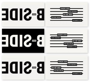
I’m loving the crisp black and white branding and materials for B Side Studios by Sébastien Bisson. via The Dsgn Blog...
This beautiful illustration was created by Javier Garcia’s 2011 Holiday Card. Such a lovely palette....
I can’t get enough of these hand-painted porcelain pins by illustrator Min Lee. A huge selection of them are available right here on Etsy. via Pikalan...
Andes is a new typeface from Latinotype. Designed by Daniel Hernández, the display face includes eight weights and is based on the design of Merced. Y...
Citizens for Optimism is a collaboration among 17 up and coming designers who strive to use their unique styles to inspire happiness through design. O...
Michael Croxton recently did a bit of work for Viacom and Viacom International that caught my eye. This first set of images represent a campaign creat...
FOUND: 1. Aspen Earrings, 2. Emerald Art Print, 3. Match Tealight Holder, 4. Block print Hello Poster, 5. Butter London British Racing Green, 6. Emera...
I first became aware of One Plus One’s work when I was really into wedding blogs during our wedding planning process. I immediately loved their weddin...
Hopscotch Design is the new studio of paper artist Chloe Fleury, who I featured back in February. She’s been quite busy since then, as you can see by ...
San Francisco-based Nidhi Chanani makes adorable art prints and paper goods that would be so great for a kid’s room....
DWL fave Vesa Sammalisto just launched an online shop! The shop currently stocks his personal Alphabet project, a series of limited edition mini print...
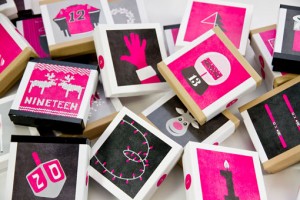
As a kid, my brothers and I used to get one of those vintage style chocolate advent calendars every year, which was pretty much my favorite thing abou...
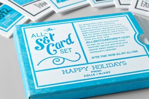
Colle + McVoy has just released the 2011 version of he All-set Card Set, a set of eight letterpressed cards that has you covered for an entire year of...
Mama’s Sauce is generously offering you almost 200 300 dpi bitmaps of created from scanning their collection of vintage letterpress plates. Score! Jol...
I can’t get enough of Martin O’Neill’s mixed media, and largely typographic, collage and art work. Check out a whole lot more here, and pick up prints...
If you’re on the lookout for some holiday gift tags, these illustrated beauties from Shore Society are definitely an option to consider. You can pick ...
This acidy bright palette was found on CSA Flat File, one of my new favorite visual blogs....
I’m loving the personal, handmade quality found in much of Bryan Keplesky’s work. An Austin-based designer and illustrator, Bryan’s portfolio spans ev...
Lovely branding and design for Fitting Wines by Marian Williams Design....
Typographic maps are nothing new, but these by Fontmap are the best I’ve seen. The letters that denote each area also make up an accurate geographic r...
Check out this new beauty from Mark Simonson: Bookmania is a revival of Bookman Oldstyle (1901) and the Bookmans of the 1960s, but with all the featur...
Emily Macrae’s Nine Lives is a self-initiated project that examines how older generations are affected by the huge changes in the way we communicate. ...
I’m loving these gorgeous floral patterns and illustrations by Sarah Papworth....
I just recently stumbled upon this project of Linzie Hunter‘s from last Christmas, where she hand lettered 100 different holiday cards for clients. He...
FOUND: 1. Spade Correspondence, 2. Rose Gold and Ruby Wedding Band, 3. Restoration hardware Stanley Flask Red, 4. Madewell Embossed Telegram Clutch, 5...
Check out this gorgeous branding created by Miller Creative for Olli Salumeria, a virginia-based shop that makes dry-cured salumi. I especially love t...
As a child of the 80s, this new set of mix tape letterpress cards by Lulu Dee is right up my alley. Each of the five cards feature an instantly recogn...
I’m loving these graphic illustration pieces by UK-based artist Adrian Johnson. Much more to see here....
Satchel and Sage is the Etsy shop of Morgana and Gerren Lamson, an Austin-based husband and wife creative team. Among other things, they make these fu...
It’s no secret that we’re big fans of Tad Carpenter around here, we’ve posted about his work several times in the past. But more than anything, I have...
The creative letterpress projects that are coming out of The Hungry Workshop are so incredibly inspiring—this little piece of paper goodness was desig...
Earlier this month Foundry Collective launched a beautiful new site featuring lots of new work. They excel at layering typographic and illustrative de...
I look forward to the Studio on Fire letterpress calendar every year, and this year’s version does not disappoint. For 2012, they’ve employed the stel...
Happy Monday readers! I hope everyone in the States had a great holiday! I know I’m feeling reenergized and ready to make the next month an extra prod...
We’re taking off today and tomorrow to enjoy some time (and, of course, delicious food) with family and friends. See you on Monday!...
Yasmeen Ismail is a London-based illustrator with a focus on character design and children’s illustration. If you love her work as much as I do, she d...
Feast your eyes on this stunning landscape photography by Richard Mosse. via But Does it Float...
Love this simple, yet bold packaging and identity work for Quills Coffee by Pedale Design....
FOUND: 1. Brown Turkey Fig Jam with Raw Honey and Cinnamon, 2. Southern Biscuit Combo Pack, 3. Apple Cider Caramels, 4. Sour Cream Apple Walnut Pie, 5...
I’m loving this selection of pieces by designer and illustrator Nate Utesch....
Awhile back I briefly mentioned the Area Code Project, Mike McQuade’s ongoing project whose mission is to catalog all of the area codes in the United ...
I am currently obsessed with the gorgeous floral paintings of Lulie Wallace. From the vibrant color palettes to the bold brushstrokes to the geometric...
I came across this graphic packaging the other day, and they immediately grabbed my attention. According to the source, BP&O, John & John is “is a ran...
Without a doubt, the minute I launch the gift guide every year I come across more items I would have loved to include, so I’ll be sharing them here an...
Minneapolis has such an amazing design scene, including an especially high concentration of talented female designers. So it was great to see the deve...
Last week Curtis Jinkins launched a brand new site for his shop, Neighborhood Studio, featuring loads of new work. All of it is fantastic, but this pa...
TunnelBravo recently completed the identity and collateral design for North, a brand new Italian restaurant in Phoenix. I’m especially loving the hand...
Like so many others, I’ve been admiring the infographic snippets Kelli Anderson has been posting on Dribbble over the last few months. So I was super ...
Shoebox by 1000 Memories presents How to Go Home, A Survival Guide to Life During the Holidays, featuring illustrations by Patrick Long. Alan Segama j...
Open publication – Free publishing – More design Without further adieu, I present to you the 2011 Holiday Gift Guide—better late then never. Enjoy!...
Mai K. Nguyen is a current design student at Cal Poly San Luis Obispo with a whole lot of talent. I’m incredibly impressed with this identity and pack...
I’ve been a big fan of Nate Williams’s illustration, design and lettering work for quite awhile, so it’s no surprise that I instantly loved one of his...
Zadie is a gorgeous, ornamental display face by A2-Type featuring open and solid styles. Pick it up right here....
This morning I am loving the typographic works of London-based Adam Hayes. There’s much more to see (plus illustration, maps and more) right here....
How great are these pattern designs by Neil J Rook? I’m loving the flat graphics, fun subject matter and compositions of tightly collected objects. Ch...
FOUND: 1. Two Arms Thank You, 2. Modern Block Letterpress Thank You Cards, 3. MMMG Talk Bubble Card, 4. Karolin Schoor Thank You, 5. Rifle Gold Floral...
Hi readers! Just wanted to give you all a quick update on the 2011 DWL Gift Guide. The Guide will launch a bit earlier this year, on this Friday, Nove...
What I find most impressive about Keren Richter’s work is how it spans across various media, but still remains distinctly her own. From collage to ani...
I’ve always been drawn to fairy tales and whimsical stories a la Alice in Wonderland, which is why I’m so excited by JooHee Yoon‘s illustration. She’s...
The Eye Poetry Photography shop is filled to the brim with dreamy, magical images created by Irene Suchocki. Check out a whole lot more right here....
I’m really loving Jenni Sparks’s sketchy illustration and hand-lettering style....
Check out this gorgeous announcement that Greg Christman designed to celebrate the birth of his son Oliver (love that name!). The lyric he chose to us...
Thanks again to all who participated! I’m psyched to have a huge list of new recipes to try; check the comments on the original post to see for yourse...
I came across several great posters this week: DKNG’s latest release is a tribute to the films of Bill Murray, The Best Part has two new Day & Night p...
Have you heard of Fake Anything? I hadn’t before I received Misty Manley‘s submission. But I’m certainly glad I did, especially since the blog feature...
A beautiful identity for Park House by London-based NB Studio. More here....
Hand-lettering is one of those skills I wish I had but don’t, so I will never tire of perusing well-done examples. My latest discovery is the graceful...
Uniqlo commissioned Charles Williams to create this series of portraits for their 2011 Brand Book. Each piece honors one of five Japanese craftsmen em...
Apparently 2011 is the International Year of Chemistry. Who knew? Anyway, to celebrate the occasion, Simon C. Page created a whole series of posters,...
When we were planning our wedding last year, a wedding video seemed like one of the items we could live without, so we opted not to hire a videographe...
I’m loving the delicate, perfectly imperfect illustrations of Pink Paper Circus....
For The New York Times Magazine’s Education Issue, Dan Cassaro was commissioned to create a a series of stickers to accompany each article. It looks l...
DDB New York’s campaign for ADC’s Annual Awards Call for Entries is just plain awesome—I think we all can relate. I especially love the tagline: Keep ...
I’m always on the lookout for scripts that emulate handwriting a bit more than traditional ones do, so I was excited to discover Carolyna, which defin...
I’m incredibly inspired by the work of Eric Frommelt, whose abstract compositions are informed by “technology, maps, data visualizations, information ...
I’ve said before that I don’t feature web design enough around here, so I’m excited to share this sleek design for Mr. Bob Films by René Bieder and Ya...
Philadelphia’s Tyler School of Art seems to be producing one talented designer after another—we’ve posted about a few of their students from the progr...
FOUND: 1. Platinum Volute Wallpaper, 2. Essie Playa del Platinum, 3. Leather Flower Bobby Pins, 4. Personalized Cufflinks, 5. Platinum Promise Gloves,...
I’m a big fan of Nate Koehler’s playful illustration style. These Library Posters, which he developed at Distillery Design Studio, are especially fun....
LOVE this student project by Miriam Altamira—packaging for a series of Cocktail Sodas...
I’m a bit late to the game on this one, but I am so excited about this new poster series by Lab Partners that I had to share. This screen printed, fiv...
Larken Designs acquired the negatives from vintage mugshots circa 1955, and made a series of prints and posters from them. Who knows what these four p...
Along with a newly designed website, San Francisco-based stationery design shop Hello! Lucky recently launched a series of fantastic custom holiday ca...
I’m completely smitten with this new project by Stitch Design Co. Rewined is a line of allnatural soy candles that are housed in recycled wine bottles...
This giveaway is now closed; the winner will be announced on Monday morning. Thanks to all who participated! For the third week in a row, I have anoth...
Expect an email from a Lomography representative with the details! Thanks again to all who participated! ...
Timothy Goodman has a brand new site and it is a beaut. Search Instagram will definitely come in handy. This new collected edition of Malcolm Gladwell...
Abstract Colors is a personal illustration project of Alessandro Pautasso, aka Nosurprises. The series features portraits of classic movie stars inclu...
Feast your eyes on the gorgeous illustration work of Sam Bosma. A selection of his work is available in print form right here....
This refreshing piece represents one half of the of the LINCOLN SLOAT SUN & FOG series by Matthew Korbel Bowers. You can buy prints of these and othe...
I’m really impressed with this unique identity project for Eastfield Village by Brooklyn-based Hovard Design. More about the project in their own word...
I’ve recently discovered A-2 Type, a London-based foundry started by A2/SW/HK, and I loving the selection of typefaces they’ve developed. A few of the...
Edge & Barrett is producing some really great work, including this branding for 11 Boundary, a high-end East London boutique. via Vigor Branding...
I’m blown away by these hand-embroidered book covers that Rachell Sumpter created for Penguin under the art direction of Paul Buckley. Get a closer lo...
FOUND: 1. Kate Spade Air Quote Mittens, 2. Small Snow Forest Basket, 3. Snowflake Trouser Sock, 4. Snow Gardenia Scented Candle, 5. Oversized Snowglob...
LOOVVOOL is a branding agency for lifestyle and luxury businesses based in Hong Kong. I was particularly drawn the branding for Bendis Financial....
I’ve been a big fan of Ann Hurley‘s design and illustration work for quite some time, so I’m surprised me that I’ve never featured her here before. Cu...
For a solo show in Johannesburg, South Africa, Jordan Metcalf created Pictures | Words, a “range of type and image based pieces in various mediums inc...
Largemammal is the shop of Kevin Mercer, who makes and sells a selection of screen printed posters. The stock represents both both art prints and gig ...
Over the summer I posted about the gorgeous patterns Moniquilla uses in her clothing designs. So I was excited to hear that she’s recently released a ...
CODO Design recently developed the identity, signage and various print materials for The Libertine, a new cocktail bar in Indianapolis. The brand took...
Good news: we’ve got another awesome giveaway for you this week! One lucky reader will receive one of Lomography‘s brand new La Sardinia Pattern Editi...
A Halloween treat: iPhone and iPad wallpapers by Andy Awesome. Help Alex Griendling produce the 2012 Time Travel Calendar on Kickstarter. Artists pay ...
I’m incredibly impressed with the breadth of Ayaka Ito‘s work, a Brooklyn-based interactive designer. From the dimensional hand-lettering to the typog...
Brazilian design agency Casa Rex has recently produced the Emporium Collection, a large grouping of stationery items, for the Livraria Cultura booksto...
This super sweet, fantastical illustration is the result of a collaboration between Mika J. Nakano and Rachel Dougherty on Ten Paces and Draw....
I’m a big fan of the work of Sasha Barr, aka The New Year. In fact, we’ve had one of his posters (the Pinback design 5 rows from the bottom) hanging u...
Alfonso is a typeface that was developed by Mark McCormick during his time in the type@cooper program. It’s not yet available for purchase, but as soo...
I actually posted about some of Chris DeLorenzo’s work awhile back, but it was only recently that I realized he not only grew up one town away from me...
Meet my latest typographical crush, display face Fierro: Fierro is a heavy-geometric-retrofuturistic typographic construction that, without any curve,...
As I’ve said before, it’s rare to come across well-designed music packaging these days, as most people have gone 100% digital. So it’s no surprise tha...
This colorful, typographic branding for Core of Discovery is right up my alley. Designed by Travis Brown while at TOKY, the program was intended to in...
I’m loving the quirky illustration work of Nolan Pelletier, a Toronto-based illustrator whose favorite things include cats, the 1939 NY Worlds Fair, h...
FOUND: 1. Halloween Wreath, 2. Candy Corn and White Belgian Chocolate, 3. Boo Ghost Halloween Charms, 4. Halloween Greeting Card, 5. Ten Wrapped Soap ...
I’m absolutely loving the work of Make & Matter, an Austin-based design studio who believes in a simple philosophy — “to make (aka ‘design’) and to ma...
Check out this awesome typographic mural that Bryan Patrick Todd designed to adorn a building in the Highlands, a popular neighborhood in Louisville, ...
I actually posted a couple of spreads from Eli, No!, Katie Kirk‘s self-written and illustrated children’s book, way back in 2008 when it was just in i...
Kayla Jang is a recent SVA grad, with a portfolio that rivals many professionals I’ve seen. Here’s just one example of her smart and sophisticated wor...
Carmen Mok has created a world of joyful, colorful and creative characters in her illustration work. I especially love the playful hand-lettering she’...
I Love Dust created this playgful, graphic, yet handmade-feeling packaging for Allotinabox, a series of GYO (Grow Your Own) boxes to help anyone—even ...
I’m blown away by the craftsmanship of Jack Hughes‘s two-part D&AD Student Illustration Awards entry, I Found the F, I Found the End. The brief challe...
I’ve always loved Cue‘s work for the Children’s Theatre Co. (previously posted about here and here), so I’m equally impressed with their newest print ...
Shoot us an email and I’ll put you in touch with the folks at the RE:DESIGN Conference. Thanks again to all who commented for a chance to win!...
A couple quick announcements before we get to the Quick Links: First, thanks to all who entered the RE:DESIGN Conference giveaway! The winner will be ...
I’m incredibly intrigued by the conceptual work of Sonia & Mark Whitesnow, a young couple from Kirov, Russia. This particular series, Burnt by the Sun...
This vintage record jacket was found at the always-awesome Project Thirty Three....
Take a Line for a Walk is a new creativity journal by Robin Landa. The journal is a true collaboration, featuring all sorts of creative prompts from w...
I’m loving all the collateral for Island Creek Oyster Bar by Oat Creative....
I recently caught a glimpse of DSType’s Braga, via Typophile and since then I have been anxiously awaiting its release. Well, now the wait is over—thi...
Merry Crisis by Phillipe Nicolas. For months, thousands of people across the world have now begun protests and elsewhere show that Europe’s lost gener...
Andy Singleton makes some amazing two- and three-dimensional paper works. More can be seen on Flickr....
Karsh\Hagan created Social Animals to help their client, American Crew, make the most of its redesigned social pages. The book outlines timelines, ton...
This campaign for the Dubai Metro was designed by Aaron and Will as part of a pitch while working at Saatchi & Saatchi Dubai. I know the colorful type...
FOUND: 1. Magpie & Rye Firestarter Kit, 2. Loll Lotus Chair, 3. Sun Jar, 4. Cast Iron Fire Bowl, 5. Campfire Cookery, 6. Mocha S’mores, 7. Pendleton F...
Well, crazily enough, it’s that time of year again—Gift Guides! This year we’re going to be putting the guides together in a slightly different (and h...
I haven’t been following the Occupy Wall Street movement all that closely, but I’ve been paying enough attention to know that it’s sparking quite a fe...
I’m loving these identity elements created by Johnston Duffy for Trevor Dixon Photography. The various marks and illustrations are used throughout var...
Here is some some beautiful new work by Jillian Frey, of Fame Retail, for the Ivey Awards. The stunning photography by William Clark. The Ivey Awards ...
Wonder Thunder is a Seattle-based shop selling all sorts of goods—from tea towels to organic vegetable bags to prints—that feature consistently lighth...
This beautiful identity for Almighty, an interior design and home staging company, was designed by Demien Conrad Design using an interesting techniqu...
I’m loving these geometric, stylized illustrations by Matt Luckhurst, a Brooklyn-based designer, illustrator, and motionographer. There’s lots more to...
Check out this amazing packaging project by Alex Sophocles, a senior at MICA. The goal was to transform Higgins Brand India Ink from a product with a ...
This giveaway is now closed. Thanks to all who participated! The winner will be announced on Monday. I have an amazing opportunity for all of you toda...
Nerdy Dirty – Illustrations for Nerds in Love, is a series of prints by Nicole Martinez that is available on Etsy “TypeFight is an ongoing project to ...
I am one of those people who is constantly looking for ways to streamline my work processes. One of the things I’m always seeking is an all-in-one app...
I can’t get enough of these vibrant pieces by Anahi Ojeda. via Art Hound...
Current ADC Young Gun Curtis Baigent created this super fun illustrative spot for Subway....
I’m loving the rich, warm color palette in this series of pieces by Owen Davey....
I’m a big fan of the work of Vesa Sammalisto, who was recently named an ADC Young Gun. His compositions are always brimming with fun details that reve...
Ryan Keightley is now a full-fledged graduate, but this piece is the result of work done in his senior year at the University of Florida. I was partic...
Stockholm Design Lab designed this sleek, modern identity system for Bella Sky, which is Scandinavia’s largest hotel. SDL was responsible for creating...
Centrale Sans is a modern sans serif typeface by Typedepot that is currently deeply discounted. Check it out....
I’m a big fan of Ingela P Arrhenius’s illustration work, so I was excited to see that she’s recently developed a 2D puzzle featuring a cast of charact...
This colorful, illustrative publication was designed as a promotional piece by Blake C. Tannery for surface designer Melody Miller....
Philadelphia-based Justin LaFontaine has made some really great screen printed posters. I love the simple, graphic style....
FOUND: 1. Espresso Coconut Jalapeno Lollipop, 2. Spice Up Thanksgiving, 3. Spiced Pecan Pumpkin Spice Quick Bread Mix, 4. Anthropologie L’Epice Jar, 5...
I spotted the fresh, clean design for Maui Bus, Maui’s public transportation system, while on vacation in Hawaii. And after some quick Googling, I lea...
Take a look at this gorgeous, screen printed and hand-stamped wedding invitation suite for Brian and Allie by Kyle Marks. The design was inspired by M...
The latest piece from Jason Dean of The Best Part is Day and Night, an illustrative city scene that completely changes its tune when the lights go out...
Andrew Lyons is a freelance illustrator based in Normandy, France (lucky!) who lists his inspirations as Tintin books, American poetry, the paintings ...
I have literally zero outdoor space here in NYC, but I am still completely smitten with these modern bird shelters by Bird Haus— I’m definitely bookma...
Friends with Benefits is a collaborative project in printmaking run by Baltimore-based printer Erin Wallace. The inaugural collection, Piles, features...
Iowa State senior Ryan Hubbard had the fortunate experience of interning at 160over90 this past summer. Under the art direction of Dan Blackman—who we...
One of Steve Power’s (ESPO) most recent projects is one that’s much closer to home: Love Letter to Brooklyn. Commissioned by Macy’s, the Philadelphia-...
There was an outpouring of love and sadness expressed over the passing of Steve Jobs, a true creative visionary, from within the creative world and be...
Luci Everett has been making some absolutely gorgeous new mixed media pieces. Browse through a few more on her blog here and here....
Love this super sleek, simple packaging for BluePrintJuice by Doubleday & Cartwright....
I’m a big fan of Riley Cran’s vintage-inspired design and illustration work. He’s just recently launched a new portfolio site with lots of projects to...
This fun, colorful image is the result of a collaboration between Alyssa Nassner and Justin Volz for the always excellent illustration blog, Ten Paces...
I’m loving these collage-like illustrations by UK-based illustrator Miles Donovan, who is a member of Peepshow Collective....
Check out the identity and materials that New York’s C/C designed for Americanana, a group art exhibition at The Hunter College Art Galleries—I love t...
George McCalman recently completed this super fun packaging for Droga Confections‘ line of Candy Bandits candies (more images here). If they look deli...
Sanchez is Latinotype‘s first display face family. The sturdy slab serif bears a strong resemblance to Rockwell but features softer, rounded edges....
“Your work is going to fill a large part of your life, and the only way to be truly satisfied is to do what you believe is great work. And the only wa...
Check out this beautiful identity program, which features stunning paper cut work, for VCE Season of Excellence by A Friend of Mine. The VCE Season of...
Here’s a great identity system developed by Knoed for Oven, a company that makes early-stage investments in technology startups. A bit about the desig...
Interabang just sent over this playful, typographic packaging for JUST, a new caffeinated water beverage—the first of its kind—available in the UK....
Just when I thought they couldn’t get any better, Nick Sambrato of Mama’s Sauce came up with a way to revolutionize our letterpress printing options. ...
FOUND: 1. Three Leaves Necklace, 2. Leaves Tea Towel, 3. Pecan Pumpkin Butter, 4. Plaid New Zealand Wool Blanket, 5.Cascading Autumns Acorns Crystal C...
Next up from Patrick Enstrom is this lovely collateral designed for Old Parkland, which was also produced while he was employed at Tractorbeam. Patric...
Patrick Enstrom has so many great pieces in his portfolio that it was pretty darn difficult to choose what to post. So I’ve narrowed it down to two pr...
Here is some amazing work by OCD | The Original Champions of Design for ArtPlace, which is a “collaboration of top national foundations, the National ...
I can’t get enough of these images by Toronto-based photographer Andrew B. Myers—the restrained color palettes and focused, well-edited compositions s...
Katherine Patton, of The Office of Nature, has recently opened up an etsy shop featuring fun “prints and paper goods for hip kids (young and old).” He...
While I am away I’ll be suspending regular posts to feature design, photography and illustration work focused on a central theme: travel. Normal posti...
While I am away I’ll be suspending regular posts to feature design, photography and illustration work focused on a central theme: travel. Normal posti...
While I am away I’ll be suspending regular posts to feature design, photography and illustration work focused on a central theme: travel. Normal posti...
While I am away I’ll be suspending regular posts to feature design, photography and illustration work focused on a central theme: travel. Normal posti...
While I am away I’ll be suspending regular posts to feature design, photography and illustration work focused on a central theme: travel. Normal posti...
While I am away I’ll be suspending regular posts to feature design, photography and illustration work focused on a central theme: travel. Normal posti...
While I am away I’ll be suspending regular posts to feature design, photography and illustration work focused on a central theme: travel. Normal posti...
While I am away I’ll be suspending regular posts to feature design, photography and illustration work focused on a central theme: travel. Normal posti...
While I am away I’ll be suspending regular posts to feature design, photography and illustration work focused on a central theme: travel. Normal posti...
While I am away I’ll be suspending regular posts to feature design, photography and illustration work focused on a central theme: travel. Normal posti...
While I am away I’ll be suspending regular posts to feature design, photography and illustration work focused on a central theme: travel. Normal posti...
Here is a fun promotional piece by Karl Hébert for Creative Suitcase: The Creative Suitcase team has worked on four continents and traveled to over 34...
While I am away I’ll be suspending regular posts to feature design, photography and illustration work focused on a central theme: travel. Normal posti...
While I am away I’ll be suspending regular posts to feature design, photography and illustration work focused on a central theme: travel. Normal posti...
While I am away I’ll be suspending regular posts to feature design, photography and illustration work focused on a central theme: travel. Normal posti...
While I am away I’ll be suspending regular posts to feature design, photography and illustration work focused on a central theme: travel. Normal posti...
These beautiful pieces are from Brooklyn-based artist Shane McAdams’s Synthetic Landscapes series. From his arist statement: “Like the stratified rock...
Here is some beautiful work by lg2boutique for La Vittoria, a gourmet gala event to raise money for the Breast Cancer Foundation of Quebec. Each year ...
There’s such an unusual combination of soft colors in this piece by Till Hafenbrak. Love it....
Check out this gorgeously detailed packaging by Leslie David, a recent Young Gun recipient, for Hussein Chalayan’s Airbone, a new fragrance produced b...
I’m loving this gorgeous wine packaging by Duncan/Channon for Farrier. Here’s a little background from the design team: The overall concept taps into ...
Peleguer, a set of four fonts including ornaments, was reinterpreted from Spanish typography from the second half of the 18th century. You can read mo...
For Dominique Falla’s contribution to this year’s Positive Posters competition, she designed We are all a Part of the Same Thing, an amazing, typograp...
This sophisticated design program was created by Blok Design for Centro, an arts university in Mexico City. Using imagery in a way that “pulls from ty...
FOUND: 1. Hawaiian Salt Duo, 2. Hawaii Pillow, 3. Paper Wrapped Pencil Set, 4. Pineapple Macadamia Cookies, 5. Hawaiian Sun Kids T-shirt, 6. Capri Blu...
Kelly Thorn is a classmate of Theresa Decker, whose work I posted about last week. While peeking through her portfolio, these typographic and illustra...
Zoo is a show curated by the husband and wife team of Jacqui Oakley and Jamie Lawson, which featured “a collection of smaller paintings and artifacts ...
Kareena Zerefos makes “whimsical illustrative work with a sense of isolation and bittersweet nostalgia.” Dreamy....
Here is a gorgeous packaging project by Marx Design for Cazulo, a new alcohol from Goa, India. A bit of background from Ryan: Despite being around for...
These large, striking, black and white posters by Debbie Carlos, are printed on a plotter— a large format printer mainly used to produce architectural...
Check out some of the winners of Minted‘s recent Great Ideas Notebook Challenge, all of which will soon be available for purchase on the site. There ...
I’m loving these sweet and simple letterpress stationery designs by Meg Gleason. More details can be found on Flickr....
I have incredibly vivid memories of watching The Muppet Show as a kid, so there’s really no way I couldn’t love this project by Michael De Pippo. In a...
Quick Note: Thanks for all of your travel submissions! We are currently all booked up for that series, but please feel free to send over regular submi...
I love this crisp, clean and modern wedding invitation suite that was designed by Dan Blackman (a newly appointed ADC Young Gun), and printed by Crank...
Check out these beer label designs by designer and illustrator Kurtis Beavers, for Cutters Brewing Co. Fun....
The portfolio of recent Tyler School of Art grad Theresa Decker is super impressive. There’s lots of great work to see, but I’m particularly loving th...
Sometimes nature can be mind-blowingly beautiful, as evidenced by this shot captured by Paul Octavious....
Here is a unique project by Alt. Group, a collaborative installation unveiled at Urbis Design Day 2011. Here’s a little bit about the project from the...
I’m really drawn to the strong lines and bright pop of color in these architectural drawings by Ben Kafton....
The work of Japanese artist Tatsuro Kiuchi is so beautiful I almost can’t stand it. Between the unusual compositions, interesting color palettes, and ...
Match & Kerosense, the type foundry and design studio of Alex Sheldon, is killing it with their releases lately. The latest edition to the library is ...
Studio Muti is the South Africa-based studio of Clinton Campbell and Miné Jonker, whose work ranges from typography to illustration to design....
I am absolutely loving Chris Ballasiotes‘s expressive, hand-lettering style....
Tad Carpenter’s new branding for Yeah! Burger is just plain fun. The Atlanta-based (and expanding) chain wanted a fresh approach to reflect their comm...
FOUND: 1. Jonathan Adler Brasilia Stripes Bowl, 2. Paul Smith ‘Westminster’ Cup And Saucer, 3. Dwell Studio Draper Stripe Citrine Rug, 4. ABR Bookcase...
Now here is a perfect example of design that is both visually interesting and incredibly smart. For the rebranding of digital agency Manifest, Eight H...
This lovely promotional poster was designed by Jose Ortiz and letterpress printed by Peter Kruty Editions....
I absolutely love this packaging for The Supernatural wine by New Zealand’s InHouse Design. Here’s a bit of background in their own words: Whilst the ...
Seattle-based designer Aaron Bloom has some great posters in his portfolio, some of which you can purchase through Big Cartel or Etsy....
These wonderfully sketchy bird drawings were created by UK-based artist Robert Clarke (who unfortunately doesn’t have a website as far as I can tell—c...
I’m really loving the minimalist letterpress goods from San Francisco-based shop, In Haus Press....
This series of pattern, by Kristin Reger for dublab, is absolutely gorgeous. I would love to see them made into fabrics....
This lovely and sophisticated packaging for Saxton was created by the New Zealand-based studio, Supply. via Best Awards...
My favorite part of the Museum of Natural History is hands down the Hall of Gems and Minerals. So needless to say, I am completely enamored with Carly...
Alex Merto has quite the selection of book covers in his portfolio. I especially love that he’s given some insight into the process by showing the con...
Dan Blackman’s Optimistic American Tee is super fun. Pick one up right here. Refinery 29 reveals their favorite invitations from New York Fashion Week...
These colorful and elegant invitation materials were created by Leterme Dowling for Lucy Atwood Events....
Designer Brian Hurst designed this vibrant invitation suite for his own (very recent) wedding. Love it....
Here’s another installment of the Student Spotlight, featuring the work of a few talented designers and illustrators who are still completing their ed...
I am usually one for lots of color, but sometimes a muted neutral palette with just one pop of color really hits the spot, as in this image by Rosie H...
I’m definitely not ready to start buying 2012 calendars just yet, but the new collection from Hammerpress is currently at the top of my list....
I admit, I know nothing about biking whatsoever, but Contrabrand‘s recent branding project for Swiss Side definitely caught my eye. A road wheel compa...
Check out Ferroconcrete‘s clean, minimal and whimsical branding for früute, who makes all sorts of colorful and interestingly constructed tarts. The b...
Nick Agin has an impressive portfolio filled with both design projects created for larger agencies, and personal pieces. In particular, I’m loving the...
Merge is a new family of four soft sans fonts by Philatype....
These lovely vintage-inspired business cards—printed by done Blush Publishing—were designed by Cutter and Savage, a creative organization who may or m...
Candy Chang’s work is so incredibly inspiring. Through interactive public art installations, she attempts to make cities more comfortable for people, ...
This playful postcard, with it’s simple design and cheeky copy, was created by United Creatives, and lovingly printed by Blush Publishing....
This beautiful wine packaging was created by Adam&Co. for Fable Wines. The concept is based on the idea that wine is about storytelling, and each pack...
FOUND: 1. Confetti Letterpress Card, 2. Fishs Eddy Polka Dot Dinner Plate, 3. Selvedge Pocket Square, 4. Generate Polka Dot Storage, 5. Kate Spade Lap...
The newest poster series from Family Tree Design, Fauna Friends – Japanimals, features artwork by Alex Pearson, Julian Baker, Scott MacDonald and Andy...
Take a look at this incredibly fun Depression-Era Circus Tea Party planned by friends Angela Stephen-Dewhurst and Jag Nagra. For the design, Jag devel...
I am absolutely loving these wedding invitations created by Three Steps Ahead. Each poster style invitation was letterpressed using antique wood and m...
This vibrant, graphic branding and packaging was created by Bless for Cool Chile Co., a small, UK-based company that produces all sorts of chile-relat...
Etsy Shop Lucy Loves This features the typographic and illustrative prints of book designer Lucy Stephens....
Good morning readers! I’m putting out a quick call for submissions for any design or art work related to travel. It could be the branding for a hotel,...
Good morning readers! It’s Labor Day here in the States, so I am taking off after the Quick Links. There’s more to come tomorrow, so stay tuned… This ...
I’m loving the work of Partnersin, a two-person deisgn and illustration studio “focused on cultivating ideas that are honest, hands-on and have a hea...
Ping Zhu’s illustration style features sweeping, expressive brushstrokes that bring so much life to each image. Love....
How fun is this illustration from a vintage Esquire cookbook?? Discovered in the stream of Annie Internicola....
Menus for Chez Panisse is an essential book for anyone who loves the art of letterpress. The book chronicles the artistic relationship between Alice W...
I’m a big fan of the work of Nashville-based Perky Bros. In addition to their work for business clients, I am also loving this wedding invitation suit...
I’m really loving the curved lines of Magnola, a display face by Eimantas Paškonis that features lots of interesting ligaures and swash variants for e...
Red Square Agency took an approach with their rebranding that reflects both their personality and their history. The backs of their business cards and...
Charlotte, North Carolina-based agency birdsong gregory developed the brand for Sheffield & Sons as a memorable private label for Bloom Grocery’s angu...
FOUND: 1. Horse Bit Socks, 2. Unused Equestrian Stamps, 3. Vintage Kentucky State Souvenir Drinking Glass, 4. Teal Modern Horse Cushion, 5. Vintage Go...
Radio is a South Africa-based illustration and design collective made up of Brad Hodgskiss, Byron Meiring and Gert Schoeman. Based on the impressive r...
The Eccentrification Tour Web Site by Tom Froese is a certainly a feast for the eyes. He says it best: When a 22-person, tall-bike-riding family going...
This sophisticated identity was created by Montreal-based Departement for Motor Flame artists, a visual effects studio. The suite features different p...
There are so many beautiful pieces of work in Danielle Kroll’s portfolio that I just couldn’t choose only one to feature. Below you will see a selecti...
Etsy Shop Handy Maiden makes these adorable miniature ceramic critters—most are under two inches tall. Each one is sculpted and hand-painted individua...
Independent publisher Pinkghost will soon be releasing a new series of Artist Chubby Books, which are thick books filled with hundreds of both lined a...
This flexible, three-dimensional typeface was created by Studio8 for Wired. Fingers crossed that some day down the line they offer it up for public co...
I know these have been featured elsewhere, but I can’t get enough of Magpie Studio’s Imagine the Possibilities, a promotional poster series for paper ...
Good morning readers! Apologies for the lateness this morning. Thankfully our only damage from Irene was the loss of cable and internet, so we’re stil...
Designer-turned-illustrator E.W. Thomason certainly has a unique style. I’m especially loving these borderless pieces that feature rich, layered color...
This branding for Periscope Creative, by Darrin Crescenzi, is absolutely gorgeous—from the intricate logo details to the typographic choices, to the p...
It feels like summer is drawing to a close around here (you won’t see me complaining—I’m definitely ready for Fall), so I figured one last super warm,...
I’m loving the branding Matchstic dreamt up for this year’s Catalyst East Coast Conference, which has the theme “Be Present.”...
These playful animal illustrations by Bruno Nunes accompany the stories of Aesop’s Fables. Take a look at the entire series right here....
I’m loving the quirky curves of Altis, a sans serif family by Typolar, featuring 10 weights and lots of open type features....
I’m really impressed with Zach Schrock’s photography, especially these pieces from his Places series....
Check out this fun, modern packaging series created for Ecostore by New Zealand-based firm, Special Group. I’m particularly loving the sketchy, line d...
FOUND: 1. Vintage Glass Tumblers, 2. Vintage Whitman Playing Cards, 3. Vintage Cast Iron Elephant Bank, 4. Big Top Lampshade, 5. Join the Circus Print...
I can’t get enough of these typographic letterpress prints by Brad Vetter, who spends his days designing for Hatch Show Print. Lucky for us, some of t...
Etsy shop Saratops is filled with all sorts of handmade goods made with found materials, from banners and notebooks to notecards and gift tags....
I’m super impressed with Christine and Ian’s unique wedding invitations. The labor-intensive, hand-crafted suite features details made with laser cutt...
Sean Freeman—who is represented by Levine/Leavitt—is producing some truly inspiring work. This piece for The Decemberists grabbed me immediately, and ...
I’m really loving these black and white pieces by Neuarmy. Victory League is a series of prints of champion athletes originally created for Adam Garci...
We’re beyond thrilled to share that Seamless Creative and design work life are featured in this month’s issue of HOW, the Self-Promotion Design Annual...
James Victore is launching The Dinner Series, what could be an amazing experience for seven lucky artists and designers. In addition to some intense w...
When Kate Thomas sent over a link to her work, I was immediately drawn to these graphic spreads from Art of the Beat, a self promotional piece that wo...
I’m really enjoying the work of New York-based artist Justin Gabbard, who draws inspiration from “pop music, new york storefront signs, bright colors ...
This lovely image was captured by *Nishe. I can’t get enough of contrast between the porcelain skin tone and rich hues in plants flowers and leaves....
I’m very much intrigued by this identity for Tigges Architect by Andreas Hidber. Unfortunately there isn’t much background information available, but ...
I’m loving these pieces for The Motorist by Sweeden-based designer, Jonas Bergstrand....
How amazing are these music boxes by Something’s Hiding in Here?!? Each one-of-a-kind piece was created from vintage wallpaper for BHLDN, but they’ll ...
Grizzly Bear is another fun display typeface from Match & Kerosene. The family includes twelve titling fonts in styles that range from inline to shado...
Since many companies are moving toward sharing all or most content online, it’s pretty rare to see a printed annual report these days. So as someone w...
I’m loving the geometric, layered quality of Chaz Russo‘s (aka ReckerHouse) illustration and lettering. via Grain Edit...
As a founding member of Forge and current President of re:play, it’s no surprise that Jeremy J Loyd has a portfolio filled to the brim with stunning b...
FOUND: 1. Yeehaw Trillium Letterpress Cards, 2. Organic Cotton Mason Jar Flour Sack Towel (shop temporarily closed), 3. Bonnie’s Red Pepper Jelly, 4. ...
Next up from Jay are the letterpress invitations he designed for his own recent wedding. The two adorable portraits—she in a cameo, he in a plaid shir...
Charlotte Charleston-based designer Jay Fletcher recently overhauled his portfolio, adding tons of new work—so much, in fact, that I’m going to share ...
Feast your eyes on the stunning landscape and nature photography of Elias Carlson. Living in NYC it’s easy to forget places as lush and gorgeous as th...
I’m not usually a pastel person, but something about these porcelain vessels from Suite One Studio caught my eye. There’s quite a large selection of p...
Use Rubber at Night is an incredibly thought-provoking project by Shantanu Suman. Here is some more information about the concept behind and goal of t...
I can’t get enough of all the details—from the geometric pattern to the delicate line work to the interesting typographic combinations—found on this p...
Quite a bit of the work I’ve been most excited about over this past year has been self-initiated. So it’s no surprise that I was immediately drawn to ...
Maraid Design is offering up a whole series of vintage map desktop wallpapers, on their blog. Now’s your chance to submit a design to UNIQLO’s annual ...
I’m really loving these layered, collage-like portraits by Belgium-based artist Raphael Vicenzi. ...
Matic is the Brooklyn-based design and illustration studio of Mark Pernice. There’s quite a bit of interesting and varied work to see in his portfolio...
I’m loving the unique color palette of this vintage stamp from the Flickr collection of Jane McDevitt....
All of the work in Emma Robertson’s portfolio is great, but I’m particularly loving this identity for Matthew Moore Photography. I love all of the han...
I’m loving all of the layered details found in CIP Creative’s identity for The Unspoken Travels of Oscar Ryan, an Australian coffee house....
Crete is an “unusual” slab serif from the Type Together library that was originally inspired by lettering found in a small chapel on Crete, Greece....
Here is yet another great wedding invitation by Mama’s Sauce. There are so many fun details involved in the production of this piece, from the bright ...
For a recent issue of Icon Magazine, Proud Creative developed a brand new look and feel for Rhyl, a small British seaside town. You can browse and dow...
FOUND: 1. Wine Quotes Letterpress Coasters, 2. Anya Hindmarch Wine Canvas Tote (no longer available), 3.Lucky Night Wine, 4. Personalized Wine Bottle ...
Here’s a great restaurant identity designed by Osl0-based The Metric System for new burger joint Illegal Burger. This super fun brand also prominently...
The Two of a Kind collection by Andrew Kolb is a series of wooden doll pairings that he designed based on the recurrence of the short/squat & tall/thi...
This morning I’m really excited to share this colorful, pattern-heavy birth announcement created by Brooke Lunneborg for her son Mylo. The playful des...
Today I’m loving these beautiful, nature-inspired giclee prints by UK-based artist, Eloise Renouf....
This new series of gift wrap and greeting cards by Dear Hancock, is such a great, simple idea that I am shocked I’ve never seen it before. Inspired by...
Standard Grit Flags are 100% hand-made, and produced in limited-editions. Released seasonally, we produce three new decorative flags four times a year...
Feast your eyes on Menagerie, a new book from animal portrait extraordinaire Sharon Montrose. A collection of Sharon’s photographs and design vignette...
A fauxgo is “a symbol or other small design created to represent a fictional company or organization that exists only on film.” Check out the blog tha...
I fell in love with Parker Fitzgerald’s dreamy polaroid portraits the second I saw them. Plus I’ve been a huge fan of Amanda Seyfried since Veronica M...
Casey Martin and Kyle Poff run a collaborative studio called Monument. (They don’t have a website up just yet, but I’ll be sure to let you know when t...
We may see this lovely illustration by Katie Daisy Lombardo in her new line of greeting cards, so keep an eye out. And get a closer look here....
Fast cars are not normally my thing; but something about the combination of color palette, illustration and typography in this illustration by Ivan Bü...
I’m completely floored by these stunning, hyper-realistic portraits by Lee Jeffries....
The ubiquity and misuse of Copperplate—on everything from bank logos to lost and found flyers—drives me insane (who’s with me?). So I love Quimby as a...
I am a sucker for things organized neatly, so I’m loving these photographed collections of natural objects Miles of Light....
Next up from Michael is a project with an entirely different look and feel. Maya Lee Mashup is a stationery system for designer Maya Lee, which takes ...
Michael Croxton, an NYC-based designer currently studying in the MFA program at SVA, has one of those enviable portfolios that boasts consistently sol...
FOUND: 1. Clouds Sonic by Aimee Wilder, 2. Port Melbourne Paper, 3. Vertigo from Ferm Living, 4. Bloomsbury Mews Bohemia, 5. Blazing Poppies Wallpaper...
Fox Liquor Bar is a new project from Chef Ashley Christensen. The branding, designed by Joshua Gajownik, features bespoke inline type in gold foil ato...
OMFG designed these custom Scout books and other marketing materials for Google Place’s Best Ever concert series. Read more about the events right her...
Brera and Solferino are are two new type families designed exclusively for the Italian newspaper, Corriere della Sera. They were designed by Leftloft ...
Something tells me I might not have the patience for this, but I love these graphic wall stencils from Cutting Edge Stencils as an alternative to wall...
To sharpen his calligraphy skills, Seb Lester has begun choosing 30 random Facebook fans lettering their names in a gorgeous script. Get a closer look...
How amazing are these Viewmaster Invitations by Melangerie?!? Each boxed invitation suite features your very own custom photo reel to be used with one...
This beautiful piece was created as a collaboration between designer Jory Dayne and photographer Weston Colton. Legatto is a collection of three print...
I’m loving this typographic, animated video, le droit de suite (the resale right). (via daily design discoveries) Always Remember: Life Lessons with L...
Daniel Mackie takes an approach to watercolor portraits that I certainly have never seen before, by using distorted, dynamic perspectives, and coverin...
These lush and vibrant flowers were captured by Casey Leblanc....
I’m loving Stitch‘s 2011 version of the Field Feast Save the Date. Great work as always....
Nick Iluzada‘s portfolio is filled with piece after piece of vibrant and whimsical work; but I am especially fond of these beautiful sketchbook pages....
Dharma Gothic is a wood type-inspired sans serif family by Dharma Type (previously known as Flat-It), featuring seven weights and 42 styles. Pick it u...
Here are a few more students producing great work. Each of these projects deserves a more in-depth look, so be sure to click on over to check each of ...
Check out Meg Gleason’s, of Moglea, brand new letterpressed business cards. I’m loving the mix of type and blind printed illustrations....
FOUND: 1. Public School Posters, 2. Susy Jack Pencil Cup, 3. Poketo Striped Fleece Backpack, 4. Camera Pencil Sharpener, 5. Present & Correct Wooden P...
Jesse Tise, an LA-based illustrator, creates pieces that feature fantastical environments and characters. I’m particularly loving his Xenology book, w...
Photographer Charles Bergquist‘s Everyday project showcases one image a day from his daily experimenting, that would otherwise not be seen. Beautiful ...
I love this smart identity and business card solution that Ty Mattson came up with for Natalie Ebnet, a TV Editor....
http://www.etsy.com/people/EnRouteStudio?ref=ls_profile Handtufted in San Francisco CA at the En Route Studio furniture and carpet workshop. Our carpe...
Here is yet another gem from the guys at Mama’s Sauce: their brand-spanking-new business cards. They’ve used a process they’ve recently perfected, a h...
Can’t wait for Jessica Hische’s Love stamps to be available! Blurb now offers up a service to make printed books with your Instagram photos. I’m so ex...
Timothy Goodman recently collaborated with Luke Bartels to customize a skateboard deck for Collective Good’s recent exhibition, Plywood for Good. A gr...
As a visually-inspired, inspiration-hungry person, I cycle through various obsessions on a pretty regular basis. The latest of these is Cyanotypes, a ...
Check out these gorgeous self-portraits by Italian photographer, Anna Di Prospero....
I’m loving the richness of color in this image by Lara Alegre....
Exciting news: Felt & Wire has launched Supply, a new product category that looks to be an amazing DIY resource. The vast selection features products ...
Not sure how I came across Austin-based Arts & Recreation, but I’m so glad I did. It was tough to decide which of their projects to feature, but I can...
Kristy White’s portfolio is filled with meticulously detailed pencil illustrations and smart design. I especially love how she brought the two skill s...
Gordon, by Letterbox, is a bold titling sans with a wide range of superscript ornaments. Pick it up at MyFonts right here....
Apfel Zet Graphic Design is a Berlin-based, three-person studio with a wide-ranging portfolio. In particular, I love the work that they’re doing for D...
Rachel Denbow, of Smile and Wave, has recently embarked on an ongoing photographic project entitled, “A Month of Instax.” Beyond the fun instant photo...
It is certainly apropos that our stop on the Collection a Day blog tour happens to fall on the same day as my Collection post series. But rather than ...
FOUND: 1. Quody Head Light Watercolor, 2. Ocean Green Maine Tourmaline 14K Gold Ring, 3. Maine Wild Raspberry Honey, 4. Lobster Buoys by icemomo, 5. H...
I don’t think I’ve seen one 826 project that I didn’t love, and this piece by Spencer Charles is no exception. Designed for 826 Seattle’s Greenwood Sp...
It’s been awhile since I’ve posted wedding-related paper goods, so its exciting to have two to share in two days! This time around I’m happy to share ...
I’m loving the sophisticated brand that Mexico-based Face. developed for Mary Oh. The visual elements come together in a way that is both coyly sugges...
My find of the week is Lila Ruby King’s lovely illustration work, which adorns all sorts of goods in her shop, from jewelry to postcards to fabric....
Made in the 216 is an event and shopping experience that was conceived to promote those who pursue creative endeavors in the Cleveland area. The color...
I’ve never read any of the Harry Potter books (I know, I know; I should), but I’m definitely a big fan of the movies. So I was excited to finally see ...
The results of this photographic technique (the wet collodion method) used by Daniel Carillo in this series of images, are nothing short of stunning. ...
Words cannot express how much I love these wedding invitations by The Hungry Workshop. Between the concept, copywriting, color palette and seriously a...
Bandit0 Design Co. released a new Wet Hot American Summer-inspired poster. Excited to finally get a look at Other Peoples House’s, a photographic proj...
I’m super into Jack Hudson‘s illustration style, with its tall, leggy characters and fresh color palettes. If you feel the same, more can be seen on h...
I’m loving Paris-based Dépli‘s beautiful work for the Musée de la danse, which includes a custom typeface, signage and collateral....
I don’t know about you, but I can’t believe that we’re half way through July already! Sadly I haven’t had the chance to get in any beach time yet, but...
I’m really enjoying the personal work of Bruno Borges, especially this hand-drawn poster entitled, Leminski....
Here is a some great work for Joyful Kindergarten, an international school, by gardens&co. I love how immersive the brand is—they’ve carried the smile...
Pluto is a new, curvy typeface from HVD Fonts, featuring a set of 16 fonts with plenty of alternates and special characters. As an added bonus, the ty...
I’m really impressed with these Facebook recruitment posters by 3 Advertising. The series was meant to appeal to prospective software engineers by ill...
I’m loving this series of posters created by Kevin Reid for Central Market, which feature lovely illustrations by Judy Unger....
Lately I’ve been seeing lots of daily or weekly illustration projects that involve the creation of unique characters. What made Sandra Reichl’s projec...
FOUND: 1. Gold Bar Paper Weight/Doorstop, 2. Hatch Linen Pillow, 3. iPhone 4 Case, 4. Gold Zig Zag Pens, 5. Rifle Hello Cards, 6. Kate Spade Passport ...
Loving this sophisticated identity refresh for a Norfolk, Virginia based restaurant, by Forest....
Check out this fun project from the creative minds of Foreign Policy. Here’s a little description, straight from the source: 13Wives is the story of 1...
Little Lion Studio makes some really great decor items for nurseries and children’s rooms....
I’m loving these snippets of lettering and logo designs from Brandon Rike’s typography portfolio....
Recently I posted about some signage ok Mitch completed for Stellina, a café whose identity was designed by Steven Jockisch and Anchalee Chambundabong...
I’ve posted about Kelli Anderson several times in the past, so it’s no secret that I’m a big fan of her smart, thoughtful and visually arresting work....
The 50 and 50 print shop is now open! Love this collection of vintage Life Savers advertisements. Simon Foster put together a great list of online res...
I can’t get enough of Yu-hsuan Huang’s adorable, vintage-inspired illustrations....
For her Weekly Critter series, Linda Coulter creates a fun little character which she publishes on her blog. via Studio Sweet Studio...
Check out the work of European-born, Los Angeles-based photographer Ewan Burns, who is represented by Friend + Johnson....
I’m loving this chic summery image from one of my favorite Flickr streams, that of Sandi Vincent....
I admit I have a bit of a quilt fixation this week. But it really was a happy accident that I came across Hvass & Hannibal’s gorgeous, vibrant cover f...
I’m really impressed with the portfolio of Portugal-based Gen Design Studio, whose work ranges from packaging to print to interactive. Below are a cou...
You may be familiar with Caroline Hadilaksono’s work as one half of A Good Company, the minds behind The League of Moveable Type, and other fun intera...
Acta is a typeface from DSType, that was originally designed for a Chilean newspaper. The super family features a Pro and Display version with six wei...
Love this identity for Joel Flory Photography by Must Warn Others....
Jordan Sondler hasn’t yet graduated from MICA, but she has already established a style uniquely her own—using bold line work along with geometric patt...
The portfolio of New York transplant (by way of Spain) Kike Besada is stacked with a wide range of sophisticated personal and commercial work. In part...
FOUND: 1. Penguin Threads Deluxe Classics by Jillian Tamaki, 2. Aubin & Wills Leventhorpe Quilted Dress, 3. Knomo Laptop Case, 4. Quilted Wedding Invi...
I’m loving these pieces of hand-lettering for Austin Town Hall by Reagan Ray....
There is so much to see in Raisenochicken‘s portfolio—piece after piece featuring a wide variety of design, illustration and typography styles, all wi...
The Fancy Lamb has a huge supply of really unique vintage items, including a pretty extensive collection of vintage cameras. Check out what they have ...
artwork by Jon Contino It’s the 4th of July here in the States, so I’ll be taking the day off for some much needed relaxation. I’ll be back tomorrow w...
I’m always waiting way too late in the year to start planning out my holiday cards and gifts. This year though, I’m determined to start way in advance...
I can’t get enough of Olaf Hajek’s maximalist blend of colors, textures and linework. Limited edition prints of the pieces you see below can be purcha...
Loving Scott Campbell’s poster designs, which you can purchase right here....
Maybe it’s the color palette, maybe it’s the musical lobster; but something about this image (with artwork by Charles Kuhn) feels very 4th of July app...
Textaxis has created a ton of amazing proprietary typefaces for their clients. Unfortunately none are currently available for sale, but they have plan...
RoAndCo is always churning out super sleek, upscale work; and I’m currently loving their work for fashion label Honor. via FPO Awards...
Wesley Cummings photo series, The Comforts of Home, features a series of contemplative and peaceful everyday scenes....
Legionary is a friendly new typeface with six styles, by Cyrill Tkachev....
I’m really enjoying the mixed-media collage work of Charles Wilkin....
Check out this serious feat of cardboard design and construction born out of a collaboration between Shotopop and JWT Shanghai: Shotopop and JWT Shang...
A couple weekends ago I attended one of the Northside Festival‘s events in Brooklyn—a show that included Guided by Voices, Wavves and Surfer Blood. So...
Stuart McLachlan makes amazing paper creations, including this extensive series of whimsical children’s party hats. via Rietje Design...
FOUND: 1. USA layout by Ordinary Co.; 2. U.S. President Wooden Blocks, 3. Chance Boatneck, 4. CXXVI White Eagle T-Shirt, 5. Vintage Flag Toothpicks, 6...
Grasshopper Reps is a Toronto-based group of photographers with a unique approach. The five artists, whose work you can see below, discuss every job a...
I can’t help thinking how these expansive landscape photographs by David Ryle would make an amazing large-scale mural....
I recently got my hands on a review copy of Nigel Peake’s Into the Wilds, a book that features his signature illustration style applied to all sorts o...
I’m a big fan of Portland-based branding agency Sockeye, so I was excited to be pointed in the direction of their recent work on Flickr. Their print w...
Hello color—check out these amazing geometric prints by Melanie Mikecz of Two Ems....
DEUTSCHE & JAPANER have produced some seriously sophisticated new corporate materials, appropriately using a color palette inspired by the German and ...
Check out Borja Bonaque’s colorful business cards designed for New York branding studio, Animal Agency. Each card represents an employee with a playfu...
Here is some beautiful work by Everyone Associates for London-based salon Percy & Reed. Love the offbeat color palette....
Another one of Tom‘s projects I am loving is the holiday gifts he’s developed for Kaldor (one, two). Each Christmas the branding agency sends out a se...
Every so often I come across a portfolio that is filled to the brim with projects I love; and such is the case with the work of Tom Froese. So today I...
First of all, I can’t do this week’s Quick Links without mentioning that New York finally passed the Marriage Equality Bill—woohoo! It was also incred...
Check out this identity for New Vintage Beauty Lounge by Andy Morris of Chandelarrow Creative. Love all the details—especially the gold metallic print...
As a fan of both baseball and illustration, I can’t get enough of Paul Windle’s series of Mid (To Late) 70s Baseball Dudes. Love the colors, love the ...
I stopped in my tracks when I spotted Megumi Goto’s colorful illustration work on Flickr. I thought this piece in particular, which depicts Lilikoi (p...
I’m so excited to share with you these gorgeous wedding invitation suite for Jaime and Anthony’s Sun Valley wedding. Designed by Kate Holgate and prin...
Check out this recent project by Lisa Schneller, a current student at the Academy of Art University in San Francisco. Marvelous Mischief Makers is a f...
I’m loving the clear, crisp, vibrant photographs in Bye.Bye.Birdie’s stream. There’s so much more to see right here. ...
Base Art Co. has always excelled at creating unique poster designs. They lack the grittiness that so many gig posters seem to embody in favor of a sle...
Beluccia is a new script by calligrapher Debi Sementelli that includes a whole set of stylistic alternates, swashes, flourishes, borders and ornaments...
The graphics students from Arts University at Bournemouth have just launched a site to showcase the work for their year-end show. Titled Disperse 2011...
Laura Tait is a recent grad of Brigham Young University with quite a bit of experience under her belt, including a stint at Martha Stewart Living, and...
In response to the fuss surrounding the Royal Wedding, Orange: The Feed, asked Owen Davey to create a series of plates to commemorate the “not-so-spec...
FOUND: 1. Paper Boat Place Cards; 2. Angela Adams® and Sea Bags for J.Crew; 3. Away by Andrei D. Robu; 4. DIY Nautical Headband; 5. Beside the Seaside...
I’m fascinated by these otherworldly graphics by Tatiana Plakhova....
Unfortunately, I don’t get away from the computer as much as I would like, so I greatly admire people that make things with their hands on a daily bas...
Simon Ålander, who is currently studying at Hyper Island, clearly has a penchant for hand-lettering. His portfolio is overflowing with various styles,...
Today’s feature is a series of brand new prints from a brand new shop—Up in the Air by Albert & Marie. The six playful designs are available as a comp...
The Same But Different is an ongoing series based off one underlying grid structure and made into individual pieces through the reinterpretation of sa...
La Sardinia is a new 35mm wide angle camera from Lomography. Pick up one of four colorful designs right here....
This post has been removed at the request of the author....
Lauren Manning has documented the food she eats in a number of interesting infographics. (via GOOD) Love this t-shirt. CSS Lint is a great little tool...
Carmen Vela has developed a really fun series of vintage-inspired patterns. I love the halftone textures that come across in the close-ups....
Danger Brain is a two-man, Orlando-based studio with a huge range of work in their portfolio, from branding to skateboard decks. They’ve done quite a ...
Today I’m excited to present the work of Alex Yeske, a fellow Syracuse grad who I had the pleasure of working with for a short time. She has put toget...
This majestic photo by Dallas Clemmons has put the previously unknown to me Bumble Bee, Arizona (which is apparently very close to the Grand Canyon) o...
Erik and Nipper Investigate is a playfully illustrated children’s detective story by Lajka Books. You can pick up your copy right here....
I’ve said it before, but the young talent that can be found on Flickr is astounding. Yet another great artist to add to the list is Nicholas Max, a 17...
ok Mitch studio specializes in custom and hand-painted murals and signage. Their work is great across the board, but I’m particularly loving with the ...
Brunswick Black is a new display face from Letterbox....
The branding and packaging design for high-end maple syrup brand Crown Maple, is yet another example of the excellent work coming out of Studio MPLS. ...
I was excited to discover that MoMA has finally built a place on the web to showcase their in-house design work. And while the entire body of work is ...
I don’t know much about Spanish clothing brand Moniquilla, but I am in love with the patterns used in their fabrics....
Here is some beautiful work from Buenos Aires-based studio, Tholon for Katz Publishers, a Spanish language book publisher....
Ever since my honeymoon in Maui last year, I have a profound love for anything Hawaii-related. So while I would have loved this branding for Kane’Ohe ...
FOUND: 1. Beverages from Martha Stewart Weddings, 2. Modern Green Candle Holders, 3. Lime Soda Print, 4. Lime Cupcakes, 5. Murphy and Daughters Bon Bo...
Crespella is an “Italian crêpe and espresso bar located in Park Slope” that was branded by new-to-me Brooklyn studio Tag Collective....
There are so many amazing details to discover in Jonny Hannah’s hand-lettering and illustration work. Beautiful....
I’m loving these medal prints by James Gulliver Hancock, which represent such achievements as “Staying Up All Night” and “Being Passionate.”...
Thomas Rennie has done some great work for the New Museum, including this print piece for the 2011 Spring Gala....
Noes Lettering sells these amazing vintage (can the 90s really be considered vintage yet?) neon letters that can be purchased individually or combined...
Best Made Co.’s latest endeavor is this series of typographic notecards featuring uplifting proclamations. (In case you’re curious about the last one,...
I’m loving Birch‘s clean, minimalist branding for Jooji, a clothing brand whose garments are made from a fabric that is comprised primarily of Japanes...
I’m really loving the work of recent grad and Brooklyn-transplant, Dever Thomas. She has so many great projects in her portfolio that it was impossibl...
Poppin is every office supply lover’s dream come true. They offer a selection of useful office products in every color of the rainbow and at very reas...
Miss Moss compiled these gorgeous photographs of colored pools from around the world. Amazing. Impressive work from John Gall‘s Spring 2011 book cover...
I discovered the work of Lindsay Nohl through Paper Bicycle’s Daily Pattern Project. Her pattern designs run the gamut in terms of subject matter, sty...
Not sure why it took me so long to discover Six Word Story Every Day, “a daily storytelling exploration through language and typography”, but it’s bee...
I’m loving the branding update, which included a logo refresh, label designs and spot illustrations, that Bureau of Betterment created for Boyds Coffe...
This sorbet-hued piece of vintage artwork was found in the eclectic photostream of Kathleen Amt....
I’m loving this recent project by Vesa Sammalisto, which was created to help reinvent the identity of Hyvinkää, a town outside of Helsinki in Finland...
Check out the branding and materials for Canada’s Walk of Fame developed by David Taylor, something I knew very little about before exploring his port...
Loving these illustrations by Spanish-born artist Lula Goce....
“Nikaia is a squarish sans serif with an additional script weight.” Designed by Miller Type Foundry, the family features five weights and italics in a...
I love the classic, feminine look that interabang developed for the Taylor Black jewelry brand....
Awhile back I posted about the EF Destinations Live the Language video series, which featured the typographic stylings of Albin Holmqvist. Since then,...
I cannot get enough of Camila do Rosário’s mixed-media illustrations. The colors are deliciously rich, the women she depicts are both delicate and pow...
FOUND: 1. Cuisinart Ice Cream Maker, 2. Ice Big White Type, 3. Dr. Cool Ice Pack, 4. Q-fan, 5. Scotch Naturals Water Colors, 6. Mirembe Sheet Set, 7. ...
I’m loving this super sophisticated packaging for Power to the People wine by Miller Creative. I would definitely pick this up based on the label alon...
This colorful mural, Man & Woman Facing Each Other, was bestowed upon the city of Memphis, aka Soulsvillle, by French graffiti artist Remed. You can r...
I love the whitewashed, worn in quality of Jing Wei’s illustration work. The Brooklyn-based artist created the series of pieces below for Electric Lit...
Along the Way is an upcoming exhibition featuring the work of Brooklyn-based artist, Scott Albrecht. The exhibition will be on view from June 25th thr...
Theory 11’s latest playing card collaboration showcases the work of JAQK Cellars, a boutique winery from some of the minds behind Hatch. This particul...
As part of Kai and Sunny’s latest gallery exhibition, The Flower Show, the duo has released a limited edition boxed print series. The set includes fiv...
Etsy shop Karolin Schnoor features a broad selection of letterpressed greeting cards and other paper goods. I’m loving their variety of lettering styl...
I’m not sure why it took me so long to discover Herb Lester’s maps, but I’m certainly glad I did. You can pick up maps for several cities in their sho...
I’m really admiring the beautiful typography in this identity for Arte y Mecenago by Mucho, which from what I gather, is a Spanish arts organization. ...
Nick Brue recently updated his portfolio with several new projects. I’m particularly loving this modern Save the Date he created for Kyle and Katie....
A Friend of Mine recently launched a new portfolio site that features several recent projects. In particular, I was drawn to the simple and smart work...
I’m really excited about this new project by Mikey Burton and Cranky Pressman: Freelance Ain’t Free. How true that is. The series consists of 10″ x 13...
I’ve got quite a few Quick Links for you today—enjoy! If you’re in search of a unique Father’s Day gift, this guide by Wantist may help. (It also does...
I can’t get enough of these architectural illustrations by Spanish architect and graphic designer Guillermo Trapiello. The pieces are part of a larger...
I’m a big fan of the work of Ingela P. Arrhenius (previously posted about here), so I became an instant fan of her adorable Hej, which means “Hello” i...
Once of my favorite things about Scotty Reifsnyder’s illustration work is his unique sense of color. This piece, for Philly Magazine, is a perfect exa...
Today I’m loving this elegant and timeless identity for Lorraine G Vale, an interior design company, by Charleston’s Fuzzco....
JJAAKK is the new studio of Jesse Kirsch, a recent Portland transplant and graduate of SVA. For a new venture, he’s already produced a slew of great w...
Calibre is a Calibre is a “geometric neo-grotesque, inspired by the rationality of Aldo Novarese‘s seldom seen Recta” by Klim Type Foundry. The family...
For me, growing up in the 80s and 90s means I will have a lifelong obsession with neon. So clearly I was in love with this piece, designed by the The ...
There are too many beautiful images—all colorful and full of life—in Elaine Fong’s portfolio to choose only a few. Check out even more right here....
I’ve mentioned Eric Smiths’s inspirational Live Now project several times throughout dwl’s run. So I’m excited to share with you a few images of the n...
FOUND: 1. Vintage Extra Large Picnic Basket on Casters; 2. Target Patterned Salad Plate; 3. Crate & Barrel Bamboo Flatware; 4. Hand-woven Summer Blank...
Dear Bill, a project that just won Go Welsh the top prize at the One Show Design Awards in NYC, is an extraordinary letterpress piece. The winning pro...
About a year ago I posted about Matt Stevens’s self-initiated Air Max 1 a Day project. He’s gone a lot farther with it since then, culminating in a ne...
Etsy shop Vintage Marvels offers quite the selection of letterpress wood blocks, from complete alphabets to sets that are grouped by letter to short w...
We’re taking off this beautiful Memorial Day to enjoy some downtime. I’m leaving you with just a Quick Links post today, but we’ll be back tomorrow wi...
It’s evident that Bologna, Italy-based illustrator Giulia Sagramola started off her drawing career with comics—she definitely has a knack for conveyin...
Bel Andrade Lima has a fun, pattern-heavy illustration style, which I’m especially loving on this lively packaging for Lio Fruit....
Words cannot describe how much I love these images by Andrew Bannecker. For one, the color palette is right up my alley. And two, I had the biggest ob...
This sweet pattern was created by Alyssa Nassner, and blogged as part of Paper Bicycle’s Daily Pattern project....
I’m continually impressed with the caliber of ideas and projects being produced by Austin’s Public School. Their latest is a set of alphabet flash car...
I’ve told Mama’s Sauce that they are printing geniuses on more than one occasion. Case in point, these four color, letterpressed Save the Dates they d...
I’m overwhelmingly impressed with the imaginative, magical images of Lissy Elle. There’s so much more to see in her Flickr stream—see for yourself rig...
Adam Johnson is a Brooklyn-based designer working at HarperCollins. Out of all the great covers in his portfolio, I’m especially loving this brilliant...
Skilt Gothic, designed by Mårten Thavenius and published by Font Bureau, was developed from a series of striking types for signage designed by Danish ...
Keith Scharwath created these hand-painted signs of his favorite “disposable communications” for a recent show at Parlor Gallery in Asbury Park, NJ. Y...
I’m loving this series of colorful maps that Owen Gatley illustrated for in-flight magazine, Ling....
FOUND: 1.Photo by Collin Hughes, 2. Cheers to You! Card by Fig 2. Design, 3. Tassel Garland by Confetti System, 4. Deborah Lippman Sparkle Mini Nail P...
I’m a big fan of Tim Boelaar’s bold, linear illustration style....
Projekt has created a lovely brand for Middletown Lumber, inspired by “rudimentary printing, old forestry diagrams, stenciled shipping crates and stai...
Brooklyn-based illustrator Michele Rosenthal makes some really bright, cheerful illustrations—a handful of which are available as prints and postcards...
I’m loving Scott Allen Hill’s illustrated Animal Alphabet....
Knoed is the Chicago-based studio of creative studio of Kim Knoll and Kyle Eertmoed. Their portfolio features everything from branding, to print, to w...
I’m super impressed with Mark Zuckerberg’s personal stationery, designed by Ben Barry, which features some fun production details, including a clear f...
The Bubble Process is doing a big poster tube giveaway to celebrate five years in business. Check out their blog for the details. Sadly, at the last m...
Today I’m loving the work of Madrid-based illustrator Marta Antelo....
Loving the sophisticated minimalism found in the identity for the Norwegian Shipowners’ Association by Neue....
I can’t get over the happy, summery colors in this photo by Sarah J. ....
This post has been removed at the request of the designer....
Love this student project by Colin Dunn: The Fortress of Solitude is an invitation only ice-hotel for super people who need to get away from it all. T...
Agile, a quirky sans serif designed by Edgar Walthert, is now available at Village. I’m thinking this one will definitely be part of my next big type ...
Among other things, Hum Creative creates beautiful custom invitations, like this one for Zooey & Ben....
As you can see below, Mike Lowery loves hand drawn type. So needless to say, I became an instant fan....
FOUND: 1. Stadium Seat Cufflinks, 2. Heinie Wagner Baseball Card, 3. River Island Denim Jersey Jacket, 4. Royal Blend Glazed Popcorn, 5. One Game Post...
What I love most about the work of Swedish illustrator Malin Rosenqvist, is her quirky sense of color and texture, which is especially evident in her ...
Mike Rogers created this fun ticket invitation for the Carnival de ScentAir....
Love these letterpress goodies from Lulu Dee....
I’ve been catching snippets of The Lost Type Co-Op on Dribbble the last couple of months so I am thrilled to see the site finally launch today. Here’s...
I’m loving the typography and compositions of this Personal Composition poster series by Anthony Martinez. via Graphic Exchange...
This whimsical brand identity created by Adam Hill for Mad Brew Productions, a live music event company. The aesthetic was inspired by the concept of ...
Kate Spade’s color of the month is orange, and this time around they’ve paired up their own Meghan Eplett with Language Dept to create the monthly vid...
A little while back we spent a rainy Saturday at the Museum of Natural History here in New York. I had never been so I was excited to explore the cave...
Take a look at this picture book by Marc Martin, whose work looks to me like a cross between Charley Harper and Eric Carle. The Curious Explorers Illu...
We’ve been having beautiful weather in NYC lately; and the easygoing, breezy mood of this image by Virginia Gálvez is making me wish I had a garden to...
Here are some lovely patterns by Robin Sheldon....
Lindsay Giuffrida, a senior designer at McMillian+Furlow, sent over this festive invitation for a Memorial Day pig roast that her family hosts each ye...
What I love most about these images from the portfolio of Junyi Wu is the fact that they all feel light and airy but also show quite a bit of depth. I...
FF Spinoza is an “elegant workhorse” that was designed by Max Phillips over a period of 11 years. Images via Behance...
For Sita Murt’s first pop-up store, Barcelona-based cla-se created a dynamic environment using hand-painted, fluorescent pink typography, which defini...
I’m really excited about Project Neon, Kirsten Hively‘s attempt to document and map all of New York’s best neon signs. Each week she’ll visit a new lo...
FOUND: 1. Interior via Pinterest, 2. Seaglass Striped Tumbler from Anthropologie, 3. Vintage Rotary Phone from Anthropologie, 4. Chevron Pillow from H...
Studio8 does some really great editorial work; and I’m especially loving their use of typography and grid in Issue 5 of Elephant Magazine. via What Ka...
Ever since the the launch of BHLDN, an offshoot of Anthropologie specifically geared towards weddings, I’ve been exceedingly jealous of all you soon-t...
Here is yet another example of the excellent work coming out of Sweden’s Lundren+Lindqvist—the Loft Investments branding. More details, and larger ima...
Who knew that outspoken designer and artist James Victore has an etsy shop!? I, for one, was not aware, so it was a fun discovery. The shop gives us a...
I’m a big fan of Ice Cream Social’s wedding invitations, and this suite for Stephanie and Ben is a recent example of their always-excellent work. In a...
Since the advent of the DVR, I pretty much never watch commercials; so it was pure chance that I happened to catch the ad below during last week’s Gle...
This identity system for Vital Findings, a market research and design firm, is just one example of the top-notch work found in Natalie Schaefer’s port...
Believe it or not, I’ve never had a chance to attend the National Stationery Show; so I’m excited to finally make a trip over to Javitz this year and ...
Just another reminder to check out Matt Braun and Matt Griffin’s Kickstarter project. There’s only 9 days left to contribute and get some amazing digi...
Here’s another Student Spotlight for your Friday afternoon. There certainly is quite a bit of young talent out there—check them out. Elisa Penello: EM...
I can’t get enough of these watercolor patterns by Ana Montiel. Each of the spreads below are part of Visual Mantras, a limited edition artist book. I...
This incredible series of photographs, Across America by ck/ck, is making me want to jump in the car and take a road trip immediately....
This piece by Jonathan Calugi, for Playstation and Studio Output, features a palette with a fresh take onprimary colors....
Robert Montgomery creates large-scale, typographic works of art, in a “poetic and melancholic post-Situationist tradition.” View more of his work righ...
I’m loving these gorgeous prints by Hannah Waldron, a UK-based illustrator and printmaker. You can purchase any of the pieces below, as well as others...
Lisa Hedge‘s portfolio features a broad selection of projects with an inclination toward clean, modern, and carefully crafted typography. Case in poin...
Kinney is a 6 weight, 12 font family by Terminal Design, whose aim is to be a great “neutral serif.” If you ask me, I’d say it definitely fits the bil...
As a follow up to the previous post, I couldn’t resist sharing this additional And Smith project for Coworth Park, the brand identity for The Barn, an...
I’m loving this extensive brand identity created by And Smith for a Coworth Park, a luxury hotel outside London. There are quite a few more images in ...
Check out this recent promo for American Crew’s new product Superglue, designed by Karsh\Hagan. The promotional materials, which celebrate the comebac...
Doodle Everyday is the daily art project of Lim Heng Swee, a Malaysia-based artist. Many of his whimsical works are available as prints in his etsy sh...
FOUND: 1. Wrap photo by Max Kim-Bee in Traditional Home Holiday magazine via designsgirl, 2. Bronze Age Flatware from Anthropologie, 3. Ocean Blue Aqu...
I recently came across the work of Bianca Chang in this month’s O Magazine. (By the way, I have to say I’m consistently impressed by the caliber and d...
I’m loving this series of six retro prints by Cory Loven, who is currently a designer at the legendary Charles S. Anderson Design. ...
Milan-based Illustrator Clausia Carieri has a bold, graphic style, and a unique sense of color—many of the pieces feature this offbeat palette of dust...
Wayne Tang is a recent graduate of Art Center College of Design (and a classmate of Vanessa Lam, who I posted about last week). I have been truly impr...
I’m loving the variety of items up for sale at How Now Design. Each item is made to order by Abbey Hendrickson, who also runs the blog, Aesthetic Outb...
I’m loving this poster series designed for the 140th anniversary of French Paper, a mill whose paper I use often. I can only assume they were designed...
Check out this identity for Abilene, Texas-based boutique, Betty and June, designed by Ryan Feerer. Quite a bit of hand-stamping was incorporated into...
work.place is Carlie Armstrong‘s photography project that documents the workspaces and creative processes of Portland-based artists and designers. The...
I’m pretty interested in this new project by Evan Stremke, Invitation to an Assassination. In his own words, “The ‘Invitation to an Assassination’ ser...
Congratulations Neha! Be on the lookout for an email from me. And thanks to everyone who took the time to comment and enter....
WeeNudge looks like an awesome resource for web design projects. Codex, the Journal of Typography, is now available for pre-order. Two amazing videos ...
From Barcelona, a project that aimed to promote tourism in Spain, was designed by Anders Hernando Balsells as part of his master’s degree program....
Shed Labs is a small design and illustration studio based in Greenville, South Carolina, whose portfolio features a wide range of work—from screenprin...
I’m loving these sophisticated, minimalistic collateral pieces designed for Stoltz & Company—a captive insurance specialist—by Jonathan Davies....
This expressive image was captured by Friendly Stranger, who has an incredibly impressive Flickr stream....
I’m extremely impressed with this conceptual project by Vanessa Lam, a recent graduate of the Art Center College of Design. Her incredibly thorough re...
As a designer at Palantir.net, Michael Mesker was responsible for creating the branding and collateral for 2011’s DrupalCon Chicago, a conference for ...
This giveaway is now closed. I’ve got a great giveaway for you today—one copy of the self-standing Stop, Look and Listen totem screenprint from One Po...
Periódico, which means newspaper in Spanish, is a serif typeface from Emtype. Originally commissioned by the Spanish daily newspaper ‘ABC’, and inspir...
Pinchflat is an upcoming, Ohio-based exhibition featuring bicycle posters by 25 different artists. Here is Jeremy Slagle’s fun-loving contribution....
I can’t help but admire Elixir Design‘s strikingly beautiful identity system and packaging design for Naturopathica, a line of organic skin and beauty...
Check out these lively materials created by José Guízar for Jazzatlán, a jazz club in the heart of Cholula, Mexico....
I was recently lucky enough to get my hands on a review copy of Mike Perry’s Pulled, A Catalog of Screen Printing, which can perhaps best be described...
FOUND: 1. Address Numbers by Object Creative, 2. Decor House Number by Mooza, 3. ModPlexi Address Plaque, 4. Grass Numbers from Potted, 5. Branch Hous...
This afternoon I’m admiring the minimal, yet luxe, packaging for Atura musk perfume oil, which was designed by Tel Aviv-based Koniak Design....
I’m loving the collateral for this Oktoberfest party by Carisa Flaherty. Great color palette....
Check out this identity for Grill’d, an Australian restaurant chain that offers healthy burgers. The design was created by Andrea Wilcock of Kudio whi...
Jacqui Lee is a super talented illustrator and soon-to-be-graduate of Alberta College of Art + Design. Her use of watercolor and playful typography co...
Jessalin Beutler creates a range of hand-painted fabric items that feature bold, geometric prints. The shop offers tees for women, men and children, p...
Just like Tobe, I became an instant fan of Ramiro Chavez’s photography as soon as I came across these typographic visuals. via Because It’s Awesome...
Belmondo, which means “beautiful world” in Italian, is a line of organic skincare products. The lovely black and white identity and packaging, which f...
Designer Nathalie Cone is doing some awesome work for Gilah Press, from promotional materials to posters to stationery systems. Here are just a few ex...
I can’t help but love the details of UK-based Andfold Studio’s stationery system. The pieces feature a truly sophisticated a color palette, and a vari...
I am a huge fan of Radiolab, so I snatched up this print series as soon as I came cross it. They’ve only printed 100 copies, so don’t hesitate if you ...
Designer Jamie Stolarski recently updated his portfolio with loads of new design and illustration work. In particular, I’m loving the identity design ...
How fun is this series of handmade greeting cards by Sam Dubeau?? photography by Scarlet O’Neill...
Daffodils scream Easter to me, so this sunny photo by Kalle Wahlstedt seemed appropriate for today. If you happen to celebrate the upcoming holiday, e...
A year ago yesterday, the massive Gulf oil spill began. In recent months though, chatter about the disastrous event has all but disappeared. The impen...
Check out this lovely, stop motion video by Erin Jang. Talk about a labor of love! Photography by Johnny Miller and video editing by Philip Leaman....
Victoria’s Secret is a custom display face by Andreu Balius. Based on another of his designs, Carmen, the large number of swatches and ligatures give ...
Today marks the relaunch of the official blog of Two Paper Dolls, Louella Court, after a break since the end of last year. During the time off they’ve...
Chicago-based Mike McQuade is one talented designer. His portfolio features everything from illustration to web design, and a penchant for hand-letter...
Check out this amazing book project by Jon Wong, a new intern over at ISO50 and current student at The Academy of Art, San Francisco. Exploradonia is ...
I’m loving all of the gig posters in the portfolio of Nerl Says, aka John Knoerl. Pick some up for yourself in his etsy shop....
FOUND: 1. Cloud Mobile by The Butter Flying, 2. Boden Rainyday Duffle, 3. Umbrella Stud Earrings at Fancy French Cologne, 4. Bolts and Clouds Card by ...
Posters of Fortune is a current initiative of The Type Directors Club and Cardon Copy. Twenty internationally renowned designers were each sent a fort...
I’m surprised that I haven’t posted about the work of Alex Perez before. I’m a big fan of his illustrated screen prints, several of which are availabl...
I’m loving these two new, limited edition print series by Justin Skeesuck: Vintage Calculators Vintage Typewriter Tins (available as singles or as a 1...
When I was younger, I spent hours making friendship bracelets (and hoarding embroidery floss in every possible color). So naturally I love these moder...
The Bicycle cap is a new collaboration between the Spanish textile company, peSeta, and NYC’s New Museum. The exclusive line of caps were made using a...
I’m loving the branding for Fiction by Danny Jones, aka YASLY. Many more details here....
10 Numbers is a collection of images created by Giuseppe Salerno through the use of Chinese ink on smooth paper. The complete set is available for pur...
I’m loving the invitation package design for FAME‘s annual party—this year’s theme is Cinco de Fame-O—by Poom Sutasinee Seitz. via Allan Peters...
Good morning readers! Did anyone watch Game of Thrones last night? I was taken aback by the title sequence, which from what I can find were created by...
Awesome gig posters by Ryan Duggan....
Not that I want to promote unhealthy eating, but these fast food prints by Dale Edwin Murray are pretty darn fun. They will soon be available at East ...
A new Student Spotlight has been long overdue. Here are a few projects from a few promising student designers from around the country: Benoit Berger M...
I love this bright, sun-drenched photo by Felicity Crew. Pick up a print on etsy. ...
Social was called in to create custom “tender” for use at concerts, growers markets, local shops and restaurants. Based on the colorful Old Town ident...
Matthew James Taylor is a UK-based illustrator who is influenced by “faded Americana, found photos, wildlife, wild music and the drawings of Jack Kirb...
Sometimes I find that ultra clean, modern design can seem cold; so I love those pieces that add an extra layer of richness through high quality produc...
This week I am loving Typecuts’s PTL Roletta Sans and PTL Roletta Slab. Both typefaces are available for licensing through Primetype....
I’m fascinated by this intricate art piece by Matthew Manos, Defiant Devices (When They’re Not Looking). Each component of this imagined machine was d...
Eye Spy Gallery has a concise but lovely selection of affordable art pieces. Here are a few that caught my eye....
Love this identity for Morehouse, a high school counseling and support program, by Markatos Moore. It’s too bad the program wasn’t implemented—a youth...
1. Lilly Pulitzer Spring 2011 Catalog; 2. Caitlin McGauley for Lonny; 3. Lisa Stickley Hankie Flower Bedding; 4. Urban Outfitters Floral Crystal Sungl...
It’s evident that Berlin-based artist Elisabeth Moch, can work in just about any medium. Her portfolio features work ranging from watercolors, to penc...
Silver Screen Society is a self-initiated project created by Adam Hanson, Brandon Schaefer, and Trevor Basset. Each month a cast of contributors creat...
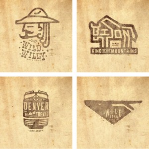
Jeremy Pruitt, aka Thinkmule, has quite the logo portfolio. Many more here....
Before his passing, Doyald Young was working on a collaborative poster with Josh Higgins as a gift for a mutual friend. Since the project was unfinish...
Letterpress printer Anna Fewster uses time-honored printing techniques—metal type, hand-cut linoleum and wood blocks—to produce the colorful and artis...
There are so many great pieces in Jillian Frey’s portfolio that it was tough to choose which to feature. Though I have to say I loved these gift cards...
For the Sentimental Journey postcard series, poet Kate Camp collaborated with Sarah Maxey and Kris Sowersby in a somewhat exquisite-corpse-themed proc...
I’m fairly certain I’ve never met a Stitch project I haven’t liked. So unsurprisingly, I love the new identity they’ve created for photographer Charlo...
Check out this new project from TunnelBravo—the identity for The Arrogant Butcher, a new restaurant in Phoenix, Arizona. It looks like it was such a f...
Theory 11 just released a Special Edition metallic version of the classic Bicycle playing cards. An infographic of infographics. I’m really excited ab...
Wallflowers is a beautiful pattern font by Laura Worthington....
Dreamland is a series of surreal, digitally-enhanced landscape photographs by Serbia-based artist, Katarina Stefanovi?....
Illustrator Edward McGowan has really built up an amazing body of work in his distinct, vintage-inspired style. I am particularly loving the use of vi...
I’m so glad I stumbled upon No.Zine, an arts publication that is curated and art directed by Patrick Fry. Each issue features a variety of artists and...
This gorgeous image was plucked from the vast Flickr stream of Leslie Thomson....
Home Truths is a series of twelve screen prints by Sam Bevington. Originally created for an exhibition back in 2010, the posters were inspired by Engl...
Hickoree’s Hard Goods stocks a selection of structured canvas bags that I am coveting right now. Here are a few stand-outs. Stanley & Songs Logo Tote ...
These typographic postcards by Ana Areias feature a set of absolutely gorgeous, hand-carved, characters inspired by the city of Barcelona. Take a look...
It’s tough for me to resist a colorful suite of patterns, so I’m loving this identity system for Beau Monde by Victoria Macey....
Merry is a new hand set font by Jeff Rogers, featuring a large set of characters, ornaments and options. Pick it up for yourself at You Work for Them....
Seeing as I pretty much live and breathe by to do lists, I am loving these new tablets from Knock Knock. Though I do wish they had an option with all ...
These two talented ladies—Alana McCann and Lizania Cruz—both have some lovely invitations for Anthropologie in their portfolios....
I’m usually a big color person, but today I’m really loving this white-washed series of images by Matthias Heiderich. via Bright Bazaar...
Check out these two postcard series for Poplarville, Mississippi by Kyle White—set one and set two....
I love making inspiration boards, and luckily I have the privilege of creating them for Brooklyn Bride every week. But I wanted to bring something alo...
Hello readers! You may have noticed some small changes around here lately. Well now we’re introducing two more: Related Posts: We’ve added a related p...
Take a look at these colorful, playfully stamped packages from the Gilded Bee. How fun would it be to find this at your front door?...
Sincerely Yours, by Ananas Press, is a handmade book that explores the signatures of well-known artists. via Upon a Fold...
It’s great to see the extent of Penguin’s commitment to design as they continue to release new series; the latest being Penguin Essentials. This time ...
MadeService is the design studio of Matt Yerman and Jackie Ngo (who I previously posted about last year). There’s a lot of great design and illustrati...
This week I’m starting two new recurring post series, starting with Etsy Finds, which I will feature every Tuesday morning. I spend more time than I s...
I’m loving these sleek, modern print and identity pieces designed for architecture firm, Elenberg Fraser. by Fabio Ongarato Design....
These crystal clear animal portraits by Morten Koldby are simply stunning. via The Inspiration...
Even though they don’t sell women’s items, I’ve been a big fan of the vintage Americana look of CXXVI Clothing Co. since their launch. So it’s no surp...
This post has been removed at the request of the designer....
Good morning readers! Apologies if you experienced any site glitches or down time in the past few days. We’ve been dealing with a hosting upgrade behi...
I’m loving Matt Lewis’s illustration and design for Baa Bar, a UK-based chain of nightlife establishments....
There’s plenty of clean, modern stationery goodness in the portfolio of Australia’s Sweet Creative....
This piece of work, called “Byway”, is past of a new series of acrylic paintings by Tyson Anthony Roberts....
There’s some great examples of small-scale, one-color, print work and stationery in the portfolio of Matthew Hancock, a London-based designer....
I’m loving the interesting combinations of color and textures in the print work of Harry Diaz....
Designed by Ekaluck Peanpanawate, Knight Sans is a contemporary sans serif typeface. The three weights—light, regular, bold—have details that veer tow...
Today I’m pleased to present some examples from the portfolio of pupilpeople, a Singapore-based design studio. 2011 SELF-PROMOTIONAL CALENDAR KICHN BR...
When I am designing for a wedding, I approach it as I would any other branding project, and attempt to capture the essence of the couple through messa...
I last posted about the work of Genevieve Simms way back in 2009, so I thought it was about time to check in on her again. It’s nice to see that she i...
Here is a super chic identity design for Edit Fashion, by NYC-based Watson & Company....
Inbox (12) is a series of international fanzines in postcard form. Each set includes 12 postcards designed by a series of illustrators based on the to...
Somehow I lost track of where I initially came across this project by The Unicorn Kingdom, aka Zach Graham. But I was really impressed with his sweet ...
For the new High Street Kensington branch of Urban Golf, Mammal decided on the theme ‘Quintessentially English’. To achieve the look, the agency commi...
Letterpress printer Elizabeth Hubbell always produces such charming design and illustration work. So it’s no surprise that she’s extended her sweet st...
I’m currently wishing I was in viewing distance of the new signage project, 12 Months of Neon Love. The project will begin on St Valentines Day 2011. ...
I’m loving all the intricate details and line work of Roison, a display face by Marta Podkowinska, which is available for purchase at hmf.com...
Love this stop-motion video for Rue Magazine by Trent Bailey and You + Me Life Stylists. The Fox is Black Desktop Wallpaper Project featured Lisa Cong...
Here’s some fun hand-lettering from Miss Lotion, a Danish-born artist whose portfolio features everything from editorial illustration to portraits....
UK-based illustrator Sarah Abbott has a lovely, graceful style. via that’s happy...
Most people know Daniel Clowes from his popular alternative comics, like Ghost World, but I’m loving his portraits as well....
Love this self-promotional coffee kit by Sussner Design. via Allan Peters...
Take a look at this adorable wedding shower invitation Christine Wisnieski recently designed for a close friend. Inspired by her soon-to-be new last n...
A lovely spring image, in honor of Japan, by Vanessa Kim....
I’m a huge fan of Pietari Posti’s colorful, graphic illustration style. So I immediately stopped in my tracks when I came across his recent stamp shee...
There’s some lovely illustration and design work coming out of This Paper Ship, who I happened to find through Dribbble. Check out their shop for prin...
I’m absolutely loving the whimsical illustration work of João Lauro Fonte....
Glue is a think tank, whose brand identity was designed by London-based Magpie Studio. They’ve written such a great description of the work, I had to ...
Alda, an in-progress typeface by Berton Hasebe, “explores how a typeface’s weight may be represented beyond the width of the stroke.” Upon completion ...
I had hours of enjoyment with spirographs when I was younger, so Snowflakes & Spirograph, by Zim and Zou immediately caught my eye....
A little warning: this is not the typical dwl post. It’s politically charged, and may be offensive to some of you. But I have to say, when I received ...
Archetypes is the product of the collective efforts of Evgeniya Righini-Brand and Dominic Righini-Brand of Moscow-based Attitude Creative. The series ...
Not too many people are printing complete stationery systems any more, which to someone who loves print, is pretty disappointing. So I was super excit...
These awesome labels, all from the Prague Zoo and printed in 1963, are another find from Oliver Tomas’s massive collection. See the rest of his Czecho...
This next project was sent to me by Greg Washington of Vancouver-based Academy. The agency recently completed an amazing interactive interview with Ni...
London-based design studio OK-RM recently launched a new portfolio site. One of the projects that stood out to be was the identity for Zuneta, an onli...
For a recent promotional campaign, Lenlee Jenckes of Lenlee Represents challenged four of her photographers to create a campaign inspired by the vinta...
Check out these hand-printed, silkscreened posters by Tind. The labor-intensive process for the series of fifty one-of-a-kind prints resulted in uniqu...
Like everything in the Present&Correct shop, these Queen and King for the Day crown cards are super fun. Not only is the design adorable, but the fact...
I can’t believe it took me so long to come across these awesomely hilarious pieces by Aled Lewis, which are part of his Make Something Cool Every Day ...
Tenfold Collective put together a great list of Portfolio Dos and Don’ts for students and job-seekers. The latest Field Notes product is a Dry Transfe...
When I came across Sam Dallyn’s work, I was impressed with how clean, modern and polished every project was. And I especially loved the simple playful...
To celebrate St. Regis as a legendary New York Jazz venue, this promotional CD was released in partnership with Jazz at Lincoln Center. Designer Marci...
I’m loving the delicate line work and feminine style of Australian artist Caitlin Shearer—more of which can be seen on her blog. And luckily, she also...
In the spirit of yesterday’s holiday, I thought a primarily green palette was most appropriate. This hyper-saturated image was taken by Vince Alongi. ...
Yellow, aqua and taupe is certainly not a typical color combination for a wedding invitation. But it definitely works in this unique, illustrated desi...
I came across the work of Annemieke Beemster Leverenz through the State Mottos Project, where she illustrated the motto of Washington. And while there...
Advice from a Rapper is a personal project by Jessica Wright. This fun series pulls out the inspirational bits from popular hip-hop songs and styles t...
Fiancé, an extra bold, pillowy italic featuring numerous alternate glyphs, is the latest release from Sudtipos. Pick it up right here at My Fonts....
I’m super impressed with the packaging for Chris Tarry’s Rest of the Story jazz album. Designed by Jeff Harrison of Rethink Canada and featuring illus...
I’m loving these gorgeous watercolor illustrations by Nathalie Ouederni....
Check out these gorgeous illustrations by Oliver Barrett for the Charting the Beatles project. Prints are available at Imagekind....
Here’s a great brand for a celebrity-chef-owned restaurant in Canada: Fabbrica. Taking a cue from the name, which means “fabricate” in Italian, Concre...
While it’s easy to feel helpless witnessing the devastation in Japan from afar, there is always some way to contribute. Every bit—however small—helps....
We’re almost a quarter of the way through the year (how did that happen so fast??), so I know that New Year’s promotions are a bit out of date. But wh...
I pretty much stopped in my tracks when I spotted this amazing Mexican chain of cafés recently on We Heart. Designed by Esrawe in collaboration with I...
Mingo Lamberti just launched a new range of colorful cushions inspired by vintage tea cup designs. The limited edition collection (only 100 of each de...
Triptychs of Strangers is a photographic series by Adde Adesokan, where the goal is to “meet a stranger — take three different body shots — make them ...
Unfortunately this post accidentally went up last week unfinished. If you have happened to catch that, here’s what you should have seen. Check out the...
I’m loving these monochromatic collages of office and design supplies by Sweden’s Kontor Kontur. via Megan Gonzalez Pinterest...
The folks over at Dear Blank Please Blank have teamed up with Sapling Press to create a series of hilarious, letterpress prints. Check out the rest ri...
I’m a big fan of husband and wife team, Eight Hour Day, who are currently in the midst of a year-long working trip around the U.S. To mark this signif...
I’m loving the gorgeous hand-lettering and illustrated details of this invite for Anya Hindmarch by Liam Stevens....
Last week Kate Spade launched a new site, the new color of the month—yellow—and a new video collaboration, this time with Mother New York. Core77 anno...
This amazing wall covering was designed by Maria Abdulhamid of Marmour for La Fabbrica dei Giganti, a children’s book store....
I’m not so great at sticking to “Make Something Every Day” type projects. I’ve attempted a couple of times, but deadlines and life always seem to get ...
This amazing vintage matchbook label is from the vast collection of Oliver Tomas....
Australian designer James Kape will soon be embarking on a year-long working trip to New York. Since he’ll be looking for a design position while here...
When Alex Wright sent over his work, I was most drawn to the spreads he’s designed for Gopher Illustrated, where he is the senior designer. The quarte...
Sweet Sans, an open, versatile, engraver’s sans serif from MVB Fonts just flew to the top of my type wish list....
There’s some fun paper goods and prints over at 55 hi’s....
I’m currently loving the work of UK-based illustrator Adam Hancher. He currently has a piece (first one below) available at Tiny Showcase....
The Hungry Workshop has recently launched a letterpress print exhibition and sale to benefit the disastrous flooding that hit Queensland, Australia ea...
Last night I attended AIGA’s My Dog and Pony IV, where I had the opportunity to see four different designers in varying disciplines pitch a project. O...
I’m a big fan of Mary Kate McDevitt’s work (especially her mini goals chalkboards). And this Garden Luncheon invite is yet another example of her beau...
I came across Ross Clodfelter’s work on French Paper Sample Room recently, and was impressed by his entire portfolio. I’m especially loving this colla...
I’m loving this brand for Jazzoo, an annual fundraising event for the Kansas City Zoo. The look and feel was conceptualized and designed by Ai Carver,...
The aim of the identity for Fast Eddie’s Barber Shop, designed by Richard Arthur Stewart, was to evoke traditional Americana, a style that the Boston-...
Plaid is one of those classic patterns that I can’t get enough of. So I was immediately drawn to Marc Johns’ recent Plaid is Rad series. All of the dr...
Eric Smith of IDRAWALLDAY recently launched a new site with a whole lot of new work. I’m particularly loving these new t-shirt designs he created for ...
Did you catch Brent Couchman’s posts on Friends of Type last week? A-maz-ing. If you’re a cat person you will love Meow Doodle, a “collection of drawi...
Check out these hand-painted graphics and typography created by Rudi de Wet for Australian agency, The Furnace. I especially love the laser cut frames...
Here’s a beautiful collaged wedding invitation by Luci Everett. Love....
Love the mix of hot and cool in this piece by Khuan Caveman Co....
There’s some great textures and depth in these six and seven color screen prints by Steady Print Shop Co....
Jonathan Schmitt and the team at MarcusThomas conceptualized the I am CLE campaign in response to Lebron James’ departure from the Cleveland Cavaliers...
Great work for Seattle’s Still Liquor by Javas Lehn....
New Gestalten release, Treza, was designed by Parisian designer Benjamin Gomez and inspired by the classic American typewriter. Below are a couple exa...
I’m loving this (in-progress) display typeface designed by Missy Austin....
Behold Jay B. Sauceda’s latest project, All Around Cowboys, a series of portraits from the Cowboy Poetry Gathering in Alpine, Texas. I especially love...
UK-based illustrator Deanna Halsall has a lovely style. According to her bio, one of her biggest inspirations is a love of nature, and it shows....
Here’s a small sampling of some awesome work from Kevin Stanley Harris. Loving his style....
I’m a big fan of the work of Colorado-based Smokeproof Press—they always manage to come up with unique and playful ideas for their custom pieces. This...
Designer Frank Aloi came up with this bright, eye-catching packaging system for Divine Dairy, a new range of cheeses available in Australia. via Spine...
I’m loving these proposed identity elements for South Austin Brewing Co. by Oscar Morris....
I’m loving the offbeat color palette of this modern wedding invitation by Atelier 1A—it definitely seems apropos for a spring wedding in Thailand. The...
Check out these awesome nautical matchbox illustrations by UK-based artist Tom Frost. Luckily, you can pick up prints of them right here in his shop. ...
From the looks of his portfolio, Adam Brackney appears to be a modern day Renaissance man. His work ranges all the way from branding and packaging to ...
This incredible set of photographs by Paul Soulellis is making me want to hop on the next plane to Rome. What an amazing source of inspiration....
I am in complete awe of Fmio Watanabe‘s technicolor landscapes. via Miss Moss...
I am really itching to give this recent arrival at Upon a Fold, Circus at Midnight, a new home on my desk. Designed by Japanese paper artist Tegamiya ...
I’m loving this new set of screen printed Southwest greeting cards by Two Arms. The set of 6 is available, along with other printed goods, right here ...
Yet another reason I neeeed an iPad: Suitcase Type’s new app, Type Specimen. Kyle Tezak released two pieces from his Four Icon Challenge series—The Li...
I’m closing out the week with these fun type sketches by Joe Newton. Have a great weekend! ...
These photographs by Tamara Lichtenstein are downright dreamy....
Talented designer Curtis Jinkins has recently set up shop as Neighborhood Studio, starting with a series of awesome hand-printed posters. I can’t deci...
This vivid photograph was captured by Valeria of The Red Balloon Photography. Be sure to check out her blog for more lovely work....
Public School member Cody Haltom has recently launched a brand-spanking-new site. And with the new projects, a few of which you can see below, comes a...
Buenos Aires-based Carolina Torres has an illustration style I’m intrigued by—simultaneously dimensional and flat, with a quirky cast of characters an...
Opula, by Agency 26 Type is a fun display face that reminds me a bit of traditional tattoo typography. Available at Veer....
UK-based illustrator Jonny Wan was recently commissioned by DDB London to create a large-scale illustration to represent the unity of two of the world...
For the Wade showreel packaging, Rhett Dashwood chose to take a hands on approach. He began by scouring second hand stores for suitable books, and the...
Target never ceases to amaze me with their commitment to high-quality design; and this project by Aaron Melander is no exception. These pieces were cr...
KeeganMeegan’s latest project is a true feat of production. The Official Time Tracking Device was a collaboration between AIGA Portland, KeeganMeegan ...
Today I’m pleased to present the work of Andrea Stark, a recent graduate of New Zealand’s Massey University. This particular project, entitled Analog,...
Here’s a great identity for Bone Daddy’s, a Texas barbecue joint. The work was created by Dallas-based Matchbox, and prominently features the amazing ...
I am incredibly impressed with the conceptual and aesthetic quality of Emeric Trahand’s photomontages. This particular project, which you can read mor...
Arcano is an impressive series of letterforms designed by Giuseppe Salerno. Each letterform was hand-drawn in Chinese ink on Japanese calligraphy pape...
Sydney-based Maricor/Maricar brings together their loves of typography, embroidery and patterns in this “Sweater Letter” series. via What Katie Does...
Just a quick note to let you know that, starting today, I’ll be posting an inspiration board every Monday over on Brooklyn Bride! I’ve been a huge fan...
The Golden Set is a set of 15 hand-crafted envelopes featuring asymmetrical touches of golden paper, by Hong Kong-based artist Furze Chan....
Here’s a short and sweet edition of Quick Links for Presidents’ Day. If you’re lucky enough to have a day off today, enjoy! Check out this behind-the-...
Check out Mette Hornung Rankin’s contribution to The Sketchbook Project: Things That Stick....
I’m loving this unique wedding invitation for Andrea and Roby, by La Tigre Design and Direction. Great color palette....
Learning calligraphy (or taking a class at least) is one of my 2011 goals, so I am currently obsessed with these gorgeous samples by Kate Forrester....
I can’t stop staring at this gorgeous painting by Michelle Armas. via frolic...
I don’t feature enough interactive work here, so I was excited when Josh Rhode, who operates under the name Kult House, sent over his portfolio, which...
To promote an upcoming AIGA Salt Lake City event, The Mandate Press teamed up with Dan Christofferson to create a companion poster and postcard set. T...
The latest product from Brian Everett is this fun pair of tea towels, featuring an intricate cityscape. You can purchase either the night (warm gray a...
Trilon is a huge new type family from Terminal Design, which was created in response to the complaint of a designer friend that hates almost every san...
I found this treasure trove of vintage inspiration very randomly while doing research for a new project, and I’m so glad I did. The Rumsey Collection ...
I’ve just stumbled upon Elsa Mora’s most recent project: Miniature Artist Books, and I am every bit as fascinated with her new venture. I think anythi...
I’m loving these playful, colorful cards by Sydney-based The Lowercase. The set includes three cards with a simple message that’s taken to a whole ne...
I know we most often show the finished product around here, but I am equally—if not more so—inspired by the process. Take these type sketches by Matt ...
Today I present to you Becca Stadtlander, a talented artist who I wish I discovered sooner. There seems to be a real sense of history in much of her w...
There is some lovely calligraphy in the portfolio of Sergey Shapiro....
Johnny Chang, a recent grad of the Art Center College of Design, has lots of great identity projects in his portfolio. However, I was really impressed...
Unfortunately there isn’t much context provided for Atelier Punkt‘s identity, by Montreal-based studio Feed; though from what I gather it is a unique ...
This playful and sweet identity for Lecca Lecca, a couture children’s clothing line, was designed by DHNN, a Buenos Aires-based studio. I love that th...
It wouldn’t be Valentine’s Day without at least one Valentine post, so I thought I’d feature these sweet and modern designs by Mike Smith. Mike create...
Up There is a lovely short documentary about the art of hand-painted advertising. This process amazes me; and I feel incredibly lucky that I’m able to...
For her son’s first birthday party, Eunice of Hello Lucky created this adorable circus-themed invitation. I am loving the playful illustrations, and w...
These interesting patterns were created by Iconblast, aka Victor Ortiz, for Nine West....
I’m shocked it took me so long to discover All the Buildings in New York, a project by James Gulliver Hancock where he—you guessed it—will attempt to ...
Looking at this photo from this Flickr set, by Tomo Kohsaka, really makes me want to step up my breakfast game. Plus, the color palette seems perfectl...
I’m interrupting our regular inspiration posts with a quick announcement. Many of you are aware of head vs. heart, my wedding blog. Well, as of today,...
Here is a sophisticated, masculine identity that Paris-based designer Xavier Encinas created for photographer James Moes—whose work I also very much a...
I’m loving these packaging illustrations by Georgina Luck. via Illustration Served...
We have some pretty talented readers. Often times the work that I post comes through clicking on the links of commenters or Twitter followers, which i...
Preface, a sans serif with some truly interesting letterforms, was designed by Nick Shinn in 2003 as a unique alternative to Helvetica. type specimen ...
You may remember Kelli Anderson’s Dig for Fire identity I posted a few months ago. Well, now the site has launched, and it is a whole work of art in i...
Brandon Wilson recently collaborated with Brent Anderson of Stir on this new brand for Ride Four Ever, a Kansas City skate shop. The designer/writer t...
I recently discovered Shyama Golden’s work and became an instant fan. I’m especially loving this playful piece done in oils, Home Sweet Brachiosaurus....
It’s rare to come across any cd packaging these days, let alone the elaborate, letterpressed variety; so unsurprisingly, this gem caught by eye. Desig...
Daniel Ray Cole is an Atlanta-based designer with a portfolio filled with print, illustration and typography projects. Out of the bunch, I’m really dr...
Today I am loving this series of hand-drawn, vintage-wallpaper-inspired patterns by illustrator Kiley Victoria. via Where the Lovely Things Are...
If I could, I would wallpaper my house with the lively works of Christian Northeast. His unique mix of hand-drawn typography, offbeat illustrations an...
Minibar for the Mind is a new collaboration between The School of Life and Morgans Hotel Group, that aims to provide guests with a more meaningful and...
Here’s a charming identity for Perrine’s Wine Shop by Alvin Diec....
What began as a Valentine drawn for his wife turned into a series of venn diagrams, hand-drawn on lovely tea-stained paper. By Gerren Lamson....
SRCP is the work of London-based designer Sam Renwick. This particular project is a series of service brochures for Astra, a European satellite servic...
For the next issue of Uppercase Magazine, over 40 letterpress printers have contributed samples of their work. Each issue will include one sample chos...
I love the clean, modern style of this promotional piece for Hale Empowerment Revitalization Organization, by Chicago-based designer Luke Williams....
Sifted: Handpicked Recipes From Our Mothers is a cookbook that Aimee Gauthier designed, wrote and curated. Both the content and design aims to honor t...
I’ve admired the cover of Gabriel García Márquez: The Early Years for awhile, but could never find any information on the designer. So I was excited t...
I would love to be wherever this photo was taken right now—sun-drenched and warm. Beautiful work by Laura Taylor....
What first caught my eye in Albert Pereta’s portfolio is the handful of typography snippets he’s featured. The few glimpses offered make me excited to...
The Four Icon Challenge is an ongoing project by Kyle Tezak, where he boils down various films, books, etc. into just four succinct visuals. He plans ...
I’m completely enamored with the the identity of St. Louis-based studio, Almanac. The concept and details are carried out beautifully across all of th...
Great modern wine packaging by Barcelona-based studio, Atipus....
Suti is a fun brush script by Mike Melvas. Available right here at MyFonts....
I haven’t done a whole lot of traveling abroad, but these promotional videos for EF Language Schools have me itching to. The short films are the resul...
If you’re not aware, 50 and 50 is a project where fifty designers were invited to represent their state by illustrating its motto. And now, the first ...
These beautiful vintage books have each received a one-of-a-kind embellishment courtesy of Frank Chimero. Each piece was originally created for his ex...
I’m loving this identity by Luchocorrea for Brown, a small, artisan confectioner in Bogotá, Colombia....
This work for the AIGA New Mexico Showdown is the result of a collaboration between Hieronymus and Jesse Arneson, with photography by Karen Kuehn. Acc...
Lately I have discovered so many talented designers and clever projects through The SVA Designer as Author MFA program, and Mrs. Connection is certain...
When I happened upon Lesley Weiner’s portfolio, I was pleasantly surprised to learn that she’s one of the creatives behind Mélangerie’s playful paper ...
If you’re looking for a unique Valentine, these letterpressed cards by The Hungry Workshop may fit the bill. In addition to the playful concept, I lov...
CF Napa seems to have successfully cornered the Napa Valley wine market. Their portfolio is filled with packaging and marketing materials for various ...
For a recent mailer, the team at Collective Approach transformed a collection of vintage London postcards into a modern and unique promotional piece....
I’m loving Hunt Studio‘s beautiful new identity. via site inspire...
For the cover of Bluetooth’s publication Signature, Adam Voorhes and Will Bryant collaborated on a stop motion animation. Check out the animation belo...
There’s some excellent work in the portfolio of Julian Zimmermann, including this identity for—believe it or not—an African King. Take a look right he...
Here is a fun identity project by Elliott Walker, who I briefly mentioned in the Quick Links post earlier this morning....
Good Reads: The Typographic Monotony of American Retail, Should Designers’ Business Cards Be Designed?, Be Who You Are. I get asked how to find work r...
Here are some light, airy, dreamy photos by Lola Thomasina. There’s a lot more to see in her Photostream, so be sure to take a look....
This lovely series of 12 illustrations, by artist Camilo Carmona, was inspired by various bird species native to Colombia....
Agnieszka Szatkowska is a 22-year-old illustrator from Poland. I’m really loving this family of interesting characters she’s created....
Lovely colors in this photo by Mary Claire Roman. If only it were warm enough for bare arms in New York!...
Face. has some great identity programs in their portfolio, including this one for Milla Suri, a beauty boutique in Mexico....
Eleanor Rudge was commissioned to create a set of eight table mats for Chiswick House in London. Each one illustrates the story of various owners, inh...
Samuel Castaño is an illustrator and designer from Colombia who has quite the talent for collage work. This illustrated book is a perfect example. Get...
Tabac Sans is a new release from Suitcase Type, featuring eight weights and a huge variety of Open Type features. Pick it up from My Fonts right here....
I’m popping in late tonight to share these redesigned Kafka covers by Peter Mendelsund. All i can say is, wow....
This beautiful cookbook, La Puglia in un piatto, was conceptualized and designed by Usopposto. Here is a description of the concept, direct from the s...
I’m a big fan of designer Amelia Grohman‘s letterpress work. I spotted the first piece, designed for Peter Kruty Editions, way back in HOW’s 2006 Prom...
For a variety of modern wine packaging, check out the portfolio of Portugese design studio Play Me....
This modern, geometric identity was designed by Dowling | Duncan for Future Designs, a bespoke lighting systems company. Since its creation Dowling | ...
I’m loving this letterpress promotional piece that Dan Blackman designed for Cranky Pressman. The piece was created for the next issue of Uppercase Ma...
Maya from Visual Lingual recently alerted me to the work of Beth Katleman who created this amazing three-dimensional toile. via Visual Lingual...
I love everything in Cleveland-based designer, Christine Wisnieski’s portfolio. The works include both personal and professional projects that she’s c...
There’s some great work to be seen in the portfolio of Steph Davlantes. I’m really loving this program for Bold Bald, a head shine product targeted to...
Adam Katz is a fellow Syracuse Grad and current MFA Candidate in SVA’s Designer as Author program. For Stefan Sagmeister’s “Things I Have Learned in M...
I’m always on the lookout for unique notecards; and right now these hand-drawn beauties from Deadweight are calling my name. via Creature Comforts...
Funnel, the studio of Eric Kass, recently launched a new site to showcase all of their beautifully layered work. This identity for Films by Francesco ...
Today I’m pleased to feature Gerren Lamson, an Austin-based designer at Springbox, whose portfolio is brimming with a variety of colorful designs, ill...
Good Reads: Whiteboard Accounting, Creative Workplace Safety, Lab Rat: Do Your “Most Important” Tast First. Pork and Jeans is a collection of random t...
Awhile back I posted about the beautiful Moving Brands work for Norton & Sons, a fine London tailor. Following the success of that launch, the proprie...
Loving this collection of letterpressed business cards by Rabe & Company. (Also doesn’t hurt that as a Top Chef fan Lee Anne Wong’s name caught my eye...
Kim Winderman’s quiet, contemplative photographs have succeeded in making me stop and appreciate nature’s intricate details....
Melvin the Realtor is from this amazing Flickr set celebrating 20th century nostalgia. via Miss Moss...
one point oh just released a beautiful new limited-edition set of typographic prints, entitled You & Me. Pick it up right here....
Holly Wales has some great new stuff in her portfolio since I last checked—these motel prints being one of the highlights. I’m also really loving thes...
Three of the talented gents of Public School recently had the opportunity to produce World of Geekcraft, a new publication from Chronicle Books. World...
Any shade of blue-green captures my attention immediately. So take that and combine it with an intricate and letterpress, and I’m hooked. The Office o...
Mistakenly, I never posted about Brandon Grotesque when I first discovered it; but it recently came back on my radar due to this Fonts in Use post on ...
Somehow I missed these beautiful packages Stuart Kolakovic illustrated for Marks and Spencer a little while back. They’re still very much worth a look...
I just took another look at Wallace Design House’s photostream (originally posted about designer Dustin Wallace here), and there’s lots of awesome new...
I’m so excited about this next project that designer Leen Sadder, a graduate student in the SVA Designer as Author program, conceptualized. For Stefan...
I can’t get enough of the whimsical illustrations that make up The Side Show Circus book by Dan Bob Thompson. via Eight Hour Day...
Here is some beautiful work by Sydney-based Ivana Martinovic. This particular project was created to celebrate Vision Day at Landor Sydney. According ...
I’m absolutely loving these vibrant illustrations by Till Hafebrak, which appeared in Nobrow’s Night and Day publication....
Minneapolis’s Sussner Design launched a new site a few months ago, and I finally just got a chance to browse around a bit. As expected, all the work i...
To celebrate five years of business, today marks the launch of a new website and a special contest for Tandem. Here are the details, straight from the...
The Kate Spade brand is one of my favorites, when it comes to both their products and their marketing efforts, so it’s great get a peek into the portf...
This sophisticated packaging system was designed by German design firm, Flaechenbrand for a new line of gourmet beers by Braufactum....
In case you missed it, Should I work for Free is a new—and useful—infographic by Jessica Hische. Loving the new sites for Creative Mornings and CSA De...
Stationery lovers, this one’s for you. Rad and Hungry is a new company that offers monthly, international stationery kits on a subscription basis. Whe...
Believe it or not but these incredible photographs were created by seventeen-year-old Chrissie White. Seventeen!...
Oklahoma-based FOUNDRY CO is producing some really amazing work, from identities to collateral to packaging. The Belle of Saint Louis brand, which it’...
Beautiful, wintery bokeh by Jackie Rueda....
Greg Pizzoli’s illustrations are instant mood boosters. They’re so vibrant and cheerful, and such a contrast to the gray, snowy winter weather we’re e...
Each month Wired magazine asks various contributors to illustrate the edition number of their magazine. For A Friend of Mine‘s recent contribution, th...
I’m loving the sketchy and colorful style of illustrator Hye Su Lee, who splits her time between New York, Korea and London (lucky girl). To follow al...
First discovered over at André Mora’s site, Trigot is a modular display face by Michael Hübner crafted entirely from the basic form of the triangle....
I love hearing from readers who are getting something out of the work I put into dwl on a daily basis. And furthermore, I love it when those same read...
To honor 2011 as the year of the rabbit, Bryan Flynn of Botto Arts created this whimsical poster. Giclee prints are available right here....
Take a look at the moody, fantastical photography of Martin Stranka....
Nathan Godding, a senior at Academy of Art in San Francisco, is one talented student, with an impressive portfolio. I’m particularly loving this playf...
I can’t get enough of Ana Albero’s style and stunning use of color. This particular pair of illustrations is from Nobrow 4: Night and Day, which you c...
I stumbled upon Nostalgia Organics on etsy awhile ago, and somehow the bookmark got lost in the shuffle. The designs have since been posted on the the...
The identity for Pazo Baión, a wine cultural foundation in Spain, includes this elegant and sophisticated bespoke typeface in sleek black and white. B...
As a former dancer and current New York City resident, this extensive series of photographs—Dancers Among Us by Jordan Matter—grabbed me immediately....
For a personal project, Matt Roeser chose to take some of his favorite books and redesign their covers. Here’s a few of the covers he’s completed so f...
In the same vein as A Collection a Day, The LA Times Magazine’s 50 series pulls together a collection of objects on a given category, from snow domes ...
This morning I’ve been admiring the diverse portfolio of Evan Stremke, who is currently a designer at Swink....
There is a great assortment of illustrated packaging, mainly for various beers, in Kendrick Kidd‘s portfolio....
Good Reads: 30 Steps to Mastery, How to Get Paid What You’re Worth, In-depth: Comedy Central Re-brand, The Six by André Mora. What do you think of Sta...
This time of year there is no shortage of complaints (by me, included) over how early nighttime creeps in—it’s especially tough here in the city where...
I’m loving this new identity for Xnilo Design Studio by Robinsson Cravents—especially the dynamic, exploding pattern created from the logo graphic. Th...
Yes, it is 2011. I’m aware. But this colorful typographic illustration actually accompanies Brent Couchman’s favorite albums of 2010. Check out the ar...
I’m intrigued by the dreamy, magical universe that Violeta Hernández has brought to life through her work. These particular images are from Exótica, a...
Play-Doh was by far one of my favorite toys growing up. (In fact, I still have a can of it sitting on my desk.) So this student project very quickly c...
As promised, here are my ten favorite typefaces from 2010, many of which you’ve seen in past Type Loves. This isn’t a “best of” list by any means, jus...
33.3 is an art show opening this weekend, January 8th, in Cedar Falls, Iowa. For the show, each artist was tasked with the challenge of reimagining an...
I’m loving the exuberant use of color in Ricardo Cavolo’s illustrations. Lots more to see right here....
Take a look at this French Heraldry Exhibition by Hugo & Marie artist Jules Julien. I’m loving the juxtaposition between the clean, modern graphics an...
I’m a big fan of Anagrama’s work, so it’s no surprise that I’m loving this identity system for Micheline, a stationery boutique in Mexico. Between the...
I briefly mentioned this site in this past Monday’s Quick Links, but I’m so excited about it that I feel it deserves a post of its own. Fonts In Use i...
I’m not sure what it is about vintage-looking diagrams, but I cannot resist them. So, of course, I was immediately drawn to this identity designed by ...
For this year’s holiday gift, Marx Design chose to create a wine bottle design. The series of three bottles play off the founder’s last name by making...
The To Resolve Project is the creative effort of Chris Streger. He put out a call for submissions for designers and illustrators to submit an iphone w...
If you’re a New York Magazine subscriber, you may have caught Timothy Goodman’s amazing intro for their annual Where to Eat section this past week. It...
http://www.emmarogan.co.nz/...
Happy New Year everyone!! We had a nice relaxing break, so I hope you all got to enjoy some time off as well. Now that we’ve had some time to step awa...
Starting today, we are taking a much-needed break to relax with friends and family over the holidays. If you have any time off in the next week, enjoy...
Yet another fun Dribble series (thanks so much for the invite offers everyone!) is this one where designers visually represent their hometowns. It all...
It seems like fewer and fewer organizations are producing annual reports these days, so I was pleased to see this design for the White House Project b...
The Conquest, by Delane Meadows, is an infographic that visualizes the travels of the characters in Harry Potter and the Deathly Hallows. Click on the...
What I love most about this image by Kimberly Chorney of Butterfly Photography is that it manages to be both chilly and wintry and vibrant and warm....
This is perhaps more appropriate for Valentine’s Day than Christmas, but I’m loving this typographic screenprint by UK-based studio onepointoh. The de...
The pure creativity of kids always amazes me, so I was instantly drawn to Wander Monster, a blog that chronicles a collaborative project between desig...
Lincoln Supply Co., a new line of vintage Americana-inspired clothing and accessories, is the brainchild of designer Jeremy Beasley. Personal attentio...
Dala Floda, from Commercial Type, is an unusual stencil typeface that was originally inspired by the lettering on worn gravestones and shipping crates...
The goal of the Unloved Collection, by London-based Supafrank, is to collect unwanted products and give them new life. They’ve done just that with the...
I love that many of Josh Higgins’ poster designs focus on one central and compelling image. You can see many more examples of this right here, and pic...
I’m a big fan of Scout Books and all of the possibilities they present, both inside and out. At the moment I’m particularly loving these white composi...
Today I’m pleased to present the work of South African artist and designer Daniel Ting Chong. I’m loving the chaotic, unpredictable quality of these p...
As someone who is always fascinated by the process of designers designing for themselves, this identity redesign is of particular interest to me. Desi...
I don’t have a dribbble account (hint hint readers with extra invites :)), but it’s always fun to pop over there and catch a glimpse of what some of t...
Small Horse Studio is the husband and wife team of graphic designer Trevor Basset and illustrator Gaelyn Woltz. Their combined efforts have resulted i...
When designer Jon Jackson accepted a job that would take him from Los Angeles to New York, he wanted to leave with a bang. And what better way to send...
Exciting news—Peggy of bluepoolroad has decided to offer her holiday goodie box once again this year! This fun little package offers a variety of new ...
Here are some great book covers, in a pretty wide variety of styles, by Kulick Design....
I have heard so many great things about Steve Martin’s new novel, An Object of Beauty, that it has flown to the top of my reading list. So I was thril...
This morning I’m excited to introduce to you 1200 Posters, a new project from Aaron Perry Zucker and Big New Ideas. On the twelfth of each month throu...
Have you seen Jeff Bridges’ site? If not, check it out. I was completely shocked and amazed by his hand-drawn type and illustrations. who knew? Krisat...
I’m loving Kirsten Swank‘s take on the Mad Tea Party theme for Olsen‘s annual Mother’s Day celebration....
Next up, eighteen-year-old Valerie Chiang, whose work is light, airy and whimsical. These images in particular are from her A Scenic World series, mor...
Today I’m featuring the work of two young and gifted female photographers. Both are equally talented, but have decidedly different styles. First up, A...
How fun is this quirky vintage Christmas illustration?? Found right here in Heather David’s Flickr stream....
ABC is for Circus is a a children’s board book featuring the fantastical illustrations of Patrick Hruby. The book teaches children their ABC’s through...
This creative and humorous campaign was created by Allan Peters and copywriter Eric Hansen for BBDO’s 80th Anniversary celebration. There’s lots more ...
Ordinary Company is the work of Matthew Genitempo, a member of Public School. This identity system is for an imaginary, patriotic beer brand that they...
Like a Glove: A Love Story is a unique and wintery poster designed by Bureau of Betterment. The intricate artwork is actually composed of a series of ...
I realize some of you may be completely spent on 2011 calendars at this point, as we’ve been flooded with them since October. However, I’ve come acros...
According to Process Type Foundry: FindReplace is the result of tinkering with the typeface-making process while aiming for a result resembling conven...
Love Aaron Eiland’s poster designs....
For her senior project, University of Wisconsin student Sarah Mick branded the proposed high-speed railway for Wisconsin together with Christopher Pau...
This is the first of two Student Spotlights for today. Normally I combine multiple designers into one post, but the work these two ladies are producin...
Here’s a fun set of New Year’s resolution themed postcards by Andy Babb. You can pick up a set right here, with a special discount for dwl readers. Us...
When looking back over this 2000+ posts published on this blog, I was shocked to see that I had never actually posted about Mikey Burton’s work. I’ve ...
New York City-based Schwartz & Sons is producing some really high-quality, sophisticated work, including this identity system for The Jane Hotel. ...
I’ve had a love for neon ever since I can remember—back in the late 80s I outfitted myself almost entirely in DayGlo colors. So ever since I got my se...
It’s no secret that I am not a huge fan of the whole facial hair trend (when it comes to design, not people). I never really got the appeal of it, and...
The folks over at Physical Fiction just cooked up a new set of prints. Check ’em out here....
How amazing is this new print from The Heads of State?? The always awesome design duo took the guest list from Chapter four of The Great Gatbsy and cr...
I was so glad to hear from Vikki of Veekee Workshop recently. It’s a paper goods brand that I wish I’d seen sooner, as she has a great style and sense...
Beautiful packaging and posters for Muse Perfumery by Wink. More photos and information can be found here and here....
Here is yet another great piece from Stitch Design Co., the call for entries poster for the Indie Grits Film Festival....
I’m always a fan of holiday items that use atypical color palettes, so I was immediately drawn to w+k studio’s typographic Jackpot Card Set. There’s n...
Most of you are probably familiar with Erin Hanson of Recovering Lazyholic. Her work is simple, smart and witty; and she hasn’t made a piece I didn’t ...
Need some last minute gifts? Here are a few great guides: The 99 Percent, grain edit, Swiss Legacy, FormFiftyFive. Check out Skinny Ships’ Top Ten Alb...
Los Angeles-based art director Jeffrey Docherty has a portfolio that certainly reflects the depth of his experience. This system for New Republic, a c...
Andrew Janik‘s illustrations and infographics are smart, cheerful, and just all-around fun to look at....
I’m loving the retro style, intricate details and saturated colors found in Vesa Sammalisto‘s illustrations. More here....
This series of six B-movie-inspired ecards was created by Will Staehle for the Type Director’s Club. They can be sent to your typographically-inclined...
Here is a great identity for Houdini, a newly formed creative agency in Australia. My posts are usually short, but Head of Design Darren Cole sent ove...
This colorful piece by Zutto features a monastery in Spain where Christopher Columbus received the Catholic Royal Family’s support to star his trip to...
I’m incredibly impressed with this thought-provoking installation by artist and writer Daniel Patrick Helmstetter. Danny’s Continental Cockatail Loung...
Designer Kacie Yates recently sent over this promotional piece she designed for Southside Creative. When Warehouse Row opened next door, the firm took...
Each year Tad Carpenter does a great job of coming up with a unique set of Christmas cards. He always uses a slightly offbeat, atypical palette for ho...
I’m a big fan of Studio on Fire’s annual letterpress calendar. I’ve owned a couple of the past editions, and even had the privelege of working on some...
Brilliant is a great new stencil typeface by FaceType, with three, equally readable weights. (It’s also 40% at My Fonts at the moment, so get in on th...
You may remember Dan Cassaro’s from his Springstreets project that I posted about back in August. But I recently took another look at his portfolio, a...
This morning I’m admiring the nature photography of Maria Kallin of Sweden. If you also like Maria’s work, she has quite a few prints, as well as a co...
I’m loving the peaceful, quiet beauty of Jon McNaught’s work....
Here’s a way to make your daily computing experience a little more playful: these picture alphabet keyboard stickers by Christopher Monro DeLorenzo. Y...
I’m loving the album art Mike Dornseif created for Yael Meyer‘s Heartbeat EP. Such a great color palette....
I can’t stop staring at these meticulously detailed, and therefore labor-intensive, paper cuts by Elsa Mora....
I’m so glad Lindsay of the Heavyweights sent this link my way… Photographer Tim Lisko left his shutter open while on a high-speed bullet train from To...
When Katie Turner sent over her work, I immediately loved her energetic, sketchy illustration style. This personal journal depicting her recent trip t...
Check out these limited edition, art deco-inspired posters for Darren Aronofsky’s Black Swan. From what I’ve read, it seems this series was released a...
Unfortunately, all of the pieces of this packaging design suite for 20×200 by Kelli Anderson weren’t produced this year—hopefully they’ll pick it up f...
Intelligence in Lifestyle Magazine is a supplement to the Italian newspaper, Il Sole 24 Ore. One of the art directors One of the publication’s art dir...
Paul and Jordan Ferney’s Let them Eat Cake paintings are now officially available as prints! Pick up the confection of your choice right here for $39....
Good Reads: Getting Creative Things Done, Lernert & Sander: It’s Time to Leave Your Comfort Zone, 10: Time and Movement in Book Design, Grid Systems: ...
If you’re looking for more affordable art gift options, look no further than The Mammoth Collection, a curated selection of art prints in a variety of...
Cloudy Collection’s latest series, Volume II, Edition 4, focuses on the idea of simplicity. The pink and black prints feature the work of seven differ...
1. Sparkling Ornament Wreath, $65.00 / 2. No Kid Hungry Holiday Cards, $35.00 donation and up / 3. Two-sided Wrap, $20.00 / 4. To You, From Me Gift Ta...
These posters celebrating California’s wine country would make a great gift for any wine connoisseur. Designed by Hatch, the three posters are availab...
I’m a big fan of Valerie Jar’s illustration and design work, so I was excited to see that her 2011 calendar is now available. This year’s design featu...
1. Video Game Controller Poster, $30.00 / 2. Rhodesian Postage Stamp Cufflinks, $70.00 / 3. Icon Printed Banker’s Envelope, $250.00 / 4. Meatbagz, $38...
By now all or you should have seen Ty Mattson‘s great series of LOST posters; but this one is a little bit different. To commemorate the final season,...
My gift guides are all set up and ready to go, but I’ve come across a few other great gifts this week, so I will be featuring them here and there over...
1. The Swan Lake, $35.00 / 2. Buoy, $35.00 / 3. Descartes, $50.00 / 4. America, $14.00 / 5. A Fond Childhood Memory I Never Had, $20.00 / 6. Hamilton ...
1. Resolution Pencils, $8.00 / 2. Thoughts Postcards, $12.00 / 3. Collector Plate, $50.00 / 4. OMFG Journal, $8.00 / 5. Alphabet Greeting Cards, $398....
From Wikipedia: Fire Signs: Aries, Leo, and Sagittarius— Fire represents one’s desires and creative energies. The Fire signs are associated with actio...
From Wikipedia: Air Signs: Gemini, Libra, and Aquarius— Air represents the intellect and one’s ability to reason and communicate. The Air signs are as...
From Wikipedia: Water Signs: Cancer, Scorpio, and Pisces— Water represents imagination, human feelings and one’s ability to love and sustain. The Wate...
From Wikipedia: Earth Signs: Taurus, Virgo, and Capricorn— Earth represents one’s material resources, environment and possessions. The Earth signs are...
If you had any time off last week for Thanksgiving, I hope you enjoyed it! This week will be a little bit different as it will mostly be devoted to th...
I’m fascinated by this branding for 1.1 Architects by COÖP. According to designer Paul Marcus Fuog, “The collaborative practice was interpreted throug...
Three-dimensional artwork has never been my strong suit, so I’m always envious of those who excel at woodworking and things of that nature. For exampl...
I’m loving this Scott Pilgrim-inspired, pixelated, three-dimensional paper art by Ruth Afrita, a young designer from Indonesia....
This post was published temporarily last week as a result of some unexpected site blips—apologies if you happened to catch the incomplete version! Tan...
This colorful message, by holds no water, seems perfectly appropriate for this week....
Iceland is definitely on my dream travel list, especially after seeing these stunning photographs taken by Þorleifur Gunnar Gíslason. via Swatch MTV P...
Douglas Richard’s project, Farm to City, is a branding program that encompasses posters, print materials and packaging. Farm to City, an initiative th...
I’m loving this new pair of prints, Le Soleil & La Lune, from Double Merrick. The set has been printed in a very limited edition, only 25 copies, so m...
This post was published temporarily last week as a result of some unexpected site blips—apologies if you happened to catch the incomplete version! Ale...
I first came across United, by House Industries, via Tyler Galpin‘s (very well-designed, might I add) site, and was immediately drawn to it. It makes ...
There is a wide variety of intricate yet dreamy work in the portfolio of Los Angeles-based illustrator Julia Sonmi Heglund. I’m especially loving this...
Here’s a series of book jackets designed by Kelly Blair, a new-to-me designer discovered via the 30 Days 30 Covers project....
Beautiful illustration and collage work by Nazario Graziano, who draws his inspiration from a variety of sources including old books, rain and rainbow...
This post was published temporarily last week as a result of some unexpected site blips—apologies if you happened to catch the incomplete version! I’m...
This post was published temporarily last week as a result of some unexpected site blips—apologies if you happened to catch the incomplete version! Gre...
There is no question that Penguin has a great appreciation for design. Case in point, the final installment of the Great Ideas series, Volume V; and t...
Loving the chic and sophisticated branding for Le Buro, an identity from the design minds at Montréal-based Inventaire. via Typography Served...
This post was published temporarily last week as a result of some unexpected site blips—apologies if you happened to catch the incomplete version! Des...
This post was published temporarily last week as a result of some unexpected site blips—apologies if you happened to catch the incomplete version! I’m...
I’m really admiring the work of Vancouver-based Glasfurd & Walker. This project, brand design for Bao Bei Chinese Brasserie, is a great example of the...
This post was published temporarily last week as a result of some crazy site blips—apologies if you happened to see catch the incomplete version! Lond...
The World Gesture Guide, designed by Alba Durana, is a detailed handbook of international silent communication. The series, which features a book, fol...
Alex Griendling’s 2011 Time Traveler’s Calendar takes 95 separate time travel occurrences—from movies, video games, and television shows—and places th...
This post was published temporarily last week as a result of some unexpected site blips—apologies if you happened to catch the incomplete version! Whi...
You may recognize some of the projects below —I posted about Julian here and Glacé here— but now you’re seeing them in a whole new light. Copywriter e...
Lorena Siminovich, the artist behind Petit Collage, recently opened a new exhibition at San Franciscos’s The Curiosity Shoppe. If you’re in the area, ...
Normally this would be a light posting week since we have Thanksgiving on Thursday. However, because I didn’t get everything up as planned last week, ...
Strangely and sadly it’s been unseasonably warm around here lately. So I’m loving this image, by Sheng Han, that feels very Fall to me....
Terminal Design’s 718 is an ode to the outer boroughs of NYC, or “the real New York”, as they refer to the non-Manhattan area code. The sans serif fam...
If you also read one of my favorite design blogs, Graphic Exchange, you may have seen several posts about a 2011 Letterpress Designers Calendar. Follo...
Good morning! Just a couple of quick updates: SITE STATUS The site is back up to speed at this point (aside from missing the posts that were meant to ...
Studio Fludd has some great new items in their shop....
For now, we’re back up—we’re just unfortunately a few days behind. We’re still working on fixing everything, and we’re aiming to have the site complet...
Bay-area illustrator Michael Wertz came up with the idea for Dog Dreams while watching his own dog, Olive, sleep. And the result is an amazing, 2-colo...
You may remember the posters Martino&Jaña designed for the Guimarães Jazz 2009 event. I was blown away by the gorgeous hand-lettering they featured. W...
Loving PTARMAK’s work for men’s skincare line, Ursa Major....
I’m loving these quietly beautiful graphite drawings by Carson Ellis for The Decemberists....
30 Covers 30 Days is a current project of The Office of Letters and Light, in which 30 designers are paired with 30 participant authors and tasked wit...
Barcelona-based Dorian has just launched a brand new site. This particular project is a poster series inspired by various synthesizers and some of the...
I’m loving these chalk type drawings by Dana Tanamachi, who is currently a designer at Louise Fili Ltd. via Two Tall Blondes...
Wonderland, a hand-drawn font by Eve Duhamel, was created with felt tip pen for Fontself....
Philippine Welser is a modern housing complex in Austria with a friendly, lively vibe. To help realize that atmosphere, Typejockeys contributed an ori...
By Force is a book that accompanied the Summit of Cheap Laser Graphics, an event held in Belgrade the past two years. The book features a series of in...
Oliver Munday recently tackled the incredible task of branding the newest 826 store, 826DC. (If you’re unfamiliar with the organization, be sure to re...
Good reads: Inside Jonathan Safran Foers “Unmakeable” Interactive Book, Design Porn: Impressive Typographical Tattoos Matt Jacobs made a bookmarklet t...
Good morning readers! First task of the day is to announce the winners of last week’s Minted Giveaway. The three lucky ladies below were chosen at ran...
Here’s a little bit of info about EIGA’s new calendar, Play! Design for Kids:“The calendar contains an inspiring cross section of contemporary childre...
Cillian is a simple and affordable sans serif typeface with two weights available. Check out more style images here, and purchase on My Fonts....
This sort of blew up yesterday, but I still couldn’t resist posting it here. As a huge Kate Spade fan—both the products and the brand—I almost leapt o...
I’m loving the illustration work of designer/illustrator Dan Matutina, who hails from the Phillipines. Here’s just one example of his geometric, textu...
It seems that it’s getting more popular for big name brands to put more time and money into design, which is a great thing. But for the most part when...
Here is a beautiful identity by Fabio Ongarato Design for interior design studio K.P.D.O. The envelope flap treatment is such an unexpected detail, an...
I’m loving this new collaboration between Zeus Jones and Ty Wilkins for Cheerios. To engage their Facebook community, Cheerios is sponsoring this mont...
Australian designer Ben Wright, aka All Caps Yeah, designed this branding program for The Office of John Cheese digital production services while at B...
I abandoned paper planners for online programs quite awhile ago, but this 2011 monthly planner by Dozi may be swaying me in the other direction. Love ...
I’m starting to get in the holiday spirit—gift guides will be coming up in the next few weeks! So I’m loving this New Year’s card that was designed by...
I know, two giveaways in one week—it’s definitely a first! You may remember that I was a guest judge for the Minted holiday card challenge a few month...
This campaign for The Rolling Roadshow, a traveling movie tour, is a student project by Alex Bloom. The annual tour produces outdoor screenings in the...
I first became aware of Studio Bomba‘s work through their new line of paper goods, Mitchell & Dent (definitely worth a look). So I was excited to hear...
Congratulations Barbara and Amandah! with your mailing address and we’ll get the print out to you. Thanks to everyone else for giving it a shot!...
Blockhead is a pixel-based drawing app for the iPhone. Quite possibly the coolest/cutest group costume ever. Really looking forward to seeing The Infl...
Jennifer and Jed Heuer are one talented husband and wife design duo. Their work definitely has unique sensibilities but they are equally talented, as ...
I’m happy to introduce you to a publication from Chin Music Press, Where We Know: New Orleans As Home which will be released this month. What caught m...
This morning I’m admiring the work of Bryant Ross, who has quite a few restaurant brands in his portfolio from his time at Korn Design. It was tough t...
These awesome hand-drawn letterforms were created by Ryan Frease for Lettercult’s Alphabattle....
I’m loving the warm combination of colors in this piece by Jose Favian Sosa...
Kacie Yates, a designer at Southside Creative in Chattanooga, Tennessee, has a design aesthetic that I absolutely love—a mix of vintage and modern sen...
After looking through the portfolio of Nathan Hinz—one of the designers behind the Cue projects I posted recently—I was super impressed by the handmad...
There’s some great work in Colin Payson‘s portfolio, including this piece for the Prix Arc Awards. via FPO...
I’m loving these layered, textural art pieces by John Fellows. My favorite has to be the Where the Wild Things Are-inspired piece (last image), but th...
There’s no shortage of woodtype fonts out there these days, but what drew me to URW Wood Type is the fun possibilities that the Shadow version present...
Well, readers, do I have a treat for you today. Remember this post? Well Justin Larosa of Physical Fiction is generously offering you 2 free new print...
These warm sunny images by Sean Scheidt are providing a brief respite from the suddenly colder weather here in New York....
Loving this vibrant identity for La Cigala Zul, a seafood restaurant in Mexico, by Eduardo Hernández....
You may have spotted these business cards (3rd shot down), designed for v25 of Space 150’s brand, on Beast Pieces last summer. But you may not have se...
I’m admiring this simple yet approachable brand created for Babylon Gardens, a husband and wife landscape design team, by New Zealand-based Everything...
I’m loving this fun and slightly wacky promotion for Dr Lemon Tequila by Plenty, which aims to recreate the traditional Mexican Day of the Dead....
Heroes of Folk is a series of letterpressed cards by Scotty Reifsnyder (who has a new site and shop by the way), that feature characters like Annie Oa...
Just recently checked in with NothingSomething—I’ve always loved their intricate branding work—and came across this eclectic brand for Magnolia Gastro...
Dolce Press recently collaborated with the Divisionof/ team to create this really fun Good Morning/Good Night poster. The limited edition letterpress ...
I was instantly smitten with San Francisco-based designer Jackie Ngo‘s portfolio, which features a little bit of everything, including handful of web ...
Here is a small sample of gorgeous patterns created by Debbie Powell, who clearly has a beautiful sense of color. There’s so much more to see in her p...
Self-explanatory: icantfindmyphone.com Myspace Goes Blank Good Reads: CMS’s Party in Front…, An Interview with Sagi Haviv, The Most Important Question...
For an upcoming book entitled An Alternative Guide to the U.S., designer and illustrator Jon Ashcroft created a series of illustrations based on Phoen...
While the dwl audience is primarily U.S. based, I always find it exciting to “meet” designers and readers who follow us from around the world. So it w...
There are some pretty amazing colors going on in this photo by Cari Ann Wayman....
Over the course of a year, artist and designer Allison Connell bound a new book each month, each with its own interesting details. Each day she filled...
Playful illustrations by Blake Suárez....
Anti-Eco‘s mission is to “provoke awareness, stimulate dialogue, and alter actions regarding the current conservation of our earth’s resources” using ...
Monroe is a fun new new slab serif/script hybrid by Sudtipos....
There’s something about primarily pink brands I just can’t resist—especially when they’re designed in a clean, modern, non-girly way. Here’s a great e...
Some of you may be aware of the fact that restaurant branding is one of my favorite types of projects to feature. So I was really excited to be introd...
I was pretty psyched when Kate wrote yesterday to let me know that Cue had just updated their portfolio. I’m a big fan (previously posted about them h...
Edholm Ullenius, a team of two designers working in Stockholm, has one of the most colorful portfolios I’ve ever seen. Filled with pattern after patte...
Pryor Design is a small firm based out of Ann Arbor, Michigan with a wide range of work to their credit. Here are a couple of projects that caught my ...
I first discovered Manual back in May and was immediately impressed with their work, so I was excited to see they’ve recently published an update. All...
A recent look at BVD’s portfolio led me to a project I hadn’t seen before, the Smicker Dubblera identity. On its own the typographic system is super s...
I’m loving the sweet floral packaging for these French soaps found at online shop Cocobohème....
UK-based Aardvark makes letterpress broadsides using traditional wood and metal type. Their shop is stocked with with vintage-inspired prints includin...
Totems is a project by French photographer Alain Delorme featuring 15 images taken in China. Here is a little background information from the artist: ...
I’m loving this collection of graphic book jackets designed by Portugese studio, FBA. via Cosas Visuales...
One Million is a unique book, conceived by New Yorker editor Hendrik Hertzberg, whose aim was to make abstract numbers more concrete for the reader. O...
Hyperactivity Typography is now available for pre-order. Ty Mattson’s Dexter posters are now available for sale via Showtime! (Did you also see that h...
Loving this self-promotional infographic piece by Kenny Barela. via HOW magazine...
When German design firm fg branddesign sent over their work, I was immediately drawn to the Perfect Nails Perfect Face brand and the geometric pattern...
Not the typical type of image I like to post for Color Happy, but I was really struck by the color palette of J. Crew’s homepage this week....
Knit is a new series of vector pattern designs from You Work for Them. The two sets of pattens “hijacked off sweater vests from long forgotten childho...
Loving this stationery system designed by Abby Brewster for J.W. Hall Builders. She had me at that striped envelope liner....
For an alternative to Bodoni Poster, check out Thorowgood. Available from You Work for Them....
Despite their recent decline, I’m still a bit of a magazine junkie. So these spreads art directed by Robert Festino really caught my eye. via @Matt Le...
Here is another set of beautiful illustrations, in a totally different style, by French artist Florian Nicolle. I love the expressive nature of the te...
Yet another find through Mallory (she always finds the best new artists!), Matthew Hawkins is an illustrator working out of London and Paris. I love h...
While checking out Matt Stevens’ blog the other day, his work for GUTS caught my eye. Started by HAWSE, GUTS is a Halloween-centric, design community-...
The collection of prints you see here are created by Anna See as part of her on-going series depicting local birds. Each one is made by using multiple...
I’m a big fan of Darling Clementine’s work, so I was excited to see that their new Woodland Collection encompasses not only stationery, but also trays...
This exquisite book, The Years Are Sailing By, was created for Farstad Shipping ASA for their 50th anniversary by Robert Dalen and Tom Emil Olsen. See...
Here is a lovely identity for Cooper & Ford, “Coffee Makers and Pastry Bakers”, by Robinsson Cravents....
If I were in the LA area next month I would definitely be attending, “You’re Supposed to Act All Impressed”, a talk and performance by Wayne White. Mo...
Here’s a great identity for fashion label Timo Weiland The chic and sophisticated brand was created by RoAndCo, the New York-based studio of Roanne Ad...
Upon a Fold has lots of new, whimsical paper goodies in their shop. Here’s just a few things that caught my eye....
This photo, by fetie, stopped me in my tracks when I first laid eyes on it. Gorgeous....
I can’t stop scrolling through this series of Typographic Posters by Tom Davie of the Cincinnati-based studiotwentysix2, especially the photographic o...
Artist Christiane Engel makes these offbeat illustrations and patterns that I’m really drawn to. She often takes seemingly unappealing subject matter—...
Suomi Slab Serif a crisp, sharp version of a typewriter font, was designed by Tomi Haaparanta (who also designed Tee Franklin, featured recently) and ...
I already caved and bought my first 2011 calendar much earlier than normal this year (the Jenny Bowers illustrations just proved too difficult to resi...
A match made in heaven? I think so. Pick up prints right here....
Well this identity for Spin! Pizza is certainly a far cry from what I’m used to seeing around here. Designed by Luke Lisi, this Kansas pizza parlor de...
Zansky is a freelance illustrator and design from Brazil. I’m loving all the details and layering in his illustration work....
I love identity systems that incorporate different textures and layers of visual information. So I’m really enjoying the juxtaposition of the pastel c...
Artist Anna Topuriya lives and works in LA, where she creates some hauntingly beautiful pieces like these lithographs below.....
Lilco Letterpress is a Dallas-based shop that features prints and cards made from hand-carved linoleum blocks. And in addition to their playful logo, ...
To promote their new line of die cut coasters, Cranky Pressman worked with Parliament of Owls to create this series of four custom designs. Each coast...
Here is some lovely patterned packaging for Beijaflor vegetal soaps, by Glitz Design....
First, how could I not mention the Gap logo debacle? There were an overwhelming amount of articles, but here are a few highlights: Brand New’s Follow-...
I originally posted about Mind Design last year so it had been awhile since I checked out their portfolio. As it turns out they’ve been continuously c...
Loving this set of patterned book covers by Astrid Ortiz....
Almost three months later I’m still feeling Hawaii withdrawal from time to time. This photo by Clark Maxwell brings me back....
Well, Ty Mattson has done it again! Turns out the internet has already exploded with these, but I couldn’t resist a quick feature. I’m not even a fan ...
Another set of book covers that caught my eye recently is this series designed by Lucy Stephens. I’m loving the juxtaposition of the graphic portraits...
Brazilian designer Daniel Justi has a knack for patterned and illustrated book cover design. He’s also working on a new typeface which I’m intrigued b...
Tee Franklin was commissioned by Vogue UK for their redesign in 2001. This new version of the classic typeface Franklin Gothic contains a wider variet...
And to round off the food/travel/hospitality theme for the day, here is a sweet, simple identity for the Vanilla Cupcake Kitchen, designed by FAMILY....
As you can see I have hospitality-related branding on my mind this week. So to continue with the theme, here are two interesting restaurant brands con...
I’m posting about travel-related art and design over at Hard Feelings this week, and in my research I came across a ton of great brands for luxury hot...
Here are a selection of colorful, expressive illustrations from the portfolio of Seoul-based Gwen Lee. via where the lovely things are...
Paris-based creative studio, Cosmo Sapiens, completed this identity for Sailor Roman, who is the official tattoo artist for the studio. I really like ...
I posted about Kelli Anderson awhile back, and I was immensely impressed when I discovered her work back then. But I was recently made aware of her ne...
Fair warning: this is one of my longer posts in terms of the volume of imagery being featured. When Foreign Policy—who I am a big fan of (and have pos...
Designed by Margaret Inga Wiatrowski, The Willow Club Identity features a series of graphic, yet delicate patterns and a crisp black and white color p...
I’m loving everything about Typozon‘s new business cards, from the color palette to the illustrations. via FPO...
Touchable Sound, the latest release from Soundscreen Design, is an exploration of the almost 25-year history of 7-inch records from the USA. The book ...
Hello all! I have a few new links for you this morning. I’ll also be guest posting over at Hard Feelings this week while Dylan is off on his honeymoon...
Dreamers Ink Aesthetics is a “forward thinking creative agency that blends a wide range of artistic disciplines to execute thoughtful and engaging wor...
I may not fully understand the meaning behind each image of the Seven Sins series by Alexey Malina, but I’m loving the formal qualities of the strikin...
This fall weather is drawing me to fall color palettes like this one from a photograph by Helen of Tartlette. Check out the accompanying recipe for He...
Philly-based designer Daniel Blackman has a really great, well-rounded portfolio.. In particular, I’m loving thiese Gentleman’s Guides to Hunting, Fis...
Here is a fun poster series by Shauna Mae. Each poster represented one event in a dinner concert series, which combined dining, wine and folk music....
Neplus Ultra is a new chunky slab serif from p.s. type, and I am loving the unique letterform details like the lowercase g’s....
Stopbreathing is the portfolio of Ron Thompson, who is currently a Creative Director at Saatchi & Saatchi LA. This is one of those portfolios that mad...
Here’s a variety of pieces by Chicago-based TNOP™ DESIGN, who works by the phrase “Design is to undesign.”...
Diego Morales is a 22-year old student from Brazil, and Annie Yiling Wang is a student from Minneapolis, and their work is certainly indicates a matur...
UK-based illustrator Ben Newman uses bold geometric shapes and lots of flat, bright colors to create his vintage-inspired illustrations. You can take ...
Here are some whimsical, mid-century modern-inspired illustrations by Fantastic Hysteria. More to see on flickr....
I’m loving KELLERHOUSE’s edgy images for the entertainment industry. Looks like they were also responsible for The Social Network (which I got a sneak...
I never get tired of checking out BOSQUE’s portfolio—it’s overflowing with colorful, whimsical pieces of art and hand-lettering. Here are just a few t...
Eat! Ekoaffären is Sweden’s largest organic grocery store. Bedow Creative designed this playful brand from the ground up, from naming and concept to s...
Book publisher Puffin has recently commissioned various artists and designers to create limited edition cover designs for classic stories including Th...
London-based studio Yum Yum was recently asked to contribute artwork to a couple of publications, and these fun little characters are the results. Lea...
Mikael Fløysand is a Norwegian-based design student, who is also a part of Studio 3 (where the Hyperactivity Typography Book was designed). I’m loving...
Pantone certainly is stamping its brand all over everything, the latest being these colorful Visa cards. New York is Full of Interesting People, a pri...
For each month of 2010, Norman’s Printery, a New Jersey-based letterpress shop, has produced a calendar to send to prospective clients. As you can see...
This series of images is the result of a collaboration between photographer Matt Shelley and artist Tim Green. The photographs were taken from Matt’s ...
This playful card game packaging pattern was designed by Studio Pounce....
Here is a selection of projects by Tyler Fortney. His work sways heavily towards print, which I certainly love to see in this digitally-emphasized day...
Recent graduate Aprile Elcich is a designer, illustrator and collage artist with a really interesting portfolio. I’m loving these images from her thes...
I haven’t featured any book jackets in awhile, so when I came across these designs by Jarrod Taylor I jumped at the chance....
Here’s an amazing branding project from newly formed studio, Studio Mpls. Salon Modern is an upscale salon with a playful yet complex brand language. ...
I’ve rarely met a slab serif I didn’t like, and Charlie, designed by Working Format, is no exception....
I very rarely feature advertising on dwl, mainly because I don’t often encounter any that makes me look. But 3 Advertising has certainly proven me wro...
We’re in between summer and fall here in New York, and even though I’m fully ready for cooler weather, I know in a couple of months I’ll be eating my ...
I’m loving the branding and packaging for &Co., designed by New Zealand-based INHOUSE in crisp, clean black and white....
You can’t really go wrong with any of the projects in Michael Freimuth‘s portfolio. Each one is striking, modern and exquisitely polished. For today t...
NY In Print is a series of cityscapes by Chris Dent. If you’re in the London area you can view these works in person at Gallery 7. In addition to 8 pi...
Quadriptyque is a new series of acrylic paintings by Antoine Corbineau....
I’m loving these new, colorful and pattern-heavy paper goods from Smock....
Unexpected is a fantastical on-air promotion for HBO created by Umeric....
Refinery 29 recently posted a selection of the most creative invitations from Fashion week. Below you can see the pieces from Candela, Alice + Olivia ...
You may remember Matt Stevens from his Air Max a Day project. Well, he’s done it again with this new series, The Black Keys Poster Project. Each poste...
Good read: Life’s Missing White Space (via swissmiss) The Scoop is The New York Times’ iPhone app that promises an inside guide to New York. Hello col...
The Hand is a limited edition art book from Nobrow Small Press, featuring the work of Luke Best. Here’s what Nobrow had to say about the book: Accordi...
Lovely illustrations and hand-drawn type by Dinara Mirtalipova....
This colorful birthday parade was dreamt up by Esther Aarts....
I’m loving the Monsters in My Closet series by Eric Stine. The oddly lovable creatures have been turned into playing cards and notebooks which you can...
Probably the biggest thing that irks me about our current living situation is the lack of outdoor space. So while these Seed Bombs wouldn’t actually b...
Sense and Sensibility are a pair of sans serifs from ShinnType that have been used by The Globe & Mail for several years. Made up of a modernist and a...
There is no question that I do not need any more stationery products—I have more than I know what to do with. but I have to say all of the playfully p...
The Art of Doing Something is the new personal illustration site of Brian Michael Gossett....
Andreas Neophytou, a designer at London-based Six Design, has a great portfolio filled with projects for chic, fashion-forward clients, like this iden...
I’m fascinated by these miniature creations crafted with crin, or horse hair weaving. via Karen Barbé...
Here is a vibrant and dynamic series of illustrations inspired by the Turkey 2010 Basketball World Championship by Charis Tsevis....
It can’t get much more fun than designing the look and feel for a music festival. And that’s exactly what Chelsea Conboy, of Double Felix got to do wi...
I’m pretty impressed with the level of detail in each of these illustrated letterforms by Jonny Wan. Get a closer look at each one right here. via Age...
A Love Letter to Syracuse is Steve Powers’ follow up to A Love Letter for You. As a former resident, I can only imagine what brightness and transforma...
Here is a great digital collage series by Heath Killen. ...
Amazing geometric, stylized illustrations by Stanley Chow. Pick up prints right here....
Locals Only is a series of artwork on Society 6 featuring “visual examination of that place called home”. The series includes work from Justin Skeesuc...
This vintage specimen is from series of pharmaceutical ads found in Sandi Vincent’s photostream....
Loving these portraits by Josh Evans....
Kerb Scrawl makes creative chalk drawings in public spaces, adding a little fun and happiness to blank concrete walls....
I love Adrián Mora’s unique take on his personal identity system, using various family snapshots as the main feature....
Geotica is a curvy display face with lots of possibilities. It features four styles and four grades, for a total of 16 different combinations. The typ...
Loving the witty illustration style of Jesse Hora....
These meticulous, tiny paper cuts are a craft that I would never have the patience for, but I absolutely love the playful look they bring to Furze Cha...
The Orphan’s Arms is a London-based t-shirt brand that features distressed patterns, lots of black and white and fun, quirky messages....
The Feedback Loop shop is now open for business. Check it out!...
Family Design Co., a New Zealand-based studio, recently overhauled their brand from top to bottom. The black and white brand was carried through consi...
Let Them Eat Cake is the collaborative art show of the husband and wife team of Jordan and Paul Ferney. The show features a collection of small scale ...
I’m loving pretty much everything in Matt Lehman‘s portfolio, from the design to the illustrations. But today I’m particularly, I’m loving these colla...
I can’t get over the amazing details of artist and designer Jane Schoufen’s embroidery and applique work. It’s refreshing to see such a colorful, mode...
Paul Price’s Signs of Affection project quickly brought a smile to my face when it arrived in my inbox. His inspirational and encouraging posters brin...
Beautifully clean, minimalist packaging for mineral water Hwila by neumeister. via The Dieline...
I’m loving Upon a Fold’s contribution to the Pop-Up Alphabet Shop, a show that opened in Sydney this past weekend. 6 is a three-dimensional typographi...
I’m always a fan of good design for a good cause, so I was really happy to receive this news about the Feedback Loop Notebook Project last week. Here’...
It’s Labor Day here in the states so I’m taking the day off, but I wanted to stop by quickly to give you a few links in case you (unfortunately) can’t...
piktorama is the illustration studio of Amaranta Martínez. Her portfolio is filled with colorful, cute illustrations and designs, some of which are av...
Very cool screenprints by Tweed Tom....
Zara Picken recently created four maps for Lonely Planet’s current issue. The one below features Quebec, but you can see the rest right here....
Great packaging by recent grad Meaghan Murray....
Here’s a great project by Nicole Ziegler, the branding and design for Ladder Up, a non-profit company that helps the working poor climb out of poverty...
I’m loving the modern, sophisticated branding for Shine, a privately owned luxury furnishings company, designed by James Trump....
Creamy Script is the perfect name for this soft and friendly typeface. Pick it up right here. via Typography Served ...
Well, my mind has officially been blown. Go now and check out this interactive experience set to Arcade Fire’s, “We Used to Wait”. (It works best in G...
I’m extremely impressed with the craftsmanship of this project from Collider: A homage to Frank Lloyd Wright and Neutra and the lifestyles their build...
Jean-François Thériault takes a look at the less glitzy side of Vegas....
I’m loving the geometric illustration style of these three posters by Derek Prevatt....
This series of portraits were from Jeremy Dubow‘s recent exhibition featuring 27 portraits made in 27 days. Three of the paintings were also translate...
Thomas Guy created this packaging design for the Paul Luc album entitled “A Revival. A Roadsong. A Rearview Mirror.”, which I think the monochromatic ...
In addition to his design projects, Jeremy Mickel has some typefaces in progress that I am really excited about. Here are just a few of them (the midd...
Check out the impressive details of this promotional piece by HUB. The design features a custom typeface and several production processes, including d...
Anyone who’s experienced the critique process will relate to the sentiments expressed in Stamps of Disapproval, a set of 12 rubber stamps created by R...
I first came across the work of Julia Kostreva when her recent invitation design was published on Beast Pieces last week. Unsurprisingly the rest of h...
If you live in the Charleston area, listen up: Parliament is a coalition of business owners, entrepreneurs, and free agents… really anyone committed t...
I am definitely a sweets person—especially when it comes ice cream—so naturally I was immediately drawn to the branding of Glacé, another great collab...
Hello, hello. I hope you all had a great weekend and are staying out of the heat! We’re facing temps back up in the 90’s this week, unfortunately. Gue...
Great logos by Dustin Wallace. More on flickr....
Los Angeles-based DKNG, the studio of Dan Kuhlken and Nathan Goldman, makes some pretty amazing gig posters. ...
Since I’ve owned an iPhone, I’ve had a tough time getting great images out of the camera (though admittedly I haven’t spent all that much time trying)...
Why oh why can’t luggage tags still look this cool? Photos one and two from Millie Motts’ flickr stream....
The sun is finally back in New York! So as much as I’m ready for fall, today I’m loving the summery holga and polaroid images of Ed McCulloch....
Here’s a few things that have caught my eye on Etsy lately: Clockwise from top left: Portland Popup Post Card by Manvsink, Birthday Whale Letterpress ...
In addition to her illustration work, Iris Luckhaus makes some simple and somewhat classic-feeling patterns....
FF Suhmo, a FontShop exclusive, was inspired by American typewriter fonts. This modern, rounded take on genre features 8 styles and various special ch...
On a more colorful note, I’d love to buy up the whole Draw Pilgrim shop if I could—from the posters and prints to the greeting cards. I’m loving the c...
Keeping with the theme of elegant simplicity, check out the identity system for the Chicago Architecture Foundation, a purely modern, black and white ...
I’m loving the elegant simplicity of these business cards designed by Ben Jennings for Top Shelf, a bookbindery specializing in bridging the gap betwe...
52 Bad Dudes is the illustration project of Adam Sidwell, where each Friday in 2010 he will complete an illustration along the theme. So far I’m likin...
We’ve had a home brewing kit kicking around for awhile, so I’m hoping this Fall we can finally break it in. For me my excitement may have more to do w...
Another great portfolio from another recent grad: Kimberly Chan. In particular I’m drawn to her modern, unfussy book cover designs like those shown be...
This deliciously retro hot chocolate packaging was designed by Kyle Tezak for Mindy’s Hot Chocolate in Chicago....
I’m loving the intricate line work that distinguishes the patterns in Raeburn Ink’s new India Collection. If you like the style enough to incorporate ...
Arizona-based design studio, Tunnel Bravo, has designed a series of fun posters for East Valley Children’s Theatre. My favorite is easily this sophist...
Exteriors is a series of hauntingly clear black and white portraits by Kelly Castro. There are a ton of other images in the group, so be sure to check...
Telegramme Studio sure knows how to make a great poster. Several of them are available for sale right here. via Benign Objects...
Insound 10 for 10 is a series of t-shirt and poster pairings featuring 10 bands that made an impact in 2010. The t-shirts posters, which actually fit ...
Neighbourhood is a set of playful, typographic illustrations by Bruce Mackay. via Typography Served...
Lot’s of links for you on this gray, rainy Monday in New York. Enjoy! Good news: looks like the Hyperactivity Typography workbook will be available fr...
Well, hello there! Monday sure snuck up on me quickly this week, but I just wanted to start off the day with a few quick updates: ADVERTISING: I reali...
Fire never looked so cool. Shots by James Parry....
It’s easy to see that these Bon Voyage postcards by One Fine Dae are simple, cheerful and sweet. But what makes them more impressive is that each one ...
I’m loving the custom, dotted type that Wood McGrath incorporated into this logo for Pottery Goes Pop....
Beautiful stripes by Dave & Anna Douglass....
If you have an interest in vintage ephemera, The Biggert Collection (a collection of architectural vignettes on commercial stationery) is a treasure t...
Montreal-based artist and designer Caroline Robert has done some interesting work on Arcade Fire’s latest release, including album artwork and tote ba...
Check out the amazing details in Vertical Cities, a limited edition letterpress print by Allison Rae. If you think that’s fascinating, you may also be...
St Ryde, a “casual and modern sans serif”, is the latest release from Stereotypes. And it’s available for purchase from My Fonts right here....
Boats is a limited edition, one-color screen print by the UK-based studio, Maddison Graphic. Pick up your copy right here....
UK-based llustrator minkee has tons of great prints available for sale. My personal favorite though, is the incredibly vibrant, Colours Collection. vi...
This morning I’m so excited to share with you The Animal Print Shop, the new home of Sharon Montrose’s amazing animal prints. Not only is it great to ...
I love this simple and smart Ex Libris (or bookplate) that Oliver Hofmann for Austrian semi-celebrity Robert Mang. Oliver also has some great illustra...
Who doesn’t love an ampersand? I’d love to see this gift series by Scott Marc Berry developed into a line of t-shirts too....
I always love to see creative business card designs, so I was especially excited to come across the new cards of artist and designer Skye Jeffreys. Th...
Pop-Up NYC is a series of pop-up books inspired by some of New York’s architectural icons. Created by Daisy Lew, Each book illustrates the icon or lan...
I’m so glad to have come across the work of French illustrator, Marnette. I fell for her quirky, vintage-inspired style at first glance. Thanks to A...
I’m loving the wide range of work in Justin Fuller‘s portfolio. But what especially caught my eye is these typographic and illustrative pieces....
Unfortunately I highly doubt this would ever fly in real life, but I’m loving Matt Chase’s retro, cheerful USPS redesign....
Every year I look forward to seeing the final projects of the SVA MFA Designer as Author program. This year, the 21 graduates present Unleashed, a col...
I mentioned this on Twitter on Friday, but I still can’t get over the beauty of this video. Created by Everynone, with an original score by Keith Kani...
I loved Where the Wild Things Are, so I love this Please don’t go… poster by dear colleen. Exhibit/Poster is a new poster design gallery created by Da...
I can’t stop looking at the gorgeous colors and textures in these aerial photos taken by Brian O’Hara....
This project from recent grad, Luke Elliott, is so much fun. I love the band of characters they developed as part of the fruit fan club. Even more imp...
This colorful snippet was taken from a Monoblock bag (see below) designed by Gemma Correll....
These beautiful paper cuts were created by Phillip Knight as part of a personal project which was inspired by a Sufjan Stevens song....
I’m loving the design style of Oklahoma-based designer, Ty Wilkins‘. For me, this especially comes through in his logo work, which has been created at...
Arbor created by Village founder Chester Jenkins. Originally designed for the New York Time’s Magazines’s 2008 Hollywood issue, the entire typeface wa...
More plaid! Supermodule‘s tagline is “Classic Paper for Modern People”, which really says it all. The Stay Warm series is a set of vibrant, letterpres...
These delicate, ethereal illustrations and patterns were created by Ooli, a Russia-based illustrator....
A Modern Eden actually creates well-designed, educational iPhone apps for kids. If you’re a parent I highly recommend checking them out. But what I’m ...
Meet The Bubble Process, a “two-man design and illustration firm built on this premise: good food, good music, good time”. In addition to their fun an...
I’m loving the graphic, allover patterns of these totes from modernest. More here....
Austin-based designer Curtis Jinkins has a great range of work in his portfolio. Here is just a sampling of a few projects that caught my eye. And if ...
These super interesting images are the work of Craig Crutchfield, a designer at McGarrah Jesse. To put the work in context, here’ some background info...
As someone who has always been a big fan of plaid, my jaw just about dropped when I spotted these cards, designed for The Plaid Lab, on Beast Pieces. ...
I mentioned this on Twitter last week, but the Paper Nut alphabet prints are finally available, and they look gorgeous. Readymade has a brand new site...
Today I’m loving Jacqui Oakley’s vibrant, lively style....
I’m usually one for lots of bright colors, but the crisp lines of this print by Owen Gatley for The Working Proof, really won me over. Pick up a print...
I’m really drawn to the intricate patterns and metallic palette of Bijan Berahimi’s contribution to the recent Los Angeles, I’m Yours exhibition....
Yet another great illustration from Luke Bott. Love it....
I’m loving Gillian MacLeod’s hand-lettering and illustration style....
Yet another great product from Best Made Co., Axe Art, consists of various maps marked with their signature red X. You can purchase a wide variety of ...
Wall-to-Wall Studios, who have offices in both Pennsylvania and Hawaii (lucky them), have some great projects—for businesses in Hawaii and on the main...
HF&J has done it again. Meet Forza. I also love these little design snippets they create to show how their typefaces pair together:...
GHS, a new display face from You Work for Them, is my latest typographic obsession. Its various layering styles and ornaments allow for endless possib...
I am not by any means a Bruce Springsteen fan, but I can still appreciate the intricacies of this map by Dan Cassaro. Springstreets includes 200+ lyri...
Time Will Tell was a recent exhibition created by Leah Rosenberg at San Francisco gallery 18 Reasons, which I’m disappointed I didn’t get the chance t...
This newish food truck trend is really starting to produce some good design—one example being the Street Sweets truck, designed by Landers Miller. I h...
Recent grad Bobby McKenna, has a great style and portfolio. He’s definitely one to watch. via Allan Peters...
Pizza Paradiso was one of those small shops that we didn’t read about on Chowhound before we left for our trip. It just happened to be right across th...
Once again, I’m loving Kate Spade’s promotional materials, this time for the Fall 2010 collection—I love that they’ve created almost a field guide for...
Exciting news: beginning August 10th, a collection of exclusive Poketo items will be available at Target. Judging from the couple of sample images rel...
You Work for Them recently decided to have a little fun with their typefaces by submerging them in water, and here are the results. If you like what y...
Jessica Hische’s Daily Drop Cap alphabet prints are now available! You can purchase individual letters, or the entire alphabet right here....
Honolulu Cookie Company stood out amongst all the beachy, touristy shops in Lahaina center. I was immediately drawn to their sophisticated color palet...
I’ve mentioned Ty Mattson’s work several times here on dwl, but his latest project, a personal one, may take the cake. Feast your eyes on the birth an...
I’m a big fan of Stitch Design Co.’s work, so I was excited to see their completed identity system. The sophisticated attention to detail is perfectio...
Here are a couple of snapshots from just one of our stops on the famed Hana Highway. There were so many amazing things to see along the way; it was ea...
Hello again readers! It’s been awhile. This week we’ll be back to normal (aside from the absence of Monday Quick Links), so hopefully you’ve stuck wit...
Hello from Hawaii! Apologies, readers, for not checking in sooner. I had planned on having lots of posts lined up for you before the wedding, but with...
Loving this packaging design for the The Good Earth Food and Wine Co. by Canada-based firm, Insite Design....
Lovely illustration by Zara Picken....
Here are three of seven weekly covers for Weekend Knack magazine, created by Khuan Caveman Co. See the rest right here. via Matthew Buchanan...
Titillation is a round and narrow sans serif by Suomi Type Foundry....
Loving L’Affiche Moderne’s selection of colorful, summery prints....
I first posted about Lupen Grainne’s photography back in 2009, and a recent visit to her etsy shop uncovered quite a few new gems....
Loving the poster designs of Ross Bruggink....
Great shirts by Make Believe (especially loving the anchor design). Purchase them here....
The current iteration of Grain & Gram, an online “Gentleman’s Journal”, interests me both in subject and in design. The look and feel is sophisticated...
This album of behind the scenes shots on Facebook is quite the teaser for Kate Spade’s newest campaign....
The internet’s latest enjoyable time-waster: Dear Blank Please Blank Penguin 75: Designers, Authors, Commentary looks like a really interesting read...
I last checked in with Nathaniel Cooper when I posted about the Julian restaurant design. So I was excited to see this equally lovely identity for Oak...
Loving this delicate, nature-inspired invitation design by Hendo Design....
This bright, summery photo was taken by Alix of the cherry blossom girl....
I’m loving the style of this series of greeting cards by Beau Ideal. Unfortunately, Besos and Mama are currently sold out, but you can still pick up G...
Marc Atlan Design recently completed the packaging design for Kjaer Weis, a high-end, organic and fully refillable make-up system. The unique and luxe...
LaSalle is an expressive, vintagey script by Filmotype....
Recently, Dolan Geiman announced that he was one of four artists to participate in Long Live Vintage, a collaborative project by Fossil. Each artist w...
I’m definitely digging Erin Fuller’s clean, graphic style. Check out more in her Flickr stream....
Take a look at 317 by Carolina Andreoli. According to Carolina: “317 is an exploration of how emotionally close versus how geographically close the pe...
When I first came across it, the IBM Smarter Planet campaign immediately grabbed my attention. The collaboration between Office and Ogilvy & Mather re...
Table Nº 1, Shanghai’s first gastro-bar that serves up tapas-style modern European cuisine, features a rustic, handmade identity designed by Foreign P...
I’m loving the textural details found in Unraveled—a campaign to promote awareness about unfair labor in the United States—by Kate Drago....
This mailer for high school sophomores and juniors was created by 160/90 for Loyola University Maryland. The images below are from the second mailer i...
The birth announcement for Allan Peter’s new addition fits easily among the most creative and beautiful I’ve seen. I absolutely love the color palette...
I don’t have a whole lot of context on this project for Carver’s by J. Chris Schwartz, but I am definitely loving the combination of in-your-face typo...
Here’s two interesting New York-related maps: New York City’s Unmapped Food Regions and NYC’s Twitter Traffic Cooper is quite possibly the world’s you...
If you like to cook, and you like illustration, this site is for you. They Draw and Cook features recipe renderings by various artists and designers, ...
Loving the pop of bright pink on this vintage matchbook label....
Joe Stephenson is a recently-graduated London-based designer and talented portrait artist. I’m loving this project that aimed to encourage designers t...
First, I have to stop for a second and recognize that this is the 100th Type Love post! How that is possible is beyond me—the last 100 weeks have comp...
Jay B Sauceda is a Texas-based photographer whose aim is to share the stories and experiences of the people he encounters throughout life. I’m especia...
The Let’s Colour Project is a worldwide initiative from Dulux, Dulux Valentine, Coral and Marshall to transform grey spaces with colourful paint. A mi...
A wave of nostalgia came over me when I spotted this project by design student Johanna Asseraf. When tasked with the assignment of branding an event, ...
When I first posted my Minted challenge favorites last week, I had no idea that the resulting conversation would take the course it did. That post gen...
Studio on Fire just keeps topping themselves—case in point, this super fun promotional item designed by Shine Advertising spotted on Beast Pieces last...
How fun is this Tall Bike Poster by Barrel NY? They’ve already run out of their first edition—a limited run of 25—but you can pre-order a print for th...
Good morning everyone! Before I get to the links, I wanted to note a couple of things. First, the next few weeks will be a little lighter posting than...
It’s great to see so many people trying to get contemporary art in the hands of the public in a more affordable way. We’ve seen this with 20×200, Tiny...
Today I’m enthralled with the colorful, whimsical images of Sebastiaan Bremer....
When it comes to illustration, Lab Partners are definitely one of my favorites. So for today’s color happy I thought I’d choose one of their recent il...
When I spotted Kate Murphy’s new business cards on her photography blog recently, I knew I had to feature them. Between the saturated yellow ink and g...
For The Visual Mixtape, Noa Emberson used the previously posted set of photographs to create a poster series based on 25 of his favorite albums. It’s ...
This set of landscape photographs by Noa Emberson is absolutely stunning....
Rum Black was actually a winner of the 2010 TDC competition. The hefty display face was created by Royal Academy of Arts Type & Media grad Trine Rask....
Studio Output is a London-based design studio with a diverse portfolio. Unsurprisingly I’m drawn to their branding projects, especially this one for I...
As many of you know I’ve recently begun shifting my focus to design for events, through Seamless Paperie. So today I am extremely excited to unveil my...
Not sure why it’s taken me so long to post about Matthew Lyons‘ work, as I’ve been admiring it for quite awhile. So when I saw his new Locations serie...
I’m a big fan of Luke Bott’s graphic illustration work. Here’s his visual response to BP oil spill disaster. (It seems as though the bottom image is a...
I’m currently admiring these beautifully textured illustrations by onefootinfront, the studio of Keegan Wenkman. You can pick up prints right here. vi...
Rachel of Benign Objects just recently released a new line of greeting cards based on her collage work. Check them out—as well as all of the other fun...
The Bureau of Betterment is a Portland-based design studio run by Mette Hornung Rankin, a designer whose personal passions clearly show through her wo...
I recently stumbled upon Sol Linero’s Flickr stream, and it occurred to me that her work looked familiar. Then I realized I had seen her etsy shop—fav...
Marlene Dietrich’s letterhead was so simple, chic and timeless....
New York-based artist Timothy Goodman was recently asked to make an artistic contribution to the incredibly chic and design-savvy Ace Hotel. And what ...
If you’ve been following the Minted Holiday Card Challenge at all, you’re well aware that the number of submissions—over 1300—was record-breaking. Tha...
Looking forward to checking out James Victore’s new book, Victore or, Who Died and Made You Boss? and Lettering & Type. Future by Design is an interes...
Anne Smith’s illustration portfolio runs the gamut, from maps to prints to suraface designs and more. But I’m particularly fond of her 100 cups series...
As most have moved on to 100% digital music files, it’s pretty rare to see any sort of music packaging these days. WE ART YOU, the work of Andrew Mura...
I’ve been admiring the vintage-inspired patterns and color palettes of etsy shop Inaluxe. Their work ranges from prints—you can find this particular o...
Joe Snow is a UK-based designer and ilustrator working in a colorful, retro-inspired style. I’m particularly loving the branding and packaging he desi...
James Mabery‘s primary focus is on motion graphics, which I don’t feature a whole lot of on this blog. However, I’m particularly fond of Live Earth, a...
This love-at-first-sight serif typeface is the in-progress St Marie from Sterotypes. Unfortunately there is not much information on an approximate rel...
It’s been pretty awesome to see the work Ben Barry has completed for Facebook since he’s begun working there. And the branding for the f8 Conference i...
I have to admit I got a bit lost on the LoSiento site. There was just such an abundance of eye-catching projects, I had to keep checking out what was ...
This delicate, feminine identity was created by Marcio Kelmanson (a partner at James) for Belle, a boutique that rents high-end wedding gowns and alte...
It’s been quite awhile since I’ve checked in to see what’s new in the portfolio of Gavin Potenza (I bought his Homage to the Stamp print from Tiny Sho...
Loving this project by Grass Studio. This series of postcards for the Dasein Academy of Art feature die-cut artwork that folds into miniature milk car...
The branding for Gail’s Bakery is just one jaw-droppingly beautiful example from the portfolio of London-based here design....
Way back when OS9 was the operating system of choice, I received a PaperRep disc at some sort of paper event. At the time I had recently graduated fro...
While browsing the Anthropologie catalog, this fragrance packaging caught my eye. A Rather Novel Collection Eau De Parfum is a collection of six scent...
For the first time ever, Communication Arts is holding a Typography Competition. This juried competition will celebrate “the best use of typography as...
LOVE the lettering and illustration style of Danielle Davis. These particular illustrations are from Merry Stories, a personal project based on Der St...
I thought it seemed apropos to start off the day with a project having to do with the currently-happening 2010 World Cup. A few designers from w+k stu...
New grads are certainly getting more and more creative with the application process. FontShop features Jason Santa Maria and his favorite typefaces. D...
Really admiring the work of Kevin Cantrell, who is currently an employee at Hint Creative in Salt Lake City. via Graphic Exchange...
Since I last posted about the work of Adam Hill, he’s launched a new portfolio, so it was fun to check in and see what new things he’s been working on...
I love everything Ray Fenwick does. And the simple, classic blue and yellow color palette from this illustration for the Globe and Mail is no exceptio...
There is some incredibly chic and sophisticated design work going on in the portfolio of Copenhagen-based LA GRAPHIC DESIGN, including this project fo...
Simply inspiring book cover designs by Ben Wiseman. ...
Engel New Sans (an updated version of the original Engel Sans, one of Gestalten’s best sellers) s a clean modern sans serif with interesting quirks. D...
In typical GOOD fashion—great ideas plus great design—they’ve put together the GOOD Guide to Education Innovation. This online guide pairs 10 profiles...
I’m currently enamored with these two great sites that celebrate the city I love so much: New York City on Pictory. Pictory’s latest showcase, featuri...
Here’s a fun set of posters for the Red Curtain Music Series, designed by Warm Graphics....
I have a thing for logos incorporating badges or crests. So naturally I’m loving this identity system created for the Rockville, Maryland-based Feynma...
I’m one of those people operating under the assumption that there are very few truly unique ideas out there. Everything, to some extent, has been done...
First of all, thanks so much for the overwhelmingly positive responses to our invitation designs! We love that so many of you love them as much as we ...
Since posting about the Save the Dates for my upcoming wedding almost 6 months ago (wow!), we have been extraordinarily busy planning for the big day....
Unfortunately I don’t speak French, so I can’t follow a lot of it; but what a beautifully designed website. The visuals for the home page were created...
A great identity for the World Design Capital Helsinki 2012 by Kokoro & Moi (who also have a really fun website, check it out)....
Beau-ti-ful. By Kirra Jamison....
Level & Tap is a site dedicated to selling curated photography prints that are curated by a small group od editors. There’s a wide range of styles and...
Aniuk is a new display family from Typejockeys featuring a unique combination of round and edgy details. Meant for large sizes, the family includes fi...
“Re-Run was a traveling exhibition created in conjunction with the re-release of some of Nike’s iconic vintage running shoes. The exhibition focuses o...
Here’s a great identity and packaging project by Robinsson Cravents. The Metrio Coffee Identity combines both modern and classical elements for a fres...
What a fun print (dedicated to her twin sister!) by Judy Kaufman. ...
Picture Systems features the work of Zacahriah Ohora, a Pennsylvania-based illustrator. I absolutely love his graphic, colorful style, especially when...
Naturella, a new release from You Work for Them, is “a collection of natural and organic elements from the garden.” I could definitely see this coming...
I am loving these bold and simple cards by byrd & bleeker. The combination of neon inks and kraft paper—not to mention the fun, playful messages—is ju...
This project by Craig Skinner is right up my alley. A rebranding of McCraw’s Confections required the designers to update the brand without losing sig...
Last week I tweeted about this awesome self-initiated project by Matt Stevens. Using an illustration of a Nike Air Max 1 sneaker, he created a series ...
We have just a few quick posts for this Memorial Day. If you’re in the States, I hope you’re enjoying a nice, long weekend. The weather sure is beauti...
I’m completely fascinated by The Portrait Machine Project, a series of photos by Carlo Van de Roer that are made with a Polaroid aura camera. The came...
These two designers—both New York City-based—have so many great things in their portfolios that it was difficult to choose what to showcase. Student w...
This colorful illustration was created by Russian illustrator Iv Orlov....
Wallnut Studio always does such a great job of styling their work sample shots. And this newish project for Marypat Pastry Shop is a perfect example. ...
It’s fun to see these illustrations by Loulou and Tummie in three-dimensional form....
Klavika is yet another one of Process Type Foundry’s modern, versatile typefaces. It was designed in 2004, but still looks just as fresh today, as evi...
Awhile ago I posted about Martino&Jaña‘s beautifully hand-lettered posters for the Guimarães Jazz 2009 event. So I was happy to see a couple of new-to...
Here is a great print campaign for Shiner Beer by Beau Hanson. If you like what you see, there’s quite a few additional (and equally as great) pieces ...
LoucheLab, the etsy shop of Brooklyn-based couple Ned and Aya, makes me wish I could go on a shopping spree and pick up one of everything. As you can ...
Paper Cut, a studio of two French graphic designers living in Brooklyn, recently took a road trip to move from LA to NYC. Being the visual people that...
Laura Redburn is a young, talented illustrator from the UK. All of her work is great, but I’m personally loving her vibrantly patterned animal paintin...
Recently, Print Magazine asked 12 designers to design a tote bag to benefit a charity of their choice, and Sawdust’s Contribution, to benefit the Brit...
If you’re at all familiar with the work of Right Brain Terrain, what probably comes to mind is their series of alternative motivational posters. Howev...
Apologies for the super late posts today! This past weekend was a whirlwind, so I’m now busy playing catch-up. Normal posting will definitely resume t...
In my opinion, the trend of serialized posters, prints, book covers and the like is bordering overdone. But these Vintage-style DC character posters b...
Gail Armstrong is quite the master of paper engineering. Check out her work for yourself right here....
This logo was created for the Red Bull House of Art by Dude Tallia. For the project, 10 artists from 7 different countries will come together in a hot...
This gorgeous image was captured by *airam....
God Loves Hair, a new book by Vivek Shraya, “is an exploration of sexuality, gender, racial politics, religion and belonging through the eyes of a ten...
It’s still pretty rare to see photography used as a major design element in a stationery package. But for a photographer, it just makes sense. So I lo...
Amboy is another one of Jim Parkinson’s creations. The inline display face was inspired by Mid-20th Century Showcard Lettering....
Love the foil stamped details of the Salon Hush identity designed by Craig Leontowicz....
I’ve always wanted to go to a Flatstock event, but unfortunately I’ve never been able to be in the same area at the same time. So Rock Paper Show, a n...
City Noise has made it possible to get a glimpse of my city as it was in decades past through a selection of photography from the Charles W. Cushman c...
Hotels Particuliers....
I’m absolutely loving these new prints from Keep Calm (especially this one). They sell out quickly, so pick one or two up before they’re gone!...
Unfortunately, the first print run of the Hyperactivity Typography workbook, an ambitious project by Studio3, is all sold out. So until they (hopefull...
Love the playful brand and packaging for sweeteeth, designed by South Carolina-based studio, Fuzzco....
Final Decline & Total Collapse, by Anthony Gerace, is a series of 50 posters dealing with themes of loss and decline through the image of antiquated c...
Inspired by Brooklyn architecture, Brownstone is the latest release by Alejandro Paul. It features multiple styles, alternates, ligatures and frames. ...
It seems that these days designers are stepping up to do their part any time tragedy strikes, and the latest unfortunate situation in Nashville is no ...
In case you haven’t heard, Ty Mattson’s LOST posters (previously written about here) are going to be available via ABC. They will be releasing the des...
Love these watercolor business cards printed and designed by Jordan Ferney of Oh Happy Day. I tweeted about this earlier last week, but Fast Company’s...
As a Mexican American, Jon Garza is influenced by the skill, design and art behind hand painted signage. His goal for the on-going project was to take...
I absolutely love Meg Gleason‘s hand-lettering and design style. Her website is currently under construction, so for now you can keep up with her work...
Perhaps it’s the fact that my wedding is coming up, or the quick glimpses of balmy weather we’ve had here in NYC, but I am beyond ready for summer. So...
I would love for my home to be as bright and cheery as this Untitled photo by Danielle T, who also blogs at Thomson Family Life....
Patrick Carvalho Dumont, of This is Crap seems to be a bit of an artistic jack-of-all-trades. A quick look through his portfolio shows work in a huge ...
I’m really intrigued by Maria Vittoria Benatti’s Flowers & Insects pattern. The style isn’t normally something I gravitate towards, but i keep finding...
I’m loving the personal, handmade quality of these stationery pieces by Alice Gabb....
Sutro is a very structured slab serif designed by Jim Parkinson in 2003. You can pick up the package of 11 fonts at FontShop right here....
I am a huge fan of Minted, an online community, resource and marketplace for all things stationery. As a paper goods fanatic, I feel like so much of t...
grow till tall is the home of the captivating photography of young artist, Angi Welsch. Check out a brief review of her recent senior these exhibition...
Awhile back I posted about Mary Kate McDevitt’s awesome Mini Goals Chalkboards. And now I’m pleased to share her latest product, sort of an abbreviate...
In Ian’s words, CMYK is “an informational set of four posters educating young children on colour mixing and blending”. The series consists of three in...
I ? Minimalism is a new art print designed by Brandon Knowlden. Originally designed for a gallery show, the 8″x 10″ letterpress print is available in ...
I’m loving the charming and colorful illustrations of Tomoko Suzuki....
Beautiful typographic experiments by Camila Drozd. via share some candy...
Thanks to Zy in the comments of this post, I found that The White Rabbit is actually a restaurant in Singapore. And they also have a pretty fun websit...
I’m loving the lively new artsy branding and packaging for Topshop’s new Make-up collection. Great colors too. via For Me, For You...
On a recent click through B?hance, this extensive identity for a retirement party caught my eye. Designed by Charles Ross, the event was held in honor...
The Bare Essentials is an art print “based on the stereotypical ‘must haves’ of the graphic designer from mind set and values to tools and appliances....
I’m loving McKenna Kemp‘s self-initiated Bluegrass project made as a present for her Grandfather. Great illustrations. via simple + pretty...
I’m loving these embroidered, typographic canvases by Laura Belle of Oh Hi. She also has a great blog that I just added to my Google reader, check it ...
When Lorena Vigil-Escalera, aka LoV-E, sent over her work recently, I became an instant fan. If you like what you see, you can pick up prints here or ...
Alice in Wonderland has always been a popular subject for creatives to work with, understandably so. I’ve always been drawn to the story and its chara...
In the mood for flowers: Peach / Prunus persica / ??(????) by Tanaka Juuyoh...
I was recently contacted by The Heavyweights, an Indianapois ad agency, to let me know about their collaborations with illustrator Michael Mullen. Thi...
Mngo Lamberti is a maker of limited edition designer t-shirts. In addition to their own designs, they often collaborate with other designers. This par...
Romantica is a boutique that offers headpieces, barrettes and various hair accessories, focusing on custom made pieces and personalized service. I lov...
I’m loving everything in Alyssa Nassner’s portfolio, especially her pattern designs....
Sudtipos recently released three new slab serif fonts. My favorite is Hernandez, a “slab serif display” with a wide range of alternates to maximize th...
I posted about T.26’s SketchType package awhile back, and now they’ve just released Volume 2. The set includes 20 original hand-drawn typefaces, each ...
I’m a big fan of Fabien Barral’s work, as well as his blog and wall decal company. In particular, I’m currently impressed with a new addition to his p...
Siggi Eggertsson recently updated his site with a whole lot of new work, including these beauties below....
I continue to be impressed with the caliber of work I’m seeing from student designers. So here is another installment of my Student Spotlight series, ...
This fun identity for the ice cream kiosk in Malmö People´s Park manages to be playful, modern and welcoming all at the same time. Bravo byggstudio! v...
Back in 2008, I introduced you to Typeface, a documentary about rural Midwestern museum and print shop. Lots of developments have been been made since...
Check out the incredible murals and installations of Luren Jenison. via Bird & Banner...
VIOLATIONREPORT.COM provides a bulletin board for the public shaming of discourteous people to procure a community that is more aware of the people ar...
Apologies for the late start to the week! I’ve had some personal business to take care of that’s held be back from blogging the last couple of days, b...
I’m in awe of the level of detail and depth in the richly colored work of Brecht Evens. via Illustration Mundo...
Watercolor Typography, just one of the illustrative works in the portfolio of Sasha Prood....
These beautiful images were created by designer and artist Taylor David. ...
While browsing the portfolio of Midwest designer Kyle Fletcher, the personal brand for producer Matt Abramson caught my eye. I love the modern take on...
I’m loving Nina Chakrabarti‘s illustrations for My Wonderful World of Fashion, “an interactive coloring book for fashionistas of all ages”. Each sprea...
Check out the vintage photography of award-winning artist Robert Herman. via The Silver Lining...
Darjeeling, a new release from You Work for Them, was designed by FaceType. With it’s various styles and library of ornaments, Darjeeling can go from ...
French company e-glue, makes a huge variety of whimsical, cartoony wall decals. Check out more in their B?hance portfolio....
Glimpse is “an online marketplace connecting artists and designers with trade and private buyers under one multi-brand umbrella.” The sleek, sophistia...
I’ve quickly become a big fan of the vibrant work of San Francisco-based illustrator Maxwell Holyoke-Hirsch. Check out the rest of his portfolio for m...
Loving the pattern designs of Silvia Dekker....
If only I had some available wall space, I would be picking up several pieces from Lola’s Room (though it would be a tough decision which ones). The w...
On Twitter recently, I mentioned my admiration for the newly designed Poketo site and identity. Then on a random browsing through Cargo Collective, I ...
I’m absolutely loving this calligraphic styling of Yani Arabena, including this particular project created for Hobby Studio. It’s a treat to see the c...
When I first saw this book design on Kitsune Noir last week, I was instantly taken by the beautiful infographics. Designed by Project Projects, Mappin...
Laura Bergland is one talented soon-to-be graduate. Each project in her portfolio not only has a strong concept, but is also incredibly polished and p...
I’m loving this black and white logotype collage of Fontan2....
The Official Manufacturing Company had the amazing job of creating signage, collateral and products for the fashionable Ace Hotel. I’m particularly sm...
One piece of news we’re personally excited about: Logo Lounge released their 2010 Logo Trends Report and one of our logos was included in the mix. Mat...
Lisa Fleck’s work is modern, polished and incredibly chic....
I’m currently loving the playful style of Darling Clementine‘s paper goods, especially this Marinoette series of notecards. If these aren’t your cup o...
Loving the fun hand-lettering of No Hurries, No Worries by BT Livermore....
Loving this identity by Transformer Studio. Multilingua is a new language school that helps people with basic knowledge of language to improve their s...
I’m hugely inspired by the work of Jessica Hische’s students. Each student was challenged to create a book cover design, endpapers, titlepage, and boo...
Incubator is Village’shome for contemporary releases from young designers. There are a few in development that promise to be available this year, my f...
PNTS a French art direction studio founded in 2009 by Aurélien Arnaud and Denis Carrier. Their work is bold, graphic and decidedly modern, as evidence...
Remember these LOST posters by Mattson Creative? Well, he’s done it again. In honor of the last episodes of the series, Ty will be creating a new post...
Germany-based designer, Andreas Homann, is churning out some great work, including this identity for Staatstheater Kassel. More images here....
Little Lands is a sweet set of tilt shift images by Jack Ambridge....
In the Land of Punctuation is a unique picture book for adults where language, design and politics intersect. First published in 1905, German Poet Chr...
There’s lots of great work in the portfolio of Aled Williams, aka Not Jones. This particular identity system was created for a rebrand of Boomerang+ P...
We get quite a few submissions, including lots from student followers of dwl. So this week I thought I would feature a couple of projects from two of ...
I’m loving these three-dimensional typographic experiments by I Love Dust....
Got lots of links for you this week! New prints from Justin Skeesuck If you’re in the NYC area, this looks like a great event: AIGA Small Talk No. 7: ...
I really appreciate the bold, graphic work of illustrator Judy Kaufmann, as in this collection of iPhone wallpapers for Poolga. If you’re interested i...
This enthusiastically cheerful room is from coreopsislibra’s Happiness set. And really, how could you not be happy in a space like this?...
Russian illustrator Egor Legkov creates some really interesting patterns....
I have a soft spot for graphic ribbons (and real ones, for that matter), so this Live and Fall tote by Sean Sutherland immediately caught my eye. Pick...
Even though I rarely get to use them, I’ve been really into stencil fonts lately. And You Work for Them has quite a variety of inexpensive, interestin...
I’ve been enjoying looking through the portfolio of Janet Hansen, a fellow Queens-based designer and illustrator. I’m especially loving her work for B...
Spot The Tiger is an independent project started by Michael Corbett-Reakes with help and support from Aisling Musgrove of Goldsmiths Debating Society....
Awhile ago I mentioned The Haiti Poster Project as it was just getting started, so I was thankful when Michelle Rollins sent over a reminder that it w...
I’ve always admired Anthropologie’s rug selection from a distance, as they’re way out of my price range. But two recent additions to the catalog reall...
I was so happy to see the work of Andy Luce, aka Visual Armory, in my inbox recently. His personal, heartfelt work, featuring beautiful hand-lettering...
Unfortunately I don’t have much background on this really amazing, three-dimensional typography, other than knowing it was created by Moscow-based Fly...
I’ve recently discovered that Craig Ward also happens to be a big fan of LOST. And in honor of the final season, he is creating a limited edition (108...
In Blik’s latest collaboration, they’ve teamed up with 2×4 on a few awesome sets of decals for the typographically-inclined. The two that I’m really e...
I always enjoy receiving House Industries catalogs in the mail—they always do such an amazing job branding their products and collaborations. It’s ver...
The new Highrise iPhone app from 37Signals was my latest download. If you’re a Highrise user and an iPhone owner, it is super helpful. An amazing arch...
Today the colorful, light-hearted illustrations by Lydia Nichols (loving the hand-drawn type) brightened my morning. There’s plenty more where this ca...
I’m loving all of the prints found at etsy shop Miles of Light, especially the Disposable Love series (below). All of the images were created by talen...
This fun teapot pattern was created by Team Kitten, whose blog you can follow as well....
Beautifully moody photographs by Alex Alexander. via Matthew Buchanan...
BATTERIEnext is a creative magazine in which designers, illustrators, photographers et al. present their visual interpretations on a given subject. Th...
Loving the voluptuous curves and thick-thin contrast of Margarita‘s letterforms. The display face, created by Pampa Type, is available for purchase t...
Take a look at this cheerful, playful identity designed by Lluis Pareras. According to the designer, Tastingirona.com “offers gastronomy and tourism i...
I’m a bit of a compulsive list maker, so naturally this set of nine list tablets by Not Made in China just flew to the top of my wishlist. via mint...
Can’t stop browsing through Scott Witt’s huge collection of personal photography, which ranges in subject from travel to landscape to portraits....
My “making” tends to lean toward the digital variety—with the exception of putting together invitations and stationery. So I’m fascinated by anything ...
Delicious Design League, one of my favorites in the world of poster design, just launched a brand new website and store, featuring lots of new designs...
A series of minimalist landscapes by Maria Zaikina—check out the rest of the huge set right here. via But Does it Float...
Really impressed with David Marmota’s varied work with collage, xerox and cut paper....
I’m completely smitten with this 5-color print for Wes Anderson’s Fantastic Mr. Fox at the Red Vic Movie House. Unfortunately though, the 100 copies s...
Gym Class Magazine is a zine for the guy chosen last. What does that mean? Well, it’s a zine for the underdog, the black sheep. Remember your high sch...
The creative working relationship of Joy Kilpatrick and Margaret Elmanhas taken them on several paths, starting with an ad agency and leading up to th...
For your inspiration: 25 Content Heavy Websites with Beautiful Structure, Layout and Hierarchy This is an oldie, but I just came across it again: Vint...
Beautiful imagery from Bernat Fortet Unanue’s 2009 Make Something Cool Everyday Project. See a whole lot more right here. via FFFFOUND!...
Today these bright springy colors are getting me into the spirit of the upcoming holiday. This beautiful photo is by he incredibly talented Abby Powel...
Everything is Possible is a lovely, animated short video for Teesside High School in the UK. The short promotional video was animated and directed by ...
Lodgecode, the first release from the Look Partnership’s Tonalcase collection, is a single weight geometric sans. Designed by Jeff Warrington this yea...
Take a look at these playful illustrations by studiofolk, aka Denis Carrier....
Can’t believe it took me this long to discover the wonderful world of Jonas Bergstrand. via FFFFOUND!...
Patrick Draws Things is the illustrative home of Patrick Hruby. There’s a lot of great stuff to see but I’m particularly enjoying these alphabets. via...
I’m thoroughly enjoying the portfolio of Aaron Bouvier. There’s lots of great stuff to see; but since I’m on a bit of a school kick this week I’m draw...
Take a look at this meticulously detailed branding program for the New Sheridan Hotel in Telluride, Colorado. The physical and virtual experience was ...
I’m loving everything about this chocolate packaging by Brooklyn-based designer Anchalee Chambundabongse, from the color palette to the graceful illus...
I highly doubt anyone has actually ever said they wanted to go back to middle school and meant it, but this recent branding project—yet another great ...
Music Philosophy looks like such a fun project to maintain. (via Quipsologies) Le Potager, a lovely video by Benoit Millot. Can’t stop browsing throug...
Ideas You Forgot is the portfolio of German-based designer and recent graduate Regina Rebele. Regina has a wide range of projects in her portfolio, bu...
I’ve got my eye on this hand cranked music box by loja de estar. The beautiful illustrations and handmade packaging was created by Maria Hellena of 2....
This beautiful palette comes from green dress by Summer Allen-Gibson, who runs one of my favorite blogs, design is mine. ...
For his first home brewing attempt, Isaac Arthur cooked up this Honey Apple Mead. I’ve never tried mead before, but—as someone who pretty much chooses...
Even if this project is not particularly your style, you will surely be impressed by the sheer scale of it. For a recent music video for the Navigator...
I’m cheering on House Industries for their latest and greatest release (and the newest addition to my typographic wishlist). In their own words: Eames...
Bobby over at Kitsune Noir just keeps topping himself. First it was the Desktop Wallpaper Project, then the Poster Club, and now Neverend, this amazin...
I’ve stayed away from featuring T-shirts for awhile, but Pavlov Visuals—who specializes in artist merchandising—has designed some really great ones. C...
Coralie Bickford-Smith is perhaps most well-known for her Clothbound Classics Series one and two. However, I’m also really impressed with her art dire...
I continue to be impressed with the quality of images some people are able to produce on the iPhone—as an owner myself, I know how difficult it can be...
A Map in the Dirt is a short story by Utah-based artist, Jess Smart Smiley about a group of animals trying to escape a common threat. The striking bla...
It’s that time of year again—hatch has launched their 3rd Annual Egg Coloring Contest. I always enjoy seeing how they rebrand the contest from year to...
The new travel poster series from The Heads of State has already been featured all over the place, so I won’t do a long post here. But that doesn’t st...
There’s some great work coming out of W+K Studio in Portland. They have a well-stocked shop featuring their handmade goods, which includes posters, to...
Photographer Kari Herer has a background in both graphic design and fine art; and her varied experience definitely comes through her in work, which ra...
Check out the “Creativity Can:” campaign for Design Indaba by South African-based designer Brandt Botes. Here’s a little bit about Design Indaba in Br...
When Pennsylvania-based designer Daniel Kent sent in his work I was immediately impressed, from the very first project I viewed. In particular, though...
Farnham is a typeface that was designed by Christian Schwartz for Font Bureau in 2004. The confident serif was based on the work of “Johannes Fleischm...
Sweets and typography are one of those combinations I can’t ever resist. So I’m loving this album artwork created for The Cake Sale, an album featurin...
Zeus Jones is a Minneapolis-based design firm that produces consistently smart, polished and beautiful work, no matter what the medium. Their pool of ...
On my wishlist: the Hand Drawn Type Collection from You Work for Them. Below are just a few of the 12 OpenType fonts that are part of the set, and eac...
Legos were one of my favorite toys as a kid, so I’m completely envious of the people that get to work from this Lego Boardroom Table every day. The wo...
After living abroad in France for awhile, Karl Hebert, of Gold Lunchbox, produced this beautifully designed and illustrated booklet to celebrate their...
I’m loving these retro illustrations of fashionable women in Paris, New York and Italy by Justin Skeesuck. The series of three was inspired by matchbo...
I’m excited to share that the Jeannie & Jewel alphabet I’ve mentioned a couple of times before, is officially completed! Soon they will be silkscreene...
Made You Think is a project that aims to create a 100 page magazine with the personal work of 100 creatives. To learn more about how to participate or...
I’m a sucker for great hand-lettering, so I found these sketch book pages by José Azevedo hugely inspiring. Check out the rest right here. via Abduzee...
Pandas and Such is a “collection of cute and adorable” by artist Renata Liwska. The nostalgic feel of her work reminds of books I loved as a child, li...
More spring colors for this Friday morning. As you can tell, I’m beyond ready to see the snow melt away and give way flowers, nature and green. Thankf...
Lately I’ve been seeing a lot of inspiration post series that pair two seemingly different objects together—a piece of clothing and a home accessory, ...
Australian design studio, Cornwell, excels in developing large scale brands that manage to retain a healthy dose of personality. Case in point, this p...
This week I’m liking the display face, Sans Merci, “an incisive font for sharp words”, by SMeltery....
Flowers in May makes some really fun prints. Each one features a collection of graphic illustrations based on various themes, including Paris (below),...
To promote Spike Jonze’s latest film—I’m Here, a half hour “robot love story celebrating a life enriched by creativity”—a set of three flip books were...
I’m loving these pieces that Juuso Koponen, a Helsinki-based designer and illustrator, designed for the Flow Festival, an annual music festival featur...
It might be a little late for Best of 2009 lists, but I recently came across this particular one and couldn’t not mention it. In January, The Hype Mac...
Great project for a great cause. 40 Days of Water Facts (more information on the cause here), by pope saint victor. found via mint...
Here are two books I’ve come across recently that made it to my wishlist: Impressive: Printmaking, Letterpress and Graphic Design This new book from G...
If you have been keeping up with Lettercult at all, you may already be aware of the Alphabattle currently going on over there. Not exactly a battle pe...
I am definitely a sandwich person. So I love these minimalist sandwich paintings by Dan Kenneally. The 18″ x 18″ acrylic originals, including a build ...
maraham, a company who makes textiles for interiors, recently collaborated with several artists and designers to create a series of digital wallcoveri...
Before I get to the links I wanted to just make a quick note. We received an influx of submissions last week, so it’s taking some time to go through a...
Check out this fun class project by Chicago-based designer and illustrator Eric Ellis. Matro is a fictional chocolate company whose concept is based o...
Here’s to hoping Spring comes sooner rather than later! Photo by catmil...
More type today! I’m intrigued by these experimental letterforms from Montreal-based studio FEED. See more here....
I’ve been a huge Tavis Coburn fan for awhile, but it has been quite some time since I’ve seen any of his recent work. So I was psyched to come across ...
Giorgio Sans is quite the character. Designed by Schwartzco as a quirky companion to their popular serif, Giorgio, the typface features six weights an...
Verdun is the result of a collaboration between Mind Design and Rafael Farias.The work in progress is a modern take on Morris Fuller Benton’s typeface...
Take a look at Rachel Wilson’s beautiful sea creature illustrations, some of which were created for a collaboration with Brainstorm. I’m loving all th...
You may have noticed a small addition to the sidebar today regarding work submissions. We get quite a few emails from our readers, which we love, so w...
Seth Akkerman does some great print work, including this Fowl Approach to Bird Watching wood cut print that really caught my eye. The details are impr...
I’m really liking the simple sophistication of the Bar Milano (now closed, unfortunately) identity by William Morrisey....
Better late than never! pr*tty sh*tty interviews one of my design idols, Paula Scher. Big news: FontShop announces the release of 30 web FontFonts! Ra...
Edmundson | Martin is a Florida-based freelance design team with a combined nineteen years of experience. Russ and David specialize and excel and bran...
I’m not sure how Tad Carpenter finds such amazingly fun projects to work on, but he’s done it again. Yummo is a frozen yogurt and smoothie shop geared...
I’m really loving the incredibly sophisticated color palette of this oversized Map of the Future infographic. If you’re interested in the background o...
Celeste Provost is a Minneapolis-based designer with quite the portfolio. All of her work, which ranges from identity and branding to web to packaging...
This geometric neon installation was created by artist Rebecca Ward for Kate Spade in Tokyo with gaffers tape. I am just amazed at what creative poten...
Adelle is a modern slab serif by Type Together. It was created with editorial use in mind, but I think it’s versatile enough to use in a whole slew of...
Something Pressed in a new North Carolina-based letterpress operation. Right now they only have a couple of pieces for sale in their Etsy shop. But ju...
I discovered the work of Unless Someone Like You via simple + pretty and immediately fell in love with her style. The pieces below were designed for a...
Swayspace is currently painstakingly letterpressing the 2009 Feltron Annual Report, which as you can imagine is no simple letterpress job. Here are a ...
In Other Words is a self-initiated project from student Patrycja Zywert. The primary goal of the was to explore the effects of textspeak on human lang...
Laura Palese recently sent over these typographic notecards she designed, which are now available at Amazon. The book of 24 cards includes various des...
I’m loving the textures, patterns and layering of these posters by doe eyed....
Katie Sokoler decided to inject some color into her neighborhood by tracing footprints on the sidewalk in brightly colored chalk. The Brooklyn-based p...
Ryan McCullah is one of those multi-talented creatives I envy who excels at not only multiple facets of design, but also in illustration and photograp...
A Beautiful Idea, a new project from the lovely and talented Evie S, aims to make a big impact on the world through art and handmade goods. Through th...
My favorite recent find, Fav4, let’s you pick your 4 favorite sites and use it as your browser start page. They have quite an extensive list to choose...
If you happen to be in Paris in the next couple of weeks, I would make MWM Graphics’ Crystals & Lasers a definite stop. Matt W. Moore’s first ever sol...
I don’t normally enjoy navigating sites that are extra flash heavy, but I can certainly appreciate how far Diogo Montes has pushed the medium with thi...
I’m loving the rich colors, graceful hand-lettering and vintagey feel of these book covers by Jim Tierney....
I’m usually the type of person that likes a lot of color, but sometimes a slick, simple black and white design will catch my eye. Case in point, The L...
While browsing through Flickr these impressive design proposals for the Computer Human Interaction Conference, by ryadia, caught my eye. I love that i...
This is such an amazing shot from the Neon Boneyard in Vegas. Definitely on my must-visit list for the next time I’m out West. photo by Pam Sattler...
When looking through Alex Varanese’s work, it’s clear that he has a point of view. His projects are thoughtful, deliberate and beautifully executed. I...
Helvetica is one of those polarizing typefaces—most people either love it or hate it, no in between. If you’re on the more negative side of that debat...
I’m impressed by everything in Phillipe Nicolas’s type-heavy design portfolio. However, more than anything, I was really drawn to these deceptively si...
I’m loving the fun and colorful styling of Mrs. Lilien, “designer + stylist extraordinista”. According to her blog—a must read—“Mrs. Lilien styling ho...
I have a soft spot for San Francisco—I’ve only visited there once, but I immediately fell in love with it. So when I saw these three dimensional poste...
As you all probably know, I’m a big fan of gig posters. So when Base Art Co. sent these sophisticated designs over last week, the decision to post the...
Today’s quick links are brought to you a bit late on account of today’s holiday. We’ll be back tomorrow with regular posting. Enjoy the rest of your d...
The Birds and the Beasts shop sells illustrated and typographic cards, prints and other paper goods. These posters are particularly fun....
The vibrant color palette of this 100% Berlin poster was created by Kristina Brusa....
Big News! I’ve mentioned before that I wanted to create a home for our design work for weddings and special events. And today we’re excited to officia...
Today I’m enjoying the wide range of packaging designs created by Lucia Gaggiotti. via simplesong...
CamingoDos is a squarish, modern sans serif available at FontShop....
Philadelphia-based Dan Judge makes some pretty great posters. More can also be seen on Flickr....
Out of Print “celebrates the world’s greatest stories through fashion”....
I am not a parent, but I hope to be some day. And when that happens, I’d imagine Wee See is exactly the type of thoughtful, well-designed product I’d ...
Picture Book Report is a new visual blog that will feature illustrated book reports by various artists. Here’s the story according to the site: Pictur...
I’ve mentioned Eric Smith’s awesome Live Now project before, but it’s now expanded into a whole new community. Check it out for stories, interviews, a...
I always love checking my Google reader to find that Beast Pieces has updated. Every new project they feature exemplifies how they push the boundaries...
On my wishlist: this clean and colorful world map print. Check out this awesome tumblelog of iPhone polaroids. Letterwerk has released a new cut of Ca...
During the airing of Mad Men, illustrator Dyna Moe creates a weekly desktop wallpaper based on each episode. The scene below was a particular favorite...
Maybe this isn’t a new thing, but I certainly haven’t seen it before. Sway Space decided to create a line of business cards for kids so that parents c...
Arctic is a headline family created by German designer Henning Skibbe. Interestingly enough, his background is in graffiti, which as you can see infor...
One of the many projects of designer/illustrator Jess Neil is Pattern Plus. The idea behind the interactive project is simple; users submit a brief qu...
This gorgeous photography by Nick Maggio was taken on an iPhone, believe it or not....
These breathtaking aerial photographs are part of David Maisel’s Terminal Mirage project. Here’s a little background from the site: In his project Ter...
London-based designer Shaz Madani has had the opportunity to work on some really great projects for Topshop, as evidenced by these portfolio pieces. W...
Check out the first issue of the The Only Shape magazine, a publication focused on creativity. McFancy a project by the Cool Hunter. Smashing Magazine...
I randomly stumbled across these examples of multiple exposure photographs on Flickr the other day. And as an extremely amateur photographer I have no...
A quick look at the unique, patterny lettering style of Matt Lyon....
Pictory is a showcase for your best photo stories. Pictory is about true, personal stories, and documentation of our lives and cultures. Pictory membe...
I love all the swashes and perfect imperfectness of each letterform that makes up Cooper Italic. Not to mention it’s a steal at only $30....
Not only do I love Wilkintie’s colorful letterpress prints, but I’m also really drawn to the more minimalist packaging of their boxed set. The gift bo...
I’m not a big drinker, but that doesn’t mean I can’t love this set of bar cards designed by Neil Hubert. The set of 5 includes cards that feature five...
I’m completely obsessed with these posters designed by fellow lost fan, Ty Mattson of Mattson Creative. Who’s with me?...
Infographic designer extraordinaire, Nicholas Felton, has just released his 2009 annual report. Each year I continue to be inspired by the new ways he...
One of my favorite visual blogs, Friends of Type, has just released their first line of prints! The set, “Always Play Amongst Friends” includes four p...
Brent Couchman—who is the talent behind Fossil’s disctinctive branding—has an extremely polished portfolio, full of bright, whimsical print and identi...
In the spirit of the upcoming holiday, I thought I’d offer a quick DIY freebie: 4 cards, 4 different designs. I’m not hugely into Valentine’s Day, but...
Here are a few of my favorite Valentine-related items and projects from around the web. Clockwise, from top left: Valentine’s Day Goodie Bag by Twig a...
Check out Ellie’s new handmade business cards for the alt. summit conference. Rory’s O’sullivan got in touch with us last week to let us know about hi...
New York-based designer and illustrator, Christopher Brand, specializes in the design book jackets....
It’s hard to resist the adorableness of Clémentine’s Dérodit’s—who is also a part of collective Bupla—work. This recent portrait project is a bit edgi...
A fun pattern by Liz Scott of Paper Pie....
Ice Cream for Free‘s designs for Armada Skis almost make me want to take up the sport....
Perhaps the most surprising thing about the photography of Natalie Kucken is that she is merely fifteen years old. She is talented-beyond-her-years, t...
Apparently Fluidum has been around for quite some time, but it is a new discovery for me. Beautiful lines....
I’m in awe of the intricate, architectural illustrations of Chris Dent. This small image size does not do them justice though, so for a bigger and bet...
I’ve seen the work of Dan Gneiding, senior graphic designer at Urban Outfitters, all over the place lately, and rightfully so. His work, which often i...
Today I’m inspired by the colorful, retro-inspired work of Sweden-based illustrator Ingela P. Arrhenius—especially her patterns....
I know in times like these a lot of us feel helpless. It’s tough to feel like you can actually make a difference when the problem is so enormous. But ...
I love this hand-lettered shaving cream packagng by Omar Tehawkho....
Talented photographer Todd Richardson groups his photographs by the place where they were taken. I love how each collage of images comes together to g...
Amanda Wachob’s tattoos are easily the coolest I’ve ever seen. Her work appears to be painted on top of the skin with a brush rather than with a needl...
I introduced you to Jeannie and Jewell’s illustrated letterforms a little while ago; and now the alphabet is almost complete. I especially love the “U...
Beautiful, beautiful photos by Jordan Tiberio....
Patrick Macomber‘s portfolio features clean, smart design and illustration for a variety of clients. In particular, I’m loving this logo and identity ...
We are off in the States today to observe Martin Luther King Jr. Day, but I thought I’d pop in to share a few posts with you. Enjoy your day off if yo...
Artist and designer Casey Burns creates posters with a certain graphic novel type feel to them—I especially like his latest creation for Spoon. While ...
The work of Nate Williams, now available on pillows!...
http://www.maurogatti.com/#26689/The-Winner-Guide...
Upside Downy Face is a fun an interesting photography project by Brouton Stroube. Check out the trailer below....
The always excellent dress code, designers extraordinaire and authors of the popular Never Sleep book, have a brand-spanking-new site. With projects f...
The new collection from Liberty features tons of new variations on their signature florals. via Frolic...
A few times I’ve attempted to create clean crisp dotted type on my own, to no avail. Stag Dot to the rescue....
Nathaniel Cooper wrote in this week to let us know about Julian, a new collaborative project between him, Jordan Gray and Brent Anderson. The new Kans...
These alphabet prints by Paperfingers are so great. Being the pattern lover that I am, I’m especially drawn to the unique patterns that are juxtaposed...
A bright, exuberant series of images by Joshua Scott. So much fun!...
Today I am loving the soft work of Columbian illustrator Luisa Uribe. Her color choices are so thoughtfully beautiful, especially in the piece for Ter...
Meeta Panesar has a great portfolio. But what I love equally as much as her work, is the intro pages she’s created for each project....
Last week I mentioned this handy New Year’s Resolution generator created by Monina Velarde. Also the 2009 Command X winner, it comes as no surprise th...
The well-known design studio, Barnbrook, recently unveiled a brand new site, filled to the brim with lots of new and exciting work....
Really great poster design by Matthew Manos. Created for a campus film screening, the design is intended to illustrate the juxtaposition of the two mo...
Lot’s of bold, modern and often minimalist work in the portfolio of Eduardo del Fraile. via The Best Part...
Inspired by Dustin Curtis’s Letter to American Airlines and a recent Delta experience, Tyler Thompson took it upon himself to redesign the boarding pa...
Super sweet work by designer Lisa Llanes… via the Dieline...
I can’t stop looking at this entry from Friends of Type 22 Design Freebies to Kick Start the New Year Download free nebulae textures right here Fontwe...
Now here’s an application of edge painting I’ve definitely never seen before. Check out A Friend of Mine’s new new business cards. Sounds like it was ...
Beautiful illustration by Emily Robertson, who is a part of Plats, a European art and design collective....
Parliament of Owls is Lauren Sheldon, Ariana Dilibero and Meg Paradise. All three have amazing portfolios on their own, but these couple of examples h...
A bright and warm illustration on an icy cold day: Story Sisters by Roman Klonek....
I am amazed by Moomin Valley, a fantastical interior design project by Maria Yasko. via The Best Part...
If anyone who epitomizes the modern day Renaissance man, I believe Will Staehle may be it. He has his hands in so many interesting projects, I have no...
I am absolutely loving this identity for The Chop Shop by Austin-based PTARMARK/PTMK. via Kitsune Noir...
I always look forward to the typographic “best of” posts each year, so I thought I’d do a rundown of my favorites. I don’t claim to be a type expert, ...
Another item which I’m late in the game to discover, a series of letter and number plaques made of vitreous enamel that make up the Enamel Alphabet se...
I’m loving the style of The Job Application Process, a series of personal infographics created by designer Jacob Heftmann while he tries to find emplo...
I’m not sure why it took me so long to find out about these fantastic products that support the High Line. First, this set of 10 postcards designed by...
Brett Warren is a young photographer and recent New York transplant, who currently has the amazing opportunity to study with Annie Leibovitz. His work...
Loving Business Penmanship, the newest release from Ale Paul. The beautiful, feature-rich script is available at Veer....
Never in my life would I have thought an axe purchase would be something I’d consider for even a second. But Best Made Co.’s custom-made, hand-painted...
I’m fascinated by the beautiful work of artist Tyson Anthony Roberts, who paints “moving landscapes that portray unsettling perspectives”. The artist ...
Concoction is the first solo exhibition of artwork by fellow designer and friend of dwl, Chad Kouri. The show consists mostly of collage works using f...
One of my favorite places to buy type, Village, has a brand new home. With the launch they’ve also introduced a new foundry, Type Supply. In particula...
In case you need some help comng up with your New Year’s resolutions, this site (via swissmiss) may come in handy. I, however, being a person with a n...
Happy New Year everyone! It’s good to be back after a long and relaxing break. I realize 2009 was a challenging year in a lot of ways. But I can’t hel...
The Beast is Back is the work of Christopher Lee, a designer and illustrator from California. There’s lots to see in his portfolio, but I’m especially...
There are so many great things to see at the new Invisible Creature. The slick, well-designed site features a vast portfolio of design and illustratio...
Currently admiring the work of London-based Bless, especially the intricate details of their letterpressed Christmas card (top image)....
It’s no secret that I’m a big fan of Tad Carpenter’s work, as I’ve posted about it more than once. However, I had to share his 2009 holiday cards. The...
Seattle-based Mint Design has an incredible portfolio filled with identity and packaging work for well-known brands....
A gorgeous, wintery new set of photos by Laurent Nivalle....
Two freebies in one week, I know. Looking forward to 2010, I hope to offer more of these on a regular basis. But if you’re looking for a last minute g...
Excellent work by Julian Baker via The Dieline...
Ever since I started this blog I had intended to offer some freebies from time to time, and I’ve finally gotten around to it. So for the first ever dw...
We have lots of new work from the last 6 plus months to update on our site, but unfortunately we probably won’t get around to that until the beginning...
I’ve got a rather large list of links for you this morning, a good start to a bit of a different week. We’ll be taking off on Thursday for a bit of a ...
I’m loving the identity projects of Caleb Owen Everitt. Here is a small selection of favorites, but clicking on each image will take you to the full p...
I’m not really sure how I could have gone on this long without mentioning the work of illustrator Andy Smith, as I’ve been a big fan of his for quite ...
It’s amazing how many subtle colors you can find in a photo that at first glance seems extremely monochromatic. Case in point, this photo by Anna Ingh...
If you’re unfamiliar with the work of French artist and stationer Fifi Mandirac, now is the time to get acquainted. Through Christmas Fifi is offering...
This is such a great idea for the holidays. Created by Imagehaus, Toast Its are greeting cards that wrap around wine bottles. Check the entire—well-de...
Home Run is a set of two bold companion scripts by master typographer Doyald Young. One of the cool things about the pair is that you have the ability...
One thing I know about our readers is that you are, without a doubt, a talented bunch. So I’d like to take a minute to feature a couple of readers who...
Zeixs is German book publisher who is all “about the fusion of online and printed media”. I was previously unfamiliar with their design-focused books,...
If you’re still in the market for a new calendar for the upcoming year, I’ve come across a couple recently that you might catch your eye… Why Hello Th...
Jared Schorr is one talented and seriously patient artist. Schorr, whose primary medium is paper, created the intricately detailed snowflakes you see ...
It’s no secret that I love stripes and mini envelopes. So, unsurprisingly, this birth announcement by Pink Dot Press is right up my alley....
Now that 2009 is swiftly coming to a close, we’re starting to be bombarded with commentary about the decade, and countless “best of” lists. For New Yo...
I realized I left out a few things I wanted to point out, so here is a second edition of Quick Links for the week. Enjoy! Dylan from OK Great, has sta...
Krom is a series of intricate, color and black and white vector shapes, motion graphics, brushes and symbols by You Work for Them. The sheer variety o...
I’m really loving the the branding of UK-based chocolatier Curious Chocolate. The color palette is fun and unexpected, and the typography gives it a h...
Designer Kyle Steed has created a hand-drawn vector font that is free for use. Take a look right here. Display is a “Display is a curated collection o...
I’m still waiting for the snow to arrive in New York, so in the meantime I’ll live vicariously through photographs like this one by Tiffani....
The Best Part (one of my favorite design blogs) has opened up shop! Take a look at his first product offering, The ABC’s of branding, a foil stamped p...
One new typeface I am determined to find a use for is Geogrotesque Stencil, a new release from Emtype. The suite of 3 styles and 7 weights is now avai...
I’m absolutely loving these beautiful illustrations by Lotta Nieminen. via Grain Edit...
Normally I like to keep anything personal out of this blog. However, although this particular example falls into that category, it is also 100% design...
The lovely Jessica Hische has a brand new site! She not only has plenty of new work to share, but also has a whole slew of prints available for sale i...
I recently discovered Bird, the latest in project from photographer Andrew Zuckerman. The hyperrealistic images highlight the beauty and vibrancy of t...
A short but sweet list of links for this week. Delicious Design League has created an impressive 4-color 2010 poster calendar. Modern Dog’s original a...
The Gift Guide postings last week took up quite a bit of time, so unfortunately I didn’t get a chance to post about Wearing Whitman’s Words, what soun...
Here is a guide featuring some favorite holiday items, including gift wrap, cards and decor. This brings the week of Gift Guides to an end, so I hope ...
1. CD Packaging Kit, $16.95 / 2. Beer Brewing Kit, $30.00 and up / 3. Attack of Literacy T-Shirt, $12.00 / 4. Whiskey no. 006 eau du toilette, $68.00 ...
1. Coney Island Katie, $15.00 / 2. Today Was a Good Day, $29.99 / 3. Penpals Set, $50.00 / 4. Oh Me Oh My, Approx. $131.00 / 5. Ranunculus Mini Set, $...
1. Push Your Luck Postcard Series, Approx. $24.00 / 2. Empire Letters, $10.00 / 3. Photolettering Blocks, $35.00 / 4. Flocked Letter Cushion, $135.00 ...
From Wikipedia: Water Signs: Cancer, Scorpio, and Pisces— Water represents imagination, human feelings and one’s ability to love and sustain. The Wate...
From Wikipedia: Fire Signs: Aries, Leo, and Sagittarius— Fire represents one’s desires and creative energies. The Fire signs are associated with actio...
From Wikipedia: Air Signs: Gemini, Libra, and Aquarius— Air represents the intellect and one’s ability to reason and communicate. The Air signs are as...
From Wikipedia: Earth Signs: Taurus, Virgo, and Capricorn— Earth represents one’s material resources, environment and possessions. The Earth signs are...
If you had any time off last week for Thanksgiving, I hope you enjoyed it! This week will be a little bit different as it will mostly be devoted to th...
Here’s an interesting color palette from The Great Carnival, the graduation project of Eric van Den Boom. Check here to learn more about the concept, ...
This versatile sans serif, Sun, a family including 14 styles, is available from Lucas Fonts....
Take a look at the beautiful bokeh-filled photographs by Siebe Warmoeskerken of De Vetpan Studios....
I’m really liking the typogrpaphic details and color palette of this identity project by Australian design firm Truly Deeply....
Loving these saturated, vintagey images by Kimmika....
These vibrant, playful silkscreen prints by Nathalie Lété are currently available at Anthropologie. via Fly...
I’ve been seeing a lot of photo collages on photography blogs and around the web lately. And I’m particularly interested in how these individual image...
The graduates of the 2009 Type and Media Program at The Hague are one talented bunch. Most of the typefaces they created as final projects are still i...
We’re almost a month away from Christmas and, since I haven’t done a thing to prepare, I’m starting to panic a bit. Every year I tell myself I’m going...
There are so many great things to see at Gold Lunchbox, the portfolio of Karl Hebert, that it was definitely tough to choose which to feature. Karl, w...
Over the weekend we took some time to check out the Yeehaw Industries exhibit at Chelsea Market. Their prints are hung all throughout the space, and a...
Just wanted to let everyone know that if you were planning on submitting your work (email us here) for the Holiday gift guides, we will need to receiv...
Hope you all had a great weekend. We have a huge installment of quick links for you today—enjoy! Field Notes has released the “Just Below Zero” collec...
Australian studio Hofstede Design has a pretty amazing portfolio, so it’s no surprise that their own identity is equally outstanding. The system, whic...
Take a look at the dreamy photographs by My Inspired Heart. Pick up prints on etsy right here....
This lively tourism poster for the city of Jerusalem is from the 1966/1967 Graphis Annual. Just one example of the vintagey goodness in Sandi Vincent’...
Another colorful project I’m loving at the moment is this interactive site for GOOD magazine and Toyota Prius. Designed by New York studio, For Office...
I can’t stop examining these vibrant illustrations and patterns by Brazilian designer, Igor Melgaco. You can see more of this project right here. And ...
This week I’m excited by the possibilities of one of Linotype’s newest releases, the ITC Chino family. The family, designed by Hannes von Döhren and L...
I wasn’t familiar with Kamal before I saw their gift wrap on design*sponge last week. But after perusing the designs on their site, I became an instan...
Take a look at Ana Carucci, aka Bam Bam Ink’s, delicate, detailed food illustrations for the late Gourmet Magazine. I love all the subtle colors that ...
While I’m particularly drawn to this illustrative identity for Cafe Hillel, Yotam Hadar’s portfolio is widely diverse, featuring everything from packa...
Awhile back I posted about Nice Type, the Vimeo channel created by Matthew Buchanan. And since I’d last checked some really great videos have been add...
Check out this huge collection of free textures for your design projects There’s some really great stuff in this collection of vintage-inspired design...
Doublenaut, who I previously mentioned in a Color Happy post, has some really awesome posters up for sale. Check them out right here....
Creative Grab Bag, a book created by design student, Ethan Bodnar, is a publication that collects the work of well-known and up-and-coming artists and...
A perfectly Fall palette in this typographic illustration by THIS STUDIO....
I’m intrigued by this identity for Legal Consulting Group by Ukraine-based designer Yurko Gutsulyak....
Parachute’s Encore Sans Pro is a humanistic sans serif that suports Latin, Greek and Cyrillic texts. It comes in 11 weights, from Hairline to Ultra Bl...
Design is Love is a gathering place whose goal is to “facilitate meaningful communication amongst designers and those working in the non-profit sector...
Mind Design’s portfolio encompasses both the chic and sophisticated, and the modern and playful, as you can see below. And no matter the style, each a...
Abigail Wynne is a talented illustrator, designer and photographer....
An awesome set of posters designed by Simon Page. More here....
Great branding work by Transformer Studio....
Thinking about picking up one of these fun prints by Buenos Aires-based artist, Sollinero. via Pikaland...
Jeremy Dimmock is a designer and art director who specializes in style guides. His portfolio is packed wth great work, including film titles for this ...
More promotional posters for Up by the talented Eric Tan Thirty Conversations on Design is a video project that collects the thoughts of 30 internatio...
Beautiful work by Twist Creative....
These slides are part of a lecture given by Frank Chimero for Portland State University this month. See a few more right here....
Loving the hyper-saturated colors in this photograph by Nancy Stockdale, aka futurowoman. Lots of her photographs are available at prints on etsy as w...
I’ve been on a bit of a poster kick lately, so I’m really enjoying these designs by Bryan Keplesky of Round Object. Be sure to take a look around at t...
Still Room, a bi-coastal writer and designer (and sister and sister!) team, is another Print Regional Design Annual find. Their work is modern and unp...
If nothing else, Type Together’s Skolar is a workhorse. A text serif originally designed to shine in multilingual publications, the Skolar family incl...
Another great find from this year’s annuals is the calligraphic identity for Scribbler, a stationery shop, by Lewis Communications....
I am working on lots of projects and updates in the background right now, as I have been for months. So I will have lots of big and small announcement...
Lately I’ve been poring over this year’s Communication Arts and Print Design Annuals, one of my favorite mail deliveries of the year. I always find lo...
If you’ve seen Where the Wild Things Are (amazing, in my opinion), you already know that the film’s star, Max Records, is one talented kid. So it may ...
Particularly enjoying the web design projects in the portfolio of Erik Marinovich....
Really liking the minimalist packaging design for tea purveyor Bernschutz & Co by Acme Industries. via Share Some Candy...
four 30 is a project of Lauren Nicole Photography, where instead of creating one image every day, she is creating four sets of 30 photos each season. ...
I’m starting to get geared up to put together this year’s gift guides, so I was excited to see that bluepoolroads’s holiday goodie bag is available! F...
Augustus is a chunky sans serif with quirky, curvy details by Karl Frankowski. Augustus is currently available at You Work for Them....
I’m currently admiring the work of South Carolina-based design duo Stitch Design Co. Their website is under construction, but you can check out their ...
Creative Roots is a new-to-me design blog with a specifically international perspective. The goal for each post is to present samples of art and desig...
Faux bois butcher block pattern by Meg Hunt....
Block Gothic is available in three weights from Fontshop....
Enjoying the work of Objective Subject, particularly the design for The Old Brooklyn Parlor....
Great work by LAPD Studio, the freelance design practice of designer, Pete Davies....
Designer and illustrator Andrio Abero, formerly known as 33rpm, recently completed a redesign of his brand and new site. I’m a huge fan of his posters...
Christine Celic Strohl is the designer behind many of my favorite Mucca projects, including the identity for Butterfield Market. Her style is the kind...
Tony Rice, Design Director for the Australian Financial Review, gives Grids an in-depth look behind the design of their most recent, 10th anniversary ...
Beautiful, “eco-chic” letterpress stationery items from Letters Lubell. via 100 Layer Cake...
I’m currenly loving the work of French designer and illustrator, Tom Henni. I especially love this unique identity project for Librairie Ouvrir L’Œil—...
A site devoted to vintage signage (via Quipsologies): Quality Vintage Remedy Quarterly is a new publication of “food stories and the recipes that go w...
Fun type and lettering experiments from the flickr stream of Letterror....
Tigerette is the freelance design studio of Robin Bilardello, an art director at Harper Collins and 2006 ADC Young Guns winner....
There’s amazing stuff to be found in the vast ephemera collection of Sheaff. This trade card rebus was found in the Extreme Typography section. via Qu...
Orange Beautiful’s 2010 calendar is a typographic gem. The thirteen double-sided cards are letterpress printed in gray ink, and come with a display bo...
Meet Mr. Eaves, available in two styles, Sans and Modern. via Quipsologies...
Check out Adrian Glatthorn‘s bold, typographic posters for the musician’s society. via Typojungle...
I like how Christian Montenegro describes his style, similar to the Lego system where “simple pieces are combined in a more complex organization”. The...
St. Atmos is a bubbly and playful display face by Stereotypes....
Beautiful and intricate illustration and lettering by Natalie Perkins....
As I’ve mentioned before, I think scrapbook paper is a great resource for pattern inspiration. And the crafting possibilities are endless. Right now I...
Using balloons as props seems to be all the rage these days, in wedding photography especially. So although I’m starting to feel a bit overexposed to ...
I love the details—especially that yellow wax seal—of this self-promotional mailer created by Cheep Industries....
Last year I ended up with way more calendars than I had spots for, so this year I’m following all the calendar round-ups—check out Paper Crave, Decor8...
Illustrator Matt Sundstrom recently embarked on a 3,700 mile road trip from New Hampshire to Oregon, by way of the old Oregon trail. Along the way he ...
I’m loving these clever limited edition posters by Because Studio. The ink coverage on each poster amounts to exactly 50% of the surface area, adding ...
Goodbye Galaxy, the portfolio of designer Khristian Mendoza, features some excellent print and packaging work. I’m really liking his clean and simple ...
Last week Matt Rainwaters (who I posted about here) wrote in to let me know that Cody Haltom, a member of the Public School collective, is the designe...
Tom Davie is the creative talent behind STUDIOTWENTYSIX2. In addition to his art and design portfolio, Tom also maintains a design blog and is now als...
I think the best way to describe Antonio Ysursa’ photography is dramatic. His portraits are dark, moody and intense, and somehow manage to project the...
I’ve wasn’t planning on adding another post this week, but I had to share these amazing posters I came across last night on Bēhance. The series was cr...
In protest of the weather getting a bit too cold and gray for my liking, this summery image by aspidistra....
The Blissful Images etsy shop is packed with a huge selection of prints featuring images of nature in rich, saturated colors. via hey susy...
I’m loving the softness of Talitha Shipman’s work....
Created by Typejockeys, Ingeborg is a contemporary typeface with historic roots. It includes various display and text weights, and multiple stylistic ...
Brian Yates wallcoverings really make me wish I wasn’t in a rental so I could cover every wall with pattern....
Check out the dreamy and fantastical photography of Laurence Philomene....
In addition to his illustration projects, James Gulliver Hancock creates some pretty amazing hand-lettered posters. Some of the ones below are unfortu...
The other day David Tristman wrote in to let me know about his friend Alison Oliver’s work. She’s a designer and illustrator with an enviable portfoli...
Great concept and execution behind this collaborative Flickr set by Yvette Inufio and Gabrielle Kai. If you’re interested, you can keep track of the p...
I’m really loving the maximalist details Barnickel Design incorporates into their work. You can also check them out on Bēhance right here....
Beautiful photography by Sara Norris. There’s also lots more to see on her blog and a huge selection of prints available in her etsy shop. via happy c...
I love these typographic posters created by Christina Yea for New York’s 2009 Spring Fashion Week....
Benign Objects has a new folksy desktop wallpaper available for download Simplify Our Love, a new print by Rob Ryan Soft Maps are “quilted maps of nei...
I’m fascinated by Christa Palazzolo’s portraiture, which she uses “as a vehicle of mockery, isolation, discomfort, and objectification”. View more fro...
A couple of logo designers I’ve come across lately… Super Furry GMoose...
This illustration, Sea Houses, is by Barcelona-based illustrator, Alex Noriega....
Colin Hill is a talented-beyond-his-years 17-year-old photographer. Wow....
Tight Slice is the work of Austin Petito, who also works at the Winter Park, Florida-based print shop, Mama’s Sauce....
You can purchase Everafter, a playful, storybook serif by Silas Dilworth, from TypeTrust....
I love Jonna Isaac’s design and illustrations for these Children’s Ministry newsletters. Check out the entire set right here....
If you’re in the market for some fun, designy tea towels, the husband and wife team behind To Dry For is your answer. Here are a few of my favorites, ...
Yup, more hand-lettering. Meg Hunt has started a daily project where she chooses a song from her ipod and letters the title. You can find the whole co...
One of my latest Flickr finds is the supreme talent of film photographer Lyndsey Buchanan....
I really love artist Julienne Hsu’s style and unexpected use of color....
It’s been a hand-lettering heavy week so far, but I couldn’t resist sharing some of the work of Carolyn Sewell. via I Love Typography...
Cool posters for the Minnesota fringe festival by Steven Jockisch....
I’m loving this new lettering project by Will Miller, Pangrams....
I don’t feature web design too often, but that is about to change. In addition to having an interesting concept for their own site (the site is design...
I come across so many bits and pieces of design every week that I wanted to create a place to collect them. I’ve been posting these kind of things her...
I am completely enthralled with the portfolio of Matthew Rainwaters. He clearly has a knack for snapping quirky portraits that somehow manage to captu...
Cool identity by Rethink Communications for Crop Hair Boutique....
The ubertalented and all-around good guy, Eric Smith, has a new exhibit up based on childhood friendships and dreams. You can check out lots more imag...
The color palette of this piece by Typozon feels appropriate for the transitional weather we’re currently having in the city. I’m loving warmer, darke...
It’s that time of year where all of the calendar round-ups have started (Check out Part 1 of Oh So Beautiful Paper’s here), so I’m starting to think a...
Lately I’ve been on the lookout for a new clean, versatile sans (as much as I love Gotham, I need some variety). One that I’m currently liking is Alri...
Etsy seller Millamella makes some extremely cool melamine plates....
Pop + Shorty makes fun, witty and well-designed products. Pick these and other fun things right here. (Top photo by Chris Glass)...
The late Louis Slobodkin was a bit of a Renaissance man, wearing the hats of sculptor, author and illustrator. Before I came across this site, which t...
Currently loving the identity created for BEAR by B&B....
I’m loving Perky Bros’ portfolio, especially this project for Miss Cordelia’s....
The League of Movable Type has recently released League Gothic, a revival of Alternate Gothic No.1, designed by Morris Fuller Benton. The new version ...
Have you been watching Bored to Death? So far, so good, in my opinion; but I’ll admit I’m a bit biased, as I’m a big Jason Schwartzman fan. Whether or...
Lily Melrose is one talented young designer. She clearly has a knack for hand-lettering, as evidenced by these moleskine sketches of hers. via we love...
Established by Nathan Yau of FlowingData, FlowingPrints creates original infographic poster designs to “tell stories in data”. For each series, one op...
Daily Drop Cap is an exciting new project from Jessica Hische. Each day she will post a new, hand-drawn decorative letterform that will be available f...
Good morning—hope you all had a great weekend! I apologize for the abrupt absence last week. An overwhelming combination of work and personal deadline...
I’m 100% sold on the Ace Hotel. Between the reviews and the pictures, I don’t need any more convincing. But seeing these typographic paintings by Jeff...
I am absolutely in love with the design style of Elena Giavaldi, especially when it comes to this identity system, originally created as a template fo...
I’m currently enjoying Lupen Grainne’s dreamy photographs of the West Coast and Hawaii. You can find more of her work in her Flickr stream, and choose...
New freelancer Mike Krol has such a bold, confident portfolio. From identities, to posters and music packaging, each piece of work is striking, so it ...
A new project had me on a search for some typographic vintage tag and label inspiration. And for that, Flickr is a goldmine. Here are a few of the awe...
I’d love to step into the world of Vincent Mathy’s illustrations. Whimsical, colorful and retro-inspired; the images are slightly reminiscent of the l...
I’m loving the vibrancy and geometric qualities of Lindsey Warren’s paintings....
This beautiful set of photos by Jessica Kettle is making me want to hold onto summer for just a few more weeks....
Gorgeously chic watercolor illustrations by Michael Sanderson. (That perfume bottle is amazing.)...
A new font family from HF&J, “Tungsten is a compact and sporty sans serif that’s disarming instead of pushy — not just loud, but persuasive”. I think ...
I haven’t featured a set of pattern designs in quite awhile, so I was excited to happen upon the playful work of Allison Cole. Her etsy shop, where sh...
I’ve seen some really impressive student portfolios lately, and Braden Wise is no exception. The set-up of his portfolio is clean and simple, and unli...
I present to you Cordial Bloom, an ornate, highly customizable display face from Veer. In addition to all of its own options, it can also be layered o...
Tangents, a set of four prints by Mark Pavey, began as a set of geometric doodles done in pencil. The designs were eventually developed into screen pr...
I’m loving all the handmade elements of Alli Coate’s work. More to see on her blog....
Jaime van Wart is a recent grad with a passion for typography. I first became familiar with her work through her two blogs, Sauce Bomb, which showcase...
Dan Matutina is another recent contributor to Terrible Yellow Eyes. Considering his fascination with the intersection of technology, design and scienc...
Nicole Gustafsson’s appreciation for nature is very much apparent through her work. Each piece honors the landscape through the attention to detail an...
Take a look at the playful, childlike illustrations of Hsin Ping Pan. Reminds me a little bit of Eric Carle....
British design firm Inventory has such a great portfolio, with work that ranges from music packaging to identity to editorial. Having a personal inter...
Manoli Lopez’s illustrations portray an amazing sense of color, movement and emotion. For more take a look at her portfolio and blog....
If you’ve been a reader of this blog for any length of time I’m sure you’ve noticed that when it comes to illustration, my stylistic preferences run t...
I’m really loving the color and light in this set of photographs by Hüseyin Yilmaz. via Yay! Everyday...
Check out the exquisitely clean and elegant work of Ryan Hammond, in an equally clean and elegant presentation. via @siteinspire...
The Animals is an amazing set of vector illustrations of animals by Nacho Gil. Click here to check out the rest....
The always awesome Brainstorm has been up to quite a bit since I last posted about them. Most impressively, the design duo has recently worked with Th...
Take a look at the colorful styling of Laurence Pasquier....
Melbourne-based studio, A Friend of Mine, has some excellent branding and identity work in their portfolio. See for yourself right here....
Cookie, the brains behind Made in England by Gentleman (I posted about his Goat Race logo here.) illustrates and designs a weekly desktop that’s then ...
6 x 6 is another new and exciting gallery concept from the creators of Charmingwall. The premise is that each month, the work of hundreds of artists w...
I’m literally drooling (well, maybe not literally) over this identity for Norton & Sons created by Moving Brands. It is impeccable; and completely fit...
ABC Letter Print by Stephanie Fizer, $20 Letterpress Alphabet Poster by Sycamore Street Press, $30 ABCs, My Favorite Things (Girl) by Petit Collage, $...
Justin HQ is a showcase of the the work of Justin LaFontaine, a freelance designer that also holds positions with Veer and Corbis. I’m really loving h...
Generell, a playful slab serif with a slightly retro bent, is newly available from FontShop. The lowercase “w” and “k” characters are especially fun....
Calling all artists and designers. IdPure, a Swiss design publication, is looking for your contributions to their latest book project. There are sever...
Lovely retro-inspired illustrations by Pascal Blanchet....
Guilt Studio is the work of Chilean designer Nicolás Soto Tabach. His portfolio features a wide variety of work from identity to photography, but I’m ...
I’m loving the vintage-inspired work of etsy seller Farouche....
Oh Semilla, it was love at first sight. I just might have to lift my self-imposed type-purchasing ban for you. via Typophile...
I’ve been a fan of Ugmonk’s bold typographic t-shirts since the beginning, and they just keep getting better. They’ve recently launched a brand new an...
Dopludo is an illustration, art and design collective based out of Saint Petersburg, Russia. Click here to check out their extensive body of work. via...
Tota Press is a monthly letterpress subscription service. Each month you’ll receive two all occasion letterpressed cards. The design will be a surpris...
Love Affair is the home of Lily Lin, a multi-cultural designer currently based out of Berlin. Her portfolio is packed with some impressive design, ill...
Today is a holiday here in the States so I’m taking it off. So I’ll leave you with the incredible typography of Steph Baxter from Steph Says Hello....
I’m loving this new project by Ed Nacional, identity system and collateral for The Terry Shop, a traveling vintage shop. Great typography and color pa...
An Abstract Telling of Hansel and Gretel is a concertina book created by illustrator Owen Gatley. The book depicts the entire story of Hansel and Gret...
A happy color palette from this photograph by doe-c-doe....
Take a look at the vibrant, otherworldly illustrations of Klaus Haapaniemi. via Illustrativo...
Art in architecture by German artist Horst Gläsker. This particular installation is from the ‘Crime Scene Paderborn’ exhibition, and was created using...
Amazing calligraphy by Jordan Jelev—check out his Bēhance portfolio for lots more....
Designed by Letterwerk (whose logo I’m in love with, by the way), Carrosserie is a sans serif display face inspired by the shapes of the 30s....
Beautifully sophisticated works by Vincent Bakkum....
Today I’m loving the typographically-rich work of Renee Fernandez, who I realized while writing this post is a designer at The Decoder Ring Design Con...
Inspired by “childhood memories, 60’s kids iconography, brazilian popular music and joy”, these patterns were created by Mopa for Casa Rima....
The work of Robert Mars is a “chronicle of Americana”, according to the artist himself. His mixed media pieces feature lots of retro signage, which is...
Not sure how I never came across these before—matchbook-style New York postcards by Yellow Owl Workshop (in Syracuse colors no less). Also available i...
A fun set of digital illustrations by Marco Recuero....
We Are The Friction is a full-color publication created by Sing Statistics that features illustration and short fiction by 12 pairs of well-known and ...
Nerdimals is an adorable collection of nerdy animal illustrations by Lauren Gregg. Prints are available right here. via Paper Crave...
Gabriel Morales, who I’ve mentioned before here, has updated his portfolio with lots of great work. In particular, I’m liking this packaging design fo...
Absolutely dreamy photographs by Rebecca Lily. via Design Crush...
Tattoday is the daily typographic project of Thomas Brodahl, one of the creators of Surfstation. Like a temporary tattoo, each day he hand-lettered a ...
The latest personal project from Nate Williams is Letter Playground, an on-going collection of various hand-drawn letterforms....
I am in love with this series of limited edition modern bird prints by Josh Brill. The Flora Fauna collection will catalog the identities of various p...
If you follow me on Twitter, you may already know that we are a bit crazed here this week, so posting will be light, at best, for the next few days. W...
Sam Soulak, who goes by the moniker SOULSEVEN, has an outstanding portfolio packed with a range of work from branding to retail to interactive design....
Nick Jones is an extremely talented interactive designer based out of Minneapolis, which seems to be a mecca for design talent these days....
I absolutely love these pen and ink illustrations by Teagan White—especially the lace detailing. The line work is amazing....
I’m loving the quirky, retro-inspired work of Adam the Velcro Suit....
A fun flickr group featuring old, weathered and faded signage. via Mustard and Sage...
The delicious styling of Aran Goyoaga....
Brilliant photography by Nicole Lynn. via For Me, For You...
Wayne Brezinka works in a few different media, but I’m particularly fond of his watercolors....
San Francisco-based Markatos Moore has some amazing identity work in their portfolio, including this intricate, gorgeously layered suite for Aventine....
A fun Jukebox serif with exuberant swashes. Torino Display...
Robinsson Cravents is another studio I came across through their packaging, this time via the Dieline. His Missile packaging had me at first glance, b...
Francisca Pageo makes some really interesting collages. via Creature Comforts...
I came across the portfolio of Vanguard Works via Lovely Package where they posted about their Chocophilia packaging. A further look at their work led...
Absolutely dreamy, retro-inspired photography by Mandy Lynne. I especially love how she’s paired her images together with other photos and design elem...
I got a bit lost in Jackie Rueda’s flickr stream as I was choosing images for this post. As you can see she captures any subject, whether it’s flowers...
I am completely inspired by the work of Kima, the multi-talented artist behind the Kup Kup Land brand. Her shop is filled with all kinds of felt creat...
I’ve been looking for business card design inspiration lately, and discovered quite a few excellent examples throughout my search. Here are a few of t...
Lately I’ve noticed a lot of high quality art and design popping up in women’s magazines where you’d least expect. One example is this illustration an...
Loving the textural, three-dimensional illustration style of Mutt Ink....
Nick Meek’s personal photography has a whitewashed, sunkissed look to it that I love....
Steph Walker’s day job is a sign artist at Trader Joe’s. Sounds like a pretty awesome job to me....
In celebraton of their upcoming five year anniversary, T Magazine is taking a look back at their famous artist and designer-commissioned T interpretat...
I’m trying to hold onto every last drop of the summer that we have left. So I was particularly drawn to this photograph by abby trys again, which—for ...
I love this new project by Erin Hanson of Recovering Lazyholic, a unique take on your typical alphabet cards. You can find all 26 letters right here....
I am excitedly following Chelsea’s enviable trip to Sweden through her blog. So when I saw her photos of Swedish food packaging (see more right here) ...
This might be the coolest subscription service ever: 500 Pencils is “the only set of colored pencils in the world that matches the span and wonder of ...
Last week I wrote about J. Zachary Keenan’s typography for the Hotel Minneapolis, as well as a new project from Crystal Barlow. And on a second look a...
Well the Decoder Ring Design Concern has done it again—take a look at this gorgeous stationery system they’ve created for photographer Raya Carlisle. ...
I tweeted yesterday about the official release of Quatro by ppwrk studio, an ultra black display face. But today I wanted to show you a couple of the ...
The new Bear Flag wine packaging features detailed, textural illustrations by Eduardo Bertone. Edit: Thanks to Alison for identifying the photographer...
Some bits and pieces of what I’m liking from Martina Flor’s portfolio....
Vibrant and playful illustrations by Migy....
Collective Lines does some really elegant and sophisticated work, which is echoed in their presentation. I love that they incorporate embellishments s...
Cue does some excellent branding work. Their portfolio is consistently on target, but their projects for the Children’s Theatre Co. really stand out t...
There’s an abundance of excellent identity work coming out of Chicago-based Arlo....
Alexis Rom Studio doesn’t have the most user-friendly site, but their patterns designs sure are great. I especially love seeing them in use....
I’m loving this identity project created by Barcelona-based, Estudio Diego Feijóo....
Mexican design studio Nrmal created this beautiful lettering as part of the brand for La Fabrica del Taco, an authentic Mexican Taqueria in Buenos Air...
I’m fascinated by these small plush landscape sculptures by pipapiep. Unfortunately, there aren’t any available in their etsy shop at the moment, but ...
Check out the excellent hand-lettering skills of Rudi de Wet....
An illustration perfect for a summer Friday, by Zara Picken....
A couple people have mentioned to me that the image for this week’s Type Love post isn’t showing up. I can see it fine in Firefox, but it looks like t...
Check out J. Zachary Keenan’s awesomely retro typography for The Hotel Minneapolis....
One of an interesting set of photos by Ailine Liefeld....
One of Cyrus Highsmith’s lesser known fonts is Loupot, a bold sharply-stroked script....
I stumbled upon the work of Nani Puspasari through a post comment, and I was instantly smitten with her intricate illustrations. Check out her portfol...
Aaron Scamihorn does an excellent job of incorporating typography and texture into his illustrations. via Yay! Everyday...
A limited edition, screen printed, typographic poster by Bandito Design Co. You can pick up a copy right here in their Etsy shop....
Avant is a multidisciplinary design studio that was founded by Andrés Schmisser, and is based out of Buenos Aires. Their portfolio leans heavily towar...
Alla Kinda is an etsy shop where clever and cute illustrations are sold in the form of flipbooks, bookmarks, buttons and more. The duo also maintains ...
Check out this impressive set of styrofoam cup line drawings by Boy Obsolete. Thanks to John for the link!...
New work from Crystal Barlow. via Allan Peters...
Designer Ed McGowan has gotten into the habit of photographing his son’s toys. I’m loving the results. via Yay! Everyday...
Lots of inspiration can be found in vintage movie stills, especially when it comes to typography. And this new site, organized by Christian Annyas, ha...
I’m back in New York and ready for a new week of posts after what turned out to be an ultra-relaxing break. A big thank-you to Jane, Ellie, Andrea, Ja...
I never get tired of calligraphy, especially the widely varied styles of Keith Morris....
Typejockeys is part type foundry, part design studio based in Vienna, Austria. Run by three young designers—Anna Fahrmaier, Thomas Gabriel, and Michae...
This time tomorrow I’ll be on my way down to the Outer Banks for a much-needed week-long vacation, so this illustration by Michele Rosenthal seemed pe...
As part of the identity for SAKS, a contemporary art gallery in Geneva, Gavillet & Rust designed this chic and sophisticated custom typeface. See it i...
It’s been awhile since I bought an album that wasn’t a digital download, but I’m still drawn to great design for music packaging. Matthew Barnes certa...
Keks is a new typeface by Hubert Jocham. Part blackletter, part roman; the interesting letterforms will definitely bring a uniquely modern edge to you...
Odosketch is a fun new web app from Odopod that allows you to create dynamic sketches using their interface. I’m completely amazed by the quality of w...
Recent graduate Stina Johansson has an impressive portfolio, including several projects completed while she interned with Paul Sahre....
For the past however many years since the Harry Potter craze began, I’ve managed to avoid getting hooked. I’ll probably never read the books, but with...
Check out today’s Transparency infographic on GOOD, Stamp of Approval (click on the image below for a larger view). This week Michael Newhouse Newhous...
I’m loving Katogi Mari’s illustrative interpretation of Alice in Wonderland....
Samantha Lamb’s photography is just plain dreamy. Check out more gorgeousness right here. via Soolip...
In the same vein as Charley Harper, Etsy seller beethings makes some fun and cheerful prints featuring graphic interpretations of various bird species...
Designer and typographer Yvonne Schüttler created Vinga in 2007 during her time at Frankfurt Academy of Visual Arts. In lieu of a traditional specimen...
I was pleased to see that Mattson Creative just recently launched a new portfolio site and blog, and even more excited to see the recent post revealin...
Check out this adorable collaboration between illustrator Julie McLaughlin and photographer Marc Rimmer, for Veer. via Uppercase...
Our friends at You Work for Them just released a slew of new fonts, vectors, and more, including these two hand-set fonts that caught my eye. Forty Fi...
Book covers by Nate Salciccioli....
Take a look at this fun self-initiated project by designer Jory Dayne, the creation of artwork for missing cover art in her his (sorry about that Jory...
Keep Calm Gallery now has a brand new website and a whole bunch of new products to go with it....
Photo by amorphity....
The Morgan Gaynin agency reps quite a few talented artists; but I’m particularly drawn to the bold brushstrokes of Peter Cusack. “Hugo” had me at hell...
A few things I’ve had my eye on lately… Bone Votive, $40 States United Print, $75 Breathe Recycled Wood Sign, $32 Pale Blue Modern Wall Clock, $35 Set...
These two whimsical typefaces, Phaeton and Olduvai, are part of Veer’s Umbrella Type Collection. Phaeton Olduvai...
Tilt Shift photography, a camera technique that results in the illusion of miniaturized subjects, has been a trend for a little while, but it still co...
Marquande Editions is a division of Marquande books, a publisher of fine illustrated books. The Editions division sells various handmade goods includi...
I’m loving this set of posters by UK design firm, Departures. The rest of their portfolio is packed with more sophisticated, polished work, so be sure...
This in-depth identity system was designed by Andreas Hidber for the JKF Festival, a festival for youth culture, in Basel. Lots more images right here...
Really impressed with the digital drawings of KHUAN + KTRON, a full service design studio located in Belgium....
Photographer Lauren Nicole Love, has recently started a really cool project called Love + 100 Strangers. The goal of the project is to photograph 100 ...
I’m loving the poster designs seen on Perfectly Pressed Poster Pals, a blog maintained by Jarred Elrod and Staci Rowlison. via Hannah’s comment on a r...
In addition to posters and t-shirts, The Bad Lab makes a couple of fun, designy wallpapers, Sellvetica and This & That (my personal favorite). via We ...
For those who have not heard of Space 150, it is a unique design firm that redesigns their entire identity—from website to business cards and everythi...
This book includes a hand-embroidered cover and 100 illustrated pages celebrating themes of Lithuania. It was created by Denis Kuchta while at NotPerf...
Nice photography by Naz Hamid....
Slab Sherrif is the first font created by Alex Sheldon aka Match & Kerosene. And if you buy before the end of July it will only cost you $16.25. via M...
The identity for Evosion, a company that embodies innovative sailing was developed by Battin, “the moniker and freelance platform of Philip Dam Roadle...
The Mandala Suite, by Rafa Jen is now available as prints. The run is limited to only 20 per mandala per size, so if you’re interested I wouldn’t wait...
I happen to own a sewing machine, piles of fabric and this book, but I have yet to find the time and/or patience to take a stab at putting together a ...
This small book, published by design studio Forest, is a collection of a year’s worth of lyrics, excerpts from books, snippets of conversations and th...
Smiley:Days is just one project from the solid portfolio of designer Mads Jakob Poulsen. Smiley:Days is a non-profit initiaive that brings a four day ...
I’m thoroughly amazed and inspired by Carina’s embroidery work. via Decor8‘s Flickr favorites...
I’m loving this personal project of Derek Boateng, entitled The Waves. Click here to see more....
A new typeface from Ale Paul: Theorum....
The Human Printer is a group of people who “print” photos in B&W, CMYK and Spot Colors by hand. I can’t really wrap my head around attempting to do so...
Danish designer Tim Bjørn designed and hand painted this playful illustration and custom typography for the Madame Madsen shop in Denmark. Click here ...
The portfolio of Woods & Weather includes several of vibrant letterpressed pieces—created during his time at Studio on Fire—like these materials for A...
These vibrant and energetic posters were designed by Helmo for the Jazzdor festival in Berlin....
Seth Weisfield is a talented New York-based designer who specializes in motion graphics. I’m personally loving these boards he art directed for New Ba...
These gorgeous letterforms stopped be in my tracks. Apparently they are actually part of a notecard set design by Jeanie Nelson of The Paper Nut from ...
Screen printer and illustrator Nicholas Saunders is currently working on the new Harry Potter film The Half Blood Prince. (How cool is that?) He also ...
Silvia Poretella, aka Bukubuku, has clearly mastered the art of cute. More of her work can be found on Flickr, and you can purchase products created w...
Liza, the latest release from Underware is pretty amazing. Not only is it a fun and playful script with a hand-painted look, but it also has built-in ...
Here is a fun project by Central Saint Martins student Sara: a set of cupcakes was made for her design tutors based on Adobe’s Creative Suite and Mac ...
Designer Brian Gossett creates mixes on his blog from time to time. He describes his latest series, The Heist Series, as such: “I am a huge fan of hei...
Isreali designer Nurit Koniak seems to dabble in various disciplines, from design to art direction to styling. Several of his her (sorry, Nurit!) proj...
I found the branding for Totem via the portfolio of Haley Fiege. Totem is a Canadian design collective of six designers and artists specializing in “t...
This series by French photographer Laurent Nivalle makes me want to hop in a car immediately. He perfectly captured the mood of a lazy summer day....
In 2007, HunterGatherer was charged with helping to launch the Swerve Festival, an event celebrating West Coast creative culture. The playful branding...
Gorgeous vintage patterned covers from Insel Verlag....
Eart Magazine invited Sabato Urciuoli to create a photographic series based on the idea of reflections about nature. The series consists of 10 images,...
I was psyched to stumble upon the work of Garrett Karol, a new-to-me designer to keep an eye on. As a huge fan of gig posters, I’m especially drawn to...
I’m really loving Charlotte Read’s bold colorful style and her use of intricate geometric patterns. Her work for the Guardian is especially fun. via Y...
Really impressive mixed media work by David Fullarton. See more here....
This ad, found here, was most likely designed by Erik Nitsche. According to it’s flickr page, the ad was included in Air News, a magazine he art direc...
I wish Zoo would produce and sell this gift wrap they created for a promotional gift. Such a fun pattern....
I’m really liking the sketchy illustration style of the multi-talented Laura Barnard. (Those gems won me over instantly.) Laura posts quite a bit of w...
Suitcase Type Foundry makes some of my favorite typefaces (Gloriola, anyone?), so I’m not surprised that I instantly fell for their newest release, Ku...
Adapt Studio has some great work in their portfolio, including this identity design for Honor Vodka. Nope, can’t resist a pattern....
There’s no question Paul Torres has a talent for hand-drawn type. See more right here....
Based on these gorgeous spreads, it looks like New York-based designer, Elizabeth Ackerman Valins at one time had the enviable job of working at Marth...
Fun patterns by Lula. Love the styling....
I’ve been posting lots of designy invitations and paper goods over at my wedding blog, including this typographic one by bluepoolroad....
Textile designer Astrid Krogh creates patterns and ornamental design with light. I haven’t been able to find much information about this neon wallpape...
It was pretty close to impossible to choose just one image to represent the illustration work of Katie Daisy Lombardo. See for yourself on her Flickr ...
Juan Carlos Pagan has a portfolio filled with thorough, polished design work, including this booklet which chronologically captures a visual journey t...
Studio 8 has a quality portfolio that seems to be heavy on collateral and editorial work. I’m particularly liking the design for this brochure for Lit...
In addition to their branding and design work, Wallnut Studio has produced some really amazing intricate textile patterns, as you can see below. They ...
While at Fame Retail designer Gregory Hubacek worked on rebranding the local Italian restaurant, Cafe di Napoli. I love the classic vintage feel of wh...
Kidrobot just recently released a series of limited edition artist prints created by the fantastical Friends With You. Each of the eight prints was pr...
For Flight of the Conchords’ Spring 2009 tour, they commissioned several well-known poster artists to create prints for their shows. Here are a few fa...
I’m loving Ward Zwart‘s sketchy style and sense of color....
In 2008 designer Rob Weychert took a road trp across America, which he documented on the Rob Across America blog. It’s interesting to go back and read...
I’m loving these graduation card designs from Linzie Hunter’s lettering portfolio. Here are a couple others from the set:...
Illustrator John Alan Birch, has a loose, playful style that I love. This lego illustration is especially fun, but there’s lots more to be seen on his...
I’m fascinated with the intricately detailed, perfectly imperfect illustrations of Lapin. He is a master of linework and hand drawn typography, and la...
My latest FontShop obsession is the chunky yet graceful Plume Advertising, designed by Bruno Maag....
I’m loving the of retro style of French illustrator, Aurelie Guillerey. via Where the Lovely Things Are...
What’s on the Hi Fi is a new-to-me music blog that reviews albums and concerts, with a New York focus. It quickly found a home in my Google reader for...
Lots of stellar design happens to come out of Minneapolis these days, and Adam Garcia, aka The Pressure, is no exception. A graduate of Minneapolis Co...
Student designer, Leigh-Anne Mullock hand stitched the artwork for these classic book covers with imagery that each novel’s protagonists might have be...
A Simple Exchange is an ongoing correspondance between designers Ned Wright and Laura Belle Hanley, from Minneapolis to Chicago....
Designer Scott Reinhard has designed some really great book covers....
I’ve long been an admirer of the styling and design work of Rebecca Thuss, but I only recently took the time to look through the site of ThussFarrell,...
Jason Booher designs book jackets and covers, and some typographically beautiful ones I might add....
I’m loving the whimsical illustrations of Fiona Woodcock. You can see more of her work in her portfolio or blog. And keep an eye on her shop, which wi...
I’m sure it has something to do with the hand-rendered typography and making something beautiful out of the ordinary, but drawings of packaging get me...
Stylo is a UK-based design firm with a branding specialty, and a knack for clean and informative presentation. I’m particularly interested in the insi...
I’m not totally sure what these posters are all about, but I love the design. There are also four other match-ups in the set, which you can see right ...
“Hi”, a set of 30 Postcards designed by Ray Fenwick will be released on June 17th, from Chronicle books. If you, like me, can’t wait til then, it’s av...
Last week I stumbled upon this really great resource for reasonably-priced wooden letters, Discount Lettering Brands. I’m always on the lookout for a ...
Terrible Yellow Eyes, a collection of works inspired by the beloved classic, Where the Wild Things Are, has introduced me to so many amazing artists. ...
As I’ve mentioned before, Lite-Brite was one of my favorite childhood toys—I’m kicking myself for letting my parents get rid of it years ago. So I’m c...
Bodoni Script Pro would be a perfect typeface for a wedding invitation.The character set is packed with lots of graceful, flourishy details, and the c...
Polimekanos, a London-based studio, has been creating these invitation cards for Hales Gallery since 2004. Even though they were each created separate...
Recent grad, Jamie Conkleton has a really tight portfolio (you might have seen this sake packaging on the dieline)—each piece is really polished and w...
I am obsessing over these posters created by Public School. I really hope they make them into prints....
Brazilian design firm, Rex Design, recently gave the Saraiva Classics book collection a whole new look. The collection, which brings together 24 title...
This student project by Andy Mangold, Rubber Bandit, was posted on The Dieline last week, but I couldn’t resist a recap. Any design using Archer (well...
Creative Inc., a multi-disciplinary creative agency based out of Dublin, has an amazing portfolio of work. Each project is meticulously crafted and ph...
Caught the portfolio of recent grad Derek Hunt the other day, and was thoroughly impressed with his work. He seems to have quite the knack for publica...
I’m really liking the simplicity of these posters by Thibaud Herem. via Uppercase Magazine Tumblr...
I’m really enjoying the typographic book projects of student designer Sean Clarke. This particular project, cmnct, is an observation of modern languag...
Between my newish Twitter usage and the hundreds of blogs in my Google reader, I come across interesting and helpful articles constantly. Whether they...
I’m loving Matt Sundstrom’s playful and graphic illustration style—it’s nice to see an example of how creative you can get with just two colors....
FLAT-IT, an independent type foundry based in Japan, produces a whole range of various display faces. I previously wrote about one of their fonts, HT ...
Emily St. John paints incredibly realistic modern portraits in oils, like the one of Nero below. Her full site isn’t up and running yet, but you can c...
Questo is an in-progress typeface from exljbris font foundry, which also brought us Museo and Anivers. The details look amazing, especially those liga...
I’m enjoying Kyle Poff’s identity work....
The colors of this image really struck me when I saw them—so fresh and bright. These materials for The Reel were completed by Daniel Freytag while at ...
In addition to being a great designer, Jay Fletcher is also a talented illustrator. I personally love what happens when he combines the two skills, li...
Tod Kapke wrote in recently to tell me abou a great contemporary illustration blog, Ape on the Moon. And in the process of checking it out I discovere...
Designer Jason Gabbert and illustrator Antar Dayal collaborated on the design of C.S. Lewis’s non-fiction works....
Ayco creates these beautifully delicate drawings on old Japanese paper, which you can see in her Flickr stream right here. She also sells prints of ma...
I’ve been hearing such good things about Pixar’s Up. And these posters created by Eric Tan make me even more excited to see the film....
FF Dancer, designed by Fontpartners, was part of Typographica’s Best Fonts of 2007. The design was intended to combine a constructed sans serif with a...
Not sure how I’ve failed to mention them before, but Golden Gems is an awesome blog that catalogs all the Little Golden Books we knew and loved as chi...
Jeff Harrison has done some really great work for Rethink Communications, including this fun identity system for photographer Hans Sipma....
Jonathan Daly is another fellow Syracuse grad, as well as an extremely talented artist. He describes his most recent paintings, a few of which are sho...
The Silent Giants have recently updated their shop with some new poster designs for Fleet Foxes, Flight of the Conchords and more. Pick up a print or ...
Publisher W.W. Norton is now cataloging all of its covers on Flickr. via The Book Cover Archive...
Check out this gorgeous letterpress pretzel packaging by the ultra-talented Yael Miller, of Miller Creative, the Dieline and Share Some Candy....
Fellow Syracuse grad Ben Whitla has some great work in his portfolio. I’m really enjoying the restaurant design work he’s worked on while at Korn Desi...
Our friends over at OK Great have an ongoing experiment creating handmade versions of their logo with various materials. Lately they’ve been experimen...
I’ve never actually done any scrapbooking before, but I do enjoy a lot of the patterned paper made for the craft. There’s a huge selection out there, ...
If you haven’t yet received the June Anthropolgie catalog, you’re in for a treat. The creative team at Anthro has joined forces with Hatch Show Print,...
I love love love these mini goals chalkboards created by illustrator Mary Kate McDevitt. I think the fun hand-painted lettering would make checking of...
Lagom is a Swedish word that is loosely translated to mean “just right”. And based on their tight selection of designer greeting cards and accessories...
Feeling muted pastels today… Photograph by the lovely Shana Rae, whose prints you can purchase right here....
Photographer extraordinaire Bonnie Tsang has a new identity courtesy of the uber talented Anna Bond. I especially love the wallpaper-patterned busines...
Danish design firm, Designbolaget created this complete identity system, including packaging, menus and signage, for Granola coffee company and coffee...
ITC Klepto, designed by Phil Grimshaw, is a playful yet rough-around-the-edges display face. I especially love the curves in the lowercase k (and the ...
I am so excited about this branding for specialist tea company Mallard by Sarah Walsh, I’m almost ready to hop on a plane to England. I would love to ...
I’ve had invitations and announcements on my mind lately, as I’m designing a few sets for friends’ upcoming weddings. So when I took another look thro...
Another artist that has mastered hand-lettering is Jack Molloy. He has a more delicate, calligraphic style that would probable be amazing on an invita...
In addition to his illustration work, Doug Alves has created some really interesting alphabets, which will hopefully be made into complete typefaces a...
Loving the watercolor incorporated into this newish shirt from Threadless. Dive With Me, $18 at Threadless...
A couple weeks ago I wrote about my obsession with diagonal stripes. So I thought I’d continue the series today with another one of my pattern addicti...
I couldn’t resist doing a quick post about Three Sisters Ink, makers of fun whimsical patterns with a vintage feel. Prints are available in their etsy...
I’m a big fan of Eric Kass’s work. Each project always incorporates plenty of intricate and surprising details, so I never get tired of looking at the...
Student designer Trevor Bassett makes some really fun gig posters. You can also see more great work from Trevor in his Flickr stream right here. via T...
Loulou & Tummie clearly have cute down pat. This threadless submission from a couple of years ago stands out to me, but you can check out a whole lot ...
The winners of the most recent Good 50×70 competition were announced a week or so ago, and I finally got a chance to look through them a bit. Here are...
Printed Matter is a project about craft within the context of graphic design. It brings together digital and hand made, aiming to challenge the idea w...
A set of 6 vintage rocks glasses from Habit—definitely a lucky find. I cannot wait for them to arrive....
Fun illustration and hand-lettering by Freya....
Brad Surcey (who I’ve written about before) wrote in the other day to tell me about the work of his friend, Candace Lieck, and I am so glad he did. Lo...
I’m amazed by the textural detail in these vector illustrations. Check out the rest of Zutto’s portfolio for more....
Really impressed with the portfolio of London-based designer Trish Papadakos. The branding for The Short & Sweet Co., in particular, really caught my ...
Perfect packaging for spring from Kate’s Paperie. (Also available as giftwrap.)...
This week has been so crazy that I failed to realize Monday was our official one year anniversary! I am truly amazed at how much has happened over the...
Designer Nelson Balaban, aka XTRABOLD, created these over-the-top graphics for an article of Computer Arts Projects. The illustration was designed for...
One of Ray Fenwick’s latest projects are this series of Coffee Money Zines—”little books that act like arts grants”. You pledge $73.85, which pays for...
In case you haven’t heard, the folks over at Alphabet Bags have added some new designs to their shop. I’m sure the recession bag will prove to be extr...
You can pick up Pinup, a pillowy, lovable sans serif designed by Pieter van Rosmalen, from FontShop....
I’m loving the vibrant colors and icons from this identity program that Independent Studio created for the SAMA Festival. So playful and fun. via Yay!...
Designer Cardon Webb (previously written about here) recently had a really fun exhibit up at the Type Directors Club. Cardon Copy is an experiment in ...
Lovely lettering by Ian Brignell. via FFFFOUND!...
Origin 68’s latest creation: Anonymous, about $23...
A little bit of news to share: I just joined Share Some Candy, one of my go-to resources for inspiration, as a curator. So in addition to this blog, I...
I discovered the work of Thomas Allen in this month’s issue of Fast Company, where the photo illustration below falls on the first page of the NOW sec...
UK-based designer and artist, Patrick Edgeley creates fun screenprints using hand-lettering and bold, graphic imagery. Take a look at more of his work...
Last Friday I took a trip to the Brimfield show while I was in Massachusetts. It turned out to be a beautiful day, and a successful one as well, since...
Swayspace is a true master of the craft of letterpress. They have a portfolio full of various printing and design projects, covering everything from w...
Somehow Pamela Michelle Johnson managed to capture all of my favorite childhood treats in her highly realistic paintings. Yum. via The Best Part...
Harlem-based Sparrow v. Swallow has some great hand-lettering in their portfolio. via BOOOOOOOM!...
Lukasz Dabrowski created several patterns using the letterforms from FF Pitu. Each pattern is so tightly done that the original letterform used is com...
One of Dan Haskett’s newest illustration series is comprised of images based on various films he’s enjoyed. I love what he’s done so far—hopefully he’...
A fun set of business cards for The Colour Gray. Image from here...
I love illustrator Oreli‘s homepage. There’s so many fun characters hiding in the composition. I’m also really drawn to her invitations and announceme...
The Type Director’s Club will be holding a silent auction on June 11th to benefit their scholarship fund. On the auction block is a series of poster d...
League, by Letterbox, is a chunky display face with interesting details....
Sentinel, a new slab serif from HF&J....
Poketo added a few new tote bags to their shop. And this feather design by Betsy Walton is a favorite....
The Society of Publication Designers recently announced the 44th Annual Award winners. Here are a few of my favorite finalists for the Member’s Choice...
As usual, I love everything about the design of the latest Kate Spade email—the vibrant color palette, simple type and especially those cut paper flow...
Not sure how I’m just discovering Mark Simonson’s typographic t-shirt designs, but I’m glad I did. Check the rest of them out right here. Simple, $19....
Take a look at this post by Jon Contino to get some insight into his design process....
These 19th century engraved checks were luckily found by Sean Kelly at Deamplified. The details are amazing—even the penmanship is impeccable, as you ...
Colby Nichols is a Portland-based designer and illustrator with some sweet hand-lettering skills—I’m loving his work for the Wolf Am I zine, in partic...
I think the last thing anyone wants to hear right now is another comment about “this economy” or the “current financial climate”. But I think this res...
I’m a huge fan of all of Victionary’s publications, but I’m especially excited about their latest release. Design • Taste is all about one of my favor...
Feel Good Anyway is a Portland-based design studio with an energetic, motion graphics-heavy portfolio. But it was one of their identity projects, for ...
Peter Mendelsund has quite the portfolio of book jackets. You can see the whole lot on his site or on the Book Cover Archive....
I finally got around to seeing I Love You, Man over the weekend (love Paul Rudd). And I usually try to avoid the commercials before the show, but this...
Another week, another shirt.woot derby. This week’s theme is nice and ambiguous — enough that Brian decided to take a crack at it with “Ambitious Air ...
My sketchbooks are typically a jumble of notes, partial thoughts and sketches. So I’m in awe of these lovely compositions by holdsnowater....
These nature paintings by British artist Keith Tyson are incredible. His site is interesting too—a little too fussy for my jumpy attention span, but c...
I’m loving these recent illustrations by Helen Dardik....
These simple yet clever typographic movie posters by Able Parris are great. Technically they are rough drafts, but they look just fine to me. A fun de...
Prepare to waste your day sifting through this amazing inspiration resource—a treasure trove of great French vintage goodies. You can also find her co...
There’s something really dark and beautiful about the work of Lisel Jane Ashlock, one of the illustrators from SVA’s MFA Illustration program. The det...
FF Good is a clean, elegant and versatile sans serif from FontShop. (I love the lowercase G.)...
Not sure how I stumbled upon the work of Wayne White, but he’s definitely an artist I’ll be paying more attention to from now on. He is best known for...
Designer Diego Bellorin, who works out of Barcelona, invited me to a circle on Bēhance the other day and I was so glad he did. His work relies heavily...
I have an ongoing obsession with diagonal stripes. Well, stripes in general. But especially diagonal ones. So here’s a little round-up of what’s caugh...
The objective behind Signs & Wonders, a photographic project by Soul Creative, is to capture signage, architecture, typography and urban elements with...
Joshua Distler has done some great work for some big name studios. I’m especially loving this concept design for Visit London (especially that shirt),...
HOW’s editor, Bryn Mooth, recently contacted me to give me some updated information about the upcoming HOW Conference in Austin next month. I attended...
Visual bookmarking sites have been popping up like crazy lately, and I’ve promptly gotten addicted to them. I’ve found that they’re generally a great ...
If you’ve always wanted to incorporate hand-drawn type into your work but lack the skills to create it for yourself, SketchType might be the perfect s...
Illustrator Jacqui Oakley has some amazing ornamental lettering in her portfolio....
How great would it be to have an office that looked like this? Love the murals....
I went to Max Brenner for the first time the other night; and in addition to having an amazing dessert, I really took notice their brand. I especially...
Daily Type is a blog I check in with regularly. It’s a creative space overseen by Russian type designers who post their daily type experiments. And th...
Patterns by Honey & Bloom It’s no secret that I love pattern art. And lately I’ve been working on perfecting my skills, so I’ve been on the lookout fo...
Prepare to be blown away with inspiration. “Artforms of Nature” is a book filled with gorgeously detailed illustrations of animal, plant and sealife b...
Gorgeous lines on Houschka Pro from Veer....
I’ve seen a lot of designers take on a daily project of some sort lately. I think it’s a great idea—something to keep your creativity flowing, especia...
By Patrick Moberg....
Loving the bright, summery colors on this invitation by Montreal-based design studio FEED. Check out the rest of their portfolio right here....
Some fun hand-drawn typography on this t-shirt by Ben Floeter. There’s not too many left, so move quickly! Suddenly It’s Real, $25...
Artist Nicole Dextras created several outdoor installations during her residency at VanDusen Botanical Garden last summer, some of which involving org...
Australian design firm /M/A/S/H/ has—justifiably—been all over the blogosphere lately, but I had to mention them here. I am in love with the contrast ...
Joseph O’Reilly wrote in to let me know about a writing project he’s recently completed, Bringing Books to Life. The project consists of two short gui...
Seb Lester has another amazing print for sale. The limited edition print is available in Silver and Gold from Keep Calm....
A fun idea from Illumination Ink. You can download a PDF booklet of all of them right here....
These posters are part of a series of hand-printed serigraphs, originally created as part of the artwork for The Stands by Yes Studio. There are a few...
I need to find one of these for myself. Amazing....
Sort Design created this luxe packaging for Co Couture handmade chocolates. via iain claridge...
Here’s some amazing three-dimensional typography created by Volumeone. There are six other designs in the series, which you can also buy as a postcard...
A new little project by Frank Chimero....
I know, more blackletter. But I love this more playful version—Blaktur—from House Industries....
If you haven’t heard already, Typographica has a brand new look, and it’s pretty awesome. Check it out right here. And. They’ve also published their f...
A fun gift from Sir Allan the Gallant: a pair of patterned desktop wallpapers. Choose your size right here....
This week’s shirt is a little bit different than usual, because it’s not actually for sale—not yet at least. Flat fight was designed by the always awe...
Loving these nonsense infographics by designer Chad Hagen. via Pitch Design Union...
Most of Christopher Brand’s book covers have an element of playfulness to them that I love. via Book Cover Archive...
We’ve finally joined the masses and set up an account. Still learning the ropes, but you can follow us right here. And while we’re talking twitter che...
It’s with a huge sigh of relief that I announce the Seamless Creative site is officially up and running! We’ve been working really hard (and forgoing ...
Brilliantly simple....
I love pretty much all of the merch Veer has for sale, but this Type Tray would make me so happy. As a laptop user, I am frequently frustrated by the ...
Illustrator Kyle T. Webster maintains a blog of these expressive daily figure drawings. The lines are gorgeous, and the fact that they’re all drawn fr...
Yesterday I attended the 99% Conference at the Times Center. Curated and organized by Bēhance and Cool Hunting, the conference focused not on generati...
I wish the schools I attended had been designed this nicely growing up. via Graphic Hug...
To Do is to Be is an “an experiment to teach the computer calligraphy and good manners, as well as an exploration of the expressive potential of eleme...
This is another one of those why-didn’t-I-think-of-that ideas. A project of Robb Smigielski, The Never Ending Internet Mix Tape is a monthly, curated ...
Beautiful work by Àlvaro Domínguez Gámez. I love the combination of textures and dimension. via evasèe...
Student designer Ed Nacional has an impressive portfolio. I especially love this identity system he created for a cinematographer friend. via UPPERCAS...
A couple of months ago I was asked to participate in a book redesign article for the new Uppercase Magazine, and my printed copy has finally arrived! ...
Dark and light, thick and thin. (Couldn’t pick just one this week.) Carmen Memoriam Narziss...
I like pink....
Svetoslav Simov’s latest font project is a chunky display face called MOD. You can download the Open Type version for both Mac and PC right here on Fo...
things magazine has quite an extensive collection of Pelican paperback covers. Below are a few from the 1970’s, but the entire collection ranges from ...
Infographic goodness by Density Design. via DesignNotes...
Plain and simple. Be Cool, $18 at Threadless...
One of the specialties of Swiss design studio, Hi, seems to be creating modular environmental graphics. There are quite a few examples in their portfo...
Montreux Jazz Cafe identity by Schaffter Sahli....
Amazing. via swissmiss...
Nessim Higson, the designer behind I Am Always Hungry, is always producing excellent work. And this title sequence for the indie film, Tom Sawyer’s Fu...
The Cloudy Collection is an ongoing collaboration between David Huyck and artists he admires. The first volume is a set of seven two-color letterpress...
I just got an email this morning announcing these awesome new surface pattern designs Nate William created to be used as desktop wallpapers or twitter...
There isn’t too much information about this typeface on Onthetable’s site, so I’m not sure if it is available for sale. But I’m loving the delicate li...
This new release from Gestalten, Naïve, “documents the extraordinary renaissance of Classic Modernism, from the 1940s to 1960s, in contemporary graphi...
I’m so excited about this flickr set I just stumbled upon. The combination of ornate typography and patterns is really just like nothing you’d see tod...
I’m loving the playful illustration style of Genevieve Simms. via Design You Trust...
In honor of Hatch San Francisco’s 2nd Annual Easter Egg Coloring Contest, I leave you with some of the fun designs from last year. Click here to enter...
I’ve never been lucky enough to work on a project where a Blackletter typeface would be appropriate, unfortunately. But I love the intricacy and contr...
I’m not quite sure what this project is all about but I love it....
My favorite part about Router, a newish release from village, are the graceful, smooth italics. For more information you can read an in-depth intervie...
A perfect example of less is more. via Iain Claridge...
One of the cool features of Moleskine’s new website is MyMoleskine, a fun wizard that gives you the ability to design and print your own moleskine pag...
I haven’t posted anything from Threadless in quite awhile but this recent release caught my eye. The Capital, $18 at Threadless...
Really cool series of book covers by Jenny Grigg. The images are available for purchase by contacting the designer through her site. via Hello Bauldof...
Check out these expressive portraits by Portugese artist, L Filipe dos Santos. (I especially love the typography, surprise surprise.) You can see more...
Osamu Akatsu—currently a designer at Goodby, Silverstein and Partners—has some great stuff in his portfolio, including this packaging for Meteor wines...
Here is some awesome handmade typography and pure crafty goodness. Check out all the detail in the larger image right here. And for more from the arti...
I’ve written about Trevor Hoehne before, but just recently discovered his Blurry Things site. The site is packed with images of cityscapes and landsca...
These cards by 9spotmonk are refreshingly simple in message, design and form. It’s definitely nice to see someone trying to have a little fun with the...
Lately Richard Perez’s poster designs—which are great—have gotten some publicity. But I’m also really impressed with his design work and typographic e...
This may be my new favorite blog. via Seesaw Designs...
Johnny Miller’s photos for Kate Spade’s advertising (which I love) have been all over the place lately. But I’m also really taken about some of the ot...
The PenJet project is the result of a classroom experiment involving a printer that used an attached pen as part of its mechanism. Created by three st...
Some things I’ve had my eye on lately… Truly Stationery Set, $10 3 months Press and Post, $30 Stay Classy Pencil 6 Pack, $6 Popsicle Interactive Postc...
These ads for the Mississippi State University Study Abroad program were created by student designer, Kate Thomas. They were recently awarded a Bronze...
Opium is a short animated film about the international opium/heroin system with a focus on Afghanistan, created by Labour. Love the graphics and color...
Lots of inspiration to be found in this flickr set of Decca Records covers designed by Eric Nitsche. via but does it float...
Works in permanent marker by Hollis Brown Thornton. via PIC DIT...
When it comes to serifs, I tend to gravitate towards slabs. I like them to have a bit of heft to them, and Zócalo fits the bill. It actually reminds m...
I love that these shots by Ulla Nyeman are strikingly dark and somber. Such a bold contrast to the subject matter. via a little sussy...
Some might consider them creepy, but I’m fascinated by these vintage anatomical drawings. The complete set can be found right here....
Gorgeous office supplies. via Visually Delicious...
Somehow I’ve only recently discovered the greatness that is Mod Cloth. In case you were also in the dark, here are a couple tees from their extensive ...
I’m loving the sleek sophistication of this ad for the Royal Gazelle for Club Monaco. The only bicycle endorsed by the Royal Dutch family, the Royal G...
I saw this project by National Forest a little while ago and was just luckily reminded of it again… The Continental epitomizes great restaurant design...
I’m loving the playful illustration style of Zoe Wodarz—especially the way she incorporates pattern and typography into her work. She also has an etsy...
Designer Joshua Tetreault has some beautiful hand-drawn typography in his portfolio, including this design for the 20th century Venetian Baroque compo...
I discovered Fresh Oil when they recently signed up for our mailing list, and was extremely impressed with their portfolio. They’ve done tons of great...
If, like me, you missed out on the Japanese masking tape at dwr, you will be excited to check out these two etsy shops for a huge variety of them. Che...
Check out Mike Rohde’s live sketchnotes from the 2009 SXSW Interactive festival. Pretty impressive. via SwissMiss...
If you’re at all a fan of LOST, you will love this set of posters by Hot Meteor. Amazing. Click here to view the full set. via Dropular...
This playful series of photographs by Carlo Van de Roer is making me anxious for summer to arrive....
I love the bold simplicity of the Helen Yentus’ book cover designs. via made by suzi...
Melissa Manfull creates these beautifully intricate, architectural drawings. If you’d like to see more, she currently has a show going on at the Taylo...
Take a look at this collaborative project between several designers, including Jonathan Looman. This effort for Casco Project was created to lett the ...
This has been everywhere recently, but I thought I’d post it here as well in case any of you missed it. It’s a great quick read....
Glosa Display...
I’ve featured Me and Mr. Jones before, but only recently came across their website (I had previously only seen their Krop portfolio). And this identit...
designboom has a great article up about the design and history of money, a subject I’ve always found pretty fascinating. The article also brought me t...
I found this shop that sells these really cute folksy printed tees on etsy. See more right here. Ladies Folksprint, $25 at etsy Purple Marsh, $25 at e...
Take a look at this awesome resource of tropical vintage ephemera, including menus, matchbooks and other all kinds of other printed materials. Much mu...
How cool is this?...
I am in love with the graphic black and white pattern that adorns the identity for Sis Cafe and Deli by Rasmus Snabb....
You Work for Them just released four new typefaces: Pineapple, Merriam, Matter and Morricone. My two favorites (Pineapple and Merriam) are below....
If you’re in the market for some super luxe (and super expensive—they start at €80 for 25 pieces.) personal stationery, you should look at Gmund paper...
Stafanie Shank is a talented illustrator and designer based out of New York. I’m a fan of everything in her portfolio, but I’m liking this packaging p...
Canadian designer, Chester Ebona, has some great work in his portfolio, including this identity and packaging project for Michelussi....
Esther Aarts recently wrote in to tell us about Adventure, a new coloring and activity book for adults, created by several Threadless alumni. It’s ava...
I’m loving this new print by Imeus Design from L’Affiche Modern. Take a look at more of their work right here....
Australian artist Lilly Piri makes these delicate, ethereal illustrations with colored pencil. Lots of prints are available right here....
Here is a fresh and unexpected color palette for this stationery by Hey Studio....
More awesome work from Erin Jang. How can you not love the maple syrup type?? Yum....
Loving the lighting effects in the illustration work of Miika Saksi....
Alvin Diec’s portfolio features a few great examples of restaurant design (among other things), one being The Buccaneer, which you can see below. Take...
Since Archer was released semi-recently, it can be seen everywhere (including my site). Don’t get me wrong, I love it. But I also like Jubilat as a sl...
Tons of great work over at Erik Below Sea Level. via Surfstation...
Cool logo for a crazy event. By Made in England....
Benjamin Steed Griffin is a recent graduate from the midwest, with a portfolio full of great work. I especially enjoy this branding project for Red-Ha...
The Names Brand offers hundreds of t-shirts sporting the trendy list of names format. They cover everything from TV to politics, in both men’s and wom...
Take a look at the gorgeous new online home of Louise Fili Ltd! It’s so much cleaner and easy to use, and I’m especially loving the newly redesigned l...
Justin David Cox makes some pretty awesome posters....
Check out the sweet three-dimensional type in Lisa Makes’ entry for a Flight of the Conchords poster contest....
Check out Pentagram’s recent redesign of The Oak Room at the Plaza Hotel. Love the pattern details....
For the past month or so we’ve worked with the lovely Jane of The Speckled Egg to give her blog a fresh new look, in conjunction with it’s new name an...
A set of t-shirts printed by MyFonts to hand out to attendees of last summer’s TypeCon in Buffalo, New York. via the MyFonts blog...
I love photographer Jacqleen Bleu’s enter wonderland series. via oh hello friend...
I love everything about this stationery from Salt & Syrup, from the adorable animal illustrations and elegant typography to the classic preppy stripes...
I really enjoy how HAUS Design presents their case studies. The presentation completely integrates each project into their site, allowing the viewers ...
Looking forward to the release of this typeface by Kimera. Soon to be available at FontShop. via I Love Typography...
Andrea Guinn has a great portfolio, including these simple and fun t-shirt designs for an orientation event for international students. via Evasee...
Check out these beautiful sketches by Morgan Blair. via Yay! Everyday...
Take a look at these finger-drawn iPhone sketches by Jorge Columbo. All were created using the Brushes application. Thanks Claudia!...
I’ve never been particularly interested in skateboarding myself, but I’ve always appreciated the artwork. That being said, these designs by Borja Bona...
If you have a chance, take a few minutes today to check out Graphic Hug Project 3, a project celebrating their soon-to-be-opened store and soon-to-be-...
Barcelona-based designer, Enric Jardí, created this identity program for The Barcelona Mercè festival in 2007. Each of the black and white logos repre...
This week I’m loving the fun retro style of script, HT Cartoleria....
“Japan Space Love on Planet Saturn” is an illustration that was rejected by a client. Looks pretty good to me…...
I am in love with the brush script of this logo. via We Like To...
The winners of the 2009 ReBrand 100 were recently announced, and there were quite a few that I wasn’t familiar with. One that stood out to me was the ...
I first discovered Maryink t-shirts a couple of years ago at the Renegade Craft Fair, and immediately loved them. So I was excited to see some new (to...
A birght and dynamic identity by Russian design firm Stavitsky Design + Airdesign. Scribbles seem to be a bit of a trend as of late, but I especially ...
I’m in love with pretty much everything Ray Fenwick makes. And on a recent visit to his portfolio I noticed these fun Friendship bracelet paintings. T...
Check out these envelope seals from K is for Calligraphy. So fun! And there’s more right here. via design is mine...
Brian Brooks recently signed up for the dwl mailing list, and this portfolio piece (among others) caught my eye....
Alex Cornell has a great style, and a portfolio packed with fun projects, including the Mega City Impact Web, below. Lots more to see right here....
I don’t post too often about interiors and products for the home, but these lamps Roger Borg sent over are so cool. Take a look right here to see more...
These posters for Play-Doh are nothing short of brilliant. For more from the portfolio of Think Simple Act Simple, click here. via Change the Thought...
I usually don’t like to post any content that’s already gone up on Design*Sponge since everyone and their mother (including me) reads that blog. But I...
These shadow puppet cards by honeylux are so fun....
Designer Daniël Maarleveld designed a book of typographic experiements using the blackletter face, Cutback Gothic, during his time at the Rietveld Aca...
That’s a lot of M’s. But in any case, I really love these materials, designed by Eric Smith of I Draw All Day, for this music festival in Washington....
I’ve been obsessing over this pair of images from Rebecca Thuss’s portfolio ever since I saw it a few weeks ago. So bright, and summery and fun. (Can ...
These flats were created for Disney Nature by Andy Gugel, of 32 round. It’s really refreshing to see something so modern and sophisticated designed fo...
designworklife reader Sara sent in a tip about the amazing work of John Vogl, aka The Bungaloo (he designed her screenprinted save the dates, which I ...
We talked about Cyrus Highsmith earlier in the week, so I figured I would feature one of his fonts. Antenna is an extremely versatile sans serif type ...
I’m not sure I totally understand the story behind this project by Fabian Jochen Kanzler and Steve Michaelis, but the artwork is really beautiful. ....
The colors and textures in Matthew Tischler‘s screen series is amazing. Take a look at the rest of his portfolio right here....
New York magazine released it’s Best of New York double issue this week. And they always ask several design firms for cover art submissions, so I’m al...
Rod Hunt creates these intricate landscapes and cityscapes that remind me a little bit of the worlds of Futurama....
I came across the t-shirts by ONLY NY in Time Out New York recently and thought they were really fun. They have a great catalog of typographic tees in...
Wow, these paintings are amazing, especially all the typographic details....
The Nice Type channel on Vimeo was created by Matthew Buchanan and features “sturdy typography, motion and kinetic type explorations, and other typogr...
I came across Brains on Fire—a South Carolina-based branding agency—through a random Google search, and I was really interested in and impressed by th...
I’m loving the retro kitschy illustration style of Seattle-based Amanda Kindregan. If you’re in need of some affordable art, she has lots of great pri...
Brainstorm is a two-person print shop based in New Jersey. And in addition to their awesome “Happy Under the Sun” and “Sleepy Under the Moon” prints (...
If you join Matt Held’s Facebook group (“I’ll have my Facebook portrait painted by Matt Held”), he’ll paint a portrait of you based on your profile pi...
Art by 160/90 For quite some time now, there has been an ongoing discussion (or outrage depending on how you look at it) going on about why logo facto...
MyFonts sent out it’s monthly Creative Characters newsletter the other day, and this time the focus was on Font Bureau’s Cyrus Highsmith. And a highli...
Lovely collage work right here....
I’m loving these Aerofauna pieces by Valero Duval. Prints are available at inPRNT....
Check out the portfolio of Jordan Michael Gray on Flickr. via Inspiration Lab...
I am dying for the cold and gray weather to subside right about now, so this week I’m focusing on this fun summer palette from a 2008 issue of Martha ...
inPRNT promises to be a great new resource for affordable artwork. In order to sell their work, artists simply sign up and submit pieces to the online...
Typeset something of your own right here....
Geogrotesque is a new type family from emtype....
“????? ??? is an eternal flow, constantly evolving, never equal to himself.” The beautiful work of Pedro Mari was featured in the Processing Light exh...
The work of illustrator Emily Glaubinger seems to be marked by intricate, organic linework, and lots of patterns. I especially love this enchanted for...
I found Jesse Lefkowitz through Tiny Showcase where his print “The Guide” is up for sale (there are still some left as of right now.) Love his retro s...
Interesting gradients: Prisma Gradient, about $51 at Marthuba Utopia, about $41 at Sixpack France...
Designer/art director Christian Zander has one of those portfolios that make it practically impossible to choose what to showcase, because every piece...
The other day I luckily stumbled upon the typographic goodness of wasianed’s Flickr stream. I’m especially loving this Berthold Type Foundry specimen ...
Cool album artwork for The Laureates There are no More Gentlemen album, by designer Michael Renaud. Also check out this amazing calendar design (found...
20 x 26 collects out-of-print Pantone by Letraset posters and resells them as pieces of art. There are still some great colors left; but move quickly,...
The winners of the Type Director’s Club’s annual competition have been announced. You can see the complete list of winners right here, but a couple of...
I came across Royal/T by way of (amazing photographer) Bonnie Tsang’s food blog and immediately loved the branding, which I later found out was create...
The latest issue of Candy Magazine—The For All Intents and Purposes Issue—is now available for download. And it’s got a brand spanking new look, thank...
Originally created by designer/illustrator Joey Ellis, these adorable little letterforms can all be downloaded as desktop wallpapers right here. And n...
The organic, intricate and vibrant patterns of recent graduate Sarah Law are nothing short of amazing. Each piece is actually handdrawn with marker an...
I always enjoy the emails I get from Kate Spade, but this one is particularly fun (and makes me reaaallly wish it weren’t 25 degrees outside right now...
In the January issue of Readymade, one feature asked five artists to reimagine the populist poster art of the Great Depression. This particular poster...
I realize this is the second blue and red identity I’ve posted in one week, but I’m really loving the boldness of this system for Wigwam by Jamie Dela...
I’m not sure what search ended up leading me to BDorsa’s etsy shop, but it was a great find. She sells both artwork and jewelry, but I was most drawn ...
To commemorate the work of the legendary Alexander Girard, House Industries has recently launched a whole suite of typefaces, my favorite being the Gi...
I just wanted to share these fun Valentines by Tad Carpenter. More here on his blog....
Marc Boutavant is another artist I wish I had discovered sooner. All of the layering and character design very much reminds me of a modern version of ...
Designer Steven Bonner is behind the latest release from Origin 68, a new-to-me shop based out of the UK. Higher Than the Sun, about $21...
I’m loving the work Alice Cho has done for SEED magazine....
I’m really enjoying the branding for Aces, the new express train that takes you from New York City to Atlantic City. So far the only design firm I’ve ...
I’ve been a big fan of the work of Widgets & Stone ever since I saw their Singing to the Deaf project a few years ago (which is a must see). But I was...
Briazilian design studio Firmorama has some really fun work in their portfolio, including these illustrations for Super Interessante magazine....
I just wanted to thank everyone who participated in the designworklife survey last week! The results were great, and getting a better feel for how you...
Sorry about the lack of posting today—it’s a vacation day for us here in the States. But I wanted to take a minute to share something sent over to me ...
I never caught on to the Harry Potter craze, but if they ever reprinted the novels with these covers—designed by M.S. Corley—I might change my mind. v...
A second (and final) edition of Seb Lester’s extremely popular Mightier print is available at the Keep Calm Gallery as of last night. They’ll surely s...
If you’re in the New York area, you may want to check out the latest exhibit at Danziger Projects. Can & Did is an exhibition of graphics art and phot...
An excellent resource for those looking to bone up on their art history, “smARThistory.org is a free multi-media web-book designed as a dynamic enhanc...
First, thanks to everyone who has participated in the designworklife survey so far. It’s been really helpful! But I would LOVE to have a few more resp...
This week’s color happy was found in the letterpress gallery of the London College of Communication, which features student interpretations of type sp...
Designer Spacesick took it upon himself to reimage a whole slew of famous films as vintage novels—I’m filing this project under the “Ideas I wish I’d ...
I think I’m probably the last to know about Emily Sutton’s meticulously detailed Songbird Sculptures, but I couldn’t resist posting a few of them here...
I am in love with the sugary sweet photography of Liz Wolfe. via Manhattan User’s Guide...
Soiree was inspired by designer Jacqueline Yue’s three month stay in Paris, and can be purchased at T26....
Image from boston.com A friend sent me a link to this article on discontinued sodas this morning, where I discovered the incredibly cool packaging of ...
Out of all the projects in the portfolio of French studio, my beautiful, the design for Jazzmin Records stood out the most to me. Something about the ...
The latest from Ugmonk: One Hundred, $21...
There’s so many cool things to look at in the portfolio of design studio Hvass&Hannibal. One of my favorites is this mural they designed for the Copen...
I found Kelli Anderson through some of her work on Card Observer, and was instantly impressed with both her work and interesting site design....
Check out the clay illustration of Irma Gruenholz....
There’s some interesting typographic logos in the portfolio of Brazilian artist and graphic designer, Yomar Augusto. Check out his complete portfolio ...
Really interesting work by artist Heiko Müller. I’m especially drawn to those featuring animals, like the ones below. via VizioMag...
In the same vein as Logopond, Card Observer provides viewers with inspiration in the form of business card eye candy. The site’s brand new, but there’...
As some of you know, the temporary Seamless Creative site is long overdue for an overhaul. And we’re finally getting closer to making that happen, whi...
I found the work of publication designer Todd Weinberger through Grids, the SPD blog. He is currently the Creative Director at Inked magazine....
I love the simple yet dramatic home page of Swedish design firm, 25ah. The ultra-close-up photograph of their work rotates every time you visit the pa...
Greg from Able emailed yesterday to tell about their latest project, and it’s pretty awesome. Palentines is a set of eight free downloadable, printabl...
Today I’m taking some inspiration from the past with this op-art inspired record sleeve from Poland. via Record Envelope...
I’m loving all the packaging designed for The Fine Cheese Co. by Irving. via The Lovely Package...
There’s a lot of really great typographic reference material in the Flickr stream of Depression Press, especially this one....
Great patterns for Soho House by the always-excellent Dan Funderburgh....
Fontfabric makes some really interesting three-dimensional fonts. Cube Cubic...
A winner of the TDC 55 Certificate of Typographic Excellence, Pretty Sure is a one-color screen print by designer Nick Schmitz. Could be a fun Valenti...
Next Tuesday, February 10th, The Society of Publication Designers presents Now and Then: Paula Scher for their first 2009 SPD@FIT event. More details ...
If you haven’t checked out Studio on Fire’s new blog, you should head over there immediately—it’s overflowing with letterpress goodness, as well as pl...
Jessica Hische has posted some great new work on her blog. One project being six awesome covers for Boston Globe “G” magazine, printed consecutively d...
Here’s some Helvetica goodness from Graniph: Helvetica B, about $28...
The husband-and-wife team behind Me and Mr. Jones created these awesome infographics as part of the 2009 RJ Calendar. Check out the rest of their port...
I’m loving these bold, graphic patterns created by Trina Turk for Schumacher. See the rest of the line right here....
Love, by Samantha Hahn, $16.95 and up Beautiful, embroidered re-appropriated linen, $125.00 Lucky, tiny text bowl, $18.00 Greenwich Letterpress Arcade...
Typenuts is another fantastic resource for typographic iphone and desktop wallpapers, brought to you by I Love Typography....
Gorgeous illustrations in the portfolio of Jill Calder. Make sure to check out her lettering too....
Check out these alternative Superbowl logos created by well-known designers. Ah what a wonderful world it would be if talented designers had a hand in...
Studio Kluif has an amazing package design portfolio. via the the Dieline (where the first image was also found)...
Designer/Illustrator Sophie Henson has so many great pieces in her portfolio. See more here and here....
Update: Hello Heath owner Jay Parkinson commented to let me know that the current advertisements were actually the result of a collaboration between d...
This typographic illustration was produced by Jonathan Barnbrook for for a special edition of the Guardian G2 supplement, celebrating the inauguration...
Bugaboo Daytrips is a site created for parents by Bugaboo International, makers of fancy schmancy strollers. They’ve created individually designed day...
I’m fascinated by Andy Gilmore’s work....
I’m enjoying the identity created for Standard 8 by Browns Design...
Typonine is a Croatian type foundry with a small but quality offering of typefaces, including the two sophisticated serifs below. Marlene Amalia...
In case you haven’t heard the disappointing news, Domino magazine announced yesterday that it has folded. I’ve been a subscriber since the beginning, ...
More exciting news for today! The genius that is Bēhance has just added another amazing program to their portfolio of great ideas—the 99% Conference. ...
Take a look at the portfolio of Jose Antonio Contreras. He worked on one of my favorite Mucca projects, Schiller’s Liquor Bar ....
London-based illustrator Von creates beautifully expressive and textured artwork. See more on his blog and pick up a print at his shop. via OK Great...
Gorgeous new brand identity for El Banco Deuno by Saffron. More images right here. via Brand New...
What exciting news! The multi-talented Janine has launched a quarterly magazine for the “creative and curious” (which is especially exciting for me co...
Grid Systems, $24.95 at You Work for Them...
Beautiful watercolor illustrations by Silvia Pavarini. via Creature Comforts...
I love the book cover design for Chris Cleave’s novel, Little Bee, which comes out next month. Anyone know who the designer is? Update: The author him...
I came across the work of Leigh Wells in the current issue of Readymade, where her hand-drawn scripts illustrated their feature on house parties. And ...
Typotheque has quite an extensive section of samples of their fonts in use. Below are a couple of examples of Fedra Sans....
“Every day since 1 January 2008, the home page of DesignAndDesign.com is entirely dedicated to two projects, one in graphic design and the other in pr...
Last week Tiny Showcase featured work from their September 2008 exhibition at Secret Project Robot in Brooklyn. WE=TROUBLE invited sixteen artists to ...
A few favorites from Marimekko’s new Spring 2009 fabric collection. Check out the full line right here. ....
The image below is from the Easy Graffiti Photoshop brush set sold through Media Slap....
I’m loving the Winter Collection of typographic tees by Every Little Counts. Each one features hand-silk-screened lyrics from popular love songs—just ...
I just came across these amazing prints via Maquette and I had to post about them. Each one is gocco printed on a 5″x7″ sheet of vintage wallpaper. I ...
Cadena...
I received an email last night announcing the release of Fontcase 1.0, a font management tool for the Mac that allows you to tag and control your font...
A couple of fun shirts from Urban Outfitters… NEAL by Neal Sperling Twist Tee, $58 Nylon Tee by Federico Gutierrez Schott, $28...
All about grids… The Grid System “The ultimate resource in grid systems.” Everything you ever wanted to know about grids can be found here. gridr buil...
I passed by this restaurant recently and was drawn in by the identity. danku, which means “thank you” in Dutch, is “an international fast food restaur...
Today is the day! If you’re not lucky enough to be in DC for the festivities, you can take a look here for more information....
Fun deck designs from Steven Harrington’s newly updated website....
I’m loving this poster series by Scott Reifsnyder. The series was created for Young at Heart, an online dating service targeted to the romantically ad...
Last month when I attended The Dinner Party, one of the projects Matteo Bologna—of Mucca Design—presented was their redesign of Menu Pages. At the tim...
Image of Dr. Martin Luther King, Jr. Landmark Memorial in West Palm Beach, Florida is from wallyg’s photostream I hope all of you get to take a few mi...
I was instantly drawn to this identity system when I saw the website on Typophile the other day. Designed by the Decoder Ring Design Concern (also a g...
Somehow these intricate drawings by Elizabeth Garvey feel both carefully planned and completely spontaneous. More right here. via yay!everyday...
William Staehle’s Silhouette Masterpiece Theatre has been around for quite awhile, but I wasn’t aware of their online shop until yesterday. You can pu...
I’m loving the color palette of this desktop wallpaper designed by Nate Williams. Download more right here....
I’m loving these illustratations by Kat Macleod, for a set of pillowcases sold at Third Drawer Down. They appear to be a combination of flat printing ...
Because Studio on Fire is having a BBQ! More info here....
Quantico is a display face designed by Mad Type, and is available for purchase at You Work for Them and My Fonts....
I love this desktop wallpaper by Margot of Pitch Design Union. Great color scheme....
A couple tees from Design By Humans that I’m currently liking… Syntax, $20 The Hat I Found, $25...
Nicholas Feltron has released his 2008 annual report. Take some time to look through all the infographic goodness, and pick up the print version right...
In an exciting announcement, the music lover’s go-to resource for concert posters—Gig Posters—has recently announced the launch of their first book, G...
More vector type, this time from Formconspiracy. Just My Type features seven free fonts, including the ones below....
“type.fwis.com is a playground for typographic experiments by Fwis (and friends).” The goal of the site is to release one new (and free) typeface a da...
James Gulliver Hancock has done some amazing illustration work for singer/songwriter Lenka....
How cool are these works by Amy Bennett? The paintings, which resemble scale models, are “glimpses of a scene or fragments of a narrative.” You can re...
Be prepared to waste a ton of time on this site. The Book Cover Archive features over 800 examples of excellence and creativity in book design. And on...
Love. via FormFiftyFive...
We’ve finally gotten around to making a page for ourselves on Facebook! So head on over and join the network. And take a look at this post on Mint for...
So I’m on a bit of a fabric kick today. Of course, I don’t need to buy any more fabric until I make some things with the gigantic stash I currently ha...
I may be the last to know about this but I was super excited to see that Project Runway Season 1 winner, Jay McCarroll, has released two lines of fabr...
I’m loving the color palette of Meet a Man From Another World by illustrator, Lee Woodgate. You can check out the rest of his portfolio right here and...
The beta version of the new (and long overdue) My Fonts site has been up for a little while. But I just got an email yesterday about the design of the...
I’m a sucker for lens flare, so the unique portraiture of Shannon Taggert immediately caught my eye. She is amazingly talented. Check out the rest of ...
These are the awesome business cards of letterpress printer, Kyle Vanhorn. Take a look at the rest of his printing work here, or pick up some paper go...
This new playful and laid-back font from You Work for Them was designed by Travis Stearns and includes three different versions with varying widths. D...
Speaking of Slumdog Millionaire, one thing that really struck me is the way they dealt with the subtitles. They were treated in a way I’ve never seen ...
Live Now is a typographic gallery of quotes and phrases related to living meaningful lives. Created by Eric Smith of I Draw All Day, Live Now came to ...
I love this poster by Matthew Anderson for Chek (designed at Hyperakt). You can see the rest of the identity system right here....
I finally got around to seeing Slumdog Millionaire the other night (which was completely amazing by the way, best movie I’ve seen in a long time). And...
“Destee-Nation Shirt Co. collects authentic t-shirts from cultural icons and independent businesses along the West Coast and Hawaii.” Clicking on any ...
In case you’re still in need of a 2009 calendar, this one by Red Black Brown looks pretty awesome. I love their description: “Six designers, three Asi...
A fun identity system by Stripe for Wattis Institute for the Arts. You can see more photos, as well as the rest of their portfolio, right here....
A few random resources for this week: Freckle A new source for online time tracking. I have no personal experience with how well it works, but they do...
These exquisite business cards were designed by New-York based agency, Nothing:Something. All of their work is gorgeous, but I’m loving the foil detai...
I’m loving these book covers by Brooklyn-based designer and illustrator, Ben Gibson....
I’ve mentioned great design for children’s products before (here and here), but I have yet to mention Serena and Lily, a perfect example. Their cheerf...
Juan Camilo makes these really impressive typographic sculptures. You can see a couple of them below: “Flavor” constructed out of cigarettes, “Gold”, ...
Fun hand-lettering for the Brooklyn Circus by Jon Contino. You can see more of Jon’s work on his blog, and don’t miss this great interview on LetterCu...
The 2009 edition of Studio On Fire’s annual letterpress calendar is now available. This year’s theme, the Hair & Fur edition, features a color palette...
Here’s a fun map by Chris Haughton for Shoreditch London....
Leftloft is an Italian design firm with quite a range of work in their portfolio, from type design to environments. One project I was particularly dra...
This project for Chocolate Research Facility by Asylum, a design firm out of Sngapore, is amazing. I wish I had future plans to travel there so that I...
Atlantik is a typeface that is made up of 213 individual wave ornaments to be used in 6 sets, providing endless design possibilities. Released by Foun...
...
I was immediately drawn to the work of Younga Park when one of her prints—A Brooklyn Morning—was featured on 20×200 awhile ago. So of course I picked ...
For some reason I’m on a poster kick this week. Love this series by Tilman Solé. Also take a look at his blog here....
Here’s a new shirt from Threadless Select, designed by Mike Perry and Jim Stoten in conjunction with the latest isse of Faesthetic. Love the colors. N...
I love this project designed by Vena2 for Alejandra Quesada, especially seeing how the patterns translate into the clothing. via Pop-Pervert...
War Design, out of Australia, has done some great work for Logan Wines. Check out the rest of their portfolio right here. via Lovely Package...
An amazing resource for all you typophiles out there, this growing database of typographic poster designs is chock full of inspiration from both estab...
Lately I’ve seen several round-ups of the best typefaces of 2008, so I figured I’d get them all in one place, along with my picks. Here are the ones I...
The portfolio of Italian designer Stefano Joker Lionetti, aka LoveLeft, is full of great stuff. But I’m really loving this typographic poster series....
FF3300 is a design publication written partially in Italian and partially in English. The design is beautiful and features a yet-to-be-released typefa...
I’m really excited to get my hands on this year’s AIGA Design Annual, 365: AIGA Year in Design 29, designed by Paula Scher and her team at Pentagram. ...
Some great type treatments from the portfolio of Queens-based Cardon Design....
Broken Social Scene poster by Doublenaut. More right here....
Merry Christmas to all of you who celebrate the holiday! And to those of you who don’t, hopefully you’re at least getting a vacation day out of it! I’...
I meant to post these a long time ago…Clever idea for holiday cards based on the 12 Days of Christmas, by No Days Off. Check out their portfolio right...
I’m picking up this Gift List Book by Russell + Hazel. It looks just as beautifully-designed as the rest of their products, and super useful—I was so ...
I’ve seen the work of Andrew Bannecker in a few places recently and have completely fallen for his vintagey, layered style. Something about It feels v...
A fun and educational holiday project from Pentagram. In their words: Each year Pentagram issues a small holiday book as a greeting to its friends, cl...
There are tons of great shirts available for men, women and children at Heavy Tees (which I’ve mentioned briefly before), but I’ve decided to feature ...
Beautiful illustration and hand lettering in the portfolio of Marcela Restrepo. I love the contrast between the delicate line work and the blocks of e...
If you’ve tried to visit the site at all this morning, you probably met the message that our site had been suspended. We’ve been having some problems ...
The current issue of Newsweek features a really cool illustration by Lorenzo Petrantoni, a new-to-me illustrator from Italy. You can check out the res...
Assignments like this are what make me want to go back to school. “What would the New York Magazine cover look like after either Obama or McCain wins ...
I am usually not a fan of continuously animating logos, but this one does it so beautifully and subtly. Take a look....
I love these t-shirts design ideas by illustrator, Stuart Kolakovic for The Fray. Too bad they couldn’t print them all....
As a life-long Red Sox fan I’ve been particularly interested in the rebranding the Red Sox have unveiled in the last week or so. Rather than giving an...
It all started with this week’s Tiny Showcase print, “Celestial Feats”, designed by Jez Burrows, which I unfortunately missed out on. (If you’re in th...
Lovely illustration in the portfolio of Ana Galvañ. She also has a few prints for sale right here at Thumbtack Press....
I’m loving the vibrant colors of Patrick Leger’s vintage-inspired illustrations. Take a look at his portfolio and blog for more and check out Thumbtac...
Letmen, aka Job Wouters, is “cuckoo for letters” and it shows. The sheer amount of hand-drawn typography in his portfolio is almost mind-blowing. And ...
I love the design for the Society of Publication Designers‘ Holiday Party invitation. Sorry about the late notice if you wanted to attend the event, b...
I’ve been seeing Didoni everywhere recently, like on these awesome rejected book covers by Klas Ernflo. Love it. Update: Just wanted to point everyone...
The Heads of State—one of my go-to shops for concert posters—has updated their portfolio with lots of new design work. Below are a couple of my favori...
Designed by Klim Type Foundry, Serrano was developed for Bank of New Zealand. I love that it’s a bold sans serif, but still friendly and approachable ...
2K by Gingham has a pretty broad selection of both men’s and women’s shirts by a wide variety of artists. I really enjoy these simple city love tees b...
These typographic paper creations have been popping up all over the place, but they’re so amazing I couldn’t resist posting. For more of Yulia Brodska...
When I received The New School Fall 2008 course catalog a few months ago, I made a mental note to post about the awesome cover art, then promptly proc...
Here is some drool-worthy type from recent graduate Lilian Liem. via It’s Nice That...
This has been all over design blogs lately, but in case you missed it, here is an inside look at the process behind the design of the Obama logo. I’m ...
For those of you not familiar, Design Bum is the home of talented designer Issara Willenskomer. And in addition to an extremely tight portfolio of (ma...
A few of my favorites for the holidays… Clockwise from top left: Cicuska paper snowflakes, $8.00 / Erin Ruth Hannah, $4.50 / Whimsey Holiday Soiree, $...
I noticed the work of Tad Carpenter as part of the December PikaPackage and was instantly smitten. His bold use of color and typography can be seen th...
1. Drinking Glass beer Bottles, Red Stripe, $50.00 / 2. Star Wars MiMobot USB Flash Drives, $50.00 / 3. Reveal Watch, Daniel Will-Harris, 2001 , $85.0...
Sorry this is posting a bit late today. As you can see I had trouble editing again so we have another 16-item list. Enjoy and look for the Guy’s Guide...
If I didn’t have a holiday party to attend tonight, I would definitely be there. Looks like a great mix of vendors. So if you’re in the New York area ...
The gift guides have been taking up a lot of my time this week, but I wanted to get in a few of my regular posts. So here are a couple of t-shirts fro...
1. Alyssa Ettinger NYC themed milk bottle set, $110.00 / 2. $2, $8.50 / 3. City Plate – Collection 3, $180.00 / 4. Subway Map NYC Pinback Buttons, Set...
I’ve been trying to limit all the gift guides to ten items, but I just couldn’t do it with this one. So below I’ve included 16—and even that was tough...
From Wikipedia: Water Signs: Cancer, Scorpio, and Pisces— Water represents imagination, human feelings and one’s ability to love and sustain. The Wate...
From Wikipedia: Earth Signs: Taurus, Virgo, and Capricorn— Earth represents one’s material resources, environment and possessions. The Earth signs are...
From Wikipedia: Air Signs: Gemini, Libra, and Aquarius— Air represents the intellect and one’s ability to reason and communicate. The Air signs are as...
From Wikipedia: Fire Signs: Aries, Leo, and Sagittarius— Fire represents one’s desires and creative energies. The Fire signs are associated with actio...
I apologize for the delay on the gift guides. I had planned on doing a more traditional gift guide. But then I was inspired by pastry chef Will Goldfa...
A few things I’ve come across recently that I’m kind of obsessed with… JCDC vs. LEGO One of my earliest memories is being at the Children’s Museum in ...
I’m enjoying these type experiments by designer Brett MacFadden. For more, take a look at his portfolio or on Flickr. And I couldn’t resist throwing t...
I came across a few more gift fairs to add to the list, so I wanted to give you an update. A couple of them are only happening this weekend—sorry for ...
I’m really into the palette of this daily posting by Christopher David Ryan. Take a look at the rest of his daily postings right here, or pick up a pr...
I saw these a little while ago on the Black Pearl Press blog and was reminded of them again last night. I might have to stop by their shop next time I...
I love these interior color studies by artist Chi Birmingham. One of his paintings, Texas, is currently part of Tiny Showcase’s winter print collectio...
00...
Dear Sarah Love the ink blots....
Check out this post on Bugs and Fishes by Lupin for a fun wrapping project for the holidays. Seems a little bit labor intensive, but definitely worth ...
Siggi Eggertson has just released three prints from his amazing portraits series for purchase through Product of God. Click on each image below to pur...
This week: typography and infographics, plus awesome holiday sales. Ugmonk is offering 10% off your entire purchase through December 10th (use code GI...
I’m having a harder time that I thought getting back into the swing of things, so I apologize for the lack of posts so far this week. The gift guides ...
I’m taking today and tomorrow off, so I will be back on Monday with some gift guide posts as well as a couple of other updates. Have a great holiday a...
This book is long overdue, can’t wait to get my hands on it....
Artist/designer Chris Piascik documented the 2008 Presidential election through typographic illustrations. And now he’s put them all together in a 28-...
These shirts from Collapse Design are perfect for the type geek in your life. Sex Drugs Helvetica Bold, about $22. Also comes in red. Your Type Makes ...
I’m a big fan of the work of designer, Serifcan Ozcan. Portrait of Steven Heller made from the covers of several of the books he’s written A visual re...
I’m starting to put all the New York area gift fairs on my calendar, so I figured I would round them up for all of you. Here’s what I have so far: Bus...
I don’t have any pets, but when I heard from Becky at Denhaus I had to post about these super stylish dog houses. They’re designed to blend in with yo...
I was lucky enough to pick up one of Gavin Potenza‘s letterpress prints, “Homage to the Stamp”, at Tiny Showcase last week. As with most of their week...
On any given day in New York, you can usually find multiple design-related events to attend. So every so often it happens that there are two or more h...
How fun are these? The top two images are from the Fryd and Design blog—love the patterns behind the type. The image below is from the current issue o...
You can find GOOD sheet No. 11, Our Present Economy, right here. This edition is a collaboration with design studio, Kiss Me I’m Polish. Love this one...
Created by Sinem Erkas, Lovelet is “a modular font created entirely from one shape.”...
Here are some beautiful examples of hand-drawn typography from artist/designer/illustrator, Ana Serrano....
Slice by Brian Cronin....
Check out this fun logo for the SPARK Animation Festival this past September in Vancouver. The branding for the event was the result of a collaboratio...
Another project from the genius that is Bēhance, Served is network of sites that aim to bring you “fresh works from creative professionals” in specifi...
Four 18″ x 12″ posters featuring 3 months each—purchase yours for $85 right here. via Design You Trust...
Here are a couple Shinn Type favorites: Scotch Modern Bodoni Egyptian...
Take a look at their new stationery system: From CA: “We needed to tell the story that things had changed at ID branding, and that brands don’t have j...
I love this packaging designed by Blue Beetle Design for the Institute of Bioengineering and Nanotechnology: From CA: “The Nano-Bio Kits are a series ...
Here’s an excerpt from KNOCK’s storybook-format portfolio: From CA: “KNOCK is in the business of telling brand stories. So it made perfect-bound sense...
Here are a couple of fun shirt designs from La Fraise. Not sure how crazy I am about the dogs modeling the shirts but I love the designs. Creativity W...
I love this seed packaging by Imagehaus. Packaging design for All Seasons Wild Bird Store. From CA: “The packaging system for the store’s private labe...
Here is a branding program for a Madison Museum of Contemporary Art exhibit, designed by Hiebing. From CA: “The Madison Museum of Contemporary Art ask...
The is the second branding program I’ve seen in the last month for a frozen yogurt chain (see this post here). And this one, designed by Asylum, is ju...
Range is a new-to-me Dallas-based firm, that is behind this great maple syrup packaging design. From CA: “Northwood Farms Maple Syrup is a gourmet bra...
This series of self-promotional papers created by Room Corporation can also be downloaded from their website. From CA: “We came up with a substitute f...
A couple of projects by the always-excellent Design Army: From CA: “There are many moves you can make in life, and in a city like Washington, DC, wher...
This week I thought I’d feature some favorite projects from the recent Communication Arts design annual. So I’m starting off with these two packaging ...
The tenth GOOD sheet—National Service—covers the topic of Volunteerism in the U.S. and can be found right here....
...
Somehow I missed this when it made the blog rounds a couple of months ago, so I was extremely excited to come across it this week. Luminodot is a Japa...
A month or so ago I came across the above poster designed by Linzie Hunter for Monoblock’s Live the Love exhibition and was immediately intrigued. The...
I love Josh Cochran—especially the above illustration and its color scheme. A print of his has been on my wish list for quite awhile. Purchase your ow...
Beautiful music packaging designs by Fantazma Gloria....
I love the work coming out of Sweden- and New York-based design firm, Amore. Aside from the examples below, they are responsible for the Malarcholocat...
Wood Type Impressions 2is a gigantic collection of wood type letters, numbers and ornaments. It isn’t actually a keyable typeface, but a compilation o...
You can find last week’s GOOD sheet, The First 100 Days, right here....
The examples of amazing chocolate packaging are endless, so here are just a few favorites. Fat Pig Chocolate Bloomsberry V Chocolates Malarchocolateri...
Threadless announced this week that they are spinning off two of their popular t-shirt lines into their own sites: The Select Series and Type Tees. Th...
Here to Make Friends, about $40.25 at A Number of Small Things...
Unfortunately my copy of the latest issue of GOOD Magazine sat barely opened for the last few weeks. The entire issue was focused on voting and the cu...
I love the branding that Parisi completed for these two residential buildings in New York City, The Laurel and 246 W17. More work right here....
Take a look at this project by Andrey Gordeev, illustrations created for a truck trading company’s calendar. I love the style and their unique perspec...
In case you we’rent aware Egg Press is having sale on their 2009 calendars. Get 25% off both the letterpress and offset versions right here....
Probably not a typeface you could get much use out of, but an interesting idea nonetheless. Click here to purchase Knot, or here to see the rest of th...
After seeing these album cover designs (first image below) on Oatmeal and Cinnamon, I decided to check out more of Christine Hale’s work. And from rea...
As a Boston native, Christmas shopping in Downtown Crossing was an annual ritual for me. So I was really excited to come across this project that bran...
Love this wine packaging design. Click here for the rest of this talented Spanish designer’s portfolio....
This is easily one of the coolest things ever. This is Sand allows you to create the multicolored sand art of your youth within the confines of your c...
I really can’t wait to see this film. Died Young Stayed Pretty is “a candid look at the underground poster culture in America.” Featuring artists from...
Emotionally Vague is a research project that aims to discover how people feel anger, joy, fear, sadness and love in their bodies and minds. The questi...
I just came across this Case Study about the rebranding of Martha Stewart. Written by Stephen Doyle of Doyle Partners, the article goes into enlighten...
Here’s a great slideshow of Massimo Vignelli’s recently-updated New York subway map (the original was designed in 1972). Unsurprisingly, it is still j...
Miniscule, a winner of the 2005 TDC certificate of excellence, is a typeface designed specifically for extremely small sizes. It is intended to be use...
Learn more here....
I love this new project that Janine from Uppercase completed over the weekend. She upcycled a banner used to promote the Old School exhibit into these...
Unfortunately I don’t speak German, so I can’t really give you any information as to what any of these infographics actually mean. But they’re still b...
Check out this 2009 wall calendar designed by Mar Hernández, otherwise known as Malota. You can purchase your own copy right here for €15 plus shippin...
Not necessarily a shirt I would wear, but definitely one that led to another illustrator discovery. Check out a couple more examples below and/or the ...
A reminder from Fontshop:...
Throughout this election I’ve always tried to keep any political content on this blog within the realm of design. Afterall, dwl is a design blog, not ...
Here’s a fun project by Human Empire for magazine Neuland—I especially love the map....
I love this identity system designed for Snog—”the first frozen yogurt brand to hit British shores”—by London-based design firm, ico design. I also en...
The Cool Hunter published a great round-up of well-designed packaging this week. I’ve seen many of them before but there are quite a few new-to-me des...
Hope everyone had a good weekend! I’m taking a bit of a personal day today, so normal posting will resume tomorrow. Photo from the talented-beyond-her...
You can find GOOD sheet No. 8, America. Love It or Fix It ‘08, right here....
Yet another member of the Hugo and Marie collective, illustrator Fontaine Anderson. Much more work right here, all available as giclee prints as well....
Spring Birds Pattern by Micah Lidberg, anoher member of the amazing Hugo and Marie collective. Take a look at the three other colorways right here....
I love this packaging design by Nikolay Saveliev for a 1920s-themed experimental-industrial music album. More work here or here....
Fakir by Underware...
Too bad this project designed by Ignacio Pilotto is purely conceptual. So fun. via Core 77...
I’m loving these poster designs by illustrator Kevin Tong....
If you haven’t heard of TeeFury, you’re missing out. The way it works is similar to Shirt.Woot. They sell one limited edition t-shirt per day (for onl...
...
Restaurant branding is an area of design that I’m particularly interested in, so I was excited when I came across this project by Marque Creative. Del...
Better late than never—you can find the seventh GOOD sheet, “Does Your Vote Matter?”, right here. As always, click on the photo for the full size imag...
After this recent post, Eunice pointed me in the direction of Tim Walker’s work. I’m still not sure if the mysterious photograph was his creation, but...
Paper n Stitch is an online exhibition that is curated monthly and features a wide variety of handmade items from artists all over the world. It’s bee...
Probably not the most useful typeface, but cool nonetheless… Thanks for the link John...
A selection of gorgeous rooms from California-based, Jeffers Design Group…...
Cool iPhone wallpapers by Chicago-based artist Chad Kouri. Check out the rest of his work right here and purchase originals on etsy....
I loved Stuart Kolakovic’s work so much that I had to share a bit more… Check out these awesome nickel cufflinks. A bargain at $30 a set, they come in...
I love the warm and cozy color palette of this Beard Tale print by Stuart Kolakovic....
Part two in my semi-regular link drop of helpful resources: School of Everything I haven’t gotten a chance to register for this site yet, but it’s suc...
Beautiful photography from Trevor Hoehne. See his site and blog for more....
I’m really loving these pillowy bold typefaces from Veer. As an added bonus, both are under $60 too. Barricada Comalle...
I immediately bought this Beau Ideal 2009 calendar when I saw it on Oatmeal and Cinnamon. Screenprinted in a limited edition of 50, each month depicts...
Has anyone else seen the November issue of O Magazine? I was pleasantly surprised to see that the artwork accompanying an article at the back, “What I...
The Ampersand Shoppe has made the blog rounds over the last couple of weeks but I couldn’t not mention it. You can choose your ampersand from 10 avail...
I’m pleased to announce that Action Method Online is up and running! AMO translates Bēhance’s much loved Action Method philosophy into an interactive ...
I have always been a fan of the Eclecto series by Janine Vangool of Uppercase, so it’s no surprise that I love the new versions she released last week...
I love these prints by illustrator Jordan Crane. A lot of them are out of print, unfortunately, but they are beautiful to look at it. You can check ou...
I came across this book while browsing in Barnes and Noble a few weeks ago, but wasn’t able to find any information about it online. So I was excited ...
I’m intrigued by the subjects of Aaron Ruell’s offbeat photography. More here. via Lost at E Minor...
I have seen so much great design for babies lately. Well, I guess it’s all really geared towards their modern parents, but everything baby-related use...
You can find the third GOOD sheet, It’s the Economy, Stupid!, right here....
Underneath by Steve Kim is a 40″ x 60″ painting using oil on canvas. Take a look at the rest of his work right here....
Over the summer Jonathan Hoefler was comissioned to create a poster for the Obama campaign, and it is now available on the beautifully designed Obama ...
I love this collection that ceramic designer Hannah Morrow recently wrote to tell me about. The playful and fun stickers collection is available in th...
I love this new print by Evan Hecox. The typography, the colors, the texture, the subject matter—it’s pretty much perfect aside from the price tag! Un...
Quick sidenote: Have I really been doing this for 20 weeks? Wow. And now back to the typography… I recently came across the work of type designer Davi...
I love the screenshots from this game created by Robin Davey in collaboration with Thought Den. The game’s pretty fun too—play here....
As a big fan of the critically-acclaimed Mad Men, I enjoyed these two recent articles about the use of typography throughout the show. I couldn’t do a...
Speaking of t-shirts, I came across the work of this illustrator via Threadless. Her t-shirt design, The Tree Referendum, was featured in Monday’s new...
It’s been a little while since I posted anything from Threadless and I really like this recent design. Seems sort of apropos considering we’re current...
Who created this image? I am in love with it and have been searching for some type of information on the artist to no avail. If you have any ideas, le...
Aesthetic Apparatus is one of my go-to gig poster resources. They’re one of the first places I discovered when I started my collection several years a...
For those of you in the Berlin area, this exhibition featuring past and new work by Eve Duhamel, Julien Vallée and Brent Wadden, is one you should not...
I forgot to mention this last week. The latest GOOD sheet to be released, Reform School, is all about education. You can find it right here. I also re...
I normally don’t just link directly to other people’s posts, but I really connected with this one by Andrea over at Fly. Like her, I often find myself...
Sorry about the lack of posts today, it’s a vacation day for me. Normal posting will resume tomorrow. Hope everyone had a great weekend!...
Being someone who isn’t around kids very often, I probably haven’t watched Nickelodeon since Pinwheel. But the other day someone mentioned to me how c...
Fun ads from designer Greg Hathaway....
I love all the weights (especially the ultra thin and black) in this modern, somewhat techy feeling typeface from The Font Bureau. Stainless...
Finally, it’s up for sale online! I love the full bleed illustrations for each month—instant wall art. Purchase your own right here for $26.95....
I’m really loving the work of designer Isaac Tobin. I was first drawn to his book covers, but after looking through his portfolio I really love his ty...
I caught this “I will do one thing today” notepad on swissmiss yesterday and it made me think. I am the queen of mutltitasking and trying to get way m...
I really enjoy this identity system from designer Fabien Barral (of Graphic Exchange and Harmonie Interieure fame). It’s definitely not my typical sty...
I’m not really a huge fan of American Apparel, mostly because of their ridiculous advertising, but I have to admit these new shirts are pretty cool. U...
I know I don’t mention my own work on here too much. But as Suann announced yesterday, we just launched her website, Simplesong Design. It was a great...
It was difficult to choose what projects to feature from Spanish design studio, Vasava, but I’ve picked out a couple of my favorites below (of course ...
Recently I mentioned Karen Kurycki‘s amazing Helio Sequence poster designs. Unfortunately, her and the team at Dog and Pony Showprints ended up having...
Recently I came across the artwork of Wilson Hsu on Thumbtack Press, where he has quite a few fun prints available for sale....
This could be a fun wall display. When I was checking out Gig Posters the other day I noticed that they sell decks of playing cards with designs creat...
I enjoy the packaging on these Jelly Jar candles sold by Urban Outfitters. They are available in four scents for $14 each....
How cool is this Helvetica monopoly board by Florent Guerlain? I’ll take one. via Surfstation...
The fourth GOOD sheet, Getting Gas, is now posted right here. I can’t say I’m as crazy about this design as the others, but it’s still definitely inte...
Nina Chakrabarti is the artist behind the beautiful pattern designs of Cowshed products’ packaging. I wish I had the room to display the entire line, ...
The new Sam Potts website is so much fun. Take a look for yourself right here. via Quipsologies...
Here is an undeniably vibrant print from Ben O’Brien. Check out the rest of his portfolio here and/or pick up a print at Wish You Were Here....
I stumbled upon the portfolio of prop stylist Kendra Smoot via the now-defunct Bluelines blog. (I think I still haven’t gotten over the end of Bluepri...
I’ve been a huge fan of illustrator Linzie Hunter—especially her hand lettering—for a while now. So I was psyched when I somehow managed to snag the l...
Designed by Typecuts, Volvox is a complex ornamental type system involving 5 fonts that can be superimposed on top of one another in an infinite numbe...
Like a lot of my internet finds, I came across the work of Julie McLaughin in a completely roundabout way. After a string of clicks I didn’t quite kee...
I love the delicate precision of these illustrations by Francisco Miranda of TOOCO—such a beautiful, restrained color palette. His website is currentl...
U.K.-based Homes & Gardens magazine has announced the recipients of their 2008 Fabric Awards. Below are a few samples from Voyage—their fabric, Zuri L...
Here are a couple of shirts that caught my eye in the Graniph new arrivals. Unfortunately, they cannot ship outside of Japan at the moment due to site...
Absolutely gorgeous hand-lettered packaging for the Belvoir Fruit Farms range of cordials and pressés. The typography, color palette, and slightly wor...
Here is some whimsical photography from Denise Grünstein. In addition to what you see below, she has an amazing portfolio filled with editorial and ad...
I wear small stud earrings pretty much daily, so lately I’ve been on an etsy mission to find some new and different ones. I was overwhelmed with the o...
Love the patterns on these IQ postcards designed by Alison Haigh. Lots more to see in her portfolio. via Form Fifty Five...
Earl Boykins creates infographics based on the music he listens to—a pretty awesome combination of disciplines if you ask me....
Designworks at BBDO recently launched a website where I found this awesome project for HBO—a series of t-shirts designed to promote Entourage. Unfortu...
I love this identity system for AAYA, designed by London-based Ramon Marin. More beautiful work right here. via The Serif...
I read on LogoLounge yesterday that well-known design firm, Planet Propaganda, just launched an online shop, Nonsek. Selling two lines of designer tee...
Intense color from painter Sam Songailo. There’s so much layering in this piece that it was difficult to pull out all the colors, so I’m sure I’m not ...
You can find the third GOOD sheet, Coming to America (on immigration, if you hadn’t guessed), right here....
Awesome work on a new(ish) site from New York-based Tim Lahan—I especially love his logo designs. For more from Tim, check out his blog and shop....
A new documentary produced by Kartemquin films, “Typeface focuses on a rural Midwestern museum and print shop where international artists meet retired...
Steve Stankiewicz Nigel Peake Zsuzsanna Ilijin (Much more map goodness to be found in each of their portfolios.)...
I first caught wind of this playful display face designed by Laura Meseguer when it won a TDC2 Certificate of Excellence from the Type Director’s Club...
If only I could wear these ridiculously adorable items from Lou and Lee myself… Carnival hydrangea headband, $13 Rosemary red and felt cameo onesie wi...
Tiny Showcase released the second print in their learning series last night. This time, artist Nigel Peake created an oversized poster featuring highl...
Common Threadz offers limited edition, artist-designed t-shirts that make a difference. For every shirt you buy, they will donate a school uniform to ...
Image via anjens Take a look at Stefan Sagmeister’s latest addition to the ongoing “Things I’ve Learned in my Life So Far” series, a statement that pr...
Here are a couple favorites (though it’s hard to choose) from the “biggest Polaroid-picture-collection of the planet”. Much much more here. Clockwise ...
I recently came across the work of Brian Oakes in an article on Design Observer where they were discussing the Lehman Brothers situation. What brought...
Beautiful illustrations from Matheus Lopes. Found by way of Design by Humans, where his t-shirt design (a collaboration with Saltyshadow) is a finalis...
In my day-to-day web browsing I come across a lot of helpful resources that don’t necessarily warrant a full post. So I’ve decided to start compiling ...
Advertising is a field I don’t often draw inspiration from—I started out as an Advertising Design major in college and it quickly wore on me. But ever...
This month Fast Company has published it’s annual Masters of Design issue. All of the content is focused on design and business—from architecture to f...
GOOD Magazine released the second GOOD Sheet—Bill of Health—yesterday. Again, click on the image below to see the full size version. (By the way I fin...
I immediately fell in love with the photography of Joseph Llanes when I saw the shot of this little boy on Communication Arts. You can’t get much more...
According to Telegramme Prints, Tavis Coburn’s unique retro-looking work is influenced by 1940s comic book art, the Russian avant-garde movement, and ...
I saw the Kawaii Not book awhile ago, but I never realized that the “cute gone bad” illustrations originated as a web comic. Check out the rest right ...
I love pretty much everything about this journal from Rosehip. But the fresh color palette definitely stands out. Check out their full range of statio...
For some reason the calendar selection seems to be better than ever this year. (And starting earlier than ever, as well.) So here are a few more I’ve ...
Love this series (especially the color palette) by Pietari Posti, an ongoing personal project that currently includes 11 images. Hopefully he will eve...
I just recently received Emigre‘s latest type catalog (sign up to receive your own copy here) in the mail, which reminded me how extensive their offer...
Tara Donne is a New York-based photographer focusing on travel and portraits, and food. I especially love how she organizes her portfolio into categor...
I just had to add one more album to my list because I’ve been listening to it non-stop for the last two days, Adele, 19. So good. Images from adele.tv...
I feel like this artist’s work comes from a place of pure, fearless creativity—childlike, uninhibited and brave. See more right here. via FormFiftyFiv...
For some reason I’ve never set foot inside a Brooklyn Industries store, but I might have to make a point to now that I’ve discovered these great t-shi...
Wow. I just saw that Holly over at decor8 has featured me as the blog of the week! It is such a huge honor for my little site to be selected by such a...
I’m a huge list maker and therefore I’m a pretty avid user of “To Do” programs. I’m always trying to figure out ways to be more organized and efficien...
Shine Box Print produces custom booklets—mini and large (similar to Moo). But I never realized they also offered a few readymade booklets, including t...
Beautiful watercolors from illustrator, Chris McNally. (Check out the type, especially on that map!) His current site is in the process of being updat...
Noodle Gun is an online horizontal publication featuring artwork by various contributors. Purely visual in content, there is very little explanation a...
Designer Toby Ng was faced with a brief that challenged him to redesign something that needed improvement. And his ingenious solution was to create li...
This fallish weather is putting in the mood for warm metallics. So here are a few favorites I found on etsy recently. substudio Hinge Series, $12 for ...
I’ve been a subscriber of GOOD Magazine since it started. In case you’re not aware, it’s a publication “for people who give a damn” whose subscription...
I thought I’d join in with decor8 and many other bloggers who’ve already commented on this post by letting you all know the current bands I have on my...
The rich colors, textures and patterns of Jane Churchill fabrics and wallpapers are insanely gorgeous. If I could immediately move in to one of these ...
Today I’m in the mood for bright pops of color set against gray, a this pattern by Helen Dardik fits the bill. See more of her work on her blog or at ...
Image from Apartment Therapy Maybe this is old news, but I just found out—Target will be opening a few “Bullseye Bodegas” around the city starting on ...
I’m in love with this identity project from Argentinian design firm, NNSS. The designers describe their work for MG54 Naturaleza Digital, a digital-de...
For those of you in the New York area, the Art Director’s Club is hosting a really great event next week. They recently announced their 50 picks for Y...
I’ve been meaning to share these two packages I’ve received in the last week or so. Recently I was lucky enough to win a free print from the lovely Sh...
This week I’m liking lots of distressed type—something I almost never use in my work, but always admire. The collections below are designed by Device ...
Image of 3B Letterpress – EDGY Collection by The Type Junkie. $12 for a 5″x7″ print on etsy. As I’ve mentioned before, I love school. There are so man...
I’m don’t really consider myself someone who is into “fashion”. Don’t get me wrong, I am definitely into shopping for clothes, but I don’t really get ...
This week I came across Ugmonk, a new site whose mission is “to provide high-quality products with simple, yet fresh graphics”. They currently have a ...
I discovered this designer’s work through her AIGA Get Out the Vote submissions (see below), which immediately drew me in. I’ll definitely be printing...
“AIGA invites designers from across the United States to create nonpartisan posters—and YouTube submissions—that inspire the American public to partic...
I’m definitely putting these geometric notecard sets from Sycamore Street Press on my wishlist. Aside from the fun line drawings adorning each card, I...
Love the design and illustration work of Jim Datz—especially the handdrawn type (surprise, surprise)....
I can’t believe it’s taken me four months to come across the amazing Oatmeal & Cinnamon blog. There Sarah Miller blogs about hand lettering, handwriti...
Design firm, Johnson Banks, maintains a section on their website where they invite those interested to submit ideas based on the theme of time. If the...
I’m loving the muted palette of this vintage wallpaper. Browse the full collection for more inspiration right here....
There are too many beautiful images to choose from in the portfolio of illustrator Penelope Dullaghan. From pattern art and handdrawn type to fine art...
Clockwise from top left: Mrs. Meyer’s Clean Day in Lavender, Earthworks Hazelnut, Est Limão (lime), Mistral South Seas Petit Shea Butter Bar Soap, Ear...
Here are some favorites from Process Type Foundry, who has a small but high quality catalog. I already own a couple of them—Bryant and Locator—but I’d...
A couple of miscellaneous shirts I’ve seen in the last week or so (coming a little late today). Not much of a theme this time around, but fun shirts n...
Here are some really cool test prints by L/2 Design Collective. As with all test prints, the design is random, but you can choose the final layer imag...
Love these photos created by 20-year-old student, Cecilia. As you can tell, I’m especially drawn to the ones involving these moody lighting effects....
I really love the illustration style of Meg Hunt, especially her sense of color and all of the textural details in each piece. You can check out more ...
This site is great for anyone wanting to keep up with all of the election news. Perspctv takes traditional news feeds as well as blog posts and tweets...
Gorgeous handdrawn type. See more here. via Design Notes...
I hope everyone had a great long weekend. This seemed like the perfect image to share with you as summer comes to a close. Summa Time pattern and icon...
Designer and illustrator Frank Chimero came up the other day in my Old School post. And I didn’t want to forget to mention another recent project of h...
The typography geek in me is in love with these paper products from Peep Paper. They have such a perfect tagline: “Handmade stuff for letter lovers”. ...
Flock by Andrew Douglas Underwood, who has a beautiful understanding of color. You can see more of his work right here....
Love these quirky photographs of children by Delphine Chanet. via black*eiffel...
Lately I’ve seen quite a few posts about 2009 calendar options. And although I mostly feel it’s a little bit early, I can’t help but be excited. I nor...
This may not appeal to everyone, but here are a couple delicate, flourishy (I’m sure I’m making that word up) fonts with tons of feminine details. Lov...
I absolutely love this idea: “Tiny Showcase Presents the first in a new series of mildly factual, mostly fictitious, educational posters — Our honest ...
Check out more gallery images on Flickr Uppercase Gallery’s Old School exhibition finally opened last week in Calgary. If you’re like me and (unfortun...
A couple Threadless faves for the week. They’re also have a massive back to school sale—all shirts are $12. Check out what’s available right here. Un ...
Not sure what I would use this for, but it’s definitely fun (especially the colors). Find out more about the designer—Thomas Dang—on his personal site...
I really enjoy these designs for Esquire by Erin Jang. Check out her blog for more recent work....
One of the talents behind the always-amazing work from Duffy & Partners is designer, Brad Surcey. View his complete portfolio, with lots of eye candy ...
I’ve mentioned before that I love anything having to do with fairytales or fairytale-related imagery— anything that brings me back to the candy-colore...
Hope everyone had a great weekend! I couldn’t resist posting a picture of these gorgeous dahlias I picked up at the Union Square Greenmarket last week...
I like to change my wallpaper every so often, so I’m always on the lookout for new resources. Here are a few fun ones (some have more choices than oth...
If you don’t recognize the name, Jessica Hische is an extremely talented designer, illustrator and typographer, who works with Louise Fili (whose work...
I saw this project on Behance awhile ago. Designed by Vash, it looks as though he has changed his privacy settings or removed his account, so I can’t ...
that makes me wish I were going back to school: these book cover kits from Paper Source. Definitely beats the brown paper bag trick I used to use. Lov...
I just got word through Behance that Craig Ward‘s Alphabet Cities prints will be available in September. The two limited edition typographic designs d...
This week, a few selections from Samuelstype. Andrew Samuels Victoria Samuels Rosemary Samuels See their complete library here, and purchase through F...
I may be late in the game, but I just discovered Fontshop’s Type Navigator tool. I’m not sure how long it’s been around, but I wish I had discovered i...
Here are a few shirts found by using Rumplo’s new color sorting feature: 50 Ways to Help the Planet, $25 at Wire and Twine Painted Rio, $18 at Heavy T...
I just rediscovered this type specimen I had saved from awhile ago. A quote from “Pulp Fiction”—hopefully no one is offended by the curse words—I love...
I read about the Girl Effect in one of my monthly magazines (Marie Claire, I think.) It’s an organization dedicated to empowering girls over the world...
I’m one of those people who always loved school—if I ever win the lottery, I’m becoming a professional student. So I’m always really interested to see...
How can these not make you happy? Check out more of Holly’s work on her portfolio site, or blog....
I just (excitedly) received my copy of the 2009 IKEA catalog the other day. So here are my picks from their new offerings. Hopefully I’ll be picking a...
I am totally ready for Fall weather. It’s my favorite time of the year, and the summer in New York can be stifling. But these photos from Yuki made me...
I’ve always been inspired by the work of Why Not Associates. But these two recent projects blew me away. I’ve definitely never seen a school or librar...
I stumbled upon the lovely work of Marie Bushbaum on Behance the other night. She is an extremely talented pattern designer. But what I love most abou...
This palette is definitely unique, and the design—by Helmo, out of France—is so intricate and layered. I see something new every time I look at it. Th...
I’m in love with these bold black and white illustrations. And check out that hand drawn type! Rami Niemi hails from Finland where he is represented b...
I’m really liking these chunky slab serifs—what they call Western/19th century—from Aerotype. Again, I don’t really get to use type like this too ofte...
There’s nothing I don’t love about the design of these books—their compact size, the colors, their common design elements and, this goes without sayin...
Somehow I managed to get on Mike Perry’s mailing list—snail mail, not email. I have no idea how it happened, but hey, I’m not complaining. So the othe...
I love the simplicity of these type tees from Print Liberation. If I was having a bad day and saw someone walking down the street in one these, it wou...
Denis Olenik is one of the designers I follow on Behance. Based out of Belarus, he does some really great logo and identity work. I also really love h...
Delicious packaging for the Bubble Roome. I especially like that they emphasize each product’s pattern by shooting each one on the same background....
Love the new If You Could prints for August, designed by Jason Munn and Rob Ryan. In case you haven’t heard of the series, it is a monthly print relea...
Photo from FotografeRx’s photostream So sorry about the lack of posts the last couple of days. I took an unexpected sick day yesterday and today I’m h...
“Playful Type presents an inspiring collection of illustrative fonts and hand-made typography created from a variety of cutting-edge approaches and in...
This may be old news, but I love this wallpaper designed by Mike Perry for Studio Nommo. It looks amazing in that dining room....
Grady McFerrin’s portfolio is overflowing with beautiful work. But I am especially loving his wine labels, with their gorgeous hand-drawn type. Makes ...
If you haven’t heard of Blanket Magazine, it is a free, bi-monthly, themed PDF publication that features artists and designers and their work. Each is...
I came across these really fun hand-printed wallpaper designs, by Grow House, Grow!, in a recent issue of Time Out New York. I love that each of the d...
I found these eco-friendly totes in the latest issue of Readymade. Handmade from banners used to promote previous Wexner Center exhibitions, all of th...
Not sure how long this feature has been present on J. Crew’s site, but it is new to me. They have this small interactive section which lets you see so...
New ASG edition print from Art School Girl for August, by Molly Carter. In case you haven’t heard of ASG editions, they produce a new limited edition ...
I know it’s not Wednesday but I couldn’t resist. Ampersand Tee, $26 from House Industries...
I’ve had fun pulling color palettes out of found imagery the couple of times I’ve done so—it allows me to get a tiny glimpse into the process. So I th...
I read about this new book from Mike Perry yesterday on Treasuring, and immediately placed an order. “Over & Over” follows the same format, only with ...
For some reason I don’t usually spend a lot of time browsing through Flickr. I know there’s a ton of great stuff to be seen, and for a lot of people i...
The other day Free Design pointed out “Eli No!”, a children’s book designed by the extremely talented illustrator, Katie Kirk. I absolutely loved the ...
Here are a few typefaces from TypeTrust that I’d like to get my hands on: Prelo Prelo Slab Ventura Heroic Condensed...
I’m excited to see what these paint by numbers turn out to be. Something’s Hiding in Here only revealed that they were shipping to Fred Flare. Hmm…I’l...
Yesterday CreativeTechs sent out a really great newsletter that compiled a list of free ebooks geared towards designers. I’ve only gotten to look thro...
This week I came across new t-shirt site built on the Threadless model, itself. All of their shirts are printed in limited edition, with a maximum of ...
This DIY project looks so fun. Originally created by Something’s Hiding in Here, this month Readymade asked them to develop a tutorial, and it looks p...
Last night I received an email from one of my favorite poster resources letting me know that their site had been updated! Delicious Design League uses...
The other day I was pointed to the Flickr account of Alejandro Paul by simple song. Paul is the type designer behind Feel Script and one of the founde...
I’ve been following Hellen Dardik’s blog for a little while now, so that I can keep up with her bright, playful pattern designs. She definitely has a ...
I first saw this piece by Damien Correll—Number One Fanclub—quite awhile ago, but was reminded again recently when I was alerted to his site update. A...
Yet another beautiful set of book designs from Penguin’s Great Ideas series, many of them by David Pearson. It reminds you how much can be done with j...
Fun buttons from type foundry, village. Pick up a set right here for $10....
San Francisco Zoo. According to the Zoo’s site, posters are scattered around the city that allow you to transform yourself into 10 different animals. ...
Back when I worked at Boxcar, I used to make the plates for Studio on Fire, a Minneapolis-based letterpress shop. I really liked their work, so over t...
Spotlight on village, and a couple of the typefaces they’ve released so far this year. Giorgio Stag...
A couple of type tees coming a little bit late today… Make it Happen, $16 at Oath Threadline via Rumplo Sad Songs Make Me Happy, $25 at The Quiet Life...
Some good family friends recently had their newly finished house published as the cover story in the July/August issue of New England Home. I haven’t ...
Poster artists, LFOP, have a unique style that’s instantly recognizable. Their website is in the process of being updated, but for now you can buy pri...
I need a couple of these for my office. 4 print series by Orange Beautiful, available right here for $12 individually or $40 for the set....
While at the Curiosity Shoppe last month I purchased a couple of cards by John Dilnot, who I hadn’t heard of before. He has a lot of other great stuff...
Creative Visual Agency, Agency Rush, (formerly Zeegan Rush), is a really great place to browse. Here a few of the artists I really enjoyed. Crush Akar...
I know it’s not Wednesday but I meant to post this link last week. The latest from Design is Mine‘s Summer is available in her new etsy shop for $19....
I’m a bit of a Starbucks addict—when it comes to their drinks and their design. I’m always tempted to buy a bag of their coffee just for the packaging...
Summer, of Design is Mine, just started a new blog that will compile all of the great design freebies available online in one place. Such an awesome i...
Jason Munn of the Small Stakes—one of my favorite poster designers—just completed a collaboration with Insound consisting of 20 images for 20 differen...
You Work For Them has some display typefaces, that would be great if you had the right project… Paul Bunyan Tapscott Flirt...
I really like the site design for Madewell 1937, J. Crew’s sister brand. The clothes are displayed in a fun way, but what I really enjoy is the Calend...
“If Only You Were Here”, a new print by Audrey Kawasaki, will go on sale July 19th at 1pm PST. Move fast if you’re interested, they tend to sell out e...
A couple of DBH favorites for the week: Gimme gimme gimme, $20 at Design by Humans Robocycle, $20 at Design by Humans...
I just found out that dwl was added to MStetson’s blog accomplices section (in the right sidebar)! I’m completely flattered—we are in excellent compan...
Douglas Wilson takes polaroids of various found typography—mostly hand-painted signage. Click here to see the full (huge) set. via TypeNeu...
I recently received an email from Veer announcing all sorts of improvements they’ve made to their Ideas section. On top of being a prime source for ty...
Awhile ago I wrote about this poster designed for Barack Obama by Scott Hansen of ISO50. Here he outlines the complicated process in detail. Pretty co...
I read about extremely talented painter, Kehinde Wiley, in a recent issue of Time Out New York, which you can check out right here. And I immediately ...
Several years ago while at Syracuse, I was lucky enough to work part time at Boxcar Press. If you know letterpress at all, you know Boxcar. In additio...
“The “Old School” theme will celebrate the aesthetics of twentieth century education through an art exhibition and companion book, as well as curated ...
The work of Italian designer and illustrator, Alberto Seveso, completely blew me away. His style is very different from my own, so the layering in his...
I love this hoodie! (Especially the black one with pink letters, super girly I know.) And it’s even cooler that all the letters are individually hand ...
Here’s some smart, clean and functional packaging from BVD out of Stockholm. They also have some great identity work, see that here. I also really lov...
I became obsessed with these typographic designs when I saw them on the Graphic Exchange last fall. And I hadn’t visited the main site in awhile—an am...
Next Tuesday Lost at E Minor will be launching what promises to be a really cool email newsletter. Every week a different guest musician will compile ...
Cameron Adams over at The Man in Blue put together a really fun post that showcases the handwriting of several prominent typographers. See Sebastian L...
FontShop does it again, with another great newsletter this week. I’m always on the lookout for a friendly text weight serif family, so here are a coup...
I caught these new Thomas Paul stationery products via the See Jane Work newsletter last night. Fun. Check out everything that’s available right here....
While I was checking out some of the shops I had on my list I ended up stumbling upon a few others that are definitely worth visiting when in the area...
Spotlight on Campfire Goods From the 50 States series, $20 right here From the City series, $20 right here...
After checking out the Ferry Building we stumbled upon this really amazing public artwork at the Embarcadero Center. After doing a little bit of resea...
Yesterday I discovered another blog (via Uppercase) dedicated solely to posters and prints. Not that I need another blog to add to my list, but from w...
While I was checking out some of the shops I had on my list I ended up stumbling upon a few others that are definitely worth visiting when in the area...
One of the many growing collections in my apartment is screen-printed show posters. We have quite a few of them, designed by various artists for sever...
Unfortunately you may have noticed this site has been in and out today. As a result (of this and several other problems we’ve been having with all our...
For awhile now, design aficionado Steven Heller has been writing a column for the online version of Print Magazine where he posts short design-related...
For quite awhile I had been compiling a list of the San Francisco shops that I wanted to visit. I didn’t get to all of them, unfortunately, but here a...
The HOW Conference site has posted mp3s of most of the 2008 sessions. You can download single sessions for $15 and workshops for $19, or you can get t...
Just wanted to give a quick update on a few small changes that were made around here over the weekend—nothing drastic, mainly small organizational cha...
Here’s some really fun letterpressed stationery from Dee and Lala. Love the illustrations, especially the whales....
Hope everyone has a great fourth of July. I’ll be at Yankee Stadium tomorrow cheering on the Red Sox. (Yeah yeah, I know, I live in New York. But Bost...
I’ve mentioned before how much I love pattern art, so naturally I’m drawn to patterned fabrics. I’m definitely not an expert, but one of my favorite t...
Freight Display by Joshua Darden (Love the italic forms in particular, shown below.) Omnes also by Joshua Darden (I’m especially a fan of these ultra ...
AIGA has released the results of their 2008 Salary Survey. Download your copy here. Or you can also find more details and a salary calculator right he...
This is not entirely design-related but this past weekend I got to see the Broadway show, “In the Heights”, which just won four Tony Awards (out of th...
I couldn’t decide on just two this week… Field Study, $20 at Threadless Le Romantique, $20 at Threadless colorstorm, $20 at Design By Humans...
I had such a good experience at the HOW Conference this year, that I’d like to try to attend conferences more often. And I recently read about a coupl...
While driving up to Napa and looking for something to eat we stumbled upon Cornerstone Place in Sonoma. It turned out that their cafe was undergoing r...
One of the HOW Conference presentations I really enjoyed was “Write More Good: Copywriting for Visual Thinkers” with Wayne Geyer. A designer-turned-co...
Check it out here....
I’ve seen these letterpress Dish of the Day cards from Present & Correct around quite a bit lately, especially in the National Stationery Show coverag...
Murals found in the Mission District off of Valencia Street....
I realize that’s a bold statement to make; and I’m sure quite a few people wouldn’t agree with me. But ever since I read about Scrap on design*sponge,...
Not sure if I have the patience to hand sew all those birds (or anywhere to hang it), but I really love the look of the final product. More about the ...
I noticed Fizzy Lizzy on the vendor list for the Renegade Craft Fair but I didn’t actually see them there. Love the design and packaging....
While in San Francisco, we took the requisite tour of Alcatraz. I actually wasn’t really that into it initially, but it turned out to be pretty amazin...
When I went out to San Francisco I had a list of shops I wanted to visit, and Heath Ceramics was at the top. Luckily, we spent one day out in Sausalit...
If you’re in the New York area or plan on visiting in the next few months, I definitely recommend checking out the New York City waterfalls, the lates...
Here’s a couple favorites from recent FontShop newsletters: Cosmiqua Com by Linotype (reminds me a lot of Filosofia, a constant favorite of mine) Loft...
I know, I know, more Obama stuff. But I am in love with this image, so I couldn’t resist. I know i said before that I’d be hesitant about hanging a po...
Image from Mr. Wright This site compiles all of the graphics and imagery created in support of Barack Obama, which is pretty awesome to see all in one...
New stationery products from Nantaka Joy (of Oh Joy! fame) are now available online. See more and shop here. “Noted”, Grey Ombre Notebook, $13.50 A No...
I first came across the illustration work of Jordon Domont in the current issue of HOW. I noticed his portraits in the table of contents and immediate...
I must admit that sometimes I’m a complete sucker for cute. And this Threadless shirt (while I’m not sure I’d actually wear it) is ridiculously so. Co...
So sorry for the slow posting the last few days—I’ve been in San Francisco on vacation. I have lots to catch up on and plenty of posts to put together...
Here’s an awesome collection of vintage bottlecaps on Flickr. For such small objects—that many would consider insignificant—most of them are pretty so...
If you’re a Mac user and you haven’t yet heard of CreativeTechs, you should check out their site immediately. The tagline says it all really: “left br...
What I’m liking this week… Soho at Fontshop Dederon Sans at Suitcase Type...
Considering I am 1) a New Yorker, and 2) leaving for a trip to San Francisco tomorrow morning, I found this article especially amusing and appropriate...
When I receive my copy of New York Magazine every week, there is always some aspect of the design I really like (online as well—love this logo). The l...
I love all things Alice and Wonderland (especially this 80’s TV version, which I know some people find pretty creepy.) So I immediately fell for this ...
Really fun pillow designs from Bonjour Mon Coussin, out of—where else—France. 1. Windy, 2. Papier, 3. Macarons, 4. Plan, 5. Numero, 6. Alphakids, 7. T...
Greenpeace, $20 at Design by Humans Savoir, about $50 at Sixpack France via Rumplo...
It’s no surprise that I’m a huge fan of Paula Scher. She is a legend in the design industry who has had an extremely successful career. Her work for P...
Awhile ago I promised I’d show you some of the paper promotions I received at the HOW Conference, and of course I just finally got around to organizin...
I know most people have heard of Threadless, but Naked & Angry, another skinnyCorp company, is lesser known. Here instead of t-shirts, you submit patt...
I really love the style of this work. A Moscow-based illustrator, Parfenov uses a highly stylized technique that still lends itself to pretty realisti...
CSA Images added a gallery showcasing book jacket designs that feature their images. Some really cool stuff there, especially the ones below....
So unfortunately I don’t really have any pictures from Renegade on Sunday. The weather was not so great—glad I remembered an umbrella—but there was so...
Fun, whimsical animal prints from photographer, Catherine Ledner. Of course, I especially love them because of the vibrant wallpaper backdrops. There ...
I’m so excited about this. Smashing Magazine recently put together a gigantic, reader-created gallery of background textures. Photos include wood, bar...
There isn’t really any background information on this visual blog so I’m not entirely sure about the thought behind it; but the work is really beautif...
Now you have to understand, I was one of those girls who grew up with Strawberry Shortcake in the 80’s. I had a Strawberry Shortcake sleeping bag, and...
It was really difficult to narrow down the list of vendors for this weekend’s Renegade Craft Fair into a few top picks. With over 200 to choose from, ...
This weekend I’ll be hitting up the 4th annual Renegade Craft Fair at the McCarren Park Pool in Brooklyn. Over 200 vendors will be selling handmade an...
I love pattern art. I use it A LOT in my work—probably too much according to some people. But it’s one aspect of design that I really enjoy playing ar...
Just as I declared yesterday T-shirt Wednesdays, today I’m doing the same for Type Love Thursdays. Since we are smack in the middle of wedding season—...
I took a peek at this book in Barnes & Noble yesterday, and at around 450 pages, it is chock full of inspiration. Area 2 is pretty much a curated gall...
I’ve been following the work of San Francisco-based Lab Partners for a few months now. Their style is both modern and retro at the same time, which I ...
It seems I’m constantly coming across t-shirts I really like, so I figured I would share a couple current favorites with you every week on Wednesdays…...
I love the typography-driven packaging for Bumble and Bumble hair products. I’m especially drawn to the scripts used for the Bb logo and product title...
I’m not sure how I came across Leesa Leva’s work initially, but I was recently reintroduced to it through Behance. She primarily works in watercolor a...
Poolga is a site where you can download artist and designer-created wallpapers for your iPhone for free. There’s a wide range of styles so it shouldn’...
Let’s start Monday off with the fun and colorful work of artist and illustrator Stephen Crowhurst. See more work at Hello Hello. via Design*Sponge...
If you haven’t heard of Woot, it’s a site that follows the “deal-a-day” format, where every day they put one product up for sale until it sells out. T...
I just realized that this post didn’t publish when I told it to yesterday. So the whole “Speaking of Penguin” follow-up didn’t make much sense. Ah wel...
I am coveting this newly-released set of James Bond novels. Not that I’m a particularly big James Bond fan, but the cover art alone is worth the purch...
Logo Lounge recently published their annual round up of current logo trends. Two of the overarching themes they noticed include the overall move towar...
Can’t wait to get my hands on these—only a couple more weeks til they go on sale (June 17th). We’ll see how quickly they sell out though… You can sign...
I was disappointed to learn that the new season of Flight of the Conchords will be delayed until the fall because of the writers’ strike, but these ne...
This book—the first monograph on artist Lulu de Kwiatkowski—looks gorgeous. de Kwiatkowski is more well-known for her designer textile line, LULU DK; ...
In honor of Barack Obama claiming the Democratic nomination, but without getting into too much political commentary, I thought I’d share this poster r...
Not sure how recently this happened, but I’m definitely psyched about it—Gmund paper finally has a brand new website. I had unsuccessfully attempted t...
By way of the Post Expose blog I heard about what sounds like a really cool exhibition by Chris Rubino, called “The Center of Something”. The show ope...
I love Threadless. (They’re on the cover of this month’s Inc. Magazine, by the way.) Even though their shirts aren’t always my style, I usually take a...
I’ve been pretty excited about Post Expose since it opened, even though I’ve unfortunately not had a chance to get there yet. They’re a screen printin...
Like I’ve said before, Duffy & Partners consistently produces great work. So I was excited to learn yesterday that they recently completed an identity...
Fortunately I got a chance to see Bill Strickland speak as the closing keynote for the HOW Conference. As a speaker and a person, he is truly inspirat...
I subscribe to quite a few email newsletters, some of which are dedicated entirely to type. Yesterday I received the Font Shop newsletter highlighting...
If you like well-designed t-shirts you should know about Rumplo. The description on their site reads as follows: Rumplo is a place to find brilliant a...
Full poster can be seen below I love working with ampersands whenever I get the chance. So when I came across this blog dedicated entirely to the glyp...
Last night I almost got into the Sex and the City premiere at Radio City Music Hall. Almost. By the time they told us they were out of seats I was pro...
One of the highlights of the conference was the Type Director’s Club exhibit (TDC54) at the conference. I love the books cataloging these competitions...
Another HOW Conference session I attended was “What it Takes to be Your Own Boss”, given by Ilise Benun of Marketing Mentor. I had previously attended...
Another presenter I was really excited about was Charles Anderson. I love the look and feel of all the work that comes out of their studio, and I real...
Another session I was excited about was the one given by David Schimmel of And Partners here in New York. I’ve always admired their work so I was exci...
These fun typographic illustrations from INVDR made the blog rounds a couple of weeks ago but I thought they’re still worth mentioning. I love the pla...
Just came across this blog via the Daily Monster. It covers a bunch of the sessions I didn’t get to see, so take a look....
Designer and Illustrator Stefan Bucher, of Daily Monster fame, gave a talk along with John Foster called “Arriving at Creativity”. The most entertaini...
Another one of Monday’s sessions I really enjoyed was given by Scott Belsky of Behance. For those of you that don’t know about the company, they maint...
In Monday’s second session I attended “Financial Planning for Solo Designers” given by Shel Perkins, the author of Talent is Not Enough: Business Secr...
Monday morning’s session presented by Joe Duffy was one I was really looking forward to. I love the work that comes out of Duffy and Partners and I wa...
This past Sunday I headed into the Hynes for the opening Keynote address, given by Jeremy Gutsche of Trend Hunter Magazine, entitled “Creating a Cultu...
Well, I really did mean to have my HOW recaps up long before now, but I didn’t realize how much being at the conference would take out of me. It was a...
Well, the first full day of the HOW conference is over and it’s been awesome so far. I went to 4 really great sessions today and got my hands on tons ...
I’m currently back home in Boston, which is exciting because I haven’t been able to get here since Christmas. And as much as I love New York, Boston w...
I have a bit of an obsession with type, and as a result keep a mile-long wishlist of typefaces I’d like to buy. If money were no object, I’d own all o...
Recently I was flipping through the latest Crate & Barrel catalog, and although I love their furniture and accessories, what stood out to me the most ...
This blog has been in the works for quite awhile, so I’m really excited to be up and running. (Thanks to B for his web expertise!) To give you a littl...
